Beyond bars and lines: 7 cool ways to visualize data in your dev tool
Topics
Share this post on
![Yaroslav Lozhkin]()
Yaroslav Lozhkin
Product Designer
![Travis Turner]()
Travis Turner
Tech Editor
Translations
Ever felt like your developer tools could display data in a more intelligent manner for your users? Fear not! In this post, we are exploring seven underrated data visualizations that fit right into the goldilocks zone: not too basic, not too complex. So, want to upgrade from the traditional bar and line charts? Then, read on!
This article is intended to inspire new ways of thinking about the data your developer-facing tool works with, and new methods of visualizing that data.
For each example, we’ll also share use cases that we hope might encourage you to consider these options. Even if you recognize some of these visualizations, perhaps looking at them alongside real life dev tools use cases (or our proposals for implementing these graphs) will lead to an “eureka” moment for you.
The options we’ll look at in this article are feasible to implement thanks to free and open source visualization libraries such as d3js or Rawgraphs. Hopefully you’ll find something here, because these simple, elegant solutions can really make your data pop!
1: Highlight tables
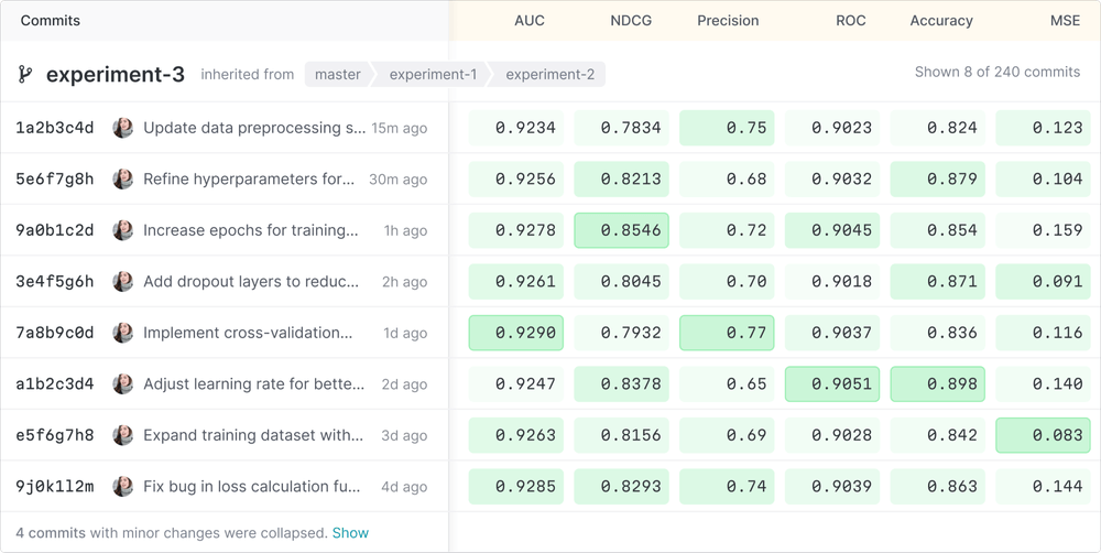
Let’s kick things off with highlight tables, which make use of colors to give data an extra visual punch, turning standard tables into easy-to-read visuals.
More specifically, colors can be strategically used to highlight tables and vividly differentiate data, making trends and outliers instantly recognizable. For instance, we can display ranges from cool to warm or leverage bold tints for key values. Whether tracking the highs and lows of performance metrics or comparing various data sets, highlight tables offer a simple yet effective tool for quick data checks.
As an example, DVC is a version control system specifically designed for ML projects, and DVC Studio provides a user-friendly interface for gleaning insights and managing ML experiments using highlight tables, as seen here:
👍 Benefits:
- The use of colors mean patterns and trends are easily recognizable and outliers also stand out instantly; no need to sift through numbers.
- Highlight tables allow users to quickly compare data across multiple categories or time periods thanks to the use of color gradients.
- These visualizations have widespread application and work well for a variety of data types, from financial metrics to user activity.
👎 Struggles:
- These tables heavily rely on color perception, which may not be accessible for all users.
- They are best suited for gleaning surface-level insights; deeper analysis requires additional context or data.
- Using too many colors or similar hues can make these tables confusing and hard to decode.
Highlight tables offer a lot of flexibility in terms of visualization, but there are also other versions of them that inherit the highlight table appearance, but work differently. So, on that note, I’d like to dive a little deeper here and shine a light on a variant in common use: heat maps.
Heat maps
As seen with GitHub’s classic commit history diagram below, the purpose of heat maps is to visualize high-density data without the need for numbers in each cell. When implementing these, it’s important that columns and rows are easily recognizable and with common values (such as dates of the year or hours of the day) to prevent users from having to constantly scan them.

Beyond the GitHub example, ChatBot offers various solutions centered around AI-driven communication, including analytics, and on the right side of the above image, we can also see an example of a ChatBot heatmap in action, showing the busiest times of bot interaction in terms of hours of the day, with increasingly intense blue shades indicating times of heavier interaction.
With heat maps, the gradation of color intensity is the most important factor for conveying the magnitude of data points. (In areas where pattern recognition and relative differences are more significant than exact values, this gradiation is particularly effective.)
Possible uses for highlight tables
Here are some appropriate cases where you might consider using a highlight table, and how to set them up:
- ML model performance metrics: list different experiments on separate rows, and performance metrics (like accuracy) on columns, then apply colors from green (optimal) to red (critical) based on thresholds.
- Resource utilization: place resources (CPU, memory) on columns, and servers/containers on rows. Then, color code from blue (low usage) to red (high usage) to highlight utilization levels.
- User feature utilization: arrange software features on columns, user segments on rows, and use shades from light (low engagement) to dark (high engagement).
- Security incident reports: list incidents by type on columns, and place sources (like external IPs, applications) on rows; a color gradient from yellow (low severity) to red (high severity) can highlight quick focus areas.
- Daily user activity levels: use a heatmap with the hours of the day on columns, days on the rows, and colors to indicate activity intensity, thus revealing peak usage times without the need for individual data points.
While highlight tables are valuable for specific use cases such as comparing, matching, and highlighting trends in data, they may not be suitable for all types of data and audiences. With this in mind, let’s move on to the next case.
2: Force directed graphs
A force directed graph visually maps out how different items are connected. It shows relationships by using lines and nodes (usually dots or pictograms) to represent items.
Obsidian, as seen on the left below, is a note taking app that allows users to visualize the relationships between their notes, and thus, identify patterns about their own thinking in a visually engaging way. Meanwhile, Neo4j allows users to create different types of graphs, and the right side of the image shows a cool view of the relationships between actors, movies and directors:

As seen in the examples above, this type of visualization is great when you want users to be able to see how things in a network interact and depend on each other, making it easier for users to understand complex relationships at a glance.
👍 Benefits:
- Connected nodes present a familiar pattern that simplifies complexity and allows for immediate understanding.
- Visual cues in the diagram can reveal relationships and highlight otherwise hidden interactions and dependencies.
- These graphs work well with a variety of data types, from illustrating IT networks to graphing out social data.
👎 Struggles:
- Growing networks can make these diagrams unwieldy, presenting scalability issues and necessitating more sophisticated visualization techniques.
- Data complexity may be oversimplified and obscured with this type of high-level overview.
- Force directed graphs are data dependent; accurate and complete data is crucial for ensuring a clear, useful diagram.
Possible uses for force directed graphs
And here are some ideas for how you might use forced directed graphs inside your dev tool:
- Dependency mapping: plot libraries or modules as nodes, and then draw lines to connect dependencies.
- Security vulnerability identification: leverage dynamic node sizes to increase the visibility of any major vulnerabilities.
- Team collaboration mapping: illusrate how team members and projects are connected, then adjust the weight of the connection line depending on the contribution amount.
- API ecosystem mapping: outline APIs and their interconnections, writing the relationships as text captions running along the lines.
Force directed graphs are very useful for rendering complex interconnected data as easy-to-understand visuals. That said, they should still be used judiciously in order to avoid clutter, and it’s worth keeping in mind that they may require some level of expertise to properly interpret.
3: Sunburst diagrams
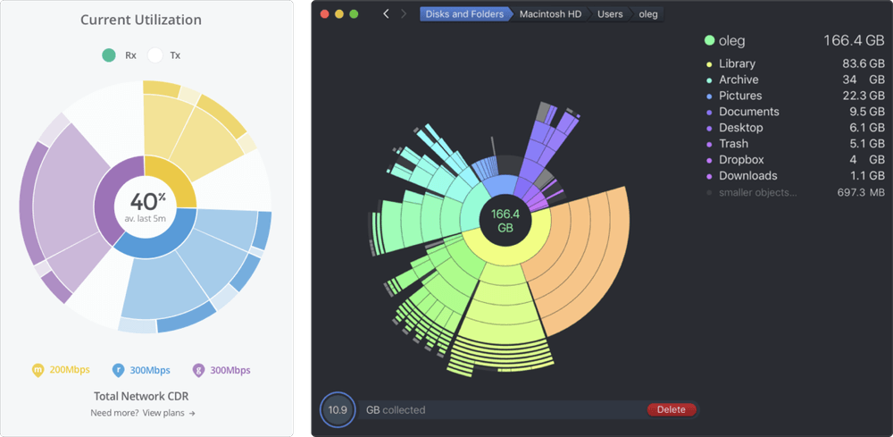
Sunburst diagrams use rings to show the layers of a hierarchy, letting users see the structure of data from the center outwards, and thus, understand how the parts of something fit within a whole. While these diagrams are a visually appealing way to explore hierarchical data, it’s worth nothing that they can become difficult to visually navigate and interpret with increased complexity and depth.
Below on the left, this mockup from Product Designer Paul Hatch shows a proposal for a sunburst diagram design with various network data allocation displayed. On the right, we see how DaisyDisk uses this kind of visaulization coupled with beautiful colors and a striking diplay so its users may quickly scan and easily visualize MacOS disk usage:
👍 Benefits:
- Easily see how categories and subcategories are organized.
- Rich detail in a compact form that combines data depth and breadth.
- A natural way of exploring data layers and drilling down into details.
👎 Struggles:
- Hard to read as number of layers increase.
- Great for seeing a structure, not for comparing exact sizes.
- More data means more complexity—and potential confusion.
Possible uses for sunburst diagrams
Here are some dev tool use cases for sunburst diagrams:
- Software architecture mapping: a diagram can be centered on the core system or platform, with rings representing layers of the architecture (UI, business logic, data access). From there, segments within each ring represent components or modules, providing a visual map of the software’s structure.
- Repository analysis: start with the repo root at the center, expanding outward through directories to individual files. Give segments a size determined by file size or commit frequency, and color code by file type or age; this setup offers a detailed view of repository contents and activity.
- Performance profiling: We can center the graph on the application, with concentric rings for different aspects of performance (CPU, memory, I/O). Segments represent specific processes or functions, sized by resource usage, to identify areas that may require optimization.
- User interaction paths: place the application homepage or main screen at the center, with paths to different features or screens as the outer rings. Determine the size of segments based on frequency of use, and implement color coding by user satisfaction or conversion rates, tracing how users navigate through the application.
4: Treemaps
Treemap diagrams break down data into nested rectangles, showing how parts of a whole compare in size and scale, making complex hierarchies simpler to digest.
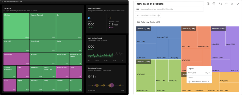
Above on the left is a treemap concept by Product Designer Jamie Fang with various cloud platform stats, and on the right we see an example of a treemap used to display sales data from Slingshot, a tool designed to boost team productivity.
👍 Benefits:
- These diagrams pack a lot of data into a compact area.
- Users can quickly see both the big picture and finer details.
- Color coding can make patterns or categories stand out.
👎 Struggles:
- Like some of these other options, this visualization can also be overwhelming with too much data.
- While size differences are clear, exact values are not, which makes comparisons difficult.
- Treemaps have a limited depth and are best for showing a few levels of the data hierarchy.
So, treemaps can efficiently visualize hierarchies and proportions within a dataset, but they can struggle with conveying precise values or managing excessive detail. Let’s move on and think of some more ways to use them.
Possible uses for treemaps
Here are some proposals of how we can utilize treemaps in our dev tools:
- Codebase organization: divide the treemap by top-level directories or modules, with nested rectangles for subdirectories or files. Size rectangles by lines of code or file size, and color code by file type/update frequency to visualize the codebase structure and focus areas.
- Storage usage: start with the entire storage system as the outermost rectangle, breaking things down into drives or servers, then directories, and finally individual files. Size and color rectangles by the amount of storage used, which makes quickly identifying areas of heavy usage a breeze.
- Feature categorization: organize the treemap by major feature categories, with sub-features as nested rectangles. Size each rectangle by usage metrics (for instance, user interactions) and color code by performance or satisfaction scores to prioritize development efforts.
- Project task distribution: break the project down into its main tasks or milestones, with sub-tasks as nested rectangles. Size them by estimated hours or complexity, and color code by status (not started, in progress, completed) to track project progress and workload distribution.
5: Sankey diagrams
Sankey diagrams show how different things flow and connect using thick or thin lines, making it easy to see major paths, relationships, and volumes in processes like data or resource transfers.

For some real life cases, we can see the examples above: on the left, a Sankey diagram in Google Analytics illustrates different user event flow distributions for visitors to a site, allowing for an immediate understanding of user navigation. Then, the graph on the right side shows how Monarch, a money management tool, utilizes Sankey diagrams to make it clear how a spending cash flow is being distributed.
👍 Benefits:
- These are perfect for seeing flows and how items move/change direction.
- Thick lines quickly draw the eyes to major paths and any important stuff.
- Users can easily compare volumes and see how much of something is going where.
👎 Struggles:
- These become messy at larger scales where there is too much info.
- A large number of lines and colors might confuse viewers.
- Can skip over the small, crucial details.
These diagrams are great for tracking flows and relationships in data or resources but, like the others, it pays to know when to use them and when to avoid them: they also become cluttered and lose detail when dealing with more complex systems.
Possible uses for Sankey diagrams
With dev tools, we might decide to use Sankey diagrams in cases like this:
- Data pipeline mapping: we can organize the diagram by the stages of the data pipeline (collection, processing, storage, analysis), with lines representing the volume of data moving through each stage. Color coding can then differentiate types of data or processing activities.
- Resource allocation: we can structure the diagram with resources (like CPU, memory, and bandwidth) on the left and applications/services on the right. With this setup, the lines show the allocation of resources for each application, highlighting inefficiencies or overuse.
- Traffic flow: we can display a map network or web traffic starting from sources (external websites, direct entry, social media) to destination pages or services. From there, line thickness can represent traffic volume, offering insights into popular paths and potential bottlenecks.
6: Bullet charts
Bullet charts are essentially further refined bar charts; they can track progress towards a goal while comparing it to other tiers or benchmarks. They are also compact, which makes them suitable for dashboards with limited space. They provide clear performance insights by combining different metrics into a single, straightforward visualization, but they struggle with complex, multi-variable data.
These two bullet charts visualize sales data: the left image from SAP features a “bullet micro chart”, with a single measure, making it extremely easy to visualize goal progress.
The right-side image displays a bullet chart in Tableau, a business analytics and intellgience tool, using a library created by Jeffrey A. Shaffer.

👍 Benefits:
- Packs multiple data points into a single, streamlined chart with either horizontal or vertical orientation, saving space and reducing clutter.
- Clearly shows progress against goals and comparisons with benchmarks, making it easy to evaluate performance.
- Directly aligns with business objectives by visually emphasizing goal achievement.
👎 Struggles:
- If you’re not familiar with stats, these charts might be confusing.
- On that note, bullet charts require careful design to avoid confusion, especially when using similar colors or crowded scales.
Possible uses for bullet charts
Here are some use cases for bullet charts with dev tools:
- Performance benchmarking: we can visualize the performance of various components or services against predefined thresholds to quickly identify areas needing optimization.
- Progress tracking in feature development: this allows us to the track progress of new features or updates against project timelines or milestones, clearly showing how close they are to completion.
- Code quality metrics: bullet charts allow us to display code coverage or other quality metrics against targets for individual modules or projects, allowing quick assessments of code health.
- Security compliance: we can track compliance with security benchmarks or standards across different areas of the IT infrastructure and easily identify compliance gaps.
7: Box and whisker plots
Box and whisker plots show the spread of data (for instance, how spread out numbers are) by marking the median, quartiles, and any outliers. These charts are great for comparing data from different groups with a quick look, showing what is normal, what is not, and how varied the data is in general.

The left example is from Stimulsoft, which offers various report creation options, and displays a quick, simple example of an easy-to-read box and whisker plot. DevExpress provide a range of UI controls, and this example illustrates how one of their charts could be used to display and analyze data about experiments.
👍 Benefits:
- Easily get a quick stats snapshop and see the median, range, and odd points in your data.
- These are handy for comparing and looking at how different groups stack up.
- Clearly marks outliers, helping identify anomalies.
- Box and whisker plots can visualize a lot of info in a little space.
👎 Struggles:
- Like the previous example, these diagrams might be confusing for those who are unfamiliar with statistics.
- Box and whisker charts can give an overview, but they skip over the fine details.
- While the outliers get a lot of attention, this can distract from overall trends.
Box and whisker plots are great for a quick statistical overview and spotting outliers, but things can get more tricky when performing a detailed analysis, or for those new to stats.
Possible uses for box and whisker plots
In terms of dev tools, some approporiate use cases for box and whisker charts are as follows:
- Performance analysis: we can cmpare execution times or memory use from different code blocks or algorithms.
- Bug resolution times: these allow us to visualize the distribution of time taken to resolve issues across different teams or projects.
- User response times: we can analyze user interaction times within applications to identify potential usability issues.
- Feature usage: compare the range and distribution of usage metrics for various features.
The end of the line
Hopefully, this survey has inspired you to think about how you’re displaying users data within your developer-facing tool. Are you doing it in most efficient way? Is there something you’ve neglected to include? Add it, and let us know!
At Evil Martians, we transform growth-stage startups into unicorns, build developer tools, and create open source products. If you’re ready to engage warp drive, give us a shout!


