Figma DIY: Building a color system plugin
Figma seem to be missing a feature that would help your workflow? Let’s learn how to build it with just some basic knowledge of HTML, CSS, and JavaScript in this step-by-step tutorial. If you’re working at the intersection of design and web development—this post is for you!
A few years after we published this post, Figma announced Variables.
This feature covers almost everything we predicted and asked for: assigning variables to variables, using semantically named variables (which we referred to as functional styles in the post) instead of spectral ones, simple theme switching, and more. We can only hope that this article served as an inspiration for Figma’s product designers working on Variables.
But, even though writing a plugin for switching themes is no longer necessary, this article is still relevant! Designers can use the first part as a guide to understand why multiple levels of abstraction backed by variables are important, and find practical examples of implementing it in their everyday design work.

Roman Shamin
Prev. Head of Design
Where to begin? If you’ve developed for the web before, working on a Figma plugin will make sense right away. If you have limited experience with HTML, CSS, and JavaScript, we still encourage you to try this tutorial—we’ve broken the process down into simple steps with accompanying explanations and code examples that can be copied and pasted into your editor.
The goal here is to get you comfortable with making your own Figma plugins whenever you encounter a missing feature and wish to solve that problem. So, in this article, we’ll draw up a simple mock interface for our sample project to work within, then we’ll imagine a better way of working with colors outside the confines of what Figma currently offers and we’ll create a small plugin to make implementation our new system possible!
To give you some motivation: here’s the video of our little plugin in action:
The simple-color-system plugin you’ll have developed by the end of this tutorial
Before we jump into the code, let’s lay out the case for the aforementioned missing Figma feature: a way to change how we manage colors in a scaling design project. Once we think up our dynamic color system to solve our problem, we’ll implement our solution by extending the feature set of Figma with our simple plugin. We’ll also walk you through the necessary preparations to set up your development environment from scratch. Let’s do it!
Those hexed colors
Let’s start with the very basics. When we draw interface mockups in Figma, we combine fonts, shapes, and colors to achieve our desired look. Let’s imagine we’ve been tasked with creating a modal window that allows users to apply tags—a pretty common component in modern software. Each tag has a name and an associated color.
We’ve prepared a small sample project for you that implements this interface. Make sure to open it using Figma Desktop since you can’t develop and test plugins using the browser version.
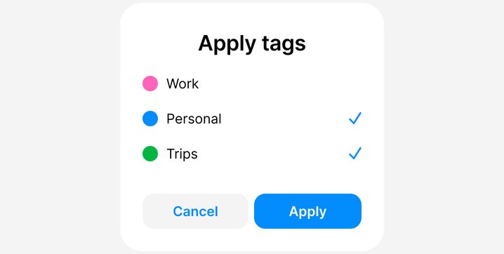
A tag selector component
As experienced designers, we want to limit ourselves to a clearly defined palette which contains just the right amount of distinctive colors to be reused between different elements of our interface. For this little example, we’ve chosen six colors in total: black, white, blue, pink, green, and light gray.
So, how do we assign these colors when we start a new project from an empty slate? In Figma, we select the shape we want to fill and use the color picker in the “Fill” menu to select the desired shade, or we just type in the hex code directly. For our blue, that value is 028CFC.
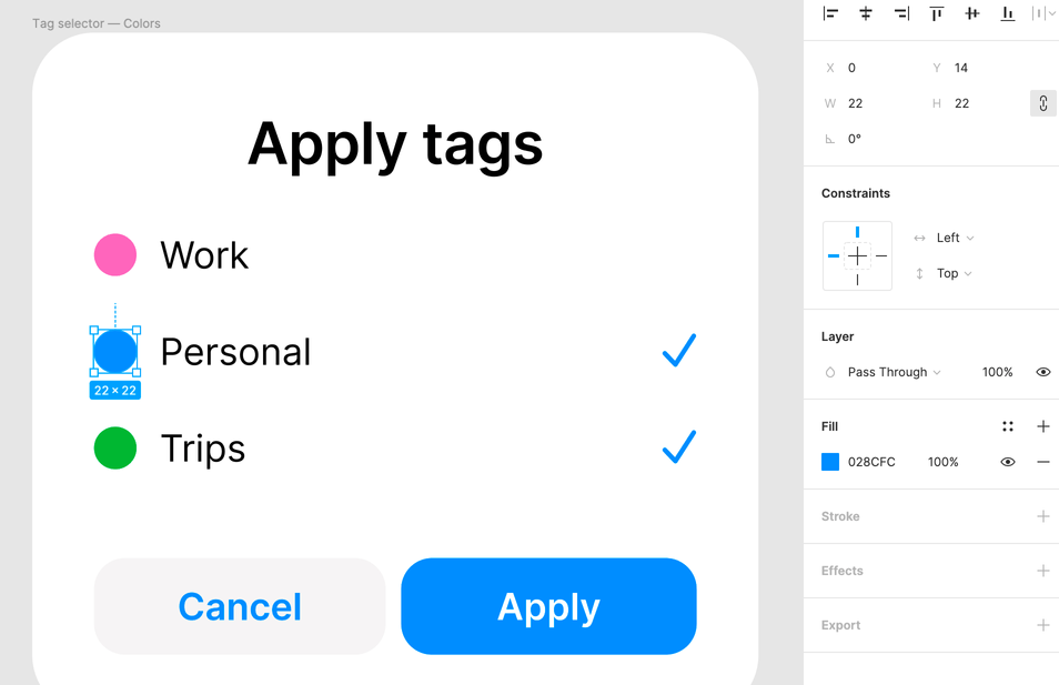
Selecting the hex-code for the color. This blue is #028CFC
When we’re set on a color, we might want to reuse it. As you can see, in our example, several elements share the same shade of blue: the color of the “Personal” tag, the check marks for selected tags, the background of the primary “Apply” button, and the label of the secondary “Cancel” button.
How did we achieve this? Simple enough, we just copied the hex value of the fill from one shape, selected another shape, and pasted the value to trigger the color change.
Copying and pasting hex codes is a valid approach to get yourself off the ground, but this does not scale well. As you create more components in the same design system, you’ll end up copying and pasting more and more color values.
In short: if it’s necessary to change this shade of blue across the entire interface—you will find yourself in copy-paste hell.
Color with style
So how can we avoid this seemingly Sisyphean task of manually changing our colors? Well, luckily, Figma implements the concept of styles.
You can create a paint style based on a color fill by clicking on a “painted” element and selecting Fill → Styles → Create Style.
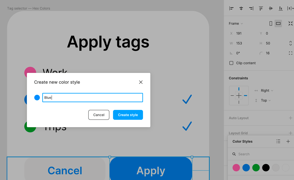
Creating a paint style with a blue fill
And we can quickly convert all six of our existing colors into paint styles by giving them human-readable names like “Blue” or “Light Gray”.
There’s really no debate—as human beings reasoning about colors, we’ll have an easier time with simple words than with hexadecimal numbers.
Take a look at the “Tag Selector Color Styles” frame in our sample project:
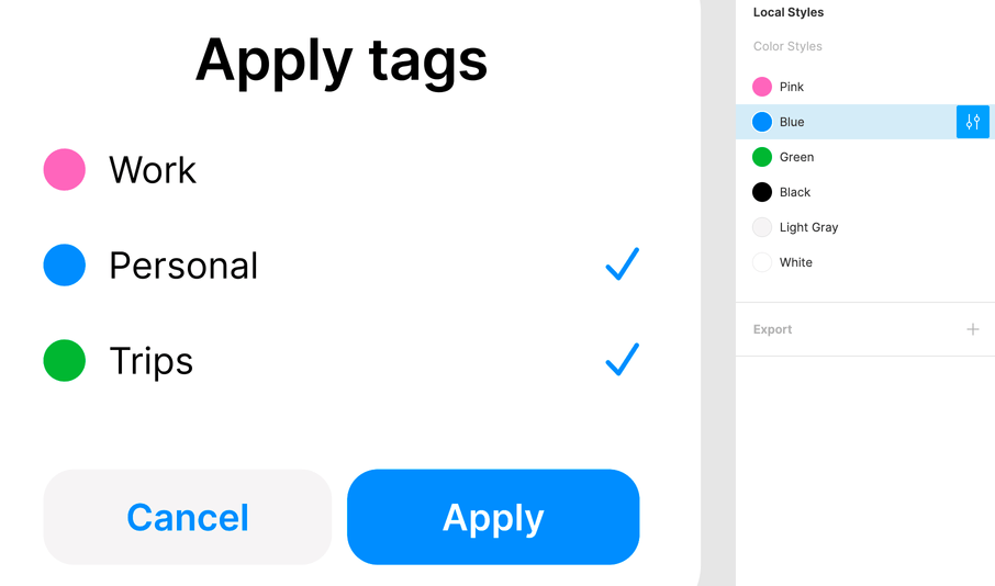
Paint styles named as fill colors
We’ve started our climb into efficiency heaven—no more copy and pasting! We can see all our color styles at a glance inside the “Design” pane. And we can also edit any style globally. As we change the color property inside the “Edit Style” menu—all the elements that depend on a selected style will change their color. Try it—it’s magic!
Style and function
OK, wait a minute. We currently have just one shade of blue in our design. But, it serves two distinct functions here: it’s the color of the “Personal” tag, but also the general accent color of our interface, shared between the check marks, the primary button’s background, and the secondary button’s label.
We might not want to change the tag’s color if we want to tweak the general accent, and having all our blue elements styled as “Blue” will make our color system too rigid.
An alternative naming methodology will be to name our styles—not based on their appearance—but on the functions they serve within our UI.
The third time’s a charm, so let’s take a final go at our styles. Inside our sample project’s “Tag Selector Functional Styles” frame, we’ve named the styles according to their function and assigned them to the respective elements. All the black text is now styled as “Text primary”, tag colors have been styled with tag names, and the blue is now “Accent UI”:
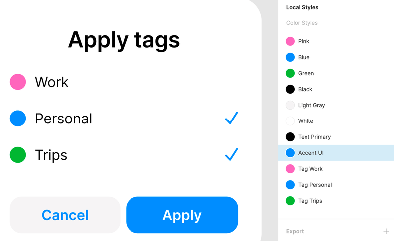
Paint styles named for their function
Dynamic color system
Our little Figma project now has eleven paint styles in total. Some are named based on the underlying color fill (“Pink”, “Green”), and some are named according to the function they serve (“Text Primary”, “Tag Personal”).
In essence, this is nothing but an abstraction over hex-codes. When we apply “Blue”, “Tag Personal”, or “Accent UI” to some element, we’re giving it the same color fill of 028CFC under the hood. All our styles depend on the same source.
Herein lies a problem that will make our project hard to maintain in the future: if we need to change the common underlying fill for several styles, we’re back to square one: copying and pasting hex values.
There’s just one crucial step missing from turning our convention into a flexible, dynamic color system: relationships between styles. But what if we could make our styles depend on each other?
If we made our styles depend on each other, we could base our “Blue” style on a certain hex color, then use “Blue” as the source for both “Tag Personal” and “Accent UI”.
If we make a little napkin sketch, it could look something like this:

Linked color styles
This means if we want to change the shade of blue globally, we just need to edit the source for “Blue”. In this case, this will affect “Tag Personal” and “Accent UI”, and both styles will automatically end up with the new shade.
In other words, a change in any underlying style would start a chain reaction, making our interface instantly conform to our new rules.
For instance, if we want to change the accent color to a shade of green—no problem, we’ll just make it depend on a “Green” style:
Changing a source style for a functional style makes your designs flexible
Now, the color of personal tags and the dominant color of the interface can go their separate ways.
This seems like a powerful, scalable color system for any project! There’s just one problem: Figma won’t let actually us control styles this way. We’ll need to develop our own feature.
At least, not if we stick to the features that it came with out of the box.
Building a Figma plugin from scratch
As Figma is based on web technologies, there’s nothing stopping us from developing our own features. All we need is some fundamental knowledge of JavaScript, CSS, and HTML. Once we learn to operate Figma’s paint styles programmatically, the popular design software will just do our bidding for us! Since Figma always works in the browser (the desktop app is based on Chrome), we can use the standard browser APIs to create the interface that we want.
We’ll take you through the entire process of building a plugin: try to find the time to actually code along with it so you can see the final functionality shaping up step by step.
Figma provides a great setup guide that we recommend you follow so we can start on the same page. Follow the official instructions and install the following:
- Visual Studio Code
- Node and npm
- TypeScript
❗ Note that you need to download Figma desktop to work with your plugin in development. The web version will not be able to access your local code.
In Figma desktop’s menu, choose Plugins → Development → New Plugin. Give it the name simple-color-system and choose the template called “With UI & browser APIs”.

Steps to create a new plugin
Choose a place to save your plugin folder. Then, open that folder from Visual Studio Code.
You should see a bunch of boilerplate files inside the “Explorer” pane, but the only ones we’re interested in are code.ts and ui.html. Initially, they just contain some sample code. No worries, we’re soon going to replace this with our own.
Now there are just a few more steps we need to take to finish setting up our development environment:
- Open the terminal inside Visual Studio Code; in the top menu: Terminal → New Terminal.
Paste the line below into the prompt and hit “Enter”:
npm install --save-dev @figma/plugin-typingsMake sure you install the typings for the Figma Plugin API:
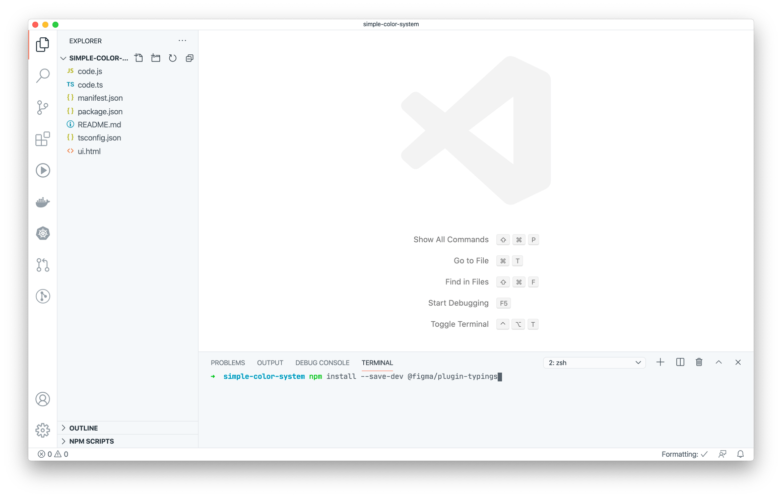
Figma allows you to write TypeScript, an advanced superset of JavaScript, but you don’t have to learn it to follow this tutorial—standard JS will do just fine. The command above, however, is necessary so Figma can automatically translate .ts files to .js.
- Select Terminal → Run Build Task in the top menu of Visual Studio Code or hit Cmd-Shift-B (Ctrl-Shift-B on Windows) to bring up the build task interface. Select
tsc: watch - tsconfig.jsonand hit “Enter”:
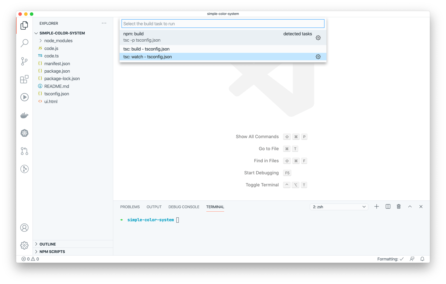
Now Figma will transpile your TypeScript code into JavaScript on the fly
Note that these are two very important steps: without them, you won’t be able to test your plugin’s code in real-time.
Reading paint styles
Now, let’s see how we can use Figma’s plugin API methods to read all the paint styles in our project. Delete all the code from the code.ts file and replace it with this:
// code.ts

figma.showUI(__html__);

const styles = figma.getLocalPaintStyles();
const styleNames = styles.map((style) => style.name);
console.log(styleNames);
Here we’re using Figma’s built-in getLocalPaintStyles method to fetch an array of PaintStyle objects, each containing information about an existing paint style in our project.
If we look up the documentation for PaintStyle, we’ll see all its properties, but the particular property we’re interested in for now is name.
We’ll use JavaScript’s map method to just get the name properties of each element. This will create a new array of names that we’ll save to a styleNames variable. Finally, we’ll print that array to the console.
Now, delete all the sample code from ui.html and leave only an empty <script> tag inside, like this:
<!-- ui.html -->
<script></script>
With that, we’e ready to launch our plugin for the first time. It might be pretty bare for now: it does’t have any UI yet, and all it can do is log the names of the paint styles to the developer console. (We use console.log as a simple debugging tool to check if our setup is complete and the code works as intended.)
In Figma’s top menu, choose Plugins → Development → Open Console. To launch your plugin, choose Plugins → Development → simple-color-system.
If everything goes well, you should see the names of all our styles in the console logs. If you don’t see anything, or if you see error messages in your console, make sure you followed the plugin developer’s setup guide to the letter.
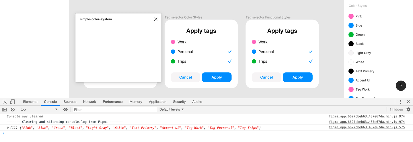
A smoke test for our plugin
Now it’s time to see how we can display those names in the interface of our plugin. For that, we’ll need the code inside our code.ts to send a message to ui.html, which is the interface of our plugin. It’s been defined as any other HTML page would be: with markup tags, styles, and scripts.
Here’s how we’ll code it from the sending side of things:
// code.ts

figma.showUI(__html__);

const styles = figma.getLocalPaintStyles();
const styleNames = styles.map((style) => style.name);

// Sending a message to ui.html
figma.ui.postMessage({
  type: "render",
  styleNames,
});
The contents of the message will be an object containing a payload (here, an array of style names) and which has a type property. When we receive messages, we can select how we’ll react to them based on their type.
On the receiving side, inside our ui.html, we need to create an empty HTML list element, give it a unique ID, then write some JavaScript code inside the <script> tag.
This code will handle the message sent from code.ts. We’ll use JavaScript’s built-in reduce method to transform an array of names into a string of HTML that will contain items for our list tag. We’ll then use the DOM API to replace the contents of the list tag with our string of HTML.
Open your ui.html file and replace it with this code:
<!-- ui.html -->
<ul id="styles-list"></ul>
<script>
  // Select the ul tag
  const stylesListElement = document.getElementById("styles-list");

  // Handle incoming message from code.ts
  onmessage = ({ data: { pluginMessage } }) => {
    const messageType = pluginMessage.type;
    // React only to "render" message
    if (messageType === "render") {
      // Get an array of style names from the message
      const styleNames = pluginMessage.styleNames;
      // Turn array of names into a single HTML string with li tags
      const rowHTML = styleNames.reduce(
        (resultString, styleName) => resultString + `<li>${styleName}</li>`,
        ""
      );
      // Insert li tags inside the ul
      stylesListElement.innerHTML = rowHTML;
    }
  };
</script>
Now you can come back to Figma and run your plugin again. You can either select Plugins → Development → simple-color-system from the top menu or just press Cmd-Alt-P (Ctrl-Alt-P on Windows). You’ll see your plugin pop-up window, showing all your project’s paint styles as a standard HTML bulleted list:
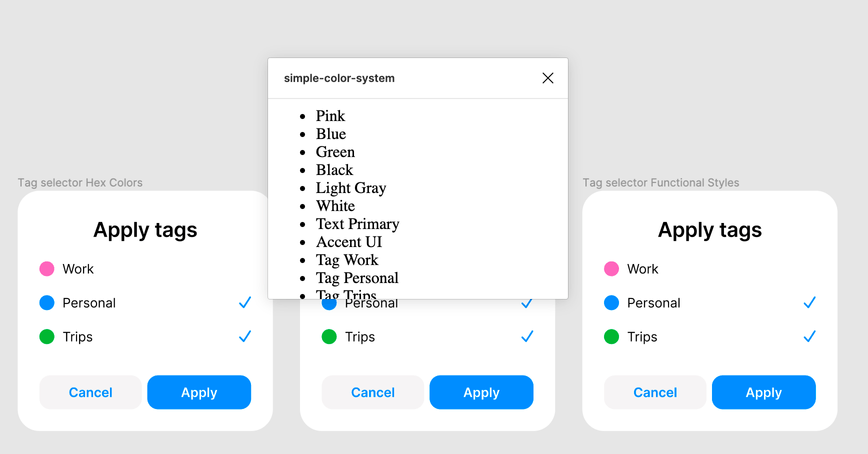
Our first shot at the plugin interface
Linking paint styles
Our plugin now has a rudimentary interface, but it still doesn’t do much. As you remember, we want to create relationships between our paint styles by assigning one style as a source for another. How can we express this in our interface? We can display a pair of styles for each row: one as the source and another as the receiver:
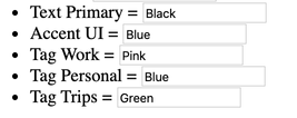
Style assignment, visualized
Hopefully, it’s immediately clear that the name of the receiver style is on the left and the source is on the right, since we’ve used the equals character to convey the idea of “assigning” styles to one another (just as we use to assign variables in code).
So, when we create a style in Figma, how are we going to express that it has a source?
If you click on “Edit style” for any of the styles in a document, you’ll see that you can change the name, the underlying color, and add or update a description. The description is just an arbitrary text field and it looks like we can use it to store information about the source. Edit your “Accent UI” style to give it a description of “Blue”:
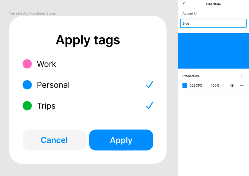
Editing a receiver style to provide information on the source style
Next, we need to be able to manipulate these descriptions from our plugin and to change style properties based on our agreed-upon convention.
Helpfully, getting a description out of a PaintStyle object is easy. We can use the description property here, just as we used the name property to get a style’s name.
Still yet, we need to do some more work in our code.ts file—instead of gathering all the existing style names and sending them over to the interface, we have to do the following:
- For each style, try to find the corresponding “source” style by reading the style description
- For each row of our interface, send an object with this form:
{
  receiver: {
    name: "Accent UI",
  },
  source: {
    name: "Blue",
  }
}
Later, we can use this object in the interface to put the receiving style name on the left of each “equation” and the source style name on the right.
To help us achieve the desired result, we’ll define a couple of helper functions: getSourceForStyle and getReceiverSourcePairs. With that, here are the new contents of code.ts:
// code.ts

// Helpers

// Look at all style descriptions to find a matching source style, and return if found
function getSourceForStyle(style, styles) {
  for (const currentStyle of styles) {
    if (style.description === currentStyle.name) return currentStyle;
  }
  return null;
}

// Form pairs
function getReceiverSourcePairs(styles) {
  return styles.map((style) => ({
    receiver: style,
    source: getSourceForStyle(style, styles),
  }));
}

// Main plugin logic
figma.showUI(__html__);

const styles = figma.getLocalPaintStyles();
// Call the helper function to form pairs
const receiverSourcePairs = getReceiverSourcePairs(styles);

// Transform data into the shape we want before sending it to the UI
const receiverSourceData = receiverSourcePairs.map((pair) => ({
  receiver: {
    name: pair.receiver.name,
  },
  source: {
    // Some styles don't have a source, so we need to check
    name: pair.source ? pair.source.name : "",
  },
}));

// Debug
console.log(receiverSourceData);

// Send to UI
figma.ui.postMessage({
  type: "render",
  receiverSourceData,
});
It might seem like a lot is going on in this code, but there’s no reason to get overwhelmed. We’re using the helper functions defined at the top of the file to go over an array of all the styles in our project and we’re comparing their names and descriptions.
If we have a style called “Text Primary” with a description of “Black”, and if there exists a style with the name “Black” among the other styles, then we know that “Text Primary” is a receiver, and “Black” is a source. We put their names together in an object with the receiver and source keys and send it over to the interface.
Before you run this code, let’s create the links between the styles in our Figma project. Put “Black” into the description of a “Text Primary” style, “Pink” into “Tag Work”, “Green” into “Tag Trips” and “Blue” into both “Tag Personal” and “Accent UI”.
Now, open the developer console in Figma and run the plugin!

Logging style pairs: receiver and source
You can see that our UI doesn’t display anything, and there’s an error in the console—but that’s expected—we haven’t yet taught our ui.html to handle a new message.
What’s important is that we can log the source for every style by reading the style’s description.
Now it’s time to take care of the interface. We want new markup for each row featuring the name of a style alongside the input for its source.
As the new row HTML is becoming quite involved, let’s create it in a separate function:
<!-- ui.html -->
<ul id="styles-list"></ul>

<script>
  function markupRow(receiverSourceData) {
    return `<li>
    <span>${receiverSourceData.receiver.name}</span>
    <span> = </span>
    <input
      type="text"
      placeholder="None"
      value="${receiverSourceData.source.name}"
    >
  </li>`;
  }

  const stylesListElement = document.getElementById("styles-list");

  onmessage = ({ data: { pluginMessage } }) => {
    const messageType = pluginMessage.type;

    if (messageType === "render") {
      const stylesNames = pluginMessage.receiverSourceData;
      const rowHTML = pluginMessage.receiverSourceData.reduce(
        (resultString, pair) => resultString + markupRow(pair),
        ""
      );
      stylesListElement.innerHTML = rowHTML;
    }
  };
</script>
If you run your plugin now, this is what you’ll see:
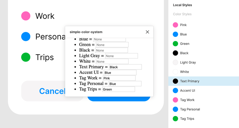
Displaying relationships between styles in the plugin interface
We can correctly read and display relationships between the styles in our project. But, we still cannot use our plugin to change the styles according to new sources yet (although we’re almost there).
Reassigning paint styles
We want our plugin to react to user input: when we change the name of the source style in a field, it should be able to repaint the parent style accordingly.
To repaint a style, all we need from the plugin’s perspective is to replace its paints property:
// Don't paste this code anywhere yet
receiverStyle.paints = sourceStyle.paints;
To do that, we need to find a receiver style first. The Figma API does not give us a method to find a style based on a name alone. Instead, we have to know its id property: a unique string identifier that every style in a project already has. Then we’ll be able to use the figma.getStyleById method to select a PaintStyle object and replace its paints property.
That means that we need to send a receiver style ID along with a name when we send a list of styles as a message from code.ts to ui.html. Let’s update the part of code.ts that forms a payload for the message and add another property to our receiver object:
// code.ts
// ...

const receiverSourceData = receiverSourcePairs.map((pair) => ({
  receiver: {
    name: pair.receiver.name,
    id: pair.receiver.id, // New!
  },
  source: {
    name: pair.source ? pair.source.name : "",
  },
}));

// ...
After that, let’s update the markupRow helper inside ui.html to store the receiver style ID inside a custom HTML attribute called data-receiver-id. We’ll need it when we learn how to send messages back from ui.html to code.ts:
function markupRow(receiverSourceData) {
  return `<li>
    <span>${receiverSourceData.receiver.name}</span>
    <span> = </span>
    <input
      type="text"
      placeholder="None"
      value="${receiverSourceData.source.name}"
+     data-receiver-id="${receiverSourceData.receiver.id}"
    >
  </li>`;
}
Now it’s time to teach our ui.html to react to user changes inside row inputs. As they are standard HTML inputs, we can use the good ol’ event listener from the DOM API to call a method of our choice once the input content has changed.
Here’s the fully-updated ui.html:
<!-- ui.html -->
<ul id="styles-list"></ul>

<script>
  function markupRow(receiverSourceData) {
    return `<li>
    <span>${receiverSourceData.receiver.name}</span>
    <span> = </span>
    <input
      type="text"
      placeholder="None"
      value="${receiverSourceData.source.name}"
      data-receiver-id="${receiverSourceData.receiver.id}"
    >
  </li>`;
  }

  // New!
  function handleTextFieldChange(event) {
    console.log(
      `Receiver ID: ${event.target.dataset.receiverId} | New Source name: ${event.target.value}`
    );
  }

  const stylesListElement = document.getElementById("styles-list");
  // New!
  stylesListElement.addEventListener("change", handleTextFieldChange);

  onmessage = ({ data: { pluginMessage } }) => {
    const messageType = pluginMessage.type;

    if (messageType === "render") {
      const stylesNames = pluginMessage.receiverSourceData;
      const rowHTML = pluginMessage.receiverSourceData.reduce(
        (resultString, pair) => resultString + markupRow(pair),
        ""
      );
      stylesListElement.innerHTML = rowHTML;
    }
  };
</script>
You can now run the plugin, change the source style of “Accent UI” from “Blue” to “Pink”, hit “Enter”, and examine the developer console. You should see something like this:
Receiver ID: S:9c376fc6968a696508c4efb1632a2d5266e49468, | New Source name: PinkThat is our event listener getting triggered. It reads the ID of the receiver style from the HTML attribute the(the value of data-receiver-id can be retrieved from JS with target.dataset.receiverId) and gets the new source name from the input with target.data.value.
Great! Now we need to get that information back to code.ts so we can find both styles and reassign the paints property. As you recall, the modules of our plugin can communicate via messages—that’s how we sent a message from code.ts to ui.html:
// From code.ts to ui.html

figma.ui.postMessage({
  type: "render",
  receiverSourceData,
});
Sending a message in the opposite direction is similar, the only difference is that from inside ui.html, we don’t have direct access to the figma.ui object. Instead, you can access the parent object (which also has the postMessage method) but the syntax is slightly different:
// From ui.html to code.ts

parent.postMessage(
  {
    pluginMessage: {
      type: "my-message",
      myData,
    },
  },
  "*"
);
Note that the message must be wrapped into a pluginMessage object, and there is an additional string argument to the call that always has the value of "*". You can read more about this quirk in the Figma documentation. With this knowledge, we can change the event listener’s handler in our ui.html to pack the ID of a receiver and the new name of the source into a message:
<!-- ui.html -->
<script>
  // Only change this function and leave the rest of the code unchanged:
  function handleTextFieldChange(event) {
    parent.postMessage(
      {
        pluginMessage: {
          type: "update-source",
          newSourceName: event.target.value,
          receiverId: event.target.dataset.receiverId,
        },
      },
      "*"
    );
  }
</script>
Now, let’s react to this message inside code.ts. Add this code to the very bottom of the file:
// code.ts

// ...rest of the code above

figma.ui.onmessage = (msg) => {
  if (msg.type == "update-source") {
    const receiverStyle = figma.getStyleById(msg.receiverId) as PaintStyle;
    // We can only find the source style by name
    const sourceStyle = styles.find(
      (style) => style.name === msg.newSourceName
    );
    // return early if one of the styles is not found
    if (!(receiverStyle && sourceStyle)) return;

    // Replace description and properties for the receiver
    receiverStyle.description = msg.newSourceName;
    receiverStyle.paints = sourceStyle.paints;

    // Show a success message in the Figma interface
    figma.notify(`New source style: ${msg.newSourceName}`);
  }
};
If you don’t have any experience with TypeScript, you might be wondering what as PaintStyle means in the code above. This is a type cast: figma.getStyleById returns the elements of type BaseStyle, but we explicitly need a PaintStyle to get to the paints property. The best thing about TypeScript is that you can write plain JavaScript, and then add the types gradually to make your code more robust. However, for the purposes of this article, we won’t go into this topic for the sake of brevity. You can read more about TypeScript features in the Figma documentation.
Phew, time to take our plugin for a spin! Launch simple-color-system in Figma and change the source of “Accent UI” from “Blue” to “Green”. See how all the accented elements of our interface update accordingly:
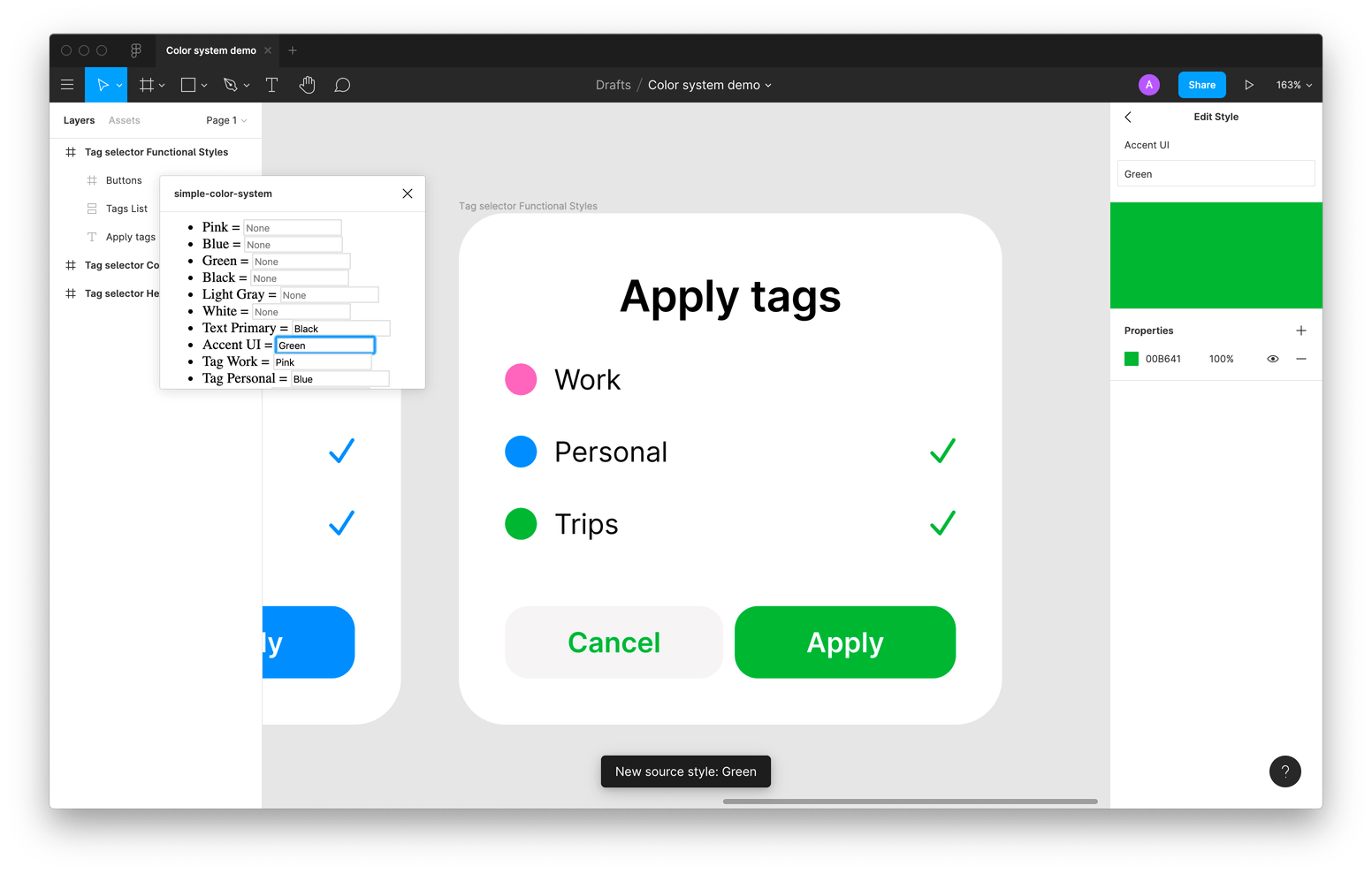
A working plugin! Now we just need to add some design
Congratulations, in less than a hundred lines of code spread across two files, we’ve created a fully functioning plugin that makes our flexible color system possible!
Finishing touches
Our plugin works now, and it allows us to repaint our interface at one time, without the need for tedious copy-pasting. This achievement in itself is a big win …but look at this UI! (We’re designers, after all.) We can’t look at the un-styled HTML any longer. Let’s sprinkle our ui.html with some CSS. We’ll be adding a <style> tag with our CSS rules and editing the markupRow function to add style selectors to our HTML.
Here’s the final ui.html in its entirety:
<!-- ui.html -->
<style>
  html,
  body {
    margin: 0;
    padding: 0;
    font: 11.2px "Helvetica Neue", Arial, sans-serif;
    line-height: 14px;
  }

  #styles-list {
    margin: 0;
    padding: 8px 0;
  }

  .styles-row {
    display: flex;
    align-items: center;
    margin: 0;
    padding: 0 16px;
    list-style: none;
  }

  .assign-operator {
    width: 16px;
    height: 16px;
    color: rgba(0, 0, 0, 0.2);
  }

  .style-source-input {
    /* Reset */
    margin: 0;
    border: none;
    background: none transparent;
    box-shadow: none;
    /* Styles */
    padding: 6px 0 6px 6px;
    border-radius: 1px;
    font: 11.2px "Helvetica Neue", Arial, sans-serif;
    line-height: 14px;
  }

  .style-source-input:hover {
    background-color: white;
    box-shadow: 0 0 0 1px rgba(0, 0, 0, 0.1);
  }

  .style-source-input:focus {
    outline: none;
    background-color: white;
    box-shadow: inset 0 0 0 1px #18a0fb, 0 0 0 1px #18a0fb;
  }

  .flexible-width {
    flex: 1 1 100%;
    min-width: 0;
  }

  .fixed-width {
    flex: 0 0 16px;
  }
</style>

<ul id="styles-list"></ul>

<script>
  function markupRow(receiverSourceData) {
    return `<li class="styles-row">
    <span class="style-receiver flexible-width">${receiverSourceData.receiver.name}</span>
    <span class="assign-operator fixed-width"> = </span>
    <input
      class="style-source-input flexible-width"
      type="text"
      placeholder="None"
      value="${receiverSourceData.source.name}"
      data-receiver-id="${receiverSourceData.receiver.id}"
    >
  </li>`;
  }

  function handleTextFieldChange(event) {
    parent.postMessage(
      {
        pluginMessage: {
          type: "update-source",
          newSourceName: event.target.value,
          receiverId: event.target.dataset.receiverId,
        },
      },
      "*"
    );
  }

  const stylesListElement = document.getElementById("styles-list");
  stylesListElement.addEventListener("change", handleTextFieldChange);

  onmessage = ({ data: { pluginMessage } }) => {
    const messageType = pluginMessage.type;

    if (messageType === "render") {
      const stylesNames = pluginMessage.receiverSourceData;
      const rowHTML = pluginMessage.receiverSourceData.reduce(
        (resultString, pair) => resultString + markupRow(pair),
        ""
      );
      stylesListElement.innerHTML = rowHTML;
    }
  };
</script>
And here’s how our plugin looks like after styling has been applied:
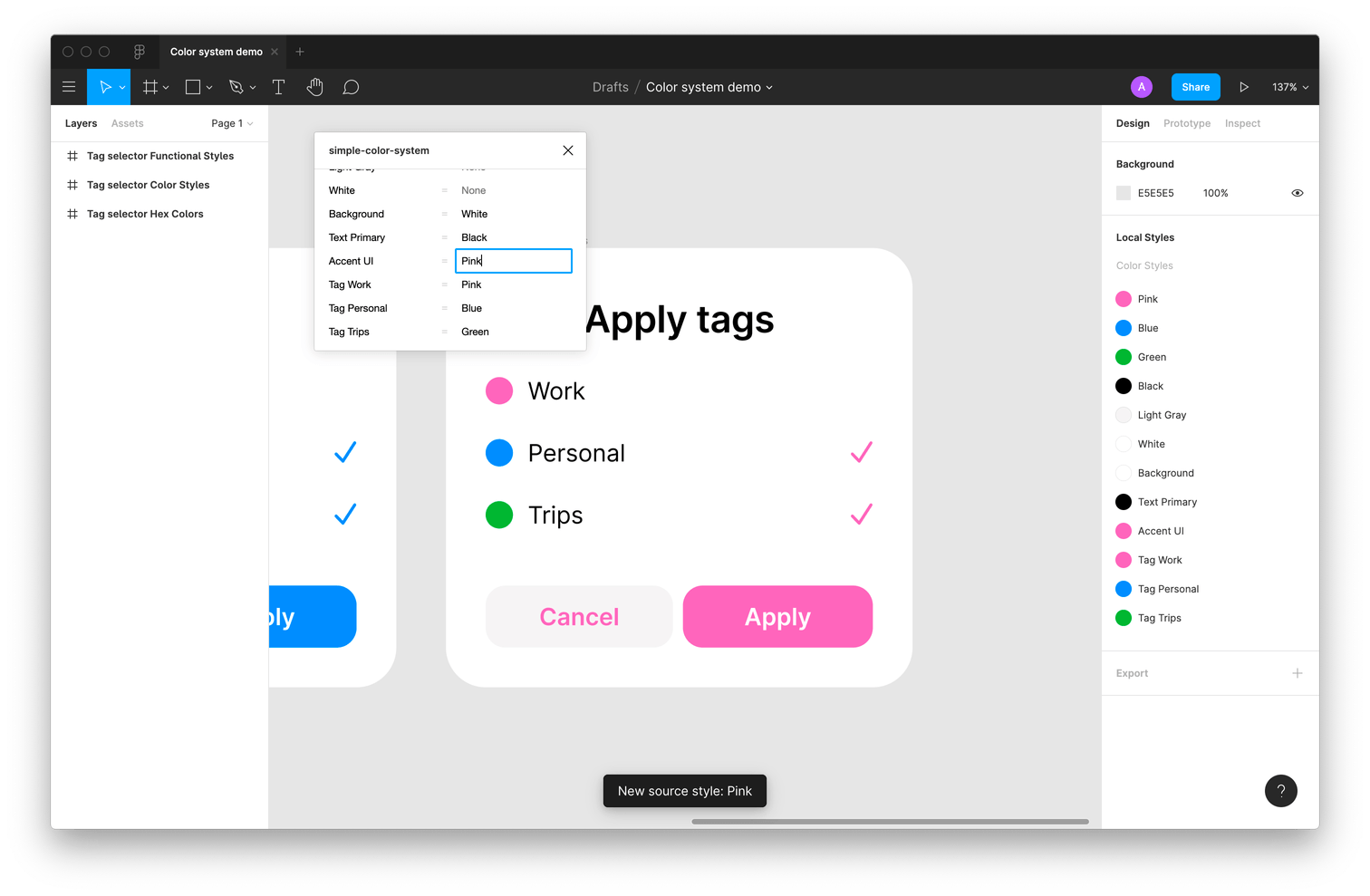
Now with some style!
Also, take a look at the final version of code.ts. We can also add a last bit of code to reassign paint styles when launching the plugin: so, if style descriptions have been edited in the Figma interface between runs of our plugin, the changes will be applied as soon as we start it.
// code.ts

// Helpers

// Look at all style descriptions to find a matching source style and return if found
function getSourceForStyle(style, styles) {
  for (const currentStyle of styles) {
    if (style.description === currentStyle.name) return currentStyle;
  }
  return null;
}

// Form pairs
function getReceiverSourcePairs(styles) {
  return styles.map((style) => ({
    receiver: style,
    source: getSourceForStyle(style, styles),
  }));
}

// Main plugin code
figma.showUI(__html__);

const styles = figma.getLocalPaintStyles();
const receiverSourcePairs = getReceiverSourcePairs(styles);

// New! Make sure to update paints  on plugin launch
receiverSourcePairs.forEach((pair) => {
  if (pair.source) {
    pair.receiver.paints = pair.source.paints;
  }
});

const receiverSourceData = receiverSourcePairs.map((pair) => ({
  receiver: {
    name: pair.receiver.name,
    id: pair.receiver.id,
  },
  source: {
    name: pair.source ? pair.source.name : "",
  },
}));

figma.ui.postMessage({
  type: "render",
  receiverSourceData,
});

// Handle message from UI
figma.ui.onmessage = (msg) => {
  if (msg.type == "update-source") {
    const receiverStyle = figma.getStyleById(msg.receiverId) as PaintStyle;
    const sourceStyle = styles.find(
      (style) => style.name === msg.newSourceName
    );
    if (!(receiverStyle && sourceStyle)) return;

    receiverStyle.description = msg.newSourceName;
    receiverStyle.paints = sourceStyle.paints;

    figma.notify(`New source style: ${msg.newSourceName}`);
  }
};
You can also find the final code for the simple-color-system plugin on GitHub.
simple-color-system plugin in action
This concludes our tutorial. By now, hopefully it’s apparent that adding your own little personal features to Figma isn’t rocket science. All you need is an understanding of the plugin architecture and a small sense of adventure: that is, you’re alright with hacking together some HTML, CSS, and JavaScript.
Our code is far from being production-worthy, but it’s still a good starting point for building the features you might need in your designer workflow.
For a designer, writing code is most certainly a step out of your comfort zone—but we believe it’s a step worth taking. Thanks to Figma’s decision to base their product on open web standards, nothing holds us back from experimenting with custom features. We hope this has whet your appetite for plugin development, and you’ll come up with your own plugins to build in the future! (Hopefully something that we’ll benefit from, too!)
The plugin we wrote together is a simplified version of the code which we use internally in the Evil Martians design department. In fact, after using our custom color system for some time, we developed a sister plugin that takes the original idea even further: it allows us to group our linked paint styles into themes and to switch between different themes with the click of the button.
This approach has already saved our designers hours of work: we can now quickly apply a new coat of paint to complex product mockups, reduce the time between iterations, and ship final results faster.
If you feel like your product can benefit from our design and engineering practices—feel free to drop us a line.