How to make absolutely any app look like a macOS app

Translations
- JapaneseアプリのUIを完全にmacOSネイティブらしく見せるコツ
What makes a native macOS app …look like a native macOS app? In this article, we’ll analyze this question and look at some practical ways you can adopt the design conventions of macOS apps in your own apps. You’ll be able to make design decisions so that your apps fit right in, thus, offering a more seamless experience as well as other potential benefits—read on!
Although this article deals primarily with the “native macOS look”, it’s important to note at the outset that many of the features and concepts below also apply to Windows apps. And further, it’s also worth mentioning that since in recent years the line between websites and desktop apps has become more and more blurred, meaning many of these conventions apply for web apps, too.
So, now that we have a shared understanding about what we’re shooting for, the question is—why might one want their app to look like a native app in the first place? Well, beyond the obvious fact that having similar design conventions allows for a more “seamless” experience for our users, I think the consistency of appearance that comes from an app which appears to have a “native” design also carries a more “credible” feel. The design seems more thoroughly considered, and overall, the application also somehow feels more stable in terms of performance.
These benefits should be an important consideration when thinking about the user experience that your application offers, and, in my opinion, are some pretty compelling reasons to incorporate native-looking design conventions into your work. So, let’s jump in and start looking at some specifics!
Use the default cursor, not a pointer
While the pointer cursor (the finger version 👆) is ubiquitous in many contexts on the web, native desktop apps use it for one particular purpose: links opening a page in a browser. Usually, the links are styled as real text links.
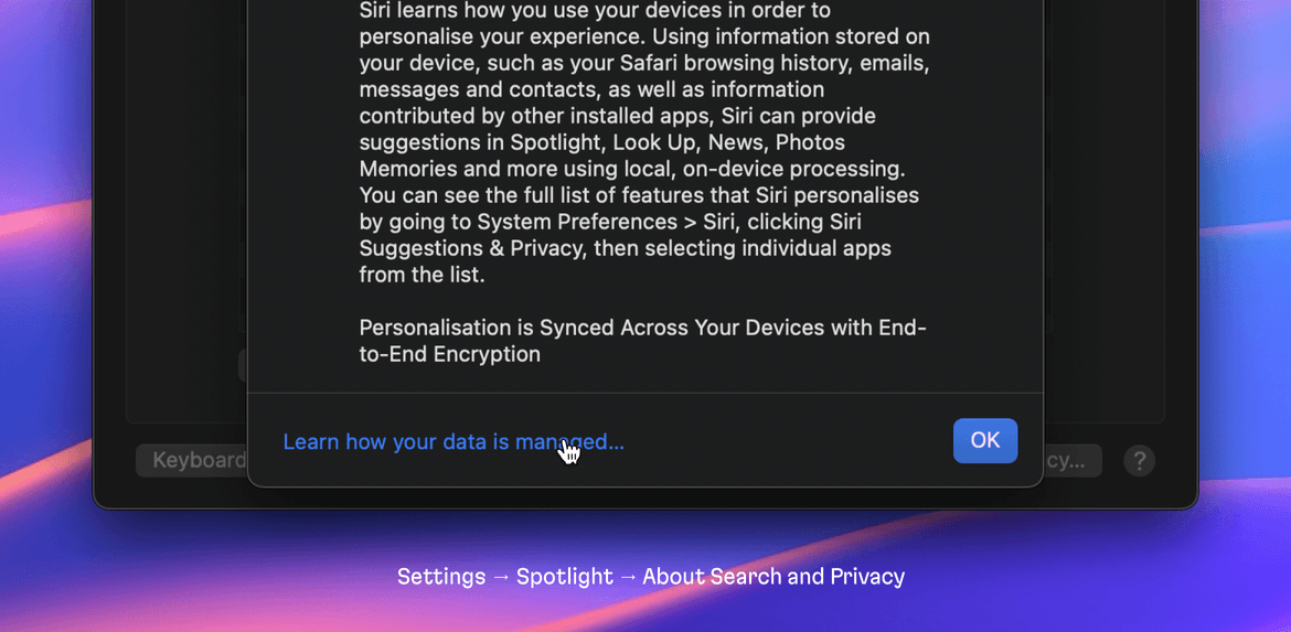
But even this simple rule is often broken.
For example, in the Resources subsection of About This Mac, some links open a web page, but they still use the default cursor to maintain consistency with the other list items:
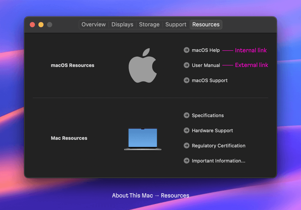
So, it’s up to you how strictly to follow the “link rule”.
Make text non-selectable by default
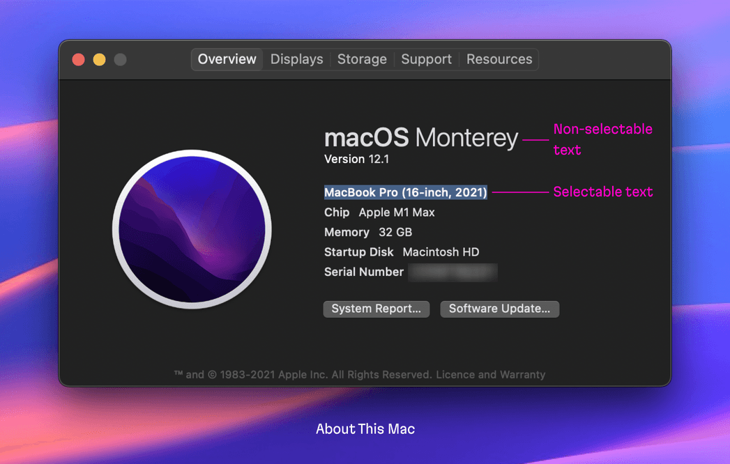
Users can only select text in labels that the developer has explicitly made to be selectable. But how can we decide what should actually be selectable? Well, this is another gray zone that requires a deep understanding of your user workflow.
Simply put, everything that users might want to select should be selectable. Here’s an example case: in the About This Mac window, you can clearly select the OS version, model name, SN, and other “content”—but you can’t select the technical labels themselves.
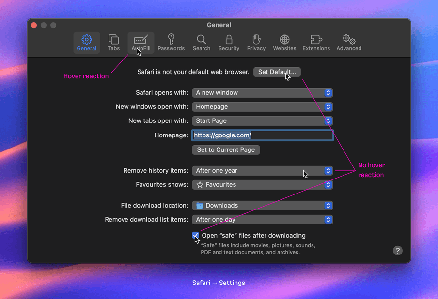
Don’t make styled buttons, dropdown menu, or checkboxes react on a hover
This is a quick tip. In terms of how they react to hovers, there are two types of buttons used in native apps. In short, styled buttons, dropdown menus (more on dropdown menu items in a bit), and checkboxes don’t react to mouse hovers, while ghost buttons (plain text or icon) do.
Don’t give menus and tables hover effects
Menu and table items don’t have a hover effect.
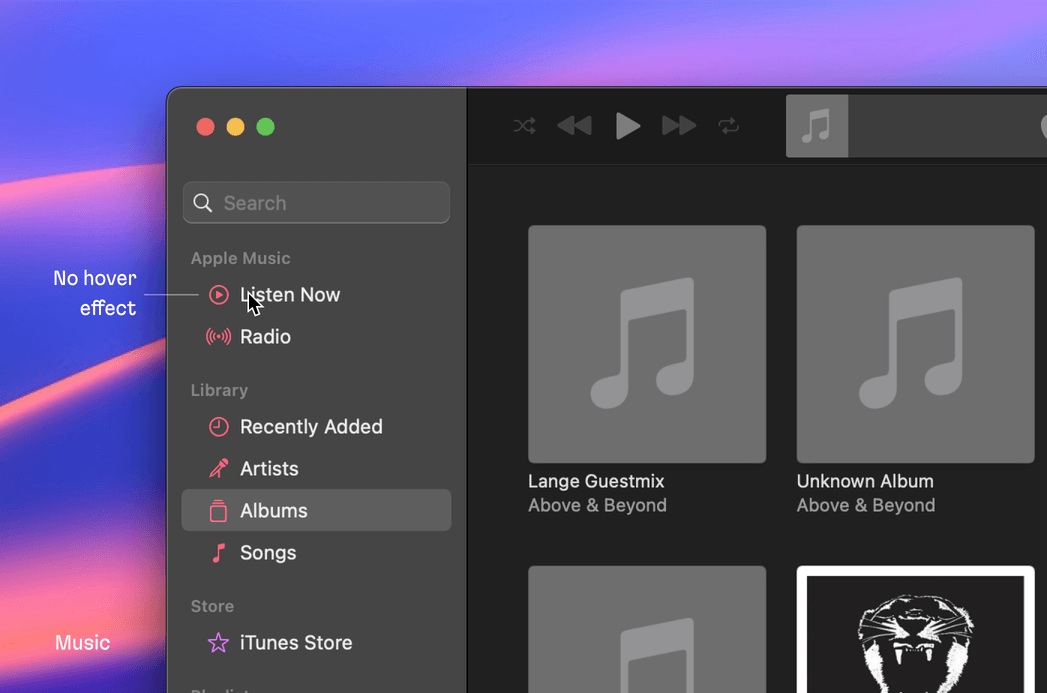
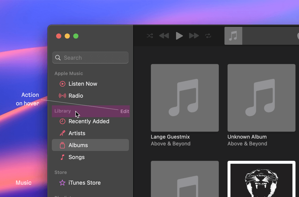
And this is true even if a menu item or a table row has a secondary action button revealed on hover—the item background doesn’t react. This technique, combined with the previous one, makes the interface seem quiet and less verbose.
However, let’s note that dropdown menu items do react on hover. This is done for keyboard navigation purposes—users using a keyboard should see which option they are about to select.
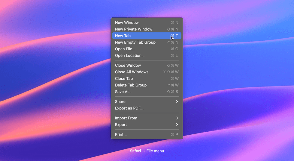
In addition, app menus and lists highlight the selected item. This provides users with visual anchors to allow for quicker orientation and navigation within the interface.
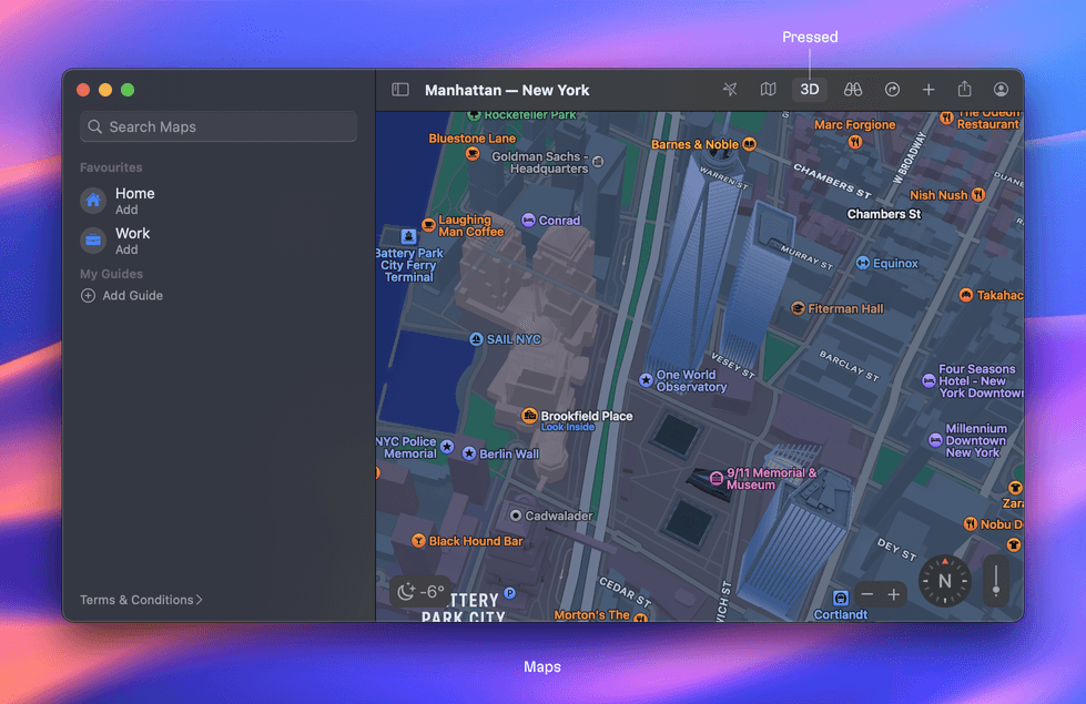
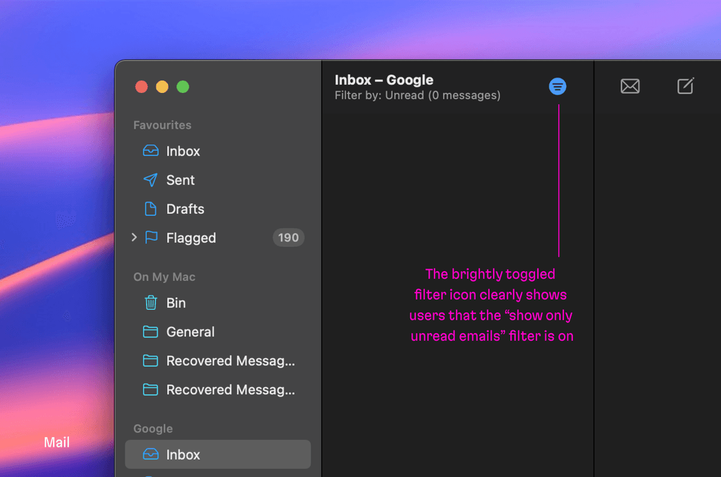
Ensure that pressed states are either subtle or glaringly obvious
Like in the example of the 3D map below, if a button turns on or toggles an obvious mode the button background is subtly highlighted.
On the other hand, if it’s not obvious that a mode might be toggled or turned on, the button applies the active color for the foreground.
Put RMB contextual menus everywhere
On the web, custom handling for RMB (Right Mouse Button) clicks is exceedingly rare, and, I’d even go so far to say, unexpected. But in the desktop world, it’s completely natural to have RMB handling. Menus and lists have it for quickly deleting or editing an item.
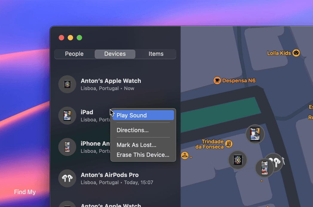
But, there’s a catch. Once you override standard RMB click handling (in the browser or Electron), you’ll have to re-implement all the standard actions like copy, cut, paste, and so on.
Summing it up
Let’s recap. For an interface (web-based included) to look like a native macOS app, consider:
- Dropping pointer cursors
- Prohibiting non-content text selection
- Reducing hover effects
- Not overusing the accent color
- Adding RMB contextual menus
By the way, if you have a project and need some Martian assistance, talk to us! Evil Martians are primed and ready to supercharge or kick off your digital products, solve your problems, and deliver results.
The Martian Design Sprint: starting and running projects faster


