How to use P3 colors with SVGs
Wide-gamut P3 colors could be the “new retina”: a way to make your website look more vibrant on modern hardware. Most new Apple devices (and Safari) already have support for these extra colors. Let’s take a look at using P3 colors with SVGs.
The extremely short version
Open an SVG in your text editor. Add a <style> tag with the color-gamut: p3 media query. Replace the colors with P3 colors in OKLCH format:
  <svg viewBox="0 0 120 120" xmlns="http://www.w3.org/2000/svg">
+   <style>
+     @media (color-gamut: p3) { rect { fill: oklch(55% 0.23 146) } }
+   </style>
    <rect x="10" y="10" width="100" height="100" fill="#048c2c"/>
  </svg>
A little theory
Screens can only display a small subset of human-visible colors. Different screens can display a different number of colors.
There are standard color subsets (color spaces) that create some standards for developers. The most popular of these, sRGB (common display) was developed by HP and Microsoft in 1996. Hex #048c2c, rgba(), or hsl() can only encode colors from this sRGB color space.
What is P3?
Many modern screens can display at least 20% more colors than were in the sRGB standard. For instance, most of OLED and some IPS screens can do it.
In 2005, the Hollywood-based Digital Cinema Initiatives created a new standard with these new colors: the DCI-P3 color space. In 2015, Apple tuned it a little and called it Display P3.

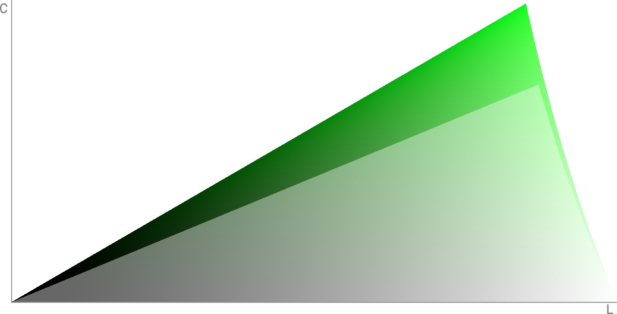
The number of new colors with P3 for green. sRGB colors are shown as a transparent layer for size comparison.
How do platforms work with P3 colors?
Many Android manufacturers implemented new colors without changing the applications and images. They just stretched out the palette and changed the colors a little in order to fill up the new P3 space and to make UIs look more vibrant. You can find this feature in the Screen → Colors settings on many of these phones.
The benefit behind of Android’s way of doing things is that we now have P3 support without changes in the ecosystem. But this comes with a big problem—apps don’t end up looking as designers originally intended.
Apple chose another way: the content creator or app developer must explicitly define P3 colors.
To render P3 colors on a platform you need 4 things:
- A screen with P3 support.
- An Operating System with a render engine that has P3 support.
- P3 support in the browser (or any other viewer application, like an image viewer).
- P3 definition in the content.
This is why we have, at the time of this writing in spring 2022, some strange cases of P3 support. For instance, on macOS, Chrome can render P3 colors from JPEG images, but not from CSS.
And currently, you can only see P3 colors on the web inside the Safari browser and on modern Apple hardware with P3 support.
How can P3 be useful?
Some people think that P3 colors are just simply more vibrant (more saturated). But the benefits of P3 are not limited to vibrant logos and landing pages.

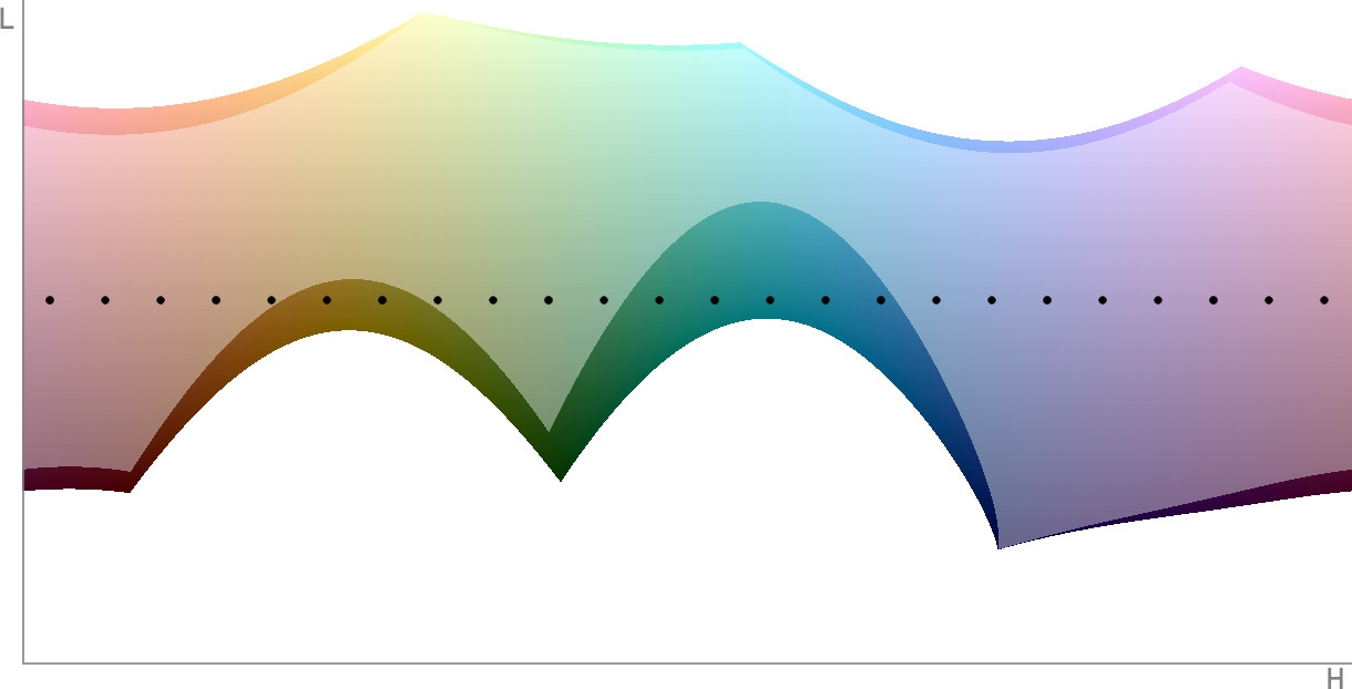
A slice of a specific chroma’s OKLCH space. Dots show a color palette with different hues and the same chroma and lightness. sRGB colors shown as a transparent layer.
- More flexible palettes for design systems. Some sRGB colors will not have a color pair with the same lightness and chroma, but with another hue. With P3, you have more flexibility in creating color palettes for your design system.

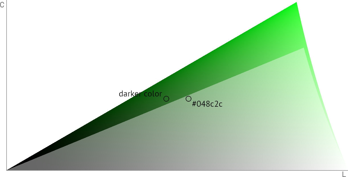
A slice of OKLCH color space for a specific chroma. Two adjacent dots have the same chroma, but the left dot is darker. sRGB colors shown as a transparent layer.
- More options for designers. More colors are always better for designers (just imagine if somebody took away 25% of your current supply of sRGB colors). For instance, in sRGB you can’t make the
#048c2ccolor darker without changing the chroma value, but in P3 you have this option.
Why is OKLCH the best format for P3?
Hex color format, rgba(), and hsla() can only define sRGB colors. Therefore, we’ll need another color format to define P3 colors.
In CSS we have the color(display-p3 1 0.5 0) format which is conceptually close to rgba() (you define the red, green, and blue components of a color).
But we recommend the OKLCH format oklch(55.74% 0.169 146). This is a good chance for the web ecosystem to move to a better format which will also be useful in another areas:
- OKLCH supports colors beyond P3. We already have the Rec. 2020 color space standard. And OKLCH uses the Oklab color space, which can support any colors.
- It’s similar to HSL: instead of using hardware components like red, green, blue, it uses Lightness, Chroma, Hue, which are more human-understandable.
- The human eye sees different numbers of colors for different hues. HSL hides this complexity by deforming the colors space. But deformed space leads to unpredictable results after color transformations. For instance, changes to lightness have different results depending on hue (causing a11y problems). To contrast, OKLCH does not deform the color space and has predictable results after color transformations.
- LCH and Lab are very similar to OKLCH, but they have a problem: hue shifts on chroma changes. OKLCH was created to solve this problem.
How to use P3 in CSS
We can’t use OKLCH in CSS without a fallback. This is because only Safari offers support for oklch(). For web apps, this is a good polyfill.
Using oklch() is more tricky for P3 colors. If a browser on sRGB hardware tries to render a P3 color, it will try to find the closest sRGB color. The problem is that we have many different algorithms for this color clamping. There is no standard yet, and we could have unexpected results on different platforms.
For now, it’s better to define an sRGB fallback.
You can detect P3 hardware support by using the color-gamut: p3 media query:
.block {
  background: #048c2c;
}

@media (color-gamut: p3) {
  .block {
    background: oklch(55% 0.23 146);
  }
}
Here’s a good thing: there aren’t many browser versions with P3 support that lack OKLCH support, meaning you only need to define one media query.
How to add CSS with P3 colors to SVG
SVG is a text format similar to HTML; accordingly, you can open it in text editors.
You can use oklch() directly in an SVG tag, but we do not recommend it: at present, only Safari offers support for oklch().
SVG supports CSS and media queries, too. You can add <style> and redefine tag’s attributes, like fill:
<svg viewBox="0 0 120 120" xmlns="http://www.w3.org/2000/svg">
  <style>
    @media (color-gamut: p3) {
      rect {
        fill: oklch(55% 0.23 146)
      }
    }
  </style>
  <rect x="10" y="10" width="100" height="100" fill="#048c2c"/>
</svg>
If you have many SVG tags, you can add id values to them in order to use in CSS selectors:
<svg viewBox="0 0 120 120" xmlns="http://www.w3.org/2000/svg">
  <style>
    @media (color-gamut: p3) {
      #left {
        fill: oklch(55% 0.23 146)
      }
      #right {
        fill: oklch(55.74% 0.26 259)
      }
    }
  </style>
  <rect id="left" x="10" y="10" width="45" height="100" fill="#048c2c"/>
  <rect id="right" x="55" y="10" width="100" height="100" fill="#306fd4"/>
</svg>
For gradients, you need to add @support wrapper and define another gradient and replace it in a media query:
<svg width="128" height="128" xmlns="http://www.w3.org/2000/svg">
  <style>
    @supports (color: oklch(0% 0 0)) {
      @media (color-gamut: p3) {
        circle {
          fill: url(#gradient-p3)
        }
      }
    }
  </style>

  <defs>
    <linearGradient id="gradient-srgb" x1="20" y1="108" x2="106" y2="18">
      <stop stop-color="#AA81F3"/>
      <stop offset="1" stop-color="#E47A38"/>
    </linearGradient>
    <linearGradient id="gradient-p3" x1="20" y1="108" x2="106" y2="18">
      <stop stop-color="oklch(70% 0.21 304.5)"/>
      <stop offset="1" stop-color="oklch(70% 0.21 49.1)"/>
    </linearGradient>
  </defs>

  <circle cx="64" cy="64" r="64" fill="url(#gradient-srgb)"/>
  </svg>
Don’t forget to use SVGO afterwards to minify SVG sources.
Further reading
- OKLCH Color Picker & Converter to play to compare P3 and sRGB colors.
- Apple article about P3
- Oklab color space introduction


