Premium design: Building a mobile app for Loewe
In this customer project with Loewe, a nearly 100-year-old German television and entertainment electronics pioneer, Evil Martians have implemented part of the brand-new corporate business strategy. Teaming up with Loewe, we built a cross-platform mobile application for users to access Loewe smart devices’ manuals and key information instantly. In 2021, the “my Loewe” app became an iF DESIGN AWARD winner in the “Communication Design” category, featuring 2021’s most cutting-edge design of services and applications.
A milestone in the television history
Loewe is a leading international brand for television and entertainment electronics that genuinely shaped the television industry. It was founded in Berlin in 1923; the year radio was introduced in Germany.
Loewe was a part of television evolution. At the 8th Berlin radio exhibition in 1931, Loewe presented a sensation—the world’s first electronic film transmission invented by Manfred von Ardenne, the young physicist and Loewe’s ingenious chief engineer at the time. He replaced mechanical image transmission methods with the considerably better cathode ray tube (also known as Braun’s tube). His triple tube prompted Loewe’s multi-tube production and today is announced as the world’s first integrated electronic circuit. Since then, Loewe has stood for “Made in Germany” television.

Manfred von Ardenne. Source: SN/Deutsches Bundesarchiv
Many Loewe products were true milestones in the history of television, the international “first-of-its-kind”. In the 1950s, Loewe began producing the Optaphon, the first cassette tape recorder. In 1961, the first European video recorder, the Optacord 500, entered mass production. Loewe also launched the first portable television, the first stereo sound TV in Europe, the world’s first “environmentally friendly”—fully recyclable television, and the first Smart-TV worldwide.
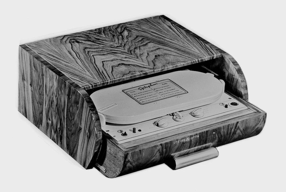
The first cassette tape recorder
Then, Loewe kept evolving from classic consumer electronics to a multimedia specialist and introduced the first TV with internet access. The first Loewe flat-screen TV enabled Loewe’s breakthrough as a premium manufacturer. In 2017, Loewe received the Gold Award of iF Design Award and won five awards at the German Design Awards for innovative products with trendsetting designs.
Today, the company develops, manufactures, and sells a wide portfolio of televisions, audio products, multi-room systems, speakers and racks, for end-users and businesses. Loewe stands for the best picture and sound quality and uses modular technology, high-quality materials, energy efficiency, and intelligent algorithms. For instance, Loewe recently teamed up with Berlin-based audio experts Mimi Hearing Technologies to make and pair hearing test results up with the Loewe TV’s audio output, boosting and masking certain frequencies, adapted to personal hearing profiles.
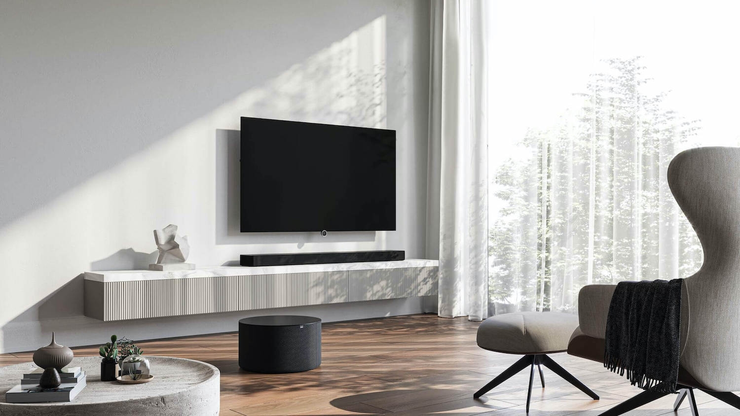
Loewe premium devices
New horizons and strategy
The investment life of the company is equally eventful. It embraces the family business stage, IPO, the period when Phillips group subsidiaries took over the majority of shares, interest from an investor group composed of German family-run companies and former Apple and Bang & Olufsen managers. Unfortunately, there was also a financial crisis due to competition from more agile and cheaper brands in Asia and even declared bankruptcy. But in 2019, Loewe was back in business as the Skytec Group investment firm took over the brand and reprofiled it.
Its main business strategy was to develop the traditional company into an internationally competitive premium provider for sophisticated consumer electronics—but relying on the proven quality of the previous products and brand reputation in the past. The new management is now focused on the core of “Made in Germany” design to reoffer the previously known portfolio in the TV sets segment and launch a brand-new audio product portfolio.
The company restored manufacturing at the traditional location in Kronach, Upper Franconia. Loewe took over 25,000 square meters and hired the first 45 employees to restart, including sales employees. The company also started to restore and expand its supply chains to offer Loewe’s portfolio again. The new owners received support from suppliers and technology partners such as LG Display, Hisense, the Chinese electronics giant, and other panels and key components manufacturers. The restoring agenda also aims to support the current end customers since spare parts supply is now guaranteed.
With a view to trade, Loewe launched a new platform for after-sales and support services to roll out to Germany and other European countries. The brand-new cross-platform mobile app “my Loewe” was highlighted to be a key part of the platform.
A fairly useful app
Previously, searching for Loewe devices manuals wasn’t a trivial task because the corporate website focused on promotion and didn’t offer them to customers. Paper guidelines are so easy to lose. Moreover, a delivery service that serves end users and cares about the delivery and installation can grab them by accident while picking up the boxes. So Loewe needed a service app for customers to easily find all papers for their TVs and audio systems and contact the Customer Care Center in just a few clicks. The app users can shape their personal devices’ “fleet” in their Loewe account and receive only the information they need.
Besides, the app should invite users to the world of Loewe: provide access to software updates, offers, news on Loewe’s products and services, and the authorized resellers in 11 countries.
The “my Loewe” app was a joint effort between Evil Martians and the Loewe team. We covered user interface design and mobile application development, including the app’s API and back-office.
Designing the UI
Timeless design is at the core of Loewe’s product philosophy: they stick to a sophisticated interplay of high-tech, quality, and user-friendliness with clear, precise, and elegant shapes. The mobile app should inherit these standards. Our task was to design a Loewe-style app following its minimalism and strict graphics principles.
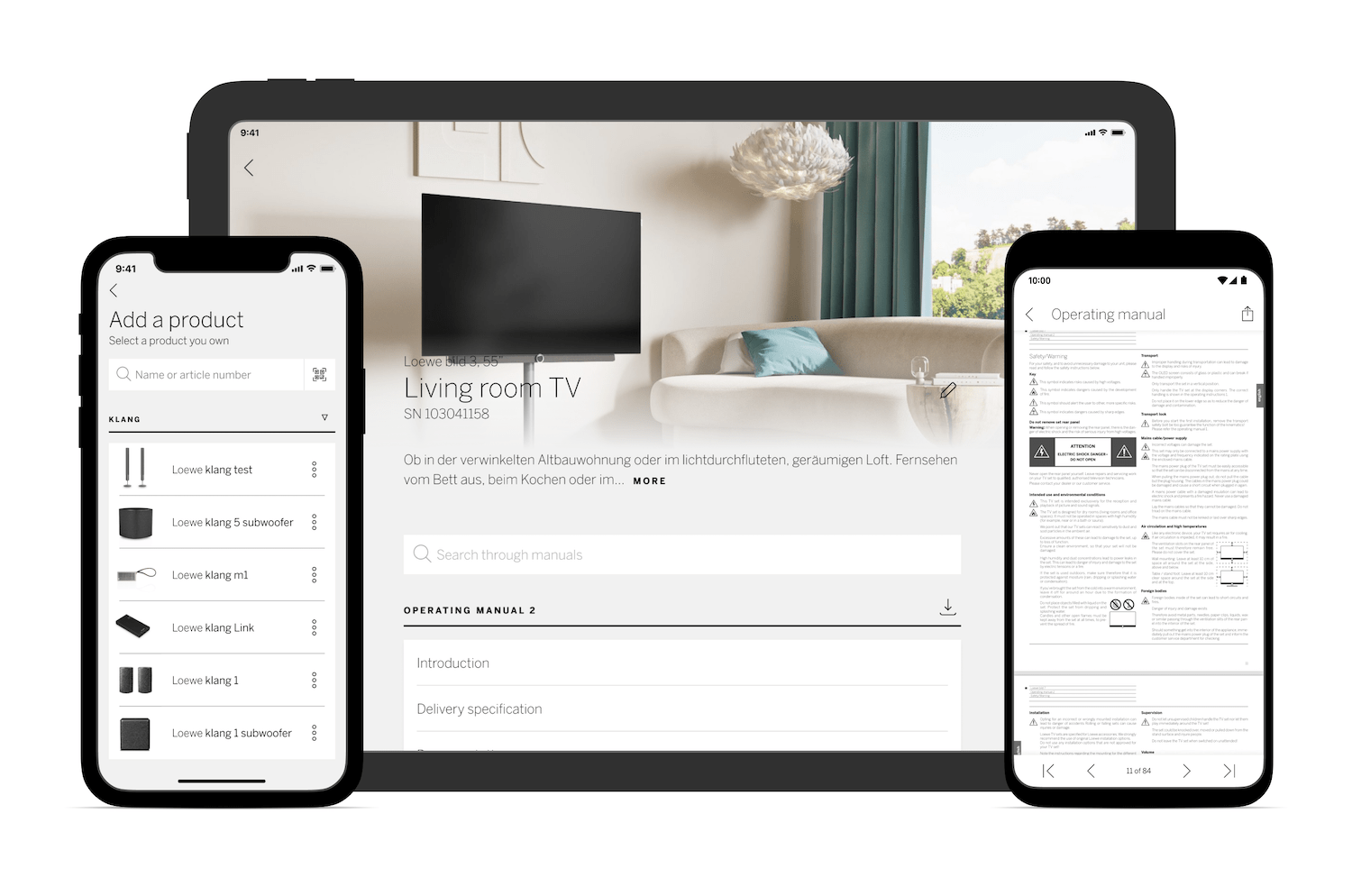
On screens
We carefully explored the corporate brand book, but we focused mostly on the company’s website interface in terms of interface development. We took many elements from there to use as a basis for the app interfaces’ components. We aimed for the app to look like its design was created in parallel with the site’s one. But each element had to be reworked according to our requirements. We used only the colors unchanged: pure white, pure black, and light gray. The fonts were described in the brand book; we clarified whether the license allows us to use them in the app and applied them.
Colors challenge
Many global brands use the black-and-white color scheme and moderate design in gray tones to emphasize their premium standards and respectability. Many of today’s online stores (ASOS, Net-a-Porter, Farfetch) adopt a similar design since it also helps focus the users’ attention on the content.
However, monochrome places some restrictions. When there is no full-color palette in the arsenal, the designer is forced to invent other solutions. So in places where we could highlight an element with an accent color, we had to use other techniques instead: bold styles, element sizes, space around elements.
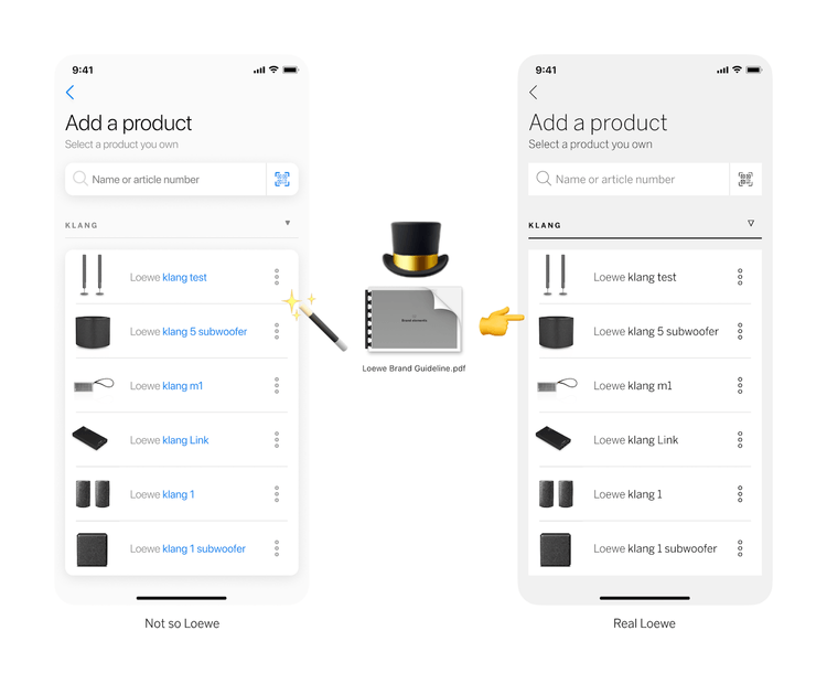
On the other hand, most of these tricks have been familiar for a long time and have been used on dozens of websites. Therefore, we had to protect our individuality. The Loewe website design is grounded on its unique product photos, and they set the style of the app’s interface. Since TV and audio systems pics are mostly black and white, they would be lost in the bright and multi-colored interface.
Catalogize it
We explored dozens of similar applications, PDF viewers (since manuals were in PDF format), and docs collections to build the most comfortable interface. First, we created a board with the app’s main sections, scenarios, and principles and made a list of all available items from the Loewe portfolio. We discovered that the catalog structure wasn’t a no-brainer: it was difficult to understand which section contained accurate information and which was outdated. For example, the catalog could have a model that couldn’t be found on the product pages. Or the product pages had a model variation that was missed in the catalog. Also, the English version wasn’t perfectly in sync with the German catalog.
As a result, we completely changed the structure. We listed all the devices, approved the currently available portfolio, and created a new logical structure. The new catalog had three levels: brand → domain (audio/video/other) → model. Some models had variations (like versions, device color, or screen size), but a variation did not always affect a specific PDF file to be shown to users. Therefore, we created the fourth level indicating a variation to take into account.
The next challenge was to figure out how to associate PDFs with models. For example, one model could refer to several PDFs, some models could share a single file, and some models required different PDFs depending on their diagonal. Eventually, after many efforts, we got the “many-to-many” structure. Although it did not affect the app’s design, it was critical to delivering users accurate documentation.
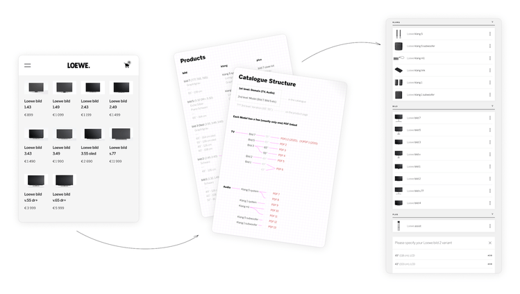
New classification
“Be a hero” image
The second challenge was to refashion the images for the product screens. Every website’s product page had a large full-color hero picture in its header. We decided to reuse this move, but to tailor it for our needs. The website’s picture was horizontal, while the app is typically used in portrait mode. We had to invent a way to locate/crop an image to look its best on any screen—in portrait mode on a smartphone or on a tablet’s screen that can be rotated in any direction. Besides, the website’s designers prepared each pic and its inscription manually: they place a model’s name on a certain part of a picture with a uniform background free from heavy details. Besides, they selected an inscription’s color that would contrast the background.
We couldn’t afford it since we were building a service application that required minimal maintenance. Therefore, we opted for a static layout. From the admin panel, we uploaded a picture cropped according to certain rules. We placed a text in a fixed place with a pre-agreed color. Therefore, it took a long time to select the images’ overlay effects, including darkening and gradients, because any text superimposed over a picture should be skimmable.
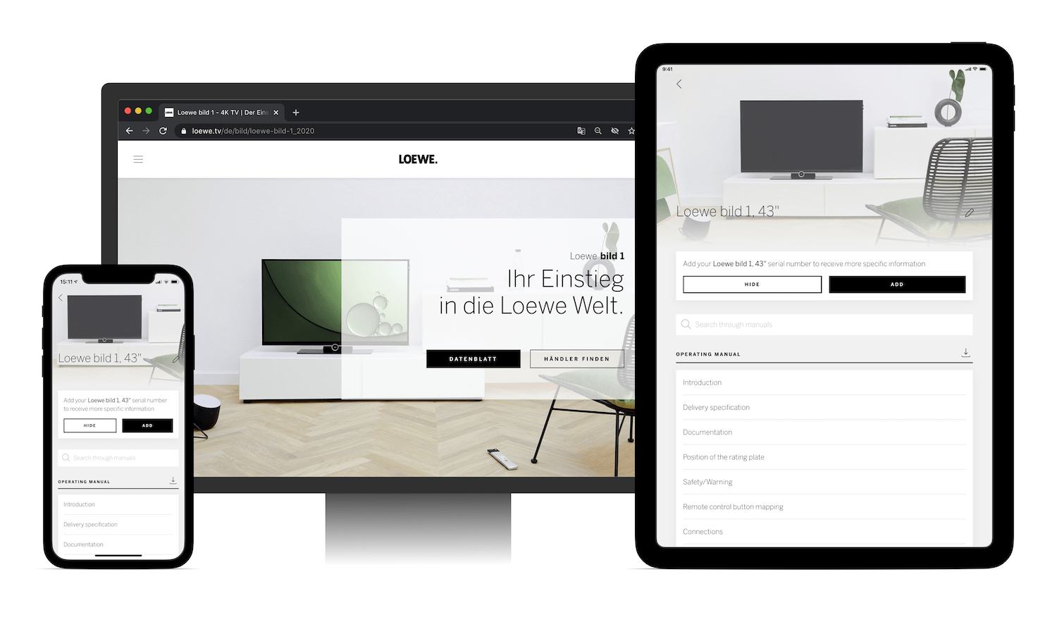
The hero solution
Consistency, consistency, consistency
With Loewe, we embarked again on the Martian single micro modular system we used for most of our UI/frontend development projects. It implies unified colors and indentations across all screens to ensure the outer look consistency and ease of development. First, thanks to the system, developers don’t need to measure each layout on a scale—they can estimate all sizes by sight due to the streamlined number of pre-approved sizes used across the application. The sizes and colors are preset incrementally, where each increment is well visible.
Second, a UI components library is a no-brainer with the micro modular system. In a typical project with a chaotic design, we have to add dozens of modificators for each component to arrange a system over a non-systematic design. But with the approach when the system is worked out at the stage of design, the UI library system keeps the ball rolling naturally.
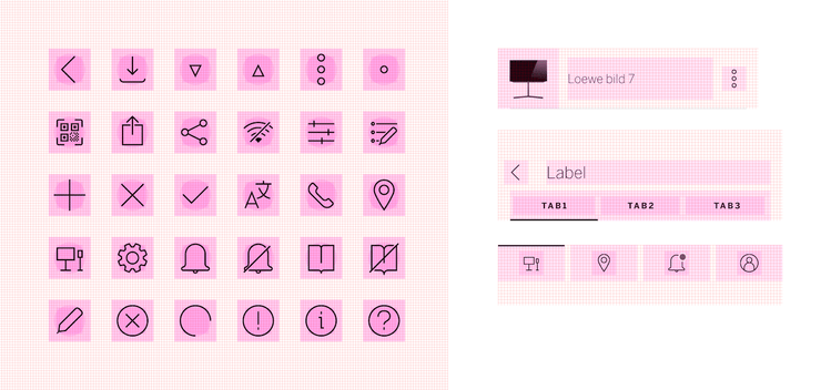
Micro modular system
The customer was impressed by the design they got. Martians even managed to influence the Loewe core interface design slightly: together with the in-house designer, we heavily discussed icons to achieve a single style across all products. As a result, they adopted our icon building template and redesigned the icons in the rest of the applications accordingly.
React Native in service
The customer opted for React Native to get the cross-platform app available for iOS and Android users with a shorter time to build and easier maintenance. Evil Martians already got hands-on experience in building React Native-based mobile apps in customer projects with Common, a co-living platform, Podium, a messaging platform for businesses, Mily, a community-driven housing platform, and many others.
Even though the application looked quite simple inside with its couple of screens and shouldn’t require much effort to support, we found the project to be sophisticated in its technical part.
The key lies in the app’s cross-platform nature, available for iOS and Android users from smartphones and tablets, and a related set of responsive fields. We were building a typical React Native application but simultaneously dealt with both platforms’ features and problems.
Instead of Redux and other tools from the classic React stack, we adopted the effector state manager to shape the logic. Why were we done with Redux in this case? It’s a simple and time-proven tool, but its weak spot is that it often ends up generating redundant boilerplate code. It affects the described business model’s clarity. The state manager is more concise, but the business model within it gets more easy-to-understand and illustrative since the tool also embraces data model transformations and events that generate these transformations. It’s a fairly young tool, but the library’s authors grounded it on their experience of client applications engineering and mathematical models and computations under the hood.
We found effector more convenient from the technical point of view, although it lacked well-structured documentation in the early days. But in the process, we provided detailed feedback to its authors, and they quickly updated it.
Despite these moments, we also chose effector because its authors were actively evolving the project. E.g., they are now building a tool to pull out connections between units from your state to show the business logic structure as a graphical diagram to understand it better. They’re also creating their own rendering, which has many chances to provide an alternative to React. We would love to see more updates from the authors!
Stable animations
We also managed to implement some animations in the app. They work quite smoothly, and their FPS rarely drops below 56-58, often showing a stable 60FPS. To achieve this, we had to do many manipulations since we did not use any special tools but worked with built-in React Native mechanisms. Some properties can be processed in parallel with the main process, while others can do it inside the main process. This directly affects the smoothness, display rate, and operation speed, which are critical for mobile applications. They typically have limited resources, high requirements for 60FPS, and a restricted number of properties that can be animated cost-efficiently, so we had to do many maneuvers to use only them.
Animations
Backing the back-office
In addition to building the mobile app itself, we also provided the back-office and API for it. The project’s tech stack was based on Ruby on Rails, PostgreSQL, Elasticsearch, GraphQL for APIs. The app “lives” in the Heroku environment.
From the backend side, it looked like a simple CMS system that bound PDF-based manuals to specific devices. But there also was a lot of room for challenges.
Status matters
As we already mentioned, the product catalog was multi-path, although not very large. We needed to synchronize it between the server and user devices. Each user has a “My Devices” screen to add devices purchased from Loewe. Our goal was to make this data easy to synchronize and not lose the catalog and “My Devices” section coherence.
We solved this task with the help of statuses implemented via the GraphQL protocol. We assigned a status to each piece of content for all the products, up to their models and variations (versions, device color, screen diagonal, etc.) That could be “draft”, “published”, or “hidden” statuses—and the app’s admins could change them. The content (a certain manual) with a “published” status on the server-side was available on user devices. We determined the statuses of parent objects (for example, products) dynamically, depending on their variation statuses. If a product with all its variations had at least one published variation’s content, we showed the product. If the product category (e.g., “audio devices”) had at least one published product, it was “published” as well.
Searching for content
We needed to attach a related PDF-docs package to each product’s variation—and we had to take into account that these docs could be written in different languages. To get searchable text in those PDFs and their tables of contents (in all available languages), we assigned a mission to parse tables of contents automatically and add them to the database. The docs should be turned from PDF into text and indexed in Elasticsearch so that users could search things there.
It took quite a long time because there were no ready-made solutions for that challenge, and Google Vision, which we used to recognize the text, couldn’t correctly manage it for tables of contents. E.g., it could not recognize the page number in the case when dots overlaid digits.
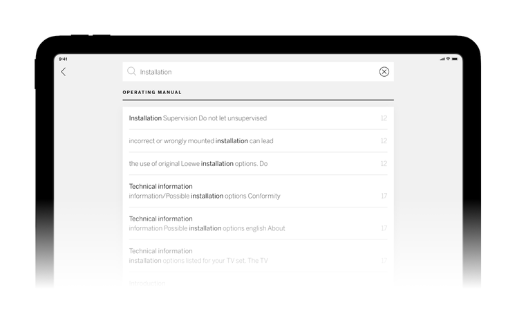
Searching in the app
PDF is a set of commands helping to draw text at a specific location with preset coordinates. Ruby has several gems that can interpret these commands to get a set of blocks with their coordinates as a result. We decided to bind these blocks together based on their neighborhoods. After collecting data on the block positions, we wrote a fairly simple heuristic algorithm. It rubricates text into paragraphs. Based on RegExps and some data about the paragraph’s location on pages, it determines lines in a table of content, their order and language, and eventually fills in the final data table of contents.
Notifications
It took a bit of work to create notifications—e.g., marketing messages and offers, firmware updates, etc. They were multilingual and very granular since we sent notifications about a very specific device, up to a device with a specific serial number. In addition, we should lean against the language of each user device: information about it we got at the stage of user registration or when users changed it in Settings.
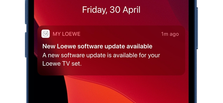
Notifications you can get
At first, we explored OneSignal and other ready-made solutions but concluded that they would not facilitate anything except notification sending—but that was the easiest part of the process. We still had to send notifications individually for specific fetches, and there was not much difference between OneSignal API and Firebase/Apple.
In this situation, the notification had to contain texts in all languages since users could change their language. We decided that it would be fair for users to read notifications in their current device’s language. However, we also created a filter by the currently installed language: it helped, for instance, send mailings only to Spanish-speaking users. Therefore, we first selected addressees according to given search parameters, created drafts in the database then, and, finally, sent them in the background, fixing the status. This scheme fitted in perfectly.
Finally, we tested the app we built and helped the Loewe team apply it to the Google Play Market and App Store. Apple and Google have specific review and approval procedures for their stores, including documentation and codebase reviews and security compliance. We helped the core team go through these procedures and eventually made the “my Loewe” app live.
Today, the app supports Android and iOS and is available in 7 languages. Users also can find contacts of Loewe Customer Care Center and resellers in 11 countries.
In 2021, the “my Loewe” app and several Loewe devices landed on a finalist’s list of iF DESIGN AWARD, the international label for outstanding design of products and apps, and became a winner in the Communication Design category.
Do you need end-to-end mobile application development with a personal touch? Drop us a line, and we’ll show you how to get your app noticed in the market.


