Accessible design from the get-go
Topics
Share this post on
![Roman Shamin]()
Roman Shamin
Head of Design
Translations
- RussianДоступность в дизайне
Accessibility when designing for a screen is not an exception to the Pareto principle. We believe that just about 20% of designer effort can solve up to 80% of accessibility challenges for digital interfaces. Read on for an extensive collection of practical tips that can help you build a great foundation for a11y—right at the mockup stage.
Getting a perfect accessibility score for on-screen interfaces is a difficult task that requires a separate coordinated effort from the whole product team, a responsible approach from the product’s owner, and, ideally, a dedicated professional well-versed in a11y. However, a solid foundation for accessibility can be laid by a single person at the very early stage of a product.
Stay with us to see how a designer in charge of mockups can prime the interface for optimal accessibility with minimal effort.
It is a mistake to assume that only a small group of screen users require visual, hearing, or motor accommodations.
For many people, vision starts deteriorating in school, and studies show that just about a third of adults in the States have 20/20 vision without glasses, contact lenses, or eye surgery. Far-sightedness, which will make your interface appear blurry to anyone not wearing glasses or lenses, affects about a half of people after the age of 40.
If you rely too much on auditory cues, your effort will go to waste in any noisy environment.
User’s motor skills can become temporarily impaired for reasons that have nothing to do with trauma or illness: if you ever carried a heavy groceries bag in one hand while trying to use your smartphone with the other hand—you know that your ability to manipulate objects on the screen can be significantly reduced. Reaching a misplaced CTA button that way requires a dangerous maneuver that can leave your phone face-down on the ground.
That only proves that accessibility should be baked into your design from the get-go to make life easier for the majority of users.
There is no point in leaving accessibility for an “alternate” design. There is no guarantee you will ever get a green light, or time, to implement it. It is much easier to account for a11y in your main design, the one that will definitely end up in production.
Below, we share a collection of practical tips on how to prime your interface for better accessibility while designing mockups. You can either read them all in one go or pick and choose from the table of contents below:
- Textual perception
- The primary text should be big enough
- If necessary, split your text styles into Paragraph and UI
- Adhere to a contrast ratio of 4.5:1 for 90% of the text in the interface
- Avoid too small or too light text when splitting the visual layers
- Use bigger spacing and slightly bolder style for small text
- Don’t rely on color only in selection controls
- Account for color blindness in color code
- Account for system font scaling and zooming
- Consider adding support for a dark theme
- Account for screen readers
- Miscellaneous
1. Textual perception
1.1 The primary text should be big enough
For most modern sans-serif fonts, it means a size between 14 and 18 pixels. There is no magic number as, in different typefaces, glyphs will occupy bigger or smaller area inside the bounding box (called “sort” or “type” in traditional typography), resulting in a different default letter spacing. Just remember that you can’t go wrong with a number between fourteen and eighteen.
1.2 If necessary, split your text styles into Paragraph and UI
The purpose of the interface affects the accessibility requirements. In some cases, density improves accessibility. In other cases, it’s the opposite.
It might be a good idea to have separate textual styles in your design system:
- Paragraph: bigger size and line spacing (minimum ✕1.5 relative to the font size)—for “readable” text.
- UI: smaller size, the densest line spacing possible—for interface elements.
This approach poses a dilemma that you will need to solve depending on the project requirements: in “pro” apps (XCode, Figma, and others), a bigger text will increase the legibility at the cost of taking up the precious space in the control area: the user will have to scroll more which poses a motor challenge. Otherwise, you can sacrifice legibility and reduce the “motor” requirements.
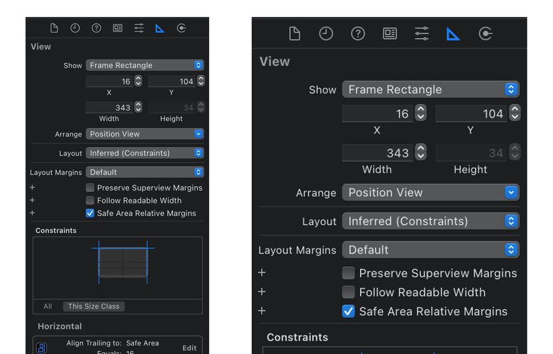
Less scrolling is required on the left, more on the right
1.3 Adhere to a contrast ratio of 4.5:1 for 90% of the text in the interface
The success criteria for contrast, as defined by Web Content Accessibility Guidelines (WCAG 2.1, recommended since 2018), are the following:
- A primary text intended for longer reading should have a contrast ratio (CR) of at least 4.5:1 (Level AA), better yet—7:1 (Level AAA).
- Large text is allowed to have a CR of 3:1 (AA), but it is better to aim for 4.5:1 (AAA).
- Non-textual user interface components or graphical objects should respect a CR of at least 3:1.
If the audience of your interface does not require any special accommodations, you don’t have to follow AAA requirements all the way through.
However, a contrast ratio of 4.5:1 is a sensible middle ground for the main interface elements that the user spends the most time with.
Keep in mind that CR is calculated relative to the background, so using colored backgrounds can reduce the contrast significantly.

The same shade of blue has different CRs on different backgrounds
When designing a palette for the new project, I would recommend starting with the backgrounds: for all possible cards, controls, and panels —so that their CR (relative to the main background) would be about 1.2:1. For white backgrounds, these would normally be lighter shades of grey. For the shades of text and accent colors of controls, you should pick colors that respect a CR of at least 1.2 + 4.5 = 5.7:1—meaning that even against a 1.2:1 background, their CR would still be a minimum of 4.5:1.
Don’t hesitate to rely on Figma or Sketch plugins that will help you check the contrast of your colors. Personally, I recommend a Contrast plugin for Figma by Alex Carr.
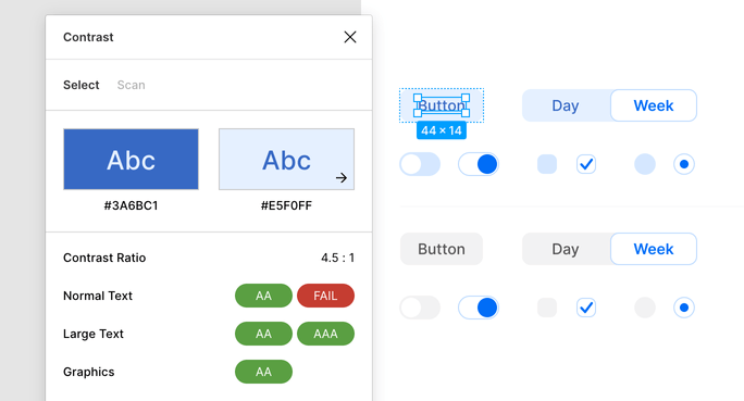
Contrast plugin for Figma
To check the colors on a live website, look no further than the Lighthouse utility built into Chrome.
You can also check any color for contrast in Chrome’s Developer Tools, right in a Styles tab.
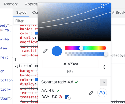
Color properties pop up in Chrome DevTools
It would be fair to mention that the current contrast ratio formula used by WCAG raises some questions. For instance, sometimes a CR is calculated higher for admittedly less fortunate color for specific background color.

You will never convince me right is better on white background
In other words, you should not rely on CR blindly. I also recommend spending some time learning about perceptual lightness and a Lab color space.
1.4 Avoid too small or too light text when splitting the visual layers
Often you have to separate the main text from the auxiliary: you can do it by adjusting color OR size, but I recommend using both approaches—both in moderation.
For instance, for a side note in an article, you can try a text that is only a step smaller and a step lighter—usually, this is enough.
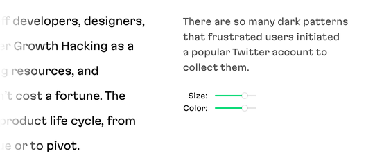
Good approach: a sidenote is slightly smaller and slightly lighter
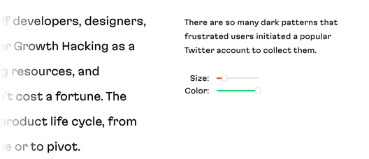
Not so good approach: a text is too small
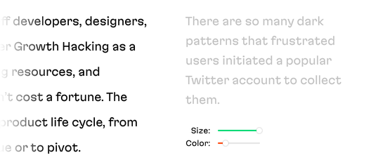
Not so good approach: a text is too light
Besides, you can try other approaches for separating text based on “importance”:
- alternative font styles: italic or condensed;
- a companion typeface: for instance, a PT Sans against PT Serif and vice versa;
- a different typeface.
On the image below, using a condensed type variant in a slightly smaller size allowed to keep the text black—which is good for accessibility.
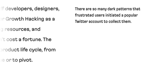
Visual separation through condensed style and smaller size
1.5 Use bigger spacing and slightly bolder style for small text
If your design has a lot of visual layers and you are venturing into a small text territory (12px and smaller), then the best you can do is to pick a Caption style if it is present in a typeface of your choice. Usually, Caption styles are optimized for small text: with wider and larger letters, bolder strokes, and wider space between letters.

Regular font on the left, caption-specific on the right
If the Caption style is not available for your font, you can do the following:
- Increase the spacing. Adobe calls this setting “tracking”, in Figma and plain CSS it is called “letterspacing”.
- If the font allows, pick a bolder style. For instance, if your main text is Regular, choose Medium or Semi Bold for small text.
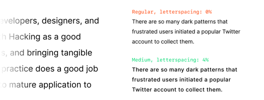
Both sidenotes are small, but the second one is more readable
The opposite is also true: reduce the letterspacing in large texts like article headings and leading paragraphs.
1.6 Don’t rely on color only in selection controls
To help people with different types of color blindness, always rely on something in addition to color to convey selection: alternative font style, increased contrast, or a pictogram will do.
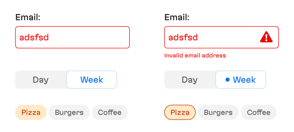
The design on the left is less accessible than the one on the right
Native applications for iOS or macOS can check if the user has an “Increase Contrast” setting turned on. It means that you can make your design adapt to this setting, especially when you don’t want to make a trade-off between aesthetics and accessibility in your “main” design. For instance, you can use a border to highlight the selection even further that will only be visible for users who prefer increased contrast:

The border appears if the Increased Contrast is enabled in OS settings
However, I recommend not to overuse this approach. First, it will result in a separate version of the design, and we already established that we want to avoid that. Second, there is no guarantee that everyone who is visually challenged will enable this setting. Third, low visibility can be situational: imagine a delivery person trying to navigate an app under bright sunlight.
1.7 Account for color blindness in color code
We often rely on color code when designing an interface: green means OK, red means error, tags have different colors that give them extra meaning, and so on.
Always make sure that you use shades that are distinct enough to pass the test in color blindness simulators. I highly recommend Sim Daltonism if you’re working on a Mac.
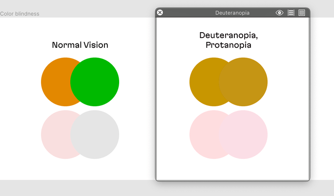
Some shades may be indistinguishable for users with color blindness
Secondly, consider using additional indications on top of color coding: you can use a pattern or add symbols:
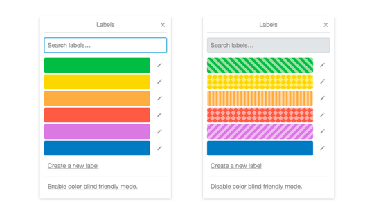
Color blindness mode in Trello
2. Account for system font scaling and zooming
All modern operating systems allow the user to increase the base font size of the interface; all modern browsers support page zooming. Accounting for a zoom rarely requires a separate effort from a designer (provided that layout was correctly implemented). Native applications where the font size can be freely adjusted by an operating system are a different story: you will have to account for that if you want your interface to keep the shape.
2.1 Always test your web application under a 200% browser zoom
If your layout follows the adaptive principles that have been the norm in web development for a pretty long time—you can be almost sure that your page will support zooming. However, when auditing the implemented layout, make sure to zoom to 200%, just in case.
2.2 For native applications, always test for a maximum system text size
Use extra caution when designing horizontal containers: table rows, toolbars, menus, and filters. Under a “blown up” font setting, they almost definitely will overshoot the container width:
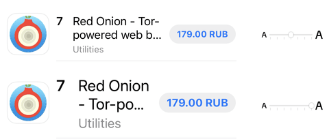
A typical problem with a large font
Dive into your device settings to check:
Agree with your developers on using Dynamic Type on iOS or Autosizing TextViews for Android.
These features allow to control how the application will look like under different system-wide text settings. Always check your layout on different default sizes (from xSmall to xxxLarge) if you’re using a custom font in your design.

A table of font sizes for iOS Dynamic Type
2.3 Put text on its own “floor”
A text container is a dynamic entity. At any moment, it can occupy more or less space than it used to in your initial mockup. A user can increase the font size at a system level. A product owner can change the wording on a button without giving you notice. Finally, your application may require internationalization, and text length will vary drastically from language to language.
The most surefire (but not always the most esthetically pleasing) approach is to assign text elements each to their own “floor” inside the container.
Let’s return to a previous example of a row containing an icon, an application name, and a price. If we give each text element its share of vertical space—our horizontal container will survive a larger font, a “longer” price, or a translation to a more verbose language.
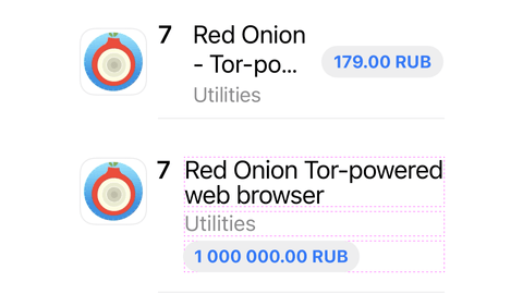
Each piece of text has its floor
2.4 Prefer multi-line text to truncated lines
If possible, avoid truncating lines of text. This will not play well with screen readers that visually impaired users rely upon. See the example above to see how you can avoid the “disfiguration” of text containers so they can accommodate multi-line text, if necessary.
If for some reason truncation is unavoidable—keep in mind that certain types of data like file names, card and account numbers, long numerical IDs—should be truncated in the middle and, ideally, only the repeating characters should be omitted. If that is too hard to implement, settle for a way to truncate that leaves a few characters at the end of the string.
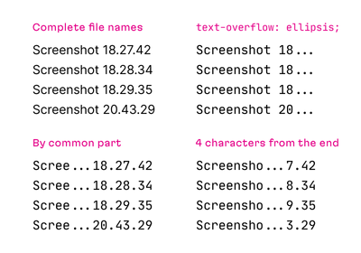
None of the ways to truncate is ideal for a11y, but the two below are slightly better
I would also recommend using a monospaced font for displaying data that would require truncation.
3. Consider adding support for a dark theme
You should always consider adding a “night” theme for your interface. Not because of a fad, but because it is hard to read from the light background in the dark. Besides, there are users with light sensitivity who will definitely appreciate darker hues.
Supporting multiple themes does not always make sense, however. For instance, if you’re designing a content website that is heavy on raster images (especially if they are user-generated), then your dark theme may still have noticeable light blobs, depending on what users upload. Maybe, in that case, providing an alternate theme would defeat the purpose.
A perfect case for a dark theme is an application where the only graphics are SVG icons: their colors will be easily adjustable through code.
If you decide to provide a night theme, don’t forget to use a three-way toggle: light theme, dark theme, or an OS-dependent setting (as modern operating systems can switch themes dynamically depending on time and other settings).
We recommend setting up a flexible color system in your design tool from the get-go—that will make implementing interface themes much easier. Read Figma DIY: Building a color system plugin in our blog: that post describes creating a custom plugin to manage color styles in Figma from scratch with TypeScript. It is also beginner-friendly, so if you are a designer with little coding experience—you will still be able to follow.
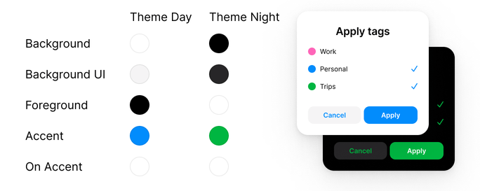
Choose ‘functional’ names for your color styles in Figma that would make accounting for themes easier
4. Account for screen readers
4.1 Adjust your content spatially based on its importance
When thinking about the structure of your interface on a given screen, think about spatial structure and make sure that your view “starts” with the most important elements: headers, CTA buttons. Range all the elements by their importance to the user, putting the most important information on top-left and the least important on bottom-right. That is true for LTR (left-to-right) writing systems, as the screen reader will read the topmost and the rightmost content first. If your users come mainly from the RTL (right-to-left) cultures, adjust accordingly.
4.2 Provide mockups along with alt text
Good designers never rely on “lorem ipsum” in their work. A good mockup should contain an actual text: validated with a client, proofread, and ready to be copied into the application code.
The same applies to the alt text for non-textual control elements: icon-based buttons and segmented controls. When providing your mockup to developers, make sure to specify which verb should be used for every control that does not have text on it (using verbs as the alt text for buttons is a good style)—this is what non-seeing users will hear from their screen reader.
4.3 Avoid line truncation
See 2.4.
5 Miscellaneous
5.1 Account for motion sensitivity in animations
Animation can cause dizziness for users with vestibular system disorders. As of 2019, all the major browsers support prefers-reduced-motion media query designed to help motion-sensitive people cope with complex animations.
Some further reading on the subject:
- Designing Safer Web Animation For Motion Sensitivity
- Revisiting prefers-reduced-motion, the reduced motion media query
5.2 Increase click area for links and non-textual buttons
Moreover, in a good design system, even the buttons without the visible “body” (toolbar, navigation) must “inherit” from a more generic parent button element and, as a consequence, inherit its clickable area to avoid surprises for the user.
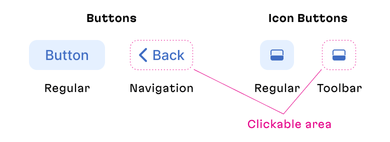
A clickable area is larger than the visible one
5.3 Set sensible minimal width for buttons
So that controls with short labels (your average “OK” button) don’t become too small when the interface is resized.
5.4 Don’t mess with the default “focus” design
Standard keyboard controls are an important part of accessibility, and the default “focus” state for elements will help those who use a Tab key instead of (or in addition to) a pointer to navigate—to distinguish between interactive and non-interactive elements.
If you absolutely have to create a custom design for a focus state, make sure it is consistent across all the controls and is easily readable against the interface.
That concludes our collection of tips: for now. Although it may seem that there are too many details to keep in mind and too many things to implement, we believe that the pointers above will help you to create a good interface that is accessible and easy to use: start slow and concentrate on the first chapter that focuses on font size and contrast. You will be surprised how quickly you will master the art of designing for accessibility and make a11y an integral part of your design process.
And don’t forget: accessible design is a necessity, not luxury. Every user needs it.
Feel free to give us a shout if you need to evaluate accessibility in your current design or you want to enlist Martian designers to help you build a functional and accessible interface from scratch.
