Beyond monospace: the search for the perfect coding font


What makes a font suitable for writing code? Back in 2021, when I started working on Martian Mono—the Evil Martians font for programming—I naively believed it was just a matter of making all characters the same width, and maybe including some code ligatures. But over the years, I’ve discovered that a well-made developer font requires much more than simply being monospaced.
The magic of a good coding font all comes down to the design of a few specific characters. Since the function of those characters differs when used in code versus regular text, it makes sense to design them accordingly. In this article, I’ll outline these characters in the hopes that this post will be helpful reference for both developers choosing a new font to work with and for type designers in the process of crafting a font dedicated to development purposes. Go down through the list and consider whether of not the characters in your font meet these winning criteria.

Irina Nazarova CEO at Evil Martians
1. Hyphens - and minus signs − should be the same
In regular text, hyphens are used to join words, like this: “five-year-old.” But in the world of code, hyphens are primarily used as a minus signs. This has some historical roots: because the hyphen has always been an available character on keyboards, programming language developers designed compilers and interpreters to treat hyphens in source code as minus signs.
Machines don’t care, but for the sake of human perception, it would certainly be helpful if hyphens visually matched the subtraction symbol, given its similar meaning and function; this is also why it’s practical for the hyphen to be designed as a minus sign in a coding font.

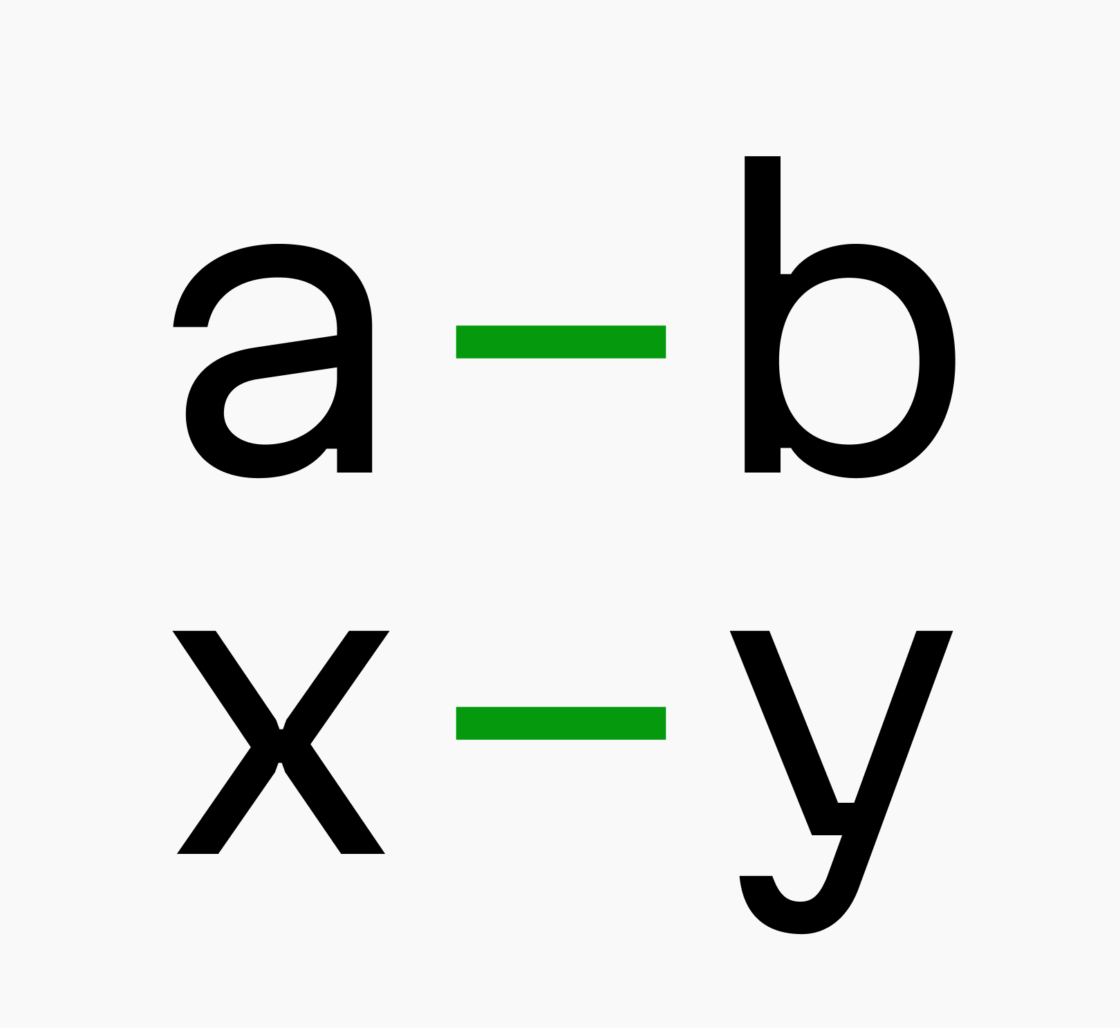
Hyphen (above) and minus (below) in a coding font
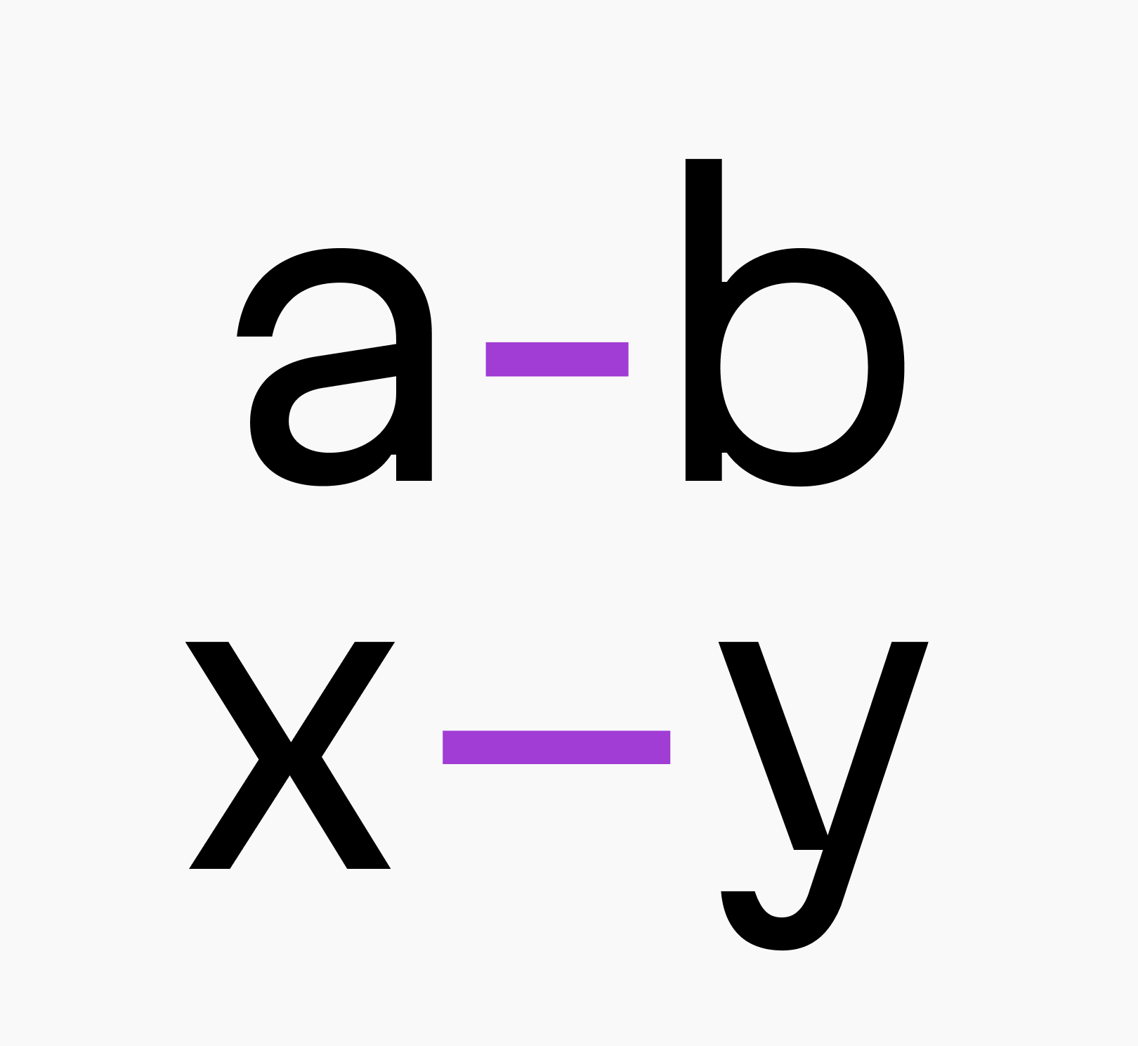
Hyphen (above) and minus (below) in a text font
You might be wondering about code comments, which are written in plain English text. In these contexts, hyphens are obviously used as hyphens, right? Well, nothing bad happens here. In monospaced fonts, many characters look wider than in a proportional font, so the wider hyphen will not draw attention.
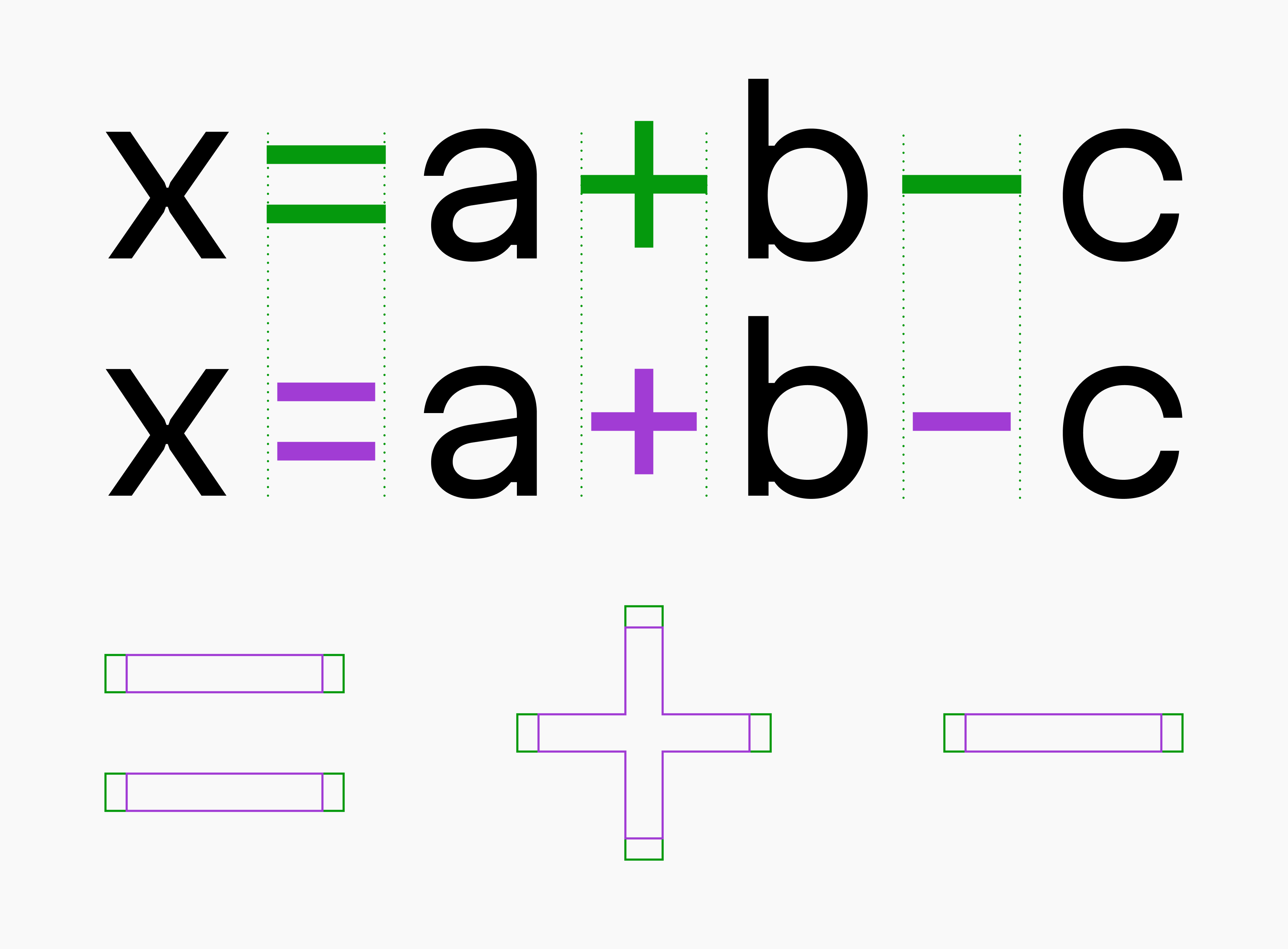
2. Asterisks * and carets ^ should resemble mathematical symbols
In formal writing, asterisk are commonly used to denote footnotes, mark missing symbols, or to censor offensive language. Meanwhile, the caret (also known as circumflex), has no grammatical use. In coding, however, these symbols function as operators, akin to mathematical symbols. Similar to the duck test, if they swim like a duck and function like operators in a typeface, they should be designed to align with the other operators in terms of weight and size.

The difference in asterisk and caret design between a coding font (above) and a standard monospaced font (below)
Additionally, it would be beneficial if the asterisks were vertically aligned with the mathematical symbols.
3. Mathematical symbols must not be too small
Since we’ve touched on mathematical symbols, let’s keep going. In a programming font, it makes sense that they be quite large since they play a major role and aren’t occasional guests like they are in regular text.

The difference in size of mathematical symbols between a code font (above) and a standard monospaced font (below)
4. Foot ', inch " marks, and backticks ` must also not be too small
Different programming languages may have specific rules, but generally, these symbols encode different types of strings. Each type of string may have unique features, and strings can be nested. Accordingly, it’s helpful if these tiny strokes are large enough to be easily distinguishable (especially the backtick), given the small font sizes used in code editors and IDEs.

Symbols used for encoding strings should be distinguishable even at small sizes
Here’s an example of all three JavaScript string literals nested:
return `<p style="font-family:'Martian Mono';">${text}</p>`;By the way, the same rule applies to the period . and commas ,, it makes sense for them to be larger in a font for developers.
5. Slashes /\ and bars | must be vertically centered with operator symbols
In a well-designed coding font, all the elements that make up compound operators should be vertically aligned when placed next to each other. This is especially true for slashes /, backslashes \, and vertical bars |, since their default positioning in text fonts often results in them appearing misaligned in code fonts, if not specifically adjusted to compensate for this.

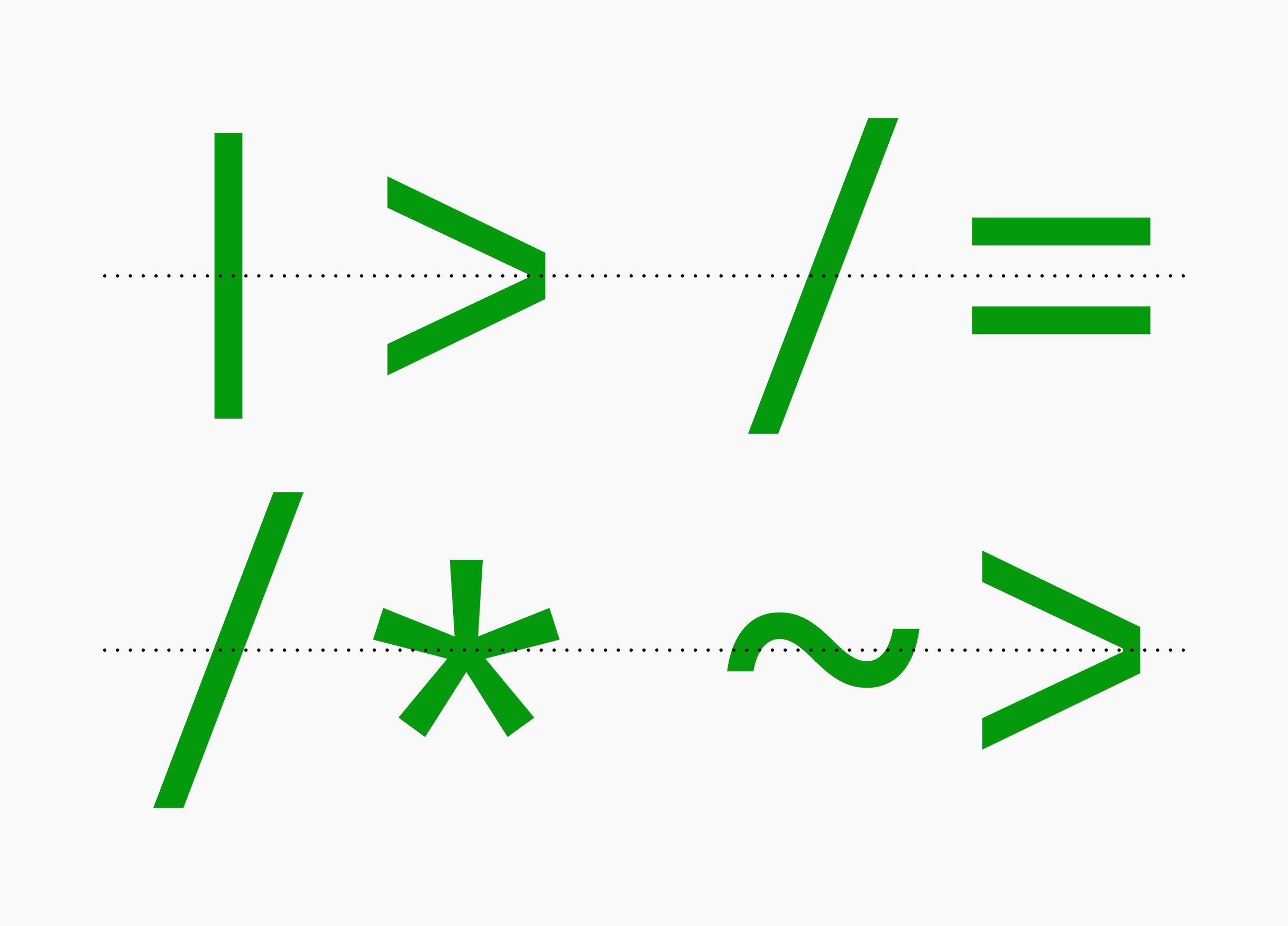
Vertically centered symbols work together akin to programming ligatures. Although, there’s room to improve the spacing
6. Parentheses, brackets, and braces must be distinguishable
If your (parentheses), [brackets], and {braces} are too narrow, distinguishing them from vertical bars (or from each other) can strain your user eyes. This is especially true when they are deeply nested and readers are using a low-resolution screen with a small font size. It’s better if brackets of all kinds are wide enough to be easily recognizable.

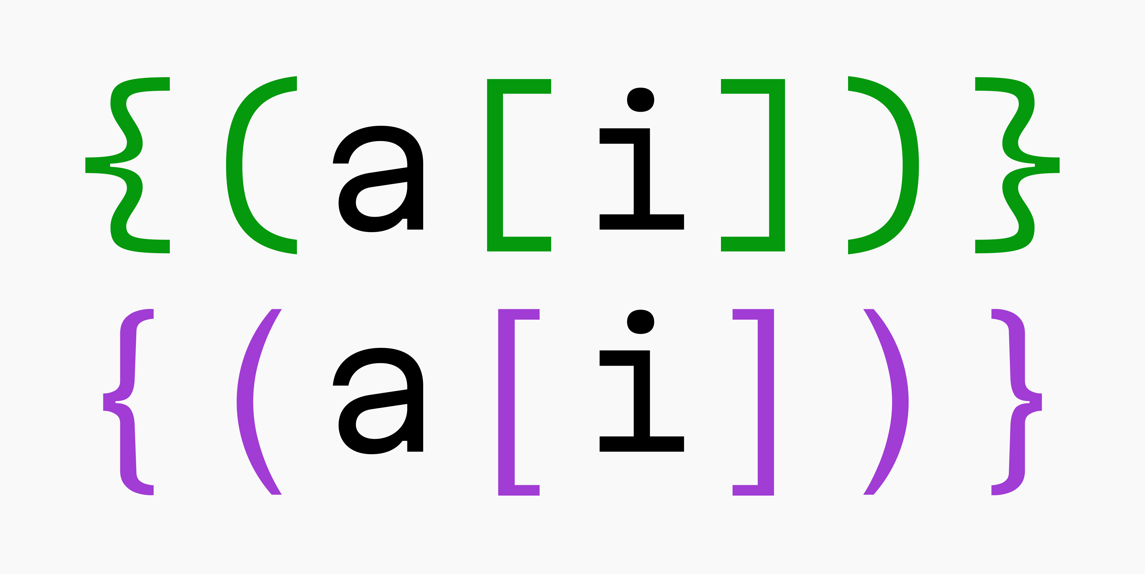
Making braces as curvy as they are at the top of the image is a matter of taste
Here’s a primitive test to demonstrate the problem. Which text line makes it easier to recognize the sequence of symbols?


7. Zero and capital O must differ
Make sure that zero characters are either slashed-through, have a dot inside of them, or have a shape distinct enough not to be confused with a capital letter O. In situations involving passwords or backup codes, where context isn’t helpful, it’s crucial users can clearly distinguish these characters.

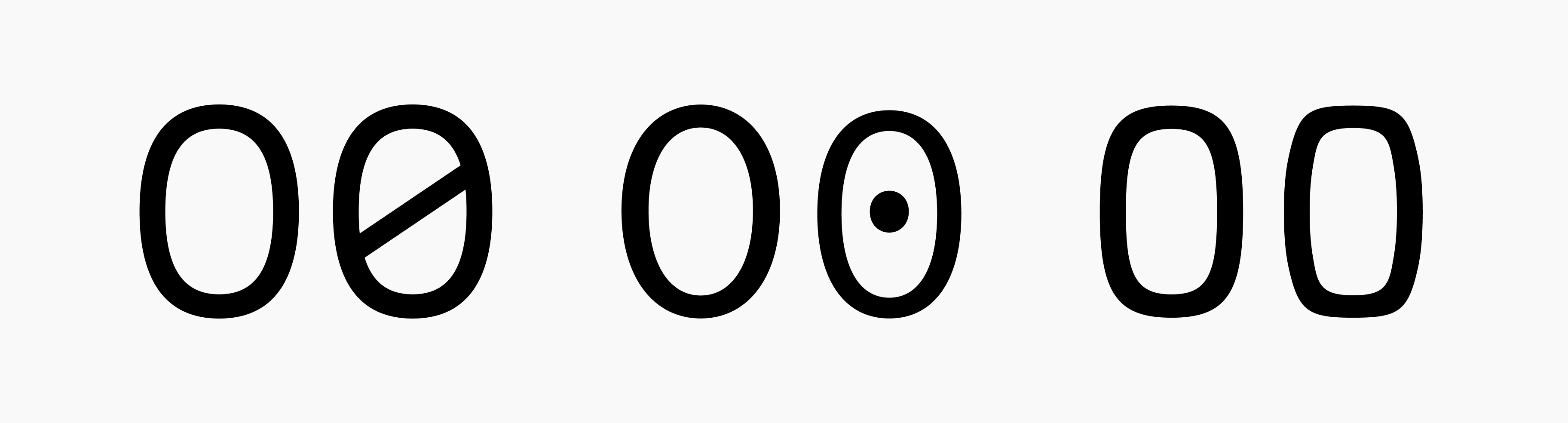
Zero designs from left to right: slashed (Martian Mono), dotted (Hasklig), and distinct shape (Berkeley Mono)
8. Capital “I”, lowercase “l”, and “1” must differ, and significantly so
The characters I, l, and 1 have various design options; for instance, in many sans-serif fonts, I and l look like vertical bars (see Figure A). Additionally, in some fonts, the number 1 can resemble lowercase l (see Figure B). This simularity can cause confusion if a font designer has, for some reason, decided to use these kind of designs in a font intended for development.

Figure A. The word ‘Illume’ in different fonts

Figure B. Lowercase ‘l’ and the number 1 in different fonts
That said, programming typeface developers deserve credit because in practice, this type of confusion is quite rare. Actually, I struggled to find a font demonstrating this issue on programmingfonts.org. Nevertheless, this guide wouldn’t be complete without a reference to this rule!
Proofing coding fonts
Designers use pangrams—these are sentences containing every letter of the alphabet—to get a quick sense of a typeface. For the purposes of testing a coding font, it’s more effective to use extended proofing strings which include all of the characters we’ve discussed in this article. For that, I suggest the following:
o0O s5S 9gq z2Z Il1|!ij a-+^*~=b .,;: _ `'"
@ {([|])} /* <-> <=> <~> <|> |= /= += ~= */
THE QUICK BROWN FOX JUMPS OVER THE LAZY DOG
the quick brown fox jumps over the lazy dog
0123456789 for (int i=0; i<=j; ++i) {a[i]};
That’s it! I hope this guide will inspire and encourage the creation of more (well-designed) programming fonts.
Happy designing, and happy coding!