Building a design system specced for engineers and agents


AI-assisted coding allows technical founders and lean engineering teams to try new languages and frameworks, write more code, and ship new designs. It’s the perfect solution for validating ideas, building PoCs and MVPs. However, as adoption grows, it’s time to drastically elevate the UX and UI.
Martian project team

Arthur Objartel
Product Designer

Anton Senkovskiy
Account Manager

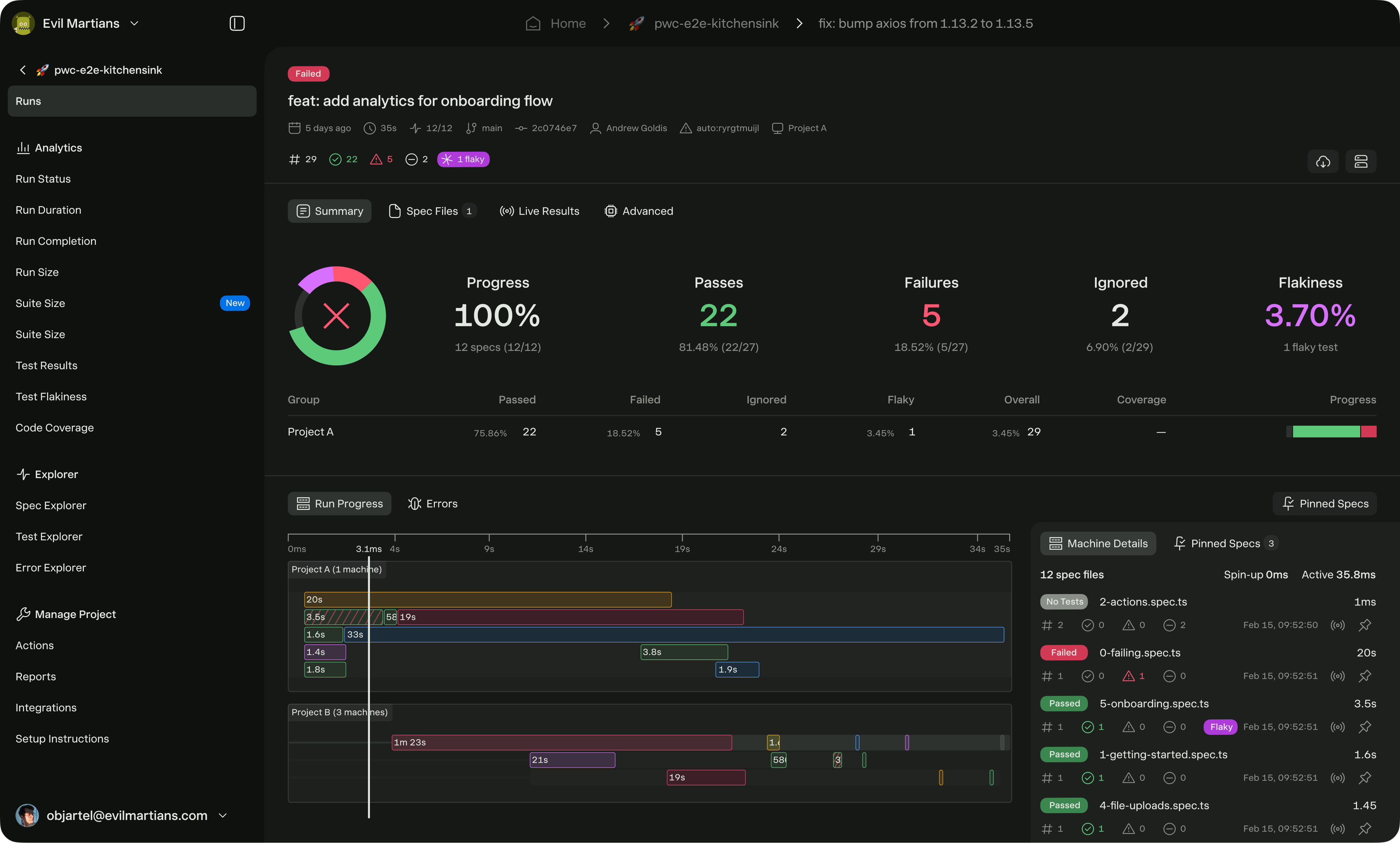
Currents is a test observability platform for running, debugging, and analyzing Cypress and Playwright suites in CI. It grew with a small team of strong engineers who wrote high-quality code but had to make hundreds of design decisions on the spot, like choosing icon and font sizes, colors, and filter options.
Currents came to Evil Martians to improve their UI and standardize design decisions. In just seven weeks, our team ran an AI-assisted UI audit and built a design system that can be used by engineers or agents …without a designer in the room. This allows Currents to invest in distribution and gives the team a design foundation that grows with the product.
Why Currents hired Evil Martians
Andrew Goldis, CEO at Currents, wanted to improve the experience for the users and his team. “Every time we want to work on something new, we need to go back and decide whether we need to reuse components or introduce new ones. And then we need to invest additional time into polishing them or we just use old school components,” he said.
Since Andrew was operating with a lean team, he didn’t have the resources to define the necessary app design guidelines and standards internally. This is when we came in.
There were two business triggers that made hiring us urgent:
- AI was amplifying divergence. The Currents team was using Cursor and Claude for code generation, but without a design foundation, every AI-assisted PR risked adding new components. Andrew wanted the design system to be AI-readable for consistent future deliveries.
- GTM was being held back. In devtools, the way a product looks plays a big role in the purchasing decision. Currents had a steady user base, but the UI had certain challenges to address before the team could feature it confidently in ad campaigns, on the landing page, or in sales demos.
Part 0: designing the vision
For an interface and product to feel crafted, a designer needs to make hundreds of small (and not-so-small) decisions that may not be visible first. This leads to a design system.
But a design system alone is hard to digest, so Arthur Objartel, the Evil Martians product designer working on this project, always starts by selling his vision.
In this case, he rebuilt key screens in Figma to use as a north star UI in order to show Andrew how the new design would look across key pages. This helps the client visualize the future product and commit to all the key design decisions right at the start. A north star UI also gives the designer, the developer, and the LLM a shared ground for making decisions.
Part 1: running an AI-assisted audit in week one
Before any design work, Evil Martians needed to understand the full picture, which was scattered around 791 files with design information. In the past, this would’ve taken us two to three weeks to manually inventory every icon, color, and font size. In this case, with LLM assistance, Arthur completed it in a third of the time.
This is what the audit showed:
- Two icon libraries running in parallel (@geist-ui/react-icons and react-icons/vsc), plus 69 local custom icons with 323 resized usages. For example, the same Check icon was being used 19 times at six different sizes.
- Two competing font systems with up to five sizes per screen.
- Many hardcoded colors without clear guidance on when to use which. There were 236 unique colors with 1,413 uses spread across five color reference systems.
- An inconsistency of button types across the product, hurting design cohesion.
- Three different filter components across views, which affected the user experience and predictability.

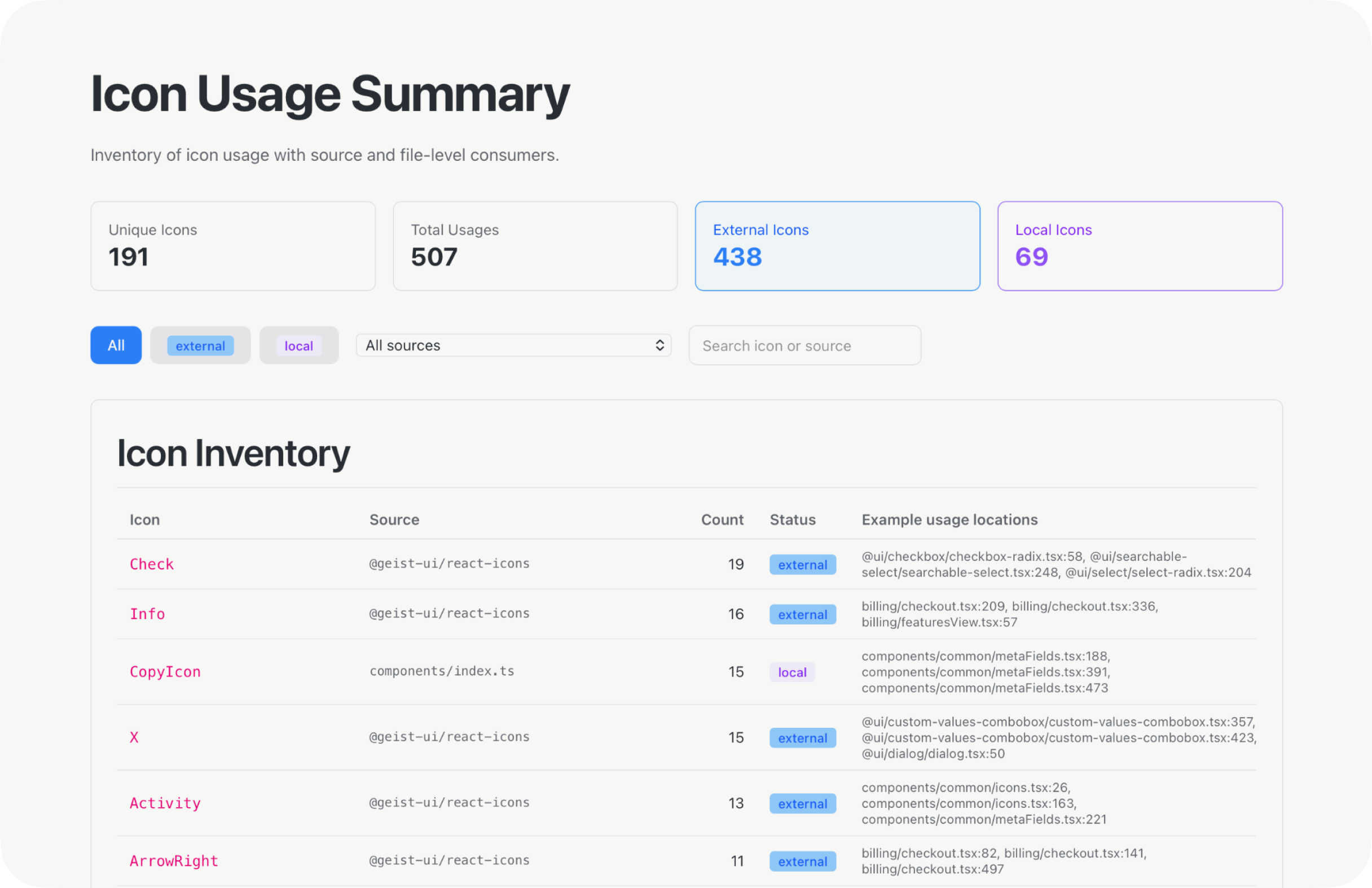
Example of the AI audit of icons from Storybook
Part 2: building a design system specced for engineers and AI
When a client runs into a problem like “we don’t know what colors to choose, what font to pick, and which button variant to use out of 10 different ones,” it’s always due to the lack of design guidelines or visual direction.
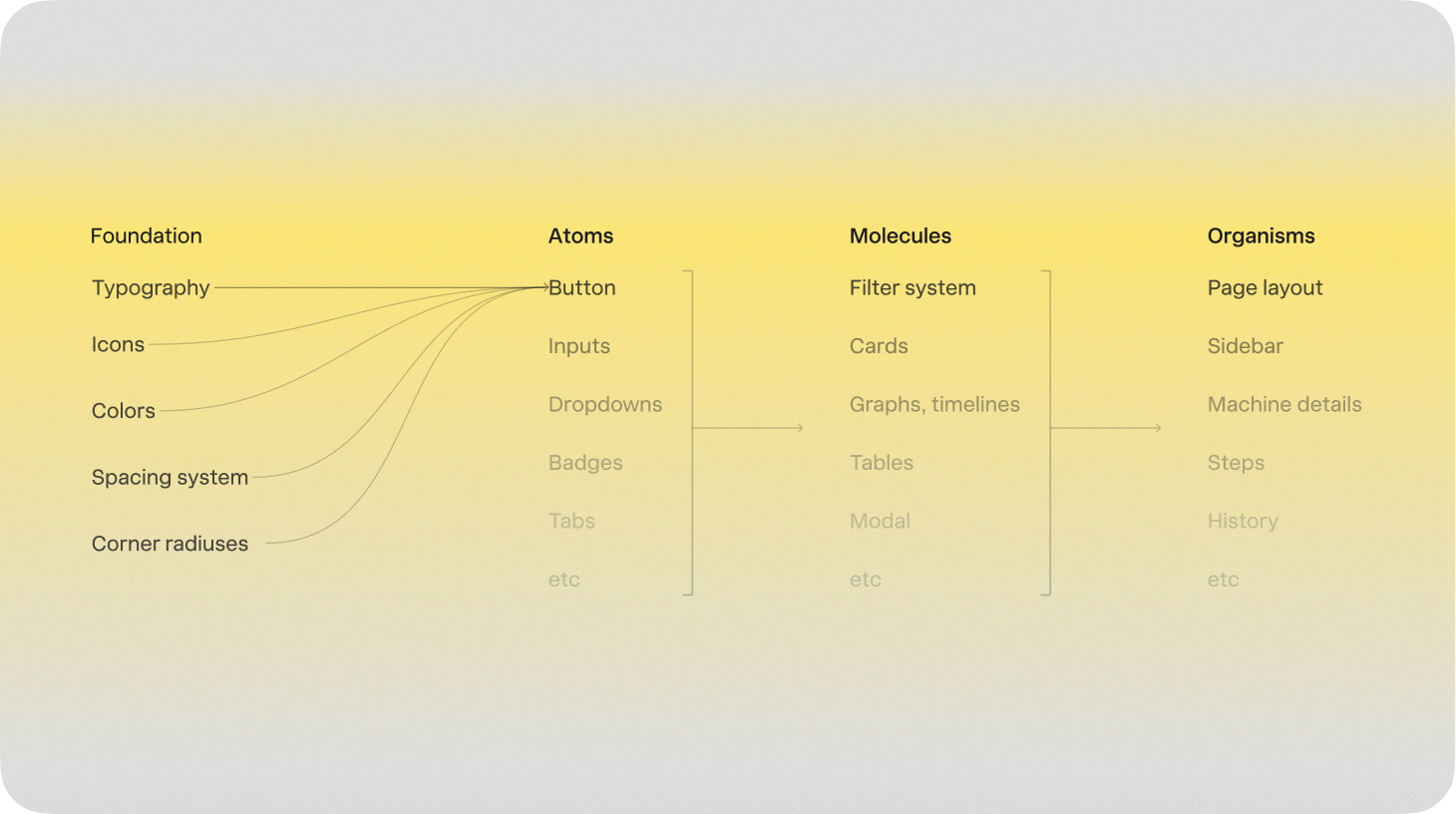
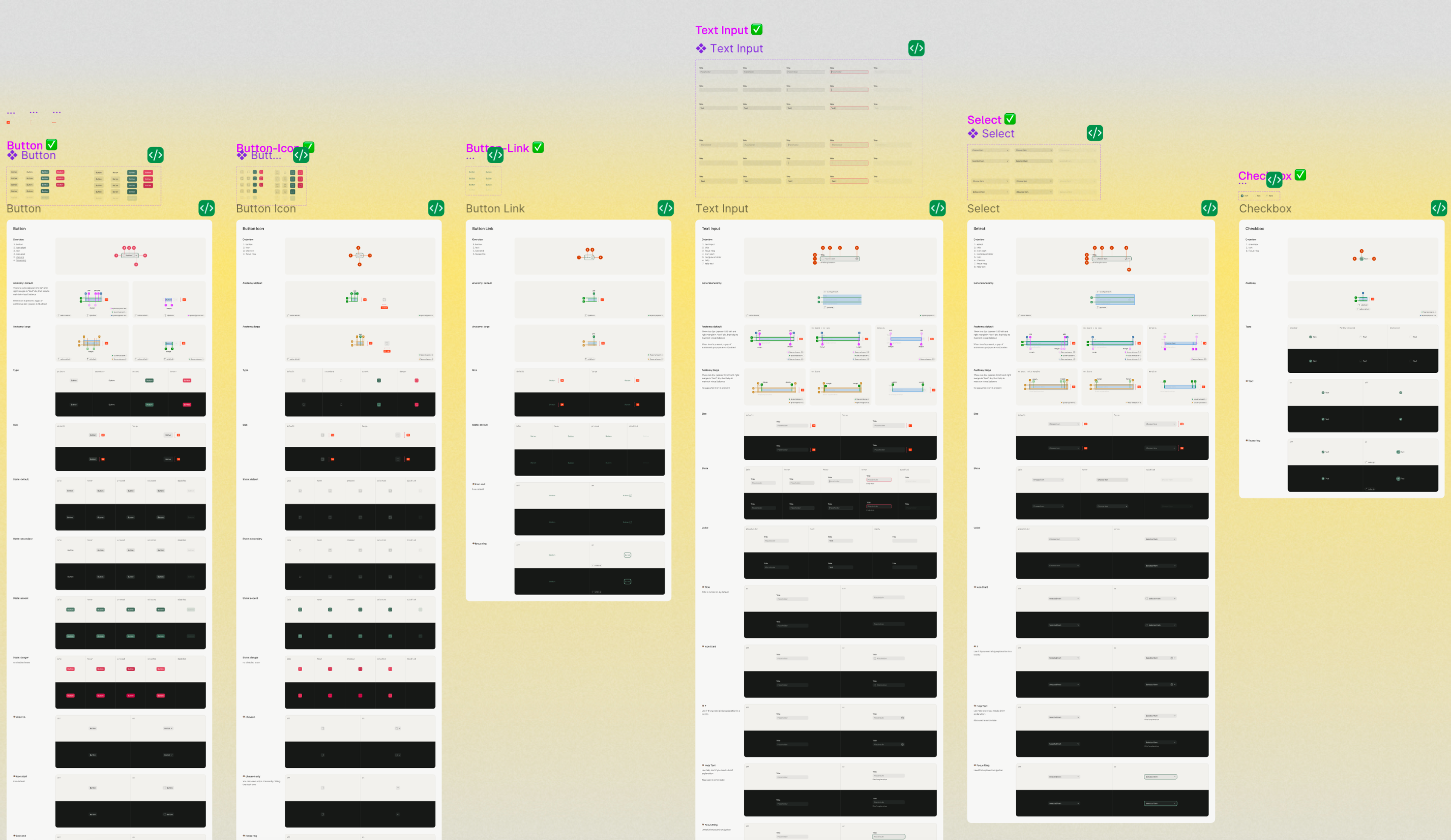
The solution is a design system. In Currents’ case, it’s deliberately small and consists of a set of Storybook docs and general usage guidelines for each of the system’s foundational parts: typography, icons, colors, spacing, and corner radius values. It also includes deep research on current usage and components location, a migration plan on how to swap previous tokens for new ones, and a new system description.

Design system build plan
What we defined in the Currents design system:
Typography: Innovator Grotesk
After comparing a dozen open-source faces, Innovator Grotesk won on one practical point: its metrics are almost identical to Inter, the team’s existing font. That meant Currents could switch immediately, with no layout overhaul and nothing to re-space. A new typeface usually costs weeks of reflow; here it was close to a drop-in.

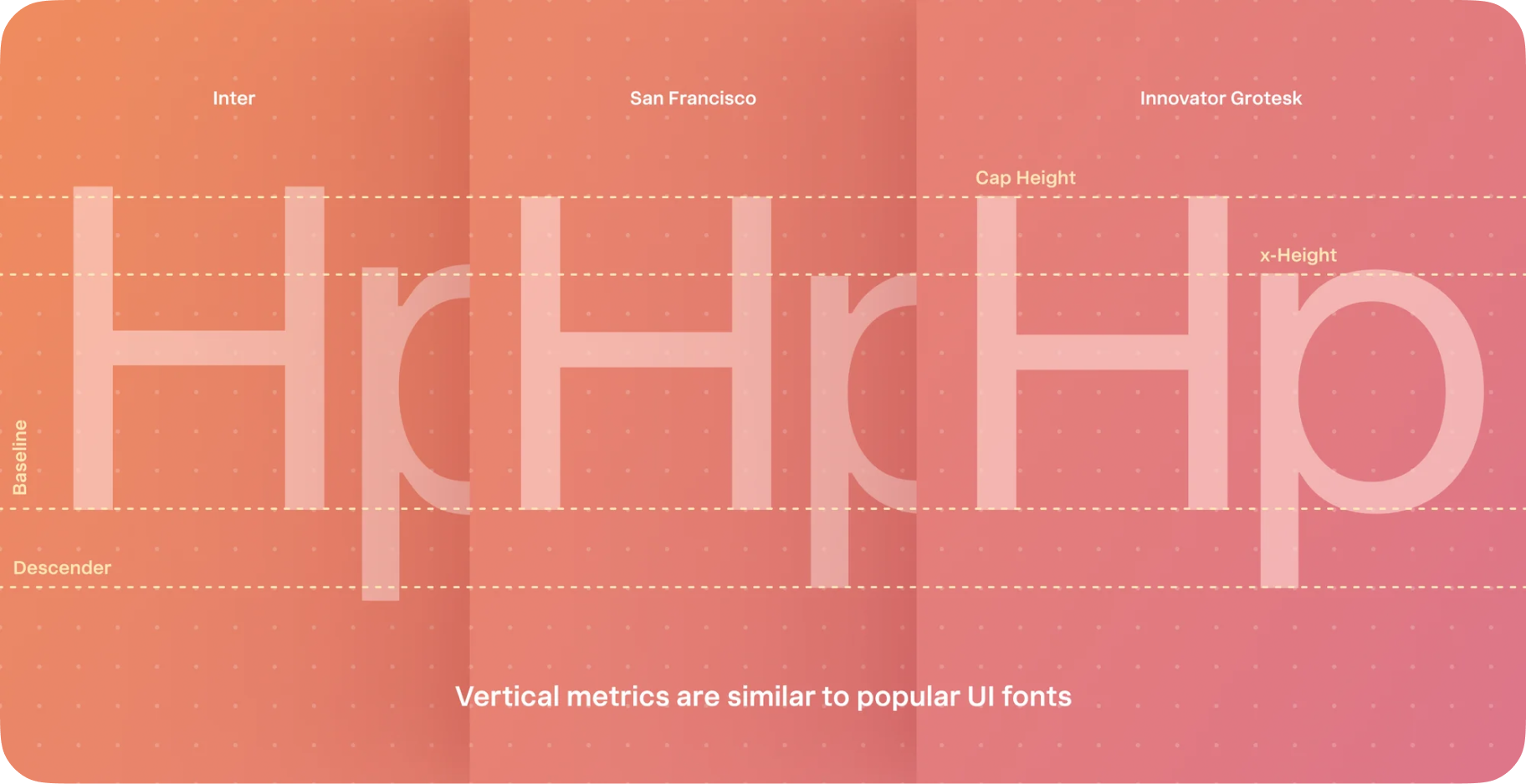
Innovator Grotesk metrics compared to Inter and San Fransisco
To keep type consistent without a designer in the loop, the rule is simple: fewer sizes, and an obvious answer for which one to use. Arthur built the system from scratch with six sizes and five token groups, each with a dedicated job. The UI group is only for interactive components, so when an engineer or an agent needs a button label, there is exactly one correct token: ui.default.

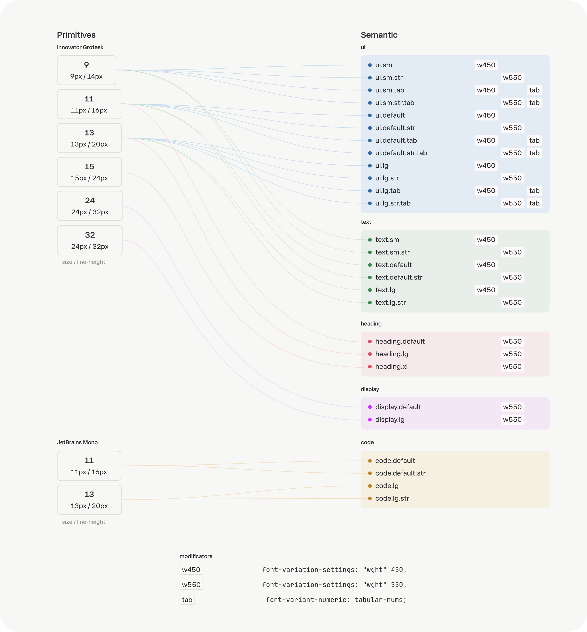
New typography system
Icons: a custom set, mapped to the old one with 90% AI accuracy
Open-source icon sets tend to look the same and lack personality. So we went with Figura One because it comes with stylish, pixel perfect icons that have a great set of metaphors.

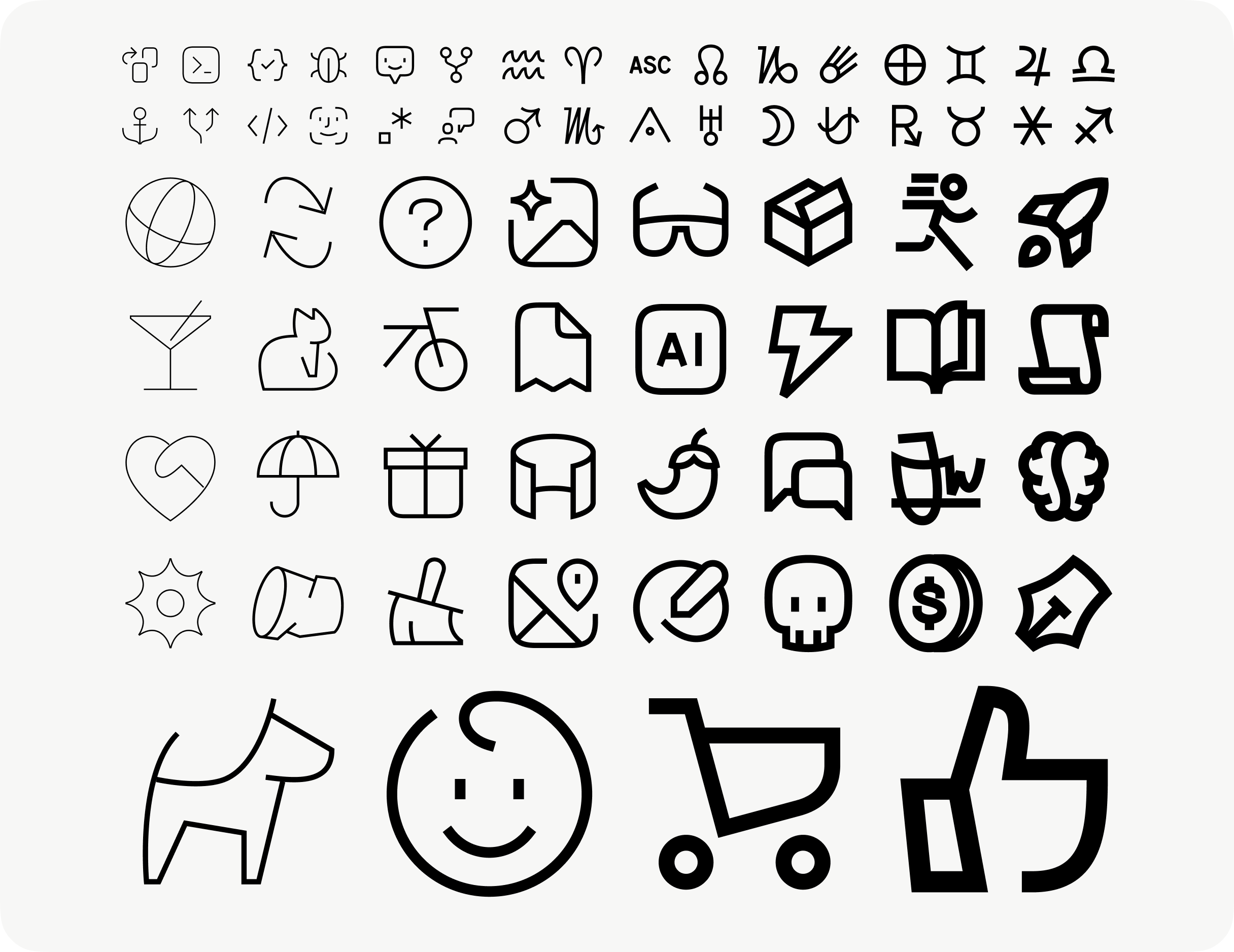
Figura One icons
The real question was adoption. Figura One had no public React library, which meant the team would have had to process every icon by hand before shipping it. Rather than hand Currents that work, Arthur built a local wrapper with SVGR and merged it into production with the frontend team’s sign-off. The icons went from a liability to a one-line import.
To make the migration mechanical instead of manual, we mapped the new set against all 191 legacy icons. The AI proposed a correct Figura One match for roughly 90% of them, and the rest were mapped by hand. The result is a lookup table an engineer or an agent can follow icon by icon, with no judgment calls left in the swap.

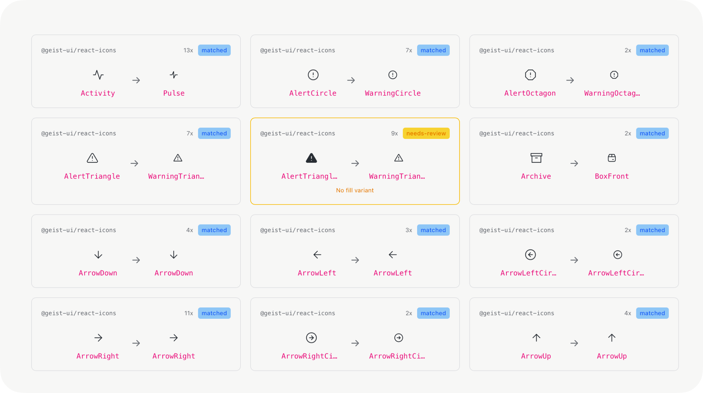
AI mapping of old icons to new ones
Color: 1,413 usages collapsed into four token groups
The first challenge before creating a new color token system was to match the UI to the brand colors. The UI used blue as primary and success colors, yet the Currents brand color was green. This confused users who usually expect successful actions to be green.
But making everything green in the interface would also be confusing, so Arthur solved it by picking different greens: cold green as an accent brand color and warm green for success indicators.
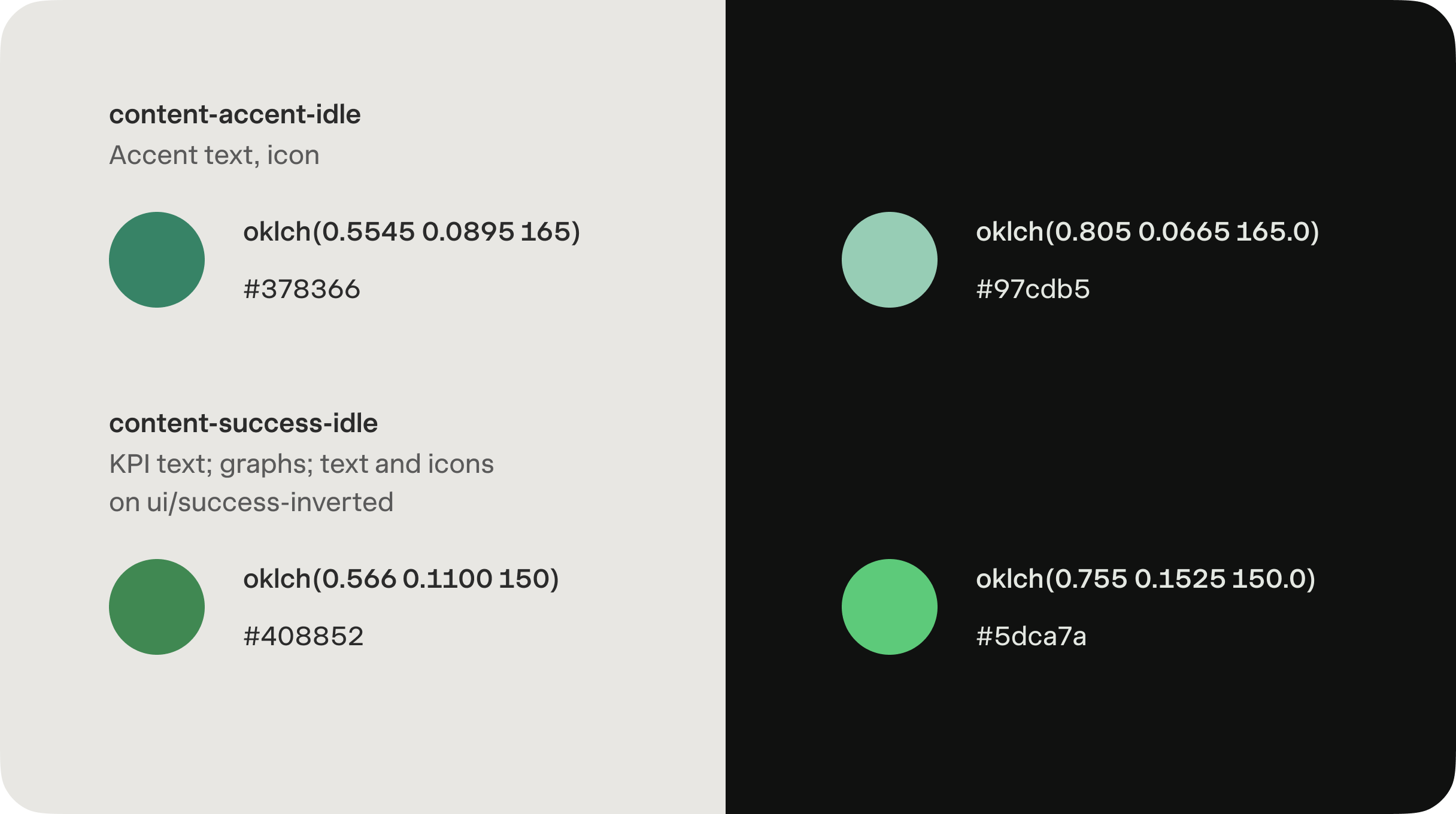
New green colors
From there, the audit’s 236 colors and 1,413 usages collapsed into four groups, each with a clear job: elevation, content, UI, and border. Fewer colors, and an obvious answer for which one applies, the same principle as the type scale.
Every color is defined in OKLCH, and this is the part that makes the system genuinely AI-readable. Because OKLCH expresses a color as plain, human-readable lightness, chroma, and hue, an agent can extend the palette without guessing: hold the hue and lightness, step the chroma, and the new shade already belongs to the system. Ask it for “a border one step softer than border.default, same hue,” and you get a value that holds up against the rest of the palette instead of a one-off hex that drifts.

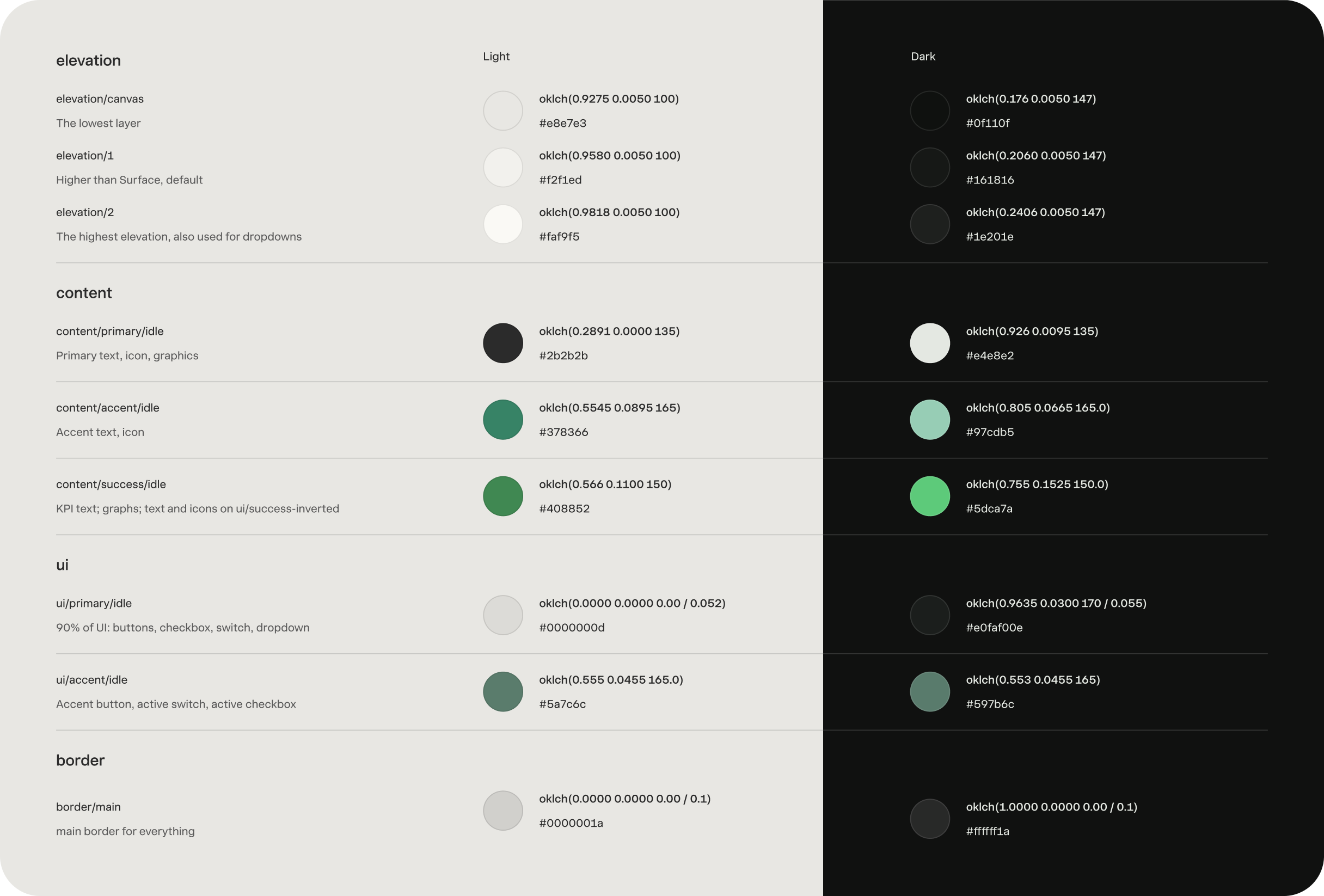
Some base colors from the new system
Lastly, we used AI to map all the new colors to the old ones and create a transition plan that was easy to follow.

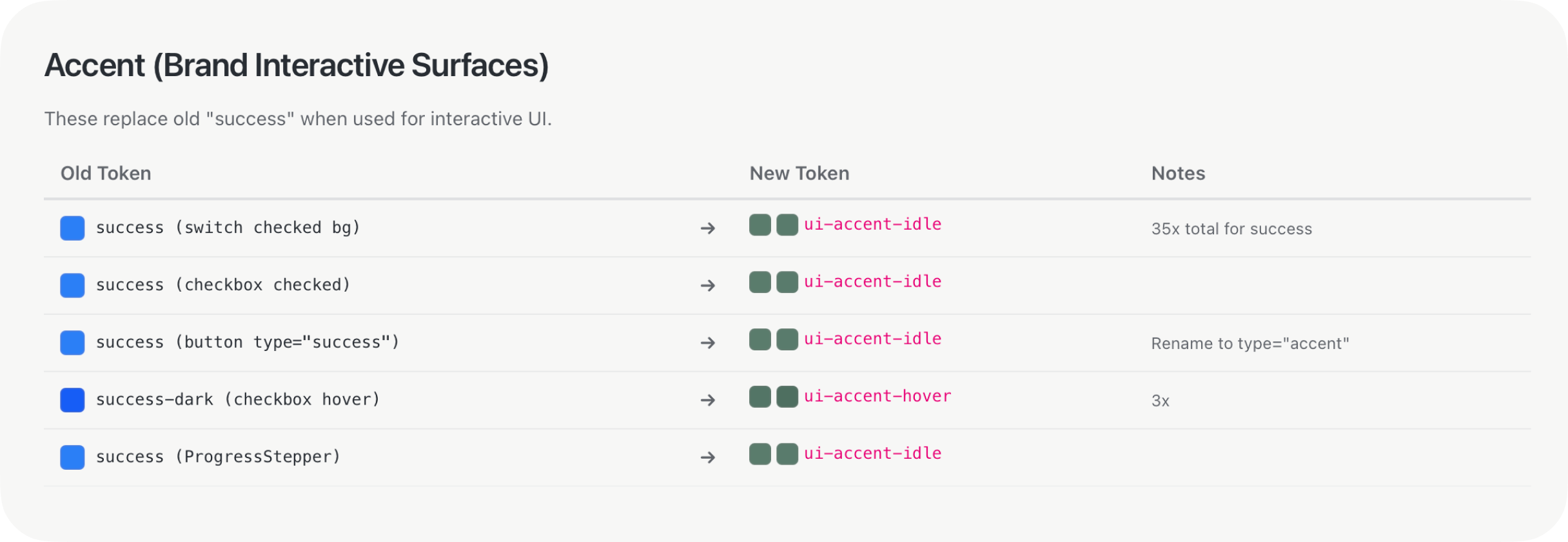
Part of a color migration plan from Storybook
Part 3: going the extra mile
Evil Martians believe in adding value fast and tend to fix things as we work. The left sidebar was a pain point for many users in terms of navigation. For example, the theme switcher, docs links, help, and changelog buttons were sitting in the top-right of the product, disconnected from primary navigation. Aligned with the client, we changed the sidebar design to help users immediately and to set the ground for future updates.

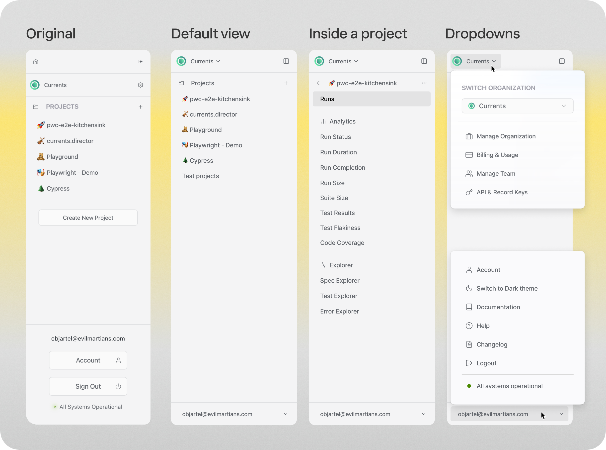
caption
We also noticed the tool was using three different filtering options. When an app has different filtering options, users lose predictability and have to relearn how to navigate your interface each time.
To stop this, before waiting for the full app redesign, we grouped all previous filter implementations into one component handling multi-select, ranges, dates, and presets with a single interaction model. Also, to make the most out of this functionality, we added quick filters and presets that allow users to save common queries.

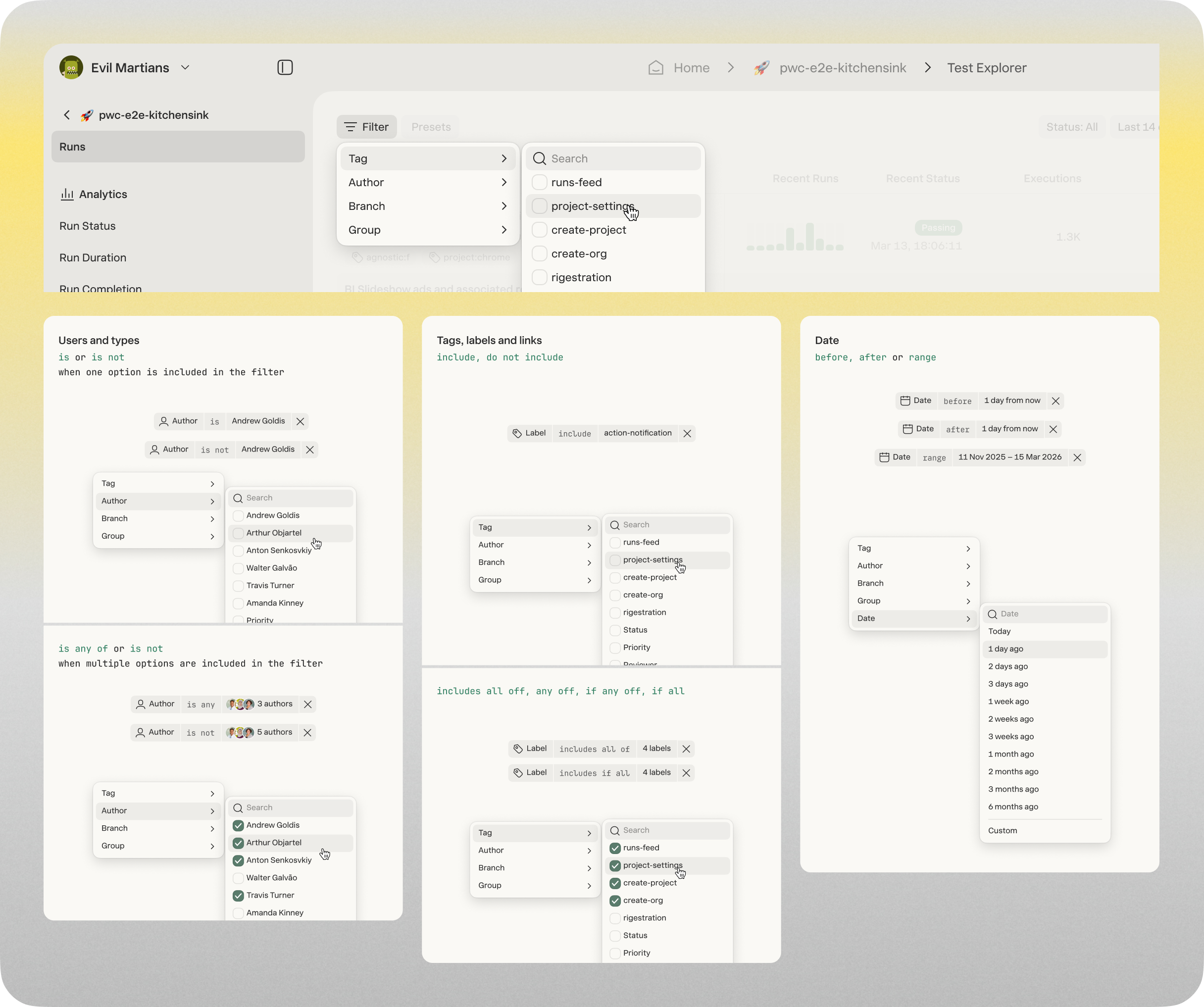
New, unified filter system
Results and next steps
I really like all the attention to details and the way Arthur delivers the assets. It’s next level! I’m not used to it and it’s very refreshing.

Andrew Goldis
CEO of Currents
To summarize, in just seven weeks, Currents got access to:
- An AI-assisted audit of every icon, color, and font size to understand the full picture
- A design system living in Figma, Storybook, and GitHub, readable by AI agents and engineers
- An icon, typography, and color migration map to simplify the adoption of new components
- A new color system that is easy to understand and use
- A north-star UI design of the most critical screens for engineers to have a reference point when applying changes
The implementation is now on Currents’ side. The team hired a front-end engineer who’s already implementing the system, which according to the client “it’s looking great.” Arthur is still in close contact with the team, guiding them through the process and answering any ad-hoc questions. We’re also looking forward to seeing the reactivation of paid distribution and go-to-market, an improvement in developer experience, and a consistent design and predictable UX.

How to know if you need to invest in a design system in 2026
A design system is the type of thing that goes unnoticed when it works, but becomes extra visible when you don’t have one. With AI-code generation becoming the new norm and allowing engineers to produce more code faster, not having a design system becomes a liability. For example, if you’re now producing 10x the output, you’re also introducing inconsistencies at that pace.
But, how to know if this is what you need? Here are three signals to tell if you’re past the decision point:
- Your product is dense or technical and you don’t feel comfortable showing the UI or demoing the tool in sales conversations
- Your team uses LLMs for coding new features, or will soon, and you don’t have designers on your team
- You can name three places in your UI where the same components follow different rules
Putting together a design system has now become less expensive than before. AI-assisted work has dramatically cut the hours required to audit the state of your tool. However, the cost of building without a design foundation has gotten exponentially higher.
If at least two of the reasons on the list are true for you, the question isn’t whether or not to invest in a design system but when.