Care beyond code: 7 best design practices for frontend developers
Translations
As a frontend engineer, it’s actually pretty easy not to think about the design of the project you’re working on–but this attitude can lead to bad UX, visual bugs, and even feature delivery delays. Read and learn how to mind the design, become a better specialist, and bring value to your project beyond just writing code.
Why should frontend engineers care about design? The final product is the result of teamwork; not just the design, frontend, or backend.
But, frontend engineers are actually the first to use an application like a user, and thus, they are the final defenders against sneaky design mistakes. They also understand the technical limitations in terms of implementation time: will a new design take a few hours–or a few weeks?
Both of the above factors put the frontend engineer in a unique position to be a valuable asset for the project. So, pay attention to the design! Failing to do so can lead to the aforementioned problems: bad UX, bugs, and delays.
That said, frontend engineers should still trust their designer colleagues. Their qualifications allow them to see things deeper than engineers, and further, you simply can’t work as a team without trust.
Nevertheless: trust, but verify. For instance, if you’ve noticed some UX behavior has left you confused, gently ask the designer if this behavior is intentional.
Below, we’ve outlined some of the best design practices for frontend engineers that will instantly help frontend engineers start implementing better designs.
1. Consider technical limitations and capabilities in the context of design
Frontend engineers possess some important knowledge that many designers don’t: an understanding of technical limitations, and they should take care to leverage this knowledge.
So, when reviewing layouts, ask yourself:
- How long will it take to implement the design?
- What are the potential problems with implementation?
- Are there any alternate solutions that can achieve a similar or improved result?
Let’s imagine a designer has presented an early layout demonstration to the team, with a projected implementation time of several weeks. However, it’s immediately clear to the engineer that this will take several months–not weeks. In this case, the best thing the engineer could do would be to politely inform the designer ASAP, and then try and determine if it would be worthwhile to alter the design.
It can also be useful to change some expensive design solutions to cheaper ones at a more opportune time in the development process, avoiding the risk of missing deadlines. Doing so also allows us to estimate the necessary time for delivering new features in a more proper way.
For example: let’s say a designer has suggested adding a progress bar to a page, with the intent that loading percentage can be visually tracked. But the frontend engineer realizes that this will require very extensive changes to the API, and suggests replacing the progress bar with a spinner. The designer agrees–and everyone wins.
This actually brings us to another important point: frontend engineers can often advise how to implement a design idea in a more convenient or quicker way. This might involve leveraging knowledge about the capabilities of various libraries–using pre-existing code instead of re-inventing the wheel and still ending up with an attractive, functional solution, as in the case above.
Another tip that will help the designer from the technical side is if the frontend engineer can suggest what effects (animations, blending modes, etc.) can be added in certain cases. Designers don’t always know what CSS can do and what tools they can use so that implementation does not require too much time–the expertise of a frontend engineer can be useful in this case.
Frontend engineers can also provide technical expertise when it comes to implementing effects (animations, blending modes, and so forth). Some designers may not be familiar with the capabilities that CSS offers or its time-saving power. This knowledge can also lead to an improved UX; let’s take a look:
The designer has created a nice modal, but its sudden appearance could startle users
The frontend engineer can propose smoothing the appearance via animation
2. Use a design system to achieve consistency and better maintainability
First, some background: a design system is a set of rules specifying how different reusable interface blocks (components) work with each other and with design tokens (atomic values, like colors, spacing, or typography scales that define a design’s properties). But a design system offers more than just color and pixel specifications–it’s a system that enforces a design logic across the entire project.
Using a design system increases maintainability since it ensures all the frontend engineers and designers are on the same page, and that they are creating new parts of the application in the same way (both in terms of code and design).
Moreover, a design system helps save time by speeding up the design and development process: with a shared set of design guidelines to follow, it’s much more efficient for designers and frontend engineers to communicate with each other and implement features. Let’s take a look at how the same design system concept translates into both designer and frontend “language”:
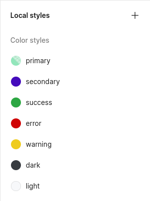
An example of a dictionary of design tokens for colors in Figma. Pay attention to the semantic naming scheme
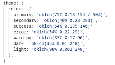
An example of a design token dictionary for colors implemented in code; these should be identical to those in Figma!
Without a design system, it’s impossible to achieve consistency in your application–and consistency is the key to a better user experience. This is what allows users to quickly learn how to use an application since they’ll encounter familiar interactions and patterns all across the interface.
So, how to start using a design system as a frontend engineer?
First, using the designer’s layout, create a version of the design token dictionary within the code. (If such a dictionary does not yet exist, work with the designer to create one!) Maintain the naming semantics for the design tokens, and group them into the appropriate categories: colors, screen sizes, spacing, and so on.
By doing this, you’ll be able to establish a sense of consistency from the beginning stages of the project. Then, to maintain that consistency, be sure to add new things from the layout design consciously and thoroughly. If something is not included in the existing design system, politely ask the designer why.
3. Help validate different user scenarios
What are user scenarios? User scenarios are detailed stories of user interaction with the application across different cases.
Designers must carefully think through the various possible user scenarios within an application, and based on their experience and understanding of UX, they can probably more easily identify pitfalls and nuances than developers. Nevertheless, frontend engineers still have one advantage here: they’re the first people to actually experience these user scenarios in the wild.
The frontend engineer is the last line of defense where your team can prevent a UX mistake. While implementing a new feature, ask yourself: is it clear how to use it? Or will users end up performing the action in some other, more obvious way?
If you find anything confusing, gently discuss the topic with the designer!
Let’s illustrate this with an example: let’s say we’re working with an interface that has multiple search filters. When certain filters are applied, other filters are no longer possible. See the example below:
In this example, all rockets cost more than $1000, so it makes sense to block the price filter ‘less than $1000’ when choosing this equipment
It’s easier for frontend engineers to catch that there’s a need to disable some filters if a user’s choice renders them meaningless. That’s because frontend engineers work in exactly the same conditions as the users!
That said, interface behavior across different user scenarios can be very subjective–and different people perceive usability differently. Further, from a UX perspective, the functionality of some scenarios can only be verified after product launch via metrics. Still, if an engineer finds something disturbing about the UX, it’s better to ask about it before launch.
4. Consider all interface states
Here’s another advantage that frontend engineers might have in their work: while a designer might accidentally miss some point in a complex flow (for example, if the options for filtering a table depend on the table’s content, then in the case of an empty table, an empty state for filters must be considered), it’s actually physically difficult for a frontend engineer to miss it.
During the development process, make sure to take different interface states into account. What if there’s a fatal error on the server? What if the data takes a long time to load? Is there a solution for this in the design? Everything needs to be transparent and clear for the users.
And the same goes for forms: it’s important to provide clear feedback on the information that users enter. For example, the validation and error messages should be indisputably clear:
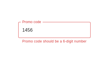
In addition to warning about a format error, there are instructions on the correct format
And, if the designer forgot to implement some state like the one seen above, then depending on their workload, you can ask them to add it or try to implement it yourself. The main thing to remember is that that solution must be consistent with other solutions in the project.
…wait, try to implement it yourself? That’s right!
With the next few guidelines, we’ll lay out the things to pay attention to so that you don’t miss anything when moving the design from layout to code–as well as tips for when you need to implement some minor visual solutions on your own, (like a forgotten field state).
5. Consider the importance of hierarchy and grouping elements
Any page in an application has a logical structure; the elements form a hierarchy and they can also be grouped. Based on this structure, users can quickly look at an interface and understand the content of the page and how to use it.
Take a look at this screenshot. (Here, we faked one blog post on our site for demonstration purposes):
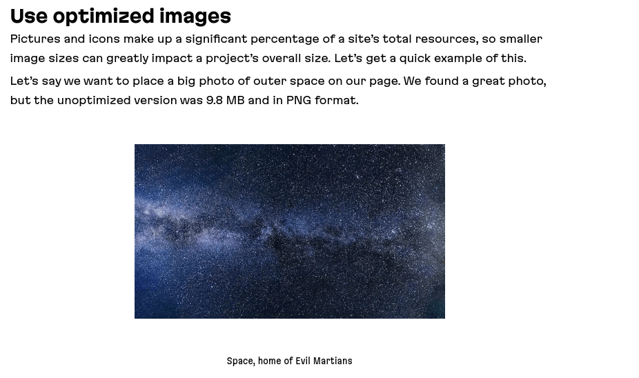
An example of a bad element grouping
We have a heading, two paragraphs of text, and a picture illustrating the text, alongside a caption. But is it easy to understand how these elements are connected?
The problem is the poor visual grouping: both the space between the text and the image, and the space between the image and the caption are the same, so their logical connection is blurred. Additionally, the line spacing separating the heading from the paragraph text is nearly non-existent. Further, because of the spacing, it’s hard to notice where the first paragraph ends and the second begins–and this looks sloppy.
After fixing the spaces, the grouping and hierarchy of elements can be seen more clearly:
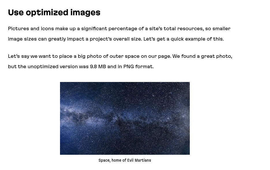
The grouping and structure has become clearer
“OK, this concept of grouping elements together with a clear structure is important, but what should I as a frontend engineer do with it?”
When implementing a design, pay attention and double-check all margins and paddings between elements in the layout so that the structure of the page looks the right way. Those pixel values aren’t just magic constants, they’re intended to realize important concepts of grouping and hierarchy as visualized by the designers.
6. Make sure the contrast is prominent
Prominent contrast between different elements on the page is one of the most important factors that infuse pages with a sense of attractiveness. Alongside hierarchy and grouping, the concept of contrast helps users to intuitively understand the structure of a page. Contrast can be achieved in many ways: colors, sizes, font styles, the amount of space between elements, and much more.
The general rule is that contrast should be emphasized–if there is too little of it, then the connection and hierarchy of elements will not be obvious, which will confuse the user’s perception. Just look at this demo:
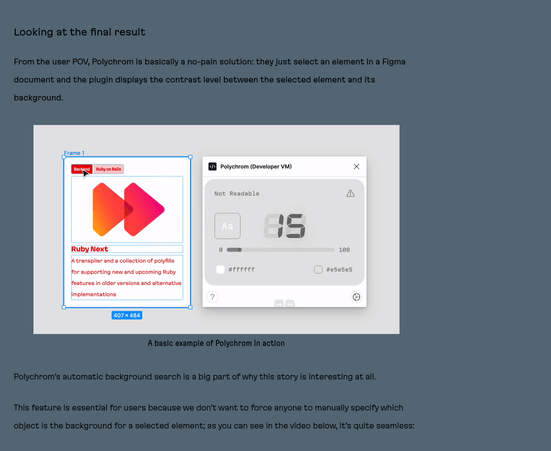
An example of bad contrast
This can be done more attractive by increasing the contrast (making the title, the keynote, the text, and the caption for the image more different) and making the text on the page more visible by making the page color lighter and the font size a bit larger:
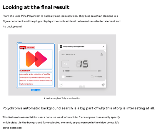
After making the contrasts more evident, and the text more visible
So, when you move the design layout into the code, pay attention to details in the layout that embody contrast: font size and style, colors, and dimensions.
You can accidentally mix up the font size, using 18px instead of 16px, and don’t notice it at first, but this small mistake can reduce the contrast with the larger header, and as a result, the article will attract less attention. The experienced eye of your designer, most likely, will notice a discrepancy, but it’s much better to get everything right in the first place.
7. Double-check alignment
Since frontend engineers are naturally focused on the development process itself, they might sometimes forget (or place less importance) on the actual visual aspects of a project. Unfortunately, this habit can lead to UI shortcomings, and one of the most common examples of this is the inconsistent alignment of elements on the page.
The concept of alignment plays a big role in design. Alignment helps establish an invisible reference line that makes it easier for the user to understand the structure of the page and how some elements relate to others.
Take a look at this example of the interface (again, we faked one of the pages of our site for demonstration). How easy is it for you to understand the connection between its different elements without looking closely?
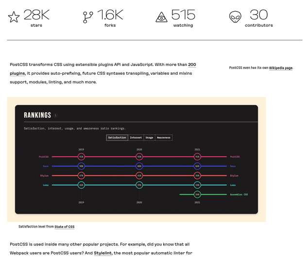
An example of an arbitrary alignment
The inconsistent alignment of elements can be not super noticeable at first glance, but it creates a feeling of disorder.
Adjusting the alignment helps to present information better:
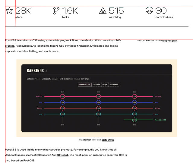
An example of fixed alignment on strict lines
After moving the design layout into your code, the same way as you check margins and padding, always check the alignment for correctness too. Otherwise, you can spoil the mood of the designer who will notice the visual shortcomings and ask you to commit fixes (which will take your own time).
Summing up: caring about design as a frontend-engineer
Despite the fact that designers are working on design, frontend engineers shouldn’t stay aside. An engineer’s involvement in the design side and their attentiveness to UX and UI is a recipe for a good project. And it can be achieved by using the simple principles that we listed above:
- Think about technical limitations and capabilities when reviewing the design layouts. Focus on trying to recognize the possible problems or expensive design solutions, and warn about them as soon as possible
- Use a design system to achieve consistency and better maintainability
- Validate different user scenarios while implementing a new feature, pay attention to the convenience of using it
- Think about considering all interface states
- Consider the visual hierarchy and grouping, and double-check the paddings and margins. It should be the same as in design
- Pay attention to details in the layout that embody contrast: font size and style, colors, and dimensions. It’s also important for the accessibility
- Check the alignment of elements while implementing the design layout: inconsistent alignments make the interface look sloppy
And remember this important idea: frontend engineers and designers are working on the same goal. We must trust each other’s competencies, but keep a close eye on the product–and that’s the key to a great product.
At Evil Martians, we transform growth-stage startups into unicorns, build developer tools, and create open source products. If you’re ready to engage warp drive, give us a shout!

