Demo app design for Medplum, open source healthcare developer platform

Medplum, an open-source developer platform designed to streamline the development of healthcare applications, initially came to us with a request to upgrade their demo application, an important sales tool for their platform. But the Martians team went further, recognizing a longer-term product strategy that could expand their customer base and open new revenue opportunities.
Client background and challenges
Medplum is an open-source developer platform for healthcare tech (YC S22) with a mission to make healthcare software development fast, easy, and actually enjoyable. Clients using their platform get a solid foundation for their use case, so they can focus on building what they need and not infrastructure—all while compliant with US law.
For some context, they initially targeted a more technical audience (like CTOs from MedTech startups). In order to market their product effectively to practitioners and hospitals (who didn’t necessarily have a strong technical infrastructure), they needed a way to explain what could be achieved with their platform. This is where their demo app, the Provider App, came into play.

Hire Evil Martians
Hire us to build the new interface for your devtool in healthtech!
Looking at the short term and long term
Medplum’s initial request was to streamline this out-of-the-box Provider App experience to better represent the products that could be built using their technology. (A perfect match for Evil Martians, with our developer tool experience!)
During our work, we realized this demo app could be more than separate pieces showcasing specific possibilities, but a full-featured Electronic Health Record EHR with the potential to be used by various medical practices as is—either white-labeled or on a SaaS model.
So, the short-term goal was to keep adding specific features to the demo, while our team introduced and worked with a longer-term objective in mind: solidifying the overall experience into a sturdy, standalone product.
Tackling the initial experience
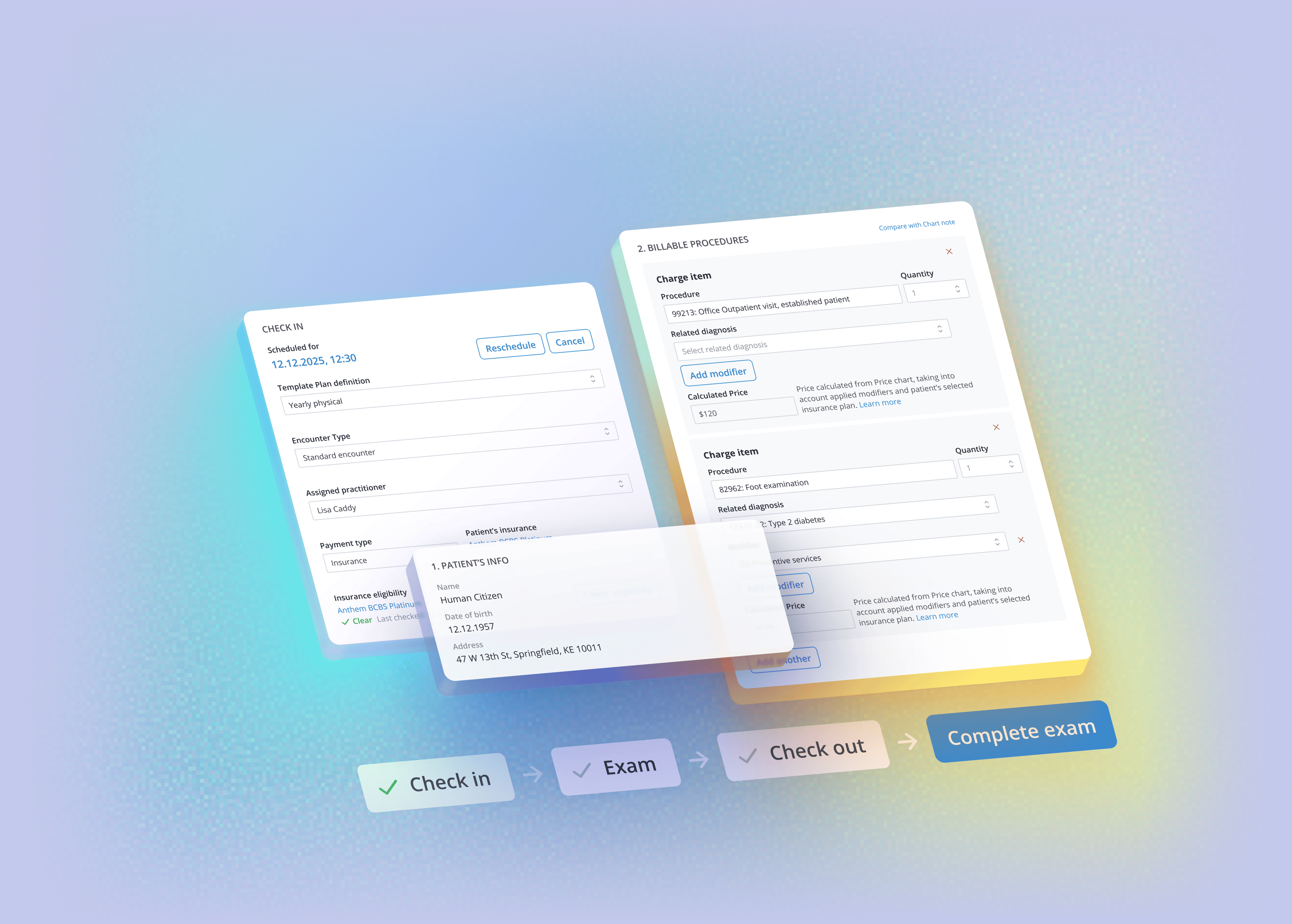
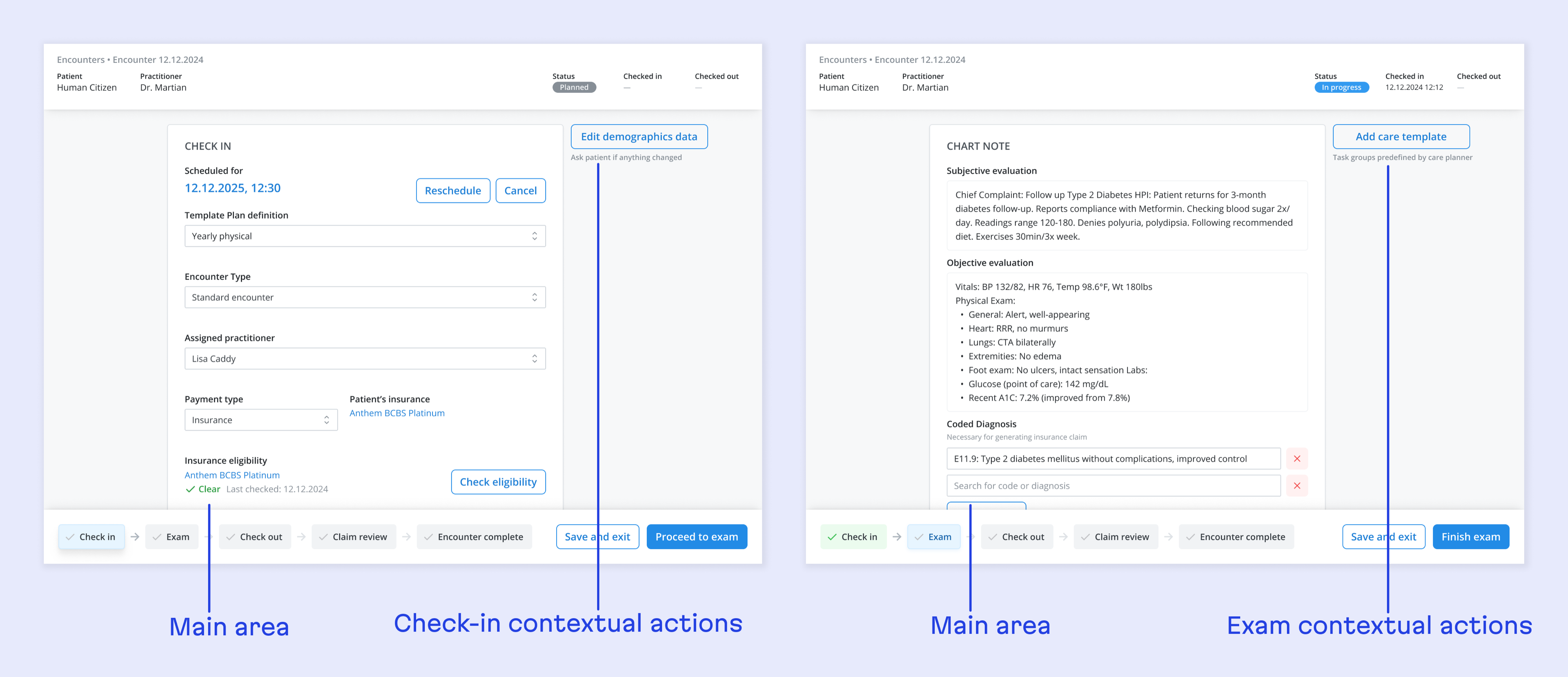
We started with the Encounter page. (“Encounter” is a common term used in MedTech that describes an event involving patient communication, mainly during office visits or telehealth visits.) In this case, the Encounter page lets practitioners store their notes during the visit and fill in necessary questionnaires.
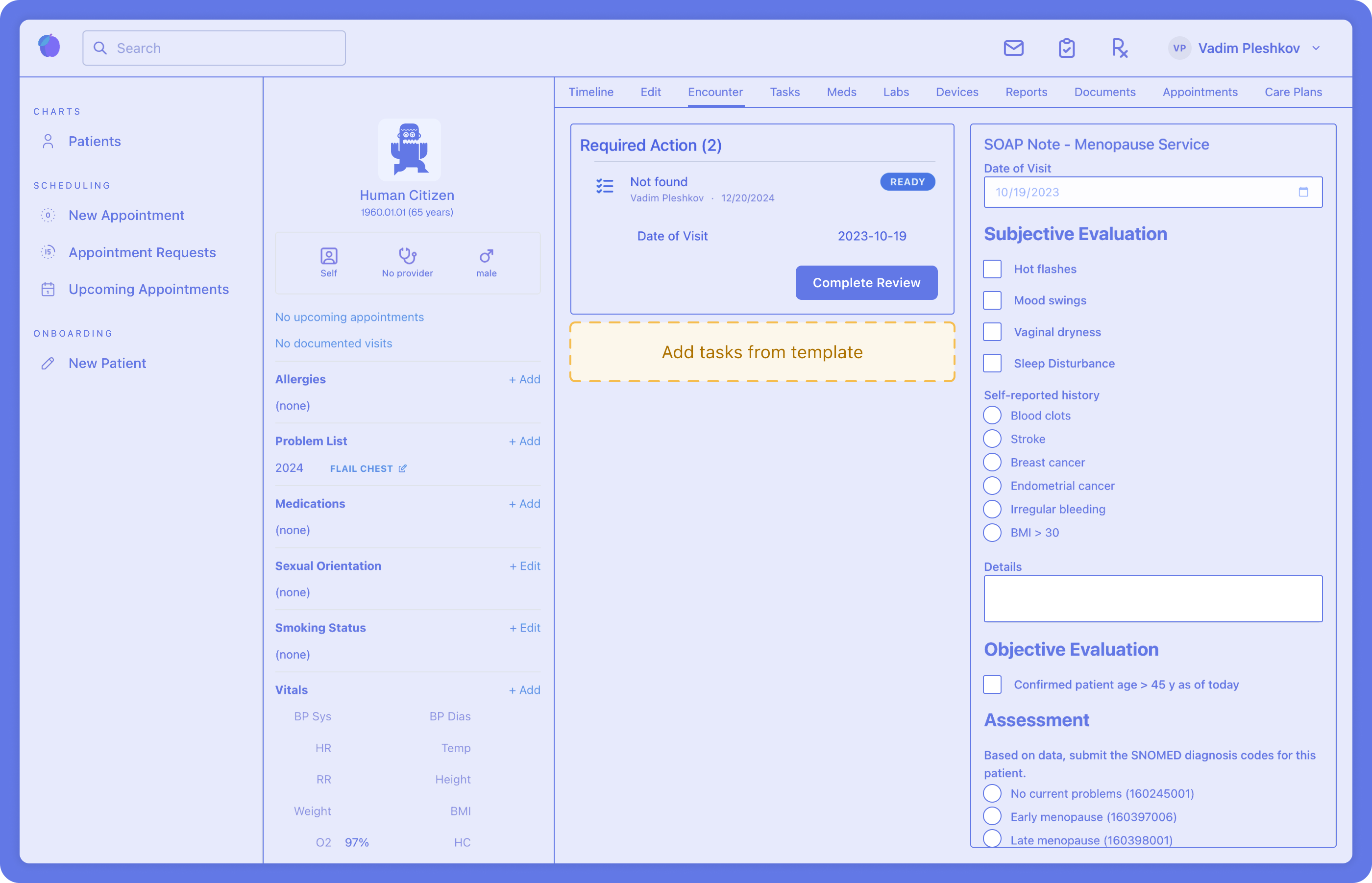
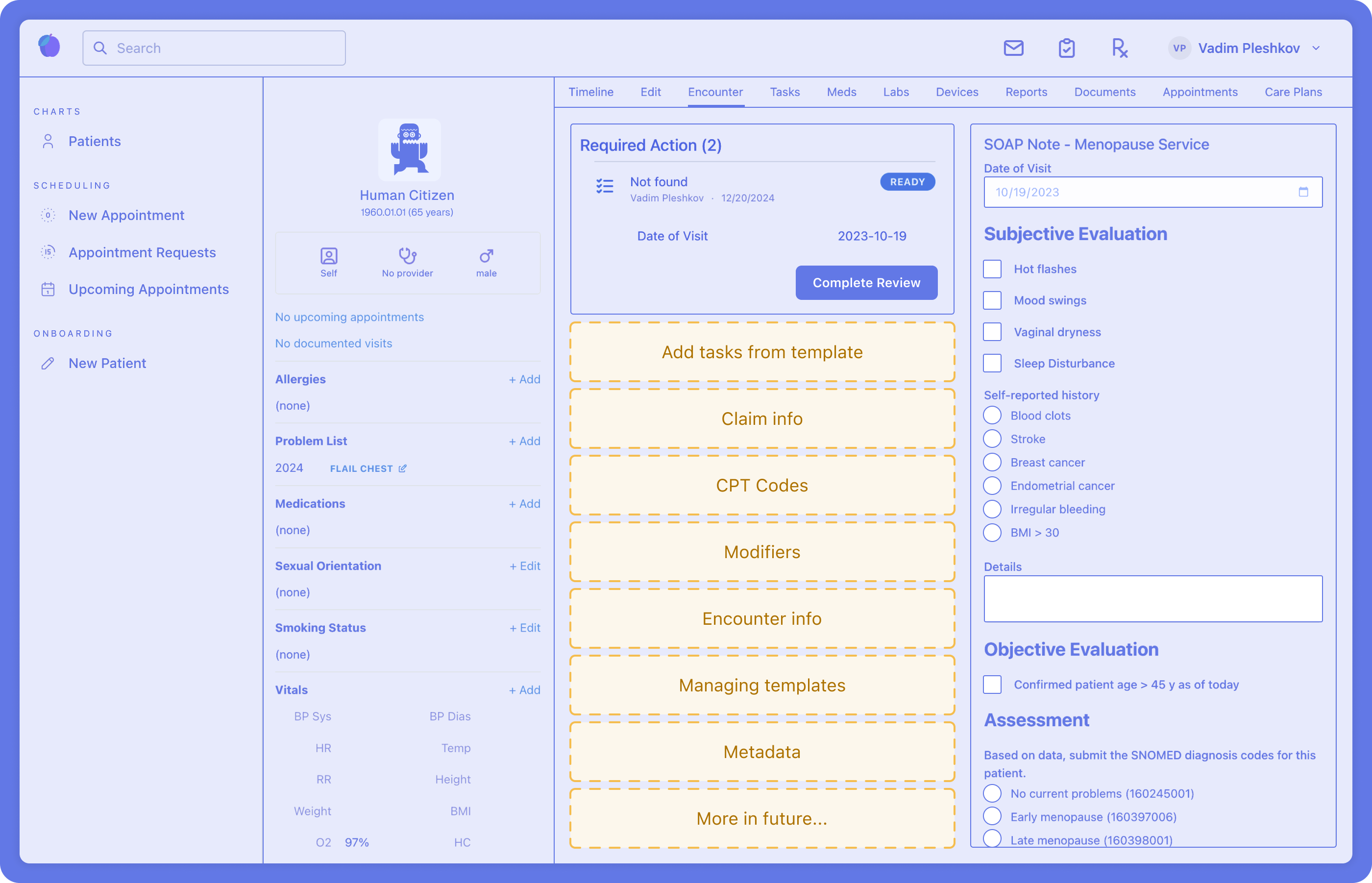
We needed to add the templates to the page, allowing practitioners to add predefined lists of tasks to an encounter. Medplum hoped to demonstrate the agile and template-based nature of the platform, allowing practices to build a workflow relatable to their needs, not just a one-size-fits-all solution.
In this case, we wanted to present the platform’s ability to predefine sets of tasks at an administrative level, so practitioners could simply follow checklists instead of filling things out from scratch every time.
Researching and pivoting
Before isolating the task, we had to do a thorough inspection of the Encounter page itself to better understand the context, asking questions like: Why are templates so important here? What is missing from the page? What are the functions that should be there, and what should be there in future versions?

We found the primary reason to use templates was making sure that the right things are being documented for each encounter. Additionally, this information would later need to be transformed into a claim for the insurance company.
After our research, we concluded that while simply adding templates to the same page could work in the short term, in reality, there’s a lot more data that should eventually be presented here. So, in order to avoid overcomplicating this page, we needed a more durable, future-proof solution.
So instead of continuing to do this…
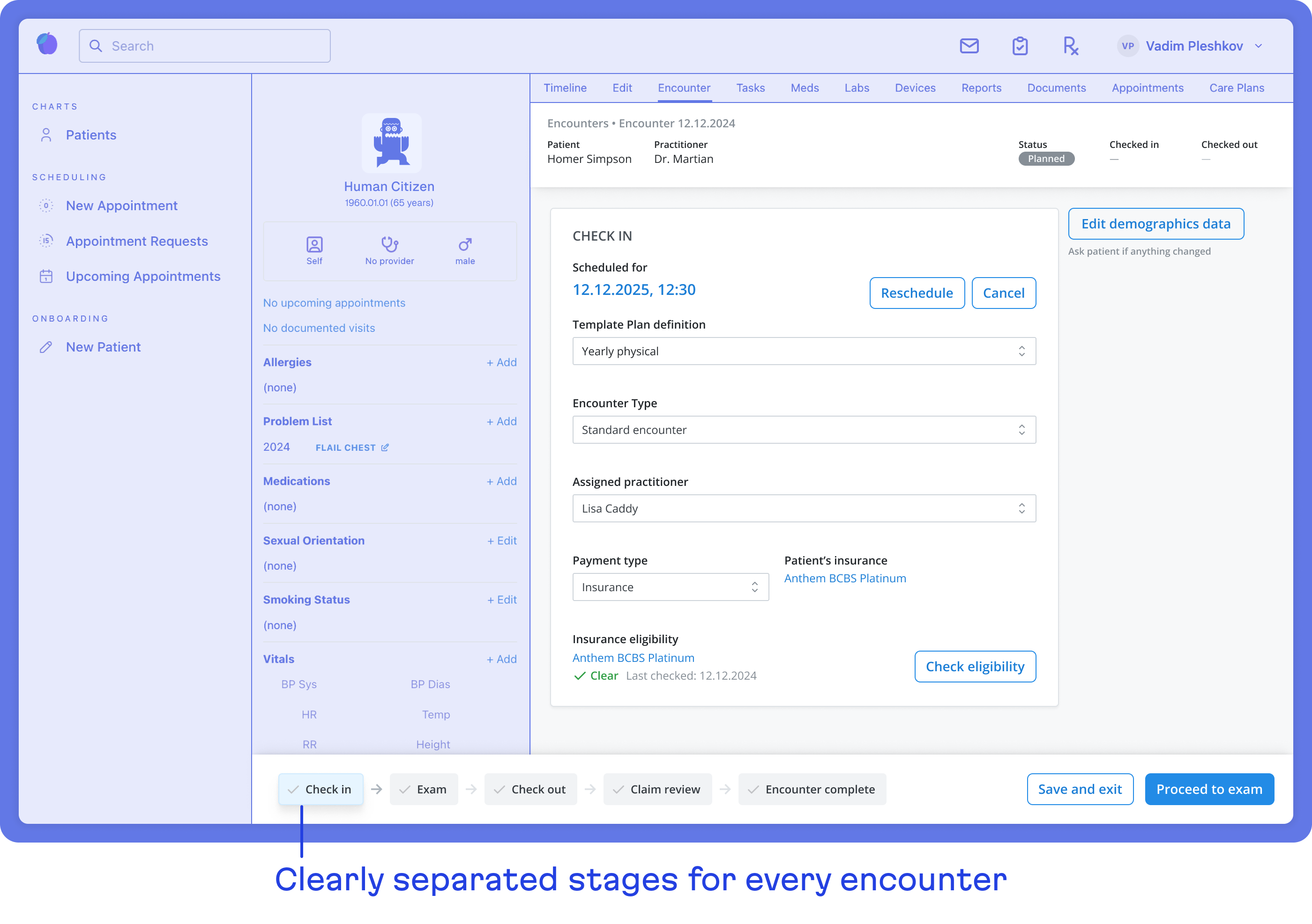
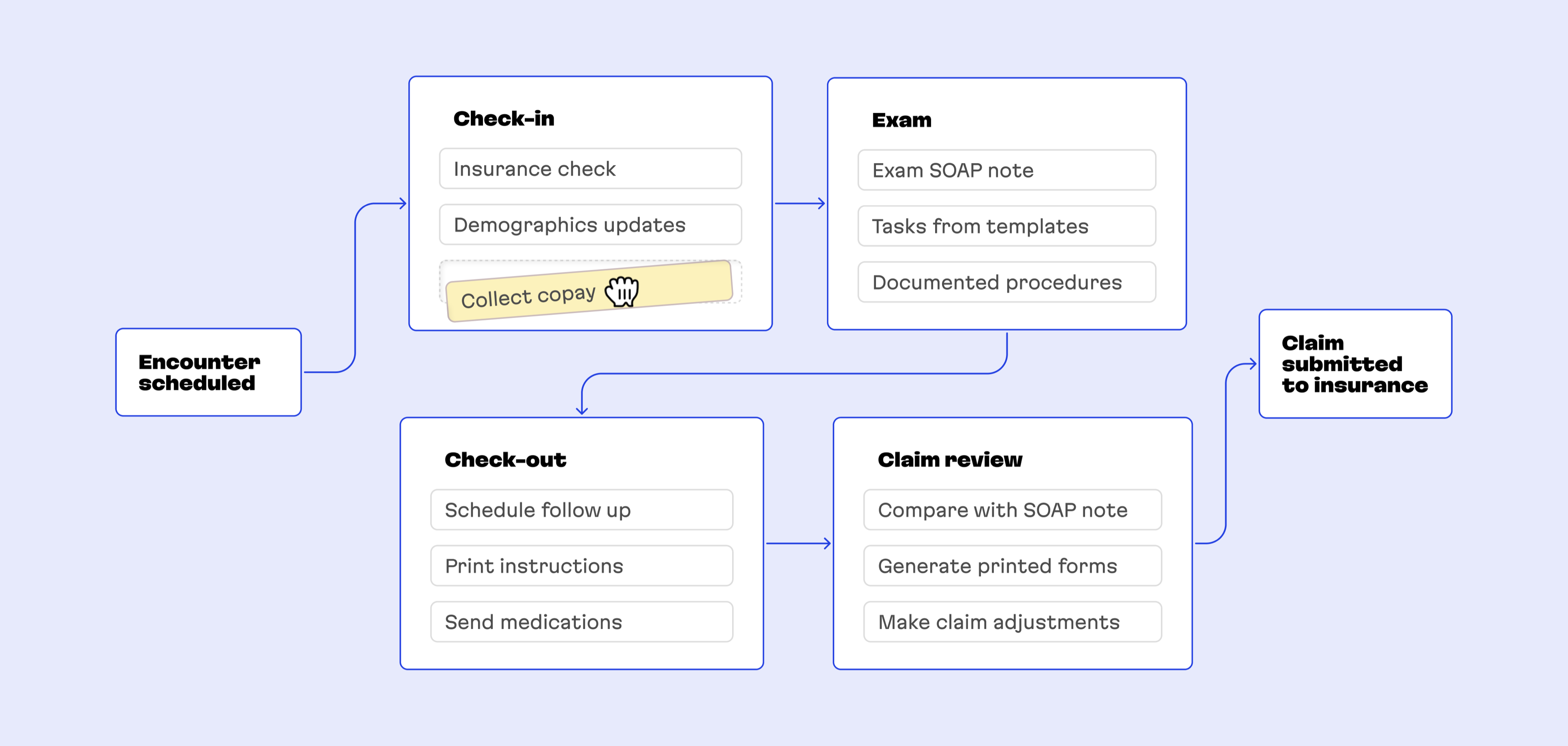
We suggested splitting encounters into smaller, easily-digestible pieces, which were more focused on their specific aspects of an encounter. Based on the user journey, the best way to do this was to split the page into the different stages that each encounter typically goes through: starting from the check-in and finishing with reviewing the claim, sending it, and archiving the encounter.

Resulting benefits
Not having to fit everything on one page allowed us to have a more thoughtful process for each of the stages, adding important context and keeping users focused during every step of the process. This split also helped divide parts of the interface by roles: the front desk has an interface dedicated to their part of the process, while practitioners only see the things relevant to the visit itself.
We also introduced a standardized structure to all the pages, with the main area in the center, and contextual actions on the side:
Aside from being more focused, this approach helps us take another big step towards Medplum’s goal of making the entire process modular and adjustable for their clients.
At first, things will be static, but this architecture allows each stage to eventually become a container that can be populated with the modules that a specific practice cares most about. So, if a practice wants to process copays at the “Check-in” stage instead of the “Check-out” stage, they could simply move the corresponding module to the Check-in stage in the builder, adjusting their process.
Future considerations
The notion of having a dedicated place to adjust and configure the experience for a practice felt important, so as a bonus, we suggested concepts for future architecture changes with this in mind.
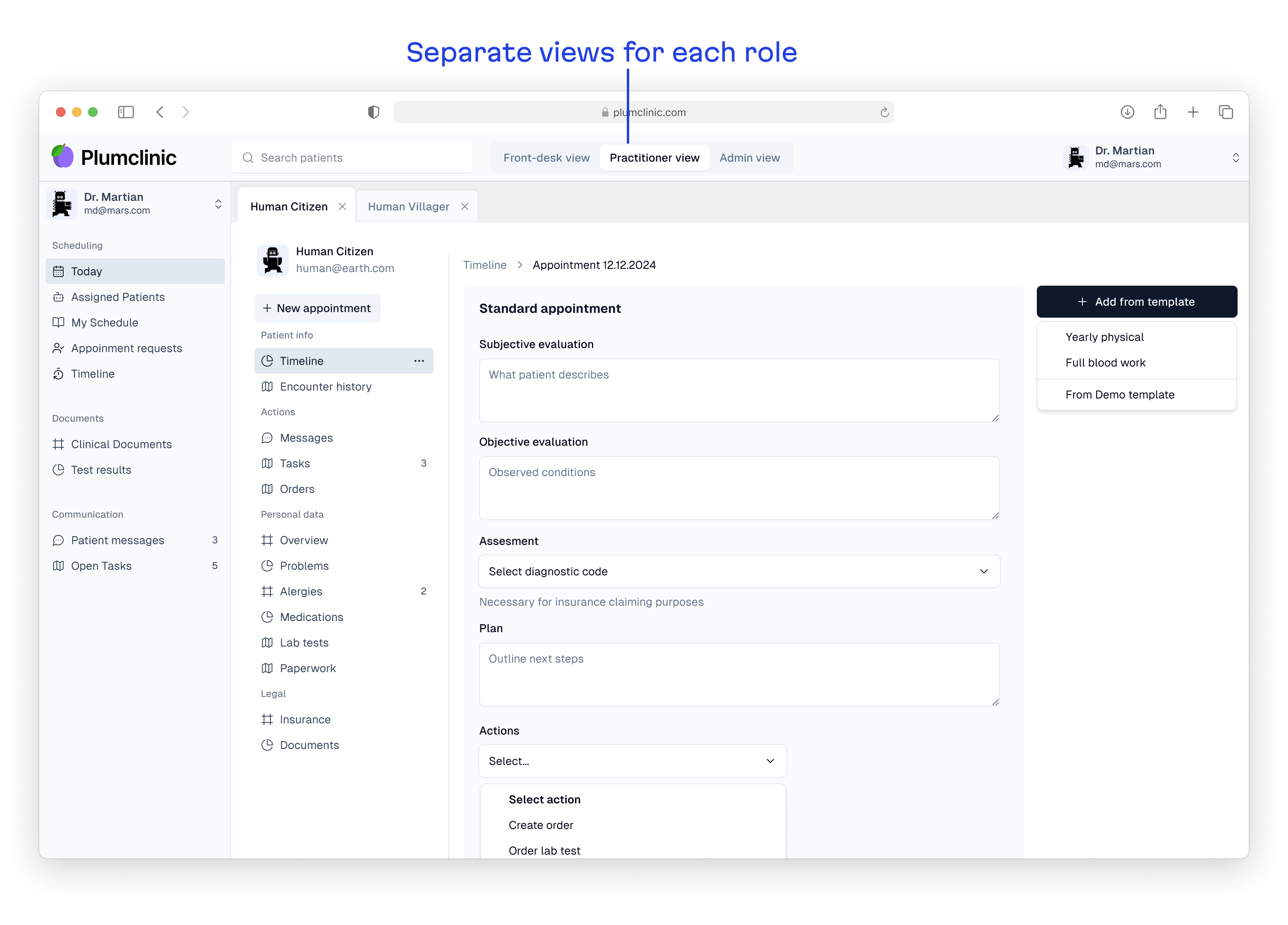
With this approach, the full experience is split by the roles of the staff in the practice. So, the front desk, practitioners, and administrators can have a dedicated place tailored for their needs and ways to use the EHR solution—effectively bringing the role split concept that we introduced to the Encounter page to the whole product.
This would also give us a place to have all the setup stages that need to be done upfront grouped together in the admin view and properly explained, opening the potential for designing a dedicated onboarding/setup experience.

Transforming a demo into a market-ready Product
What began as a request to add templating capabilities to a demo app evolved into something much more valuable: a reimagining of Medplum’s product strategy. By transforming their Provider App from a simple demonstration tool into a full-featured Electronic Health Record (EHR) system, we helped create a product that medical practices could adopt immediately, without requiring custom development.
This strategic pivot opened an entirely new business opportunity for Medplum. Beyond serving developers building custom healthcare solutions, they could now offer a ready-to-use product that smaller medical practices could implement directly—either white-labeled or as a SaaS offering. This dual-market approach significantly expanded their potential customer base and accelerated their path to revenue.
The modular architecture we developed not only solved the immediate design challenge but aligned perfectly with Medplum’s long-term vision of flexibility and customization. Medical practices of all sizes can now configure the platform to match their specific workflows, creating a truly adaptable solution in an industry where one size rarely fits all.
The lesson for other technical founders is clear: sometimes your demo or MVP contains the seeds of a more powerful product strategy than you initially envisioned.
Thank you for all your help in refining our thinking and giving Provider App a strong start!

Reshma Khilnani
Co-founder and CEO, Medplum
At Evil Martians, we believe this kind of strategic thinking is just as important as technical execution when helping ambitious startups transform their early concepts into mature products that solve real business problems. If you agree, reach out to us!