Want to make a great developer tool UI? Follow this fundamental rule!


This fundamental UI design principle can make your interface intuitive and simple: elements on the top should control elements on the bottom, and elements on the left should control elements on the right. Seems obvious? Keep reading to learn deeper nuances about this rule—and make sure your users perceive your MVP, app UI (or whatever you’re building) as logical and intuitive!
Top-down flow

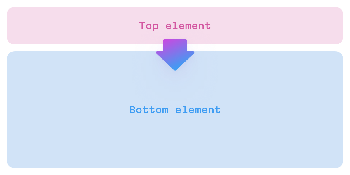
Rule: the UI element above controls the one below
Tabs in IDEs, browsers, and many other applications exemplify top-down control flow. When the user switches a tab, it changes the entire content of the primary window. On desktop and web platforms, tabs are typically placed at the top of the UI.

This rule is widely followed and adhered to at all levels: you can find smaller tabs within panels in almost any professional app, from XCode to Figma; these tab bars are placed at the top and determine the panel’s content.

Tab bars in the XCode navigation area and the Figma properties panel
The rule is even followed at the micro level! For example, in the Play app, the selection in the Direction property hides and shows subsequent properties based on which ones are relevant.

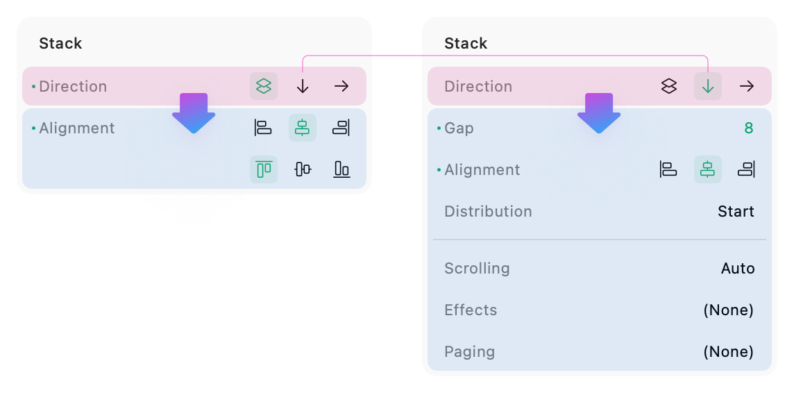
The user’s selection controls the following properties structure

Irina Nazarova CEO at Evil Martians
Left to right flow
Accessibility note: the following rule primarily makes sense for Western audiences—people who read and write from left to right. If you’re designing and developing for right-to-left cultures, you’ll likely need to adapt the horizontal flow in your UI!
Rule: the UI element on the left controls the one on the right
Here’s a common example of left-to-right control flow: a navigation panel on the left and the content of the selected item in the main area to the right.
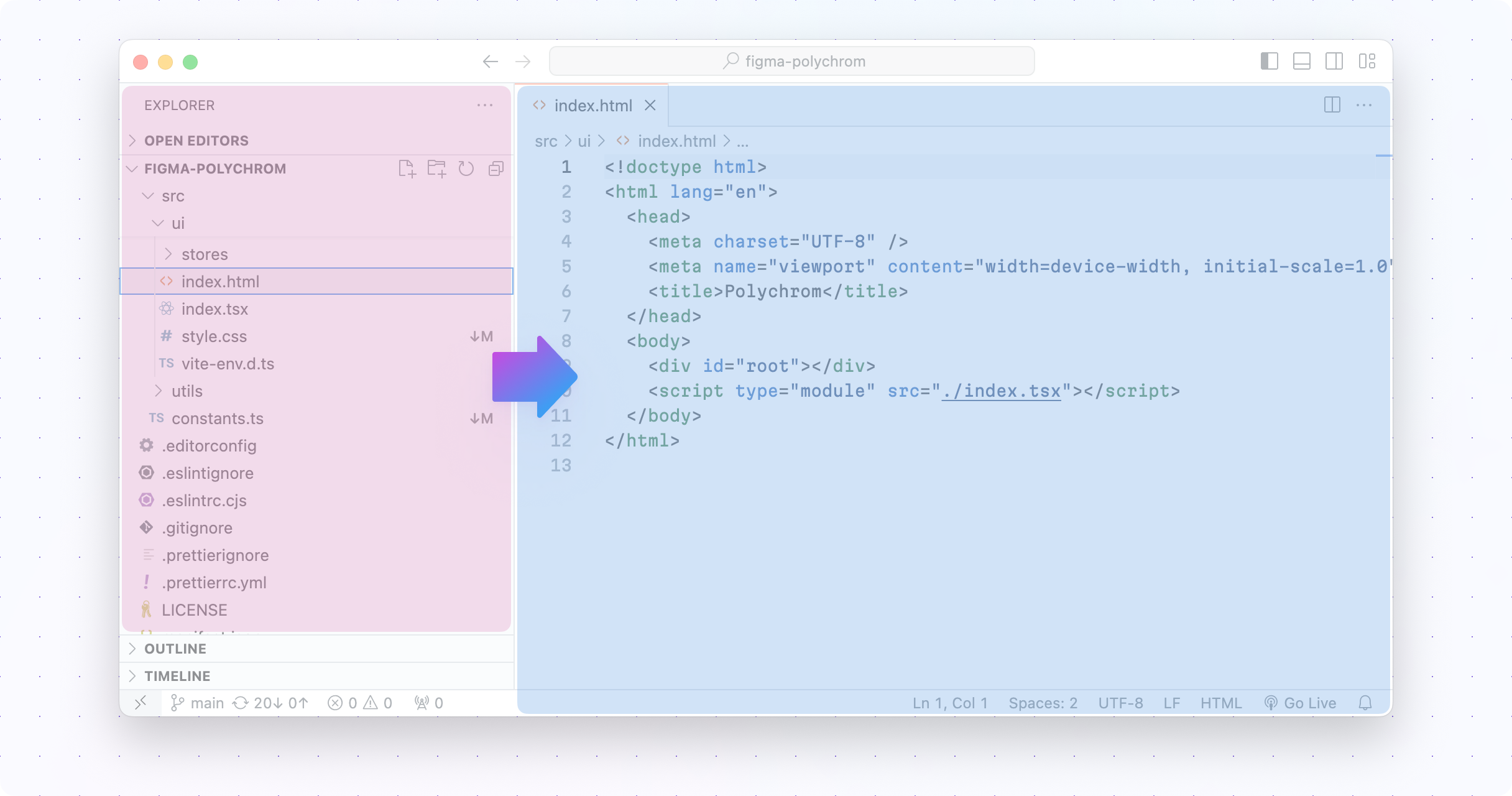
In VSCode, the user’s choice in the navigation panel determines the content that is displayed in the main area; if the user selects another file, its content will be shown.
The same pattern applies to various design editors in different contexts. If an element in the scene is selected, its properties are displayed in the Properties panel, usually on the right.

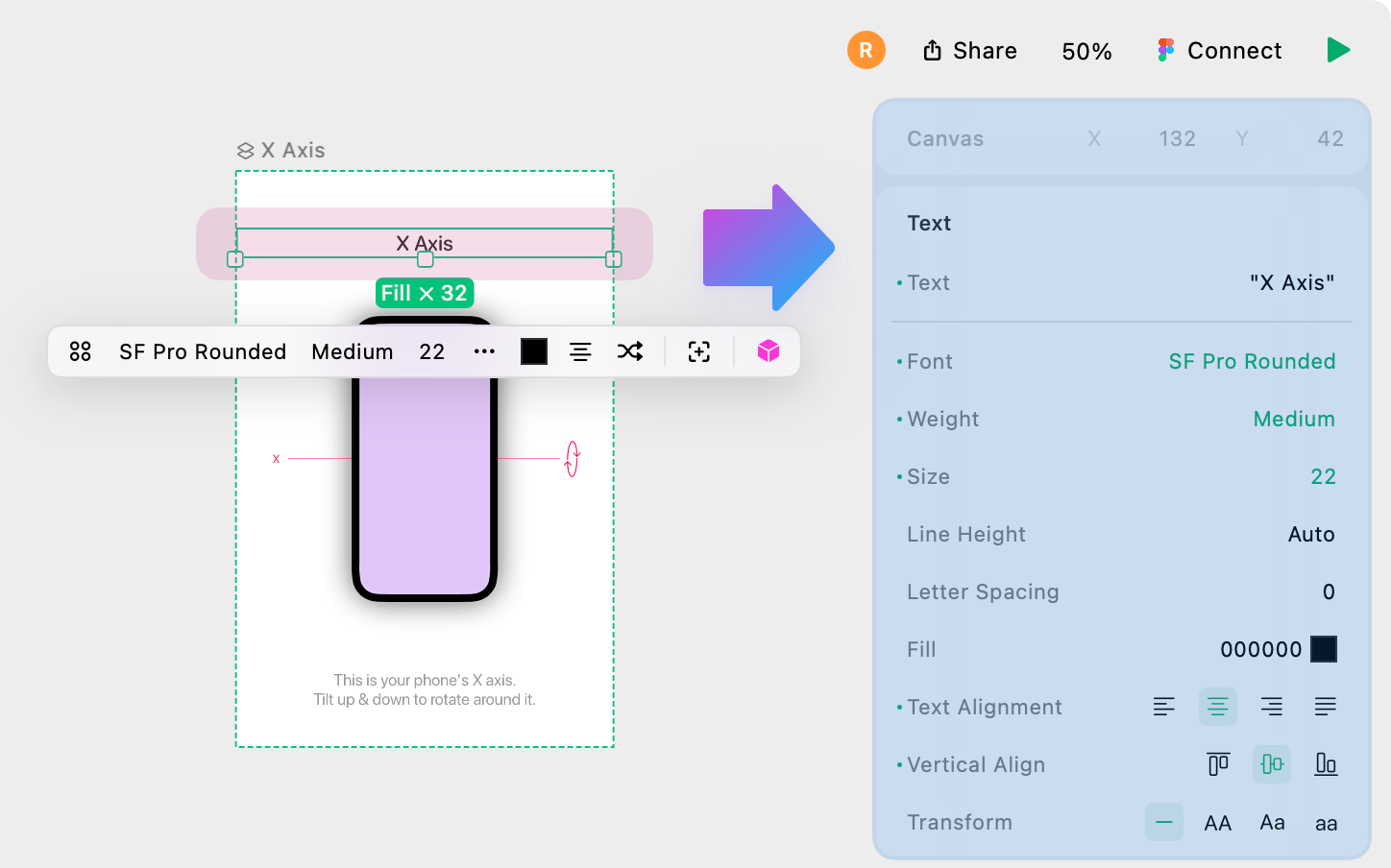
Play displays properties of the selected element on its right
Similar to the top-down flow, the left-to-right flow also works in an inline context. For example, in query builder UIs, the leftmost selection in a condition line determines the subsequent UI elements.
In the video above, if the condition is “From,” a function selector is revealed (called “contains”) and an input field with an email address also appears. However, “contains” condition and the email field aren’t relevant for the “Data sent” condition, so it replaces the entire line with its own set of options instead. The same applies to “Account.”
To understand the importance of this ordering system, try to imagine using a UI where the main selection is on the right!
Combining flows
Now that we’ve outlined top-bottom and left-right flows, let’s discuss how both flows can be combined multiple times.
To illustrate, let’s dissect an example from XCode. Take a look at the following image, then check the description below.
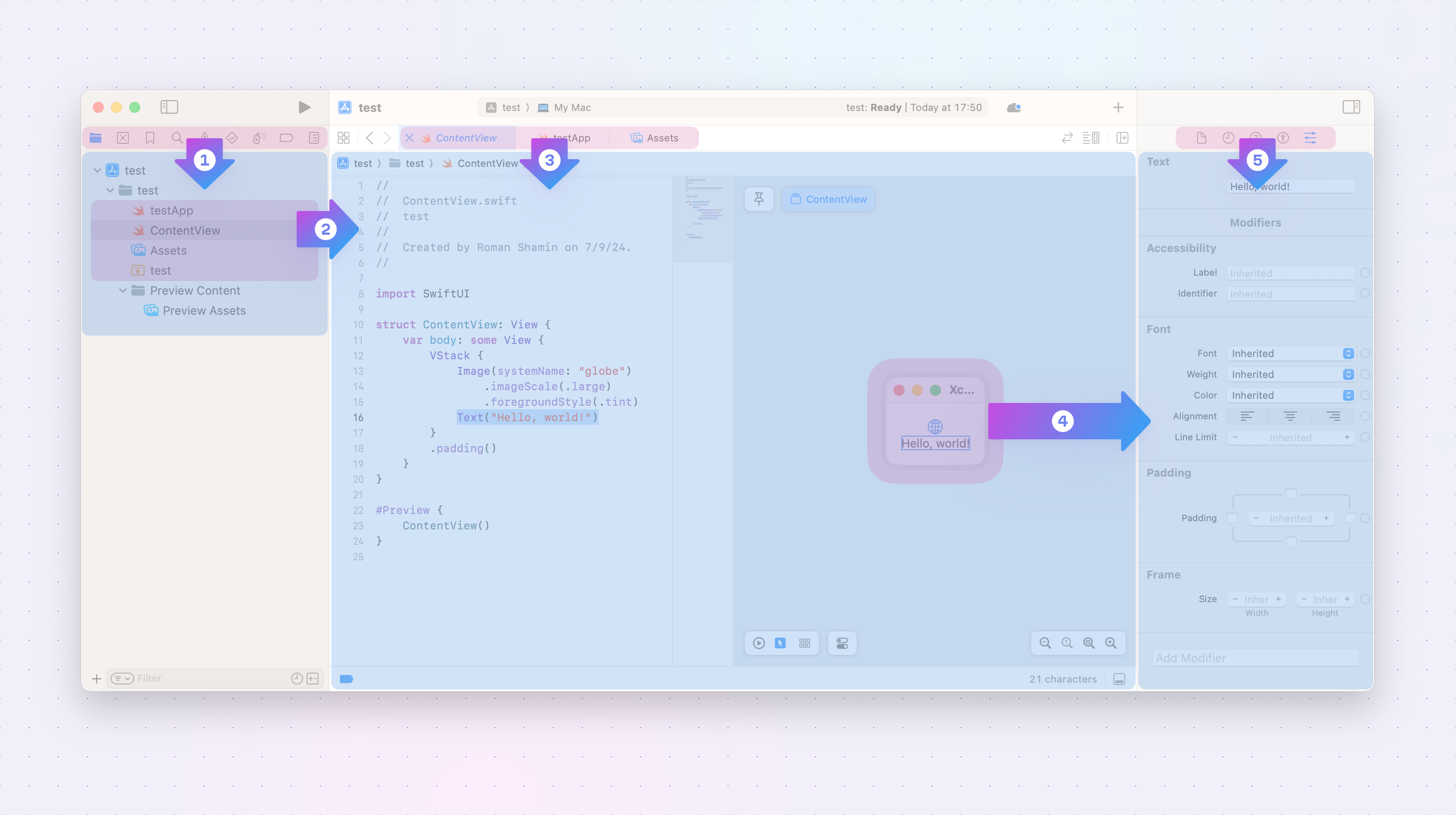
Nesting of left to right and top down flows in XCode’s UI
Let’s move through the screenshot above:
- The micro-sized icon tab in the left panel determines the content the panel below it will display (1).
- The file navigator is selected, and the user’s choice in that navigation area determines the content that will be displayed in the primary area (2).
- From these selections, the tab bar determines which file’s content is actually shown in the main area (3).
- Finally, a combination of the selection within the ContentView (4) and the active tab (5) determines the properties displayed in the right panel.
Notice that the entire control flow proceeds step by step, top-down, and from left to right. This also leads up to another important point: the overall flow usually reflects the app’s internal hierarchy. XCode’s UI follows the project hierarchy: the files contain code, and objects in the code contain their properties.
What about the opposite flows?
For controls placed at the bottom and/or on the right, we usually expect them to transform or modify the content of the view—rather than changing it completely. For instance, XCode’s navigation area contains a field that filters the file tree. Here, the properties panels we mentioned earlier only changes properties for selected values but it doesn’t actually switch the content in the view.

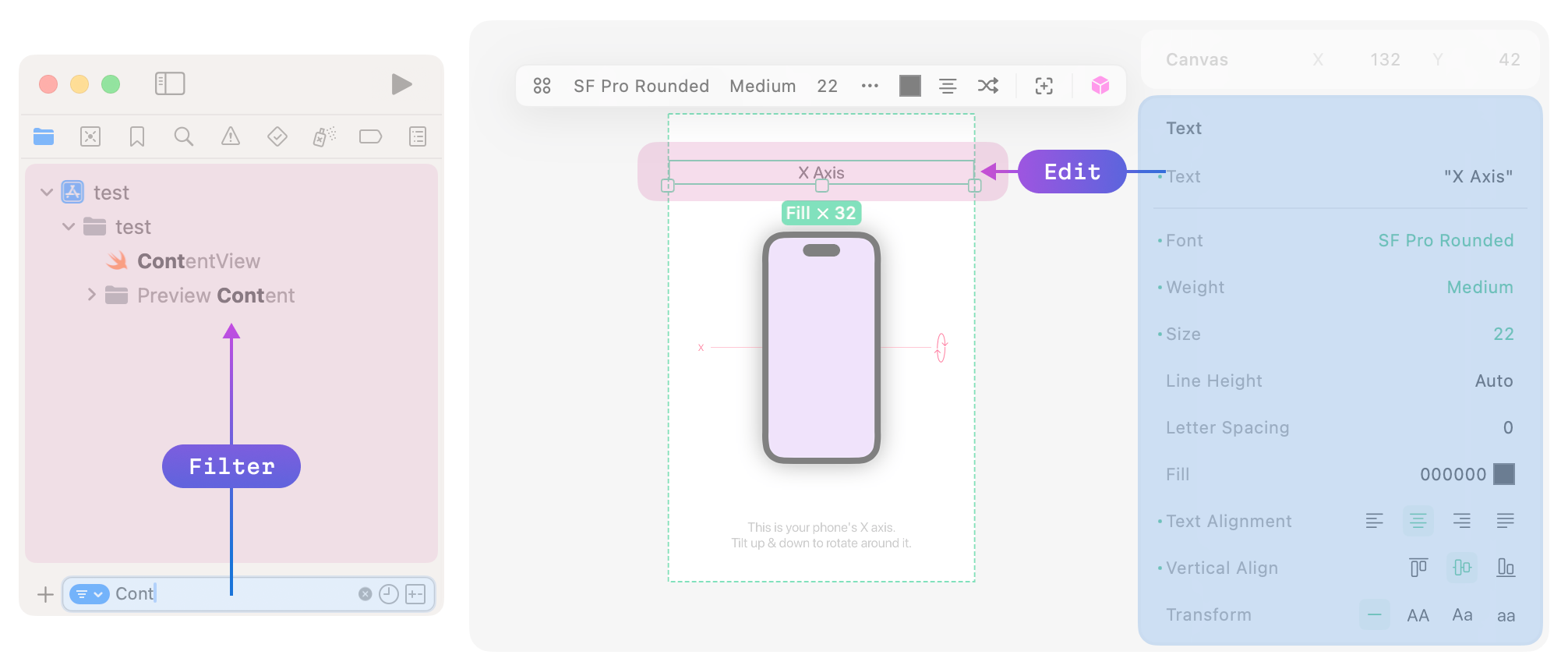
The opposite direction flow is for transforming data
Breaking the rules

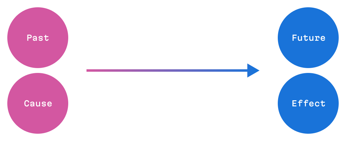
Scientifically speaking, this all relates to the STEARC effect: the Spatial Temporal Association of Response Codes. This is a cognitive phenomenon where people associate temporal concepts, like the past and the future (or cause and effect), with spatial positions.
Simply put, people from cultures where readers interpret text from left-to-right expect logical flows and sequential steps (such as timelines or process flows) to be likewise be presented from left to right. When designing for right-to-left reading cultures, it’s important to reverse the horizontal flow to match their natural reading direction.
All of that said, this rule is not absolute. Managing screen real estate is challenging, especially when dealing with developer tools, so it’s acceptable if a UI occasionally breaks these rules. For instance, some IDEs have bottom file tabs, and that doesn’t bother anyone!
So, try to follow this principle—but don’t be afraid to break it if you have a good reason for doing so—and happy building!