Level up for UX: Design lessons from video games
Translations
Looking for inspiration to improve the look and feel of your product? Take clues from popular video games to create engaging user experiences for web and mobile. Learn how game designers grab players’ attention with tricks from psychology books and apply those practices to your applications.
Press “start” to play
No one likes being lectured. Most people, if asked to study a 20‑page manual before playing a game, will probably choose another pastime (dear board game fans, please don’t take this personally).
Game designers are well aware of that, and they try to make the first step in a game as effortless as possible. Press a button to run, press it twice to jump, press another button to shoot. That’s it, the first achievement unlocked! Enough for a player to learn some ropes and feel immersed in a game’s world. Just enough information, before it’s time to learn something else.
Best in-game tutorials are woven into a plot and do not interrupt the story. A player starts small and learns more advanced patterns while advancing through the game.

Uncharted 3 by Naughty Dog and Sony Computer Entertainment has got the onboarding just right: fighting controls are explained the first time you get into a fight
The same approach proves its worth when creating web or mobile experiences. Users want to put their hands on a product as soon as possible, so they tend to skip lengthy tutorials. If your interface cannot be used straight away, don’t expect visitors to stick around.
The best way to introduce a product is to “nudge” users into taking small actions, introducing new features as the journey unfolds.
A good example is Teamweek: an online team calendar. After you sign up, you are taken straight to the board, where you are asked to add and edit a task, reschedule it, and change its length. All is done in a “repeat after me” fashion. Floating hints don’t interrupt the workflow, and it’s easy to dismiss them.
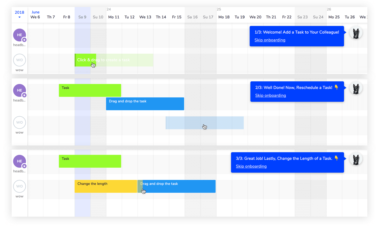
Teamweek’s onboarding process does not interrupt your workflow and never asks you to leave the screen
Choose your character
Your in-game preferences may vary. Some players are looking to quench their thirst for power while defeating enemies with weapons. Some release their inner “craftsman” and tinker with virtual items. Some are there for undiscovered lands and plot twists. Others embrace social component: bringing offline friends to the game and making new ones online.
Difficulty levels are there also for a reason. Some players prefer to stroll through a game leisurely as if they were watching a movie with popcorn in hand. Others look for more trouble and turn the difficulty setting up to the max.
Multiplayer games are so magically addictive because they know how to cater to each player type.
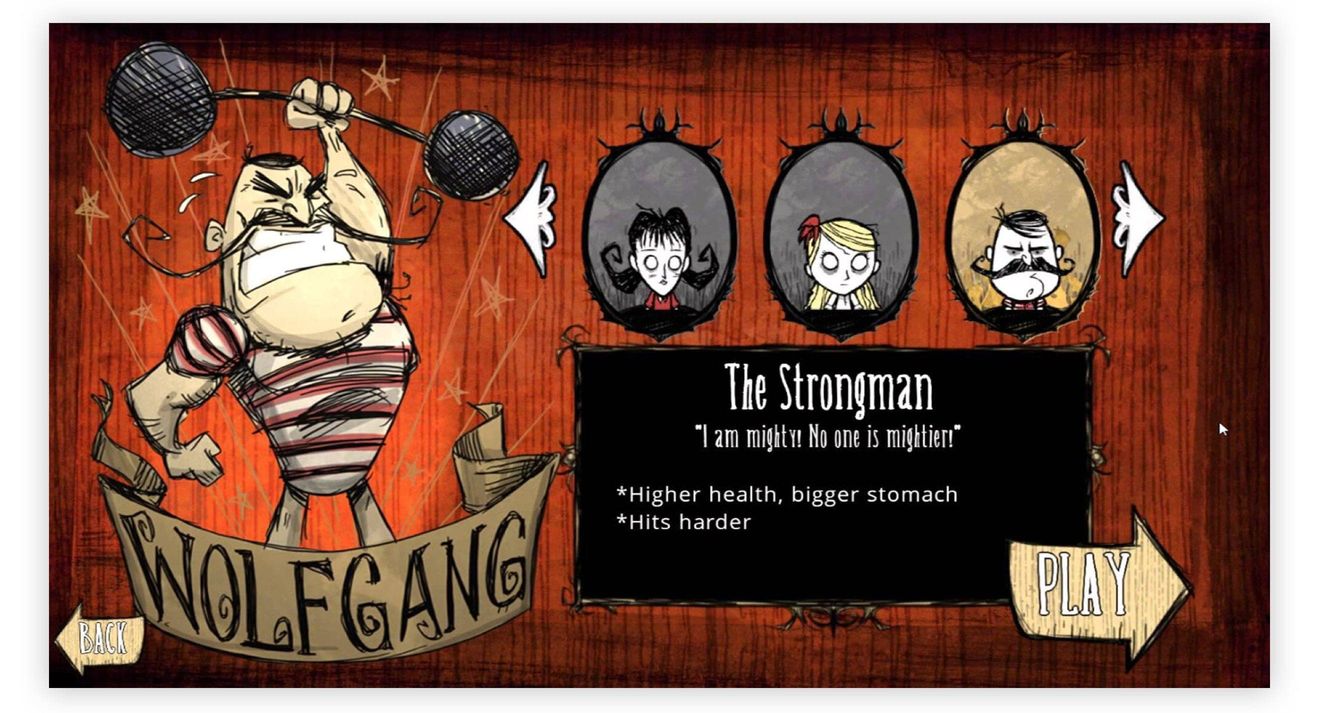
Different characters in Don’t Starve by Klei Entertainment and 505 Games appeal to different player types. A more diverse team have a stronger chance at survival
What’s the inspiration here to be applied to a product UX? Imagine an average car seller website. The top model is usually featured on a landing page while the rest of the cars are in a catalog, sorted by model, make and year. Designers often overlook the fact that visitors define their own categories: a family person will look for a wagon, a junior professional will probably go for something compact to save on fuel and park easily, a successful middle-aged entrepreneur may opt for a sports car.
When designing navigation, consider catering to different types of visitors and their everyday demands. Do not just replicate the database structure!

HireLevel separates visitors into groups right away
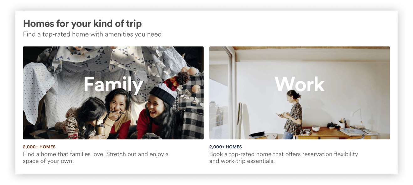
Airbnb targets family travelers and business travelers differently
Try breaking your offers into categories that appeal to different demographics. The “difficulty level” (the number of features) can also vary from segment to segment. Think about different entry points for different groups of users—one product can have multiple faces, each with its own personality.
Achievement unlocked
There is no game without a reward. Defeat a boss and get to the new level with a rare new weapon hand. Discover a new territory and obtain some local respect. To make us stay in the game developers offer gifts in the form of game money or free items. A pleasure we get from those rewards is based on a simple fact: our brain treats in-game items as if they were real.
It has been established that immediate rewards directly activate brain parts responsible for emotion.
Short feedback loop draws players into a game: if your action is rewarded, you will most likely repeat it.
Players are motivated to complete missions because they know they are on their way to a sure reward. At the same time, randomizing a reward mechanism leads to even more engaging (some might say addictive) experience—the very same principle stands behind gambling.

A rare Arcana in Dota 2 by Valve Corporation. Win another fight and hope for another bonus!
How can we improve our non-game experiences with these observations? Don’t underestimate the power of a “virtual” reward. Consider awarding loyalty of your users by introducing some form of an achievement system. To make rewards even more useful, consider adding some randomness to the process.
Untappd, a social app for beer lovers, leans heavily on rewards psychology. As of this writing, there are 10,673 available badges: some need to be earned, some are being awarded randomly to lure you back into the game
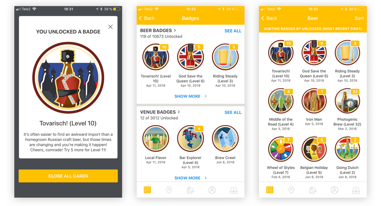
Look at all those badges!
Gotta Catch ‘Em All!
Remember long lists of quests in World of Warcraft? Even though most of the tasks are quite monotonous, players still try to make those lists shorter.
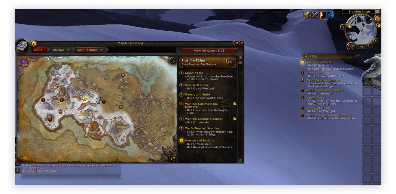
Got nothing to do? World of Warcraft by Blizzard Entertainment will help you with that
One of the first researchers to notice that unfinished tasks have a particular hold on us was a Soviet psychologist Bluma Zeigarnik. A Zeigarnik effect states that any task marked as uncompleted stays accessible in a cognitive “buffer”, while a completed one is quickly forgotten. Zeigarnik’s colleague, Maria Ovsiankina, also noticed that an interrupted task creates intrusive thoughts, aimed at taking up the task again and again.
Game designers exploit these “effects” all the time: with mission checkpoints, task lists, and progress bars. Everything to remind a player that they are not done yet.
Towards the end of each task, the psychological pressure to achieve result grows even stronger. This is known as an endowed progress effect. As a paper describing it states:
“By converting a task requiring eight steps into a task requiring 10 steps but with two steps already complete, the task is reframed as one that has been undertaken and incomplete rather than not yet begun.”
If merely by entering a game you have already unlocked first two levels out of 100, why stop now?
Of course, not everything in your product can be quantified. But if you set some goals for the user (fill in profile, list an item, write a review), it is a good idea to turn them into a checklist of simple tasks. Be sure to pre-check some of them.
A social media management platform Lightful presents its onboarding process as a simple checklist. Just by signing up, you complete 2 out of 5 tasks. Seems rather easy to get to the end, right?
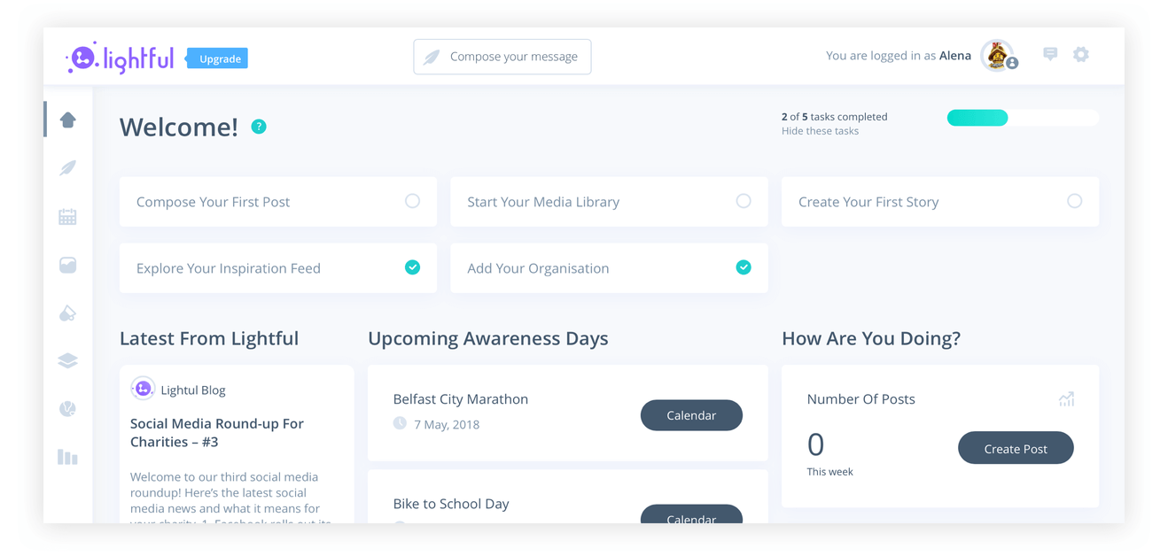
Lightful sends you on a checklist completion adventure from the first click
Spell damage +6
What has just happened? Have I bought something? Did I hit anything? All those questions can be avoided if every action that a player takes yields timely and predictable feedback. Feedback can be seen as consisting of two parts: a short-term signal and a long-term effect. For instance:
- Action: a player casts a spell.
- Signal: in-game character make a gesture, and the target is set alight.
- Effect: target loses health points. A scroll with the spell is wasted.
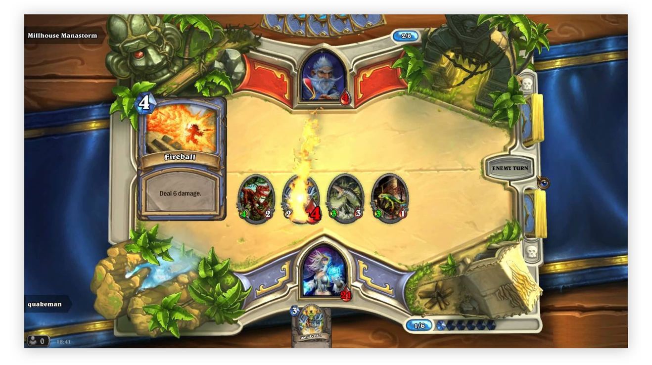
Hitting an enemy in Hearthstone by Blizzard Entertainment
Immediate feedback to a player’s action triggers the release of dopamine or adrenaline, depending on the outcome. It becomes a learning procedure, similar to the classical conditioning, discovered by Ivan Pavlov, a scientist who got famous thanks to dogs. The signal has to come quick, though: if it does not follow in the first 200-500 milliseconds, there will be no strong association between the cause and the effect.
Fast, predictable response assures players that they are in control and leaves them satisfied with their actions. The learning curve continues.
How can you apply that to your interface? Think of the core functionality of your product and which actions do you want your user to perform regularly. Design clear and meaningful feedback to each of those actions. Use the following sequence: action → observable signal → effect.
Let’s take Uber as an example:
- Action: Confirm pickup location with a tap.
- Signal: The screen is blocked with “looking for nearby drivers” animation that is informative and unintrusive.
- Effect: The driver is found, you can track their progress.
Easy and predictable, an incentive to try again!
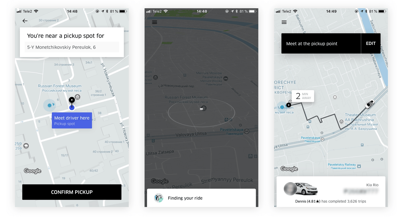
Classical conditioning in action!
Pick your color
It is important for game interfaces to be intuitive, so they don’t steal attention from gameplay. In Dota 2, friends are highlighted green and enemies red while each spell has unique animation. In Starcraft, you can tell one race from another with a quick glance, despite the variety of unit designs.
If a rogue designer were to join a Starcraft team and repaint one of the Terrans gold, that would cause a lot of confusion, as that color is already taken by Protoss.
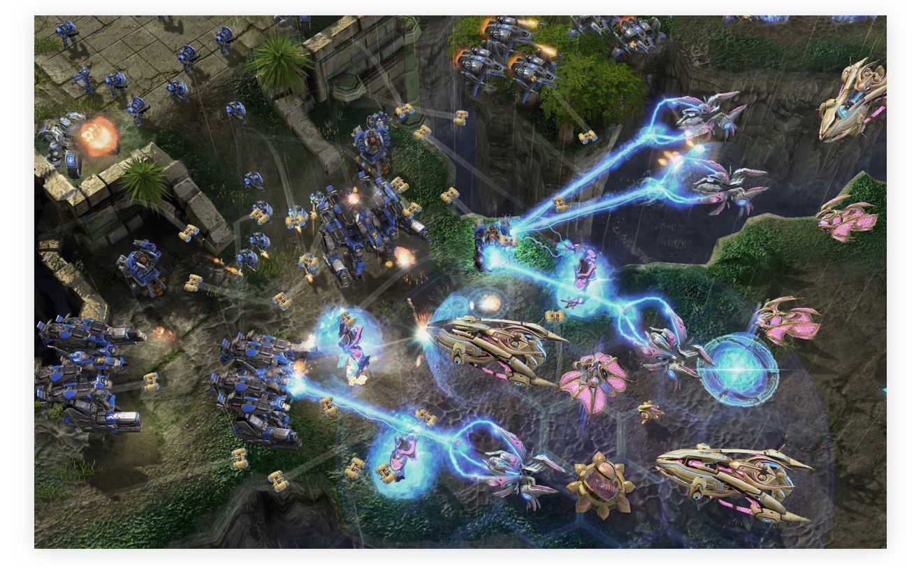
Terrans and Protoss in Starcraft by Blizzard Entertainment are easily distinguishable by shape and color
On the web, you can often see an abundance of styles on the same page, even if elements share similar functionality. Do not repeat that mistake, try to come up with a coherent design guide for your product and do it as early as possible. Come up with distinct interaction patterns where each notification has a unique set of traits: color, shape, animation.
For instance, grey universally signifies neutral interactions, green—positive feedback, and red—errors and warnings. Icons, animations, even screen areas where notifications appear, can be distinct too.
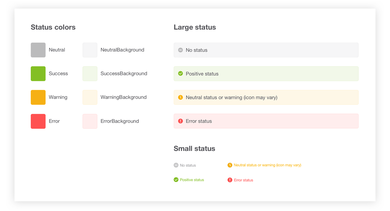
An example of project documentation for our client, eBaymag.com
Document the appearance and behavior of different elements. Follow those guidelines through the project—a user will have fewer chances to get lost. Developers will appreciate it as well.
Ready player one
Almost every game has a competitive element. Even single-player arcades have top player ratings. The psychology behind this is worth looking into.
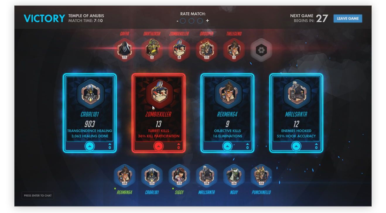
Stats after a round in Overwatch by Blizzard Entertainment. Take a break and reflect on your skills
An American social psychologist Leon Festinger came up with his social comparison theory in 1954: he stated that individuals have the drive to gain self-evaluations, and, in the absence of clear standards, start comparing themselves to others. The most exciting part is that, according to Festinger, you are much more likely to compare yourself to someone whose abilities and opinions resemble yours. On the contrary, if a person is very different from you, you will be less compelled to measure your progress against theirs.
It follows that we prefer to compete with those who are in our own group: age-wise, profession-wise, education-wise, and so on. The closer you get to the “top” of that group, the higher your self‑esteem.
The same theory might be of help when designing a product interface. Try splitting users into pools based on some similarities and compare those pools against each other. It works well for abstract concepts: points gained, calories burned, a score of any kind. If a particular metric brings a user closer to the top, make it stand out.
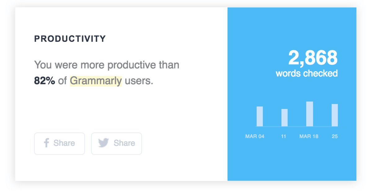
Grammarly sends out weekly emails, highlighting achievements (by comparing you to all other users)
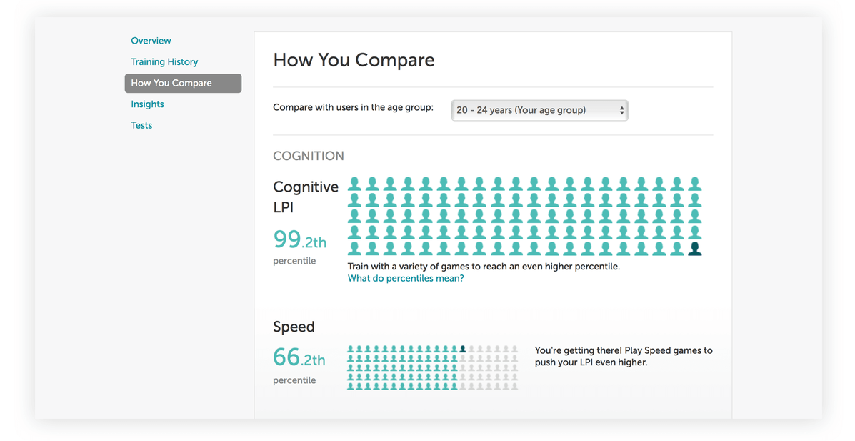
“Brain training” start-up Lumocity shows your stats relative to your age group
HUD settings
How many things can you hold in your head at the same time? An often-cited Miller’s law, named after cognitive psychologist George A. Miller, states that the number of objects that an average human can hold in working memory is seven, plus or minus two. This magic number is also responsible (along with Miller personally) for phone numbers commonly being seven digits long: that’s the limit of our ”digit span“.
Of course, in any game that is complicated enough, there is much more information to display and process. And here chunking comes to the rescue: units of data grouped together are much easier to operate upon. 25101982 looks like a nasty number to remember, but 25.10.1982 makes much more sense. A shopping list arranged by an aisle (dairy, vegetables, fish) is more effective than a single column of items. Take a look at the following screenshot, taken in X-Com 2:
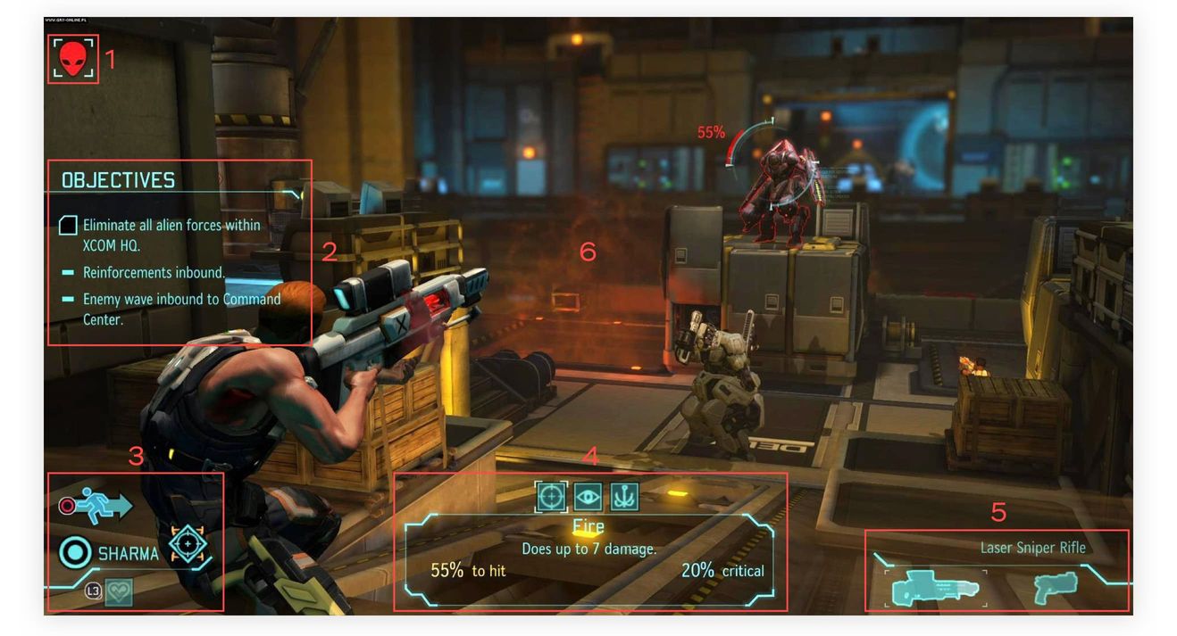
Contents of the screen in X-Com 2 by Firaxis Games and 2K Games can be divided into 6 (still below the magic number!) distinct areas
Weapons, objectives, fight info, player dashboard, target, main gameplay—there are six regions in total, each containing numerous items. Each “chunk” is perceived as a whole and does not clutter the screen or player’s working memory.
The same principle can be applied to all product designs.
Group related elements into “chunks” and watch out for Miller’s law! It is much easier to deal with five clearly defined regions than with a single block of text.
Use spacing to separate the chunks, avoid unnecessary information, and your application will be a joy to use.
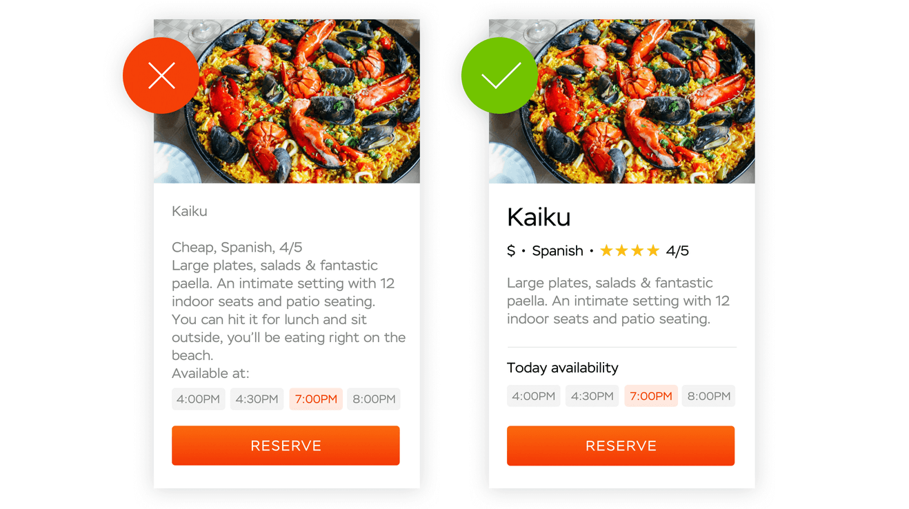
On the left: text looks monolithic and makes it hard to discern important information. On the right: relevant pieces of information are chunked and grouped together
Play on the go
Game designers know how to take advantage of different platforms to make players stay in the game. We spend hours behind a PC or a console, and once we go about our own business, we can kill a little more time by turning to a smartphone screen or a portable gaming system and picking where we left off. Different platforms mean different playing styles and different sets of controls: PC has a keyboard and a mouse, consoles have gamepads with a limited amount of buttons, smartphones employ touch controls and sensors. VR headsets give us a 360° view on the game world. All that possibilities (and limitations!) require different approaches to UX.
The Need For Speed franchise is a good example of gameplay adjusted to a platform. When playing on PC, clickable elements are located in screen corners, where they are easy to reach with a mouse. W, A, S, and D keys control the movement. There is an evolved storyline to follow.
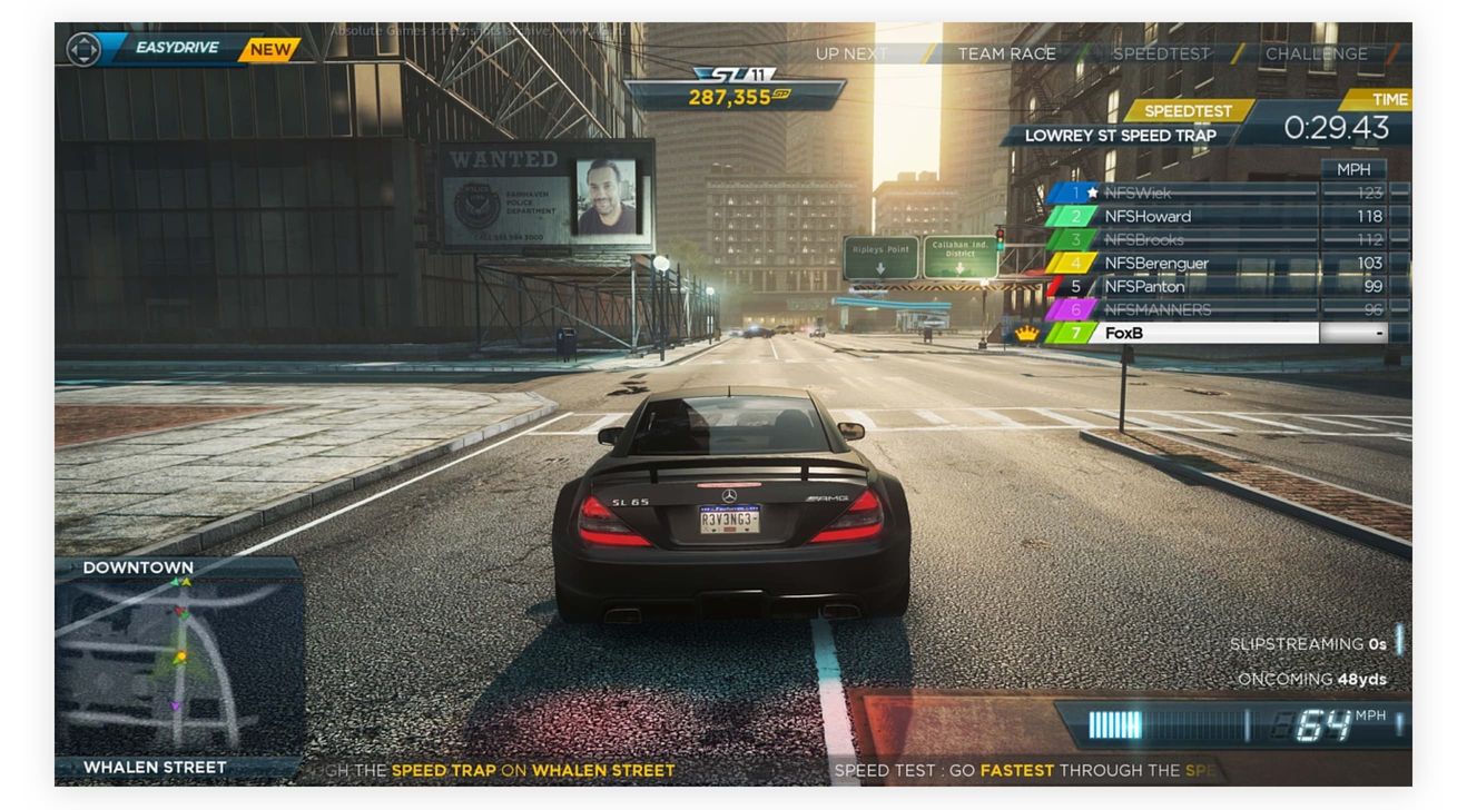
Need for Speed Most Wanted by Criterion Games and Electronic Arts on a PC
On a smartphone screen, Need For Speed developers fight for space. Menus look simpler and contain larger items. Essential information shifts towards the bottom of the screen which is the most accessible zone on a smartphone. The movement can be controlled either with an accelerometer, by tilting a phone, or by tapping large areas on the sides of the screen. The plot is reduced and gameplay centers around a quick race—ideal for short breaks.
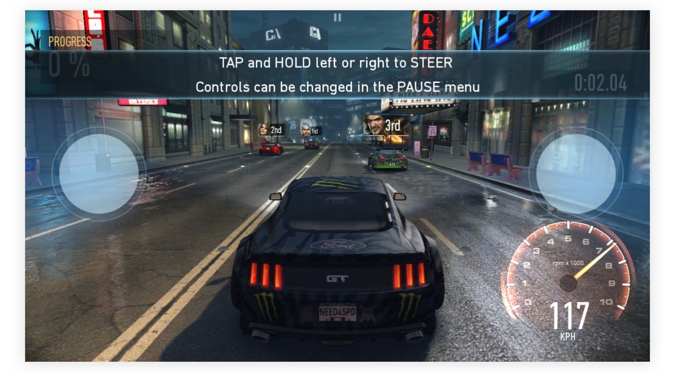
Need for Speed No Limits by Firemonkeys Studios and Electronic Arts on an iPhone
But what about our product? We can study how users interact with it on different devices and in various life settings.
A user behind a laptop or a desktop screen is more focused and is willing to spend more time on your product. On mobile, quick access to most important features is essential, as the interaction time tends to be short.
Don’t forget about the “physics” of each platform: on mobile, links and buttons should be easy to tap and should not rely on hover. If you want users to interact with your app on a giant screen (through Apple TV or Chromecast)—don’t make them squint to make out finer details. Use all means that a platform gives you, do not just “resize” your interface to fit on different screens.
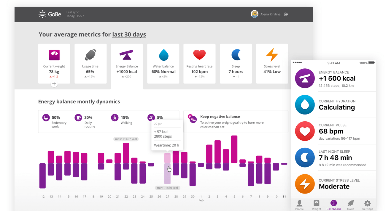
GoBe health-tacker dashboards display different kinds of information on different devices
While designing dashboards for GoBe health tacker at my old place of work, I took into account not only how different platforms look like, but also how users interact with them. Mobile version gives users instant stats, a website allows to examine data in greater detail.
No lives left? Buy a set of 5
Only big budget games can charge a hefty amount for a download. Smaller and independent studios rely on in-game purchases. We can divide them into three categories: consumables, durable goods, and subscriptions.
Consumables are required to progress through a game quicker. You can play Harry Potter: Hogwarts Mystery leisurely, waiting for your “energy” to recharge and allow the next move, or you can stock up in advance by spending real money and play without interruptions.
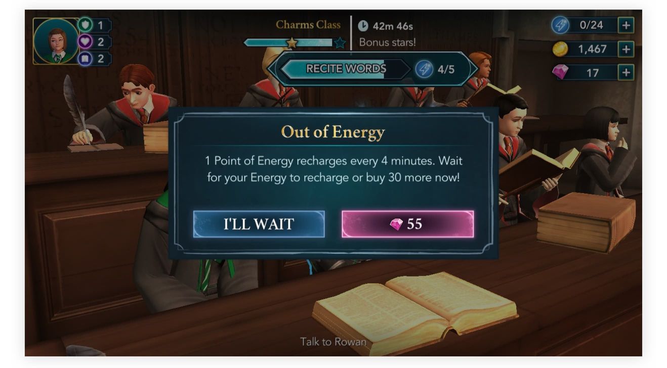
Harry Potter: Hogwarts Mystery by Jam City. Wait a couple of hours or buy your next turn
Durable goods are more popular in MMORPGs: you can buy your next level, next weapon, a rare magical item, or an entirely different character. Have you seen my new shiny space shuttle that I spent my hard earned dollars on? Lo and behold!
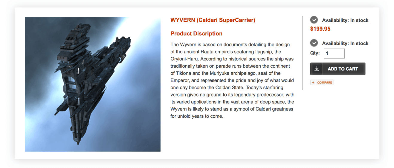
You can spend your salary in Eve Online by CCP Games and Simon & Schuster
Another model is subscription-based: you get a free trial period and then pay a set amount periodically to keep playing. Or pay even more and unlock premium features!
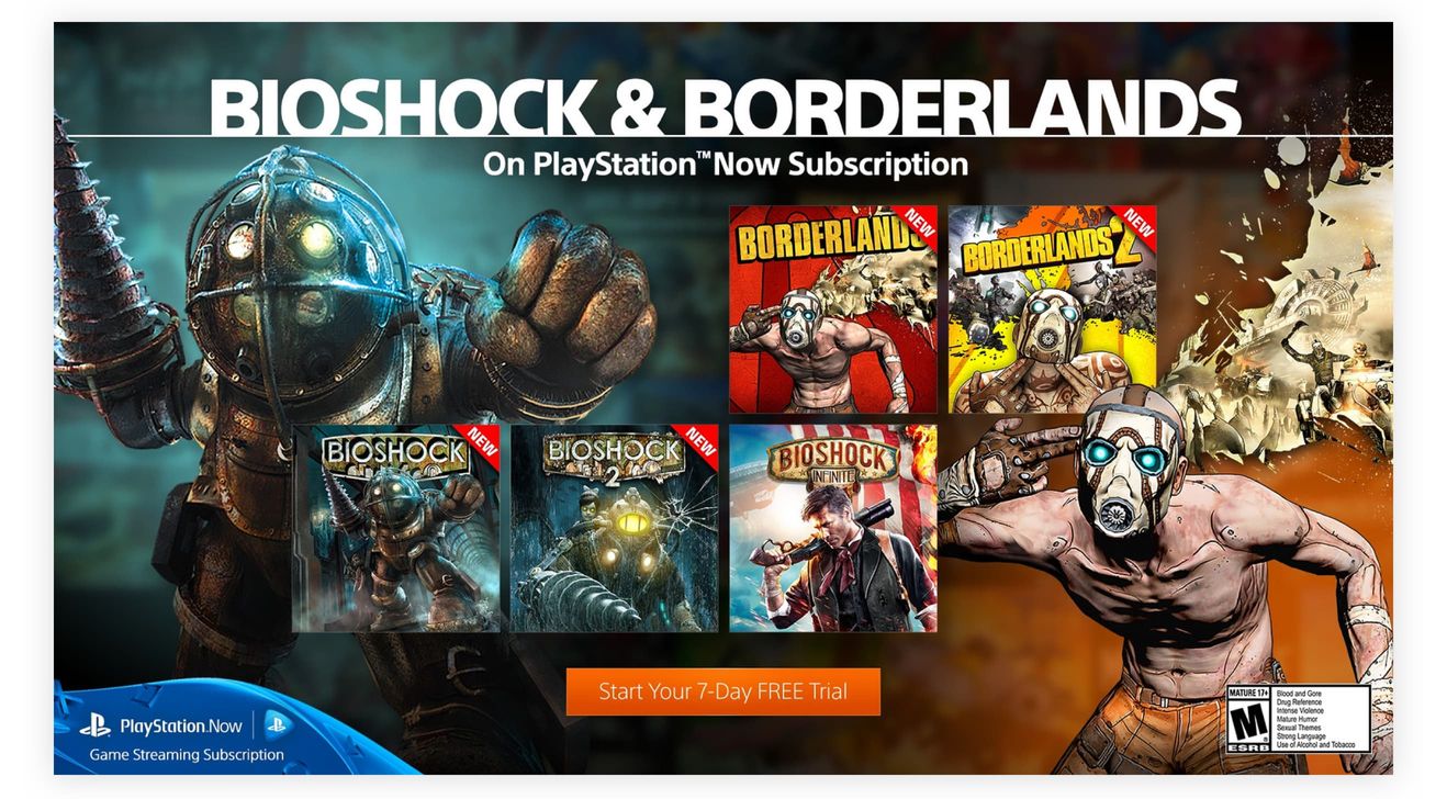
Try playing Bioshock by Irrational Games, 2K Australia, 2K Marin and 2K Games or Borderlands by Gearbox Software, 2K Australia and Telltale Games for a week and refrain from subscribing
In a dog-eat-dog world of web start-ups, it is hard to get users by requesting them to pay upfront.
You have to either rent out valuable screen space for ads that annoy people or come up with a pricing model as described above.
In my opinion, Tinder is an excellent example of an app that had nailed pricing. Installation is free, as well as the complete core journey: swipe, match and talk. However, if you are looking for more, Tinder Plus and Tinder Gold promise to expand your experience by offering unlimited likes, an ability to “travel” to different countries without ever leaving your room, or even to see who have “liked” you first.
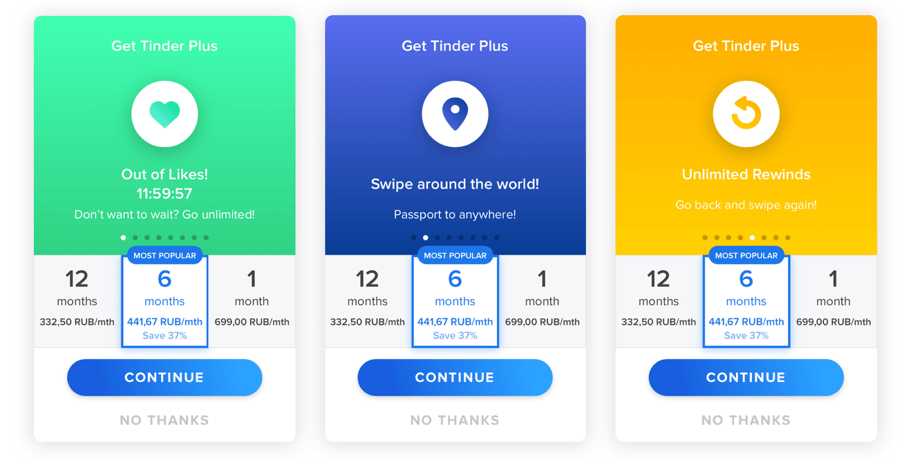
Feeling lonely? Out of likes? Few dollars a month could fix that!
The key to a successful purchase is a timing of the offer. Tinder will ask you to upgrade the moment you ran out of likes. This is a valuable lesson to be learned—only show an offer when a user really needs it.
Game’s not over
There is a lot more inspiration waiting to be discovered in video games: keep playing and keep your eyes peeled for clues! Of course, we don’t urge you to turn your banking application or accounting software into a MMORPG, but the success of gaming titles is based on years of trial and error in usability practices. Safely borrow those tricks and make your product stand out from the competition.
Thank you for reading! I am an interface and user experience designer who has recently found a new home at Evil Martians. Feel free to ping me on Twitter if you have any questions or suggestions regarding my article. If you want to talk about your product’s design—swing by our contact page. If you found this text useful, don’t hesitate to spread the word!
