New home for Logux: Pouring love into an OSS documentation website

We saw building a documentation website for Logux, our ambitious open source project, as a chance to throw all preconceptions (and JavaScript frameworks) out of the window. We strived for a fresh UX for our users and a novel DX for ourselves. Our decision to start from scratch with an open mind paid off: we achieved a 17 KB page weight and a Lighthouse score of 100. This post is a collection of bite-sized assorted tips that you are free to borrow for your project.
Logux promises to change the way developers build offline-first web applications by introducing a novel approach for a client and a server to synchronize application state through the concept of append-only action logs. It promises to replace a standard AJAX/REST or GraphQL approach that makes accounting for non-perfect mobile connections incredibly hard.
However, this post is not about Logux itself—it is about building a place on the web where you can learn about it. No open source initiative can succeed without a good documentation website, so we needed to build one for ourselves.
We believe that putting some love into online documentation, even if in essence, it’s just a Markdown wrapper, will help to build a more engaged community.
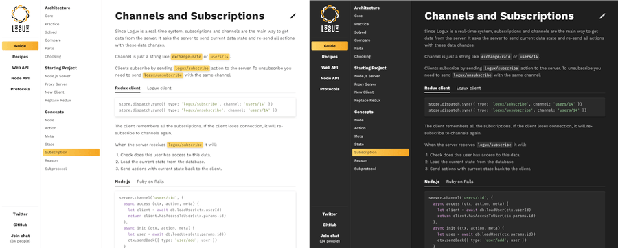
Light and dark themes for the website
Our experiments in performance brought us a perfect score of 100 in Lighthouse. Of course, Lighthouse is not the only metric you should trust. The best way to check if your website is performant and user-friendly is to grab a low-end smartphone, go to the subway with a bad cellular signal, and try to load a page.
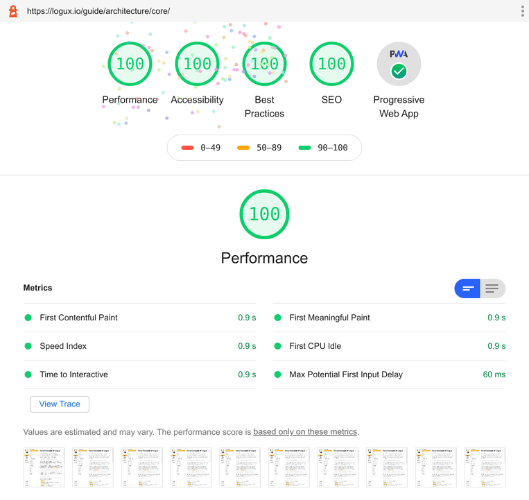
Lighthouse score for Logux website: 100 for performance, accessibility, best practices, SEO, and PWA
Building a visual identity
I believe that visual identity is as important for open source projects, as it is for commercial products. It allows your users to develop a stronger sense of attachment to your values.
Logux visual identity is based on my admiration for various scripts (as in “human language writing system”, not JavaScript). My colleague Anton Lovchikov created a fantastic logo that subtly references a circular writing system from the Arrival movie. We used the free Kurbanistika font by Misha Priemyshev, which also reminds us of a Vyaz, an ancient Slavic writing system.
Aljona Kirdina made a design for the website. Her main focus while working on both color themes—light and dark—was keeping a good text contrast.
Providing a place for discussion
Logux is still a young project, and its documentation is mostly a work in progress. That is why it was especially important to give users a place to talk in real-time. Gitter turned out to be a hit in the PostCSS community, so we decided to adopt if for Logux too.
In contrast with Slack, where getting into a workspace is far from an easy task, in Gitter, you can join a chat and ask your question in just a few clicks. You don’t need to have an invitation page and a separate login/password for each project. All you need to do is to sign-in through GitHub or Twitter, and there is a high chance that people interested in your open source are already on GitHub or Twitter.
The ultimate killer feature of Gitter is a Gitter Sidecar, a JS library to integrate a chat directly into the web page.
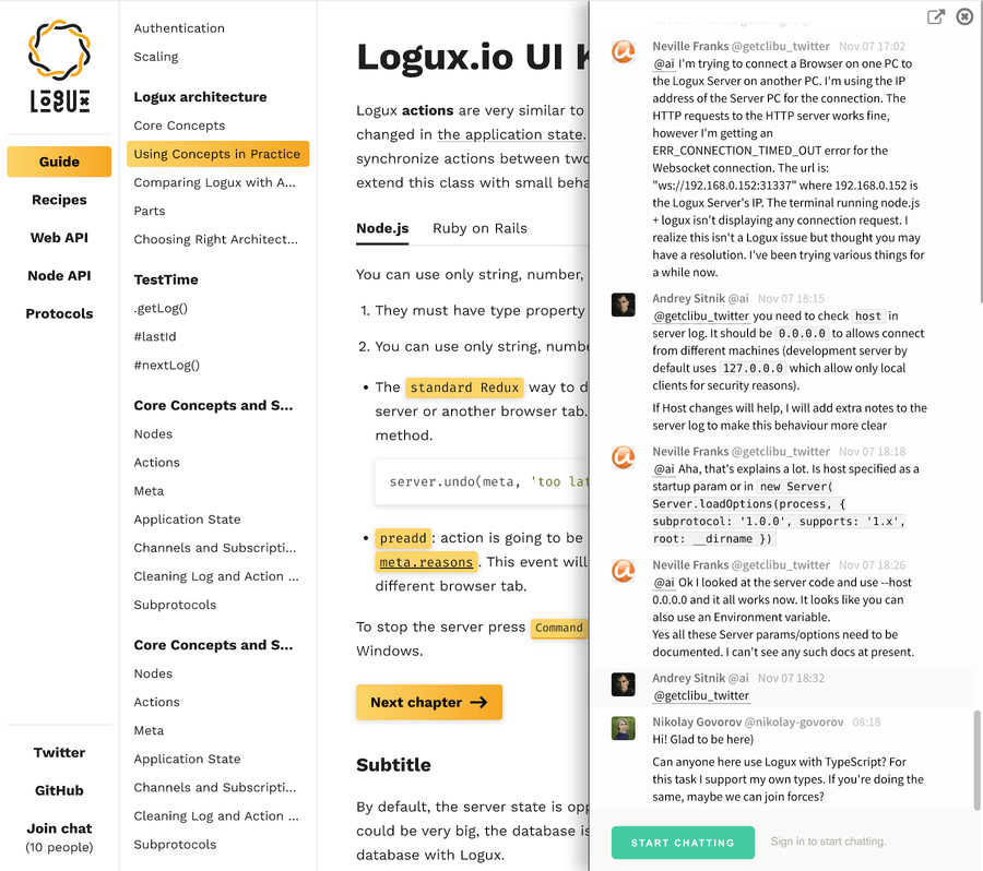
Gitter chat widget on Logux website
logux.org is a static website, but we still want users to know that the chat is alive (I answer most of the requests in about an hour). At the build stage, we request a current number of active users and bake it into the page:
function getChatUsers () {
  let room = await callGitter(`rooms/${ process.env.GITTER_ROOM_ID }`)
  return room.userCount
}
Making navigation a no-brainer
We also decided to avoid a popular pattern of a separate top and side menus for navigation. On logux.org, everything is combined into a single two-level side menu. This approach also allows us to save considerable space on mobile.
The design by Aljona (check out the layout CSS here) allowed us to put more elements on the top level and describe the project with top-level menu items. For instance, “Web API”, “Node API”, “Ruby API” describe frameworks that we support, so users can immediately focus precisely on the integration they need.
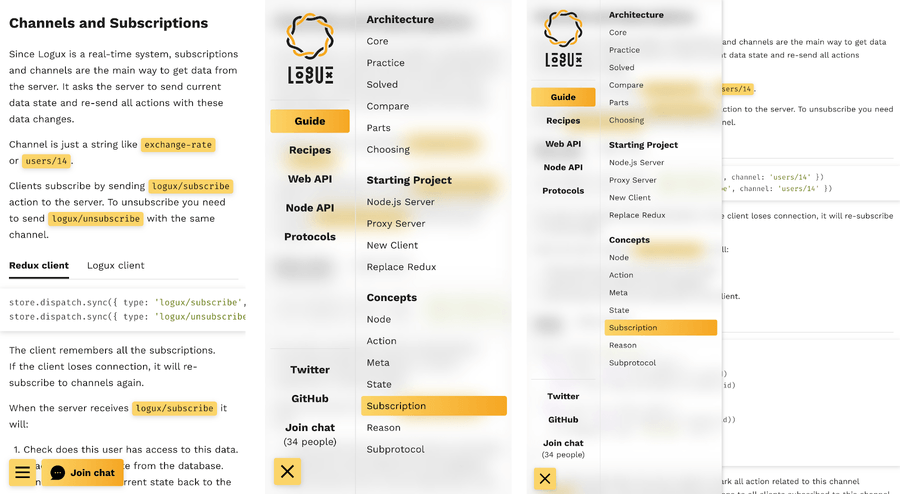
On mobile, we opted for a smoked-glass effect
And here’s some simple CSS code for a smoked-glass look on mobile:
.layout_aside {
  position: fixed;
  top: 0;
  bottom: 0;
  left: 0;
  z-index: 2;
  width: 450px;
  background: var(--base-panel);
}
@supports (backdrop-filter: blur(15px)) {
  .layout_aside {
    background: transparent;
    backdrop-filter: blur(15px);
  }
}
Another UX idea was to avoid having different sets of docs for different frameworks. We opted for tabs inside code examples.
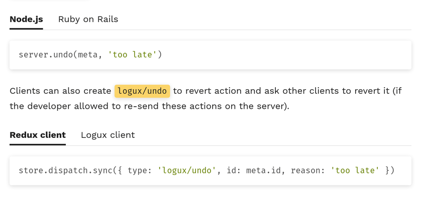
You can try out tabs on Channels and Subscriptions page to see what we mean. If you choose “Node.js”, a tab will remember it, and all further examples will show code for Node.
Inside the JS implementation of the tabs, you will find scrolling position lock, keyboard navigation for accessibility, and saving the selected language to localStorage.
Custom code highlighting and improved a11y
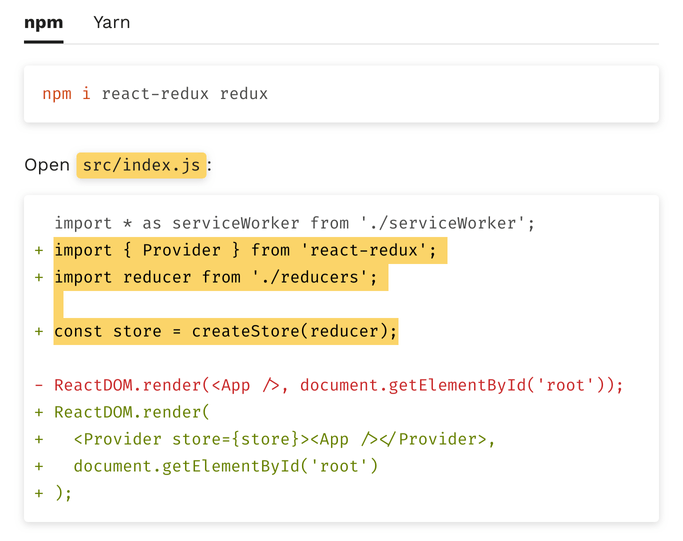
Custom code highlighting for INI, bash, and diff is another UX detail. In console examples, we highlight tool names, popular commands, and arguments. As a small touch, copying diffs will exclude + or −.
Of course, we take special care for accessibility.
- All interactive components have visible
:focusstyle. - Good keyboard navigation, even for non-standard components. For instance, we use this great guide by W3C to make accessible tabs with extra JS.
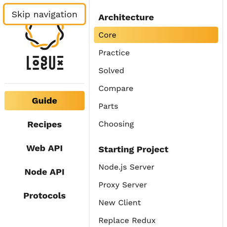
- Invisible “Skip navigation” button for screen readers.
Seamless theming
Modern operating systems allow for easy switching between dark and light modes: either manually or automatically. macOS now can automatically enable dark mode after sunset. Android enables dark mode on low battery. Throughout the day, a user can switch between different system themes for a number of reasons. That is why it is important to account for a system-level dark mode instead of focusing on the manual theme switcher. On Logux, we rely on a media query to set a theme, so it is always synchronized with a system setting:
html {
  --base-black: #1f1f1f;
  --base-text: var(--base-black);
  --base-title: var(--base-text);
  --base-background: #fff;
  --base-panel: var(--base-background);
}

@media (prefers-color-scheme: dark) {
  html {
    --base-text: #bbb;
    --base-title: #fff;
    --base-background: var(--base-black);
    --base-panel: #2a2a2a;
  }
}
You can add a switcher too, of course, but don’t forget to account for three possible positions: auto, enable, and disable. There exists a special PostCSS plugin to have manual switcher while respecting an OS-level dark theme:
Having an overview of design choices
To spot corner cases in UX and find regressions more easily, we created a separate UI Kit page with all our design choices combined. Whenever we create a new component or find a corner case of combining existing elements—we add it to this page. Now, the designer can use this page to check how their design was implemented, and developers can go there to see if a change code hadn’t broken anything in design.
Serving only the JS we need
Important disclaimer: we love React! A React/Redux application is the primary use case for Logux. React, Preact or Svelte give you a great way to bind your data to DOM and to avoid manipulating DOM by hand, which is extremely useful for big web applications.
For a documentation website such as Logux, pulling the whole library for DOM manipulation into a bundle does not make a lot of sense. We have just a couple of components that need to manipulate the DOM after the initial load, so we are free to write and send only the JavaScript we need to the client.
As a result, our website serves only 2 KB of minified JavaScript (compared to 114 KB with React or 9 KB for Preact):
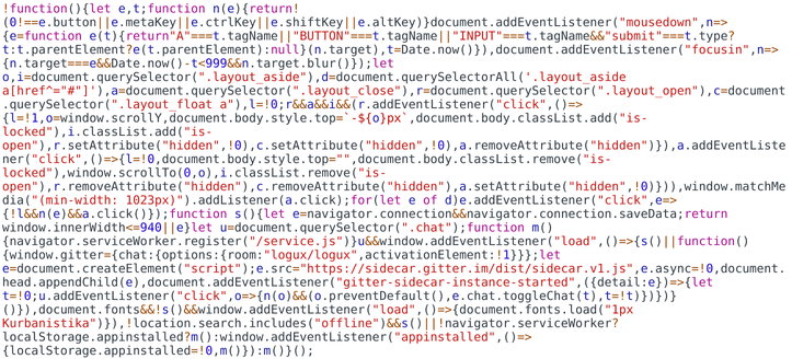
All the JavaScript code that the client will receive in one screenshot
To be fair, our code examples tabs implementation require another 2 KB of JS, but we do not load them on pages that don’t use this feature.
Smooth DX without a framework
JavaScript frameworks are great not only for automatic DOM manipulations (which we don’t need in this project)—they give you the notion of component isolation, and their ecosystem provides great tools for development experience, like Create React App.
We can afford to lose React, but we can’t lose a DX.
That is why we use Parcel. It is a single npm dependency that allows you to call something like npx parcel serve src/index.pug with an HTML template as an argument (we use Pug as template language).
Parcel has everything the big projects need right out of the box: hot-reload, Babel, PostCSS, asset minification, cache busting.
Isolating CSS using only CSS
For component isolation, we use a semantic approach with BEM. We split our UI into small components. Each component has its dedicated directory with JS and CSS files, and Pug template. Switcher is an example of our most complicated component.
CSS classes have a prefix with the component name. We are using the same prefix for CSS Custom Properties.
.switcher_tabs {
  display: flex;
  margin-bottom: var(--text-after);
  color: var(--base-title);
  list-style: none;
  border-bottom: 1px solid var(--base-border);
}
Our JS relies on the same selectors:
let switchers = document.querySelectorAll('.switcher')
for (let switcher of switchers) {
  // Add events to component
}
Prepping for HTTP/2 future
In HTTP/2, we do not need sprites and data:uri encoding anymore. But HTTP/2 is not a solution to every problem. We still have a problem with latency. In mobile networks, round trip time could be up to 500ms.
Latency becomes a problem when we have a chain of resources: browser request HTML, HTML loads CSS, CSS requires images. We will need 500 ms for every step.
To reduce latency we can add <link rel="preload" to HTML page. It will ask the browser to downloads assets.
With postcss-url we get list of images and fonts used in CSS:
let collected = []
let fileCollector = postcssUrl({
  url ({ url }, dir, ops, decl) {
      let media = decl.parent.parent
      if (media && media.name === 'media') {
        // If assets was used in medua query,
        // we need to use this query in preload tab too
        collected.push([media.params, url])
      } else {
        collected.push([undefined, url])
      }
      return url
    }
  })
})
Then we insert preload tags in HTML with Remark (it is like PostCSS, but for HTML).
<link rel="preload" href="/kurbanistika.b6a2a97a.woff2" as="font" crossorigin>
<link rel="preload" href="/fira-code.d2d96802.woff2" as="font" crossorigin>
<link rel="preload" href="/open.6ababf7c.svg" as="image" media="(max-width:1023px)">
<link rel="preload" href="/close.0d7dc742.svg" as="image" media="(max-width:1023px)">
Using service workers for offline experience
Logux website used a service worker to make documentation available offline (for instance, to check the API during the productive hours of coding in the flight).
During the production build, we generate a list of assets and pages and then inline it to the service worker file with Rollup.
In a service worker, we clean cache from old files, download, and cache new files, add the listener to all HTTP requests to use cached files instead of sending a new network request.
self.addEventListener('install', e => {
  e.waitUntil(async () => {
    let cache = await caches.open('v1')
    let files = FILES // Array with files will be inlined by Rollup
    await Promise.all([
      cleanCache(cache, files),
      cache.addAll(files)
    ])
  })
})

self.addEventListener('fetch', e => {
  e.respondWith(fromCache(e.request))
})
The browser will re-install the service worker if the service file has changed. If we update any assets, they will have different cache buster in the name (like /common-f4ab67.css), and the service worker file will be changed too (since it contains an array with all assets names).
But there are no cache busters in HTML page names (like /protocol/ws/spec/). That is why we generate a hash from the content of all HTML files and put this hash at the beginning on the service worker file:
'18b4948c';!function(){const e="1";async function c(e,c){…}}New HTML files will update hash in the service worker. The browser will see the different content and re-install the worker. An install event listener in the service worker will clean the cache from old HTML files and put new versions in the cache.
Saving user’s data (and battery)
We try to avoid loading non-critical JS for users, who may want to save traffic. On mobile and on navigator.connection.saveData, we do not install service worker and avoid loading Gitter Sidecar.
function isSaveData () {
  let connection = navigator.connection
  return window.innerWidth <= 940 || connection.saveData
}

if (!isSaveData()) {
  loadScript('https://sidecar.gitter.im/dist/sidecar.v1.js')
}

if (!isSaveData()) {
  navigator.serviceWorker.register('/service.js')
} else if (localStorage.appinstalled) {
  navigator.serviceWorker.register('/service.js')
} else {
  window.addEventListener('appinstalled', () => {
    localStorage.appinstalled = true
    navigator.serviceWorker.register('/service.js')
  })
}
That logic is a bit different for a service worker. With appinstalled, we can track when the user installed the website as PWA to the home screen. In this case, we install the service worker anyway and add a flag to localStorage to enable a service worker on the next visits.
Setting up the CI
We use GitHub Actions to test and deploy our website.
For deploy we:
- Install dependencies with
yarn install --production. We keep all dependencies to build a page inpackage.dependenciesto avoid installing ESLint and such frompackage.devDependenciesand avoid security risk on build servers. - Build static files.
- Build a Docker image with nginx and custom nginx config with redirects and headers.
- Run this Docker image on Google Cloud Run.
We put Cloudflare in front of Google Cloud Run to enable CDN for assets and latest performance techniques like HTTP/3 and TLS 1.3 with RTT-0.
We can also recommend Mozilla Observatory to test your HTTP headers for security best practices.
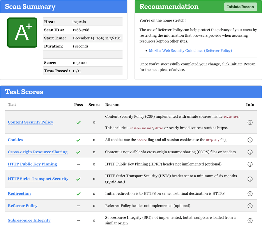
Lighthouse CI is great in keeping website performance from regression. Here’s how we run it as a separate audit step in our deploy.yaml GitHub Actions workflow.
audit:
  runs-on: ubuntu-latest
  needs: deploy
  steps:
    - name: Check out the repository
      uses: actions/checkout@master
      with:
        fetch-depth: 1
    - name: Warm CDN
      run: wget --page-requisites https://logux.org
    - name: Audit website
      uses: treosh/lighthouse-ci-action@master
      with:
        runs: 3
        temporaryPublicStorage: true
        configPath: ./lighthouserc.json
    - name: Save results
      uses: actions/upload-artifact@v1
      with:
        name: lighthouse-results
        path: '.lighthouseci'
In lighthouserc.json, we specified limits, and CI would be failed if the website became slower.
Pinning down the size of the bundle
In addition to long and complex Lighthouse CI metrics, we have a fast and simple Size Limit to keep the size of the website under control.
In our package.json, we specify our desired size limits:
"size-limit": [
  {
    "path": [
      "dist/uikit/index.html",
      "dist/*.woff",
      "dist/*.svg",
      "dist/*.js",
      "dist/*.css",
      "!dist/service.js",
      "!dist/logo.svg",
      "!dist/logotype.svg",
      …
    ],
    "limit": "17 KB"
  }
],
Only 17 KB for the whole page with all assets!
We put a lot of love into logux.org, building our website with an open mind and questioning every architectural or tooling choice from the point of view of UX, DX, and end-user performance. If you don’t find anything you can borrow among those (admittedly not very well-organized) notes—feel free to browse the source code for inspiration.
Put your use case before popular trends, and don’t be afraid to experiment!
