Everything you always wanted to know about implementing scrolling but were afraid to ask. We have scrolled to the bottom of modern web specifications to take you on a whirlwind tour of latest CSS and JavaScript features that make navigating around a single page smooth, beautiful and less resource-hungry.
Most of the web pages do not fit on a single screen, so the ability to scroll information is taken for granted by all users. For frontend developers and UX designers, though, implementing scrolling experiences that work well across browsers, fit nicely into a design, and still perform well, can be a challenge. With web standards evolving faster than ever, coding practices often lag behind. Read on to revisit some common corner cases for scrolling and check if the solution you are using have been replaced with something more elegant.
The curious case of a disappearing scrollbar
Over the past thirty years, a scrollbar’s appearance kept changing, responding to design trends. Colors, shadows, shapes of arrows, the radius of borders—interface designers experimented with everything. Here’s how the journey looked like on Windows:
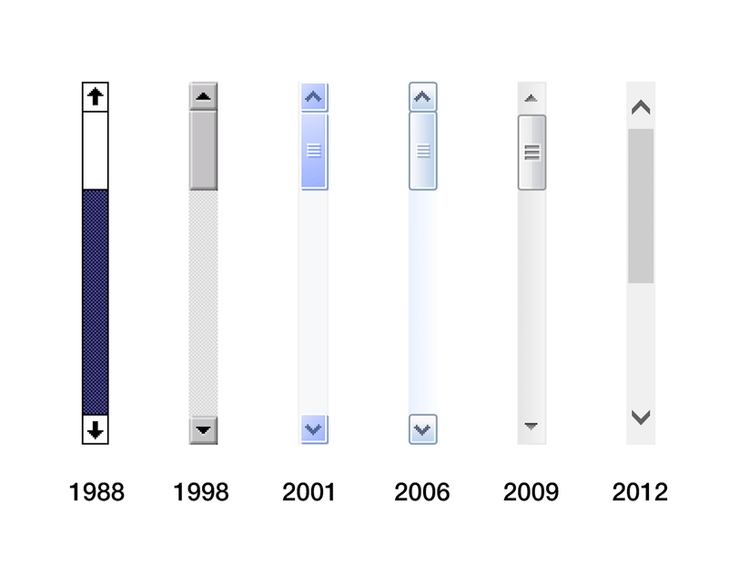
Scrollbars in Windows
In 2011, Apple’s interface designers, taking clues from iOS, had put a definitive end to all attempts to “beautify” a scrollbar. The ubiquitous design element had just disappeared from all Macs. It no longer takes any space in a static view, only to emerge when a user starts scrolling.
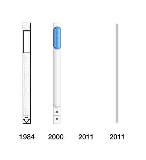
Scrollbars on a Mac
The quiet death of a scrollbar was never mourned by Apple folk. Users, grown accustomed to the way scrolling is done on iPhones and iPads, have quickly embraced the change and most of developers and designers have thought “Good riddance!” Accounting for a scrollbar width had always been a chore.
However, we still live in a world with multiple operating systems and browser implementations. If you develop for the web, as we do, you cannot just push the “scrollbar question” aside.
We are going to show you some tricks that can make a scrolling experience more pleasant for your users.
Hide and scroll
Let’s take a classic example of a modal window. When it opens up, the main content of the page should be stopped from scrolling. There is a quick way to do that in CSS:
body {
  overflow: hidden;
}
But that code leads to an unpleasant jittery effect, captured below.
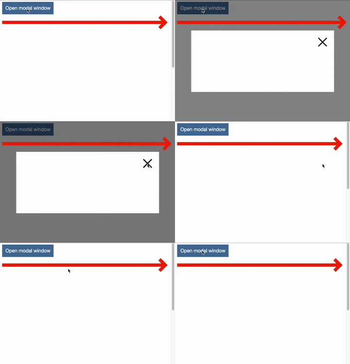
Watch the red arrow
In this example, a scrollbar on a Mac was forced to stay visible in System Preferences, for the sake of demonstration (and so we could relate to the experience of Windows users).
How do we solve this problem? If we know the scrollbar’s width, we can add an offset on the right of the main page every time the modal window opens.
But the width is not easy to guess, as different operating systems and browsers set it differently with Mac being the most consistent (15 px, no matter the application), and Windows letting developers go crazy:
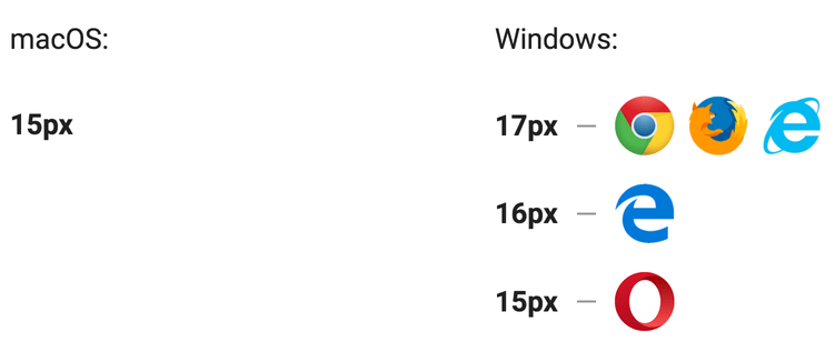
A pixel here, a pixel there…
Note that these measurements only concern the current versions of browsers under Windows. The situation used to be different in earlier versions, and no one knows how this is going to change in the future.
Instead of guessing, you can calculate the scrollbar width dynamically by resorting to JavaScript:
const outer = document.createElement('div');
const inner = document.createElement('div');
outer.style.overflow = 'scroll';
document.body.appendChild(outer);
outer.appendChild(inner);
const scrollbarWidth = outer.offsetWidth - inner.offsetWidth;
document.body.removeChild(outer);
That’s just seven lines of code, but these are lines of code interacting with the DOM. It is better to avoid DOM manipulations, unless absolutely necessary.
Another way to solve the issue is to make a scrollbar stay visible even behind the modal. Here is how to do it with pure CSS:
html {
  overflow-y: scroll;
}
The “jumpy modal problem” is solved, but you are stuck with a disabled scrollbar, which can be a visual sore in your otherwise perfect design.
A better solution, in our opinion, would be to remove a scrollbar altogether. That can also be done with styles. The approach does not replicate the macOS behavior exactly, as the scrollbar does not appear on scrolling: it always remains hidden, but the page stays scrollable. For Chrome, Safari and Opera, you can use this CSS:
.container::-webkit-scrollbar {
  display: none;
}
For Internet Explorer and Edge:
.container {
  -ms-overflow-style: none;
}
With Firefox, unfortunately, you are out of luck: there is no way to get rid of a scrollbar.
As you can see, there is no silver bullet. Every approach that we have described has its pros and its cons. Pick one that suits your project the most.
A fight for appearances
Let’s admit: a default scrollbar implementation in some operating systems is not exactly beautiful. Some designers prefer to have full control over the look and feel of their application, not leaving anything up to chance. There are hundreds of GitHub repositories with custom scrollbar implementations in JavaScript that replace system defaults completely.
But what if you want to customize an existing browser scrollbar? There is no common API, every vendor will let you do different things.
Internet Explorer allows you to mess with scrollbar’s appearance since version 5.5, but you can only change colors. Here’s how to repaint a “thumb” (the part that you drag) and arrows:
body {
  scrollbar-face-color: blue;
}
But playing with colors is rarely enough for complete user experience. WebKit developers understood that and proposed their own way of styling already in 2009. Here’s how you can use -webkit vendor prefix to replicate the macOS scrollbar in any WebKit browser:
::-webkit-scrollbar {
  width: 8px;
}
::-webkit-scrollbar-thumb {
  background-color: #c1c1c1;
  border-radius: 4px;
}
These tweaks are supported on a desktop in Chrome, Safari, Opera, and even on mobile in UC Browser or Samsung Internet. Edge planned to implement it too, but three years after it is still on a backlog with a medium priority.
When it comes to customizing the scrollbar, Mozilla Foundation is an absolute champion in ignoring designer’s needs. A feature request to make scrollbars styleable in Firefox was opened 17 years ago, at the start of a millennium. And it’s only a few months ago that Jeff Griffiths (Director, Firefox Browsers at Mozilla) had finally dignified the thread with an answer:
“I have zero interest in doing anything until there is an actual spec unless someone on the platform teams is interested in prototyping the spec behind a pref.”
To be fair, from the W3C’s standpoint, WebKit approach, albeit well-supported, officially does not exist. An existing draft for CSS Scrollbars specification takes hints from IE: customization stops at colors.
The fight continues, with issues being open begging to support WebKit customizations. If you want to try to influence the CSS Working Group—it is high time to join the discussion. Perhaps, the issue is not the top priority, but the standardized support could make life easier for a lot of frontend developers and designers.
Smooth operator
The most common task that involves scrolling is navigating the landing page. Usually, it is done with an anchor link. All you need to know is an element’s id:
<a href="#section">Section</a>Clicking that link results in a jump to the section, and often UX designers would insist on some sort of animation to make scrolling smooth. There is a plethora of ready-made solutions on GitHub that use more or less of JavaScript, but the same can be achieved nowadays with just one line of code. Since recently, Element.scrollIntoView() from the DOM API takes an options object with a behavior key, enabling smooth scrolling out of the box:
elem.scrollIntoView({
  behavior: 'smooth'
});
But the browser support for options is still quite limited and it is still a script. And extra scripts should be avoided whenever possible.
Luckily, there is a brand new CSS property (still in working draft) that can change the scroll behavior of the whole page with a single line of code:
html {
  scroll-behavior: smooth;
}
Here is the result:
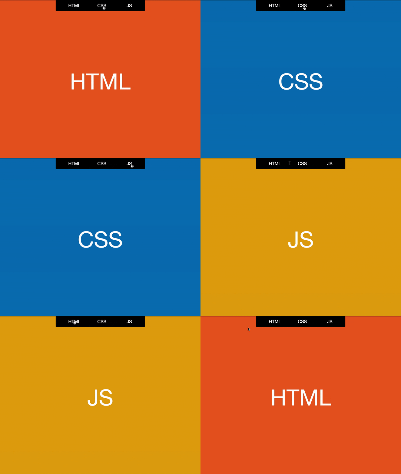
Jumping from one section to another
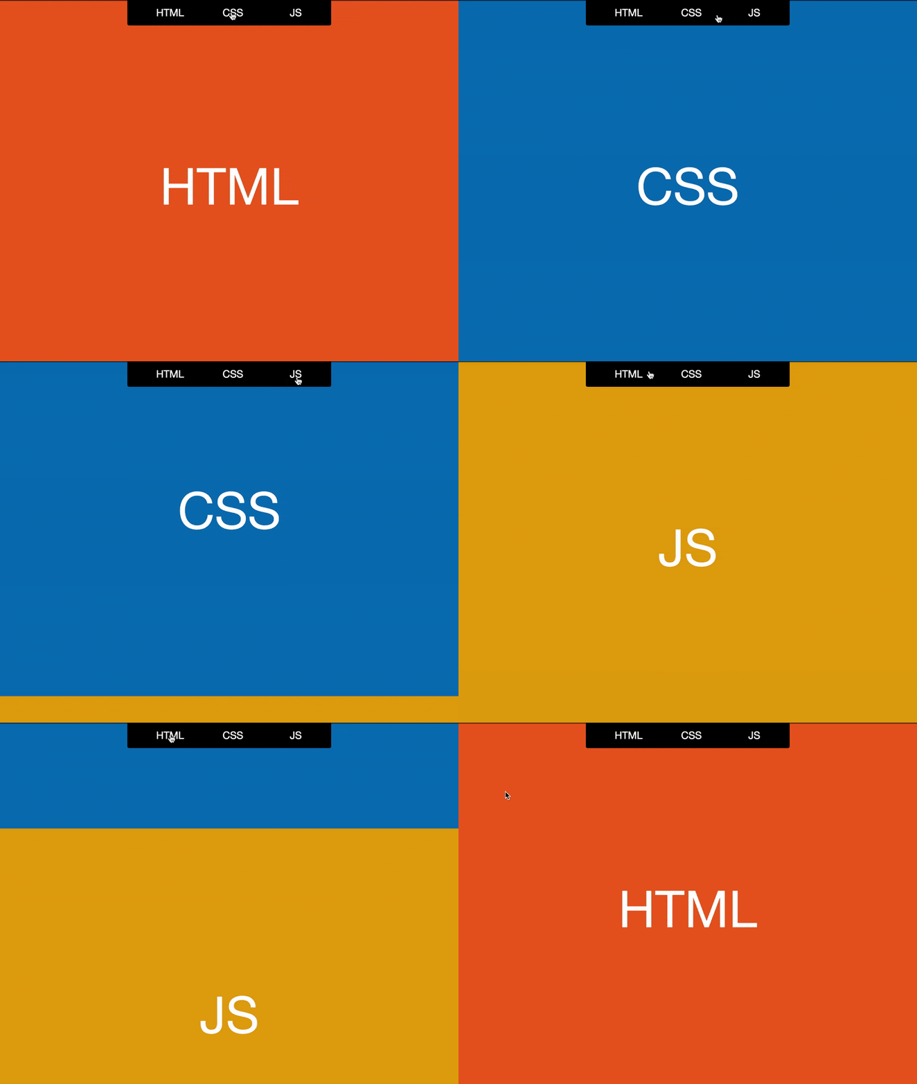
Scrolling smoothly
You can play with the property yourself in this codepen. As of this writing, scroll-behavior is only supported in Chrome, Firefox, and Opera, but we hope it will be universally adopted, as solving the smooth scrolling problem with CSS is much more elegant, and it fits better into the ”Progressive Enhancement” mindset.
Stick to CSS
Another common task is to position an element dynamically depending on scroll direction, the famous “sticky” effect.

A sticky element
In olden days, a “sticky” implementation required writing a complicated scroll handler that accounts for sizes of elements. Attempts to optimize the handler led to subtle delays in “sticking” and “unsticking”, which resulted in jitters. JavaScript implementations also lagged behind in performance, especially when Element.getBoundingClientRect() was used.
Not so long ago, position: sticky property was implemented in CSS. It allows to achieve the desired effect just by indicating an offset:
.element {
  position: sticky;
  top: 50px;
}
The rest will be handled by a browser in the most efficient manner possible. You can test it in this codepen. At the moment of this writing position: sticky is almost universally supported (including mobile browsers), so if you were still handling the issue in JavaScript—it is time to stick to pure CSS.
Full throttle
From the browser’s perspective, scrolling is an event, so in JavaScript you handle it with a standard addEventListener:
window.addEventListener('scroll', () => {
  const scrollTop = window.scrollY;
  /* doSomething with scrollTop */
});
But people tend to scroll a lot, and if the event is being fired too often (and it is fired on every pixel scrolled)—it inevitably leads to performance problems. You can make a browser’s job easier with a technique known as throttling:
window.addEventListener('scroll', throttle(() => {
  const scrollTop = window.scrollY;
  /* doSomething with scrollTop */
}));
Then you need to define a throttle function that will wrap around a listener function and will “pace” its execution by prohibiting it from being fired more than once per the desired interval:
function throttle(action, wait = 1000) {
  let time = Date.now();
  return function() {
    if ((time + wait - Date.now()) < 0) {
        action();
        time = Date.now();
    }
  }
}
To make things smoother, you can couple throttling with window.requestAnimationFrame():
function throttle(action) {
  let isRunning = false;
  return function() {
    if (isRunning) return;
    isRunning = true;
    window.requestAnimationFrame(() => {
      action();
      isRunning = false;
    });
  }
}
Of course, you are free to use ready-made implementations, as in Lodash. Check out this codepen to see a comparison between a solution described above and _``.throttle from Lodash.
It does not really matter which one you pick—just remember to optimize your scroll event handler in some way.
Staying in the viewport
Tricks like lazy loading for images or infinite scrolling require you to figure out if the element has appeared in a viewport. That is also done inside the event listener, with the most common solution being Element.getBoundingClientRect():
window.addEventListener('scroll', () => {
  const rect = elem.getBoundingClientRect();
  const inViewport = rect.bottom > 0 && rect.right > 0 &&
                     rect.left < window.innerWidth &&
                     rect.top < window.innerHeight;
});
The problem with this code is that every call to getBoundingClientRect causes a reflow and an overall performance takes a hit. It is even worse with these calls made inside of an event handler, and even throttling in this case is not of much help.
The issue was handled in 2016 with an introduction of the Intersection Observer API. It allows tracking intersections between an element and any of its ancestors, not necessarily a browser’s viewport. Moreover, you can choose to trigger a callback even if an element has only partially appeared in the view, even by a single pixel:
const observer = new IntersectionObserver(callback, options);

observer.observe(element);
This API is widely supported, but some browsers may need a polyfill. Still, even with a polyfill, it is the best solution so far.
Don’t scroll too far
If you ever had to implement a scrollable pop-up or a drop-down, you must be aware of a scroll chaining problem: after you scroll past the end of an element, the whole page starts moving.

Scroll chaining visualized
You can get rid of an “overscroll” either by manipulating the overflow property of a page or by intercepting the scroll on an element and canceling the scrolling event whenever the element’s boundary is reached.
If you choose JavaScript, be sure to handle not the “scroll”, but the “wheel” event which is triggered whenever a user scrolls the page with a mouse wheel or a touchpad:
function handleOverscroll(event) {
  const delta = -event.deltaY;
  if (delta < 0 && elem.offsetHeight - delta > elem.scrollHeight - elem.scrollTop) {
    elem.scrollTop = elem.scrollHeight;
    event.preventDefault();
    return false;
  }
  if (delta > elem.scrollTop) {
    elem.scrollTop = 0;
    event.preventDefault();
    return false;
  }
  return true;
}
Unfortunately, this solution is not very reliable. Also, it can negatively affect the performance.
Overscroll is especially a menace on mobile devices. Loren Brichter has coined a “pull to refresh” gesture in his Tweetie app for iOS, and this trick has taken the UX community by storm: all major players, including Twitter and Facebook, have adopted it.
The problem appeared when the same feature made its way into the Chrome browser on Android, which became a nuisance for everyone who implemented “pull to refresh” in their web apps: if you pull the page down, it causes a full refresh instead of loading more posts.
CSS came to rescue with a new property: overscroll-behavior. It permits to control the behavior on reaching the scroll boundary, dealing with both pull to refresh and scroll chaining, as well as with OS-specific special effects: Android’s “glow” and Apple’s “rubber band”.
Now the problem that is shown in the GIF above can be solved in Chrome, Opera or Firefox with a single line of code:
.element {
  overscroll-behavior: contain;
}
To be fair, Internet Explorer and Edge implement the -ms-scroll-chaining property which controls the scroll chaining, but it does not handle all cases. Luckily, according to this thread, the overscroll-behavior implementation for Microsoft browsers is on its way.
The final touch
Scrolling in touch-based interfaces is a vast topic which merits its own article. However, it deserves mentioning here, as a lot of developers tend to overlook the possibilities.
How often do you see people around you moving their fingers up and down across their smartphones’ screens? That’s right, it happens all the time, and most probably you are doing the same while reading this article.
When moving your finger across the screen, you expect one thing: smooth, uninterrupted movement of content.
“Momentum”, or “inertial” scrolling, pioneered and patented by Apple, quickly became standard UX everywhere and is now wired into our brains in a Pavlovian fashion.
But perhaps you have noticed that while momentum scrolling of the whole page is handled for you by the mobile OS, it goes away when you try to scroll inside of an element on that page. For the mobile user, subconsciously expecting some inertia, it can be quite frustrating.
There is a CSS solution for that, but it is more of a hack:
.element {
  -webkit-overflow-scrolling: touch;
}
Why is it a hack? First of all, it only works with a vendor prefix. Secondly, it only works for touch devices. And finally, if browsers don’t support this functionality, maybe we should just leave it at that? Anyway, there is a solution, and you are free to use it.
Another point to consider while developing scrolling experiences on touch devices is the browser’s performance when handling touchstart or touchmove events. The problem is described in full here. In short, modern browsers, though knowing how to handle smooth scrolling in a separate thread, will still wait, sometimes for up to 500ms, for results of handlers placed on these events, to prepare for possible cancellation of the scroll with Event.preventDefault().
Even an empty listener that never cancels anything can have a significant negative effect on performance, as the browser still expects preventDefault to be called.
To explicitly tell the browser that it should not expect an event to be canceled, a somewhat obscure feature exists in WHATWG’s DOM Living Standard. Meet Passive event listeners that enjoy quite a generous support: the idea is to pass an optional object argument to the listener that tells the browser that the event taking place can never be canceled. Calling preventDefault inside such a handler will do nothing:
element.addEventListener('touchstart', e => {
  /* doSomething */
}, { passive: true });
There is also a polyfill to make up for browsers which are not supported. The effect of this improvement is clearly demonstrated in a video.
If it ain’t broken, why fix it?
In the modern web, relying heavily on custom JavaScript to achieve identical behavior for all clients is no longer justified: the whole idea of “cross-browser compatibility” is becoming a thing of the past with more CSS properties and DOM API methods making their way into standard browser implementations.
In our opinion, Progressive Enhancement is the best approach to follow when implementing non-trivial scrolling in your web projects.
Make sure you can provide the best possible minimal, but universally supported UX, and then improve with modern browser features in mind.
Whenever necessary, use polyfills, as they do not create dependencies and can be easily removed once the necessary support has arrived.
Six months ago, when this article was just an idea, some of the properties we have described were introduced only in a couple of browsers. By the time of the publication, they were almost universally supported.
Maybe even now, while you were scrolling through this article, another browser has shipped support for a property that will make your life easier, and your bundle size smaller.
Thank you for reading! Read browsers’ changelogs, participate in proposal discussions to move web standards into the right direction, and smooth sailing scrolling to everyone!


