Vibecoding tools can learn from design UX and win over everyone


For developers working on vibecoding tools, the only way to become profitable is to actually ditch the “vibecoding” paradigm and refocus on developing “the ultimate creation tool”, cracking open the mass consumer market in the process. We can look to the world of design for 5 insights and solutions that can make this happen.
Can you remember how word processing changed when the UI became WYSIWYG? Before: frustrating trial and error to get documents right. After: anyone could create professional documents visually. This breakthrough enabled tools like Word to reach billions of people.
Similarly, at present, vibecoding tools are great for prototyping, but fine-tuning is a hellish experience. Users burn tokens trying to perfect the details, or need to manually edit code (which most users can’t or won’t do).
Ultimately, the design experience is the weak point. Luckily, design tools have given us the answers we need multiple times over the years. Let’s look at the patterns that I think would work best.

Hire Evil Martians
At Evil Martians, we understand how to leverage AI to enhance developer tools!
1. Treat design as a tab-worthy, first-class citizen
A friend of mine—a streamer who is completely non-technical—wanted to create a custom bingo game for his streams. I showed him Bolt. Within hours, he had something working. The guy was amazed.
…but then came the design part.
All the memes, the specific vibe he wanted and the tiny details that would make the project his own, turned the job into a frustrating slog. I had to jump in and help him to get things looking right. Still, even with my help, he told me it was a magical experience.
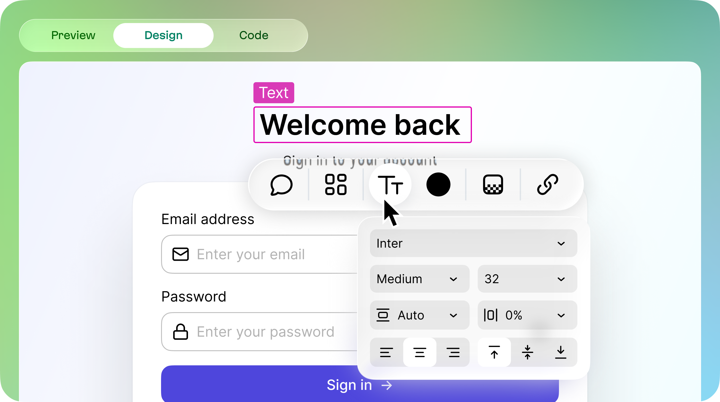
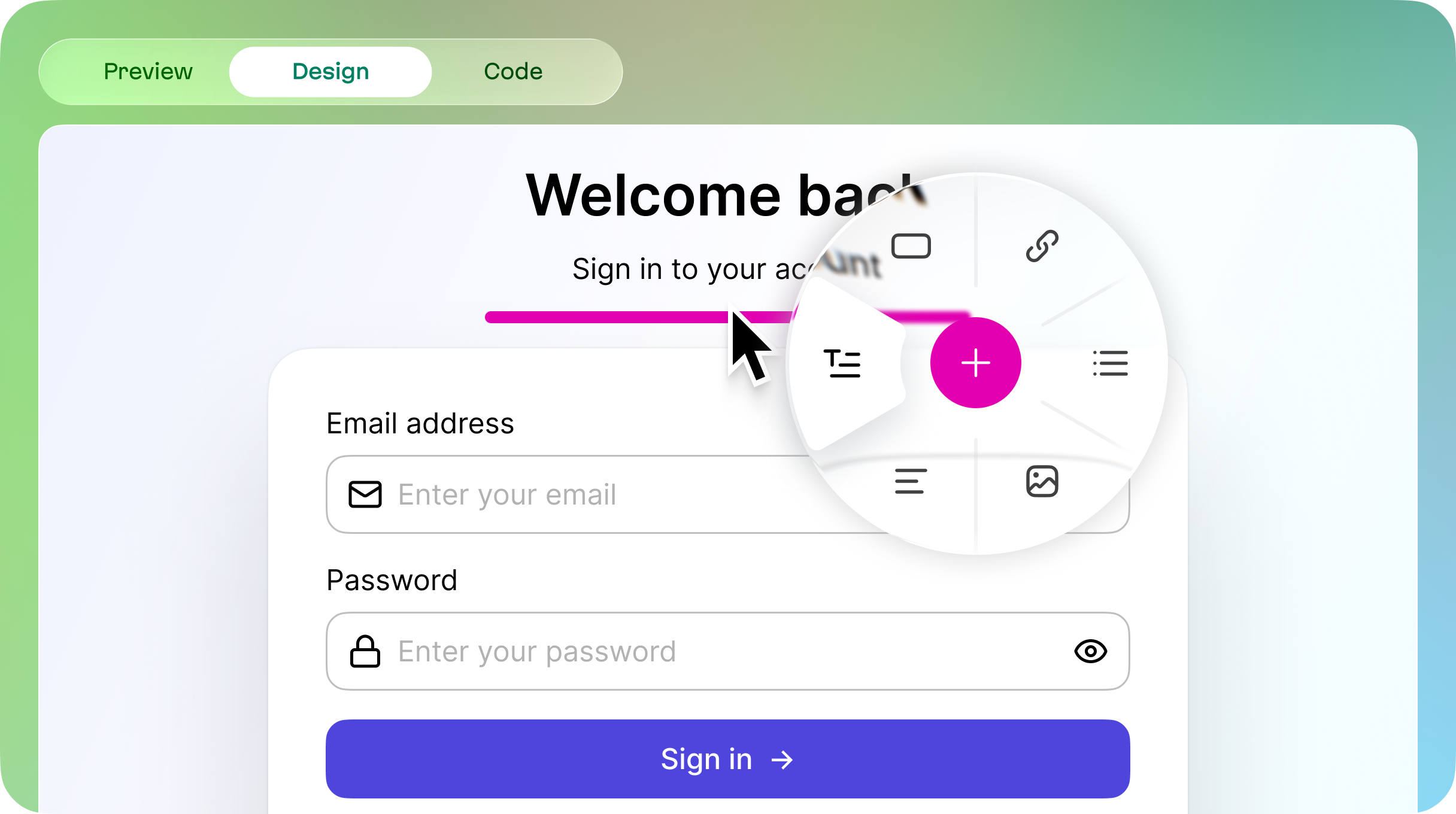
This is the gap: code generation works but design fine-tuning doesn’t. That’s exactly why we need to treat design as a first-class citizen. This means placing a “Design” tab right alongside “Code” and “Preview”:

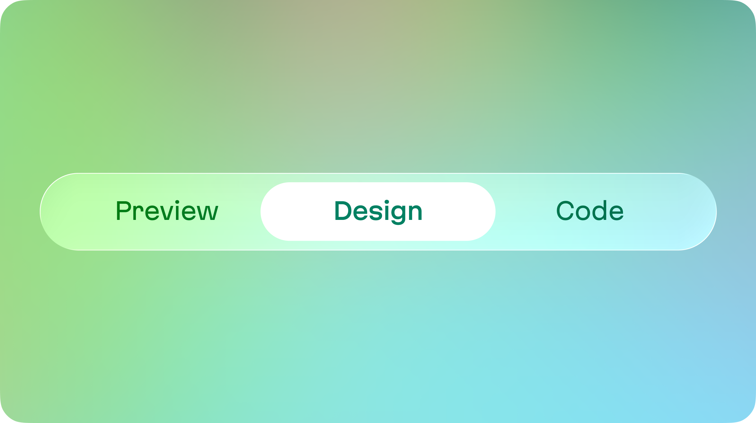
A design tab alongside code and preview
Ideally, this tab would be where users could switch to a ‘fine-tuning’ mode, and would be free to edit without the distraction of AI chat. Still, if for some reason chat is needed, it could easily be opened simply by hovering closer to the left side.
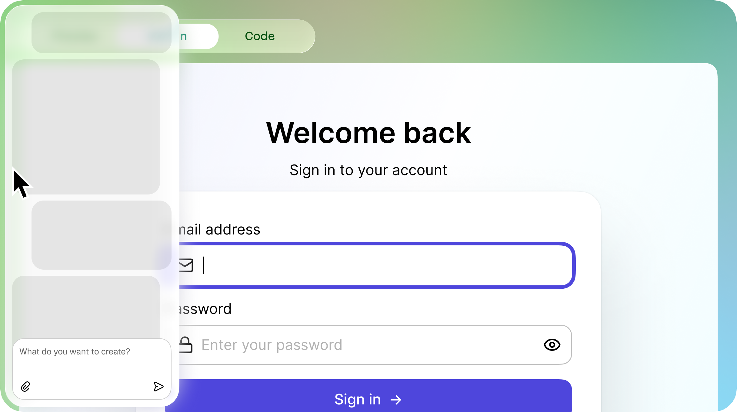
In this Design mode, chat can be opened by just simply hovering closer to the left
This would be a place where users could fine-tune and improve the product to their liking without spending many (if any) tokens.
2. Simple inline editing that’s contextual and streamlined
Vibecode tools do not need to be design tools and they do not need to be Figma 2.0. Complexity, too many things to control, and bloated sidepanels will not help gracefully grow the audience; they are more likely to scare them away.
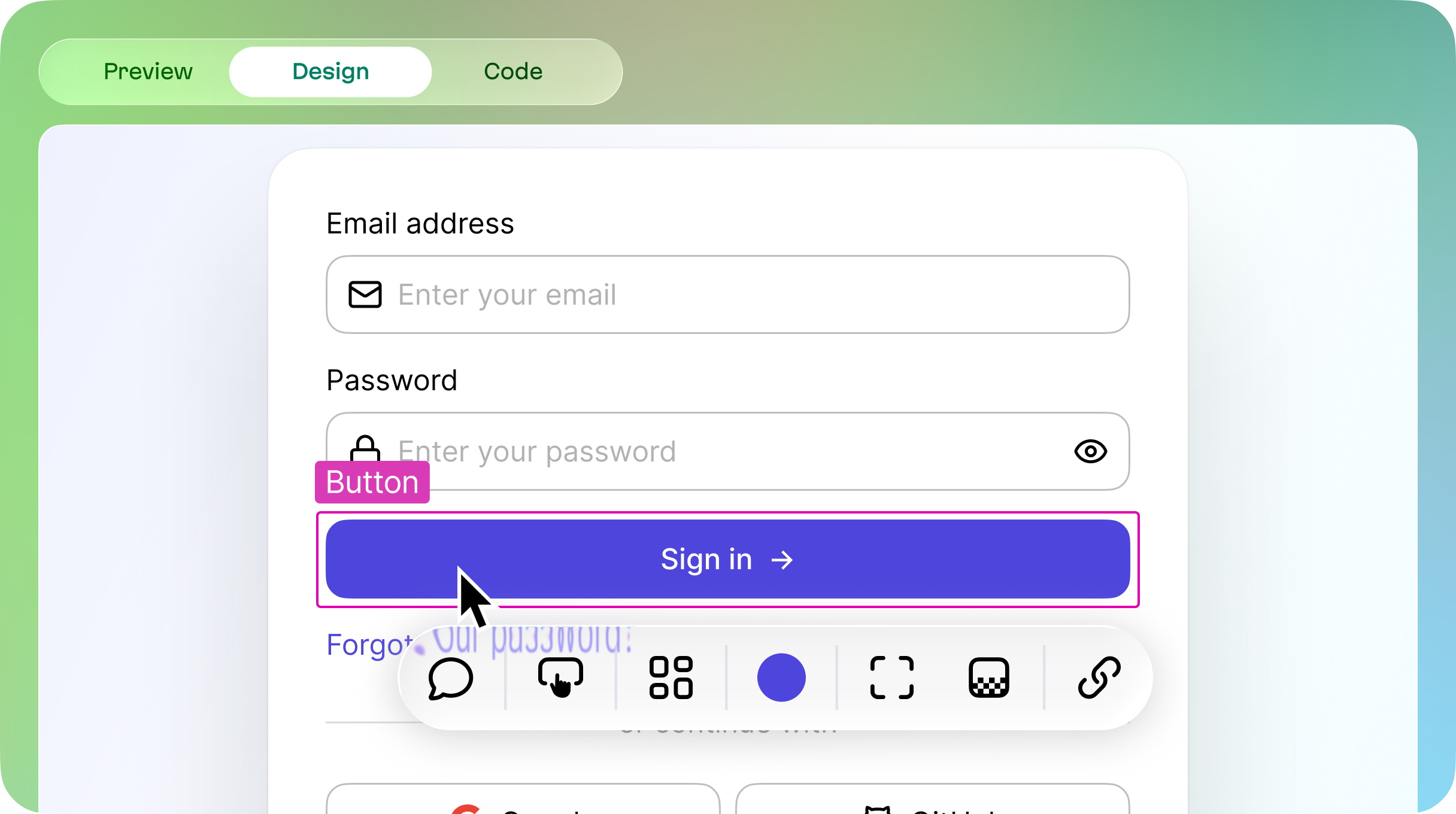
Instead, vibecode tools have the chance to do something design tools have always dreamed about, but couldn’t: be very simple and minimalistic! In that spirit, the essential part of any “Design” tab should be inline editing.
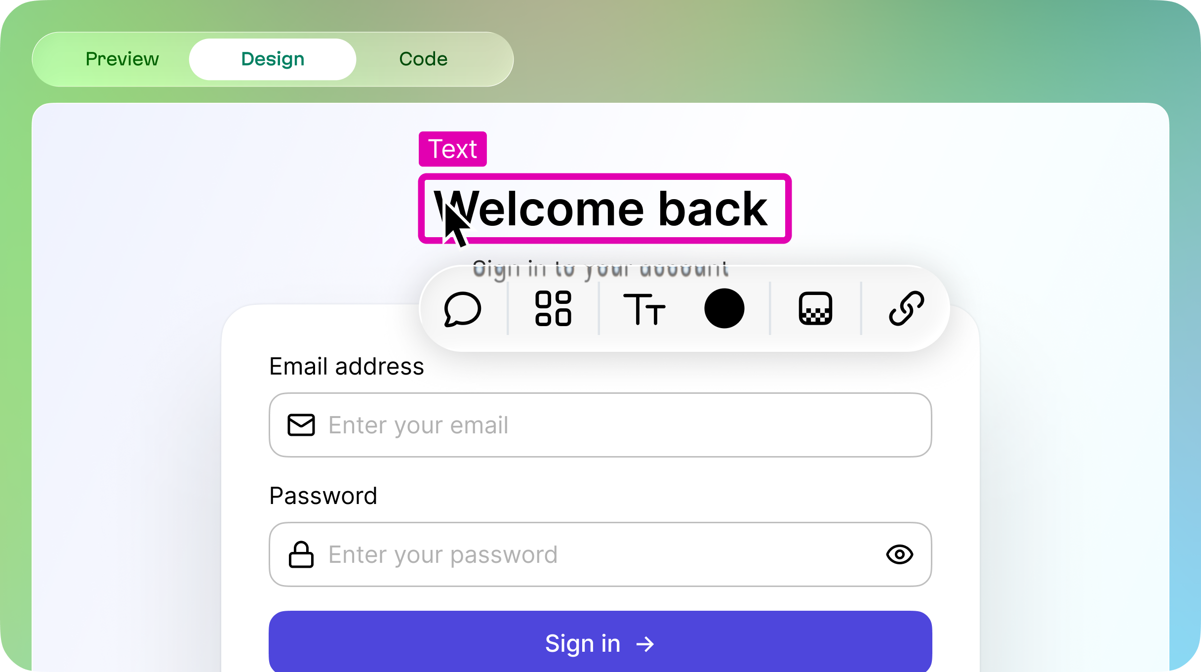
Inline editing demonstration
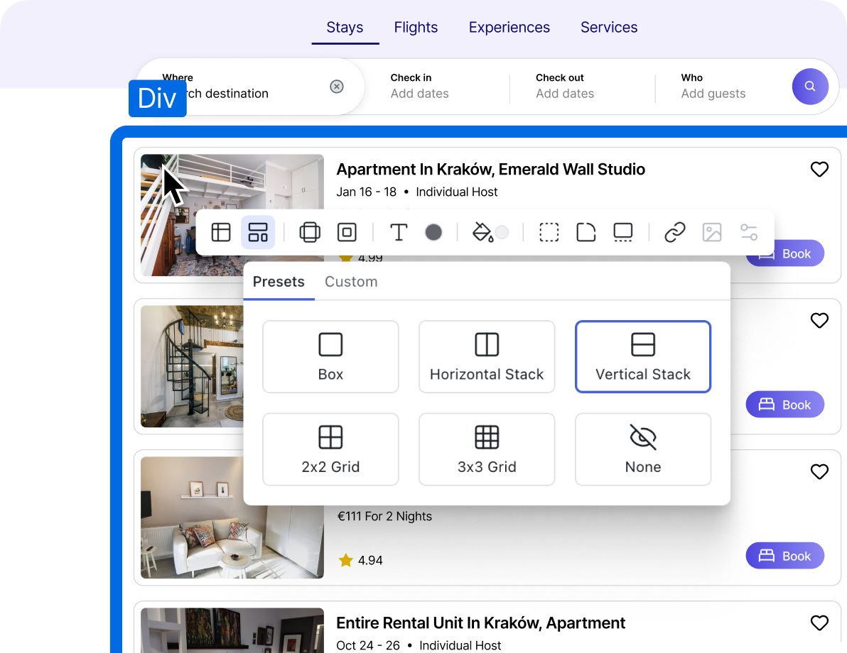
Instead of showing panels on the sides, we can have something even more simple and powerful. Just click on the object and the properties dropdown will appear next to that object.
The properties dropdown appears near a selected object
Here’s the chance for beautiful, streamlined simplicity. For example:
- If the item we’re selecting is a font… we can just show the options related to that.
- A div? Spacing and layout.
- An image? Display options to replace, generate, and so on.
Keep things simple and focused!
Here, states and corner radius controls are added, and font selector removed since no text is selected
We could also (almost) eliminate switching back to full AI chat by adding an action to open a small AI chat for the specific component.
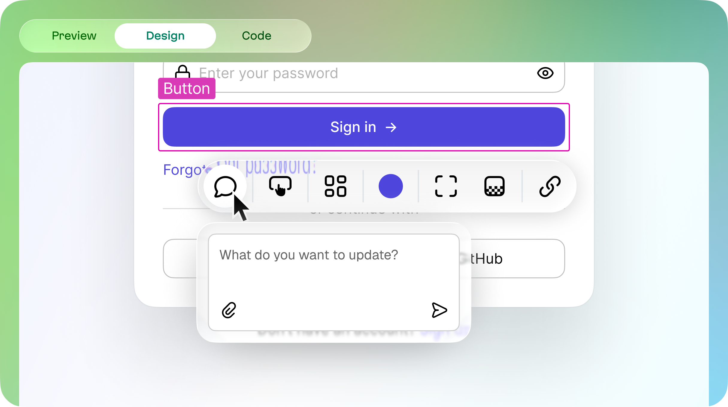
Showing a mini AI chat
Some vibecode tools are already leading the charge in this area. Examples include Bolt and Dazl, and that’s great!

Bolt’s 2.0 release is moving the product in the right direction
Dazl, an underdog in the vibecoding community, has very powerful tools to edit the end result
That said, when it comes to catching up with user needs, our imaginations are the limit here.
3. We must go beyond the chat mechanism
Here’s an obvious open question in the world of vibe coding. What’s the best way to add something new without engaging with an AI chat? Like maybe a component from a component library? Or a new image? Or text? We can do this with a toolbar… but I’d like to posit a better source of inspiration.
We need better vibes, and a big chunk of any video game’s success lives and dies based on this principle. Can we not turn to them to grow our audience?

Dreams has one of the best interfaces for controller, period. I really recommend checking how it works
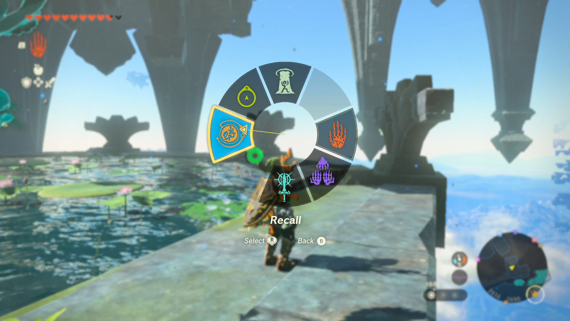
You can do a lot in Zelda: Tears of the Kingdom, A LOT. And Wheel UI helps to get through the complexity with ease
In fact, games are chock full of great UX ideas that web and tools are just flat out ignoring, as if they can never apply here. Take for example Dreams, it’s a game that features a tool so native, people are building full games …USING A CONTROLLER.
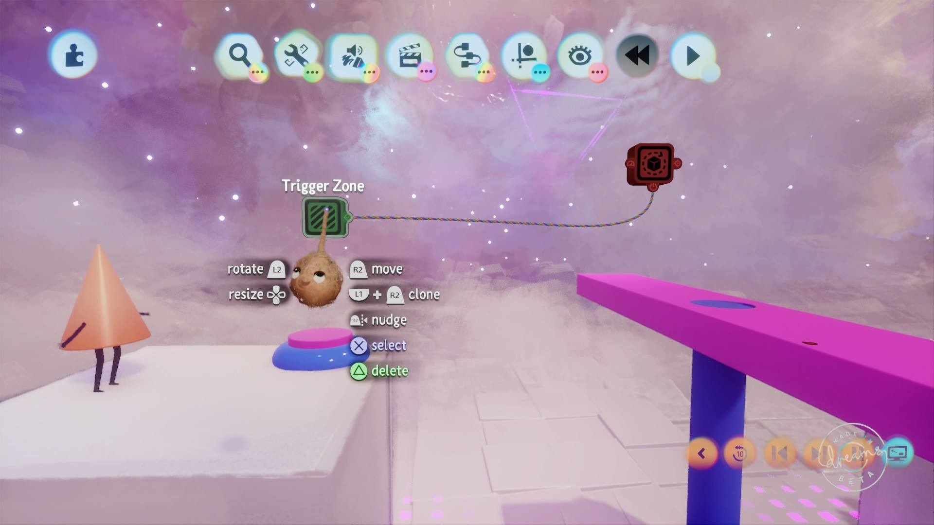
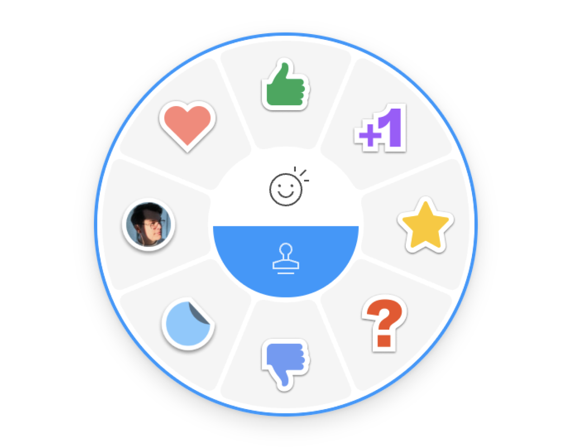
Indeed, one of the great UX patterns that games have developed is hugely overlooked by web tools: the control wheel.
Adding text block with Wheel Control
Figma tested something like this too for their UI3 but decided not to move forward. Perhaps this was because it would be quite a departure from established UX patterns.
.](/static/a2641f6679eb67e971f63df80b8a9180/figma-wheel.png)
Ryhan, a former Figma designer, shows his demo of the control wheel.
Figjam has a wheel for stamps and it works like a charm
I’ve built (vibecoded) a full demo just to test it and let me tell you–IT’S AMAZING. Actually, check it out for yourself.
Building a simple button while using Wheel Control
4. We need better vibes for users who want to fine tune design systems and their individual components
Design systems have been thoroughly explored in the design community. Meanwhile, vibecode tools generate generic design systems by default. Here’s the big question: why don’t we give users the ability to edit and change these components, tokens, and colors in a clear and easy way?
We need a UI for this.
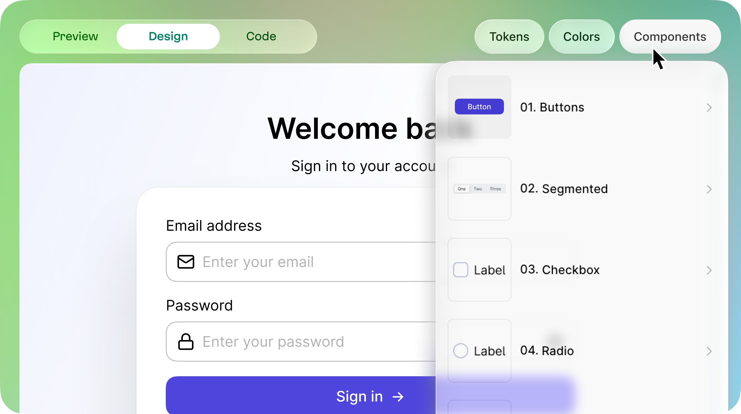
Components selections might be the first step towards the design system workflow
Bolt has already allowed users to connect their own design system, and again, this is fantastic!
But what about the audience of users who want to build on top of a pre-existing design system? One thing that would help is the ability to work on a component in isolation.
We can see this feature in Figma, Framer and other design tools, and this feature would also be welcome in vibecode tools. This would save users a ton of “frustration tokens” because we are locking on one thing, which means that the AI won’t touch the other parts of the product.
Can you imagine asking AI to change one button and then it “helpfully” decides to redesign your entire navigation? Of course you can! Component isolation isn’t something “nice-to-have”, it may be the only thing that can keep us all from going insane.
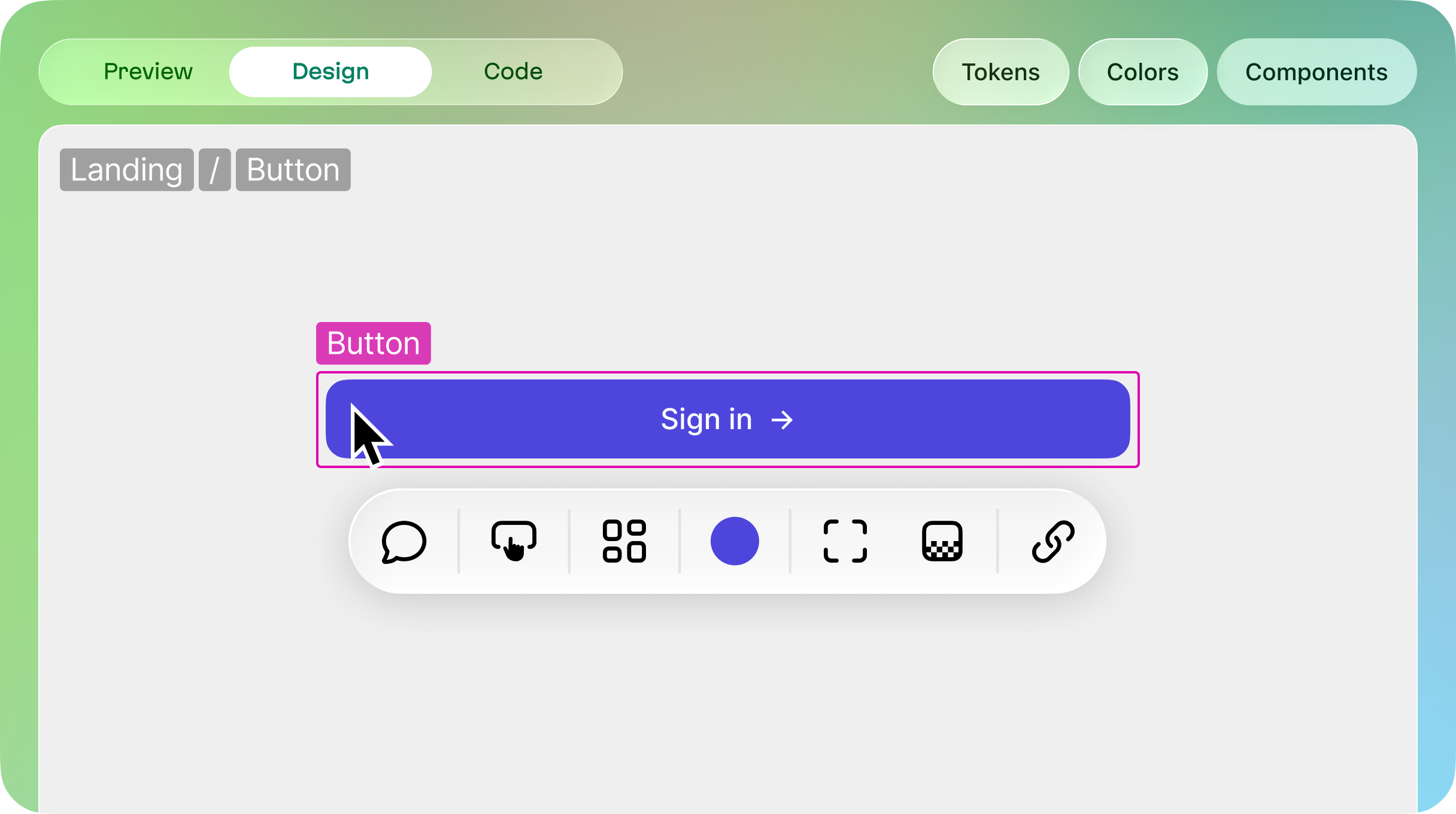
Editing a component in isolation
5. Give users the ability to make custom workspaces
Imagine we’re repeating a text that involves touching text again and again. I’ve mentioned that sidepanels can be overwhelming, but there actually is a way to do this the right way. Can you recall Photoshop’s workspaces?
An incredible concept: the ability to tailor a workspace for your specific workflow. I had workspaces for web design, illustrations, and print design. This is something that has been lost; a vibe that has been killed.
But, we could allow users to do this, because it can be quite useful. For instance, users could move those properties to the side, then save this configuration as a workspace.
Need to change hundreds of elements to a different typeface? Save yourself a click or two and just let users fix that panel on the right.
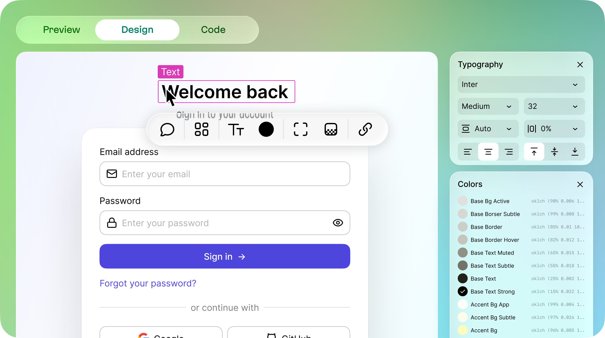
A typography and color workspace that can be saved
Fortune favors the bold
This is a magical moment. Part of the charm of creating vibecode tools is that they don’t have established patterns yet. The time to be bold and creative is now, and it’s during a big shift like this that a window of opportunity appears.
That said, the real winners will be the next generation of creatives that our tools empower!