ViewComponent in the Wild III: TailwindCSS classes & HTML attributes


Translations
Ruby on Rails full-stack development is back on track; HTML-first is the way! To move forward, we need better tools to manage the view layer. GitHub’s ViewComponent library is still the top choice among Rails developers for bringing sanity to HTML. We’ve been using this library at Evil Martians for a while, and we’re ready to present new tips and tricks accumulated since this series started. In this post, we’ll discuss integrating TailwindCSS styles and the propagation of HTML attributes in view components. Buckle up!
Other parts:
- ViewComponent in the Wild I: building modern Rails frontends
- ViewComponent in the Wild II: supercharging your components
- ViewComponent in the Wild III: TailwindCSS classes & HTML attributes
We started adopting ViewComponent a few years ago to help us organize HTML templates and partials. At first, we mostly used it as a software design pattern to help keep code under control. Yet, as the ecosystem and our experience evolved, ViewComponent became a keystone element for creating application design systems.
A design system is a collection of reusable elements and guidelines for crafting a UI. In code, a design system is expressed via the UI kit, a part of the view layer responsible for implementing the design system’s UI elements. “Reusable elements” naturally lead to components. But maintaining a UI kit is impossible without having a storybook for it. ViewComponent, together with Lookbook (which we talked about in the last post), gives you everything you need to get started with design-system-driven UI development.
Rails focuses on productivity, and the most productive way to write code is to not write code at all. Ready-made UI kits for Ruby and Rails applications are still rare beasts, and most of them are still in the alpha stage. So, chances are that you’ll have to craft a custom UI library for your application. But no worries! We’ve been through this a few times and are ready to share valuable tricks to simplify UI kit development with ViewComponent. Here’s what is on today’s menu:
Style variants
TailwindCSS has conquered the world of UI development. Why bother with CSS rules, nesting, and naming (BEM, SMACSS, and so on) when you can define all your styling with HTML classes? Making HTML a single source of truth plays especially nicely with the “No Build” ideology of modern full-stack Rails.
With TailwindCSS, you can develop a consistent UI without ever touching CSS files. You can define your design system’s fundamentals (typography, grids, and so forth) and design tokens in the tailwind.config.js file and enjoy the magic of atomic (and dynamic) CSS classes. However, this comes with a price: dozens of classes in your HTML. Let’s consider an example Button component:
class UIKit::Button::Component < ApplicationComponent
  option :type, default: proc { "button" }

  erb_template <<~ERB
    <button type="<%= type %>"
      class="items-center justify-center rounded-md border border-slate-300
      bg-blue-600 px-4 py-2 text-sm font-medium text-white shadow-sm ring-blue-700
      hover:bg-blue-700 focus:outline-none focus:ring-2 focus:ring-offset-2
      focus:ring-offset-blue-50 dark:border-slate-950 dark:bg-blue-700
      dark:text-blue-50 dark:ring-blue-950 dark:hover:bg-blue-800 dark:focus:ring-offset-blue-700">
      <%= content %>
    </button>
  ERB
end
In the example above, we use ViewComponent’s inline template feature, added in v3, and the ApplicationComponent class generated via the view_component-contrib library (learn more in the second part of the series). We can render it as follows:
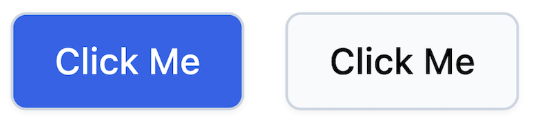
<%= render UIKit::Button::Component.new do %>
  Click Me
<% end %>
This results in the following UI:


Button component
But that’s just the beginning because button components never come in just one single format; every UI kit contains multiple button variants. Let’s consider adding an outline version of the button. This would require including some classes conditionally, depending on the variant selected:
class UIKit::Button::Component < ApplicationComponent
  option :type, default: proc { "button" }
  option :variant, default: proc { :default }

  STYLES = {
    default: "text-white bg-blue-600 ring-blue-700 \
      hover:bg-blue-700 focus:outline-none focus:ring-2 focus:ring-offset-2 \
      focus:ring-offset-blue-50 dark:border-slate-950 dark:bg-blue-700 \
      dark:text-blue-50 dark:ring-blue-950 dark:hover:bg-blue-800 dark:focus:ring-offset-blue-700",
    outline: "bg-slate-50 hover:bg-slate-100 focus:outline-none \
      focus:ring-2 focus:ring-slate-600 focus:ring-offset-2 \
      focus:ring-offset-blue-50 dark:border-slate-950 dark:bg-slate-700 \
      dark:ring-slate-950 dark:hover:bg-slate-800 dark:focus:ring-offset-slate-700"
  }.freeze

  erb_template <<~ERB
    <button type="<%= type %>"
      class="items-center justify-center rounded-md border border-slate-300
      px-4 py-2 text-sm font-medium shadow-sm <%= STYLES.fetch(variant) %>">
      <%= content %>
    </button>
  ERB
end
Now, we can specify an optional variant when rendering a button:
<div class="flex flex-row space-x-4">
  <%= render UIKit::Button::Component.new do %>
    Click Me
  <% end %>
  <%= render UIKit::Button::Component.new(variant: :outline) do %>
    Click Me
  <% end %>
</div>
Button variants
Extracting dynamic parts of the class list into a constant did the trick. But that’s just for a single variation dimension and a couple of variants. In practice, there are usually a greater number of variants and variations.
For example, we may have different sizing variants (small, full, and so on). And sometimes, these variations are not independent and require adding additional classes for some combinations. To illustrate, dealing with the disabled state for our button component might require us to write the following code:
class UIKit::Button::Component < ApplicationComponent
  option :type, default: proc { "button" }
  option :variant, default: proc { :default }
  option :disabled, default: proc { false }

  STYLES = {
    # ...
  }.freeze

  erb_template <<~ERB
    <button type="<%= type %>"
      class="items-center justify-center rounded-md border border-slate-300
      px-4 py-2 text-sm font-medium shadow-sm <%= STYLES.fetch(variant) %>
      <%= disabled_classes if disabled %>"
      <%= "disabled" if disabled %>>
      <%= content %>
    </button>
  ERB

  def disabled_classes
    if variant == :outline
      "opacity-75 bg-slate-300 pointer-events-none"
    else
      "opacity-50 pointer-events-none"
    end
  end
end
Not only has the component’s code become increasingly entangled, but it doesn’t work the way we’d expect. The problem is that for the outline version of the button in the disabled state, we now have two conflicting classes, bg-slate-50 (from STYLES[:outline]) and bg-slate-300 (from #disabled_classes). (And the former wins.)
How do we bring back clarity, maintainability, and correctness to our component styles? Allow me to introduce Style Variants.
Style Variants is a plugin included in the view_component-contrib package which was inspired by the Tailwind Variants and CVA projects. It allows you to define your styling rules in a declarative way, as follows:
class UIKit::Button::Component < ApplicationComponent
  option :type, default: proc { "button" }
  option :variant, default: proc { :default }
  option :disabled, default: proc { false }

  style do
    base {
      %w[
        items-center justify-center px-4 py-2
        text-sm font-medium
        border border-slate-300 shadow-sm rounded-md
        focus:outline-none focus:ring-offset-2
      ]
    }
    variants {
      variant {
        primary {
          %w[
            text-white bg-blue-600 ring-blue-700
            hover:bg-blue-700
            focus:ring-offset-blue-50
            dark:border-slate-950 dark:bg-blue-700 dark:text-blue-50 dark:ring-blue-950
            dark:hover:bg-blue-800
            dark:focus:ring-offset-blue-700
          ]
        }
        outline {
          %w[
            bg-slate-50
            hover:bg-slate-100
            focus:ring-slate-600 focus:ring-offset-blue-50
            dark:border-slate-950 dark:bg-slate-700 dark:ring-slate-950
            dark:hover:bg-slate-800
            dark:focus:ring-offset-slate-700
          ]
        }
      }
      disabled {
        yes { %w[opacity-50 pointer-events-none] }
      }
    }
    defaults { {variant: :primary, disabled: false} }
    # The "compound" directive allows us to declare additional classes to add
    # when the provided combination is used
    compound(variant: :outline, disabled: true) { %w[opacity-75 bg-slate-300] }
  end

  erb_template <<~ERB
    <button type="<%= type %>" class="<%= style(variant:, disabled:) %>"<%= " disabled" if disabled %>>
      <%= content %>
    </button>
  ERB
end
All the styling logic is described within the style do ... end block. In the HTML template, we only use the #style(**) helper and pass variant values to it. Thus, we no longer have classes scattered all over the component code.
We may enforce custom conventions to be used in style variant definitions. For example, you may notice that we’ve grouped classes by their modifiers (e.g., the focus:* and dark:* classes are placed on separate lines). It’s possible to write a custom RuboCop cop to enforce this convention (and even auto-arrange classes). So, switching from text fragments to Ruby code also opens up new DX possibilities.
The compound directive replaces our previous #disabled_classes method. How does it solve the class conflict issue? By default, the Style Variants plugin has no assumptions regarding the nature of your classes (i.e., it’s not TailwindCSS-specific). To make it a bit smarter and teach it how to resolve CSS conflicts, we can integrate it with the tailwind_merge gem:
class ApplicationComponent < ViewComponentContrib::Base
  include ViewComponentContrib::StyleVariants

  style_config.postprocess_with do |classes|
    TailwindMerge::Merger.new.merge(classes.join(" "))
  end
end
Style Variants significantly improves the DX of working with TailwindCSS-backed UI components. HTML is no longer polluted with verbose style definitions; CSS classes are well-organized and statically analyzable. With this approach, we’ve managed to simplify defining class HTML attributes. What about all the others? Well, let’s talk about HTML attribute propagation.
HTML attribute propagation
For basic (atomic) UI elements, like button and form inputs, it’s necessary to support all possible functional HTML attributes (e.g., required, disabled, autocomplete, and so on). Imagine a generic input component defined as follows:
class UIKit::Input::Component < ApplicationComponent
  option :name

  option :id, default: proc { nil }
  option :type, default: proc { "text" }
  option :value, default: proc { nil }
  option :autocomplete, default: proc { "off" }
  option :placeholder, default: proc { nil }
  option :required, default: proc { false }
  option :disabled, default: proc { false }

  erb_template <<~ERB
    <span class="relative">
      <input type="<%= type %>"
        <% if id %> id="<%= id %>"<% end %>
        <% if value %> value="<%= value %>"<% end %>
        <% if name %> name="<%= name %>"<% end %>
        autocomplete="<%= autocomplete %>"
        <% if placeholder %> placeholder="<%= placeholder %>"<% end %>
        <% if required %> required<% end %>
        <% if disabled %> disabled<% end %>
      >
    </span>
  ERB
end
Here we have a monstrous template for injecting these attributes (only if they’re defined). Why deal with raw strings when we have content_tag (or even text_field_tag)? The reasons vary (from “avoiding mixing helpers with pure HTML” to “for performance sake”). In any case, the important thing here is that such code can be found in the wild; I haven’t just pulled it out of thin air.
We can also declare all of the HTML attributes that we want to expose (via the .option DSL from dry-initializer). But this turned out to be far from optimal. First of all, there could be many of them, and most must be injected into HTML as is. Second, there are often attrubutes coming from the outside, and we don’t want our isolated components be responsible for them (e.g., Stimulus data attributes, or test_id for browser testing).
As the first step towards clarity, we came up with the idea of the bag of attributes:
class UIKit::Input::Component < ApplicationComponent
  option :name

  option :html_attrs, default: proc { {} }
  option :input_attrs, default: proc { {} }, type: -> { {autocomplete: "off", required: false}.merge(_1) }

  erb_template <<~ERB
    <span class="relative" <%= tag.attributes(**html_attrs) %>>
      <input <%= tag.attributes(**input_attrs) %>>
    </span>
  ERB

  def before_render
    input_attrs.merge({name:})
  end
end
Instead of enumerating all possible options, we’ve added just two: html_attrs (for the container element) and input_attrs. To convert a hash into an HTML attributes string, we use Rails’ built-in tag.attributes helper (available since Rails 7). Here’s the new interface for using a component:
<%= render UIKit::Input::Component.new(
  name: "name",
  input_attrs: {placeholder: "Enter your name", autocomplete: "on", autofocus: true}) %>
Note that we still accept the name of the input field as a separate option to underline its essential role (and that fact that it’s required).
The declaration DSL still doesn’t look ideal (especially the type: ... part). Therefore, we can go even further and sugarize the API like this:
class UIKit::Input::Component < ApplicationComponent
  option :name

  html_option :html_attrs
  html_option :input_attrs, default: {autocomplete: "off", required: false}

  erb_template <<~ERB
    <span class="relative" <%= dots(html_attrs) %>>
      <input <%= dots(input_attrs) %>>
    </span>
  ERB
end
Note that the #dots alias is a reference to the JS object spread operator (...).
Browser tests for components
To finish off our yearly “ViewComponent on Mars” report, I’d like to share one more tiny extension we’ve recently released aimed at improving the developer experience when using view components.
In the first part of this series, we mentioned testability as one of the key benefits of switching to components. But, in addition to unit tests, you can also use Rails system tests to test interactive components:
# spec/system/components/my_component_spec.rb

it "does some dynamic stuff" do
  visit("/rails/view_components/my_component/default")
  click_on("JavaScript-infused button")

  expect(page).to have_content("dynamic stuff")
end
Tests like these rely on the preview functionality, which messes with your storybook and introduces coupling between test and development environments. To deal with this, we built inline templating for tests:
it "does some dynamic stuff" do
  visit_template <<~ERB
    <form id="myForm" onsubmit="event.preventDefault(); this.innerHTML = '';">
      <h2>Self-destructing form</h2>
      <%= render Button::Component.new(type: :submit, kind: :info) do %>
        Destroy me!
      <% end %>
    </form>
  ERB

  expect(page).to have_text "Self-destructing form"

  click_on("Destroy me!")

  expect(page).to have_no_text "Self-destructing form"
end
Now, the HTML being tested can be defined right inside the test itself, and this functionality is available via the rails-intest-views gem. Give it a try!
A last note
Since the first post from this series was published about a year and a half ago at the time of writing, the way we build Rails full-stack applications has changed. TailwindCSS has won the battle for CSS (we used to experiment with PostCSS Modules), Webpacker retired, and UI component libraries finally came to the Rails world.
Nevertheless, ViewComponent remains our core UI technology and easily allows us to keep up with ever-changing software development trends. And that’s precisely why we continue investing in it!

At Evil Martians, we transform growth-stage startups into unicorns, build developer tools, and create open source products. If you’re ready to engage warp drive, give us a shout!