Compo: UI components in Sketch

Compo is a Sketch plugin that makes it easier to work with interface components. With Compo, pressing ⌘J is all it takes to turn a text layer into a button or put an existing component in order. The plugin can be used with State Machine.
When it comes to the design, UI components are the foundation stone. That is why it is totally surprising that today’s design tools are so poorly suitable for work with components. Of course, there has been a certain progress lately, and the symbol update in Sketch 3.7 is a fine example. However, as useful as it was, this update didn’t change the situation entirely. There is still a lot of room for improvement.
Working with components. What it usually is
Let’s launch Sketch and make a button. Create a text layer and a rectangle, then align them, and turn them into a Sketch symbol. Everything is perfectly fine until you need a button with a long label.

Assume the button width depends on the label width. Unfortunately, this is not a case when Sketch Symbols can help. One has to adjust the rectangle to fit the label there is no escaping it.
Another example. Let it be a more complex component like a product card with the photo, name, and the price. Turn this construction into a symbol, and the considerate Sketch will allow each item to have parameters of its own. Isn’t it great?
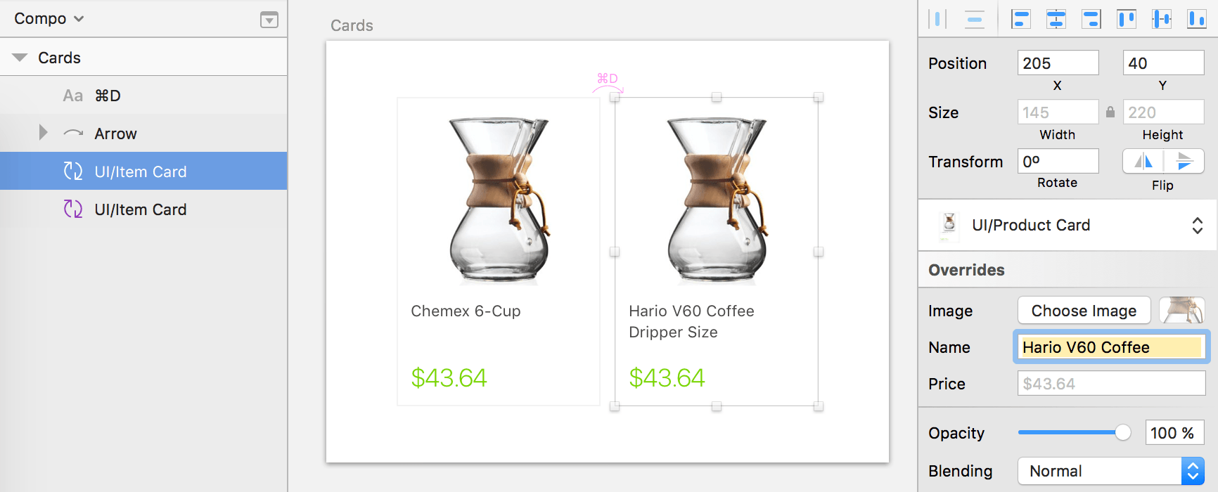
The problem is the tiniest change in our card will prevent Symbols from working. What if we have the price at the top and the name at the bottom with the name aligned by the bottom of the picture? If the name is shorter or longer than it is by default, the construction will become a mess. The Symbol won’t know I want to align the text to the bottom.
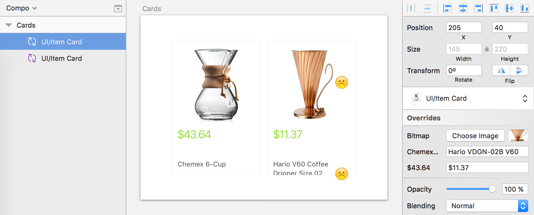
Dynamic Button and Dynamic Reposition plugins were close to fixing it. So close
Thanks to Sketch’s plugin engine, extending its functionality is just a question of time. These problems have been around too long to be unattended. Some skilled designers couldn’t but come up with solutions of their own. As the result, we have some decent CocoaScript-based plugins.
For quite a time, I used the plugins Dynamic Button and Dynamic Reposition. The first one adjusts the button size to the new label. The second one uses indentation to position the objects in a component. For example, one can ‘ask’ the drop-down list arrow to be always on the right, with the indentation 10 pixels from the page.
These plugins make an excellent combination. Usually, I created a drop-down list as follows. I would duplicate an existing component, and change its label. Then I would launch Dynamic Button to get the bottom layer resized and Dynamic Reposition to get the caret icon into the right place.
Very soon it was obvious that such things should be done by a single plugin.
Compo instead of Symbols
Compo does two things:
- Turns a text layer into a simple button.
- Puts an existing component in order.
A few examples.
Example 1
Select a text layer and launch the plugin by pressing ⌘J. The text is a button now. Nothing special, but nice.

Example 2
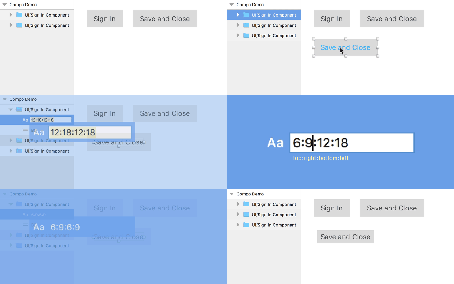
Duplicate the button we created, change its label, and launch the plugin. Here it is—the bottom layer is now adapted to the new label width.

Should you want to have the plugin process an existing button of your own, set the indentation in the layer name in a format of 12:24:12:24. From the left to the right, the numbers mean the top margin is 12 pixels, the right one 24 pixels, the bottom one 12 pixels, and the left one 24 pixels. This is the order CSS uses.
Example 3
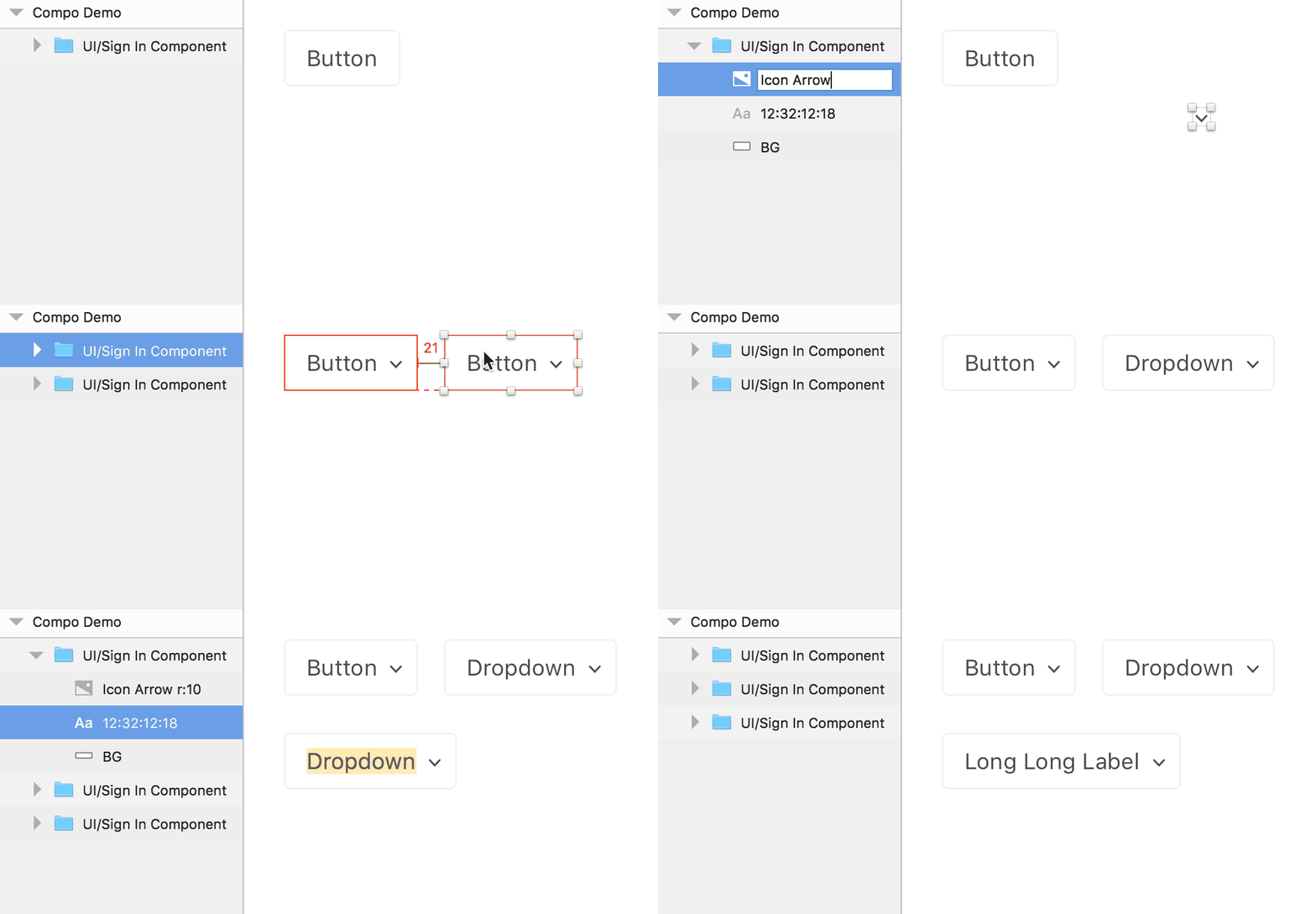
Let’s make a more complex control like a drop-down list. Technically, it is just a button with a caret at the right. In the label name, set the right margin big enough for the caret to fit in. Set the caret margin as r:10—it means it will be 10 pixels from the right edge. Press ⌘J. Now, a drop-down list takes only a few seconds to create.
Example 4
Remember that Symbols failed when it came to a product with the price at the top and the name at the bottom. Now, this problem is history. No matter how many symbols long the text is one can set the text bottom margin because Compo will be there to align it.
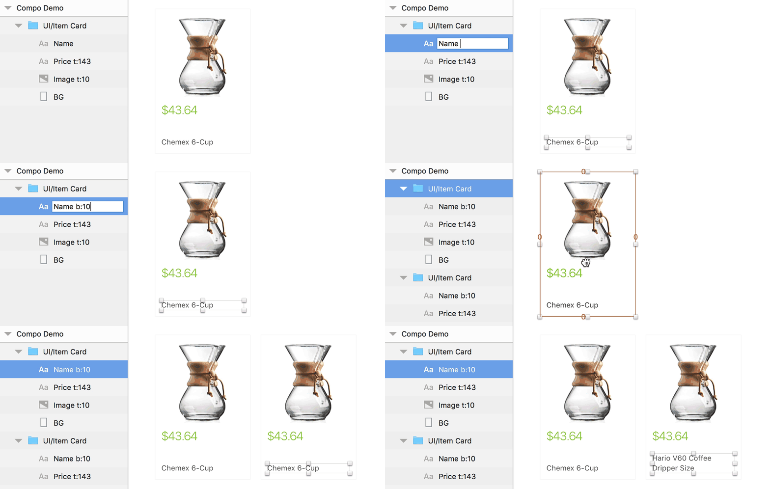
The bad thing is one needs to choose—either to keep the component as a symbol or as a Compo-useable group. Bear in mind it might be a good idea to turn certain parts of a component into symbols.
As for the rest, Compo takes care of the dull work you’d prefer not to do and eliminates some Sketch Symbols drawbacks.
Compo is a free and open source project hosted on GitHub. Use Issues to report any bugs you find, and feel free to fork the repository if there is any additional functionality you would like to implement.
