Decentralized app design: first aid for common dApp UI pains

Let’s tackle the unique UI patterns designers must deal with when working with dApps. Whether you’re an aspiring Web3 designer looking for insight, or a product manager curious about basic design patterns in your project, read on!
This article does require a bit of preexisting knowledge, but we’ll try to catch you up as quickly as possible. For a good intro to Web3, we recommend this comprehensive Web3 article from Ethereum. Likewise, their intro to dApps is an awesome resource for getting up to speed.
A brief note on how blockchain apps work
Essentially, “regular” apps work within a centralized global network (a.k.a. the Internet). Thus, the only prerequisite for users to work with this type of app is an active connection to the Internet:

Technically speaking, blockchain apps also have their code on the Internet, but the reading and writing of transactions related to user wallets is carried out in a decentralized network (blockchain). While a Web3 app can support multiple blockchains, but within an active session, it can be connected to just one.
Connection to a blockchain is usually handled by a 3rd party wallet. Desktop users usually need to install a wallet browser extension. On mobile, wallet apps often have a built-in browser for establishing a connection. For a visual idea of the difference between these apps, compare the image below with the image above:

This new experience brings with it numerous considerations for app designers:
- Since there are so many different networks, it’s important to know where users are and help them to get into the right place
- As network transactions are handled via a wallet, having a wallet is a must
- Because transactions carry different fees and require different times to process, apps must show these details and help user to adjust them
- Finally, users are responsible for everything—there is no 3rd-party regulation—so, apps must be transparent and build trust
As we dive in and start thinking about the UI challenges we’ll face, it’s crucial that we keep the points in mind above to guide us. Now, without further ado, let’s go.
Connect button at a glance
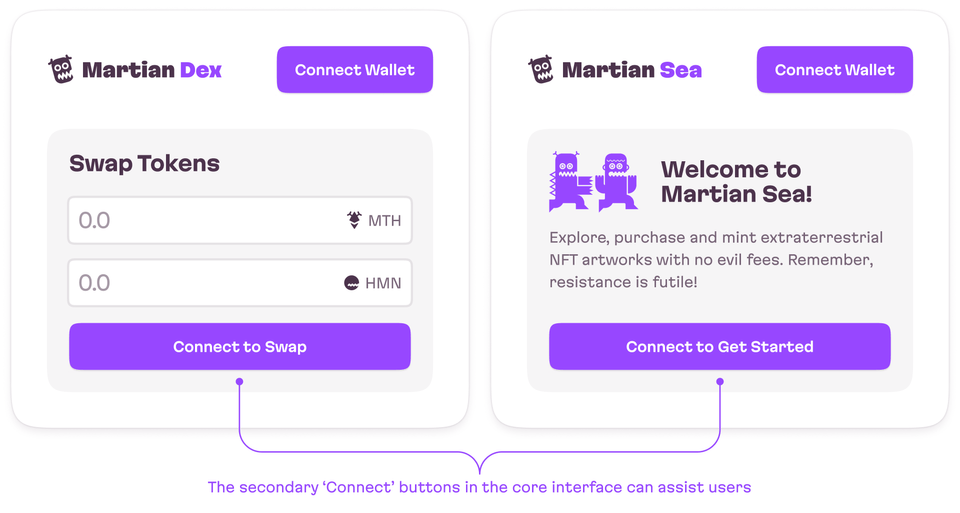
A prominent “Connect” button should be easily accessible. Since a wallet connection is required for most dApps, experienced users expect they’ll easily find the button in the top navigation bar.

Meanwhile, users just starting to use blockchain apps may need an easily-identifiable “get-started” action, like connecting their wallet, within the core interface.

In the example above, we have cases to illustrate how different dApps could initially lead users to connect to a wallet. On the left (a decentralized exchange), the “Connect to Swap” button in the main form guides users to a mandatory action they must complete before using the app. On the right (an NFT marketplace), the “Connect Wallet” button on the welcome screen implores users to get started.
Make wallet addresses visible
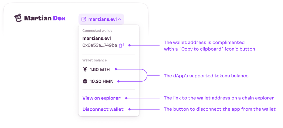
Once a user has connected their wallet, its address should be visible. But wallet addresses are quite long, so how to handle this? We can truncate the address in the middle so that at least the first four first and last four symbols are visible. This is a good idea since users can have multiple wallets and usually remember just several symbols of their addresses. Additionally, if a wallet address matches an ENS name alias, show the ENS name instead of the address. An ENS name is a web domain that mirrors a particular wallet address. So many users purchase them as a short handle or brand name connected to a wallet:

In proximity to the address, we can add some relevant features, first and foremost, since the address is quite long, and we’re potentially truncating it, give users the option to easily copy it, and make this visibly clear with an icon.
So that users have a clear idea of their wallet’s capabilities, it’s a good practice to clearly display the supported tokens.
Finally, add an option to disconnect the wallet.

Switching networks
Users should easily be able to determine their currently active blockchain network. A good practice is to simply show the name of the blockchain (preferably alongside its name). The best place to put this information is somewhere near the wallet menu.
If an app supports multiple networks, add some kind of input to easily switch between networks:

Dealing with the wrong network
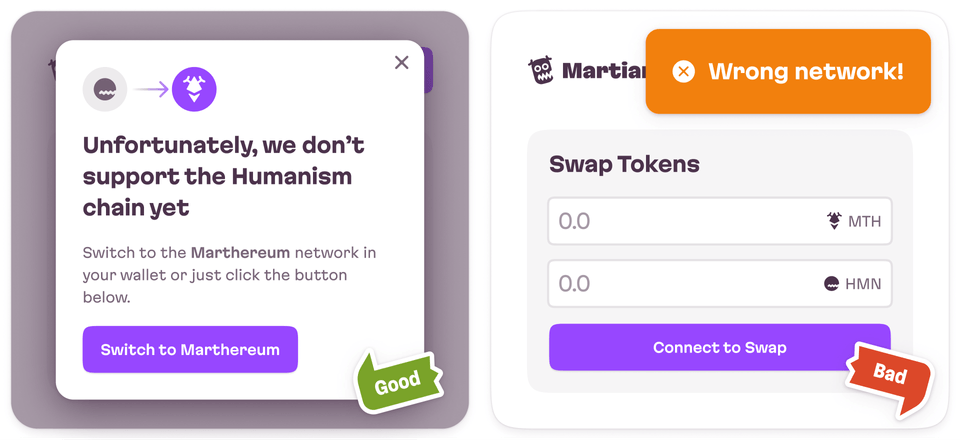
There might be a situation where a particular Web3 app doesn’t support the wallet’s active network. Here, users have to manually switch over to the desired wallet.
Handle the wrong connection gracefully and provide users the shortest possible path to the network they want. Avoid warning or blaming users!
In cases like this, don’t warn users with some generic, unhelpful errors. Instead, carefully explain the issue and add clear instructions on how to switch the network. The most handy option is to provide a call-to-action button that will trigger the wallet to switch the network.

Transactions state visibility
Let’s discuss the logic of transactions. There is always a queue, depending on actual network bandwidth (many transactions → high fees (this is dynamic) → lower priority for a single transaction from a low fee dApp. So, it is feasible that a transaction could get “stuck in traffic”. Of course, this jam doesn’t stop us from sending more transactions—they’ll just be marked as “pending”. Thus, it’s important to actually notify users when their transaction has been completed.
So, to zoom back out and think about this UI/UX from the start, when a transaction has been submitted, show a pending transaction status. If there are several transactions one after another, the queue could be quite long, so in this case, displaying the number of pending transactions helps create a better UX.

Once a blockchain transaction has been completed, show a success message. Additionally, the success message for a blockchain transaction should include a link to the transaction on the network explorer.

Off the chain
Let’s take a pause for today. We’ve covered the main patterns that you’ll need to deal with, but in fact, there are many more of these to explore. So, stay tuned!
Evil Martians can help with your project and product design needs. Whether it’s a dApp or not, blockchain-based or beyond, if you have a web or mobile application in need of expert problem solving with product design, frontend, backend, or software reliability, we’re here! Or, are you looking to get your project off the ground? Reach out to us!

