Smartly contracted: UI design and frontend for Certora
Developer tools and their professional interfaces exist in a special world. Evil Martians recently encountered these rules in the blockchain world, and in the process, we had the chance to elevate a product that helps analyze smart contracts. Smart contract is a self-executing contract with the terms of the agreement between buyer and seller being directly written into lines of code. This is one of the most critical areas in the blockchain landscape since smart contracts are responsible for financial transactions.
Smart contracts testing
Certora is a series B blockchain startup. In 2022, the project raised $36M from Jump Crypto and Electric Capital—a leading corporation in the blockchain world. It’s used by dozens of other large, signature DeFi—Decentralized Finance—projects.
Certora provides advanced security analysis tools for Ethereum Smart Contracts to automatically detect security vulnerabilities both before the code is deployed and during operation. For developers, the service ensures a quality development environment with their unique language-agnostic Certora Prover Technology for checking security rules. The process is automatic, supports arbitrary programs, and integrates into CI/CD pipeline.
Bringing tests to the IDE
Certora had already offered the web report feature to their customers: it displayed all the test results and showed all the locations in the code where technical errors or vulnerabilities had been found. The report was highly detailed, but to find errors in the development environment, users had to switch between windows, copy lines from the report to search inside the IDE, and then switch to the terminal to run the checker. This was a time-consuming process. Also, in the web report, developers couldn’t track the sequential data processing in a particular block of code.
The Certora team decided to make the feature more user-friendly and implement the test results in a well-known development format—as a VS Code plugin. The plugin would need to support smart contract verification logs and highlight problem areas right in the IDE itself.
The Martian design sprint in action
When they reached out to Evil Martians, we suggested researching user demands and putting together the requirements first. The ideal format for gathering this information: the Martian design sprint.
We started the sprint by interviewing current users and evaluating their pain points, checking out what development environment they use and whether it would be comfortable for them to utilize VS Code plugins. Based on these insights, we formulated a set of requirements, compiled documentation on the current way to run contract verification, and wrote a user story for the VS Code flow.
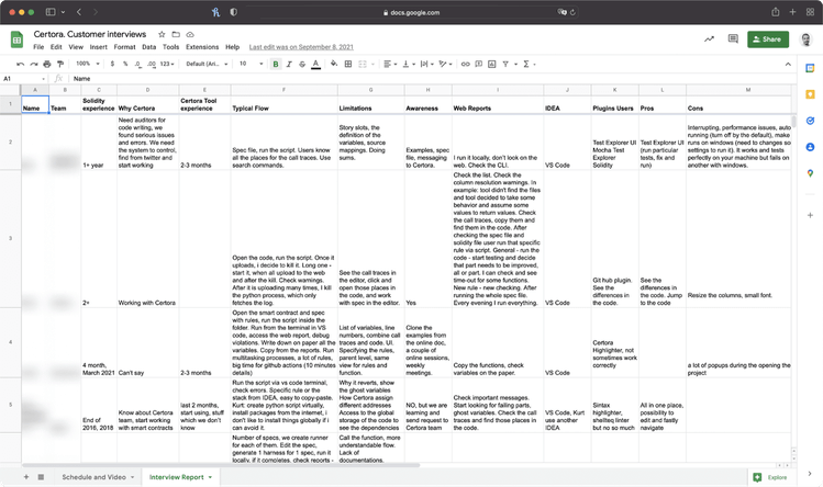
One of the design sprint artifacts: an interview results report
As a result of the design sprint, we ended up with an inspiring concept filled with rich functionality. However, there were too many ideas. So, this meant that some of the conceptualized features were implemented in the first version, while some were retained for implementation with the second release.
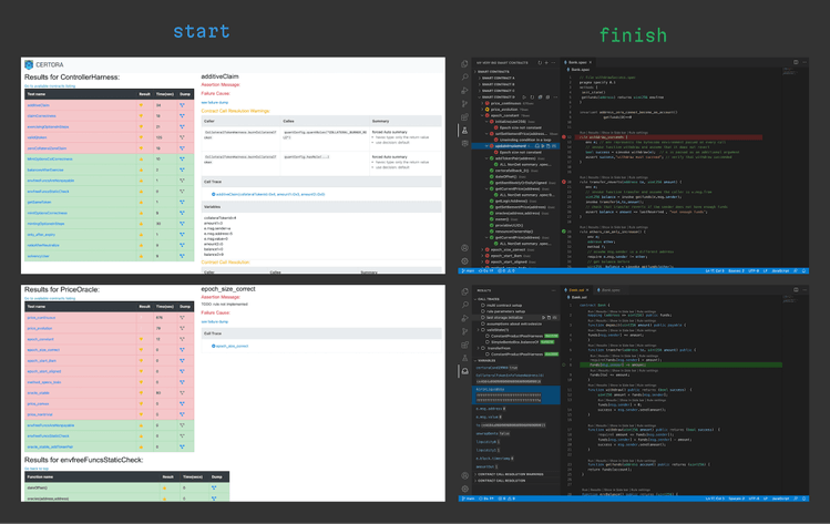
The design sprint’s input and output—a web report on the left, and the plugin’s output inside the IDE.
Building a professional UI
The most challenging (and interesting) part of designing professional interfaces is expressing a complex idea using standard UI elements and patterns. We had an inspiring task—migrating smart contract verification (with dozens of sophisticated rules) to an IDE interface.
We had little space to maneuver, but this made the task even more intriguing. Of course, VS Code guidelines allowed us to extend an element’s capabilities via things like Webview, but they still recommended adhering to the framework’s style (in terms of appearance, buttons, elements). And, this is as it should be! Thanks to this, users can easily utilize a vast number of plugins and it is critical to keep the user experience and interface clear and native. The second factor that made the task trickier was displaying a very detailed report—in an intuitive way within VS Code—where all the data was crucial.
Another idea we and the client had in mind was making smart contract analysis more similar to the debugging process in typical (not smart contract) code by migrating it to an IDE, which is more natural for developers since many of them arrive from non-blockchain development.
To start with, we looked at real contract examples and learned how our solution would appear in different contexts. We also formulated the full picture of the functionality and visualized the structure of the check rules, the results display, and organization of settings. In the process, we made sure to check the design solutions in terms of implementation complexity and also provided alternative solutions for the more sophisticated blocks. As a result, we opted for a standard VS Code pattern—a job tree—one of the most native and simple ways to represent data. We built the entire UI design on this pattern.
Settings
This was one of the most tricky areas in the product to deal with, and we had to work hard on it together with the client’s developers. The design sprint helped us realize that we need a lot of settings to handle the different parts of the checking process. We prepared a solution to knock out this task by creating two blocks:
- A general page with a list of all settings (the settings page)
- Command palettes—a fast way to request any settings on the go (with quick selection and pop-up)
After our research, we discovered that VS Code couldn’t work with dynamic data with native settings, and we couldn’t use the general settings page for this (we could only use an API key). We needed to break down all settings into two types—general settings (like an API key) and project-related ones (like compiler options). So, we only had a single option: designing a custom (Webview) solution. But we thought that settings configuration would still be too complex for users.
To ease new user onboarding, we did our best to make the plugin’s interface self-explanatory and to ensure the documentation was as clear and visually compelling as possible. Not every plugin on the VS Code marketplace contains a visual and illustrative description—but it was important to us to give users maximum clarity.
Marketplace assets: helping users understand the plugin’s functionality
We also figured out how to let users more easily write the complex config required for each script before running tests. Prior to this, users either wrote a JSON file or had to manually add flags to a script in the command line (certoraRun --flag1 value1 --flag2 value2). In order to create a comfortable UI, we made a web page inside VS Code that looked like a native one. It contains a form for filling out the config with field descriptions as well as dropdowns for easy file selection. Simultaneously, we kept the ability to manually edit them for advanced users. This new interface helped keep things familiar for developers accustomed to using them from the command line (terminal).
Variables and Call Traces
The Variables section features call trace monitoring, which is critical for debugging processes. To optimize it, we utilized Webview to transfer data running on the server and styled it to be “VS Code-like”. Moreover, we added a “go to line” option—but to implement this, we had to rebuild everything.
It is important for call traces to show the status of the verification process of a rule, and a user can have dozens of them. A standard component can display it as text or as a simple icon. This didn’t fit our purposes since the text was easily cut off and all the data was located on one line. Also, it was necessary to show the value of variables, and with the truncation, long values could be lost. To fit everything, we needed to expand the sidebar.
As a result, we created an additional action panel, where users could view call traces. Here, users can watch how the data flows in vulnerability scenarios.
Color schemes
VS Code provides many color scheme variations that users can take advantage of, so we had to be ready to support all the color schemes that users might apply. We needed to automate color switching and to ensure the plugin colors were always in harmony with VS Code’s themes.
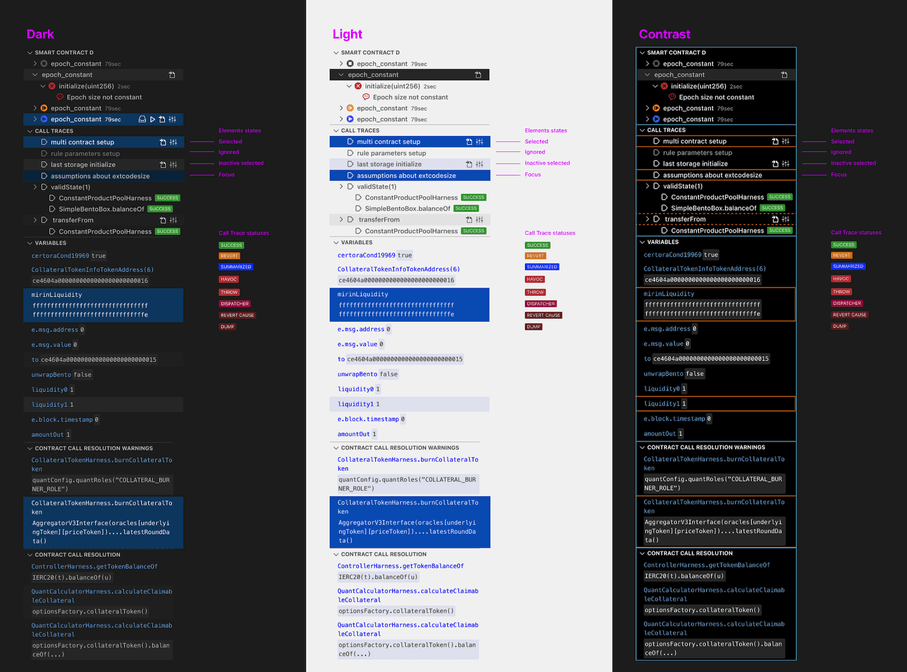
Some of the available color palettes in VS Code
Here we came to an interesting point in the design: VS Code uses simple color values in its color schemes, which means they don’t support functional styles. To create and support a component throughout the various color schemes, you need to manually enter the values for each of the schemes.
Essentially, we couldn’t provide a universal solution that would also look good and be accessible with all themes. Therefore, together with the client, we decided to support 3 standard themes (light, dark, and contrast) that would appeal to all users. To validate the idea of a color theme and check how they looked in the real world, we used this Figma plugin built by Martian designers.
In front of the frontend
After completing the design sprint, we entered the RnD stage. This was necessary since VS Code has many different modules, poor documentation, and inadequate search functionality—it searches across the entire website code.visualstudio.com (even release notes ended up in the search results). There were also a few examples in the guide with outdated cases where we had to fix their code to even run them.
The Certora team developers initially built a script based on Python and Solidity (a programming language for building smart contracts). The tests are like this: the Solidity file contains functions, the spec file (the unique type of files developed by the Certora team to create tests for Solidity-based smart contracts) executes those functions, and, in case of an error, displays the corresponding error text. But there is one important detail to note: most developers likely imagine tests as something that is run in the command line locally on your machine, or in CI. But with Certora’s tool, testing works differently: you need to write a test, then run the Python script. This script has several steps:
- Compiling Solidity files and checking their syntax (this vaguely resembles a linter). If the Solidity file contains syntax errors, the test will not run.
- Running the test itself (in the Certora cloud environment—not on your machine).
- After test completion, you’ll get a link to an HTML page to see the results.
This approach involves some inconvenient navigation between the HTML report and VS Code. If you get an error, you need to find the desired file, pinpoint the line or function within VS Code, fix the error, and restart the test.
Further, the tool was pre-configured with the command line using a Python script, and often, users were unable to reckon with it on their own; they ended up reaching out to the client’s team to configure and get the final file.
Rebuilding the solution
The VS Code extension allows test results to be displayed directly in the code editor—users can jump to the desired line in the desired file, and they can also run individual tests.
We had initially wanted to begin work on the extension with the feature to run tests separately. This would involve taking Test Explorer UI as the foundation and forking it to incorporate the changes we needed. But we realized that this was a bad way to start because it was necessary to write a Test Explorer UI adapter for spec files (files with tests). This would require a lot of additional development time (for example, we’d first have to write a parser for the spec files, since they use a custom language).
To get more functionality and save development time, we reworked the plan and started our development with HTML reports migration to the VS Code interface. VS Code’s native options did not allow us to implement what we wanted, so we adopted Webview—an HTML page inside VS Code, which has the same features as a site in the browser and communicates with VS Code via postMessage. postMessage is used to arrange communication between Webview and the extension’s core. We taught our extension to reach the desired lines in code in one click from Webview. This was done in order to implement Certora’s concept of simultaneous navigation through the rules and tests: to notice the error first, jump to the rule it breaks, and work with the code at the same time.
Project tech stack
Making sure we were adhering to the VS Code design guidelines, we designed the UI to look like a native one, but with some details that we could not implement in the native components themselves. The UI itself was built on Svelte (since it would have hindered the team if they had used pure JS) and, additionally, the code was much shorter than if we’d used React. And with Svelte, we avoided any problems with style setup (Svelte has CSS modules out of the box and an easy PostCSS setup that we used for nesting).
The project stack ended up looking like this:
- Svelte + Typescript + PostCSS (pure CSS with nesting) in VS Code Webview
- TypeScript in VS Code Extension code
Planting a tree
During the development process, we wrote several components. A job tree was one of the trickiest ones since we needed to implement it in a similar way as the native tree component from VS Code (although at its core this is an API with limited functionality). Using dev tools, we explored VS Code’s job tree code and transferred the layout from there piece by piece. Along the way, we learned that VS Code has several aria-* tree attributes and many other things to make nested structures more accessible.
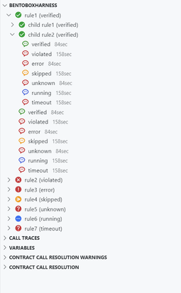
The tree built with Svelte inside VS Code
The testing process at this point was as follows: it’s still in the cloud but users can configure, run the tests, and see the results in the VS Code extension. A test takes between a few minutes to two hours, and addresses a typical client’s workflow. Here, several tests are run at once, checking contract rule by rule, where independent rules can be checked simultaneously.
New engineering practices
In this project, we had our first hands-on experience building a VS Code extension. Both teams needed to understand what we could implement and how it would look. So we created dozens of demos to show how the features, UI elements, and flow would work.
We also initiated the migration of all our communication with the Certora Team from Google Docs and Google Spreadsheets to Notion in order to track task progress and record everything agreed upon during our meetings.
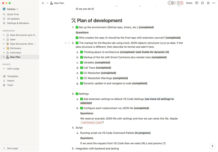
The list of development stages and their statuses in Notions
We wrote a plan for the product’s further enrichment via feature development, pooling together the Certora team’s ideas with our own. Then, the project entered the testing and feedback stage. Certora ended up with a large client base, which will enable them to collect real-life feedback.
We took a plethora of ideas and created an MVP around them, implemented the UI design, and built out the frontend—and we started by crafting the feature roadmap and choosing the technologies that would be utilized.
In just two months, we managed to build a plugin that improved users’ lives and allowed them to get all the necessary information right inside the IDE. You can watch a video explainer here.
We migrated the sophisticated smart contract verification process to the developer’s comfort zone. Now, right in the native interface, some tricky things are much simpler:
- Launching a verification process with a script now entails running it with a button click and a quick launch toolbar.
- Complex structure and nesting formed into a job tree.
- A cumbersome results report morphed into code and function highlighting complete with the “go to line” option.
- Users can launch some parallel verification processes simultaneously.
- Status tracking and logs helps users easily and swiftly indicate any issues and stop the process.
We had a great project with Evil Martians and we are progressing with more versions of the plugin as well as other products. Although the technical challenge of understanding what we are doing was big and took a lot of effort both on your side and our side, the experience with you was good overall, and especially the design phase was eye opening for us.

Uri Kirstein
Certora, Software Engineer
Need to release a product or a critical feature on a tight schedule and with specific requirements? Let’s discuss how we can help ensure that your product brings real benefits.

