Designing Tegon: a signature vision for the AI-driven issue tracker
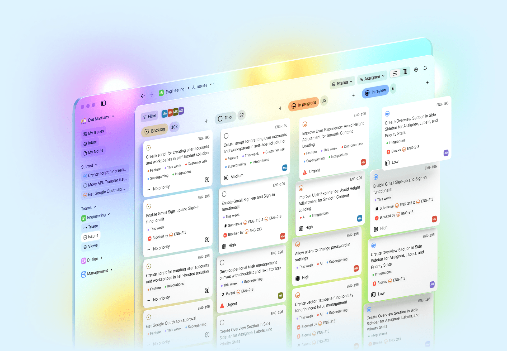
Tegon, the open source, AI-first issue tracker for engineering teams, faced the challenge of changing its UI and UX to set the product apart from other issue trackers. Evil Martians took charge of this transformation, successfully redesigning the core experience and bringing forward new ideas for AI-first features to take the issue tracker UX above and beyond. Our contributions helped Tegon launch version 2.0 in just 2.5 months, with well-received results!
Martian project team
![Arthur Objartel]()
Arthur Objartel
Product Designer
![Kirill Yakovenko]()
Kirill Yakovenko
Account Manager
AI-first

Irina Nazarova CEO at Evil Martians
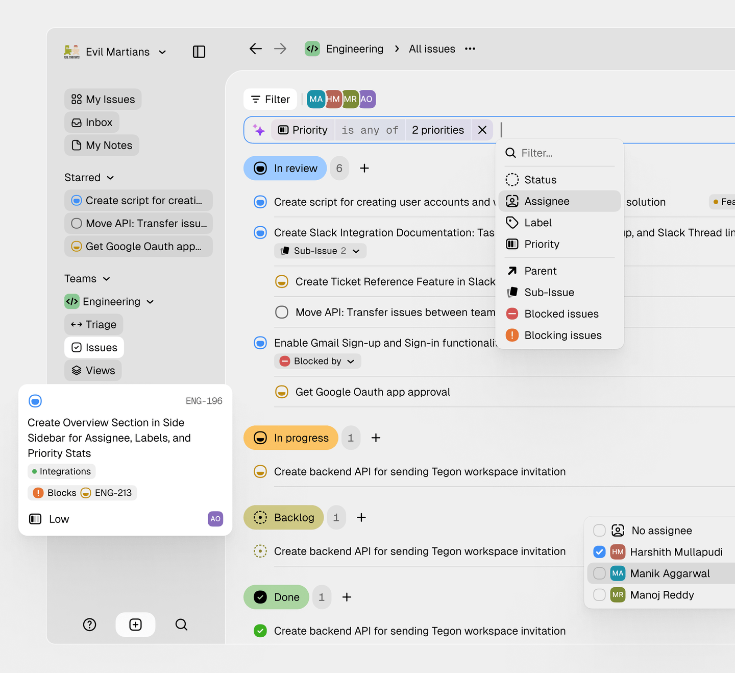
Tegon’s redesigned AI capabilities now offer a more intuitive and efficient user experience. Smart filters, ticket augmentation, duplicate detection, and text assistance are streamlined, making complex tasks easier to manage. The integrated AI chat, with GitHub and codebase support, simplifies coding workflows and accelerates triage processes.
Fast, excellent, accessible.
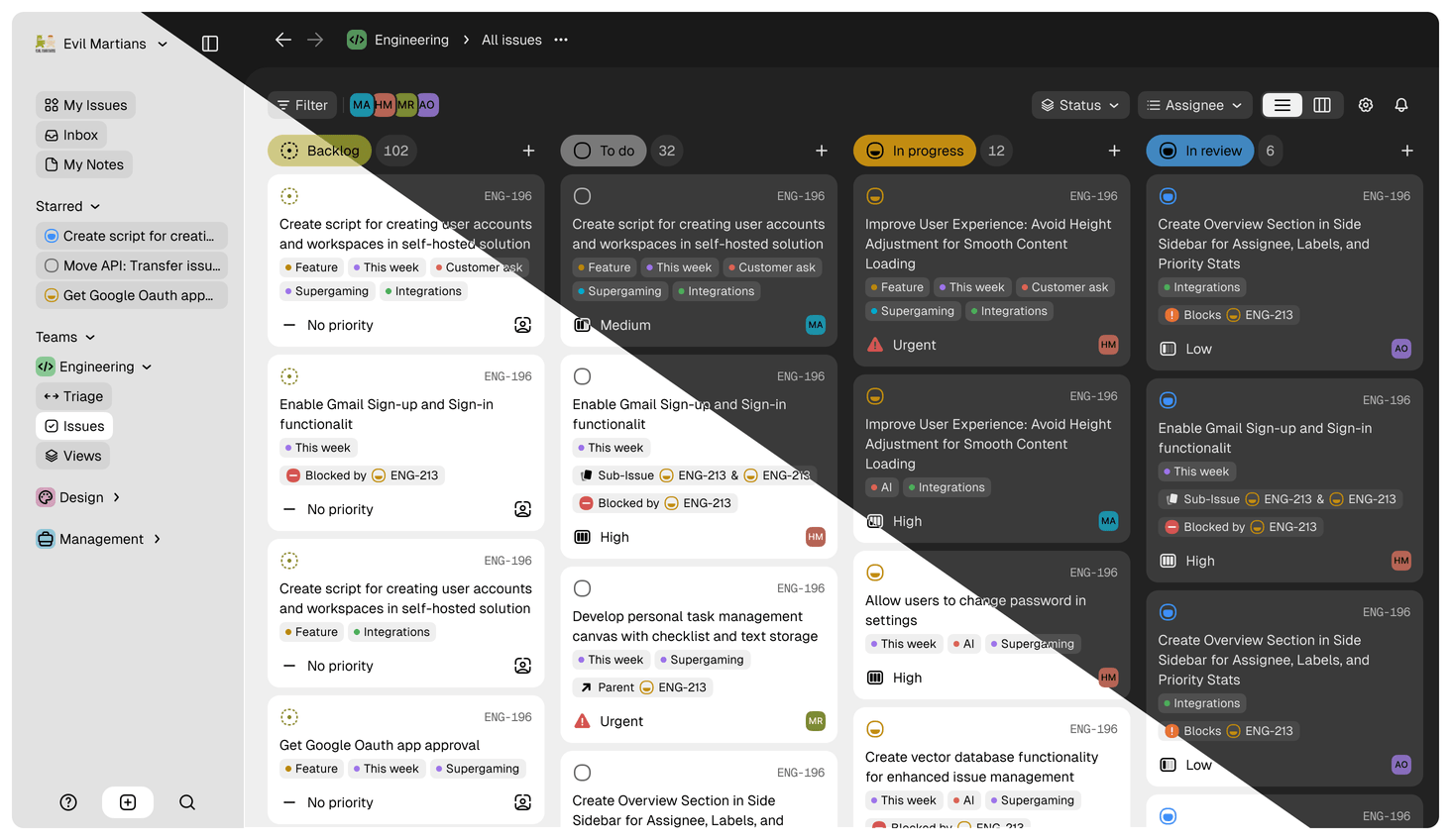
From day one, Figma variables help us create a high-quality UI that smoothly adjusts to both light and dark themes.
Using the OKLCH color model, we crafted UI palettes that enhance color vibrancy based on the background, meeting accessibility standards while delivering a visually appealing experience.
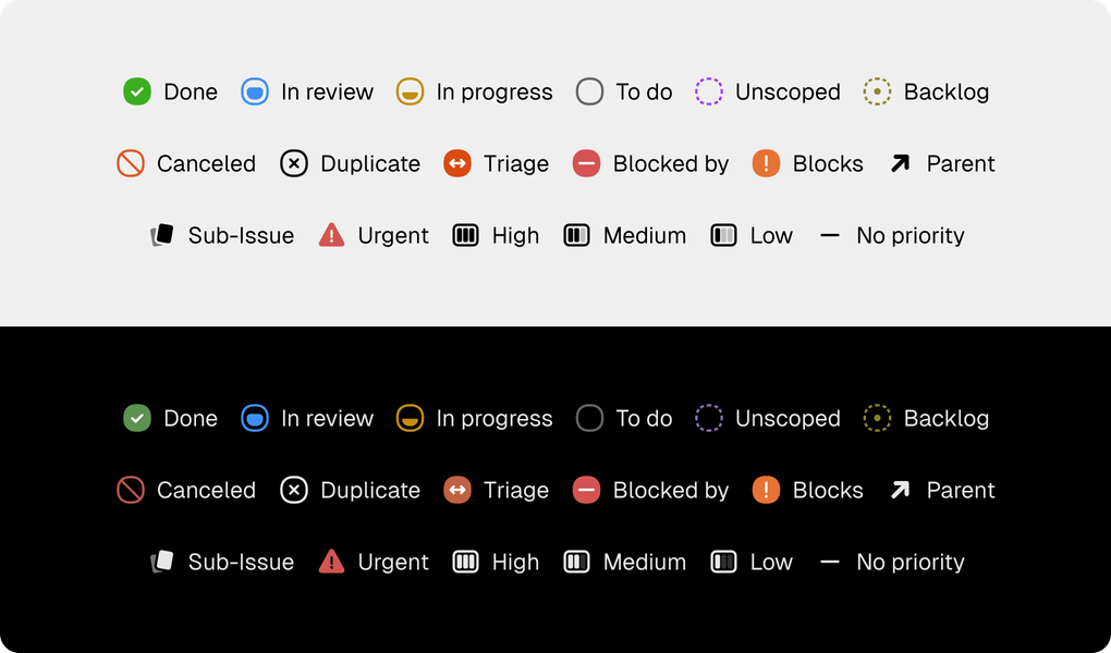
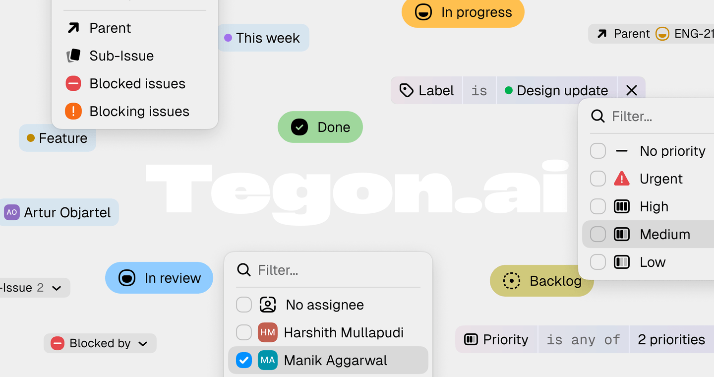
Custom icons designed with colors that adapt seamlessly to both light and dark backgrounds
With a focus on usability, Tegon’s UI is built to support seamless navigation and quick access to key features, allowing teams to dive into their work with ease and confidence.
The Cycles feature is designed to streamline the development process. Once set up, it helps with scoping tasks and keeping track of progress
Augmenting the team
Martian product designers do more than just create visuals; they take full ownership of each project. Thus, working hand-in-hand with the Tegon team, we set up an iterative process that included building hypotheses, planning releases, tracking metrics, and gathering user feedback. Our focus is finding the right product-market fit and developing solutions that truly connect with users.
The Focus mode clears the screen of unnecessary elements to help users stay on task without distractions
It’s been a pleasure working with Evil Martians! These past 2.5 months have been an incredible journey, and your creativity and hard work have truly made Tegon something special.

Harshith Mullapudi
Co-founder Tegon
From brainstorming sessions to final touches, every moment working with you has been a joy. Your talent and dedication have been inspiring, and it’s been fantastic seeing our vision come to life with your designs.
I’m really proud of what we’ve achieved together. I hope we get the chance to team up again in the future.

Harshith Mullapudi
Co-founder Tegon


