Evil Front Part 2: Modern Frontend in Rails
Topics
Translations
An opinionated guide to modern, modular, component-based approach to handling your presentation logic in Rails that does not depend on any frontend framework. Follow this three-part tutorial to learn the bare minimum of up-to-date frontend techniques by example and finally make sense of it all.
Other parts:
- Evil Front Part 1: Modern Frontend in Rails
- Evil Front Part 2: Modern Frontend in Rails
- Evil Front Part 3: Modern Frontend in Rails
New! This article was updated in July 2019 to follow the latest developments in frontend and support most recent versions of Rails, Webpacker, and other libraries.
Previously, on Part 1…
By the end of the much-discussed Part 1 (read it here), we have managed to rewire our standard Rails application to cater for modern frontend practices. We are using Webpacker gem to build our assets with Webpack while PostCSS and postcss-preset-env are processing our styles. Babel, Autoprefixer, and Browserslist allow us not worry about cross-browser issues. Our code is automatically checked for syntax errors with Prettier, AirBnB Base Config, ESLint, and stylelint on each git commit.
We have a comprehensible folder structure that allows us to think in components and we are not tied to any particular frontend framework like React—we are still dealing with good old .erb partials. In development, we launch our server with hivemind (you can get it here) or foreman instead of usual rails s.
Our app is still lacking though, all we display for now is a “Hello world” message. Time to build a real thing. If you are following the tutorial and building an application along with us, brace yourself for a lot of cutting and pasting (also feel free to retype example code and modify it to your liking). But first, make sure you have completed Part 1.
Getting real
As a quick reminder, this is how we render our components:
<!-- app/views/pages/home.html.erb -->
<%= render "components/page/page" do %>
  <p>Hello from our first component!</p>
<% end %>
We can make our life a bit easier by introducing a helper that will allow us to render our components like so:
<%= c("page") do %>
  <%= c("auth-form") %>
<% end %>
That way, we can only mention our component’s name instead of typing the whole path. Our helper will also handle a case when we happen to have two partials in the same folder with a slightly different functionality (for instance _message-form.html.erb and _message-form_admin.html.erb). As a convention, we will use underscores to tell these “alternative” partials from each other.
Go to your application_helper.rb and add a method:
module ApplicationHelper
  def component(component_name, locals = {}, &block)
    name = component_name.split("_").first
    render("components/#{name}/#{component_name}", locals, &block)
  end

  alias c component
end
Now it’s time to think about our controllers. Currently, we have a single pages_controller.rb, the one we needed for a smoke test. You can safely get rid of it (and corresponding app/views/pages folder). Our chat application will have two controllers: an AuthController to handle authentication and a ChatController responsible for our chat window. We can generate them both:
$ bin/rails g controller auth
$ bin/rails g controller chat
Also, change your routes.rb:
Rails.application.routes.draw do
  root "chat#show"

  get "/login",  to: "auth#new"
  post "/login", to: "auth#create"
end
Let’s start with our “authentication” page:
# app/controllers/auth_controller.rb
class AuthController < ApplicationController
  before_action :only_for_anonymous # check if we know the user

  def new; end

  # Get username from params, save to session and redirect to chat window
  def create
    session[:username] = params[:username]
    redirect_to root_path
  end

  private

  # If a user had been to our chat before, send them straight to chat window
  def only_for_anonymous
    redirect_to root_path if session[:username]
  end
end
For the sake of example, our actions are fairly simple. A first-time user will be prompted a username, and we will store it in the session hash. A returning user will skip the authentication page. We only need one view, for our new action, so let’s create one. By design, our view templates should only contain render calls to component partials. Here we are embedding an auth component inside the page component that was created at the end of Part 1.
$ touch app/views/auth/new.html.erb<!-- app/views/auth/new.html.erb -->
<%= c("page") do %>
<%= c("auth-form") %>
<% end %>Now, let’s create a component for our authentication form. We will name it more explicitly: auth-form.
$ mkdir -p frontend/components/auth-form
$ touch frontend/components/auth-form/{auth-form.pcss,auth-form.js,_auth-form.html.erb}
You will run these two commands pretty much every time you create a new component. Let’s start with the .erb partial. Here we are building a basic form, using standard Rails helpers.
<!-- frontend/components/auth-form/_auth-form.html.erb -->
<div class="auth-form">
  <%= form_tag login_path, method: :post do %>
   <%= text_field_tag :username, "", class: "auth-form--input", placeholder: "Choose your username...", autofocus: true, required: true %>
   <%= submit_tag "Identify me", class: "auth-form--submit" %>
  <% end %>
</div>
It also makes sense to agree on CSS naming from the very start.
By choosing a clear methodology, we can avoid nasty collisions in the common namespace and make our code self-documenting.
We are going to borrow from BEM’s handbook by adopting a “block/element” approach (where “block” is our component, and “element” is some logical part of it). We will choose this syntax convention: component-name--element-name. That way, text field and submit button need the following classes: auth-form--input (component auth-form, element input) and auth-form--submit (component auth-form, element submit). “M” in BEM stands for “modifier”, but we will not use modifiers in our simple example.
Of course, you are free to stick to any CSS naming you are used to, just make sure it is consistent across your components.
So, we have prepared the ground for our styles, but we have not added them yet. At this point, our authentication page looks like this (go to localhost:5000/login):
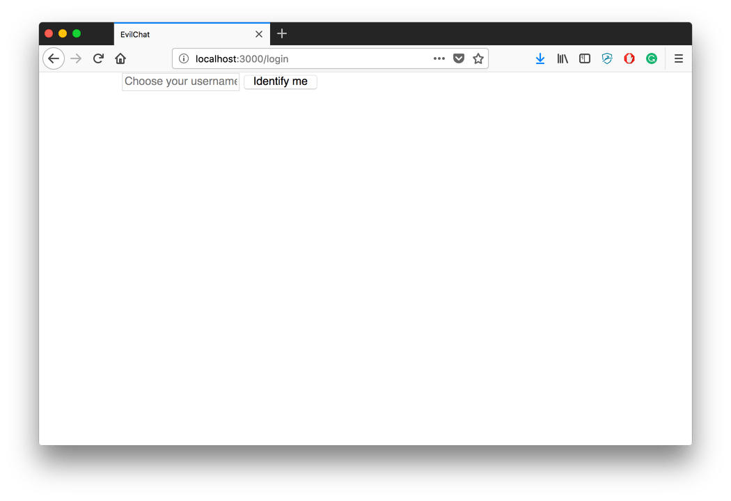
Bare authentication page
Let’s also take a second to enable postcss-nested plugin that will allow us to nest CSS classes. Type yarn add postcss-nested in the Terminal and add this line to the top of plugins section inside .postcssrc.yml: postcss-nested: {}.
Time to add some styles! Remember that they are pulled into Webpack by way of JavaScript, so we need to always import our component’s stylesheet file into its javascript file. We also need to “register” component’s JS inside our application.js entry point.
// frontend/packs/application.js
import "init";
import "components/page/page";
import "components/auth-form/auth-form";
// frontend/components/auth-form/auth-form.js
import "./auth-form.pcss";/* frontend/components/auth-form/auth-form.pcss */
.auth-form {
display: flex;
justify-content: center;
align-items: center;
width: 100%;
height: 100%;
&--input {
width: 100%;
padding: 12px 0;
border: 1px solid rgba(0, 0, 0, 0.1);
font-size: 18px;
text-align: center;
outline: none;
transition: border-color 150ms;
box-sizing: border-box;
&:hover,
&:focus {
border: 1px solid #3f94f9;
}
}
&--submit {
width: 100%;
margin-top: 6px;
padding: 12px 0;
background: #3f94f9;
border: 1px solid #3f94f9;
color: white;
font-size: 18px;
outline: none;
transition: opacity 150ms;
cursor: pointer;
&:hover,
&:focus {
opacity: 0.7;
}
}
}You can see that our component-name--element-name convention makes it easy to write nested PostCSS with the help of the ampersand. & is simply replaced by a “parent” class name when PostCSS is processed into plain CSS, so .auth-form { &--input } becomes two separate classes: .auth-form and .auth-form--input. In our code, though, anything that has to do with the auth-form component is contained inside the auth-form class scope, so you don’t have to worry about class names clashing. The rule of thumb here is to have your parent CSS class to be named exactly as a component and its folder inside the project—not respecting that can lead to a spaghetti code in no time.
Now if you go back to your browser window (provided your server was already running), you will see that our login page has got some style: webpack-dev-server noticed changes in JS file and had refreshed the page in the background.
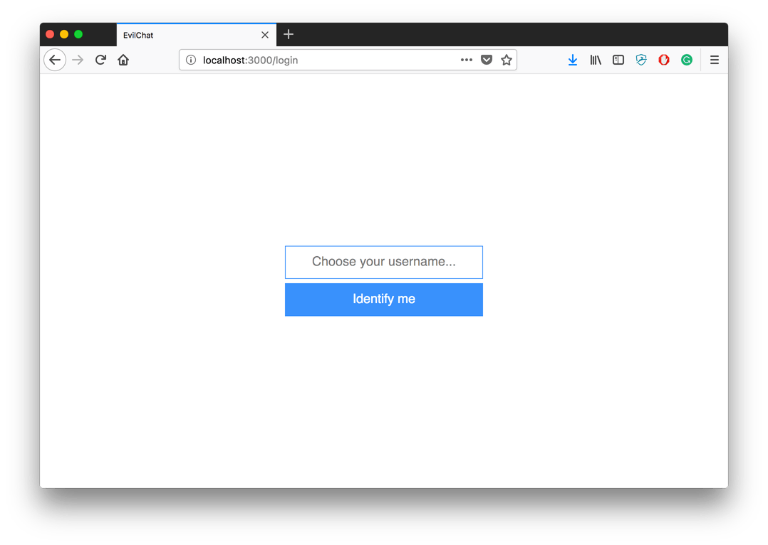
Styled authentication page
See how easy it has become to tweak CSS to your liking? If we need to change a button’s color, we can just open a browser and a code editor side by side, and your browser will reflect changes immediately—on each file save. That speeds up working with styles a lot.
Note: If you happened to submit this form and can not reopen the auth page due to controller logic (once the username is in session you can not go back), clear your browser’s cookies.
Don’t shoot the messenger
Our authentication page needs to lead somewhere, but all we have for now is some routes and an empty ChatController. We are going to be dealing with messages, so we need a basic Message model. Let’s create one:
$ bin/rails g model message author:string text:text
$ bin/rails db:create
$ bin/rails db:migrate
Our messages will be created from ActionCable, so our controller just needs a way to display them. We will display last 20 messages on initial page load.
# app/controllers/chat_controller.rb
class ChatController < ApplicationController
  before_action :authenticate!

  # dispay last 20 messages
  def show
    @messages = Message.order(created_at: :asc).last(20)
  end

  private

  # redirect user to /login if he hadn't picked a username yet
  def authenticate!
    redirect_to login_path unless session[:username]
  end
end
Again, we need only one view, this time it’s show.html.erb:
$ touch app/views/chat/show.html.erb<!-- app/views/chat/show.html.erb -->
<%= c("page") do %>
<%= c("chat", messages: @messages) %>
<% end %>As our components are just plain ERB partials rendered with a helper that uses a render method, we pass our locals the usual way. You already know the drill to create yet another component:
$ mkdir -p frontend/components/chat
$ touch frontend/components/chat/{chat.pcss,chat.js,_chat.html.erb}
Here, we are going to see a deeper component nesting. Our chat component is a way to refer to the contents of the page as a whole. Our page will have a dynamically updating list of messages and a form to submit a new message, so that can be broken into two components: messages and message-form. And where there are messages, there’s a message, so we need a message component too! More Terminal:
$ mkdir -p frontend/components/message
$ touch frontend/components/message/{message.pcss,message.js,_message.html.erb}

$ mkdir -p frontend/components/messages
$ touch frontend/components/messages/{messages.pcss,messages.js,_messages.html.erb}

$ mkdir -p frontend/components/message-form
$ touch frontend/components/message-form/{message-form.pcss,message-form.js,_message-form.html.erb}
The final structure after you have created all folders and files should look like this:
frontend/components
   ├── auth-form
   │   ├── _auth-form.html.erb
   │   ├── auth-form.pcss
   │   └── auth-form.js
   ├── chat
   │   ├── _chat.html.erb
   │   ├── chat.pcss
   │   └── chat.js
   ├── message
   │   ├── _message.html.erb
   │   ├── message.pcss
   │   └── message.js
   ├── message-form
   │   ├── _message-form.html.erb
   │   ├── message-form.pcss
   │   └── message-form.js
   ├── messages
   │   ├── _messages.html.erb
   │   ├── messages.pcss
   │   └── messages.js
   └── page
       ├── _page.html.erb
       ├── page.pcss
       └── page.js
We are going to start filling in the blanks with our parent component: chat.
<!-- frontend/components/chat/_chat.html.erb -->
<div class="chat">
  <div class="chat--messages">
    <%= c("messages", messages: messages) %>
  </div>
  <div class="chat--form">
    <%= c("message-form") %>
  </div>
</div>
You can see now that our component will render its sub-components, but we don’t want to put all of them in our entry point individually, this may quickly get out of hand. We’ll adopt a new rule of thumb: if a component has any children, children should be imported in a component’s .js file. This way, in our application.js we only register components located at the top of the hierarchy. Let’s do it right away, so we don’t forget later:
// Our updated frontend/packs/application.js
import "init";
import "components/page/page";
import "components/auth-form/auth-form";
import "components/chat/chat";
Now we import JS files for all components nested inside chat in the chat.js:
// frontend/components/chat/chat.js
import "components/messages/messages";
import "components/message-form/message-form";
import "./chat.pcss";
And, finally, for CSS:
/* frontend/components/chat/chat.pcss */
.chat {
  display: flex;
  flex-direction: column;
  align-items: flex-start;
  width: 100%;
  height: 100%;
  overflow: hidden;

  &--messages {
    width: 100%;
    flex: 1 0 0;
  }

  &--form {
    width: 100%;
    background: white;
    flex: 0 0 50px;
  }
}
One component done, three more to go!
For our message-form:
<!-- frontend/components/message-form/_message-form.html.erb -->
<div class="message-form js-message-form">
  <textarea class="message-form--input js-message-form--input" autofocus></textarea>
  <button class="message-form--submit js-message-form--submit">Send</button>
</div>
Note that we are not using a <form> tag here, as we are going to submit the contents of our <textarea> with JavaScript to make use of ActionCable.
Perhaps you are wondering why we repeat our class names twice: message-form and js-message-form. This convention ensures that if someone gets carried away while redesigning and chooses to change a class name, your JS selectors will not be affected. Thus you have two parallel ways to name things: one for CSS and one for JavaScript. You are not required to adopt this practice in your code; it is perfectly fine just to use a single selector. But you have to be extra-vigilant and modify your JS for DOM-manipulation every time you modify your CSS class names, so a redesign does not lead to broken logic.
// frontend/components/message-form/message-form.js
import "./message-form.pcss";
/* frontend/components/message-form/message-form.pcss */
.message-form {
display: flex;
width: 100%;
height: 100%;
&--input {
flex: 1 1 auto;
padding: 12px;
border: 1px solid rgba(0, 0, 0, 0.1);
font-size: 18px;
outline: none;
transition: border-color 150ms;
box-sizing: border-box;
resize: none;
&:hover,
&:focus {
border: 1px solid #3f94f9;
}
}
&--submit {
flex: 0 1 auto;
height: 100%;
padding: 12px 48px;
background: #3f94f9;
border: 1px solid #3f94f9;
color: white;
font-size: 18px;
outline: none;
transition: opacity 150ms;
cursor: pointer;
&:hover,
&:focus {
opacity: 0.7;
}
&:active {
transform: translateY(2px);
}
}
}Note that at any point of this process we can go to localhost:5000 and log in: our chat window will be displayed. Just make sure to comment out c render calls for components that are not ready yet.
Moving on. We have a parent component and a form; now we need a place to display our messages and a template for each message. We follow the same pattern: ERB, then JS, then CSS.
<!-- frontend/components/messages/_messages.html.erb -->
<div class="messages js-messages">
  <div class="messages--content js-messages--content">
    <% messages.each do |message| %>
      <%= c("message", message: message) %>
    <% end %>
  </div>
</div>
// frontend/components/messages/messages.js
import "components/message/message"; // message is nested, so we import it here
import "./messages.pcss";/* frontend/components/messages/messages.pcss */
.messages {
position: relative;
width: 100%;
height: 100%;
background: white;
border: 1px solid rgba(0, 0, 0, 0.1);
border-bottom: 0;
box-sizing: border-box;
&--content {
position: absolute;
top: 0;
left: 0;
width: 100%;
height: 100%;
overflow-x: hidden;
overflow-y: auto;
}
}And, finally, for the individual message:
<!-- frontend/components/message/_message.html.erb -->
<div class="message">
  <div class="message--header">
    <span class="message--author">
      <%= message.author %>
    </span>
    <span class="message--time">
      <% if message.created_at > Time.now - 24.hours %>
        <%= l(message.created_at, format: :short) %>
      <% else %>
        <%= l(message.created_at, format: :long) %>
      <% end %>
    </span>
  </div>
  <div class="message--text">
    <% message.text.lines.each do |line| %>
      <p><%= line %></p>
    <% end %>
  </div>
</div>
// frontend/components/message/message.js
import "./message.pcss";/* frontend/components/message/message.pcss */
.message {
margin: 12px 6px;
&:first-child {
margin-top: 0;
}
&:last-child {
margin-bottom: 0;
}
&--author {
font-weight: bold;
}
&--time {
color: rgba(0, 0, 0, 0.5);
font-size: 12px;
}
&--text p {
margin: 0;
}
}Time to test that all went well. We are not yet able to create our messages from the form, but we can create some Message instances from rails console and see that if they are in fact displayed correctly:
# In rails console...
> Message.create(author: "Evil Martian", text: "Surrender!")
Now make sure you run your server and refresh the browser. That is what you should see after following all the steps above:
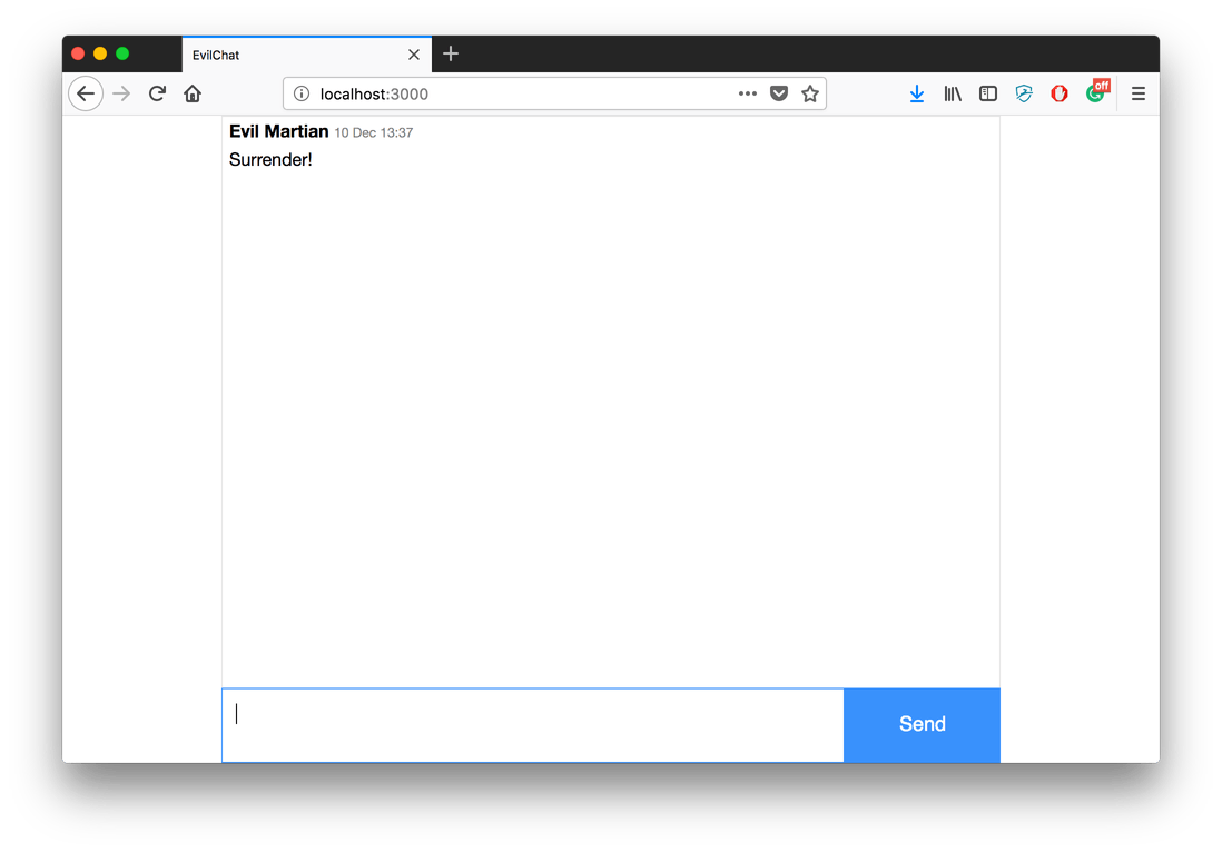
A chat window
One more thing…
If you are tired of creating components’ folders and files by hand, here is a simple Rails generator you can use and adapt to your needs. Create a folder named generators inside your lib and put a file named component_generator.rb inside:
$ mkdir lib/generators
$ touch lib/generators/component_generator.rb
# lib/generators/component_generator.rb
class ComponentGenerator < Rails::Generators::Base
argument :name, required: true, desc: "Component name, e.g: button"
def create_view_file
create_file "#{component_path}/_#{component_name}.html.erb"
end
def create_css_file
create_file "#{component_path}/#{component_name}.pcss"
end
def create_js_file
create_file "#{component_path}/#{component_name}.js" do
# require component's CSS inside JS automatically
"import \"./#{component_name}.pcss\";\n"
end
end
protected
def component_name
@component_name ||= name.underscore.dasherize
end
def component_path
"frontend/components/#{component_name}"
end
end
Now you can generate your components from the command line:
$ bin/rails g component NAMECongratulations! You have completed Part 2 of the tutorial. Check your code against this this branch of the official project repository if you had any trouble. Thank you for reading and jump to Part 3 where we will make our application interactive with ActionCable, put some finishing touches and happily deploy it to Heroku. We will also discuss what can go wrong in a “sprocketless” Rails application.


