How to build a better React map with Pigeon Maps and Mapbox

Evil Martians recently launched an Events page on our brand new website. Like the site itself, the Events page is overflowing with bold and extraordinary design solutions. The heart of the new page is the events map—a cool visual reminder about our team’s worldwide presence.
In this article, we’ll cover the entire process, the initial concept, the design, and implementing the solutions and logic to make our vision a reality. But before we talk about how we built the map, it’s important to know what we intended to build in the first place.
And, just in case you missed that link above, we invite you to check out our map on the Events page so you have a complete idea of what we’re talking about in this article!
Mapping out our goals
Our event map was intended to show how we’re spreading our knowledge around the globe (and to give more people access to this knowledge). We envisioned a map showing the locations of notable talks we held at conferences and meetups, and we wanted users to be able to go deeper and get more resources for a particular event. For instance, by visiting a talk page, they would be able to flick through presentation slides or watch a recording of the talk.
Our goal was to collect all the Martian conference talks with the geolocation data, the name of the speaker, and most importantly the information that may be useful to developers and designers: brief description of the event itself with slides, videos, and audio. That’s quite a bit of data, so let’s touch on that next.
Gathering enough data to begin the design process
As with every data visualization tool, it’s important to gather a few samples of the data you intend to display in order to extrapolate how things will play out in the completed design. In our case, to actually start the design process though, it was sufficient to gather information about 10 or so events.
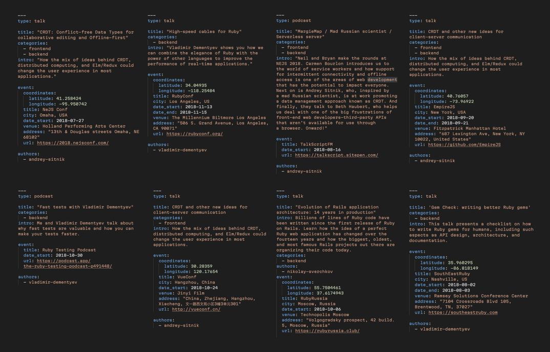
A few samples of the data we intend to display
Based on the length of the descriptions and the number of attachments, we realized that the name, type, and geo position of the event could be displayed in a tooltip directly on the map, but detailed descriptions and attachments were better placed on a dedicated page.
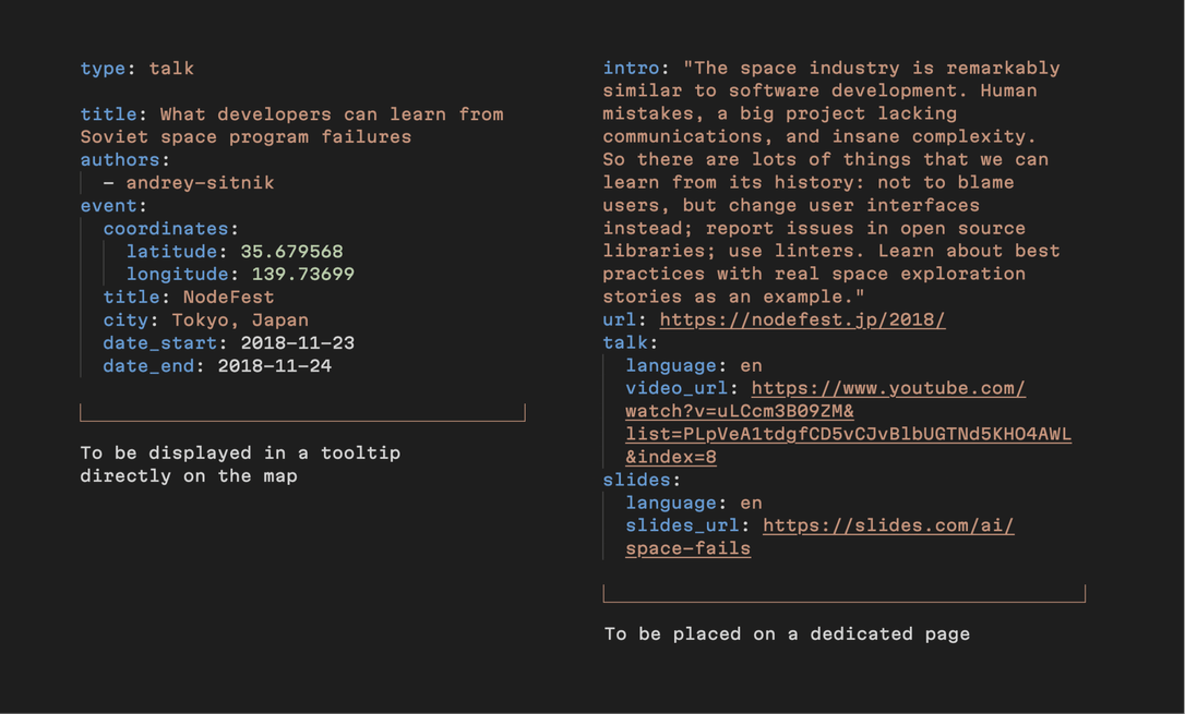
With this set of requirements it was possible to proceed with the design layouts.
Designing a map that fits your purpose and optimally illustrates the data
Different types of content (and functionality, depending on what your map is intended to do) require different types of maps. For instance, road maps are used when you want to tell a person how to get from point A to point B. Thematic maps are the best way to show the distribution of human or natural features or data. In our case, a simple physical map was sufficient.
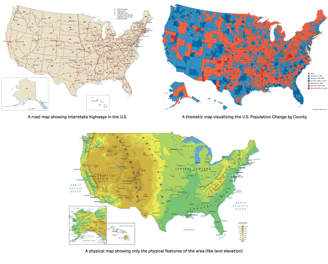
With the “type-of-map” question out of the way, it was necessary to think about the look and intended functionality of our map.
To match our overall design, the map needed to be seamlessly woven onto the top of the page. We also wanted to create this feeling that you are observing the Earth from space (naturally, as if looking down from a Martian spaceship.) To create this effect, we removed secondary data like country names, borders, and any size indicators. (We also implemented a smooth transition from map to content, mimicking a “landing from space” effect.)
After cutting out a ton of other traditional map elements, we ended up with just 3 main elements: the map itself, markers of past and future events, and tooltips with brief information and a link to a dedicated page for videos and slides.
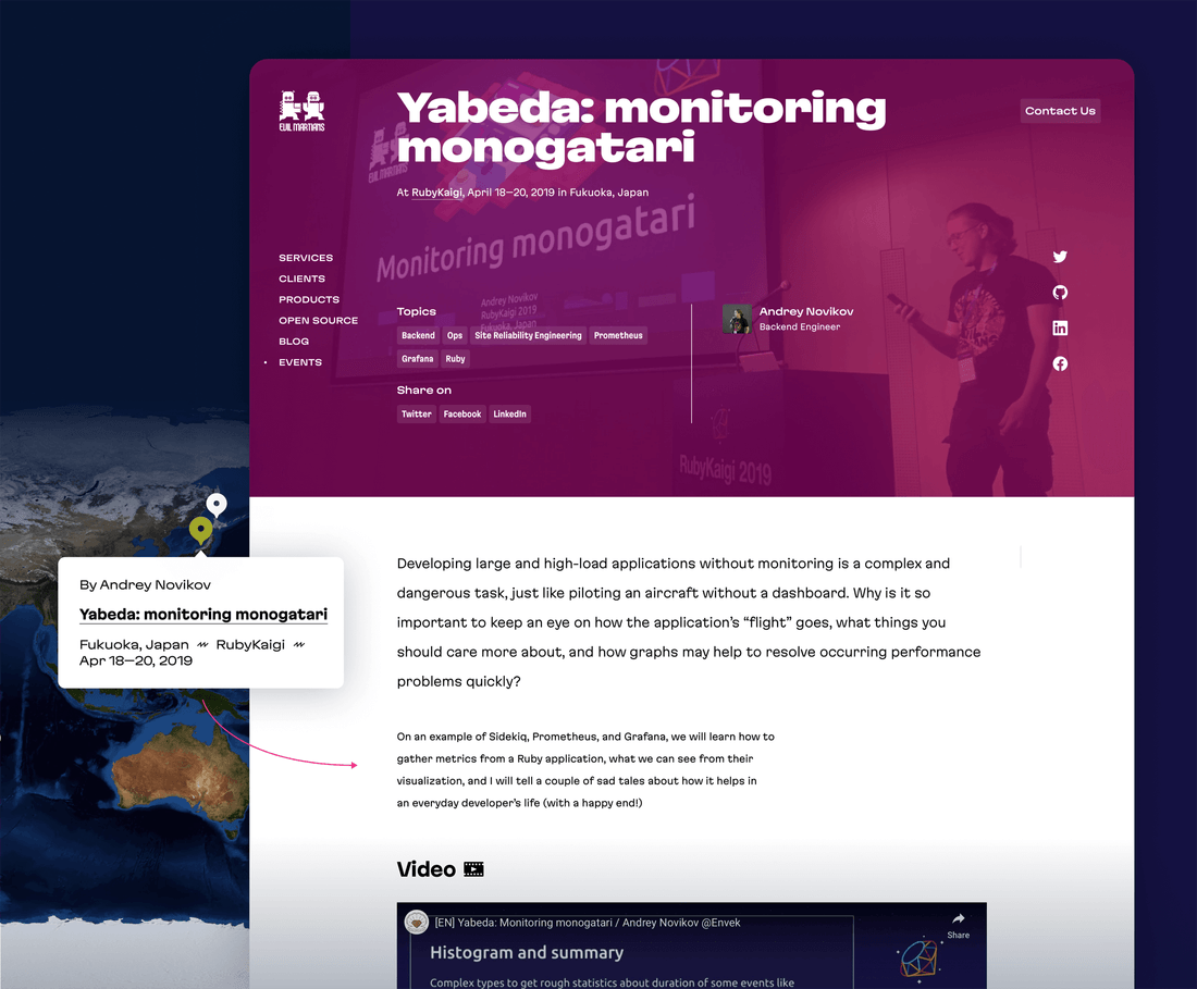
Even from our relatively small data sample, it became clear that many conferences are annually repeated, so those corresponding markers would need to be on the same point. For such cases, we added “event clusters”—these are a special kind of marker and tooltip that indicates multiple items. Event clusters allow users to browse through an entire list of events in one location, from the newer, more relevant events, to older events.
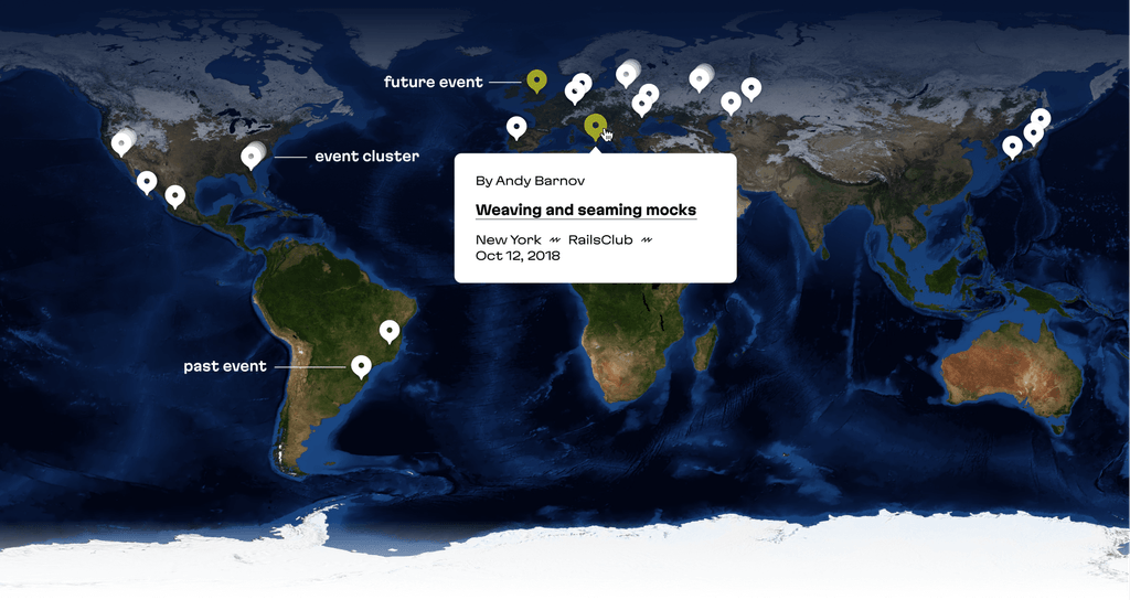
It was also important to implement standard page filters to control the information displayed on the map. So when a frontend developer checks out the map, they can filter the page by “frontend” and see only those events.
Starting the map R&D
Once the design was ready, we started researching tools that could help us develop the map on the frontend side.
Google Maps is the currently reigning industry standard; our old website map was built using it, too. And Google Maps isn’t bad, but there were several reasons for us to look up for alternatives:
- With a straightforward and static design, we didn’t need all the functionality of Google Maps
- We wanted to save those precious kilobytes and keep our website to be as fast as possible
- We wanted it to have a realistic, satellite look without much customization effort
- We wanted to use it easily with React & Gatsby (Google Maps doesn’t provide a convenient React API—although there are several unofficial wrappers)
- We love and support open source products!
Our quest began, and we quickly found several other packages that could help us render a map with a markers:
All of these work with tiled maps; this means the map element consists of multiple square images (tiles) with map slices rendered one by one. If your map is interactive, when moving it or zooming in or out, you just load another set of tiles with more (or less) detailed images. The standard tile sizes are 256×256px and 512×512px (for HiDPI screens).
Map tiles loading one-by-one
Pigeon Maps turned out to be the most lightweight and simple solution: it’s minimalistic, easily customizable, React-centric, and open source. And it’s only 9.8KB when minified and gzipped! With our “plain” design, it was the best option to start.
For our map, we would only need to use a tile renderer (via the <Map> component) and the self-explanatory <Marker> components, both provided by Pigeon Maps.
The cool benefit of open source map packages is that you can decide which set of tiles to use: this means different designs, detalization, and custom object descriptions. Some map tiles are built for street navigation, some for landscape study, some for weather description—the choice is yours. There are free tiles from OpenStreetMap, many commercial tile providers, and you can even set up your own custom map with some services like MapTiler or Mapbox. And they’re all compatible with Pigeon Maps and Leaflet.
Introducing Mapbox
While checking out some tile providers, we instantly fell in love with Mapbox. They have some cool styles that are worth a look! We chose a beautiful satellite map that exactly fit our initial design needs.
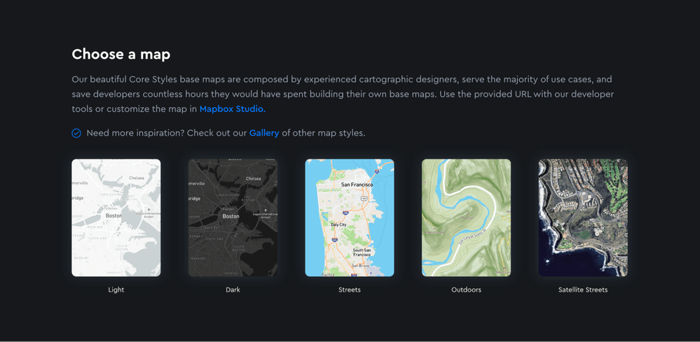
A set of Mapbox default tiles styles, including satellite, street views, dark mode, and so on
Mapbox maps has a handy API that is highly customizable. Also, they provide different methods for insertion on your site: vector tiles (mostly for high-precise maps), raster tiles, static tiles, and static images. As our map is mostly static, in order to use it with Pigeon Maps and add markers, we used static tiles.
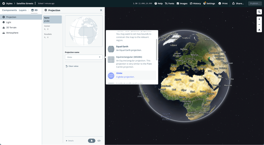
You can build different layers you wish to display on your map with the Mapbox Studio tool. It’s possible to add or remove different layers of geographic data, like boundaries or labels, change any of their colors, and even choose a different projection of the Earth (actually, someday we’d like to transform our map to a globe!)
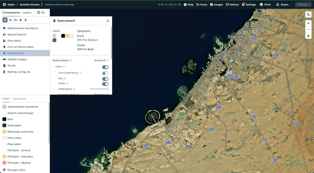
Mapbox isn’t free, but prices are affordable even for small teams; we have 200k static tiles requests a month for free, with pay-as-you-go pricing.
We created a new project in Mapbox Studio, removed all the component layers (as we don’t really need them with our minimalistic design) and chose Equirectangular projection to make it rectangle and save the scale.
Embedding the map
To use the Mapbox tiles provider, we added our Mapbox project URL and access token to the environment variables, and added a function builder to use the static tiles from the Studio project design we created.
To embed the map with Pigeon Maps, we created a new <EventsMap> component. Altogether, it looks like this:
import * as React from 'react';
import { Map } from 'pigeon-maps';

const TILE_SIZE = 256;
const HEIGHT_RATIO = 0.75;

function mapboxProvider(x, y, z, dpr) {
  return `https://api.mapbox.com/styles/v1/${
    process.env.GATSBY_MAPBOX_URL
  }/tiles/512/${z}/${x}/${y}${dpr >= 2 ? '@2x' : ''}?access_token=${
    process.env.GATSBY_MAPBOX_ACCESS_TOKEN
  }`;
}

const EventsMap = () => {
  // With Gatsby or another SSR-based framework, there would be also a `window` check,
  // but we skip it for simplification
  const screenWidth = window.innerWidth;
  const zoomValue = Math.log2(screenWidth / TILE_SIZE);

  return (
    <Map
      provider={mapboxProvider}
      dprs={[1, 2]}
      height={screenWidth * HEIGHT_RATIO}
      width={screenWidth}
      defaultCenter={[0, 0]}
      center={[0, 0]}
      defaultZoom={zoomValue}
      zoom={zoomValue}
      animate={false}
      attribution={false}
      mouseEvents={false}
      touchEvents={false}
      metaWheelZoomWarning={null}
      twoFingerDragWarning={null}
    />
  );
}
The false and null values in the Map props represent non-interactivity—users can’t pan and zoom. The center of our map is latitude 0° and longitude 0°, Null Island. We use tiles for HiDPI and regular screens, so that’s why dprs={[1, 2]} is passed.
We struggled a bit trying to find the correct zoom value—this was tricky because we needed to show the full projection of the Earth in fullscreen, without cropping or leaving a padding. And, this isn’t documented (although it might be obvious to developers with map experience), but empirically, we figured out that the zoom level and real width of the map tiles scales not with simple multiplication, but to the power of a zoom level. That’s why we use Math.log2 to adjust it.
Also, we need to reload the map as the window width changes, so we also added a handler on the window resize event to recalculate size and zoom levels.
We use HEIGHT_RATIO 0.75 because, by default, the tiles form a square image with the Arctic on the top and the Antarctic on the bottom, and unfortunately, there haven’t been any conferences at these cool places (so far). There was no use displaying them on the page, so we cropped them.
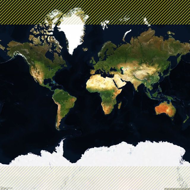
The original map aspect ratio. We cropped the highlighted areas
After embedding the map, we added some styling to make it fit seamlessly in our page design: we added gradients with the help of postcss-easing-gradients. These are two simple, absolutely-positioned divs: a dark blue to transparent gradient on the top of the map, and transparent to white on the bottom.
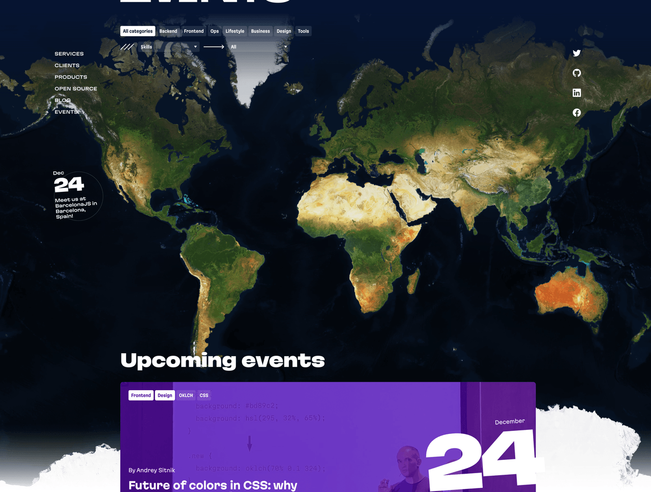
The result: map with gradients
Placing the markers
Pigeon maps has a core Marker component that is quite simple to add: just place it inside the <Map> component. <Marker> uses an anchor prop for placement, which is basically an array containing the latitude and the longitude of a particular place. But the thing is we have a list of events with addresses only. So how to get the coordinates for these addresses, fetch them all at once for more than a hundred events and not to spend a massive amount of money on it?
Geocoding is the process of converting addresses into geographic coordinates (latitude and longitude) which you can use to place markers on a map, or to position the map.
You may know Google Maps provides its Geocoding API (static and dynamic), but currently, it costs 0.005 USD per request—it’s not available for free, even for development purposes. But Mapbox, whose tiles we already use, also provides their own Geocoding API with 100,000 free requests per month. That’s more than enough for our project.
Because our content management system is GitHub, we use Gatsby, and store all the event data on the file system, right in Markdown files, with the YAML-like frontmatter at the beginning of the file.
To illustrate, here’s how the source file for one of our events looks:
# content/events/2022-11-15-weaving-and-seaming-mocks/index.md
---
type: talk
title: "Weaving and seaming mocks"
event:
  title: RubyConf Mini
  city: Providence, USA
  date_start: 2022-11-15
  date_end: 2022-11-17
  venue: Omni Hotel Providence
  address: "1 West Exchange Street, Providence, Rhode Island 02903"
---

To mock or not mock is an important question, but let’s leave it apart and admit that we, Rubyists, use mocks in our tests.
So, our goal is to write the coordinates of “1 West Exchange Street, Providence, Rhode Island 02903” (or at least, “Providence, USA”, if the full address is not presented) to the same file, and to do the same for all 130+ events. We can do this with a Node.js script, encoding the address string to URI, and making a fetch request to the Mapbox Geocoding API with the same access token we used to receive the map tiles:
const fs = require('fs/promises');
const path = require('path');
const glob = require('glob');
const matter = require('gray-matter');
const fetch = require('node-fetch');

require('dotenv').config({
  path: `.env.development`,
});

async function calculateEventsCoordinates(baseDir) {
  // Check if token presented
  if (!process.env.GATSBY_MAPBOX_ACCESS_TOKEN) {
    throw new Error(
      'Please provide GATSBY_MAPBOX_ACCESS_TOKEN to fetch coordinates.'
    );
  }

// Find all events dirs
const dirs = glob.sync(baseDir + '/*');

for (let i = 0; i < dirs.length; i++) {
  const dir = dirs[i];

  // Read the file content
  const eventFile = path.join(dir, 'index.md');
  const content = await fs.readFile(eventFile, 'utf-8');
  const { data: frontmatter } = matter(content);

  // Skip event if the coordinates are already presented,
  // or no address or city provided (we have podcasts events with no address)
  if (
    frontmatter.event.coordinates ||
    !frontmatter.event ||
    (!frontmatter.event.address && !frontmatter.event.city)
  ) {
    continue;
  }

  const address = frontmatter.event.address || frontmatter.event.city;

  try {
    console.log(`Fetching geocoding data for ${eventFile}...`);
    // Make an API response
    const response = await fetch(
      `https://api.mapbox.com/geocoding/v5/mapbox.places/${encodeURI(
        address
      )}.json?access_token=${process.env.GATSBY_MAPBOX_ACCESS_TOKEN}`
    );
    const data = await response.json();

    if (data && data.features && data.features.length > 0) {
      // Get coordinates position
      const coordinates = data.features[0].center;

      // Create new content data with the coordinates
      const updatedContent = content.replace(`event:
  `, `event:
    coordinates:
      latitude: ${coordinates[1]}
      longitude: ${coordinates[0]}
  `);

      try {
        // Write updated content to the same file
        await fs.writeFile(eventFile, updatedContent);
        console.log(
          `Coordinates wrote to file ${eventFile} for ${address}: [ ${coordinates[1]}, ${coordinates[0]} ]`
        );
      } catch (error) {
        console.error(
          `Unable to write coordinates to the file ${eventFile}. Error: ${error}`
        );
      }
    }
  } catch (error) {
    console.error(
      `Unable to fetch geocoding data for the address: ${address}. Error: ${error}`
    );
  }
}

const baseDir = path.resolve(process.cwd(), './content/events');
calculateEventsCoordinates(baseDir);
After running this script, we received static geocoding data for all 130+ events—without spending any money—and wrote the data to the same file to make it easy to handle in Gatsby, like any other frontmatter fields. We’ll fetch these fields along with the complete event list data.
For example, here’s what we received for the previously referenced “Weaving and seaming mocks” event:
# content/events/2022-11-15-weaving-and-seaming-mocks/index.md
---
type: talk
title: "Weaving and seaming mocks"
event:
  coordinates:
    latitude: 41.825215 # New field!
    longitude: -71.415851 # New field!
  title: RubyConf Mini
  city: Providence, USA
  date_start: 2022-11-15
  date_end: 2022-11-17
  venue: Omni Hotel Providence
  address: "1 West Exchange Street, Providence, Rhode Island 02903"
---

To mock or not mock is an important question, but let’s leave it apart and admit that we, Rubyists, use mocks in our tests.
With this approach, we can manually set coordinates for an event if we find out that for some reason the Geocoding API returned the wrong data. Still, after the first run, all 130+ addresses we fetched were geocoded correctly, so we can trust Mapbox with this task.
For future events we add to our website, we could run the same script manually, or write down every other event coordinates by hand. But, because we care so much about our content authors and editors, we want to make it so that they don’t need to work with anything except Markdown. Therefore, we added nearly identical code into the build to add the new events to the map. It’s not an ideal solution, as every production build will query events data and spend API free requests, but it seems impossible to reach 100,000 requests when, at best, we have a few new events a month. In the future, we want to automate this with Github Actions or with hooks (we already use Lefthook for linting, so why not add geodata as another step?)
When the data is ready, we can actually add the markers to the Map:
import { Map, Marker } from 'pigeon-maps';

const EventsMap = ({ events = [] }) => {
  // ...

  const renderMarker = (event) => {
    if (!event?.node?.event?.coordinates) {
      return null;
    }

    return (
      <Marker
        width={33}
        anchor={[event.node.event.coordinates.latitude, event.node.event.coordinates.longitude]}
        key={event.node.slug}
      />
    );
  };

  return (
    <Map {...}>
      {events.map(renderMarker)}
    </Map>
  );
}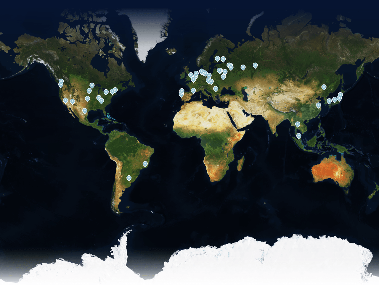
The map with the default Pigeon Maps markers added
This is how we created a map using the default Pigeon Maps marker design. But we wouldn’t be Martians if we didn’t make our own markers!
Customizing the markers
Thankfully, it’s easy to replace the standard design with a custom SVG just by placing it inside the <Marker> component and adding some styling with class names:
import cx from 'classnames';
import { ReactComponent as MarkerIcon } from './assets/marker.svg';
import * as cs from './EventsMap.module.css';

// ...

<Marker
  width={33}
  anchor={[event.node.event.coordinates.longitude, event.node.event.coordinates.latitude]}
  key={event.node.slug}
  className={cs.marker}
>
  <MarkerIcon
    className={cx(cs.icon, {
      [cs.upcoming]: event.node.event.upcoming,
    })}
    onClick={() => {
      console.log(`Click event: ${event.node.slug}`);
    }}
  />
</Marker>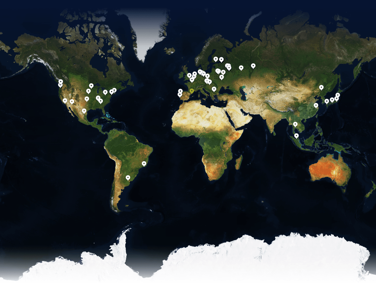
The map with our custom SVG markers added
Additionally, within this code, we also added a highlight with a different color for upcoming events.
Clusterization
As we gathered info about the over 130 events we were part of during the last 13 years, it’s obvious that some took place in the same general area: many events happened in the same city, or in a nearby city, so when the scale is zoomed out to see the world map, their markers overlay one above another, thus making it impossible to click on some of them. That’s why we need clusterization—in other words, we must group these events to render as one marker with a special design indicating this is the case.
Pigeon Maps itself doesn’t provide clusterization, so we initially thought to write the algorithm ourselves, or to use the one provided by Google Maps. But luckily, we found the amazing supercluster package from Mapbox.
A supercluster instance initializes with an array of GeoJSON Feature objects. We convert our events into these objects and use the getLeaves method to return all the points (that is, clusters and individual events that have no neighbors).
const EventsMap = ({ events = [] }) => {
  // We use in with useState and useEffect as we get events list from props and it could change
  const [supercluster, setSupercluster] = React.useState(
    null
  );

  React.useEffect(() => {
    const index = new Supercluster({
      // The cluster radius in px, which means minimal distance between the cluster points
      radius: 15,
      maxZoom: 16,
    });

    index.load(
      [...events]
        // Take only events with coordinates (we also have podcast that don't have an address)
        .filter((event) =>
          Boolean(event?.node?.coordinates) &&
          event.node.coordinates.latitude &&
          event.node.coordinates.longitude
        )
        // Transforming an event to the GeoJSON Feature object with some custom data
        .map((event) => ({
          geometry: {
            coordinates: [
              event.node.coordinates.longitude,
              event.node.coordinates.latitude,
            ],
            type: 'Point',
          },
          type: 'Feature',
          id: event.node.slug,
          properties: {
            node: event.node,
            upcoming: event.node.event.upcoming,
          },
        }))
    );

    setSupercluster(index);
  }, [pastEvents, upcomingEvents]);

 const renderMarker = (point: any) => {
    if (!point?.geometry?.coordinates) {
      return null;
    }

    const cluster = point.properties?.cluster || false;

    // Sort events from latest to earliest to always highlight the upcoming ones
    const clusterItems = cluster ?
      supercluster.getLeaves(point.id, Infinity).sort((a, b) =>
        new Date(b?.properties?.node?.event?.dateStartISO) -
        new Date(a?.properties?.node?.event?.dateStartISO)
      ) : [point];

    return (
      <Marker
        width={33}
        anchor={[point.geometry.coordinates[1], point.geometry.coordinates[0]]}
        key={point.id}
        className={cs.marker}
      >
        <MarkerIcon
          className={cx(cs.icon, {
            [cs.upcoming]: clusterItems[0].properties?.upcoming,
          })}
          onClick={() => {
            console.log(`Click cluster: ${clusterItems}`);
          }}
        />
      </Marker>
    );
  };

  // Get all clusters and individual events from minimal to maximum longitudes & latitudes on a given zoom value
  const markersAndClusters =
    (supercluster &&
      supercluster.getClusters([-180, -90, 180, 90], zoomValue)) ||
    [];

  // ...
  return (
    <Map {...}>
      {markersAndClusters.map(renderMarker)}
    </Map>
  )
}
The map with clusterized markers
In order to make sure event clusters have an easily identifiable appearance, we re-used the same SVG marker to create a transparent underlay representing events in a cluster, with a maximum of 4 markers (as in some cities we had 18 events and the map would be too overloaded with such a stack):
 const renderMarker = (point: any) => {
    // ...

    // To show transparent markers behind the main one, maximum 4 markers in a row
    const clusterCount = Math.min(point.properties?.point_count || 1, 4);

    return (
      <Marker
        width={33}
        anchor={[point.geometry.coordinates[1], point.geometry.coordinates[0]]}
        key={point.id}
        className={cs.marker}
      >
        <div className={cs.iconsCluster}>
          <MarkerIcon
            className={cx(cs.icon, {
              [cs.upcoming]: clusterItems[0].properties?.upcoming,
            })}
            onClick={() => {
              console.log(`Click event: ${event.slug}`);
            }}
          />

          {/* Add transparent markers behind the main one */}
          {cluster &&
            clusterCount > 1 &&
            [...Array(clusterCount - 1).keys()].map((index) => (
              <MarkerIcon
                className={cx(cs.icon, cs.clusterIcon, {
                  [cs.upcoming]: clusterItems[index + 1].properties?.upcoming,
                })}
                key={clusterItems[index + 1].id}
              />
            ))}
        </div>
      </Marker>
    );
  };
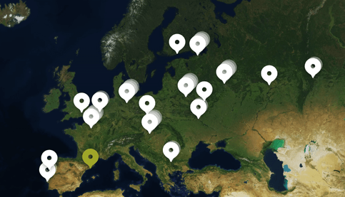
Clusters with underlays
It’s cool to see that the zoomValue for getClusters can be as dynamic as screen size changes, and this also means that users on bigger screen widths see more markers (and less would be displayed as clusters) than smaller screen users whose clusters would contain more items. Now we have 31 markers on screens at 768px width and 46 markers on 2560px screens. Works like magic!
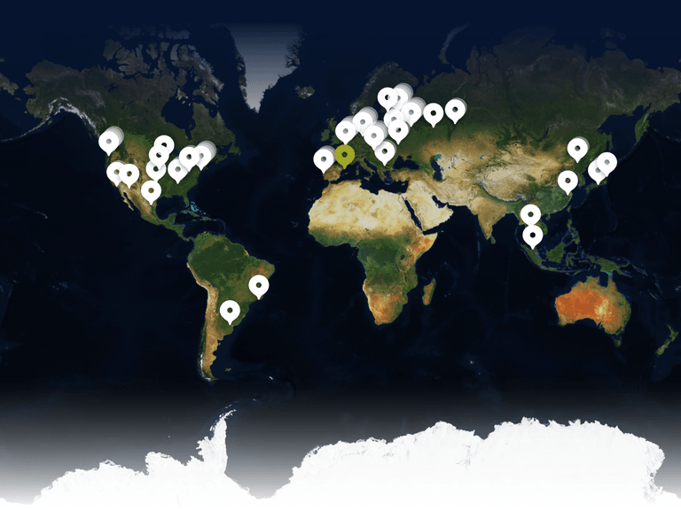
The map at 768px screen width
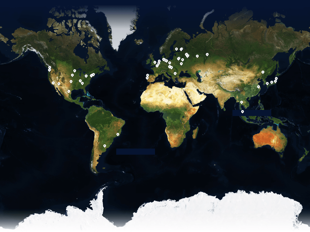
The map at 2560px screen width
Finishing steps
With the main stage of our map development completed, all that’s left is a little polishing.
The first tricky bug we faced during clusterization: events clusters that are close to each other overlay each other in a random way. This is easy to fix and make more intuitive—the lower marker should overlay the higher one—with a simple sort of the rendering array of clusters & markers by latitude:
// ...
markersAndClusters
  .sort((a, b) =>
    b.geometry.coordinates[1] - a.geometry.coordinates[1]
  )
  .map(renderMarker)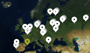
The map with unsorted clusters
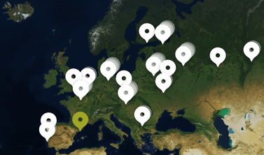
Clusters sorted by latitude
The other funny bug was SVG-specific: since we had a marker icon with a hole in it, hovering or clicking on that hole initially wasn’t working (which made our eyes twitch).
This was occurring because CSS pointer-events on SVGs, by default, can work with visible parts of the image (those filled with color) or with the entire rectangle containing the image. To fix this behavior, we added a <circle> in that SVG right above the hole, and added a transparent fill (fill="rgb(255 255 255 / 0%)").
To add simple tooltips on event clicks, we used react-popper. To prevent excessive DOM expansion, we added it once inside the <Map> component, this dynamically updates referenceElement and event data on every click, and handles outside clicks to close it.
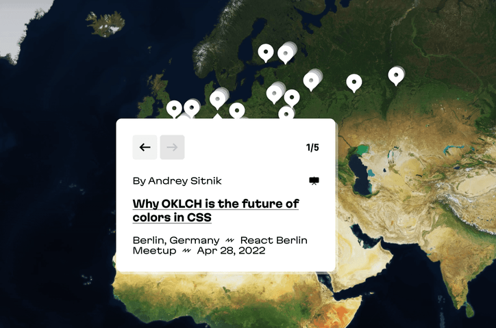
Custom tooltip with Popper
We have many mobile users, so to prevent excess megabyte consumption and long page loads, on mobile screens we decided to use a static map image instead of the full setup. (And anyway, it wouldn’t be easy to click on a 33px marker on a small smartphone screen.) For tablet users, however, we decided to keep the full map functionality.
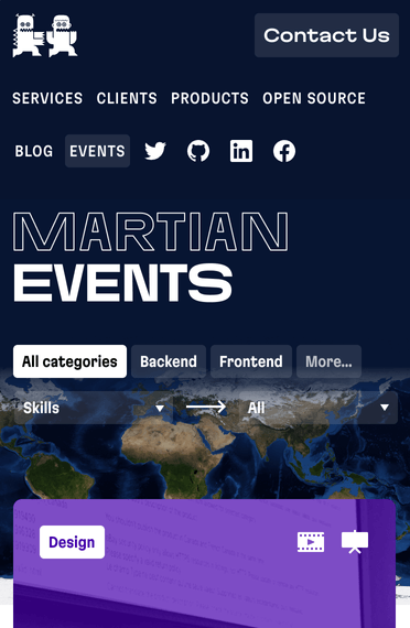
The static map on a mobile screen, no markers are visible
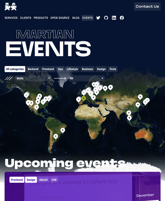
On the tablet screen the map still has clickable markers
The world turns
Designing and developing this map turned out to be an interesting experience, and to be frank, it was not as complicated as it seemed at first glance. Even better, engaging in this process of exploration and getting the minimum features in place has sparked some creativity! We have ideas that we would love to implement in the future, for example: adding more interactivity to the desktop map with zoom and pan and making the mobile version more dynamic with actual marker images.
That’s all from our side! Now we’re waiting to see what sort of custom maps you can come up with!
And one more thing: our Martian experts are on standby! We’ll meet your unique requirements, whether for web or mobile, and provide expert solutions in product design, frontend, backend, software reliability, and more. Give us a shout and we’ll “map” out your future together.


