Martians unveiled: infusing a new site with extraterrestrial tech and soul

Topics

In this post, we’ll tell you how a video game called Space Wars, Biophilic Design, OKLCH colors, and other emerging techniques and technologies combined to help us forge a new website interface. One which not only reflects the true Martian spirit but also facilitates the handling of practical business tasks.
Before 2015, our website was super minimalistic because all our sales were driven by personal recommendations and word of mouth.
Then, we decided to spread the word. We updated the site to tell about the work we do for clients, our open source efforts, and the events we attend. And yes, we started a blog covering a diverse selection of topics (and which seems to be loved by Rubyists in particular!)
However, even with these additions, our funky little site was still quite modest. That brings us to the present day.
More content for a bigger company
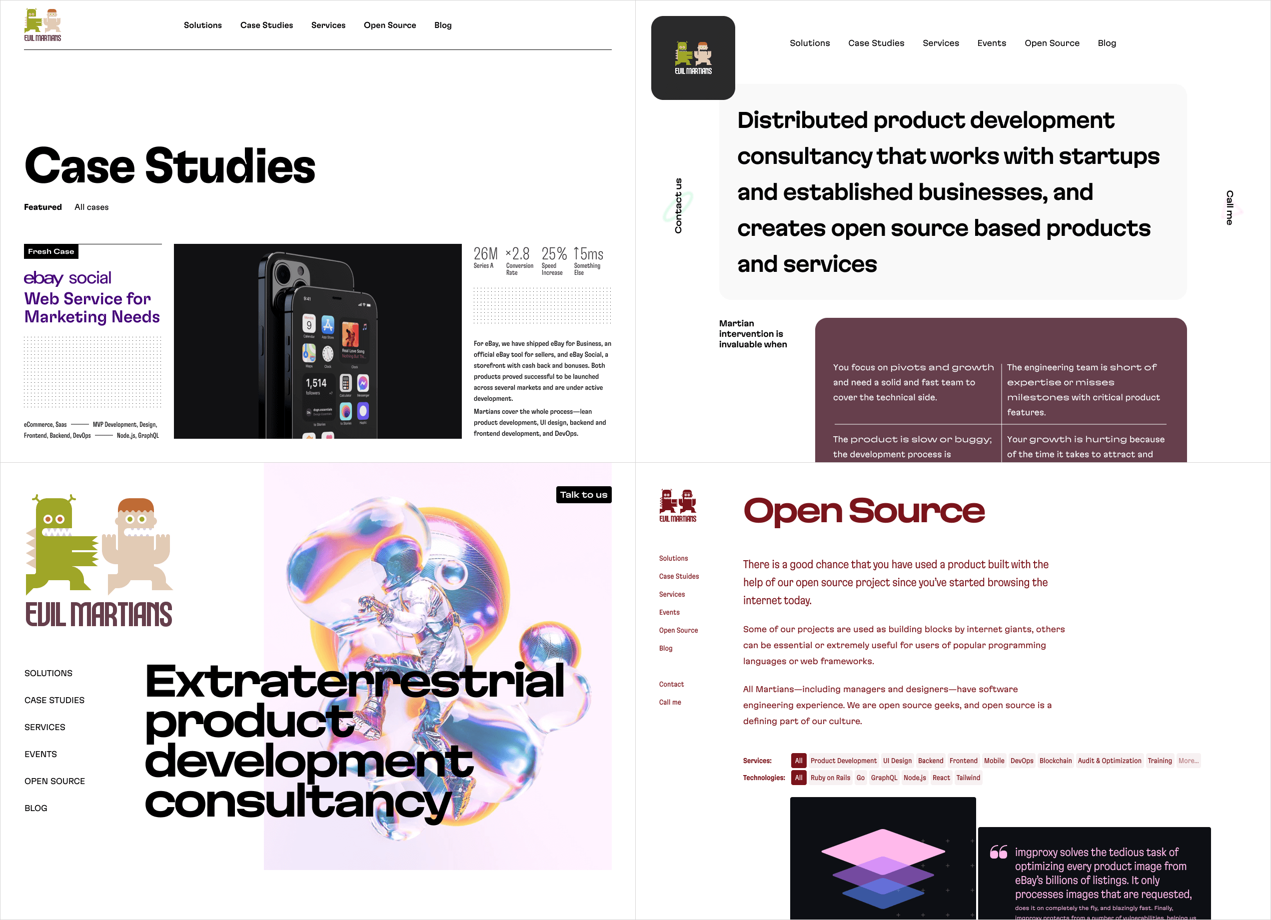
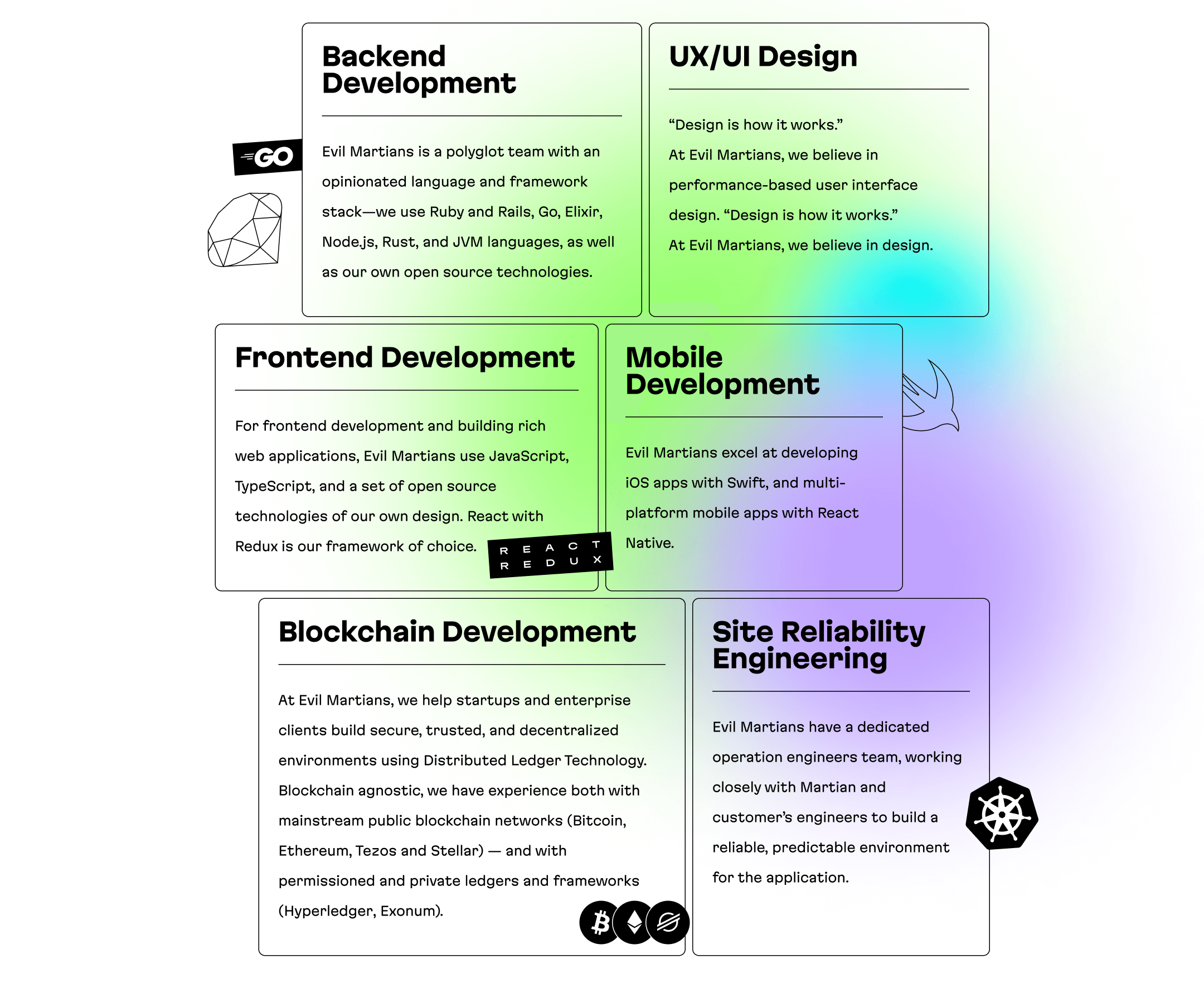
Although the core spirit and business of Evil Martians is pretty much the same today as it was back in 2015, there have been some shifts in terms of business scale and product landscape. Our list of clients, the size of the Martian team, and the number of Martian offices around the globe (with additions in Japan and Portugal) have seen a notable increase. Further, we have a newfound focus on selling our own Open Core products and have diversified our specialties: in addition to our frontend, backend, and SRE services, we’ve added design, mobile, blockchain, and ML services.

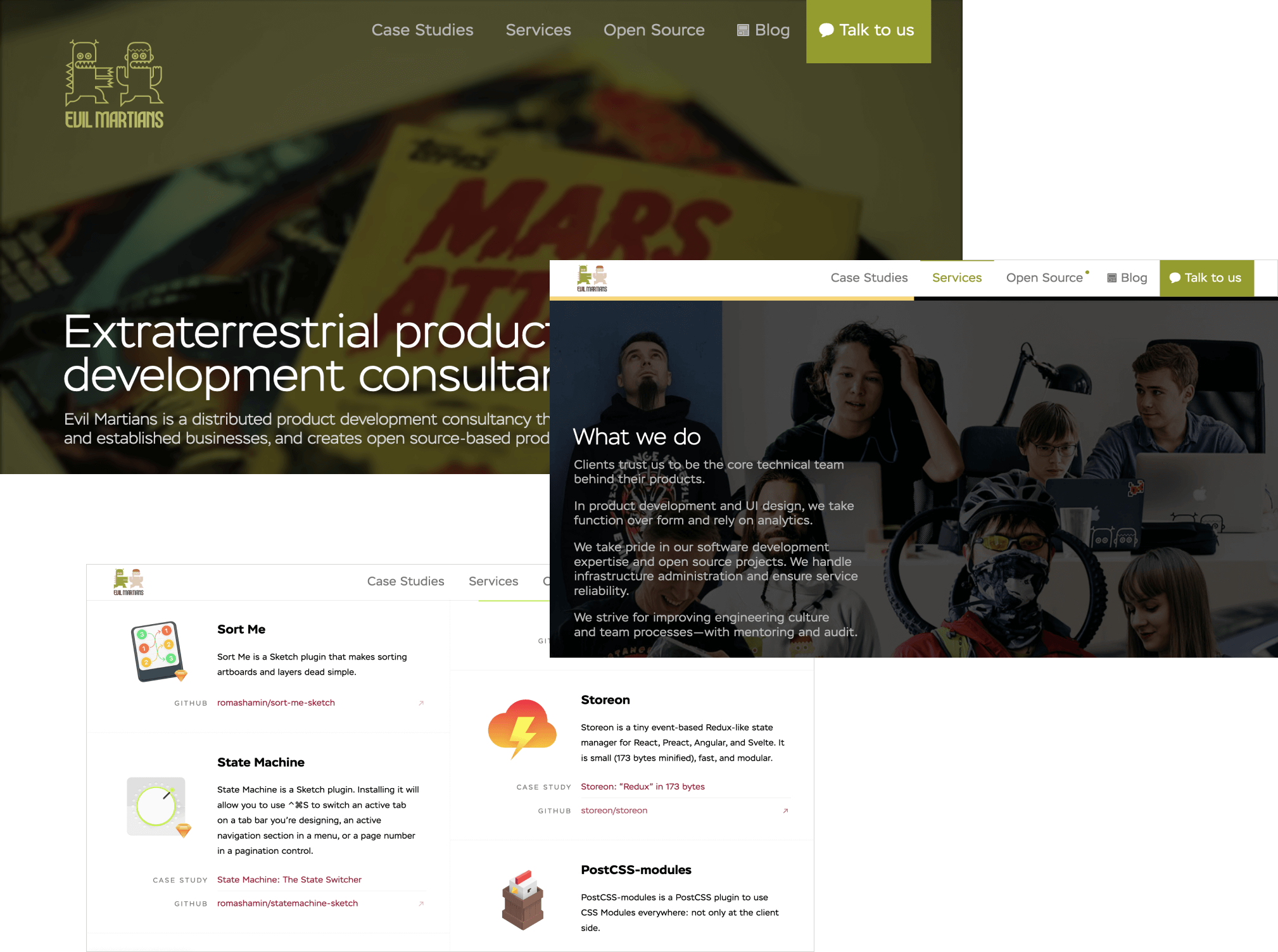
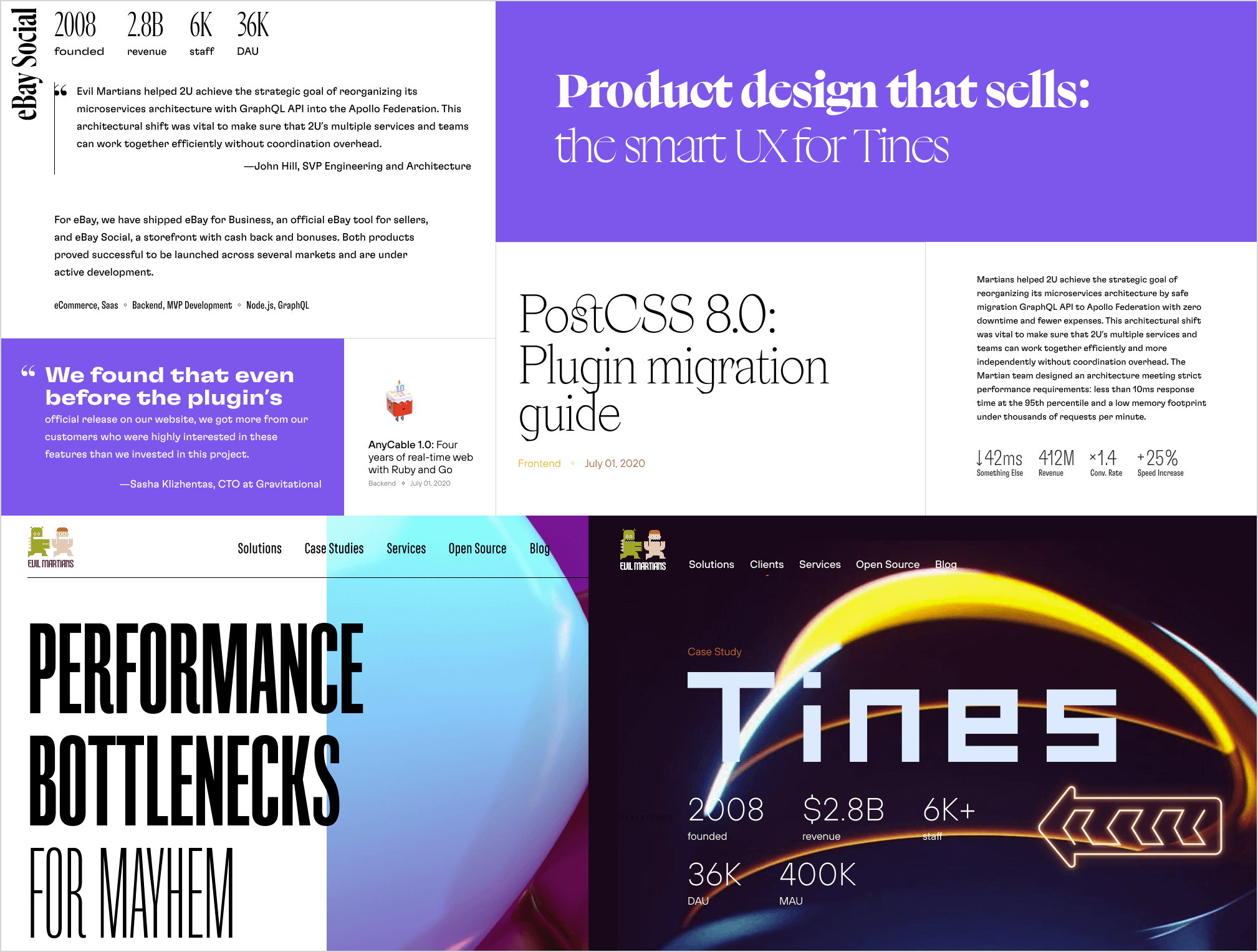
Our previous website
Of course, it was important for us to show some of our key projects and clients. But we also wanted to create an information infrastructure to handily organize each unit within our company—clients, products, services, and blog posts—in such a way so that newcomers would be able to easily see what we do, learn about our history, and get an idea of what the Evil Martians experience is like. And we wanted to connect all these things together in a meaningful way (literally) so that users could organically explore our story.
Finally, we wanted to hook an audience that might’ve happened upon us relatively randomly via Google search or a popular article. In all likelihood, such visitors wouldn’t have time to figure out what site they were on, and they’d just leave without reading other articles or subscribing. It was our goal to fix that.
An amazing maze
Our site (and this is not unique to us) had to solve two problems: we needed to store a lot of content and ensure a sense of visitor engagement, holding user interest. Ideally, users would become absorbed exploring our pages, crisscrossing to related material via links and tags, while also learning information about Evil Martians relevant to their interests.
As a result, we decided not only to store each piece of information as a separate card but also to build the entire website as a set of their relationships:
- Each card has its own separate page (1 blog post, 1 OSS project, 1 client).
- Each card stands alone (visitors don’t need to read the rest of the pages to understand its content).
- Each card is linked with the others. Cards without any relationships will not be shown in recommendations, so users are less likely to encounter them. When creating a new card, we add links to previous cards.

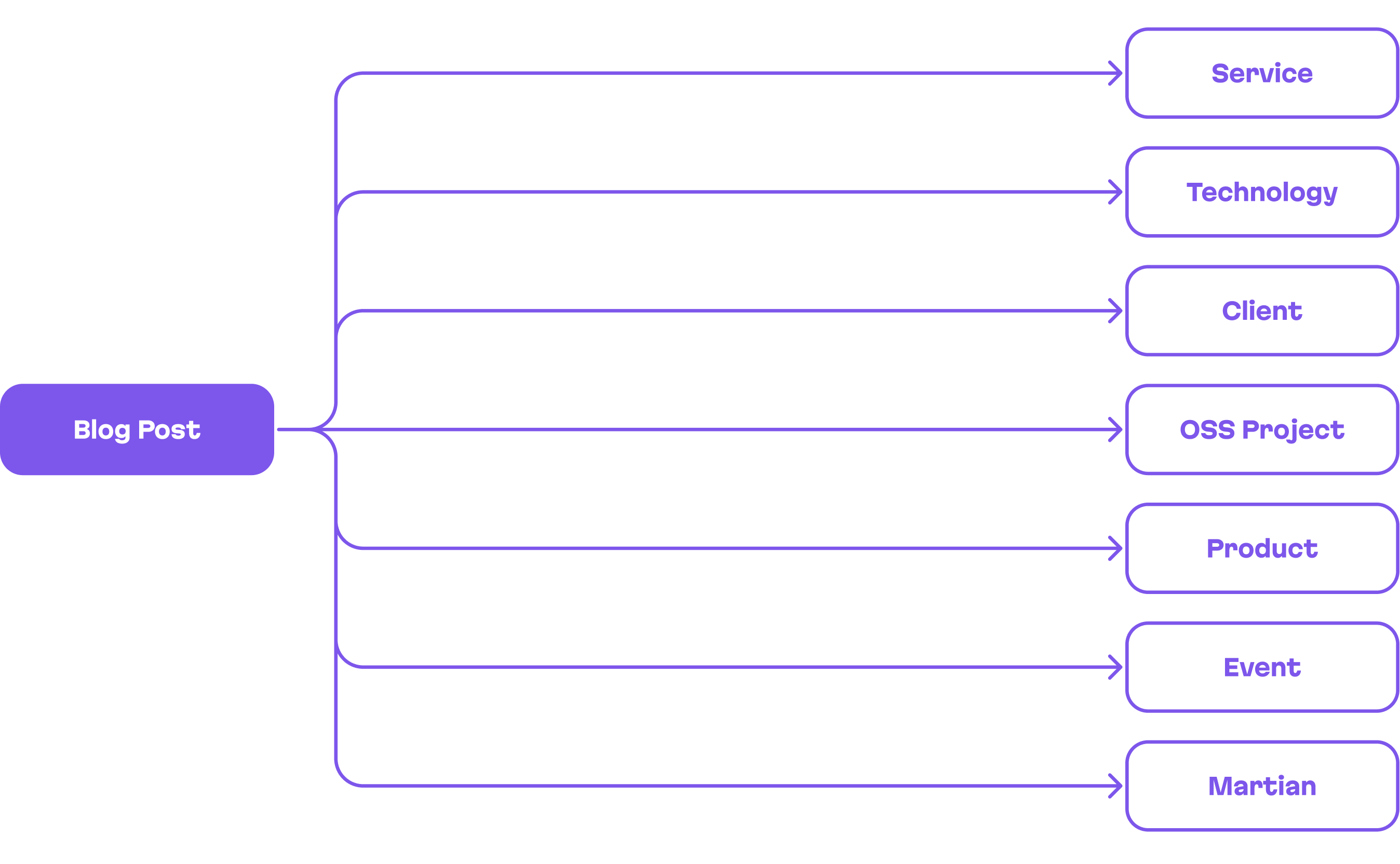
A blog post relation scheme (1 to N)
So, while looking at a post, you can easily go to any client or open source project mentioned there. If you check out an open source project, you’ll be able to find any other posts where it’s been mentioned or take a look at client products where it’s been used. These connections make it easier to provide reading recommendations no matter where the user initially entered the site. The intended effect: we hope users will have a pleasant wander through a labyrinth of interesting content.
Good UX—not only for visitors
So, we have a number of intertwined entities, and now we need a page for each of them. These include 90+ open source projects, 30+ clients, almost 200 blog posts, and many other entities we’d like to highlight, the list of which will grow over time. To promote a surge of visitors we need to add new content relevant to our audience. Further, to motivate our team to add more content, new pages should be easy to release.
Thus, we were faced with two tasks:
- Designing and developing 300-ish pages without the need to devote half a lifetime.
- Creating a system where any team member—whether engineer, manager, or editor—can easily add new pages without chasing down a dedicated employee (like a site manager or frontend engineer).
Our solution: for most pages, we developed just two basic templates—the card page, and the card list page. Both of these pages have a logo and corporate identity elements present at any given point while scrolling.

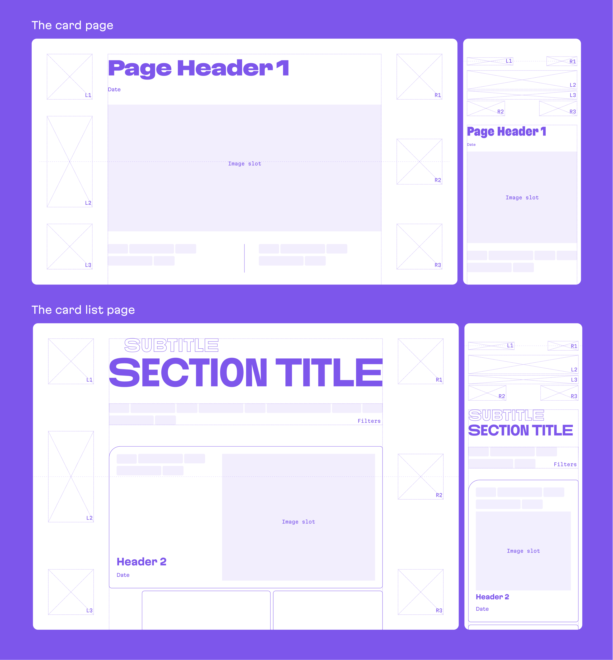
Two basic page templates
Talking tech: actually, our content management system is GitHub (or Git), with a favorite text editor like VS Code or vim. Our “database” is a number of Markdown files in the repository, where we write content like posts and project descriptions. Every markdown file comes with a so-called front matter, embedded YAML, where we write metadata, including references to other cards.
This approach is similar to the one we used with our previous website, and this made it so that migrating hundreds of pages of content to our new site was quite painless.
Thinking of our design as our elevator pitch
Our new data structure more easily accommodates navigation through the increasing number of Evil Martians projects. But over the years, our company has significantly grown as a business and has also upscaled its positioning and branding on international markets.
We asked ourselves: what kind of company are we? What drives us? How do we stand apart?
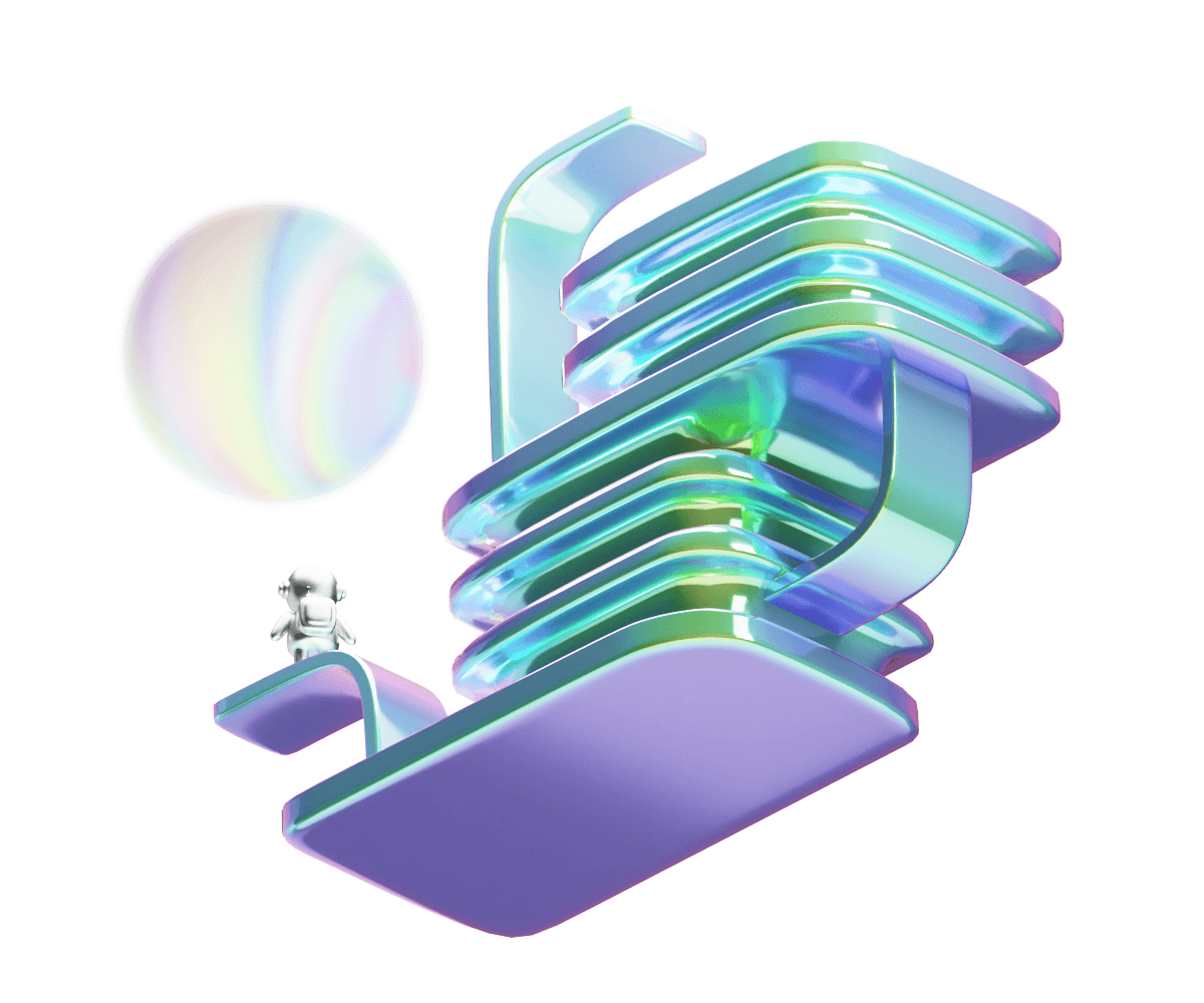
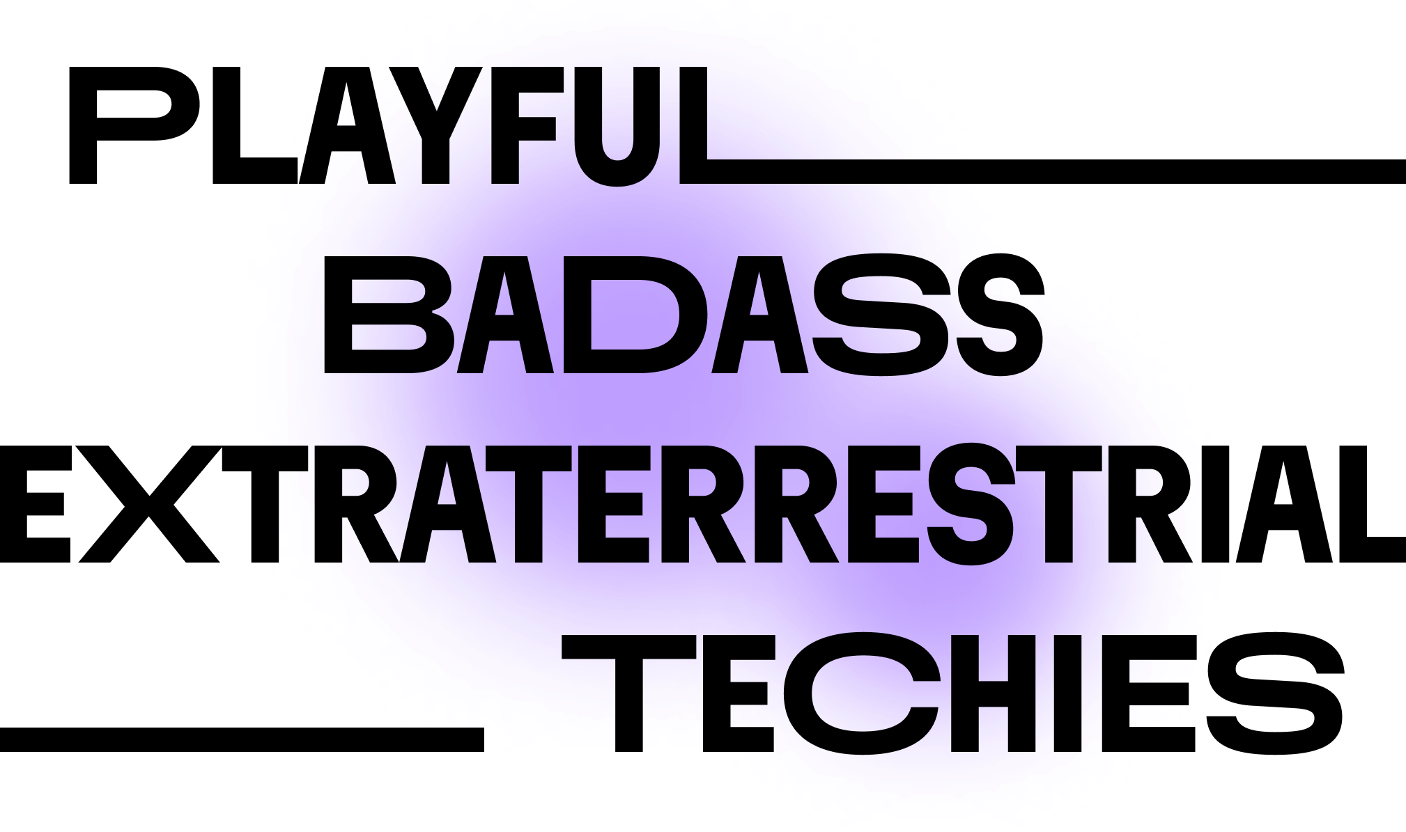
Evil Martians have always been a bit extraterrestrial by nature—beyond just our name and logo, we also love new, out-of-this-world technologies.
We are definitely techy—we immerse ourselves into technology depths to invent something new or create the highest quality solution based on existing tools.
Badass is also in our vocabulary—Martians are ready to go beyond all bounds and break the rules if an outstanding result is worth it.
At the same time, we are playful and with a hint of humor.
Could our website design broadcast all these characteristics while maintaining readability and sufficient minimalism?

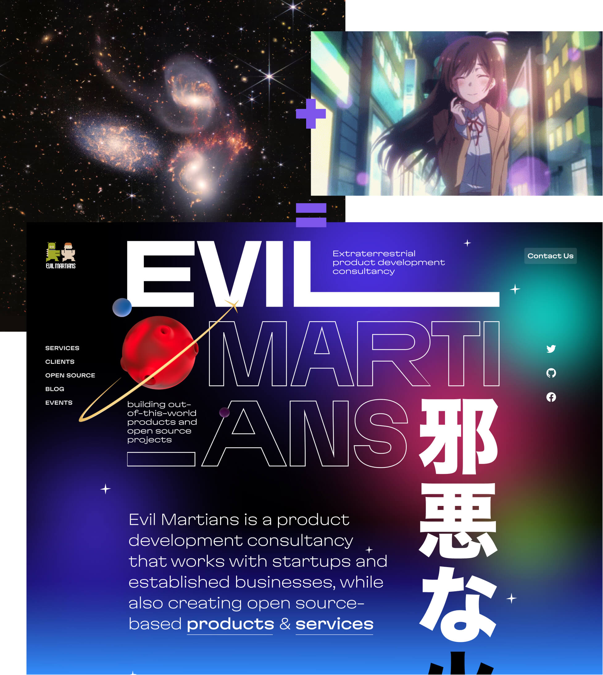
An extraterrestrial layout
A critical question about our branding: how could we infuse our tech-savvy content with Martian metaphors and extraterrestrial imagination without descending into the cliched realm of astronaut and rocket imagery? Or, to put it into terminology orbiting somewhat close to that familiar lingo: we were aiming for “red dwarf” vibes rather than “black dwarf” vibes. Ultimately, our solution was inspired by things that 85% of the Martian team love—classic games and anime.
To start, we test drove some page templates featuring the standard top and left navigations, realized these weren’t “far-out” enough for us, and set out on another path.

Samples of different design options with top and left navigation
Consequently, our site’s navigation was built with central composition in mind. In our case, the symmetrical composition was inspired by arcade games with interfaces where the various parameters are placed around the corners while the main action takes place in the center.

Space Wars VS the Evil Martians website navigation built with central composition in mind
This geometric, symmetrical navigation is complemented by a background of “wandering lights” from far-off galaxies. In terms of shape and color gamut, we also think these are a bit reminiscent of some backgrounds you might find in cartoons and anime.

We complemented each card with “fact lists” of important numbers and achievements. This not only calls to mind the sort of player statistics you might find in a video game, but also allows readers to hone in on essential information without the strict need to read a ton of text.

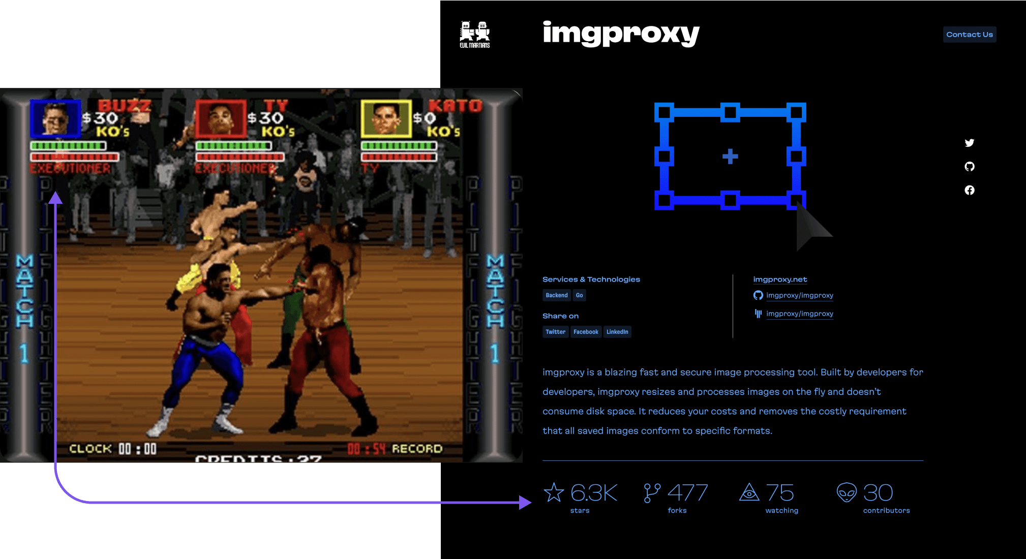
Essential player stats in Pit Fighter VS essential stats for an open source project
Nature-inspired technology
We wanted to make our design still more alien, adding a look that truly embodied a feeling of “Martian” tech. To make this a reality, we decided that Zaha Hadid’s buildings and other experiments in generative design would provide an inspirational base to start from.

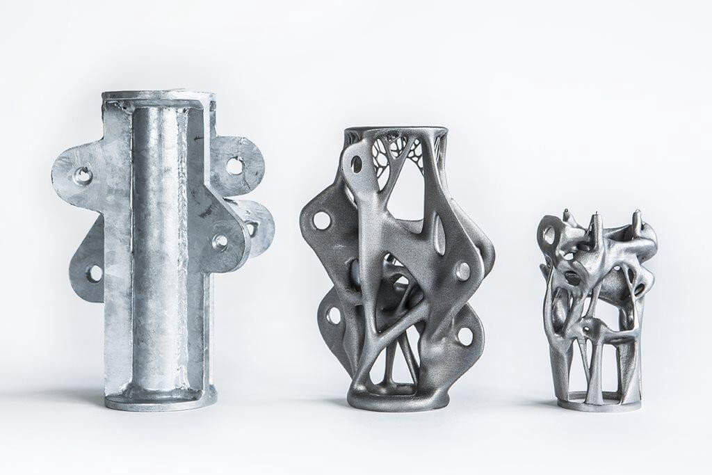
Human (left) vs. “Martian” aka generative design. Source
According to the research described in the “Biophilic Design” essay collection, over the process of evolution, our neurological system evolved to respond directly and exquisitely to complex, fractal, hierarchical geometric environments. In contrast, monotonously repeating objects look alien to us. This is why wandering between similar buildings through a concrete jungle might be off-putting while being out in nature often makes us feel much more comfortable.
Architects have been exploring this effect for a long time, trying to move away from economical post-war dwellings even if it made construction more expensive. Why, then, on the web, the design still goes ahead of humans, and everyone continues to arrange lists and cards in monotonous rows?
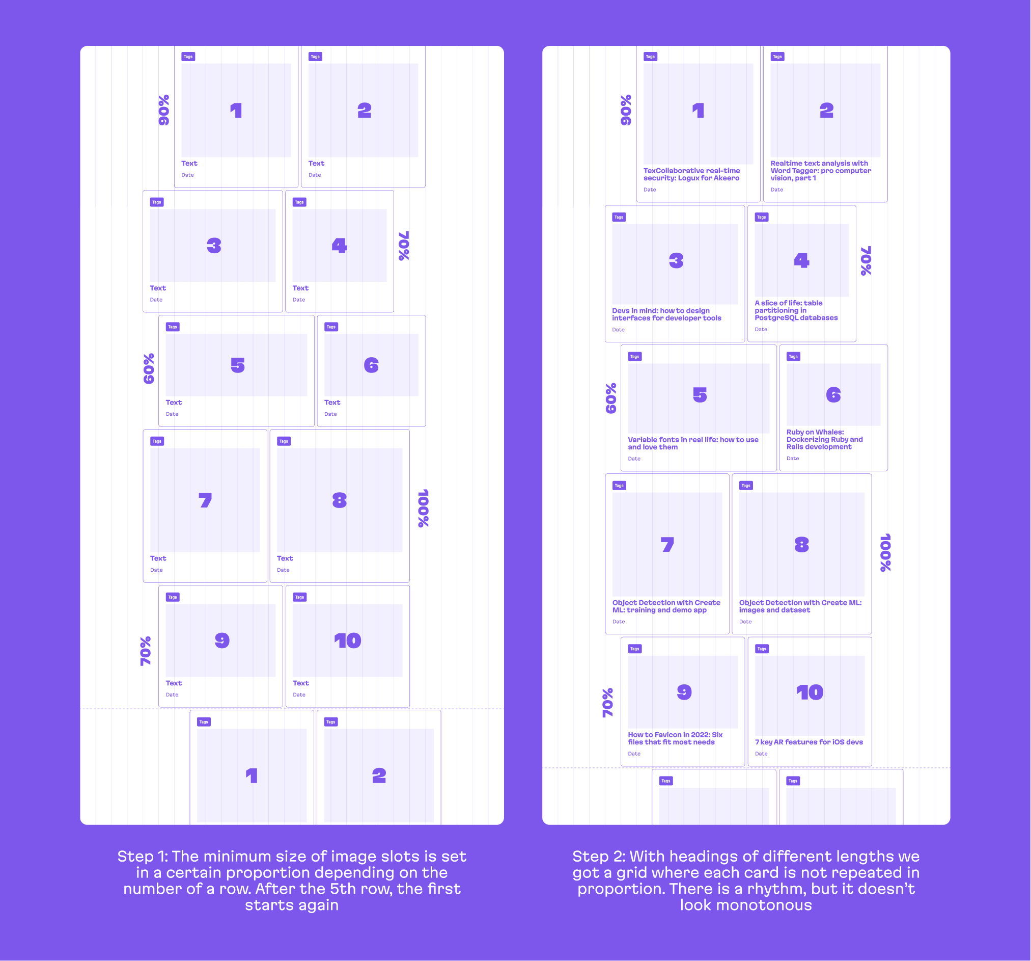
The grid of our website was inspired by natural forms. We used CSS Grid layout, giving us more flexibility to place our cards in the space. The basic grid consists of 5 rows and then repeats.
The image height in the card is set by the max-height formula: calc(340px * var(--organic-ratio, 1)), where organic-ratio is a size variation from 100% to 60% depending on the row. We ended up with a grid where elements, in terms of their proportions (width, height, and position), are not repeated. This makes our grid look like more “organic“, keeping the human eye from getting bored.

The same organic idea is supported by the variability of letter widths in the headings (more on that later) and the opacity selection algorithm: to give our cards’ tags more contrast, we select opacity level based on background lightness.
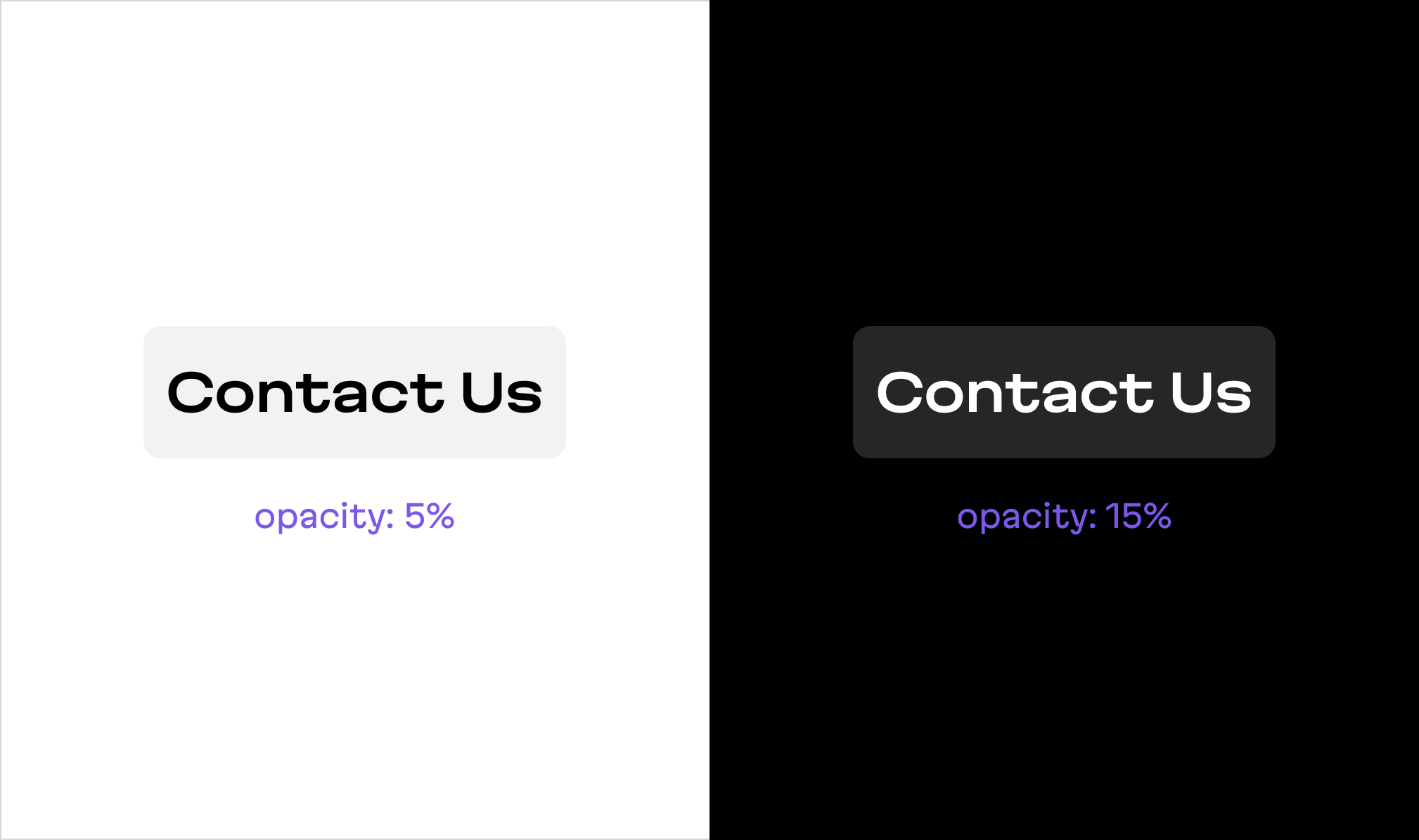
On a white background, even a rectangle with 5% opacity will be visible, but on a black one we have to make it 15% so they are perceived as equally transparent
In some places, we used OKLCH colors—a “new retina” for color rendering, which all monitors and browsers will soon switch to (for now, it’s supported by Safari browsers running on the latest gen MacBooks and iPhones). This allows us to manipulate colors in the way we described above and also it makes the colors more saturated.
Badass typography
While working on the website, we also designed and developed the Martian Grotesk and Martian Mono typefaces. These are variable fonts that are readable but which carry quite a brutal style at the same time. They perfectly encapsulate the essence of the Evil Martians team: strong personalities, ready to transcend boundaries to achieve outstanding results.

After trying dozens of different fonts, we realized that none adequately reflected the Martian soul—so, we invented our own
Martian Grotesk was used as the primary site font—you’re reading it right now. As it is a variable font, we are able to use it as boldly as possible. We can vary its width, not only within a larger page, but also within a single heading—to make it “rhyme” with cards of different proportions within our “organic” grid.

Throughout the website, we use Grotesk’s monospace brother Martian Mono for code snippets. It inherits Grotesk’s rebellious and eye-catching aesthetics as well as both of its benefits—metrics equilibrium and intelligibility:
# Chunky bacon.

5.times { print "Odelay!" }

exit unless "restaurant".include? "aura"

['toast', 'cheese', 'wine'].each { |food| print(food.capitalize) }

require 'net/http'
Net::HTTP.start('www.ruby-lang.org', 80) do |http|
  print(http.get('/en/about/license.txt').body)
end
With Martian Grotesk and Mono, we built a typography system that does not hesitate to use fractions for some small font sizes. It makes text blocks pixel perfect (and thus extra sharp) which means readablity on any screen no matter the pixel density. Although, the font is already designed to hit the pixel grid at almost any size. More on that in this Twitter thread.

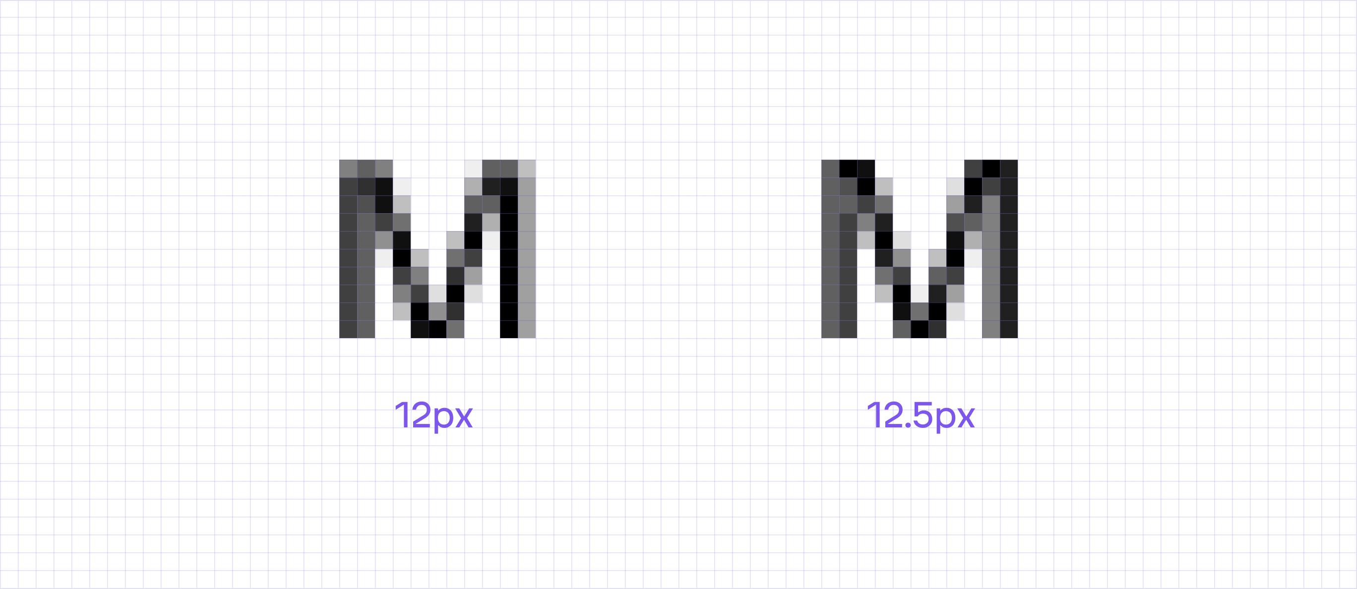
We slightly tweak the font size to achieve the closest pixel-perfect height and thus better readability
The brutality continues in the design: we used pure black #000 color for the font and element borders, coupled with a complete absence of shadows, volumes, and halftones. This allowed us to build a harmonious composition that included both the “organic” skeleton and “audacious” graphics.

Silly illustrations & easter eggs
The Evil Martians logo was created by 5nak and subsequently remastered by Roman Shamin. In terms of customization versatility, it checks all the boxes, and we use that fact to the fullest capacity: we create remixes for special events, like celebrations, and conferences.
To illustrate our services, we decided to use the same approach and mix the rows of geometrical logos and graphics with some funny elements. After all, what is the best illustration of Martian areas of expertise, if not the Martian mascots themselves?

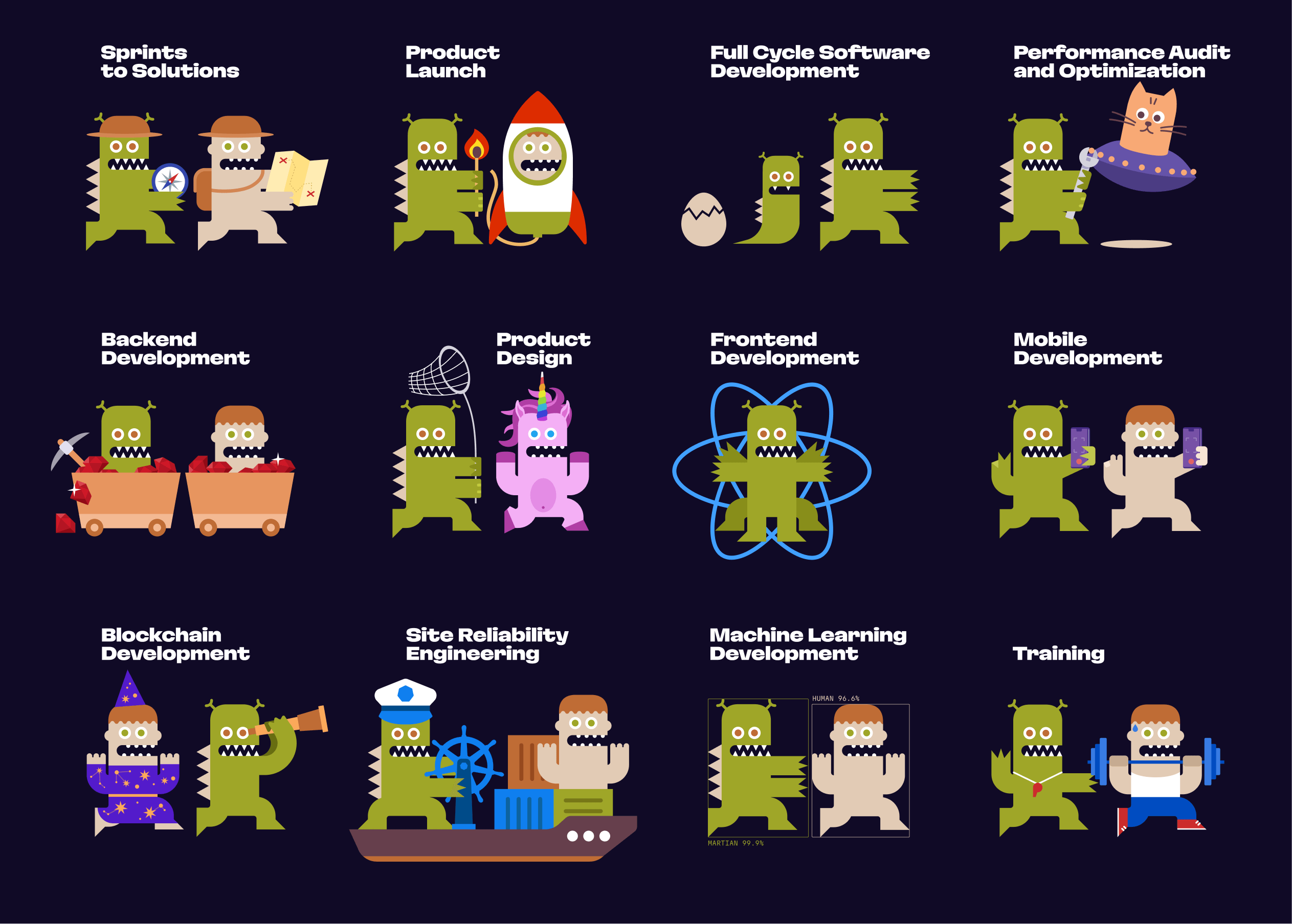
The Martian mascots as services
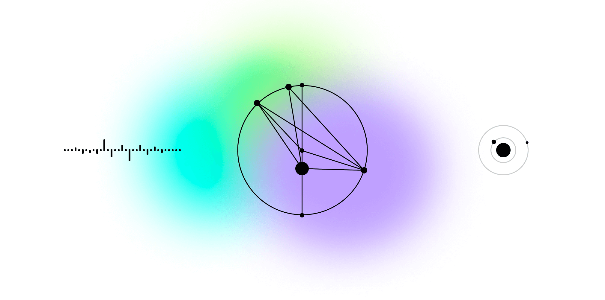
The site entices the reader through every minor detail, none of which were implemented at random. The dividers used between texts and blocks are a piece of a sound wave taken from a recording of the wind on Mars, and a Kepler diagram designed as part of a research of the shape of the Martian orbit. The element used when loading the data is the movement of Phobos and Deimos, two satellites, around Mars.

A huge part of the Evil Martian team took part in building the new website. It became a pet project and a kind of manifesto for many Martians since it was an attempt to formulate who we are and what our values are. But the work is not over yet: the site will be updated with new pages and change like a living creature. Follow us and see its evolution in real time!
And one more thing: if you have a problem or project in need—frontend, backend, SRE services, mobile, blockchain, or ML—Evil Martians are ready to help! Get in touch!