How to kill conversions on your developer tool's landing page


Evil Martians’ website reaches 0.5M+ developers and CTOs yearly. The goal of our website and blog is to make the case for our expertise and services, and to convert our tech readers into clients. It hasn’t always been smooth sailing. In fact, over the years, we’ve identified several excellent ways to kill landing page conversions. If you’re interested in repeating our mistakes, we’ve decided to share some of them below!
Mistake 1: maintain vague language
We tried to be too “cool” with vague messaging because we were afraid to appear “too salesy.” So, for a long time, our pitch was kind of vague: “Evil Martians transform growth-stage startups into unicorns, build developer tools, and create open source products”.
Reading this, users thought we were an incubator, a dev tool startup, or an open source collective. We learned our lesson: technical audiences need specificity and the lowest possible level of abstraction. The new version is all in on the facts: “We are the go-to agency for early-stage developer tools startups.”

Irina Nazarova CEO at Evil Martians
Moving on, here’s a quick test of vagueness: which builds more trust?
- ”Blazing fast” or “An open source image processing server that handles JPEG images at least 35% faster than leading alternatives”?
- ”Leading tech companies trust our performance optimization expertise” or “GitHub reduced test suite latency from 10ms to 1ms using our parallel execution implementation”?
- ”We understand developers” or “We work with 30 VC-backed early stage developer tools startups each year”?
We shouldn’t have to tell you here, but stick with the facts because they will make your value a lot more tangible.
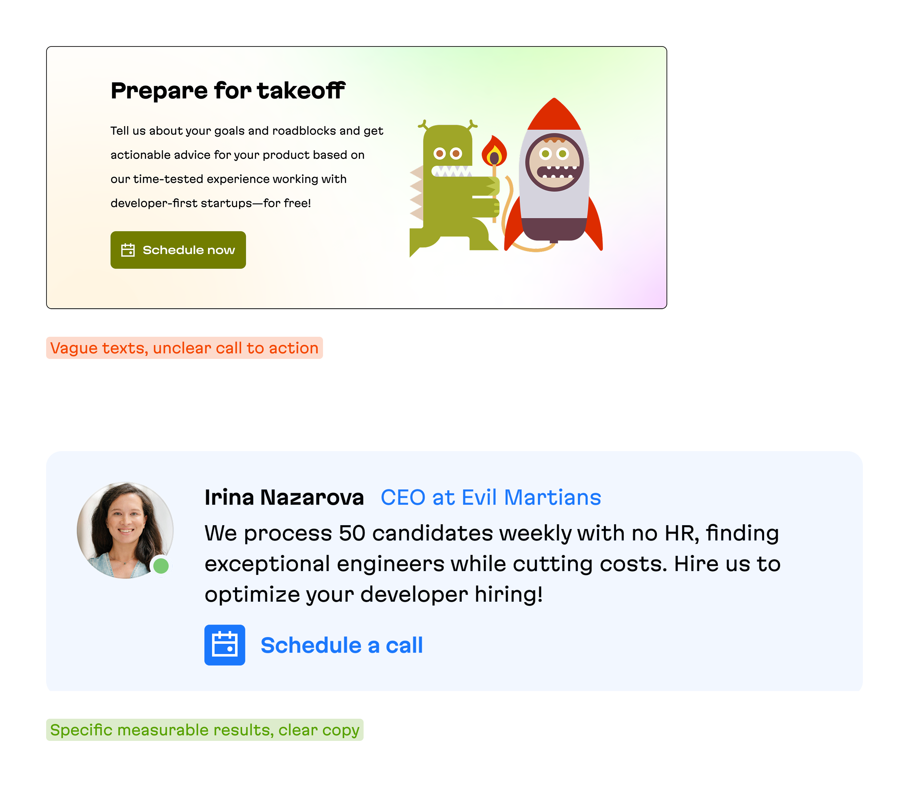
Mistake 2: make your CTAs “invisible”
Another common trap that dev tools fall into: forgetting what your CTA actually is! Take commercial open source projects-many list their website on GitHub, but then make their main website CTA… go right back to GitHub, instead of converting open source users to paying customers!
We were no exception to this. We’ve been through multiple iterations with our main CTA:
- “Work with us"
- "Let’s talk"
- "Schedule a consultation"
- "Build with us”
Reality check: If we’re truly being empathetic to customers, busy technical founders, then we need to make their journey from interest to first call as clear as possible. Indeed, changing from “Build with us” to “Hire Martians” quickly improved click rates from 1.3% to 2.0%.
And beyond the “main” CTA, general CTA wording is extremely important as well. Just in the past year, we’ve gone through multiple rounds of iterations of how we approach this. That said, our latest version uses minimal abstraction and focuses on specifics: measurable metrics, real client examples, and concrete technical challenges we’ve solved.
For example, instead of saying “we optimize Rails performance”, we now say “We slashed PowerHRG’s test suite time from 50 min to 12 min, saving millions for a billion dollar revenue company.”
This approach immediately demonstrates that we understand the specific problems our clients face and have proven solutions ready.
See the difference for yourself:

Mistake 3: maximize first screen distractions
We used to treat every pixel of screen space as precious real estate that needed to be filled. Our first screens became crowded showcases of everything we thought visitors should know: social proof, newsletter signups, translation options, and social media buttons. Because that’s what landing pages are supposed to have, right?
But via user interviews, we discovered a harsh truth: developers were getting lost before reaching any meaningful content. They had to scroll through mountains of marketing speak just to find basic information about our services or documentation links. The very elements we added to appear more credible were actually hurting our credibility with technical audiences.
The solution turned out to be counterintuitive: strip away everything except what developers actually need.
That means no carousels, no buzzword-filled introductions, no distractions. Just clear, technical value propositions and obvious next steps. We learned that the best way to impress developers is to respect their time enough to not waste it.
Mistake 4: overcomplicate your enterprise sales CTA
For years, we complicated things with our contact forms, and we’ve seen the same pattern with developer tools selling to enterprises.
Many products create a multi-step qualification process that looks like this:
- Fill out a detailed “Request Demo” form
- Wait for a qualification email
- Schedule a screening call:
- Finally get access to the product
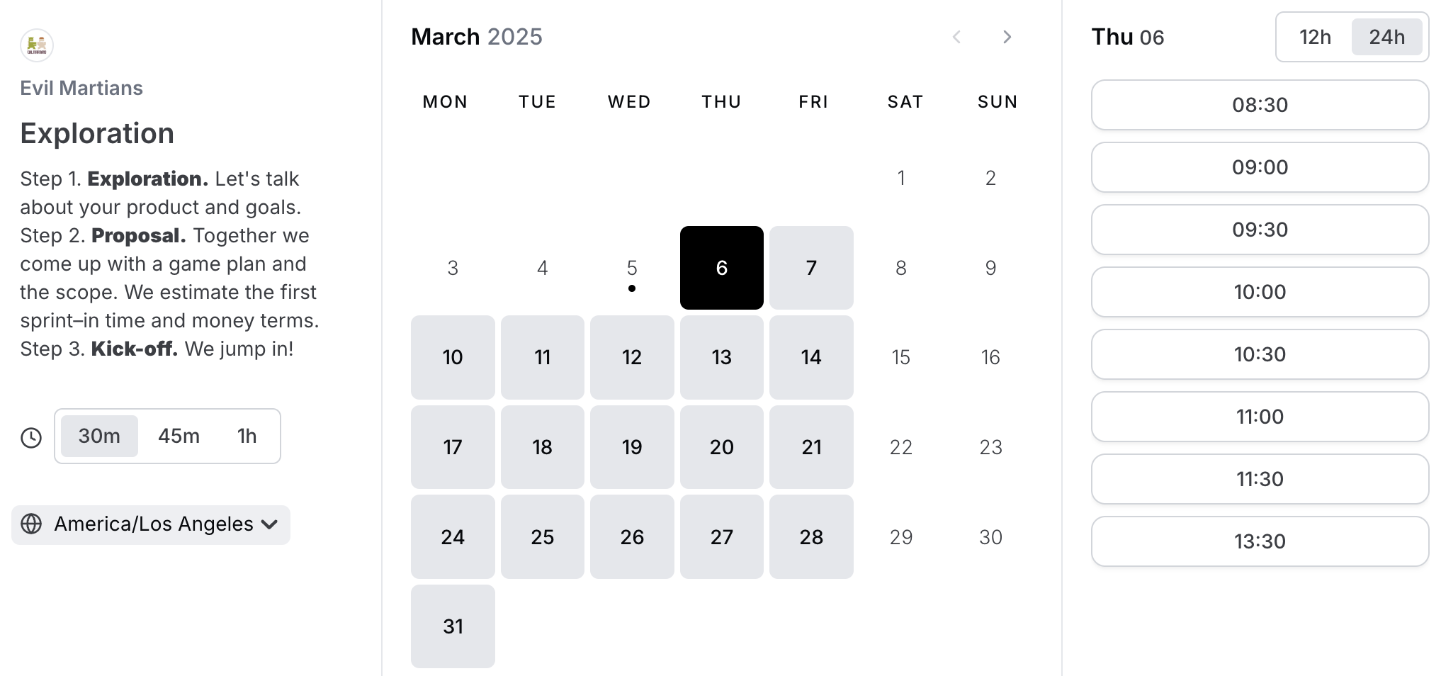
Our own process was similarly bureaucratic: users would fill out a detailed form, then we’d email them back with a Cal.com link to schedule a screening call, as seen in the screenshot below:

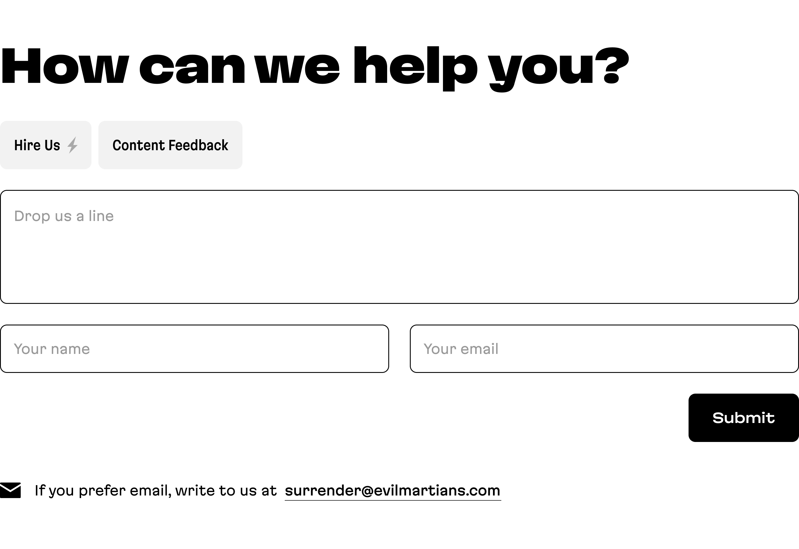
Then we had an obvious realization that applies to both services and products: if you’re going to end up talking to a prospective client anyway, why not skip the form entirely? We debated this internally. Would we scare away introverted clients? Would our calendars get flooded with spam? Would we waste time on unqualified leads?
The results surprised us: direct booking through Cal.com achieved a 2% conversion rate, while our carefully crafted contact forms peaked at 0.1%.

As for calendar spam? We’ve had to cancel maybe one suspicious booking every six months.
This principles of this flow extend directly to developer tools:
- Enterprise products that offer immediate product demos or trials (with reasonable limits) see 3-5x higher conversion rates
- ”Book a demo” buttons that go straight to scheduling outperform multi-step qualification processes
- Self-serve options with clear upgrade paths reduce sales friction dramatically
Even for high-touch enterprise sales, removing steps between interested developers and your product experience is critical.
Technical buyers want to evaluate the solution themselves before talking to sales, and the more barriers you place between them and that evaluation, the more leads you’ll lose.
Mistake 5: build once and walk away forever
The ultimate conversion killer is treating your landing page like a monument rather than an experiment. It’s an easy trap to fall into because there is a clear funnel to this mindset:
- Reading articles on landing page best practices
- Implementing those practices in one heroic sprint
- Feeling accomplished as we cross “website optimization” off our to-do list
- Never looking at the analytics again
Here’s a real example: we created an elaborate filter system for our blog, investing workweeks of design and development into it. The vision was clear: we wanted to help developers quickly find relevant content based on technologies and topics.

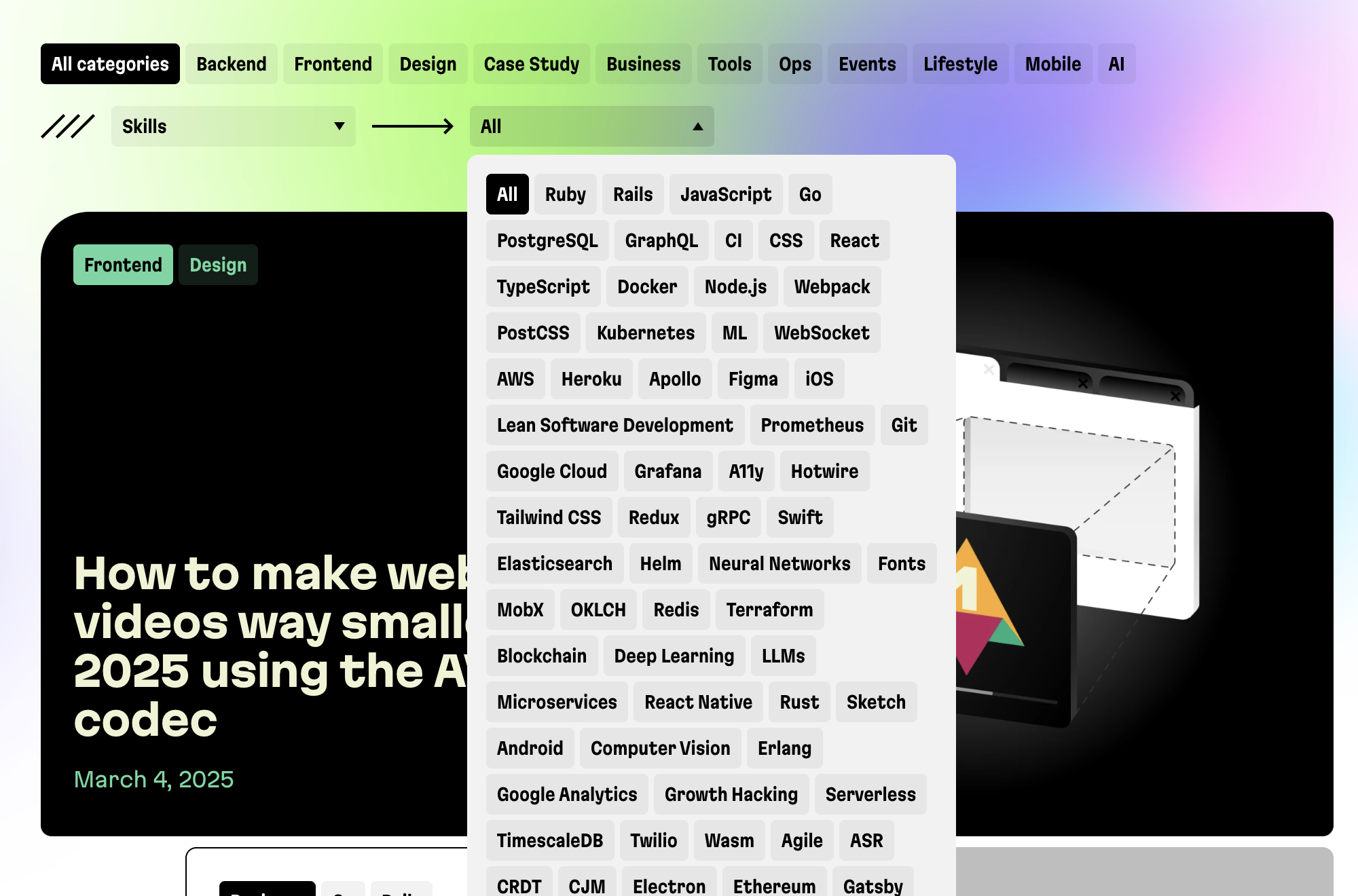
Yet, we were in for a brutal reality check: when we finally checked the usage data three years later, almost no one was using it. All that effort for a feature that added complexity without improving conversions.
When we invest significant time and resources into a landing page feature, it becomes emotionally difficult to change it. We find ourselves resisting updates even when metrics suggest our approaches aren’t working.
This leads to the most insidious trap: relying on our own opinions instead of data. We debate internally about whether a CTA is visible enough rather than simply testing it with actual developers. When we finally started running regular tests with our target audience, the results often surprised us.
What does all of this imply? Your landing page is never “done.”
The highest-converting developer tools treat their pages as living experiments, with steps like these:
- Set clear metrics for success before implementing changes: page views, CTA clicks, conversion
- Schedule regular check-ins to review performance data
- Test with actual target users, not just your team
- Iterate continuously based on real results
- Accept that sometimes your clever ideas will fail spectacularly
But like the process we’re talking about this isn’t just some one-time “set it and forget it” advice—this is a mindset shift.
The “build and forget” approach feels efficient but costs you countless conversions over time. So, so small, test often, and let data, not your ego, guide your decisions.
Some quick results from our experiments
Onece we fixed these issues, we started seeing more journeys like this:
- Developer finds technical article
- Clicks clear “Hire Martians” CTA
- Books call directly through Cal.com
- Becomes client within 48 hours
The lesson?
Everything comes down to respecting developers’ time and intelligence.
That means clear language, obvious next steps, and minimal friction.
And hey, this is all definitely a work in progress. And that’s the whole point. A website is a living, breathing thing and a continuous process of tracking conversions. We’ll be constantly running experiments with the target audience.
The other main thing is to acknowledge that we all too often fall into the trap of trusting only our own judgement and getting locked in. So, test your website with your target audience, and constantly improve it. That’s the only path forward!