OK, OKLCH: a color picker made to help think perceptively

Perceptual color spaces have been around for ages, but the average designer doesn’t actually know much about them, and certainly don’t use them in their work. So, when we set out to build our UI for the OKLCH Color Picker & Converter, we had education in mind as the core principle to guide our work. Let’s see how and why.
If you’re somehow not familiar with OKLCH, here’s an extremely quick overview: OKLCH is a new way of encoding colors (like HEX, RGBA, or HSL). It always has predictable lightness after color transformations (compared to HSL), it’s capable of encoding a wider range of colors, it offers native browser support, and unlike LCH and Lab, it has no hue shift when chroma is changed.
As mentioned, perceptual color spaces aren’t a new invention at all. The Lab color space predates both the first Mac and Windows PCs, to illustrate the point. But they simply haven’t seen widespread adoption: you won’t find a Lab or LCH color picker in Figma or Sketch, and designers still use RGB and HEX to describe the palettes in their UI creations. So despite the fact that perceptual spaces have been around, in light of this context, perceptiveness as a modern approach to color control might not only seem new, but downright revolutionary.
Moreover, the OKLCH/LCH color spaces are different from those which have been widely adopted and therefore require a little effort in order to properly wrap one’s head around them.
So that’s precisely why we decided that the key principle guiding the UI of our OKLCH color picker would be education. Users, designers, should have the opportunity to learn, and effectively become familiar with all the new concepts underlying the OKLCH and LCH color spaces.
Good information software encourages the user to ask and answer questions, make comparisons, and draw conclusions.
Bret Victor
Magic Ink
We’ve been sounding the horn on this for some time, and it’s starting to pick up more and more steam. At the time of writing, just a few days ago, our work with OKLCH, and OKLCH Color Picker & Converter was being talked up by Google in their guide to HD CSS color migration.
In this article, we’ll talk about all the ways we baked our educational aims directly into the UI of the OKLCH Color Picker & Converter. (By the way, it’s open source so check the repo on GitHub, too.)
But first, let’s take a quick look at the OKLCH Color Picker itself.
The OKLCH Color Picker & Converter
You’ll find the OKLCHCPC at oklch.com.
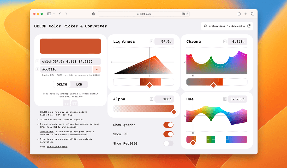
The current version of OKLCH Color Picker & Converter
The dropdown menu allows conversion from many familiar color encoding sections, including HEX, Lab, RGBA, and many more. There is also a toggle to convert to LCH instead of OKLCH.
Four sliders and four accompanying graphs correspond to Lightness, Chroma, Hue, and Alpha. There are also toggles to show P3 colors, Rec. 2020, and to turn off the graphs entirely. Finally, fallback colors are also identified in case it is not possible to display them on a device.
The tour is finished, now let’s talk about the driving educational forces behind the design.
Displaying the spaces
To help users visualize what’s actually going on, we decided to provide the chart representing the color spaces in addition to the sliders that users would use to control them.
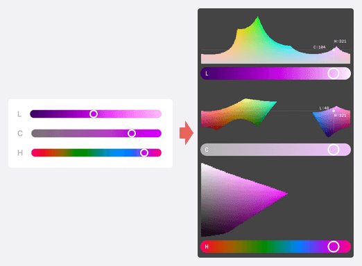
The first rough sketch illustrating our idea: pairing graphs with sliders to help users learn
OKLCH does not stretch to form the shape of a perfect cube; this is simply in its nature. It does not hide the fact that our screens can display many more colors in the violet zone than, for instance, in the blue zone. In this way, it’s kind of more honest with us, don’t you think?
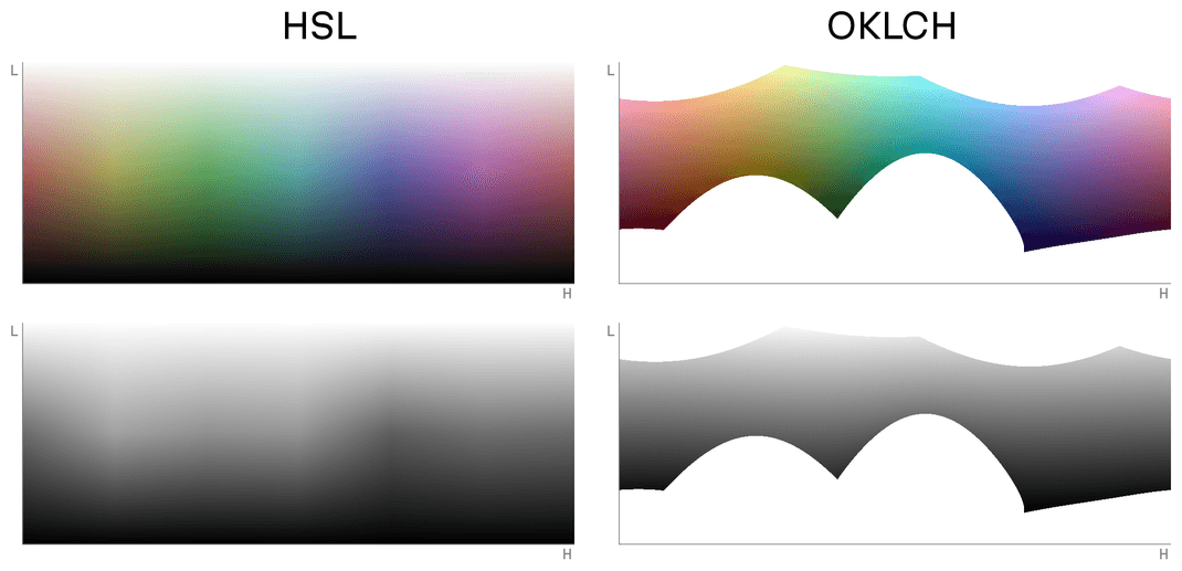
This feature can lead to a few side effects, but let’s single out one that is actually quite essential to familiarize yourself with: sometimes you can set up a non-existent color. Take a look at the graphs above: technically speaking, you can point the imaginary color picker to an unfilled area in the OKLCH color space, but you’ll get no color.
Such a situation is impossible in our familiar color pickers (where the colors are stretched into a rectangle, and there are no unfilled gaps in the color space), but these gaps are something we must get used to when switching to perceptual color models.
So just imagine: you’re moving a slider’s thumb and suddenly the selection moves out of existing possible colors. Your first reaction might be: what the hell is going on here?
And that’s exactly why, to answer this (as well as some other questions), we baked graphs into the UI. You can actually see why there are gaps between available colors at some parts of the space.
And with that background info “colored in”, this is where the story of our design really starts to begin.
Every graph corresponds to a slider
It’s no coincidence that the graphs are placed above the sliders. Take a look at the Lightness and Hue charts: the slider tracks show actual horizontal cuts of the graphs’ shapes, and the slider thumbs are paired with the vertical lines on the graph.
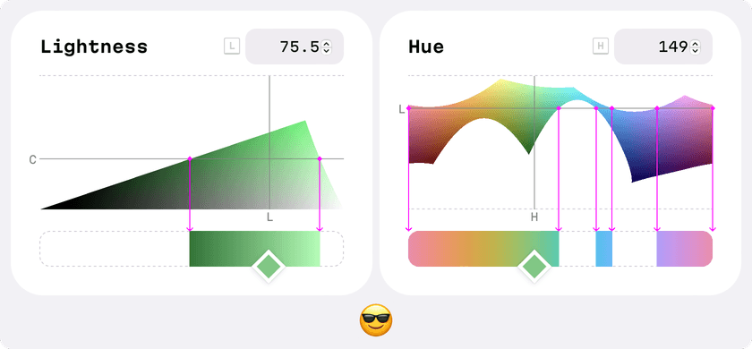
The sliders actually reflect horizontal cuts of the color space graphs
On the Hue, for example, the L line shows where this cut lies along the horizontal axis. Want to move the L line lower? Lower the Lightness value on its slider.
Want to change both at the same time? Click on any point on the graph! Yes, this is one of the hidden gems of the UX!
Off topic
While I was thinking about this concept, the idea that “the slider is just a cut of the graph”, and sketching out ideas, I made this bit of UI which I consider funny. Try to imagine how this interface would work in reality!

Back on topic
Unfortunately this principle only works for two of the three graphs. Take a look at the Chroma block below: here the slider shows the vertical cut, but not the horizontal one.
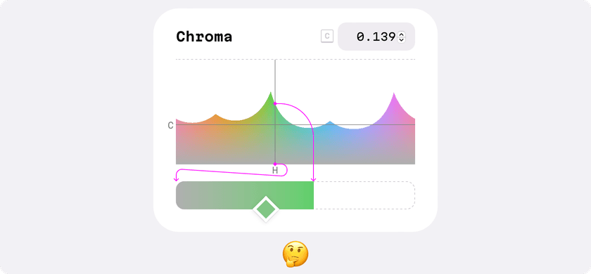
For Chroma, unfortunately, the slider represents a vertical cut of the graph
This was a tricky problem. I considered two solutions: placing the vertical slider on the side, or rotating the graph 90° clockwise.
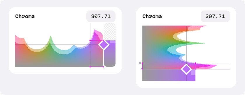
Possible solutions: placing the vertical slider to the side, or rotating the graph
Strictly speaking, both solutions would’ve been correct. But…
(And this was a big “but”.)
A vertical slider is quite an uncommon pattern. Further, when it is placed on the side of the graph, this breaks the tiling. Also, this design choice could lead to problems on mobile devices.
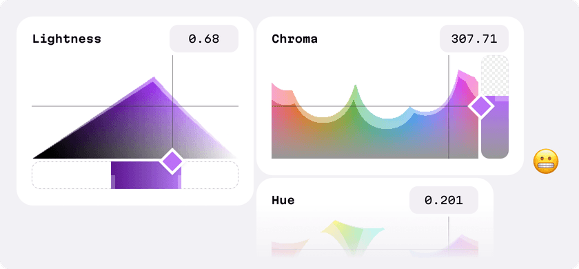
The rotated graph has no such problems, but, well, it just looks weird. Look at it! This won’t do. And here’s another reason to forget rotation as a solution—we’d lose the connection between the C and H graphs. (We’ll talk about this further in the next section.)
We discussed this a lot, and, in the end, we decided to keep this parameter as is: the slider is on the bottom, the graph is on the top, even if the slider’s track doesn’t reflect the graph’s cut and the thumb isn’t connected to the C line on the graph. After all, it’s still clear what is going on when the user uses the slider.
The graphs are connected, too
The order and the placing of the graphs also has a logic behind it.
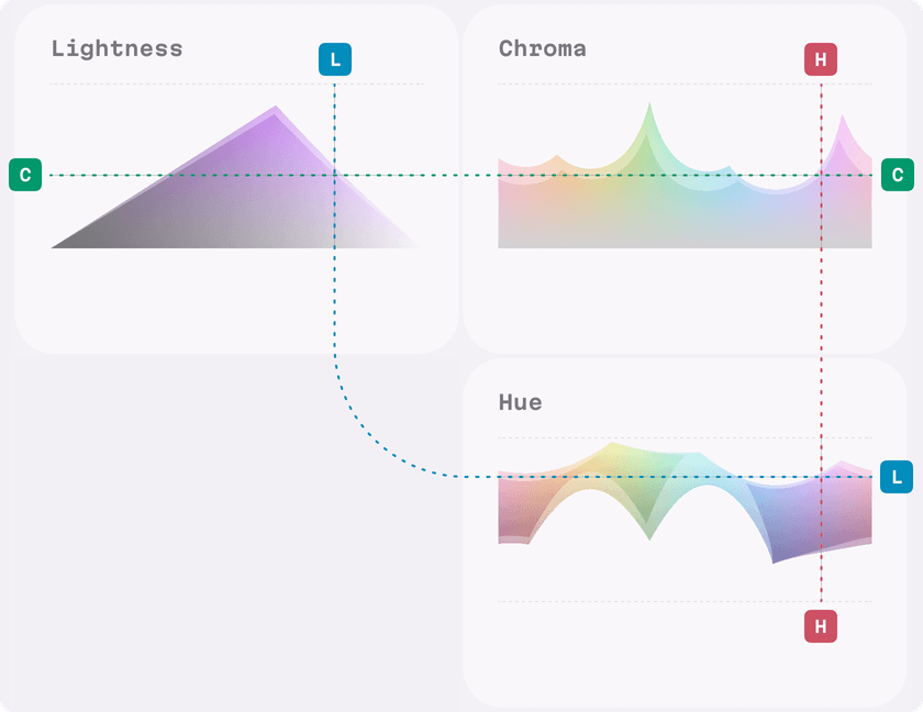
OKLCH is a three dimensional space that recalls a landscape with mountains and hollows. It’s quite important to keep this fact in mind while working with its colors.
The current layout is a net of this 3D figure. In fact we could draw one single horizontal H line for both L and C graphs—they are always on the same height. And one vertical L line for both C and H graphs. We mention this connection in the previous section where we discussed the idea to rotate the graph.
And finally, a few more details
Slider design
Compared to a regular slider, the slider design in the OKLCH Color Picker is a bit different. The slider thumb is placed at the bottom because this guarantees users can see the top part of the slider’s track under their finger, even when using the mobile Picker. Further, the tip rhombus-shaped thumb functions as a natural arrow, clearly showing the user’s current selection, despite the fact this shape occupies the same area as a more typical circle-shaped thumb.
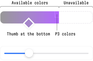
A slider from our picker on the top, a slider from iOS on the bottom
Dynamic accent colors
Implementing this itself is not normally difficult, but with OKLCH it’s easy-peasy, just one line of code. This feature is interesting since it clearly demonstrates the benefits of using a perceptual model.
Look at the video below—whatever the user chooses, no matter how dark or bright the color sample is, the color of the switches “Show graphs” and “Show P3” remains legible. This is because we only take from the given color sample the value of the Hue parameter, but we leave the Lightness parameter picked out beforehand, taking into account the contrast level and accessibility.
Converting the present into a colorful future
OKLCH and LCH are not magical cure-alls. They bring both new opportunities and new challenges. However, compared to HSL, RGB, and HEX, they are a huge step forward, and they provide designers and developers with a relatively reliable basis for building scalable design systems.
And, if you’re looking for cutting-edge solutions, need help with a project in need, or want to get your project into orbit, Evil Martians are ready. No matter if it’s product design, frontend, backend, devops or beyond, we’re here—please reach out to us now!


