OKLCH in CSS: why we moved from RGB and HSL


Topics

Translations
The new CSS Color 4 specification has added the new oklch() notation for declaring colors. In this post, we explain why this is important for design systems and color palettes.
The extremely short version
oklch() is a new way to define CSS colors. In oklch(L C H) or oklch(L C H / a), each item corresponds as follows:
Lis perceived lightness (0-1). “Perceived” means that it has consistent lightness for our eyes, unlikeLinhsl().Cis chroma, from gray to the most saturated color.His the hue angle (0-360).ais opacity (0-1or0-100%).
a:hover {
  background:   oklch(0.45 0.26 264); /* blue */
  color:        oklch(1 0 0);     /* white */
  color:        oklch(0 0 0 / 50%); /* black with 50% opacity */
}
Irina Nazarova CEO at Evil Martians
The benefits of OKLCH:
- OKLCH frees designers from the need to manually choose every color. Designers can define a formula, choose a few colors, and an entire design system palette is automatically generated.
- OKLCH can be used for wide-gamut P3 colors. For instance, new devices (like those from Apple) can display more colors than old sRGB monitors, and we can use OKLCH to specify these new colors.
- Unlike
hsl(), OKLCH is better for color modifications and palette generation. It uses perceptual lightness, so no more unexpected results, like we had withdarken()in Sass. - Further, with its predictable lightness, OKLCH provides better a11y.
- Unlike
rgb()or hex (#ca0000), OKLCH is human readable. You can quickly and easily know which color an OKLCH value represents simply by looking at the numbers. OKLCH works like HSL, but it encodes lightness better than HSL.
But, that being said, OKLCH comes with two challenges:
- With OKLCH and LCH, not all combinations of
L,C, andHwill result in colors that are supported by every monitor. Although browsers will try to find the closest supported color, it’s still safer to check colors using our color picker. - OKLCH is a new color space. At the time of this writing in 2024, its ecosystem is still limited (for Figma we have the plugin but not official support), but we already have a palette generator, color picker, and many converters.
OKLCH space in color picker
So, that’s the short version, but if you want the whole story, let’s start from the beginning in the next section.
Table of contents:
- How CSS colors have changed
- Comparing OKLCH with other CSS color formats
- How OKLCH works
- How to add OKLCH to your project
- Summing up the results
How CSS colors have changed
CSS Colors Module 4
Some recent history: the CSS Color Module Level 4 specification become a candidate recommendation on July 5, 2022.
It added new syntactic sugar to color functions, which we will use in this article:
.old {
  color:   rgb(51, 170, 51);
  color:   rgba(51, 170, 51, 0.5);
}
.new {
  color:   rgb(51 170 51);
  color:   rgb(51 170 51 / 50%);
}
But more importantly, CSS Color 4 also added 14 new ways to define colors—and these are not just syntactic sugar. These new color-writing methods (like
oklch()) improve code readability, a11y, and have the potential to add new features to your website.
P3 colors
Modern displays can’t actually display all the colors which are visible to the human eye. The current standard color subset is called sRGB and it can render only 35% of these human-visible colors.
New screens fix this a bit, since they add 30% more new colors; this set of colors is called P3 (also known as wide-gamut). In terms of adoption, all modern Apple devices, and many OLED screens, have P3 color support. So, this isn’t something from the distant future—this is happening now.
This additional 30% of color can be very useful for designers:
- Some of these new colors are more saturated. Thus, you can produce more eye-catching landing pages.
- The additional colors give your designers more flexibility with palette generation for their design systems.
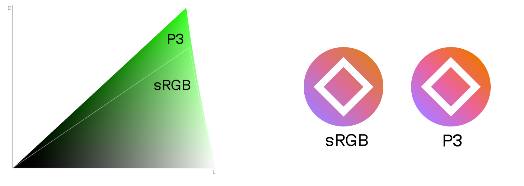
Newly available P3 colors for green on the left. Real-world icon comparison with sRGB vs. P3 on the right.
So, we have P3 colors! That’s great and all, but to actually use them, we’ll need to find a color format in order to support P3. rgb(), hsl(), or hex formats can’t be used to specify P3 colors. We could, however, use the new color(display-p3 1 0 0), but it still shares the readability problems of the RGB format.
Luckily, OKLCH has good readability, supports P3 and beyond, as well as any color visible to the human eye.
CSS native color manipulations
While it’s true that CSS Color 4 is a big step forward, the upcoming CSS Color 5 will be even more useful; it will finally give us native color manipulation in CSS.
/* These examples use hsl() for illustrative purposes.
Don't use it in real code since hsl() format has bad a11y. */
:root {
  --accent:   hsl(63 61% 40%);
}
.error {
  /* Red version of accent color */
  background:   hsl(from var(--accent) 20 s l);
}
.button:hover {
  /* 10% lighter version */
  background:   hsl(from var(--accent) h s calc(l + 0.1));
}
With this new syntax, you can take one color (for instance, from a custom property) and change the individual components of the color format.
Still, as mentioned, there is a drawback to this approach as using the hsl() format is bad for a11y. Results will have unpredictable lightness because the l values are different for different hues.
A familiar refrain emerges: we need a color space where color manipulations produce expected results. Like, for instance, OKLCH.
:root {
  --accent:   oklch(0.7 0.14 113);
}
.error {
  /* Red version of accent color */
  background:   oklch(from var(--accent) l c 15);
}
.button:hover {
  /* 10% lighter version */
  background:   oklch(from var(--accent) calc(l + 0.1) c h);
}
Note: You don’t need to use OKLCH to input the --accent colors of oklch(from …), but using a consistent format is better for code readability.
Comparing OKLCH with other CSS color formats
Hopefully, the previous section gave you some context about where we’ve been, where we are, and where we’re going, as well as oklch(), P3 colors, native color manipulation, and how they all fit together.
Of course, rather than just going all in with oklch(), we could mix and match formats, using different color formats for things like custom properties, P3, or color modifications as needed—but, naturally, having the same color format for most tasks is much better for code maintainability.
So, with this in mind, let’s go ahead and assume that we’ll try to find just one color format for the future of CSS. I believe that format should meet the following criteria:
- It should have native CSS support.
- The format must be able to encode wide-gamut color: P3 and beyond.
- It should be well suited to color modification:
- This includes a human-readable axis (
lightnessinstead ofamount of red). - All axes should be independent. Changing the value of a hue’s axis color should maintain the same level of contrast. Saturation changes should not change hue.
- This includes a human-readable axis (
So, now that we have our criteria in mind, let’s compare formats.
OKLCH vs. RGB/Hex
The color formats rgb(109 162 218), #6ea3db, or the P3-analog color(display-p3 0.48 0.63 0.84), each contain 3 numbers that represent the amount of red, green and blue. Note: 1 in color(display-p3) encodes a larger value than 255 in RGB.
The above formats all share essentially the same problem: they’re completely unreadable for most developers. Instead, people just use them like they are some sort of magic number, absent of any real understanding or way to compare them.
RGB, hex and color(display-p3) aren’t convenient for color modifications because, for the vast majority of humans, it’s difficult to intuitively set colors by changing the amount of red, blue and green. Further, RGB and hex also can’t encode P3 colors.
On the other hand, OKLCH, LCH, HSL have values we can set that are much closer to the way people naturally think about colors. OKLCH and LCH contain 3 numbers which, respectively, represent the following: lightness, chroma (or saturation), and hue.
Compare hex and OKLCH:
.button {
  /* Blue */
  background:   #6ea3db;
}
.button:hover {
  /* More bright blue */
  background:   #7db3eb;
}
.button.is-delete {
  /* Red with the same saturation */
  background:   #d68585;
}
.button {
/* Blue */
background: oklch(0.7 0.1 250);
}
.button:hover {
/* A brighter blue */
background: oklch(0.75 0.1 250);
}
.button.is-delete {
/* Red with the same saturation */
background: oklch(0.7 0.1 20);
}OKLCH’s intuitive values sound great, no? But, here’s where we need to talk about the flip side of the coin. The main disadvantage of OKLCH is that, unlike the others, it has a “young” color space and the ecosystem is still in the development process.
OKLCH vs. HSL
Now, let’s move on and compare OKLCH with HSL. HSL contains 3 numbers to encode hue, saturation, and lightness, like so: hsl(210 60% 64%).
The main problem with HSL is that it has a cylindrical color space. Every hue has the same amount of saturation (0—100%). But in reality, our displays and eyes have different max saturations for different hues. HSL hides this complexity by deforming the color space and extending colors to have the same max values.


Hue-Lightness slice of HSL and OKLCH spaces with the same chroma/saturation and black-and-white versions below. HSL lightness is not consistent across hue axes.
As a result, an HSL-deformed color space can’t be used for proper color modifications; here, the L (lightness) component is not accurate. Different hues represent different “real” lightness values. This leads to issues with contrast and bad accessibility.
Here are a few real use case examples to demonstrate this problem:
- Adding 10% lightness will have different results for blue and purple colors. (SASS users may remember how
darken()generates unexpected results.) - Hue changes (for instance, producing an error-like red color using a company’s accent color) could also change lightness, thus making text unreadable.


In HSL, hue changes could lead to accessibility issues from low contrast
HSL is bad for color modification. Many teams have asked the community to avoid HSL for design system palette generation. Additionally, like RGB and hex, HSL can’t be used to define P3 colors.
OKLCH doesn’t deform the space; it shows the real color space with all its complexity. On one hand, this feature allows us to have predictable lightness values after color transformations and P3 color definition. But, on other hand, not all number combinations in OKLCH generate visible colors: some are only visible on P3 monitors. But there’s still some good here: browsers will render the closest supported color.
OKLCH vs. Oklab & LCH vs. Lab
CSS has two functions for Oklab space: oklab() and oklch() and the same for Lab: lab() and lch(). So, what’s the difference?
While they use the same space, they use different ways of encoding a point in this space. Oklab and Lab cartesian coordinates (a: the green/red value of a color, b: blue/yellow value), and OKLCH and LCH use polar coordinates (angle for hue and distance for chroma).


Cartesian coordinates (Oklab) vs. polar coordinates (OKLCH) in Oklab space
In short, OKLCH and LCH are both better choices for developer readability and color modification because the chroma and hue values are closer to how people actually think about color, rather than simply a and b.
OKLCH vs. LCH
LCH is a good format on top of the CIE LAB (Lab) space that was created to solve all the problems of HSL and RGB. It can encode P3 colors and, in most cases, produces predictable color modification results.
But LCH has one painful bug: an unexpected hue shift on chroma and lightness changes in blue colors (between hue values of 270 and 330).


A constant-hue slice of LCH and OKLCH spaces with the same hue. The LCH slice is blue on one side and purple on the other. OKLCH keeps a constant hue as expected.
Here is a small real case:
.temperature.is-very-very-cold {
  background:   lch(0.35 110 300);
  /* Looks blue */
}
.temperature.is-very-cold {
  background:   lch(0.35 75 300);
  /* We changed only lightness,
     but blue became purple */
}
.temperature.is-cold {
  background:   lch(0.35 40 300);
  /* Very purple */
}
.temperature.is-very-very-cold {
background: oklch(0.48 0.27 274);
/* Looks blue */
}
.temperature.is-very-cold {
background: oklch(0.48 0.185 274);
/* Still blue */
}
.temperature.is-cold {
background: oklch(0.48 0.1 274);
/* Still blue */
}The Oklab and OKLCH spaces were created to solve this hue shift bug.
But OKLCH isn’t merely a bugfix, it also has nice new features related to the math behind color axes. For instance, it has improved gamut correction and CSSWG recommends using OKLCH for gamut mapping.
How OKLCH works
A little bit of history
The Oklab & OKLCH color spaces were created by Björn Ottosson in 2020. The primary reason they were created was to fix the CIE LAB & LCH issue. Björn wrote a great article detailing the reasons he made them and their implementation details.
To be clear, Oklab is very young and this is its primary weak point.
But, after just 4 years, Oklab has already seen very good adoption:
- It was added to the CSS specification.
- Chrome, Safari, and Firefox have
oklch()support. - Photoshop added Oklab for gradient interpolation.
- OKLab is used in color palette generators for good accessibility.
- OKLCH already can be used in Figma using this plugin.
I personally think, that the big changes coming with CSS Colors 4 and 5 are a good time to grab the latest and best solution. In any case, we’ll need to create a new ecosystem around new features from new CSS specs.
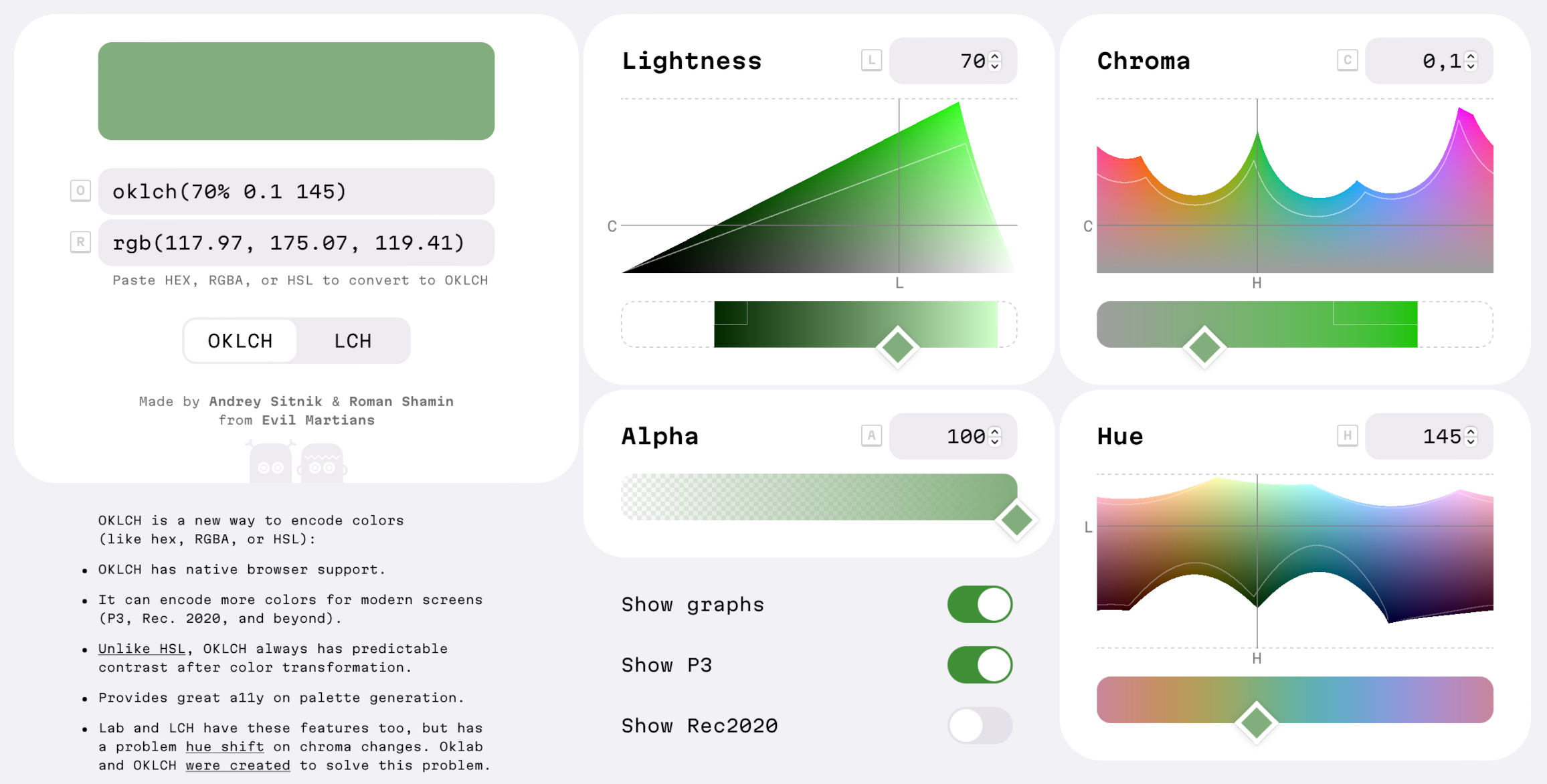
Axes
Colors in OKLCH are encoded with 4 numbers. In CSS, it looks like this: oklch(L C H) or oklch(L C H / a).

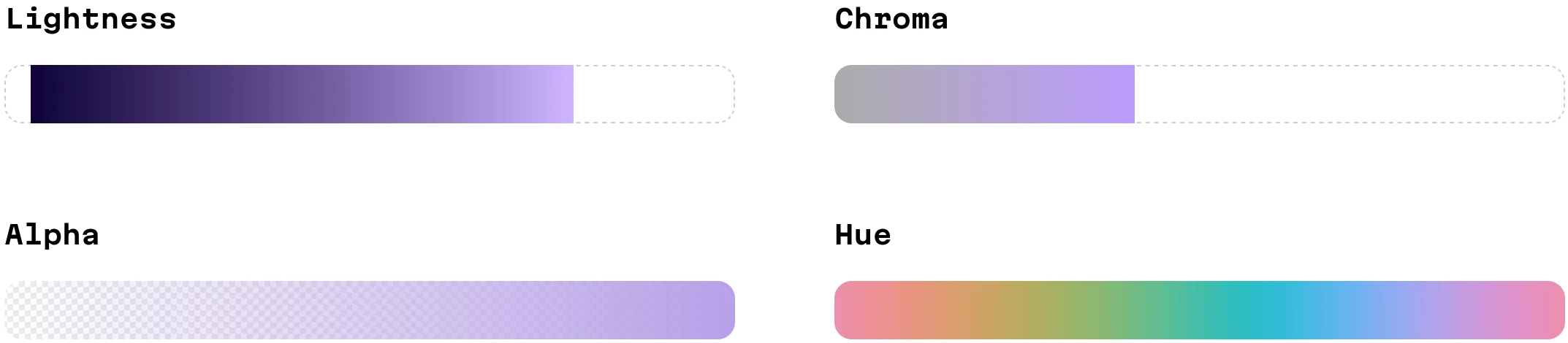
OKLCH axes
Here’s a more detailed explanation of each value:
Lis perceived lightness. It ranges from0(black) to1(white). It accepts percentage too (from0%to100%), but%doesn’t work incalc()or relative colors.Cis chroma, the saturation of color. It goes from0(gray) to infinity. In practice there is actually a limit, but it depends on a screen’s color gamut (P3 colors will have bigger values than sRGB) and each hue has a different maximum chroma. For both P3 and sRGB the value will be always below0.37.His the hue angle. It goes from0to360, through red20, yellow90, green140, blue220, purple320and then back to red. You can use Roy G. Biv mnemonic by giving around 50° to each letter. Since it is an angle,0and360encode the same hue.Hcan be written with units60deg, or without60.ais opacity (0-1or0-100%).
Here is a few examples of OKLCH colors:
.bw {
  color:   oklch(0 0 0);     /* black */
  color:   oklch(1 0 0);     /* white */
  color:   oklch(1 0.2 100); /* also white, any hue with 100% L is white */
  color:   oklch(0.5 0 0);   /* gray */
}
.colors {
  color:   oklch(0.8 0.12 100); /* yellow */
  color:   oklch(0.6 0.12 100); /* much darker yellow */
  color:   oklch(0.8 0.05 100); /* quite grayish yellow */
  color:   oklch(0.8 0.12 225); /* blue, with the same perceived lightness */
}
.opacity {
  color:   oklch(0.8 0.12 100 / 50%); /* transparent yellow */
}
Note, that some components could have none as a value. This may occur after a color transformation. For instance, white has no hue, and browsers will parse none as 0.
.white {
  color:   oklch(1 0 none); /* valid syntax */
}
Color modifications in CSS
In CSS Colors 5, we’ll be able to have native color modifications. This will shine a light on one of my favorite perks of OKLCH: it’s the best color space for color modification because it has very predictable results.
Color modification syntax looks like this:
:root {
  --origin:   #ff000;
}
.foo {
  color:   oklch(from var(--origin) l c h);
}
The origin color (var(--origin) in the example above) can be:
- A color in any format:
#ff0000,rgb(255, 0, 0), oroklch(62.8% 0.25 30). - A CSS custom property with a color in any format.
Each component (l, c, h) after from X can be:
- A letter (
l,c,h), indicating to keep the component the same as it was in the origin color. - A
calc()expression. You can use a letter (l,c,h) instead of a number to reference the value in the origin color. - A new value, which will replace the component.
It may sound complex, but seeing some examples can help illustrate:
:root {
  --error:   oklch(0.6 0.16 30);
}
.message.is-error {
  /* The same color but with different opacity */
  background:   oklch(from var(--error) l c h / 60%);
  /* 10% darker */
  border-color:   oklch(from var(--error) calc(l - 0.1) c h)
}
.message.is-success {
  /* Another hue (green) with the same lightness and saturation */
  background:   oklch(from var(--error) l c 140);
}
The predicted lightness of OKLCH is very useful when generating accent colors from user input (check an example with our OKLCH color picker):
:root {
  /* Replace lightness and saturation to a certain lightness */
  --accent: oklch(from (--user-input) 0.87 0.06 h);
}

body {
  background: var(--accent);
  /* We do not need to detect text color with color-contrast()
  because OKLCH has predicted lightness.
  All backgrounds with L≥87% have good contrast with black text. */
  color: black;
}
Gamut correction
OKLCH has an another interesting feature: device independence. That is, OKLCH wasn’t just created for current monitors with sRGB colors.
You can encode any possible color with OKLCH: sRGB, P3, Rec2020 and beyond. Some number combinations will require a P3 monitor to be displayed. For some other combinations, the proper monitors necessary for their display have still yet to be created.
But really, don’t worry about being out of the gamut (the colors supported by a user’s monitor) because browsers will render the closest possible color. Finding the closest color in another gamut is called “gamut mapping” or “gamut correction”.
And this is why you can see holes in axes of the OKLCH color picker: every hue has a different maximum chroma. Unfortunately, this isn’t just a problem with OKLCH color encoding; it’s a limit both of currently available monitors, and our own sense of vision. For some lightness values, there is only a blue color with a large chroma. For other lightness values, a green color will not have a corresponding pair in a blue or a red with the same chroma.


For 44% lightness only blue has high chrome colors visible on sRGB screens
There are 2 ways of gamut mapping:
- Convert the color to RGB (or P3) and clip values above 100% or below 0%:
rgb(150% -20% 30%)→rgb(100% 0 30%). This is the fastest method, but it has the worst results—it could change a color’s hue and this change will be visible to users. - Convert the color to OKLCH and reduce the chroma and lightness. This keeps the origin hue but is a little slower to render.
Chris Lilley has created a nice comparison between different gamut mapping methods.
The CSS Colors 4 spec requires browsers to use the OKLCH method for gamut mapping. But still, right now, Chrome and Safari use the fast, but inaccurate, clipping method. That’s why we currently recommend manual gamut mapping and adding both sRGB and P3 colors to CSS:
.martian {
  background:   oklch(0.6973 0.155 112.79);
}
@media (color-gamut: p3) {
  .martian {
    background:   oklch(0.6973 0.176 112.79);
    /* You'll only see the preview with P3 monitors */
  }
}
And here’s some good news: stylelint-gamut can automatically detect all P3 colors which need to be wrapped with @media.
How to add OKLCH to your project
Right now, all browsers support oklch(). You don’t need old polyfills.
Step 1: Converting currently existing colors
You can replace all colors using hex, rgb() or hsl() formats to OKLCH; they’ll work in every browser.
Search for any colors in your CSS source code and convert them to oklch() using the OKLCH convertor.
.header {
- background: #f3f7fa;
+ background: oklch(0.97 0.006 240);
}
You may also use this script to automatically convert all the colors:
npx convert-to-oklch ./src/**/*.cssIf you only have a Figma file, you can use the OkColor plugin to copy colors in oklch() directly from Figma (using the OkLCH (CSS) format).
Extra: Adding a color palette
Perhaps this little bit of refactoring is also a good time to increase your CSS code’s maintainability by moving the colors onto a palette:
These are the requirements for color palettes:
- All colors are described as CSS Custom Properties.
- React/Vue/etc. components only use these colors as
var(--error). - Designers should try to re-use colors to reduce number of color variations.
- For a dark or high-contrast theme, you do not need
@mediain your components’ CSS, you just change CSS Custom Properties in the palette.
Here’s an example of this approach.
:root {
  --surface-0: oklch(0.96 0.005 300);
  --surface-1: oklch(1 0 0);
  --surface-2: oklch(0.99 0 0 / 85%);
  --text-primary: oklch(0 0 0);
  --text-secondary: oklch(0.54 0 0);
  --accent: oklch(0.57 0.18 286);
  --danger: oklch(0.59 0.23 7);
}

@media (prefers-color-scheme: dark) {
  :root {
    --surface-0: oklch(0 0 0);
    --surface-1: oklch(0.29 0.01 300);
    --surface-2: oklch(0.29 0 0 / 85%);
    --text-primary: oklch(1 0 0);
  }
}
And plus, moving over to oklch() will be a little easier after palette creation.
Step 2: Maintaining OKLCH with Stylelint
Stylelint is a style linter that’s useful for finding common mistakes and promoting best practices. It’s like ESLint, but for CSS, SASS, or CSS-in-JS.
Stylelint can be very useful when migrating to oklch() because you can:
- Specify that colors using hex,
rgb(),hsl()will not be used and instead keep all the colors inoklch()to improve consistency. - Double-check that all P3 colors are inside
@media (color-gamut: p3)to avoid browser gamut correction (right now, Chrome and Safari don’t do this correctly).
Let’s install Stylelint and the stylelint-gamut plugin using your package manager. With NPM, run:
npm install stylelint stylelint-gamutCreate .stylelintrc config with:
{
  "plugins": [
    "stylelint-gamut"
  ],
  "rules": {
    "gamut/color-no-out-gamut-range": true,
    "function-disallowed-list": ["rgba", "hsla", "rgb", "hsl"],
    "color-function-notation": "modern",
    "color-no-hex": true
  }
}
Add the Stylelint call to npm test to run it on CI. Change package.json like so:
  "scripts": {
-   "test": "eslint ."
+   "test": "eslint . && stylelint **/*.css"
  }
Run npm test to find any colors which should be converted to oklch().
We also recommend adding the stylelint-config-recommended to .stylelintrc. This Stylelint sharable config will ensure that your CSS code is using the popular best practices.
Extra: P3 colors
Replacing colors with oklch() will improve code readability and maintainability, but it will not add new features for users. However, there is an additional feature of OKLCH which will be visible to users: we can add rich, wide-gamut P3 colors to our websites. For instance, we could add deep colors to a landing page.
Here’s how to do it:
- In your CSS, choose some saturated color, like an accent color.
- Copy it into OKLCH Color Picker.
- Change the
ChromaandLightnessvalues to move the color into the P3 area. TheLightnesschart will provide the best feedback. Simply move the color above the thin white line. - Copy the result and wrap it with a
color-gamut: p3media query.
  :root {
    --accent:   oklch(0.7 0.2 145);
  }
+ @media (color-gamut: p3) {
+   :root {
+     --accent:   oklch(0.7 0.29 145);
+   }
+ }
Extra: OKLCH in SVG
You can use OKLCH, not only in CSS, but also in SVGs (or HTML). For instance, this could be useful for adding unique, rich colors to app icons.
<svg viewBox="0 0 120 120" xmlns="http://www.w3.org/2000/svg">
  <style>
    @media (color-gamut: p3) {
      rect {
        fill:   oklch(0.55 0.23 146)
      }
    }
  </style>
  <rect x="10" y="10" width="100" height="100"
        fill="   #048c2c" />
</svg>
Extra: OKLCH/Oklab in gradients
A gradient is a path through a color space between 2 or more dots. This means that if you change your color space, you’ll end up with a very different gradient for the same starting and ending colors.


Gradients in different color spaces
For gradients, there is no silver bullet; different tasks will require a different color space. But the Oklab color space (OKLCH’s sister that lives on top of cartesian coordinates) often has good results:
- It has no grayish area in the middle as default (sRGB) gradients.
- It has not blue-to-purple shift as Lab.
CSS Image 4 specification has a special syntax to change the color space in gradients:
.oklch {
	background: linear-gradient(in oklab, blue, green);
}
Extra: Color modification with OKLCH
Right now all browser supports native CSS color modification (relative colors) from CSS Colors 5.
OKLCH is incredibly good for color modification: unlike HSL, it has predicted lightness, and unlike LCH, it doesn’t have any problems with hue shifts upon chroma changes.
Here’s how you can define a 10% darker :hover background for a button:
.button {
  background:   var(--accent);
}
.button:hover {
  background:   oklch(from var(--accent) calc(l - 0.1) c h);
}
With CSS Custom Properties, we can define the :hover logic just once and then create many variants simply by changing the source color.
.button {
  background: var(--button-color);
}
.button:hover {
  /* One :hover for normal, secondary, and error states */
  background: oklch(from var(--button-color) calc(l + 0.1) c h);
}

.button {
  --button-color:   var(--accent);
}
.button.is-secondary {
  --button-color:   var(--dimmed);
}
.button.is-error {
  --button-color:   var(--error);
}
Thanks to OKLCH’s predictable lightness, we can work with colors from user input and have good a11y on our sites.
.header {
  /* JS will set --user-avatar-dominant */
  background: oklch(from var(--user-avatar-dominant) 0.8 0.17 h);
  /* With OKLCH, we're sure that black text will
  always be readable on any hue, since we set L to 80% */
  color: black;
}
Extra: OKLCH in JS
With Color.js or culori, you can transform colors in JS while reaping all the benefits of OKLCH color space. You can check examples with culori using the OKLCH Color Picker source code. In this article, I’ll use Color.js.
Here’s an example that shows off making an accent color from a custom color:
import Color from 'colorjs.io'

// Parse any CSS color
let accent = new Color(userAvatarDominant)

// Set lightness and chroma
accent.oklch.l = 0.8
accent.oklch.c = 0.17

// Gamut mapping to sRGB if we are out of sRGB
if (!accent.inGamut('srgb')) {
  accent = accent.toGamut({ space: 'srgb' })
}

// Make the color 10% lighter
let hover = accent.clone()
hover.oklch.l += 0.1

document.body.style.setProperty('--accent', accent.to('srgb').toString())
document.body.style.setProperty('--accent-hover', hover.to('srgb').toString())
You can use these libraries to generate an entire design system palette in the OKLCH color space. This allows you to have predicted contrast and better accessibility. As an example of this in practice, Huetone, an accessible palette generator, uses Oklab by default.
Summing why we moved to OKLCH
At our company, we already use OKLCH in our projects—as a matter of fact, the website you’re on right now uses oklch(), too. So, here’s the question of the moment: what benefits have we gained after moving to OKLCH?
1. Better readability
With OKLCH, we can understand colors just by looking at code.
For instance, we can compare darkness in the code and find some contrast-related accessibility issues:
.text {
  /* ERROR: a 20% lightness difference is not sufficient for good contrast and a11y */
  background:   oklch(0.8 0.02 300);
  color:   oklch(1 0 0);
}

.error {
  /* ERROR: colors have a slightly different hue */
  background:   oklch(0.9 0.04 30);
  color:   oklch(0.5 0.19 27);
}
2. Simple color modifications
We can apply simple color modifications right in the code and get predictable results:
.button {
  background:   oklch(0.5 0.2 260);
}
.button:hover {
  background:   oklch(0.6 0.2 260);
}
3. Relative Colors
You can define design systems in CSS using relative colors. OKLCH is the best color space to do any automatic transformations for colors.
.button {
  background: var(--button-color);
}
.button:hover {
  /* One :hover for normal, secondary, and error states */
  background: oklch(from var(--button-color) calc(l + 0.1) c h);
}

.button {
  --button-color:   var(--accent);
}
.button.is-secondary {
  --button-color:   var(--dimmed);
}
.button.is-error {
  --button-color:   var(--error);
}
4. P3 colors
We can use the same color functions for both sRGB and P3 wide-gamut colors.
.buy-button {
  background:   oklch(0.62 0.19 145);
}
@media (color-gamut: p3) {
  .buy-button {
    background:   oklch(0.62 0.26 145);
  }
}
5. Better communication with design teams
Since OKLCH is much closer to real-life color, using oklch() in CSS will actually educate developers and lead the community to an overall better understanding of color itself.
Further, this move could have even larger ramifications: one small step towards improving communication between development and design teams.
Modern design tools (like palette generators) use Oklab for better accessability. Figma has the OkColor plugin. Using the same oklch() in both designer tools and developer CSS will keep everyone on the same page.
Changelog
2024-07-18
- Move from
%inLto float because browsers don’t require%anymore butcalc()don’t support%in relative colors.
2024-07-15
- Add note about
%issue in relative colors.
2024-07-13
- Update guide to reflect that all browsers supports
oklch()and relative colors.
2023-08-08
- Add Figma plugin for OKLCH.
2023-05-17
- Recommend
stylelint-gamutto detect P3 without@mediainstead of polyfill tools.
2023-05-10
- Browser support was updated: stable Firefox got
oklch()support with a flag, Chrome got Oklab/OKLCH support for gradients.
2023-03-08
- Browser support was updated: Chrome and Firefox Nightly got
oklch()support.
2023-02-05
- “Contrast” was replaced with “lightness”. Developers should use APCA to detect contrast. Just OKLCH is not enough.
2023-01-25
- Added ROYGBIV mnemonic rule to remember OKLCH’s hue values.