Better dynamic themes in Tailwind with OKLCH color magic


Gone are the days of static color palettes! In this article, we’ll delve into the next big thing in web design: dynamic theming with Tailwind. So, if you’re curious about how OKLCH is reshaping the world of Tailwind, you’re in the right place.
Tailwind isn’t just hype
It seems like Tailwind has officially blown us away. Sure, it has rustled some jimmies in the community, but even those who were rustled can’t outright deny some of its fantastical perks:
- Tiny bundle size and high performance: even for huge sites, bundle sizes rarely exceed 10–15KB. This means style sheets are processed in the browser faster than you can say “I love CSS modules more than this”.
- Built-in code splitting: there’s just one CSS bundle, so no headaches about loading separate styles for components. Styles are delivered hand-in-hand with components, BFF-style.
- Markup and style coupling: classes are baked right into the markup, boosting readability and portability. Moving a component from one project or an example to another? Piece of cake.
Now, one thing we’re aiming to hype up in particular today is the color management system. While Tailwind provides a fabulous palette out of the box, if you’re dreaming of dynamic theme generation at runtime, static classes are just not going to work.
…but stick around, and we’ll give you the full lowdown on how to make that happen.
What are dynamic themes, and why do we even need them?
A dynamic theme lets users play Van Gogh and choose the core interface colors. The medium that allows users to make their selection can vary—it could be a fixed color set or a fancy UI “color slider.” But the endgame is the same: users can jazz up their product to match their taste or needs with their fave shade—brightening their day, every day.
Note how the entire product color scheme changes in real-time as you adjust the hue picker.
Beyond global themes, the magic of dynamic coloring can also be applied to very specific UI components. Let’s imagine a promo banner that automatically selects its accent color based on the image it’s displaying. Now you’ve got a banner that’s not only eye-catching—it’s color-coordinated, down to the pixel.
Or consider a social network where users can choose their profile’s dominant color, which then affects how it appears to visitors. Now you’re curating the visual experience for anyone who lands on your slice of the social web.
Watch me redecorate this promo banner. From dusk beach till dawn. Demo by my colleague Anton Lovchikov.
To be clear, this is not just an aesthetic gimmick. By personalizing a product, users bond with it. Consider it an added layer of engagement, which could lead to better retention and overall satisfaction. The choice of color scheme is no minor detail, it’s the wellspring that every interface’s overall vibe pours out from.
That being said, “dynamic” doesn’t mean every single color in an interface should be customizable. After all, some colors send signals to the user and follow time-tested patterns. These include things like errors, which need to sort of “scream” in red, “warnings” that wave a yellow flag, and success notices that give a green “thumbs up”.
Why dynamic themes are a rarity-and how this is changing
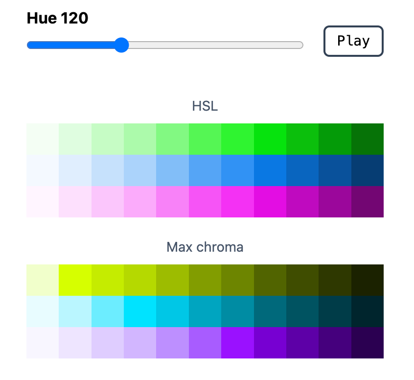
So, what is new here, exactly? You might be thinking, “We have HSL, right? Hue, Saturation, Lightness! Give users a hue slider, pop that value into a CSS variable, and bam, you’re golden.” But why isn’t everyone on that bandwagon?
The culprit is color perception. The RGB color space isn’t the best when it comes to delivering uniform perception, leading to a mishmash of visual outcomes. In other words: shifting hue with consistent saturation and lightness can lead to wildly different results.

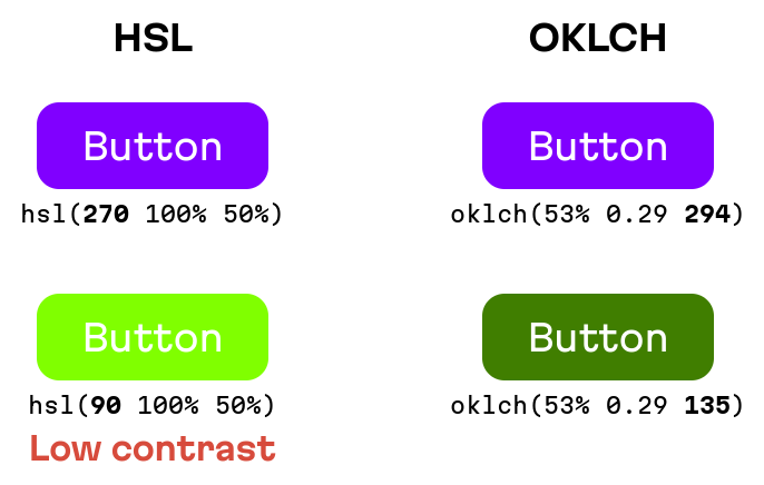
In HSL, hue changes could lead to accessibility issues due to low contrast
This brings us to the core challenge of designing and implementing dynamic themes: teams often have to invent their own color math to ensure some level of perceptual consistency. (Imagine a developer having to create cryptography algorithms every time they made a new project. Why do that? There are already battle-tested libraries for that, like OpenSSL.)
This is where OKLCH comes into play. It’s not just another color space; it’s specifically designed for uniform color perception. With OKLCH, you can slide the hue around and achieve consistent visual results—with no more need for any DIY formulas.
Next, we’ll break down how to seamlessly integrate OKLCH with Tailwind for a robust dynamic theme.
Replacing semantic classes with spectrum-based ones
Heads up: there’s a full “product” demo at the end of this article, showcasing all the juicy details we’ll cover here.
The first step towards integration is switching from spectrum-based classes like text-red-500 to semantic classes such as text-accent-500 or bg-secondary-300. This will be part of your pact with the designer: any color we want to spice up at runtime needs to be semantic.
There’s only one exception: signal classes, like errors or successes. Although, I’d still nudge you towards semantic classes, especially since linking the Tailwind spectrum palette with a semantic token is pretty straightforward.
You can have as many dynamic colors as your (product’s) heart desires; you can let users pick one or more, but typically complementary colors should be distinct from the main shade. Sadly, with dynamic themes, we’re unable to set them in stone beforehand. But… you can still generate them at runtime!
If we were in the RGB realm, we’d inherit the same old problem: generated complementary colors in perception would differ massively. But lucky for us, we’re in OKLCH world. Complementary colors can be whipped up on the fly by tweaking the hue using a fancy algorithm. (For instance, for 4 distinctly different colors, you’d add 360/4=90 to the base hue.)
Crafting classes with dynamic colors
Once you’ve settled on your semantic names (like accent, secondary, and so on), it’s time to roll out some new classes in the Tailwind config. For a shade of 300, the raw value in the tailwind.config.js should look something like this:
oklch(var(--dn-accent-300, 0.762 0.177 190.000) / <alpha-value>)Let’s break that down:
oklch. This color space is already supported by most browsers, and it also lets you dabble with the vibrant P3 colors. If you’re fretting about older browser support, you can play it safe withrgb.--dn-accent-300. Here,300is our shade;accentis the semantic name, anddnis shorthand for “dynamic”. We sprinkle that in to avoid any potential variable clashes.0.762 0.177 190.000. These are your fallback values for the CSS variable. Without these, if there’s no value up the cascade, the color will just be black all around; I always add them for extra safety. But hang tight! We’ll discuss the FOUC issue later in this article, ensuring that our needed variables are always present.<alpha-value>. This bit is for Tailwind, and lets it handle color opacity syntax, likebg-accent-300/50, for a 50% transparent background.
Creating the colors: going full brightness
I casually dropped an accent color example earlier, 0.762 0.177 190.000. But you might be wondering, “Where did that come from?” Well, it’s time for some color math magic. And thanks to OKLCH, we don’t have to reinvent this wheel.
Now, the Hue component will either be set when creating classes (via fallback values) or user-picked. That’s 1/3 of the work done.
In true Tailwind style, we’ve got 11 shades, ranging from 50 to 950. In OKLCH terms, these shades differ in Lightness, which ranges from 0% to 100%. We’ll manually match Lightness to the Tailwind palette, so that our custom-made dynamic theme adheres to the look and feel of the stock palette. One may think you can find a formula to find the Lightness with mathematical precision, but nothing beats the trained eye of a designer:
const lightness = [
  97.78, 93.56, 88.11, 82.67, 74.22, 64.78, 57.33, 46.89, 39.44, 32, 23.78,
];
So, our job boils down to calculating Chroma.
There are numerous ways to do this, and I’ll shed light on two: max chroma (which comes with visual inconsistency), and the less radiant, but extremely consistent one.
Let’s start with the max chroma.
We’ll automate auto-magic this! We’ll create a color with the existing Lightness and Hue. Then, for the starting Chroma, we’ll aim way beyond the available color space—say, 0.4. From there, the OKLCH converter will grab this off-the-chart Chroma and compute the max possible value.
This approach will give you fairly consistent visual results, all thanks to the OKLCH math. But brace yourself, some inconsistencies in Chroma might rain on your parade.

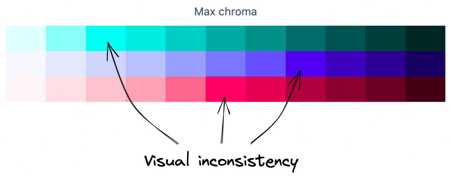
On one hand, this method brings out the most vibrant colors. On the other, the brightest shade varies with the Hue—sometimes it might be shade 200, other times 500.
I would go this route (that is, going full brightness) if, for some reason, I needed dynamic coloring on landing pages—this is where P3 shines the most, and users are blown away by extremely vibrant colors.
But hold on to your hats—there’s another way.
Creating colors with optimal consistency
To ensure maximum visual consistency, we’ll need to manually set the Chroma for each shade. And here’s how the magic happens (spoiler alert: no magic at all):
Head on over to oklch.com, set the desired Lightness, and slide the Chroma slider upwards until you hit a sweet spot where there are no gaps in the Hue spectrum. Gaps mean that there won’t be such a color for this Hue, meaning the color will fallback to closest value, and here’s where you’ll have inconsistency once again. Once you find a Chroma value that has no gaps in the spectrum, save it.
As a result, we get a pre-defined array, just like with Lightness, and this time the palette is very consistent.
const chroma = [
  0.0108, 0.0321, 0.0609, 0.0908, 0.1398, 0.1472, 0.1299, 0.1067, 0.0898,
  0.0726, 0.054,
];
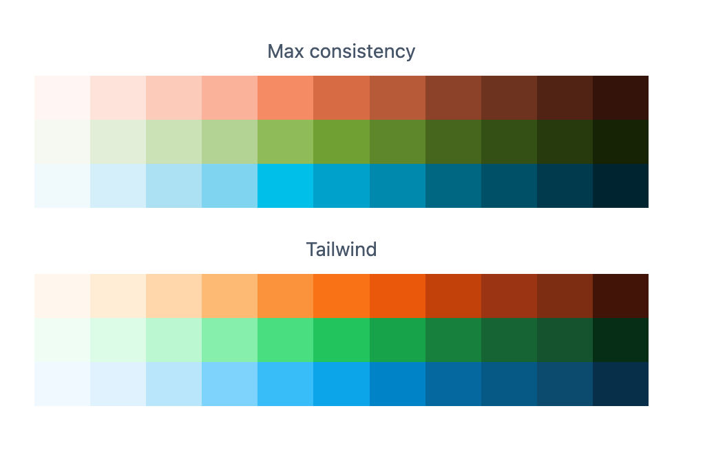
Very consistent, even with very different Hue components.
The coolest part is that if you compare this dynamic palette with the static one from Tailwind, you’ll see very little difference; your dynamic one will play nicely with those signal spectral classes.
Feel free to change play with both algorithms in this demo!

Now, that dynamic colors and Tailwind are in sync, over the next few sections, we’ll turn our attention to creating the “ultimate” demo. Let’s get going.
Crafting the ultimate demo
Let’s put this theory to test in a live interface and delve deep into the quirks and intricacies of the task at hand.

By all means, give this UI a try, it’s marvelous! Source code is available on GitHub.
When to load the runtime
The code that calculates those colors relies on the culori library; without it, we’d be stumbling in the dark. On its own, it size is 30+ KB minified and gzipped, which is overkill—like a sports car sitting in a traffic jam. Here are some ways to deal with this:
- Asynchronous imports: load the library and runtime only when needed using async
import(). This is ideal if color customization is reserved for settings pages. - Serverless: deploy this function in a serverless environment (manually, or using meta-framework APIs like Next, Nuxt, SvelteKit, and so on), and fetch it as users slide through the Hue picker. We end up with a slightly compromised UX, but this works wonders even on low-end devices: small bundles, server-side computations.
- Precompilation: While Hue values range from 0 to 360 with floating points, in reality, you could achieve ample customization by setting steps of, say, 5 or 10 for the Hue picker. This gives you a finite number of color combinations: from 36 to 72. Precompute during build, stash it in a CDN, and fetch the data as users play with the slider. 36 combos for one color? That’s a 5KB gzip’d JSON, small enough to ship to the user.
Also, you can always fallback to adding it all in the bundle. If you’re looking for offline capabilities, or you just expect the incoming colors to be very different and changed quite often, then you don’t have another choice.
Dealing with FOUC and retaining user choices
The term FOUC (flash of unstyled content) is usually about a situation where a page is painted before the CSS is fully loaded. In our case we could also have a situation where a browser draws a page before the user-selected theme CSS variables are applied, meaning that users will see our fallback values. So we’ll need to store and retrieve the color somehow.
Where to store user’s color choice?
- In the browser, for instance, we can do this using Local Storage.
- On the server in a database. This brings in an added spice: the theme gets preserved across devices, and migration is easier (e.g., jumping from two colors to three or tweaking the palette algorithm). But, of course, with great power comes increased complexity.
- Cookies! They do have a size limit, but the great thing is they’re accessible both server-side and client-side. This is perfect if you’re avoiding user profiles and don’t want to pull color libraries into the client.
Most times, I’d put my money on the database, it’s a much better UX overall.
How to store the choice?
- Just save the chosen hue. It’s compact, compatible with any storage, but may face challenges if rendering outside the Node.js ecosystem due to the potential lack of color libraries.
- Save the entire generated palette; but there’s the catch: it might not play well with cookies.
For most simple endeavors, a hue should suffice.
How to retrieve it?
- If you’re rendering templates server-side (SSR), the easiest method is to fetch the color from cookies or the database and pin the variables as inline styles. Local Storage, unfortunately, won’t make the cut here.
- Otherwise, you absolutely must save the palette in a client-accessible storage (Local Storage or cookies), and as early as possible (among the very first script tags), retrieve these colors and set the CSS variable values.
For the demo I showed, we brewed our project with Next (employing React Server Components), storing the hue in cookies and sprinkling the variables in inline styles in the root layout component. We also use a serverless function that’s called during initial render, and which gets revalidated every time you change the selected Hue.
What to do with Dark Mode?
Dealing with Dark Mode is an easy one: we treat dark mode the same way in dynamic themes as in static. Think of your semantic classes as spectral cousins; behind every numbered class hides a specific color. Before, you’d do text-sky-700 dark:text-sky-200. Now? It’s all about text-accent-700 dark:text-accent-200.
Typically, you’d want to have three states: “default” (from media queries), “force light,” and “force dark.” For simplicity, this demo only has the latter two.
How to display the Hue Picker UI?
The regular old <input type="color" /> or non-native pickers just won’t do. They allow picking all color components together, which might puzzle the user. We just want to serve up Hue. The straightforward approach is an <input type="range" /> with a numeric value. But, between us, I doubt users would want such a bare-bones UI.
For our demo, I made a nifty little cross-framework component: simple-hue-picker.
The simplest color picker in the universe, 1 kilobyte, cross-framework. As good as it gets!
While it isn’t the sharpest tool in the shed, it gives users a decent reference. Plus, it’s lightweight compared to most color-picking libraries and can easily be used in all frameworks and even without one.
How to collaborate effectively with designers?
Time for the grand finale question. Dynamic colors are all fun and games until a designer needs a playground. The fix? Just export colors with your favorite hue once (I’d lean into green with hue 150) and serve it in JSON format.
Most design tools can gobble up these color tokens. Mockups are now designed with that one color in mind, but you and your designer will be bound by the same math formula! That’s why they can safely use whatever shade they have, and you can sleep peacefully knowing that no angry user will come to you saying that when they pick yellow, the text suddenly becomes unreadable.
Wrapping up this colorful journey
Well, folks, that’s a wrap on our technicolor adventure through the vibrant world of dynamic theming with Tailwind and OKLCH.
As you dive back into your projects, remember: colors have the power to evoke emotions, set moods, and shape perceptions. So, why settle for the same old palette when the world is much brighter? Here’s to painting the digital canvas with hues that resonate and themes that truly pop. Happy coding and colorful designing! 🎨🚀

A big shoutout to my colleague Anton Lovchikov for his invaluable insights on OKLCH color spaces. His expertise helped elevate this article to a whole new level of clarity and depth.
At Evil Martians, we transform growth-stage startups into unicorns, build developer tools, and create open source products. If you’re ready to engage warp drive, give us a shout!