Payment form best coding practices that don't drop sales


Revenue is won or lost at checkout. Up to 70% of carts are abandoned, and every 100ms of latency can cut conversion by ~1%. That said, customers aren’t abandoning payments, they’re actually abandoning poor payment form design. In this post, (inspired by insights from our work with clients) we present an exhaustive guide to practical frontend improvements that can boost conversion and keep users checking out instead of dropping out.
That said, improving checkout UX can mean up to a 35% conversion increase!
Let’s take a holistic look at this topic. We’ll start by talking about when it’s worth building your own payment form, then we’ll get a comprehensive look at 10 principles for making the best possible payment UX, and finally seeing some frontend implementation in action.
TL;DR:
- Start with hosted checkout: You get local methods, wallets, and SCA/3DS built in—with lighter PCI
- Performance: Every 100ms = -1% conversion. Optimize loading, use code splitting, preconnect to PSPs
- Form fields: Fewer fields (6-8 vs 11.3 average)
- Form structure: Single column, logical order
- Payment methods: Offer 2-3 options, show wallets only when available, localize per market
- Transparency: No surprise fees, show totals early and always
- Mobile wallets: Show only if truly available
- Security: HTTPS, visible trust signals, clear 3DS messaging
- Micro-interactions: Smart autofocus, input masks, auto-fill friendly
- Error handling: Inline validation, specific messages, preserve user input
Skip to optimization cheat sheets
Of course, do read on for the detailed breakdown!
Should you build or buy your payment form?
Before going further, let’s pause to note that, for most teams, a hosted checkout from your payment provider is the shortest path to a reliable, global checkout: dynamic local methods, wallets, and SCA/3DS are handled for you. Meanwhile, sensitive card data is off your servers, meaning a reduced PCI DSS burden compared with fully custom forms.
Building and maintaining all of that yourself is a long-term commitment. Here are some scenarios where a custom implementation may be justified:
- Brand-critical layouts or deeply embedded flows a hosted page can’t match.
- Complex business logic (marketplaces, multi-party splits, specialized risk checks).
- Platform constraints (kiosks, super-apps, in-app webviews).
If you choose to build a custom checkout, budget explicitly for risk: SCA/3DS edge cases, per-country payment methods, PCI scope changes, fraud controls, and ongoing maintenance.

Hire Evil Martians
Improving checkout UX leads to 35% conversion increase
1. Speed = $$$
Let’s make something very clear: payment forms are not “top-of-funnel marketing.” They are cash registers. Users are ready to pay. Every delay here is just annoying and directly burns revenue.
Per Baymard Institute, up to 70% of carts never make it to payment. Slow checkout is a leading culprit. Back in 2007, Amazon showed that every 100 ms of latency = −1% conversion.
If your payment flow pulls an extra 200–300 KB, you could be losing percentage points of sales every day. But what to do? Here are a few performance speed guidelines that just work:
- Preconnect. Let the browser open connections to your PSP ahead of time. This saves hundreds of milliseconds of network “handshakes” when the user is already ready to pay:
<link rel="preconnect" href="https://provider.com" crossorigin>-
Code splitting. Put payment code into a separate chunk. Even a few hundred kilobytes saved on mobile networks = conversion lift.
-
Measure in production. Lighthouse is fine to start, but only RUM (Real User Monitoring) saves the day. Track “form opened → payment success”, and compare by market. In SE Asia and LATAM, the difference between “1s” and “5s” can seal the deal.
-
Aggressive caching. JS and CSS with cachebusters, let the browser cache them for weeks. For returning customers, the form should open instantly.
Cache-Control: public, max-age=31536000, immutable. For versioned assets likepayment-form.abc123.js, the browser can cache forever. Update the hash when the code changes. -
Audit dependencies and downsize. Review JS libraries and swap heavy deps for lighter or native equivalents. Use tools like Bundlephobia to compare min+gzip sizes, prefer tree-shakable ESM builds, and (if it’s a trivial helper) replace it with a few lines of custom code (an LLM can scaffold). Size Limit can enforce it in CI, keeping bundle budgets in pull requests.
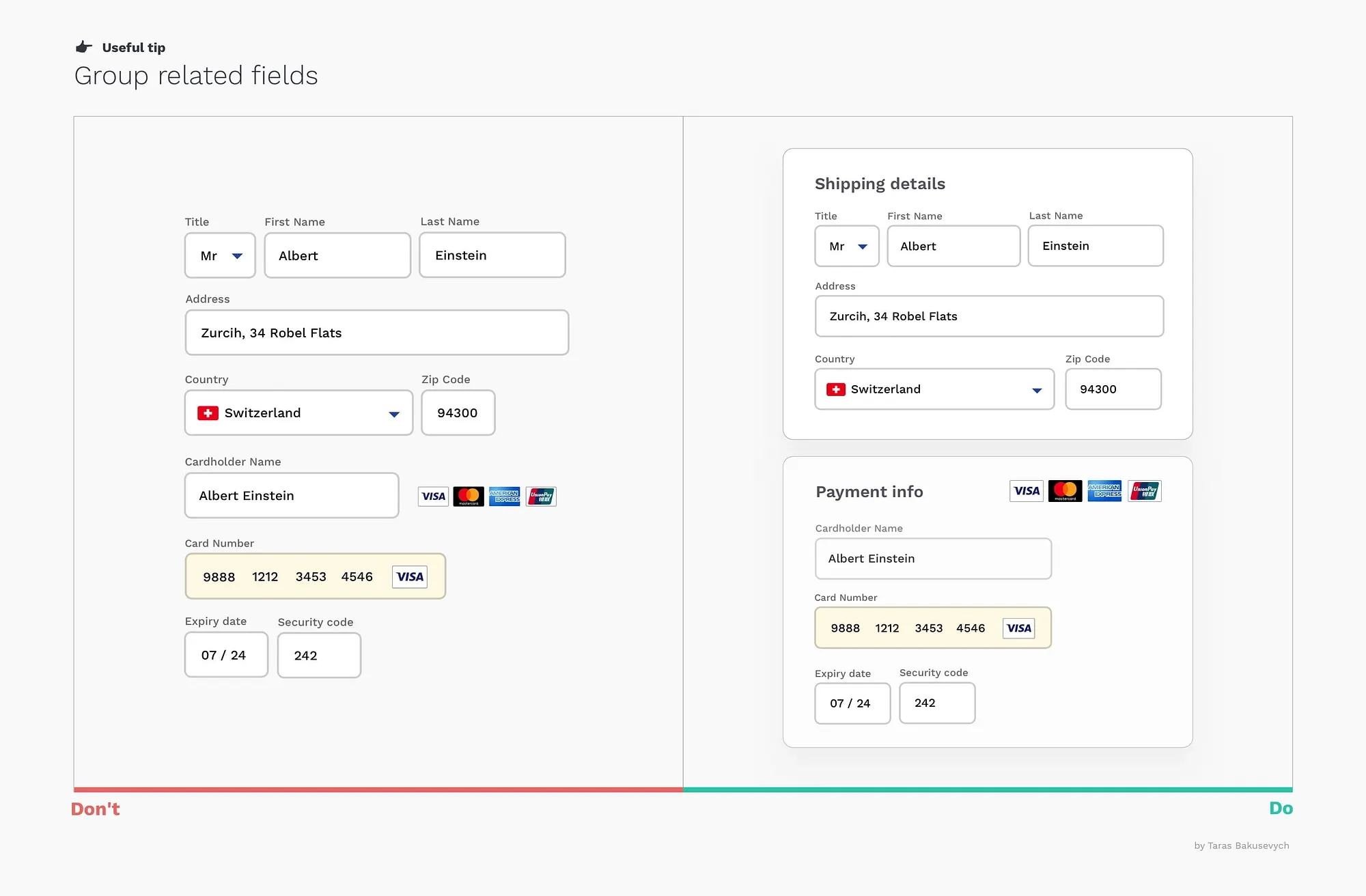
2. Fewer form fields + proper localization = more $$$
The average e-commerce site shoves 11.3 elements onto the payment page, but you typically need 6–8 fields (Minimize Checkout Form Fields). The rest is noise and friction.
Baymard says 18% of shoppers abandon a purchase because of long or confusing checkout exeriences.
So, what can we hide or optimize?
- First + last name → combine into “Full name” (unless legal requirements force separate fields), and allow single-name entries—many users don’t have a family/last name, see the W3C guide on personal names.
- Promo code field → collapse so it doesn’t distract.
- “Cardholder name” → remove or auto-fill from profile.
- Billing address → have the checkbox default so that “Same as shipping” is ON.
- Card type → don’t ask card type (Visa/MasterCard), detect it from card number and validate with Luhn algorithm.
Proper localization is huge
Most importantly, we must consider payment form localization. There is no one-size-fits-all form, and required fields and formats vary by country.
This means your form has to adapt dynamically. For instance, changing country should update the phone mask, show/hide fields and hints. Fewer questions and errors → higher “first-pass” completion.
3. Simplify structure and give fields a smooth flow
Cutting fields is only half the job; their layout matters too. Offbeat sequencing or chaotic field placement can also kill conversion.
Again, per Baymard, about 36% of sites mix up the order of card inputs, thus provoking errors. A classic example: placing the “Cardholder name” field before the card number, meaning users start typing digits into the wrong field.
Instead, do it right:
- Opt for single column, top to bottom. No zigzags or two-column chaos. This is critical on mobile; gaze should move predictably.

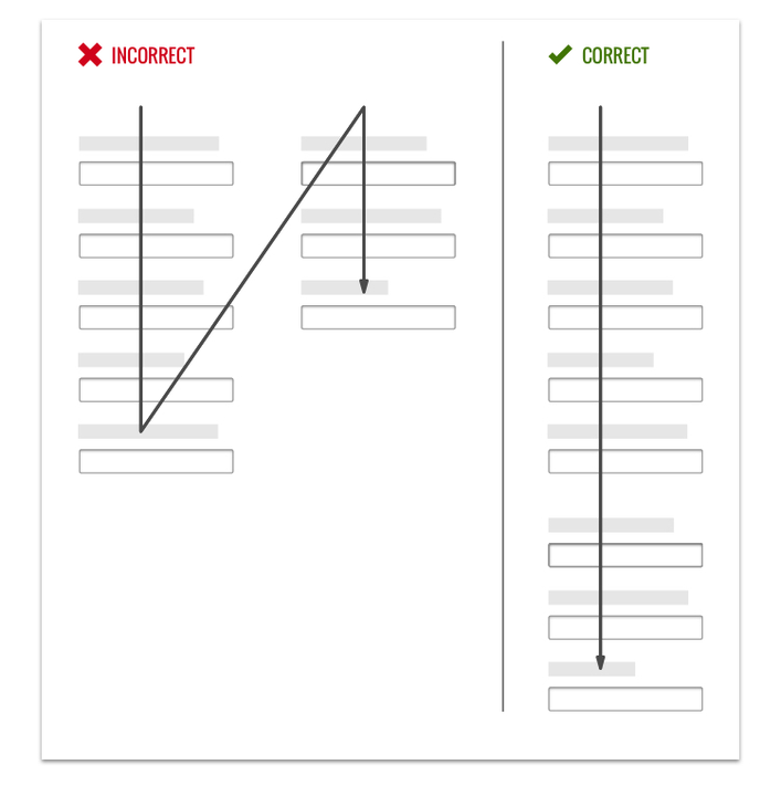
- Make sure you’ve got the correct order: Card number → expiry → CVC/CVV → (optional) name. Generally speaking, that’s exactly how it appears on a card.
- Use grouped fields. Combine month/year into a single “MM/YY.” (If side-by-side on desktop, stack vertically on mobile.)

- Only ask for a billing address after card details and display the “Same as shipping” option right away.
- Auto-detect city/state from the ZIP (but keep fields editable). This is especially important on mobile: Baymard finds 28% of mobile sites don’t offer ZIP→City/State (or full address lookup), missing an easy way to cut typing and errors.
Localization matters here, too. Address structures are country-specific. Some examples:
- US: ZIP first, then state.
- UK: postcode and county.
- Japan: prefecture → city → ward → block.
Your form should switch layout, masks, and hints with country. If not, the form will feel “foreign,” and errors are almost guaranteed.
Finally, the primary action button belongs at the end of the main flow, with clear text, for instance: “Pay €42.00”. Note that the format should be localized and this work includes proper symbol placement and decimal/grouping separators depending on the currency.
4. Offer payment method choice without overload
Not everyone wants to type a card number. Some prefer PayPal, others love Apple Pay or Google Pay. In some locations, users might want cash on delivery. Our job is to offer the right option without turning the screen into a logo landfill.
If you sell globally, your baseline should include:
- Payment cards (Visa, Mastercard, Amex, etc.)
- At least one alternative method (PayPal, Apple Pay/Google Pay, Klarna, Shop Pay, and so on).
Teams often stumble here. 21% of sites offer no alternative to cards and this causes up to 11% of users to bail.
Additionally, payment methods should depend on country, currency, and device. Don’t show an Indian wallet to a user in Germany.
Payment method UX
Remember that people value simplicity and set expectations accordingly.
If you have a few options (≤4–5), show them inline. If more, show the top 3 and put the rest behind “Other methods.”
For PayPal, say upfront: “You’ll be redirected to PayPal to sign in.” This removes “sudden redirect” anxiety. Meanwhile, for offline/Bank transfer/COD, show clear instructions: “Pay the courier in cash” or “Send the total to this account.”
Also follow these UX patterns:
- On iPhone, show Apple Pay first; on Android, Google Pay.
- Wallet buttons must follow brand guidelines (Apple/Google/PayPal actually require this).
- Radios or tiles are a good choice: a label + recognizable icon.
- For returning customers, preselect the last used method, but always allow switching.
5. Beware the supreme checkout killer: surprise fees
Nothing irritates shoppers like hidden costs.
They reach “Pay” having mentally already said goodbye to the money… and only then see “+ shipping”, “+ tax”, and “+ card fee.” A predictable outcome ensues: tab closed, cart forgotten, sale lost.
In fact, Baymard ranks this the top reason for abandonment: 39–48% quit due to extra costs at the last step.
Pricing should be honest and predictable from the start:
- Show the total early and always. Keep a sticky, real-time “order summary” visible at every step.

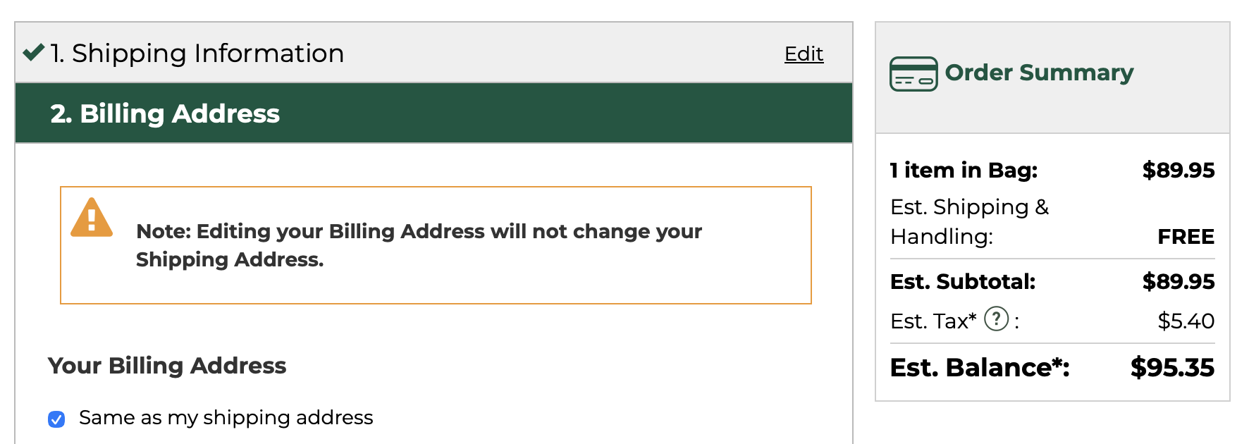
Example of sticky order summary showing itemized breakdown of items, shipping, taxes, and total price. (Source)
- Itemize clearly: “Items — €40, Shipping — €2, Taxes — €0, Total — €42.” A simple breakdown reduces anxiety.
- Calculate shipping and taxes before the final screen. Do it in the cart or even on PDP. Ask for country and ZIP → estimate shipping and delivery date. For cross-border, use DDP (Delivered Duty Paid) so duties are known upfront, not at customs.
- Add small trust labels along the way. “VAT included”, “No payment method surcharge”, “Duties pre-calculated”. Short badges build trust better than long paragraphs.
Shoppers anchor to the price they’ve seen. If a total “jumps” at the end, trust breaks. Transparent totals pre-payment offer trust, legal cover, and conversion lift.
6. Using Apple Pay and Google Pay as conversion “cheat codes”
Mobile wallets remove manual entry entirely. Face ID or fingerprint …and that’s that. For users, this is the “easiest path” and for businesses, it’s the way to conversion growth.
That said, don’t show Apple Pay or Google Pay logos for everyone:
- Apple Pay only works on Apple devices in Safari (and with iOS 18, also via third-party browsers; more on this below).
- Google Pay works on Android and in Chrome (or via their JS API).
On mobile, place wallet buttons above the card form so that the “fast path” is immediately visible:
- If you support multiple methods (Apple/Google Pay + card + PayPal) show the 2–3 most popular and hide the rest under “Other methods.”
- For returning users, surface the last used method first (but allow switching).
Check for compatibility
Always check capability before rendering:
- Apple:
ApplePaySession.applePayCapabilities(). (Optionally,ApplePaySession.canMakePayments()). - Google:
isReadyToPay.
Only render if the check passes. This keeps the UI tidy and avoids confusion.
Follow brand guidelines
It’s worth nothing again that Apple and Google are strict when it comes to brand guidelines:
- The Apple Pay button must be rendered via
<apple-pay-button>or Apple Pay JS SDK. - Google Pay provides a ready-made button with correct SVG and styling (brand guidelines).
Skip any custom styling: no custom colors, fonts, or anything. If you “tune” the design, your integration could be rejected.
For get a better understanding of the final design for payment buttons, see the interactive demos from Apple and Google.
A note on the new iOS 18 flow
Before iOS 18, Apple Pay only worked with Safari. With iOS 18, users running third-party browsers can now tap a button, scan a QR with their iPhone camera, and complete payment.

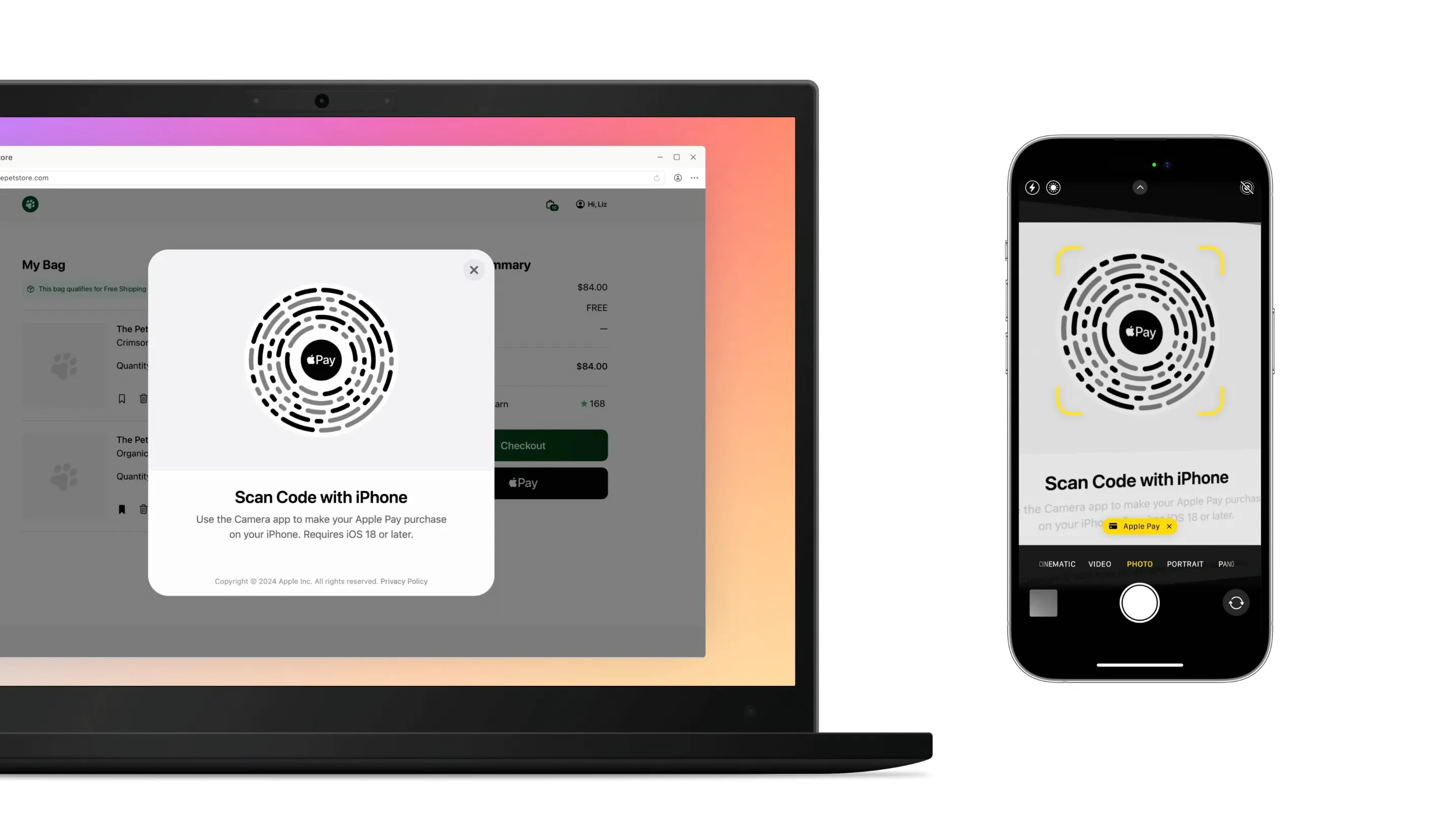
Image: Apple
Don’t hide the Apply Pay button just because you see Chrome on iOS. Instead, add a hint like this: “Apple Pay will open on your iPhone.”
7. Signal trust and show you take security
It’s natural for paying users to worry “Will my data be stolen?” Even if your security is perfect, if users don’t see signals of safety, they may bounce. 19% admit abandonment due to lack of trust.
HTTPS or bust
Payment pages must load over HTTPS only—no mixed content:
- The lock icon is the first visible trust signal.
- The certificate should be valid and on a meaningful domain (no sketchy redirects to
secure-pay-123.biz).
(Mixed content means the page is HTTPS, but it fetches some sub-resources (JS, CSS, images, iframes, XHR) over HTTP. Those insecure assets can be tampered with and may be blocked by browsers, which is unacceptable on a checkout page.)
Loading policies that show you’re in control
Signal orderliness to the browser (and to users, indirectly):
- Verify headers with Mozilla Observatory.
- Content-Security-Policy with tight allowlists.
- Subresource Integrity (SRI) for external scripts.
- Clickjacking protection (X-Frame-Options).
Narrate clearly what’s happening with bank checks
Some payments require an extra 3-D Secure check where your bank briefly asks you to confirm it’s really you via SMS/one-time code, banking app, or a passcode. Once finished, the user comes back and can finish the order.
However, bank pages can often look different from your site, which can feel like phishing. Soothe this by using good copy and clear UI.
Use messages like this before the switch (on your page):
- “You may be asked to verify this payment with your bank.”
- “A secure page from your bank will open to confirm the payment.”
- On mobile: “Approve in your bank app, then return to this tab.”
During the bank step:
- Render the bank step in your provider’s secure iframe/modal; keep page context (order summary) visible.
- Switch button to a disabled “Verifying with your bank…” state and show a spinner.
- Provide help links: “Didn’t get a code?” “Try another method.”
After the bank step:
- On success, show a clear confirmation (“Payment confirmed. Order #12345”) and send an email.
- Upon failure/timeout, explain the next steps without blame: “Your bank didn’t approve this payment. You can retry, use another card, or contact your bank.”
Here are some more important UX details to keep in mind when it comes to the bank verification process:
- Never wipe entered data after a failed challenge.
- Handle mobile app switches gracefully. If a user returns without a result, show “Still verifying…” briefly, then surface Retry.
- Accessibility matters. Move focus into the modal/iframe container, use
aria-livefor status updates, and trap focus until the step completes. - Avoid pop-ups (use iframe), prevent double submits, and keep a sane timeout with a friendly fallback message.
Visual trust markers
It’s simple psychology to understand that clear trust markers can make users feel more secure. 2–3 logos are enough here. Overdoing it looks suspicious (trying too hard to “look secure”):
- A short note by the form: “Card data is transmitted securely and not stored on our servers.”
- Logos like “PCI DSS Certified” or familiar security badges. Baymard found any familiar trust emblem can increase confidence.
8. Interaction design: small touches that make the form feel alive
Filling in a payment form can be tedious …or so smooth, it’s as if nothing even happened. It all comes down to micro-interactions.
These are the touches that turn UGH, FINE into “Hey, that was easy!”. And this effort translates directly into conversions.
Autofocus and smart focus management
On desktop, autofocusing the first field saves a click. On mobile, it can cause the keyboard to pop up and this cover content—so only auto-focus when the form is in view.
Use inputmode and enterkeyhint for small, meaningful speed-ups on mobile.
<input inputmode="numeric" enterkeyhint="next" />inputmode presents a numeric keypad, enterkeyhint tells the OS keyboard to show Next, Go, etc
Then, smart navigation comes into play: after a full card number has been input, automatically move the caret to expiry (but only when the field is truly complete).
Of course, always allow easy edits without fighting the focus.
Masks and on-the-fly formatting
A good input mask is an invisible assistant:
- Group card digits automatically (4-4-4-4; Amex 4-6-5).
- Auto-insert “/” in the expiry field.
- Delete behaves predictably across separators.
Rule of thumb: the mask helps, never fights. Let users type at their own pace; formatting adapts gently. Add subtle animations (≤ 300 ms) and the form feels friendly.
Auto-fill and pre-fill
Don’t disable auto-fill. Browsers and phones can store cards and addresses, so use this feature. HTML autocomplete (cc-number, cc-exp, cc-csc, name, address-line1, etc.) enables Safari’s “AutoFill Credit Card” and Chrome-suggested cards.
Additionally, when it comes camera card scanning, Safari can read the number and expiry in one step. Native apps can use SDKs for the same.
And if you already have data (shipping address, email, phone), don’t make users retype it. Pre-fill and allow edits. For return buyers, a saved card (last 4 + expiry) with “Use this card” removes typing entirely.
A little bit of caret and key behavior magic
Here are some small touches that can make typing in payment forms more comfortable:
- The caret shouldn’t jump when spaces appear.
- Backspace should remove a space, then a digit (no leaps).
- Mid-string editing should be enabled, not just at the end.
- Pasted numbers should auto-format within fields.
- Arrows and selection should behave as expected.
9. Errors and validation: don’t scold users!
Input mistakes happen. The question is how the form responds. Errors aren’t supposed to punish users, but to help them succeed quickly. Clear, friendly feedback translates to fewer abandons and more completed payments.
Promptly catch errors
Don’t wait for “Pay” to say something went wrong:
- If a field is definitely wrong, flag it on blur.
- Example: 15 digits instead of 16 → “Card number is incomplete—enter one more digit.”
- Expired card → “Card has expired.”
But don’t overdo it: flashing “error!” on every keystroke is annoying. Let users finish typing.
Clearly describe the error and explain how to fix it
98% of sites still use vague messages like this: ❌ “Field error”.
Instead, be clearer:
✅ “Invalid card number”
✅ “Enter a postal code”
✅ “Payment declined: insufficient funds”
If the reason is truly unknown (the bank just refused), be honest: “Your bank didn’t approve the payment. Try another card or contact your bank.” It’s actually better to be vague than misleading.
Sometimes the error comes from the bank/gateway:
- “Bank declined the transaction. Try another card.”
- “Unable to reach the payment service. Check your connection or try again later.”
If it’s on you (server down), say so and apologize. Add that the order was saved and can be paid later.
Additionally, show error messages under their corresponding fiel and use a red outline/background. Example: “Please enter a city” beneath the “City” input. A generic banner at the top is a worst-case scenario UX.
Never wipe user input
The most frustrating thing is a form that resets after an error. Be sure to preserve card number, address, name. (Exception: it’s fine to clear CVV numbers for security purposes).
Confirm success!
Don’t drop users into the void after “Pay”:
✅ “Payment successful. Thank you! Order #12345.”
✅ Send an email or push confirmation.
❌ Contextless redirect to homepage.
10. Input design: make card entry painless
Typing a card number is probably the most fragile moment in the payment process. The goal: remove friction—format, hint, don’t nag, and usher users to “Pay.”
Card number: the center of the universe
- Format per brand. Group digits as on the plastic: 4–4–4–4 (Amex 4–6–5). Without grouping, the eye loses track—especially on mobile. 51% of sites still don’t auto-format, and 15% forbid spaces—pure UX anti-pattern (auto-format spaces).
- Luhn auto-validation. Validate as they type. (As recently as 2024, 31% of sites don’t have any inline validation at all and 53% of sites don’t Luhn validate the credit card number field.)
- Card type (BIN) detection. Show the Visa/Mastercard/Amex icon based on the first digits. (But don’t make it clickable: research shows 61% of users try to click overly prominent logos.)
- Paste-friendly. Many paste from password managers. It should just work auto-formatted with
onpaste.
The Google team published a useful article that outlines best practices for creating checkout forms. However, we recommend using proven libraries instead of reinventing the wheel. For example, card-validator:
import valid from "card-validator";

const SUPPORTED_CREDIT_CARDS = [
  "visa",
  "mastercard",
  "american-express",
];

const INPUT_ERROR_MESSAGES = {
  cardNumber: {
    unsupported: "This card type is not supported",
    incomplete: "Please enter the complete card number",
    invalidFormat: "Card number is invalid"
  }
};

export const validateCardNumber = (value) => {
  const num = sanitizeNumber(value);
  const res = valid.number(num);

  // Brand detection via BIN; reject unsupported brands
  if (res.card && !SUPPORTED_CREDIT_CARDS.includes(res.card.type)) {
    return INPUT_ERROR_MESSAGES.cardNumber.unsupported;
  }

  // Still typing but format looks plausible — offer a gentle hint
  if (res.isPotentiallyValid && !res.isValid) {
    return INPUT_ERROR_MESSAGES.cardNumber.incomplete;
  }

  // Definitely invalid by Luhn/length/pattern
  if (!res.isValid) {
    return INPUT_ERROR_MESSAGES.cardNumber.invalidFormat;
  }

  return true;
};
Why card-validator? `It solves most frontend tasks out of the box:
- Comprehensive checks for PAN, expiry, CVV, cardholder name, ZIP.
- BIN detection: identifies brand (Visa, MC, Amex, and so on) to show icon and adjust CVV length.
- Lightweight integration: small, no heavy deps, works in SPA and React/Vue.
- UX bonus: fewer errors, fewer gateway declines, faster entry → higher conversion.
And two helpful flags:
isPotentiallyValid—input isn’t complete, but plausibly valid;isValid—all checks pass.
This lets you provide gentle hints (“Looks like a Visa card, enter the remaining digits”) instead of scolding mid-entry. This reduces stress and mistakes.
<!-- maxlength equals 19 digits + spaces headroom (UnionPay/Maestro), ideally update dynamically -->
<div class="field">
  <label for="cc-number">Card number</label>
  <input
    id="cc-number"
    name="ccnumber"
    type="tel"
    inputmode="numeric"
    enterkeyhint="next"
    pattern="[0-9 ]*"
    autocomplete="cc-number"
    placeholder="0000 0000 0000 0000"
    aria-label="Card number"
    aria-invalid="false"
    aria-errormessage="cc-number-error"
    aria-describedby="cc-number-help"
    autocapitalize="off"
    autocorrect="off"
    spellcheck="false"
    maxlength="23"
    onchange={handleChange}
    onkeydown={handleKeyDown}
    onpaste={handlePaste}
  />
  <span id="cc-number-error" class="error" role="alert" hidden></span>
</div>
Skip dropdowns for expiry dates
Please don’t use month/year selects (on mobile they’re painful).
- Single field
MM/YY. - Auto-insert
/, add leading zero (“7” → “07”). - Catch obvious errors: “00”, “13”, past dates.
Fact: 72% format expiry differently from how it appears on the card.
<div class="field">
  <label for="expirydate">Expires</label>
  <input
    id="expirydate"
    name="expirydate"
    aria-errormessage="expirydate-error"
    aria-describedby="expirydate-error"
    aria-invalid="false"
    autocomplete="cc-exp"
    placeholder="MM/YY"
    maxlength="5"
    type="tel"
    inputmode="numeric"
    pattern="[0-9/]*"
    enterkeyhint="next"
    autocorrect="off"
    autocapitalize="off"
    spellcheck="false"
    onchange={handleChange}
    onkeydown={handleKeyDown}
    onpaste={handlePaste}
  />
  <span id="expirydate-error" class="error" role="alert" hidden></span>
</div>
CVC/CVV: small field, big role
These are generally just three digits, but there are many ways to mess them up.
- Amex uses 4 digits; most others use 3. So, adjust length based on BIN-detected brand.
- Add an info icon “Where to find this?”. A small icon beats text here.
- By default, use
type="password"and a “show” toggle if you allow revealing digits.
Validation with card-validator:
import valid from "card-validator";

const INPUT_ERROR_MESSAGES = {
  cvv: {
    incomplete: "Please enter the complete security code",
    invalidFormat: "Security code is invalid",
  }
};

export const validateCVV = (value, cardType) => {
  // Determine expected length based on card brand
  const cvvLength = cardType === "american-express" ? 4 : 3;
  const res = valid.cvv(value, [cvvLength]);

  // Still typing — show gentle hint
  if (res.isPotentiallyValid && !res.isValid) {
    return INPUT_ERROR_MESSAGES.cvv.incomplete;
  }

  // Invalid format or length
  if (!res.isValid) {
    return INPUT_ERROR_MESSAGES.cvv.invalidFormat;
  }
  return true;
};
<!-- type toggle to text when revealing -->
<div class="field">
<label for="cvv">CVV</label>
<input
id="cvv"
name="cvv"
aria-errormessage="cvv-error"
aria-describedby="cvv-error"
aria-invalid="false"
autocomplete="cc-csc"
placeholder="123"
maxlength={cvvLength}
type="password"
inputmode="numeric"
pattern="[0-9]*"
enterkeyhint="next"
autocorrect="off"
autocapitalize="off"
spellcheck="false"
onchange={handleChange}
onkeydown={handleKeyDown}
onpaste={handlePaste}
/>
<span id="cvv-error" class="error" role="alert" hidden></span>
</div>Only ask for cardholder name if you must
The cardholder name is actually rarely verified. If your PSP doesn’t require it, remove the field. The form becomes lighter with no downside.
However, if you must keep it:
- Label clearly: “Cardholder name (as printed)”.
- Visual all-caps is fine (don’t mutate the stored value).
- No strict validation; don’t enforce Latin-only letters, names can include diacritics, hyphens, Unicode, etc.
Fact: 89% of sites have more than one separate name field.
<div class="field">
  <label for="cc-name">Cardholder name</label>
  <input
    id="cc-name"
    name="ccname"
    type="text"
    autocomplete="cc-name"
    placeholder="Evil Martian"
    aria-label="Cardholder name"
    aria-errormessage="cc-name-error"
    aria-describedby="cc-name-help"
    aria-invalid="false"
    autocapitalize="characters"
    autocorrect="off"
    spellcheck="false"
  />
  <span id="cc-name-error" class="error" role="alert" hidden></span>
</div>
No duplicate billing addresses
If the user has entered a shipping address, don’t make them retype it:
- Default “Same as shipping” ON.
- ZIP/region must adapt to country: US 5 digits, Canada alphanumeric with space, UK patterns like SW1A 1AA.
- Consider offering
textareaas an advanced option for hard-to-fit locales
<textarea autocomplete="street-address" rows="3"></textarea>Again, the pay button is where the magic happens
This is where it all comes together or falls apart:
- Always include the amount: “Pay €42.00” (localize number & currency format).
- After clicking, show “Processing…”, disable double-clicks, and show a spinner. Success? “Done!” Error? Restore the button and highlight the issue.
- Add a small trust marker: 🔒 “Secure connection. We don’t store your card data.” Psychology matters.
Time to check out
Unlike other parts of your product where the connection between design and revenue might be abstract or delayed, payment forms are perhaps the clearest demonstration of how UI/UX decisions translate directly into measurable business outcomes.
And the beauty of payment form optimization is that improvements are both immediate and measurable:
- Reduce fields from 23 to 8? Track the conversion lift within days.
- Add input formatting? Watch error rates drop and completion rates rise.
- Optimize loading performance? See fewer abandons in your analytics.
- Implement smart validation? Measure the decrease in failed payments.

Finally, some quick references for you:
Improvement cheat sheet:
- Start with hosted checkout: fastest, safer default; provider handles wallets/local methods/3DS and card data never touches your servers.
- Performance: minimize bundle size, lazy-load SDKs, code-split, cache hard. Every 100 ms = −1% conversion.
- Fields: remove non-essentials, combine “First + Last,” hide promo codes.
- Structure: single column; order like the card: number → expiry → CVV → name (if needed).
- Payment methods: offer 2–3 minimum (card + PayPal/Apple Pay/Google Pay), localize per market, avoid option overload.
- Price transparency: no “end-step fees,” keep totals live and visible.
- Mobile wallets: show only if truly available (
ApplePaySession.applePayCapabilities()/isReadyToPay), use official SDKs and brand guidelines. - Security: HTTPS only (no mixed content), tokenization, 3DS with clear copy, 2–3 trust badges by the button.
- Micro-interactions: smart autofocus, input masks, auto-fill, camera card scan, “smart backspace.”
- Errors: inline validation, specific messages (“Card expired”), preserve user input.
Payment field cheat sheet:
- Card number: formatting + Luhn.
- Expiry: single
MM/YYfield. - CVV: 3/4 digits with an icon.
- Name: only if required.
- Billing address: no duplicates; adapt per country.
- Button: always with amount (“Pay €42.00”); after click show progress and a clear result.