Phone inputs and you: the designer's essential UI guide
Telephone number inputs are a pretty common UI feature for tons of websites and applications. Seems simple enough to implement, right? Well, actually we need to account for a lot of different factors: What format will users input the number? Will we support international numbers? In this article, we’ll explore some background information, leaving no stone unturned, to help us effectively make these decisions, and we’ll share practical UI design tips.
With any input, the form of data we ultimately expect to receive is an important consideration. But, since this is a phone number we’re talking about, this should be totally simple! But, it’s not quite so cut and dry. The problem quickly becomes apparent when you consider just a few of the variations a user might try to input the US-based number “888-400-5485”:
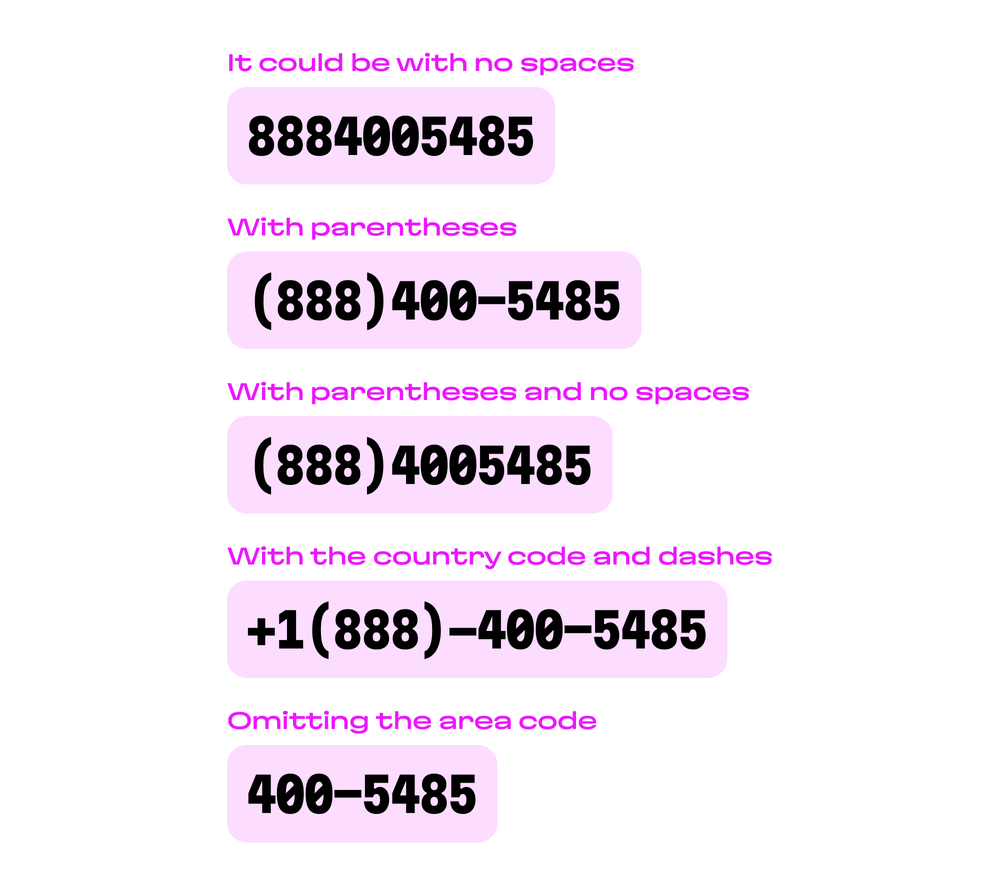
And this list could go on, and on, and on. But hold the phone! Further still, we’re just talking about US-based numbers right now—the level of complexity grows when we add international concerns into the mix. That can be a lot to digest, so let’s briefly examine some of the factors that can influence this wide range of variation.
Country codes and international fun
If you’re in the United States, you’ve probably been exposed to the “+1” at the beginning of numbers. This is the country code for the USA. Internationally, countries can have their own code, and some are shared between nations. For instance:
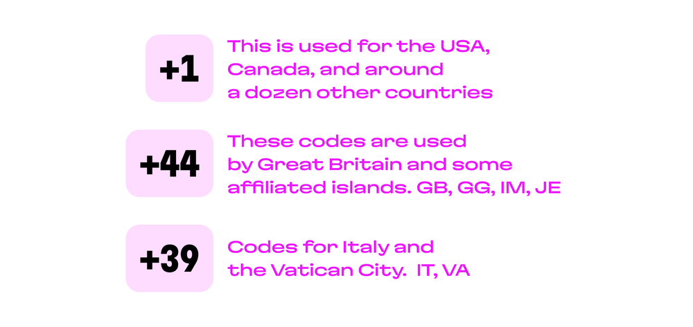
As designers, it’s probably good to note that, as seen above, these codes can be longer than a single digit. In fact, country codes can be from 1-3 digits in length.
Additionally, when actually making a call, rather than inputting a “+”, it’s also possible to replace this symbol with numbers. These are “00” in most countries, but there are multiple exceptions: “011” in countries like the USA, and Canada, “0011” in Australia, etc. So, our number from the example above could be “00118884005485” if it were being dialed from down under.
❗️ It’s also important to consider that depending on personal habit, a user may enter a number in an international format, local format, or without any prefix. Naturally, this is both important for design and on the engineering side.
Number length and variations
That last example number, “00118884005485”, is pretty long, so this is probably as good a place as any to talk about possible number length variations. The International Telecommunication Union has implemented a comprehensive numbering plan called E.164 which dictates many of the specifics we will mention in this article. For example, they have imposed a maximum length of 15 symbols for any number, and we’ve already mentioned that a country code can range from 1-3 digits.
This is also a good point to contrast closed numbering plans and open numbering plans. In a closed numbering system, (like in the USA) there are fixed-length area codes and local number lengths, which the open plan features room for more variance (and this is more common in European countries.)
This can affect, for instance, regional (area) codes as follows:
- A fixed length, for example, 3 for the USA, Canada, and Russia, 1 in Australia.
- Variation in length: in Germany that can be from 2 to 5, in Japan 1 to 3, or 1 or 2 digits in Israel.
For example, in the USA, the regional code might be 859 in central Kentucky and 212 in Manhattan, but those regional codes are still fixed at 3 digits throughout the country. In Japan however, where the length can vary, the code for Tokyo is 03 and the code for Kyoto is 075.
Ultimately, when considering the country code, the regional (area) code, and length, a country will have its own rules for formatting telephone numbers:
- The USA: +1 (xxx) xxx-xxxx
- Denmark: +45 xx xx x xx
- Portugal: +351 xxx xxx xxx
Other numbering quirks
In addition to the points above, we’ll also quickly note that the ITU reserves some special country codes for certain services:
- +888: international disaster relief operations
- +979: International Premium Rate Service
🛰️ And some satellite telephone systems have their own special country codes too:
- ICO Global: +881 0, +881 1
- Ellipso: +881 2, +881 3
- Iridium: +881 6, +881 7
- Globalstar: +881 8, +881 9
Which format to use for our inputs?
Learning about all the different considerations we need to take into account might’ve been a bit of a wake up call for you. But no worries. Let’s start thinking about how we might actually translate some of these inputs into the data that we’ll gather in the UI.
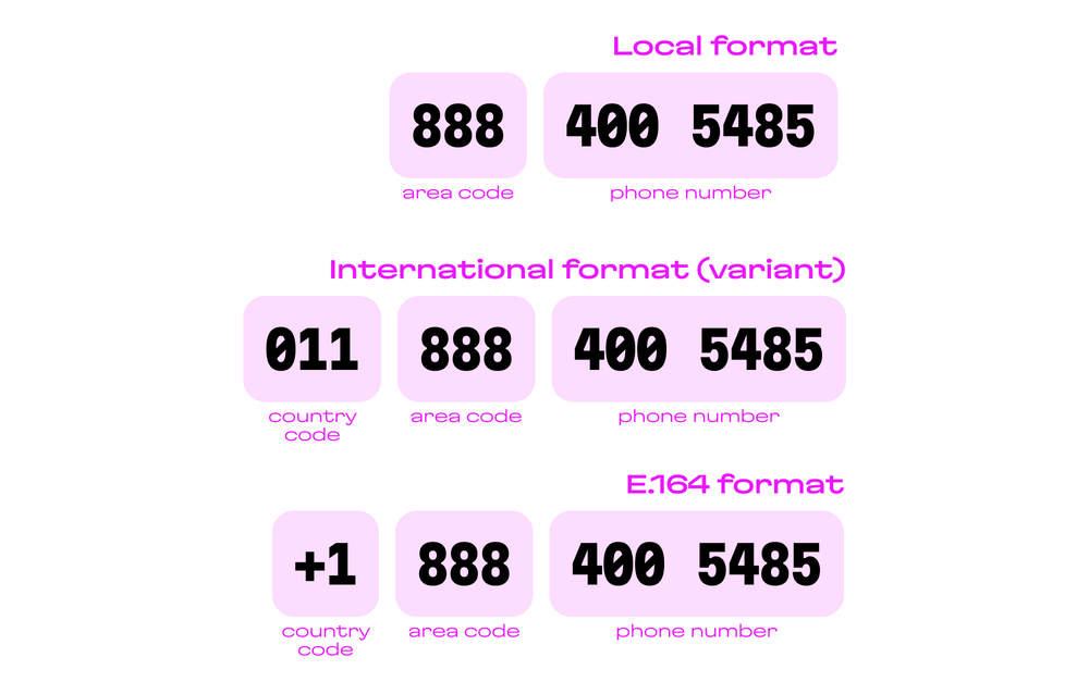
So, in the first case above, if our UI will just be used within a single country, technically speaking, the country code could be “added” automatically behind the scenes. Or, as in the second case, if the country code was entered in a field in its full format, it can be converted: for example, transforming “011” into “+1”.
In my experience working with phone numbers, there are basically two ways to crack this egg that don’t involve making a big mess: either numbers should be strictly in E.164 format, or the country of the number is already known and the rest of the number can be entered in any format.
Additionally, there is a bit more to consider in terms of who the users are and how they might enter their data.
We have to clarify the data format requirements in which format the system will receive data. This means that, for example, alongside the engineers, we’ll need to work out whether the user can only enter the number in international format or in national format. Depending on the requirements, we will have several options:
- Users can only enter the number in a specific format, any other format must be handled by an error message.
- Users can enter in any accepted format for the country. This is an additional burden for engineers. For example, to process the entry number +1 through 011 and accurately parse the code (as mentioned above).
Perhaps the app will have an international user base. Further, some users might live in the same country where the project has originated, but have numbers with different country codes. This is a bonus problem: for example, a number from Drimsim, which offers international SIM cards, and issues numbers from a variety of countries.
So, for the purposes of this article, let’s agree that putting a region lock on a phone input might not be the best move, and proceed from there. The country code + the national number. This format complies with the E.164 format, so using it will be clear for any engineers.
The basics of phone input design
Now that we’ve explained our choice of UI and you know all the factors behind the scenes that led us to that decision, let’s move on and actually talk about taking those solutions and incorporating it into the design itself.
Let’s say we’re strictly collecting numbers in an international format. In this case, there are more input requirements to consider. In addition to the input field for the phone number itself, this includes a separate field for selecting a country code.
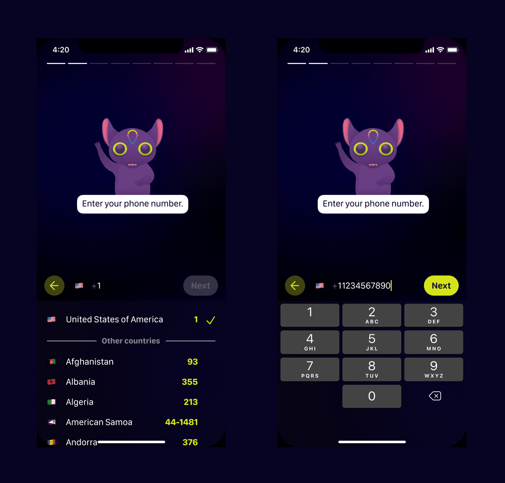
Note, as in the left side of the image above, it’s a good practice to display this in the following format: Country — Code, and to order alphabetically by country name for user convenience.
Whenever a user must select a country or code from a list, we need to keep in mind that this list is likely to be very, very long. (There are just under 200 countries in existence at the time of this writing.)
To illustrate, if the countries are displayed in alphabetical order, a user with a code from the United Kingdom (+44) would save a lot of time using a search feature. This doesn’t necessarily need to be a search bar. For example, a user might just enter the first letter of a country on their keyboard to quickly jump to the one they’re looking for.
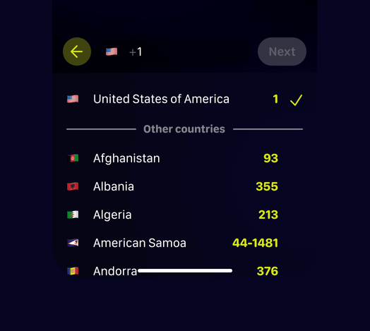
This might seem like an obvious feature, but believe it or not, there are major sites that don’t offer this basic, quality-of-life functionality.
Auto-generate number placeholders
Upon selecting a country, the input placeholder text should show the form that the user should enter their data, as seen here:
Finally, the entered data should be validated, and the maximum length should be limited to 16 digits. (To match the E.164’s limit and an extra character to deal with any autofill or edge cases).
Auto country detection
If you have access to a user’s geolocation data, lend them a hand and auto-select their country. You can also automatically set the phone number to be in the correct format, which is sure to give the user an extra reason to thank you.
Save the entered number when user is changing the country
If the user made a mistake with the country code after entering the number and decided to change the country, when changing it will be correct to show the new code and keep the previously entered number.
Let’s say the user has selected a country code and entered their number—but they’ve made a mistake! Instead of +1 for the USA, they accidentally chose +81 for Japan. When they go back and select the proper country code, it’s good UX to keep the phone number itself inside the input—don’t wipe it clean.
Dealing with browser auto-completion
One unexpected problems users may encounter when filling out an input is browser auto-complete.
The browser may have its own format for writing the number, so when it attempts to auto-complete numbers into our clever system, unpleasant things can happen. For instance, if you chose to use a separate input for country selection, the number is trimmed. The full length of the number is cut off because there is a strict limit on the number of characters. In this case, it is necessary to enter the number in the form intended by the user and then give them the opportunity to correct it as necessary.
Last call
That’s enough for now. Hopefully, this article has not only shed some light on some good phone number input practices, but it illuminated why some of these design decisions are good ideas in the first place! And, with any luck, since you know the background behind these designs, when the time comes, you’ll be able to handle any edge cases with ease. Form after form can be tedious enough, so the least we can do is give our users a convenient, consistent UX and UI that makes logical sense!
Have a web or mobile application that requires a phone number input and struggle with creating a proper flow, easy to understand UI design, frontend implementation, and security? Reach out to us to ask for any help.

