Pen, paper, IDE: a DevTool Founder’s early-stage product design guide


Within the classic startup core team duo of hustler and hacker—especially for companies that make developer-facing tools, it’s usually the hacker’s role to build the initial product. This makes sense—software interface design and software development are closely related engineering fields. If you’re a technical founder: a CTO, technical CEO, VP of Engineering, or any type of engineer, and now the UI is in your court—this post will give have practical advice for you. You won’t become a professional product designer overnight, but we’ll see how to achieve more while spending less.
Skip the designs, but don’t skip designing
Build your UI directly in code for a faster workflow. While it might seem more typical to begin with mockups in Figma or Sketch (especially for product designers) if you’re not well-versed in these tools, that can actually hinder your progress. So, if coding is your primary skill, then design directly in code.
This approach is not just acceptable, I’d say it’s actually quite popular. At Evil Martians, we frequently encounter founders who coded their first MVP, gained traction, raised funds, and then sought a designer’s input for the next iteration.
Focus on key user tasks and on the journeys your user will undertake to complete those tasks. I suppose this could be a no-brainer, since you’re likely developing within your own field of expertise (see also the “Stay close to your customers” point just below), however, if you have the slightest suspicion that the user journey isn’t clear to you, grab a pencil and a napkin or a notebook, or use your favorite diagramming tool—whatever works for you to gain a clear vision of every step within the flow.

Irina Nazarova CEO at Evil Martians

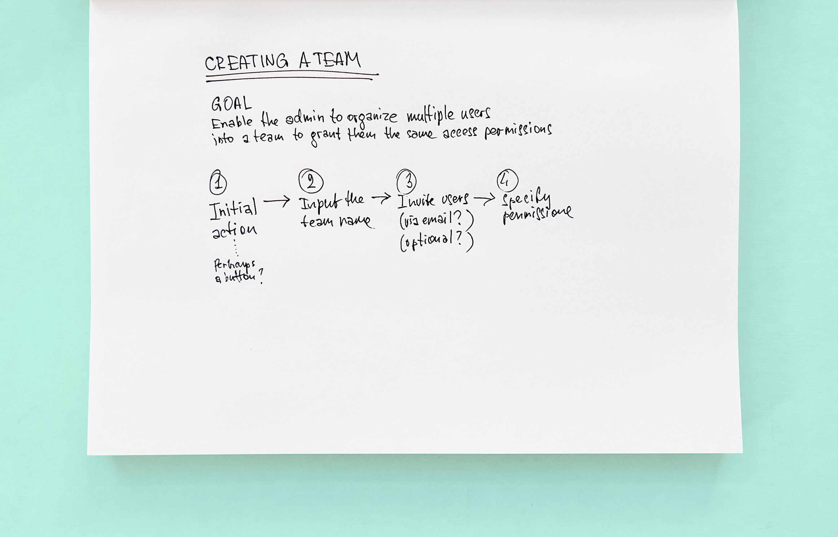
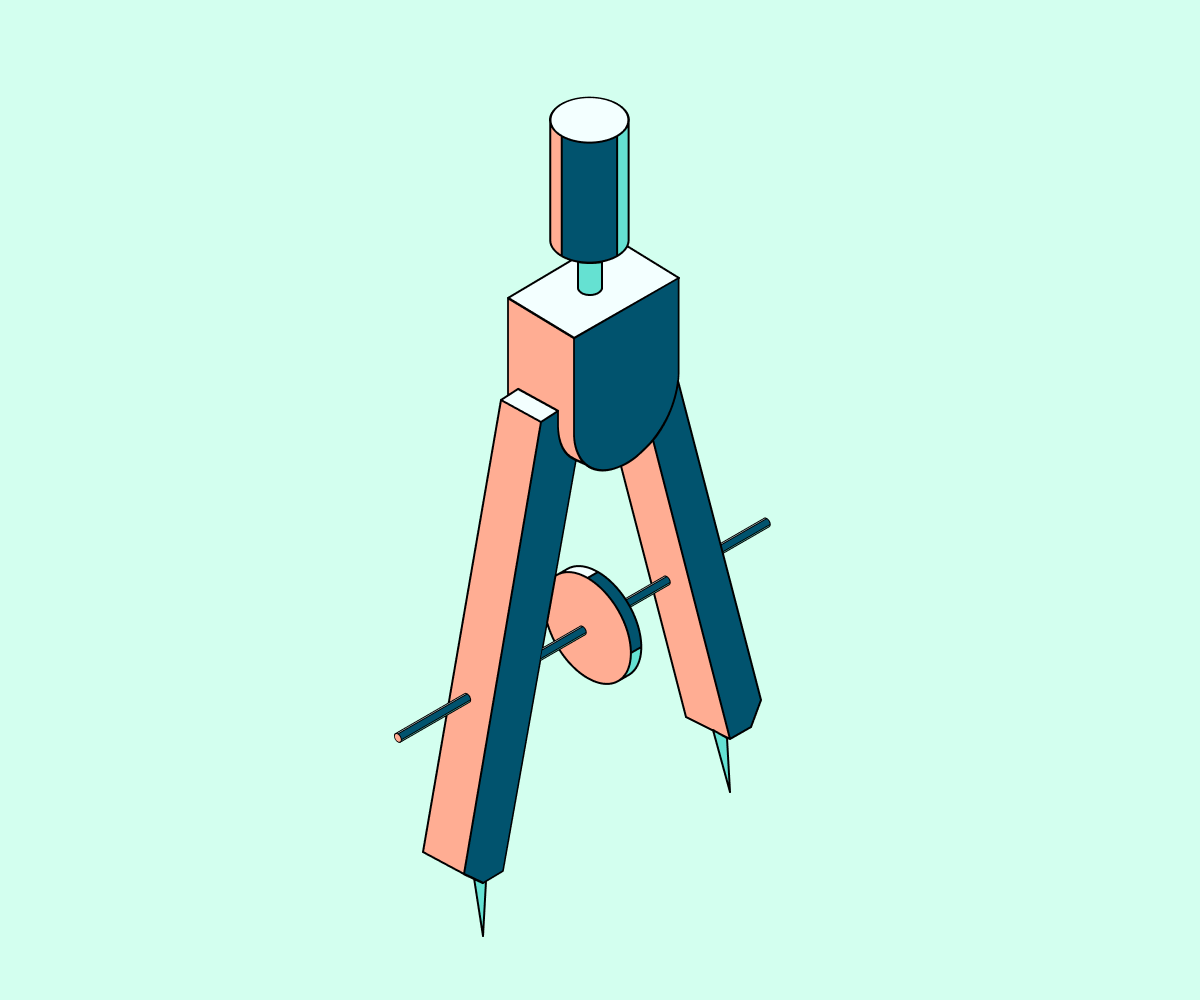
An example of thinking with a pen in hand. You don’t have to draw buttons and screens (but you can if you want), just clarify the order of steps and what the user may need along the way
Maintain a user-centric mindset to prioritize solving user problems over struggling with the user interface. This is another way of emphasizing the importance of focusing on user needs. For instance, saying, “We need to add the ‘Run’ button to the toolbar” reflects a feature-centric approach. In contrast, “The user should be able to execute their code once it appears to be complete” represents the situation from the user’s perspective.
Moreover, when you center your attention on the user and the outcome, this approach may open up a broader range of potential solutions for you. Let’s revisit the examples from the previous paragraph.
Saying “I need a button” prematurely restricts you to using only a button, while stating “The user needs to run the code” leaves room to decide that, besides, another possible solution might include a keyboard shortcut.
Stay close to your customers. The drawback of working within the framework of your own expertise is that, as a power user, you might overlook the needs of new users or those who aren’t as familiar with a technology that you know inside and out. In other words, what seems obvious to you could be obscure to them.
So, find a way to stay connected with your customers: seek out design partners, conduct user research, conduct a closed beta with early adopters and gather their feedback.
The key is that all of this: understanding user needs, optimizing their journeys, and finding ways for your product to bring value—represents the actual work of a product designer; mockups are simply the result of that work. This should clarify the somewhat mysterious section header: you may skip designs, but you can’t skip designing.


Don’t reinvent the wheel
Utilize pre-existing components since you’re designing in code. If your main focus is on speed and scalability, it’s advisable to forgo headless solutions and instead opt for high-level component libraries. Here are some popular options: daisyUI, Radix, Chakra, MUI, Ant Design, and Semantic UI.
The typical layout for a developer app consists of a relatively limited list of components, so ensure that the chosen component library offers an adequate number of primitives.

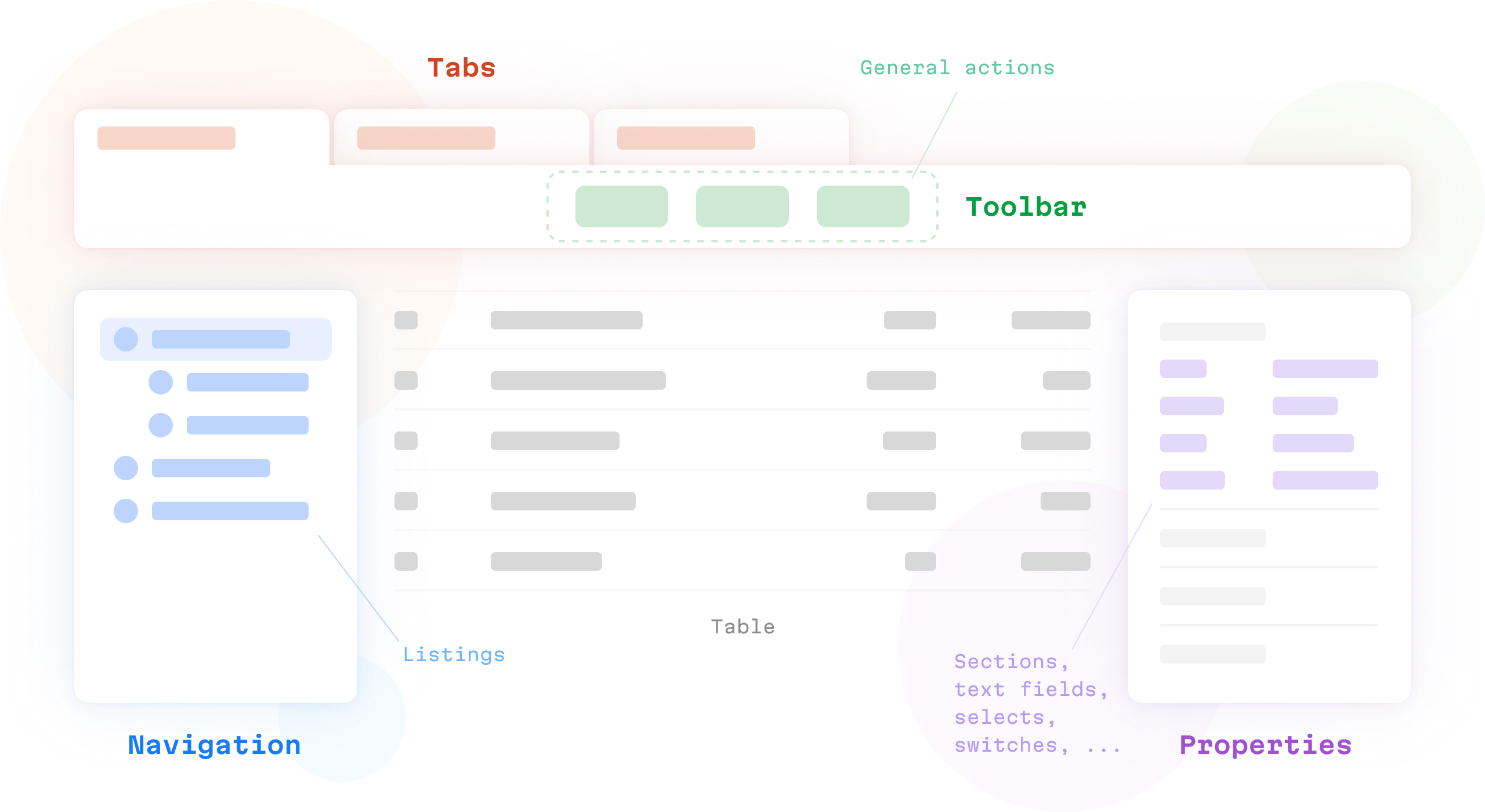
Some compound parts of a typical dev tool UI
To elaborate, most likely, you’ll require tabs, horizontal toolbars with buttons, a left navigation panel displaying a list, a right properties panel containing text fields, selects, and switches divided into sections, as well as various types of tables.
Speaking of standard UI components, study and draw inspiration from the UI patterns prevalent in popular applications. By aligning your product’s concepts with existing patterns, you can streamline the development process for yourself, and your users will encounter a more familiar interface.
Approach this MVP as if you will discard its UI once you engage with a product consultancy or an in-house designer. Because spoiler alert: you will.
Cut the scope to find the product core
Narrow the scope mercilessly. When scoping consumer apps, I find it’s benefical to conduct the following mental exercise: I suggest selecting just one (and only one) of the most crucial user tasks and developing an initial MVP that focuses solely on that task.
The above exercise effectively compels the team to distill the essence of the future product. Additionally, this streamlined scope can enable the product team to rapidly build and internally deploy your MVP within a matter of weeks. (Of course, more features would be incorporated around this core before the product is revealed to your design partners.)

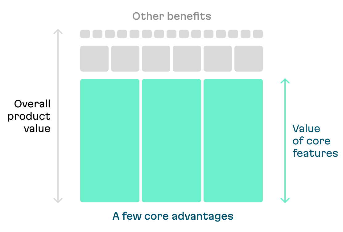
I believe that an ideal MVP is built over a very few core features that deliver the majority of value to the customer
Professional developer tools are rarely simple enough to be reduced to a single task. Nevertheless, I highly recommend this mental exercise: Trim away everything until you are left with a handful of functions that constitute the heart of your product.
While this process is challenging, let’s consider an example from the UI design world. Let’s take the concept of design editor software overall as an example and see what it would take to determine the core of the product for this type of platform.
Example: finding the core (and more) behind design editor software
If we break down Figma or Sketch to the essential task they’re designed to perform, it boils down to manipulating objects on a canvas, doesn’t it? All the flashy stuff: shared color styles, reusable components, and real-time collaboration ultimately stem from the basics of adding rectangles and text to an artboard, adjusting their size and color, grabing them with a cursor, and moving them to a specific place of the layout. Now we understand the product’s core functionality.
Unfortunately, a product with only these functions (and absent the flashy stuff) wouldn’t cut it—no one needs another MS Paint. Even in old school Photoshop, we could place text over a horizontal rectangle to create something that looked like a proper button; this was the way we designed things back in the early 2000s.
So what are the killer features built on top of that core functionality?
Then, Sketch emerged with a few key advantages over basic object manipulation. Designers could do things like resize vector rectangles without losing rounded corners or turn a group of primitives into a reusable component. And while Sketch had other features, those two, in my opinion, were at the core of the product and most contributed to its success.
A few years later, Figma added another layer of advantages. It retained object manipulation as a basis, offering scalable vectors and components, essentially covering Sketch’s core value. Above all, Figma was platform-agnostic, provided a free tier for personal use, and introduced real-time collaboration with multiple cursors. While these weren’t the only features Figma offered, they, in my belief, defined the product’s core and played a significant role in its becoming an industry standard.

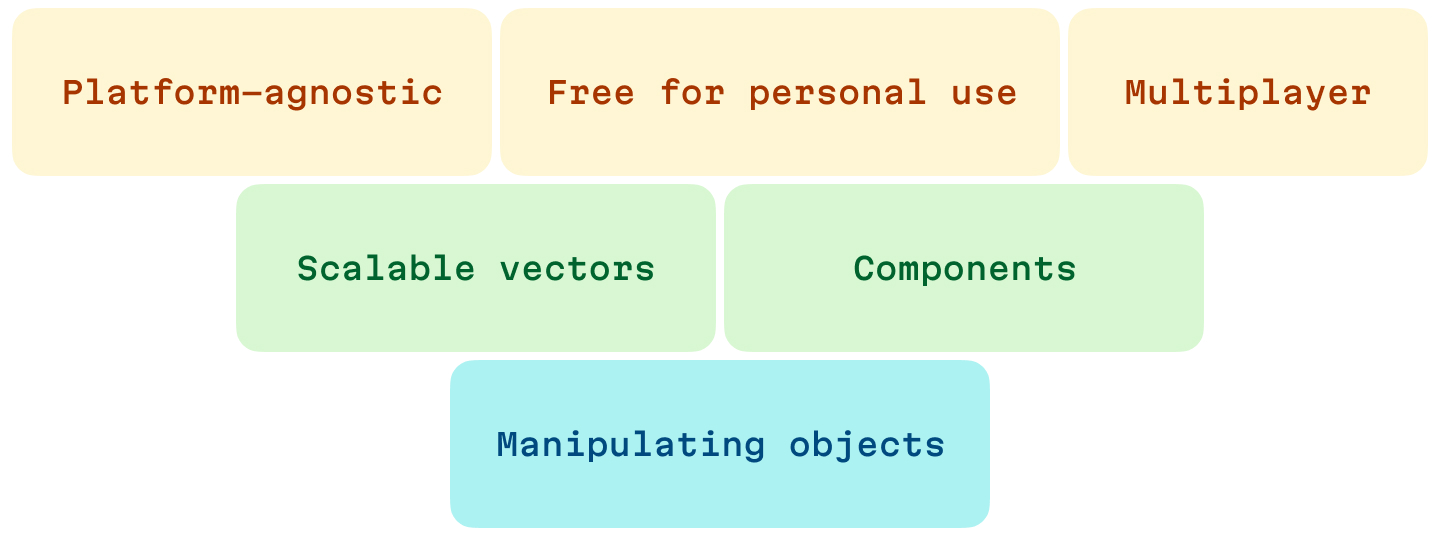
Reversed pyramid of software for UI design
So, my point is: strip away everything else and identify a very few core advantages that would make your product a game-changer for your customers. Build your MVP around these core features.
User possibilities over user experience
Facilitating possibilities for your users is your primary focus at this stage. Remember, you will discard this UI later, so leave the task of taking care of the user experience to the professional product designers. This means that if you’re unsure where to place another button, simply position it on any available toolbar and move on.
Yes, this might seem counterintuitive, especially coming from a principal designer! By the way, it pains me to give this advice. Also, don’t get me wrong; of course, you should strive to maintain order in your UI. You should consider where the user is likely to search for a specific feature—you should. My point is, if you feel stuck, prioritize shipping something today that you may not be proud of, rather than waiting until tomorrow to ship something polished. It’s painful, but this is the way.
Consult LLMs for design guidance
Utilize ChatGPT or a similar AI assistant to handle best design practices. UI design involves a limited number of well-known patterns and approaches that have been discussed and explained extensively on the internet.
In your prompts, try to formulate a specific design request, like this:
- As an experienced UI and UX designer, could you help me with the layout of the user authorization page? Describe UI elements, visuals, and icons that would ensure a seamless user experience. Share text suggestions, and let me know what key aspects I should focus on.
Or, for each task, seek both best practices and mistakes to avoid:
- What are the best practices for designing user authorization?
- What are mistakes to avoid when designing user authorization?
Here are some example prompts you can use to learn more about your users or assist with conducting user research:
- What do users struggle with most in desktop apps built on Electron?
- Propose user research interview questions for new users of a no-code-workflow-builder type of app.
Remember, don’t expect the LLM to solve your problems. Treat it as a brainstorming partner with the ability to provide you with a ton of ideas, but keep in mind it’s still your job to combine them into something useful.
Next steps
There’s so much more to professional software design: we’ve barely discussed colors, buttons, and layouts—all the things usually associated with UI and UX design. But, I think you’ve gained something much more valuable: a strategy on how to approach building your V1 without a designer.
If you’re still interested in the more practical aspects of product design (like laying out a typical developer tool app so it aligns with the user’s mental model; or how to strike a balance between density and simplicity to provide all necessary tools without cluttering up space with numerous buttons) share this article, because if I see it out there, I’ll know there’s a demand and that will be the next post on my list!

We’re excited to chat and provide strategic advice on designing your product at early stages. Please reach out with any questions, and let’s talk!