Devs in mind 2025: how to design interfaces for developer tools


It’s one thing to design an interface for user-facing software, but when designing interfaces for tools that developers will use, there are certain considerations that should be kept in mind. Read on to compare, find out exactly what those are, and learn to easily and quickly incorporate these practical tips in your work!
Editor’s note: this post has been updated and refreshed for 2025!
Developer tools have several unique features that make them stand apart from the interfaces we see on landing pages, ecommerce applications, social networks, and so forth. The cases we’ll cover in this article and the corresponding advice I’ll offer up are based on my own practical experience dealing with developer tool interfaces. So, let’s get started by defining what is and isn’t a developer tool.

Irina Nazarova CEO at Evil Martians
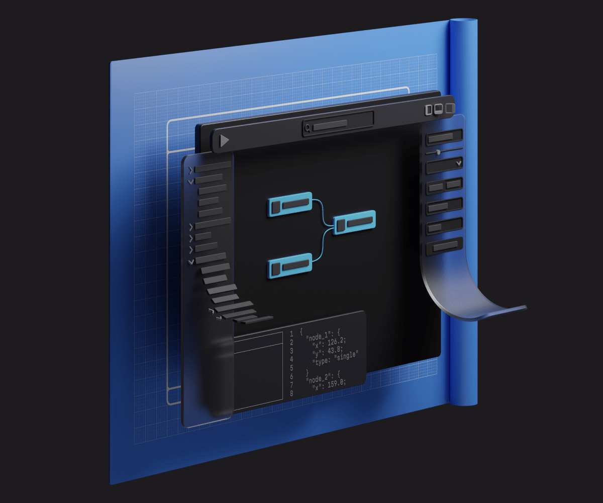
Defining developer tools
What do I consider a developer tool to be? Broadly speaking, I define this as any software used for creative purposes (as opposed to something designed for user consumption), and these types of applications are often used every day for many hours. This includes software such as Figma, Photoshop, Blender, VSCode, AE, FontLab, Grammarly, and even MS Word.

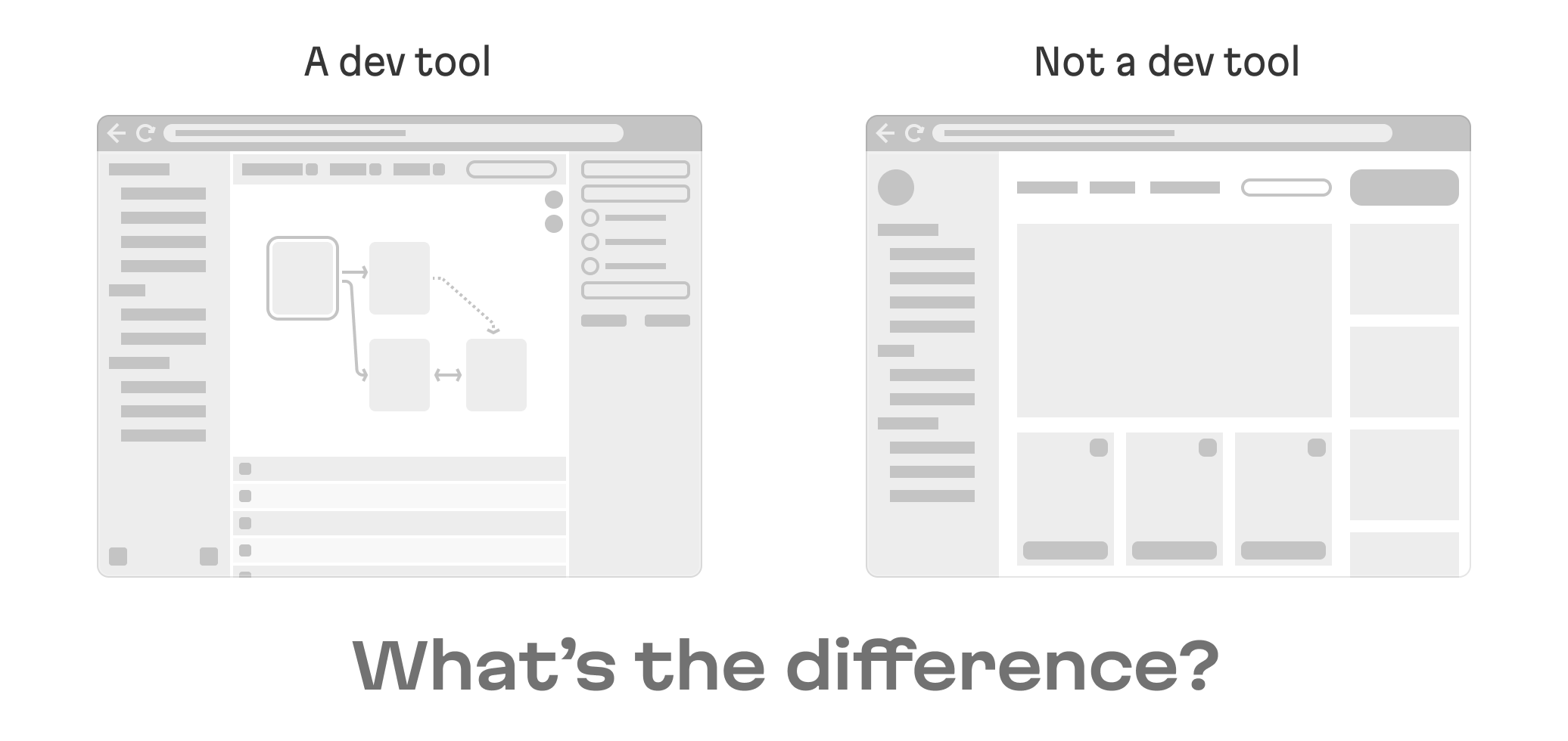
When working with a dev tool, a user’s attention is distributed differently than it would be when using, say, an ecommerce application. In an ecommerce app, the typical user path is a kind of linear flow that loops: users set up some filters, reveal the search results, repeat, and checkout when ready. With a developer tool, the user path seems to “randomly” go back and forth between panels and windows—this is a never ending process, and there isn’t really a “final” target action a dev tools user will perform:

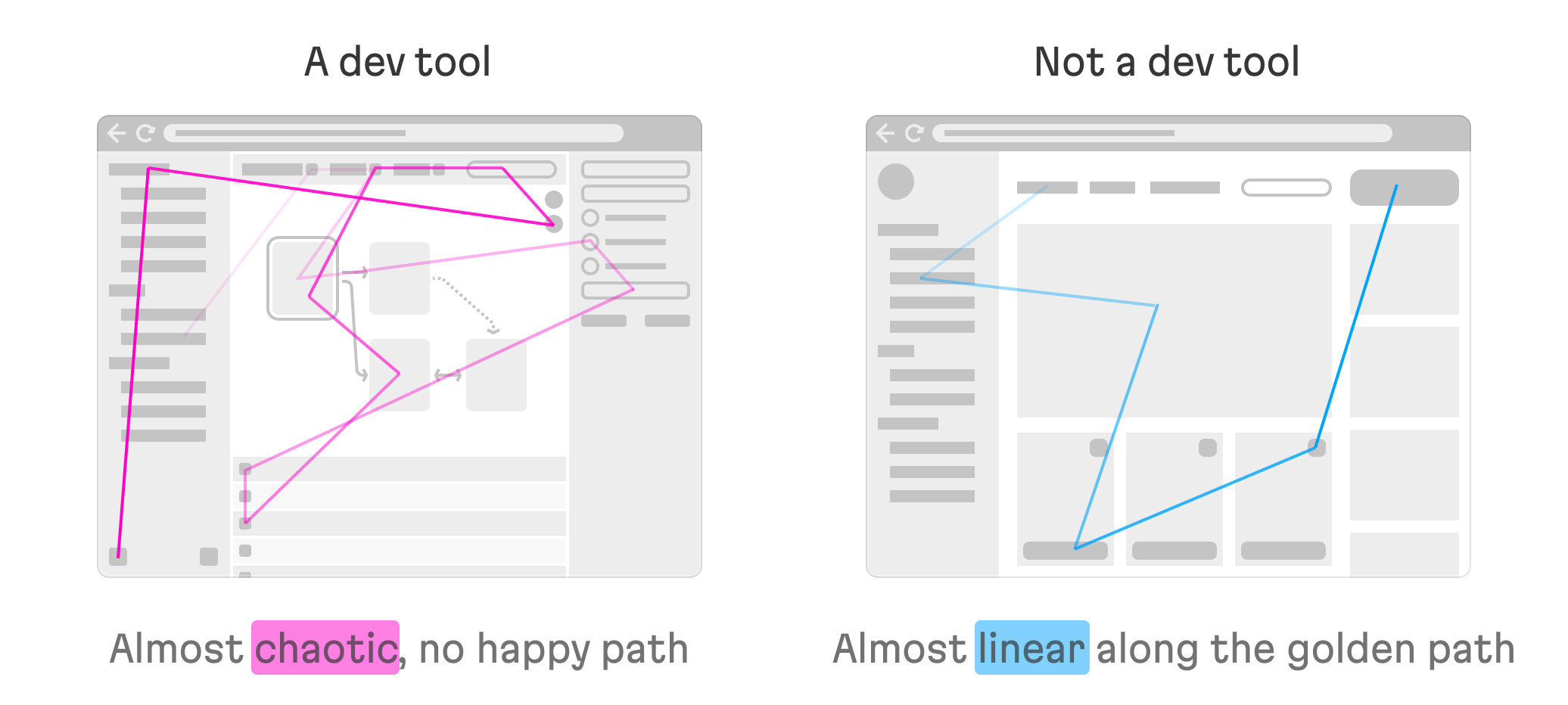
Essentially, this means there is no “happy path” for a dev tool. In fact, when considering the typical user path, what seems to be a tiny edge case might actually be the main case for a particular user—or even for a healthy portion of the user base!
Choosing the best dev tool layout
Understanding the user’s tasks and the context they’re working within (more on this later) is the key to designing a proper layout. If the user does the majority of their work in a single place (a canvas for drawing or manipulating nodes, or an editor for coding or writing text), the layout must correspond to this work, taking care to prominently feature the primary editor within the interface.
While designing and developing the Akeero UI, the Evil Martians team prioritized placing the primary work area—the composer for managing nodes and their connections—front and center.
Accordingly, if work is equally distributed between a couple of mediums, it’s better not to have one occupy a dominant space in the layout.

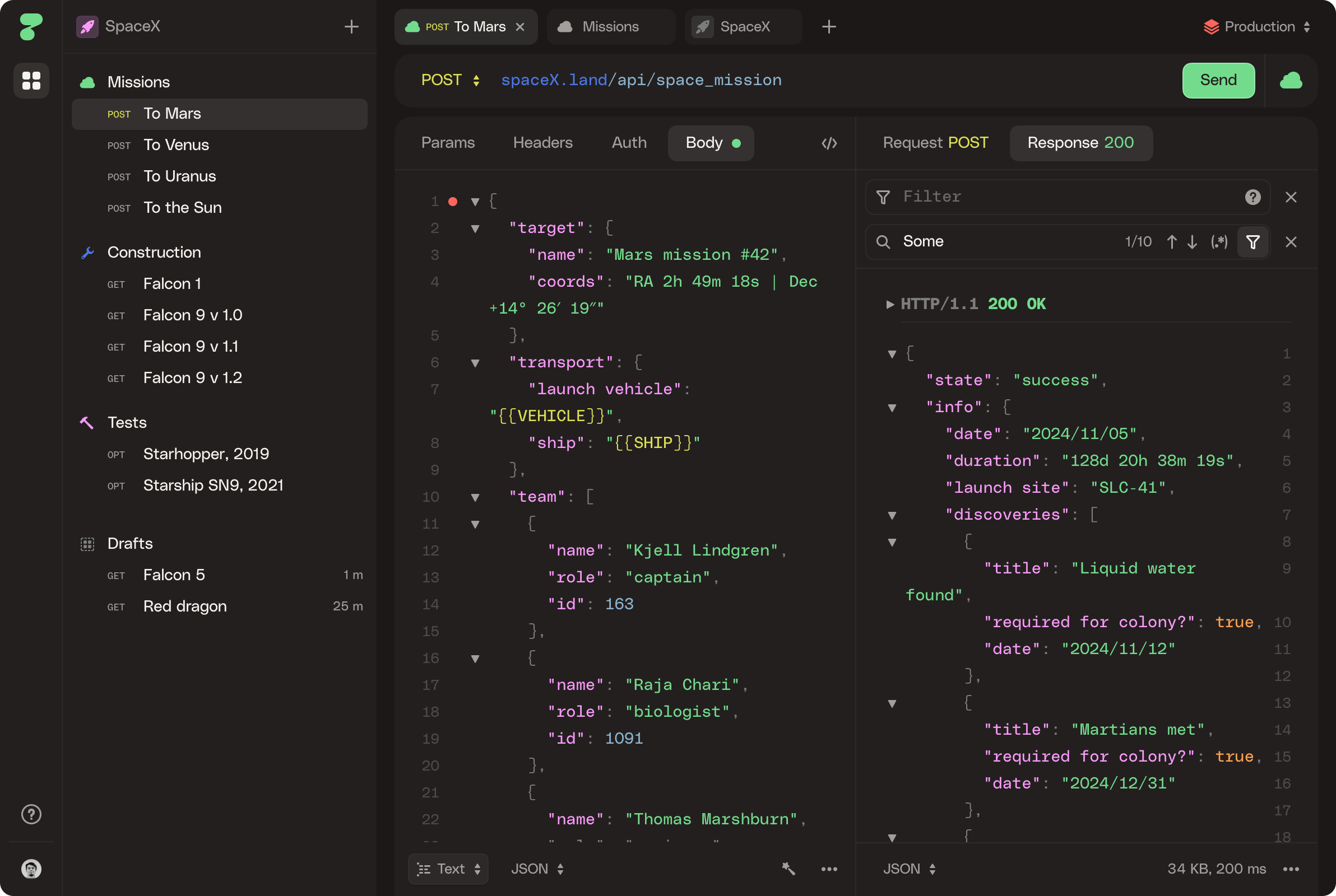
HTTPie’s interface has a balance that reflects how the user will switch between the different components of the application.
Understanding the user’s “context”
Above, we alluded to the fact that we need to understand both the user’s tasks as well as the context in which they perform those tasks. Let’s make clear exactly what I had in mind by “context”. More precisely, there are three contexts users may work within, and we’ll look at each of them next.

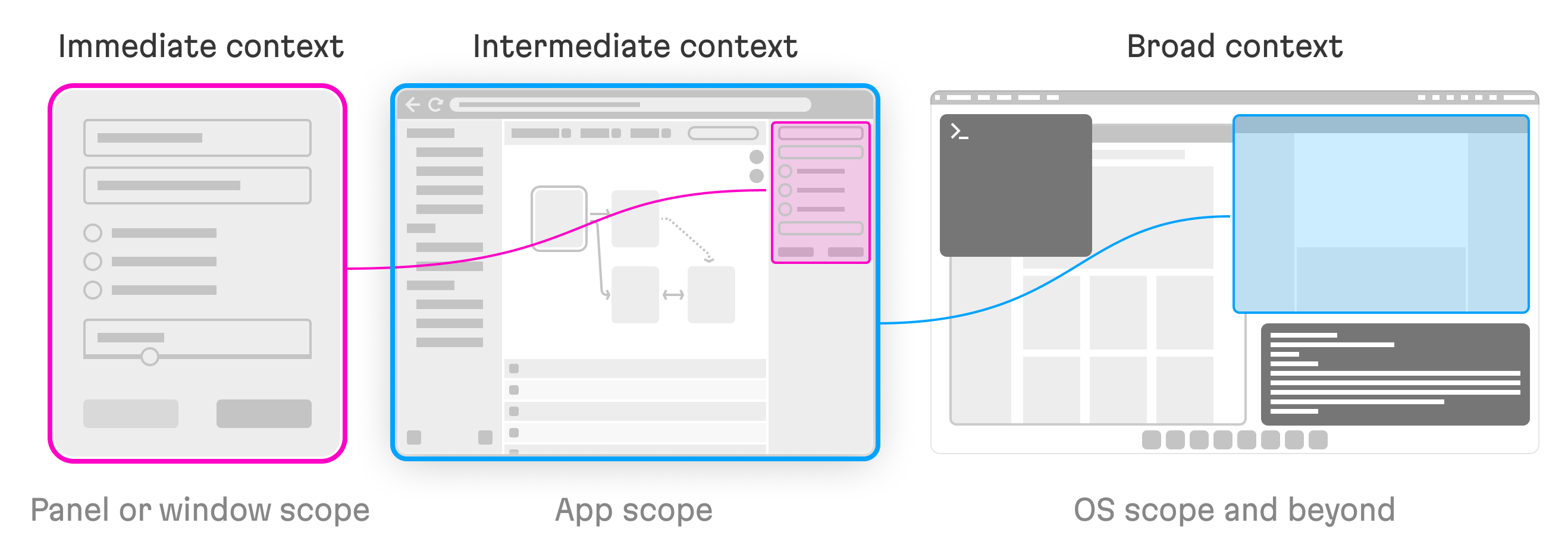
Immediate context: This describes the user’s current set of actions at a granular level. Examples of this might include fixing compiler errors in a file or two, creating a Figma component, or adjusting a page header in MS Word. These actions are likely to be isolated within a single panel or window.
Intermediate context: This is the user’s current task within the app itself. For instance, developing a large feature, creating an interface consisting of a number of screens, or preparing a business proposal. Somewhat naturally, this is a broader context than the immediate tasks mentioned in the previous example, and it requires users to perform a specific set of immediate context tasks and to switch between them.
Broad context: This describes the user’s task for their job at large. This might mean pushing a feature live to production, getting approval for a design and handing it over to the dev team, or signing a client up and starting a new project. This is the widest context and is something that likely requires switching between different apps.
Now that we’ve outlined the gist of these contexts, let’s take a look at designing the best possible experiences for each of them, providing practical examples for working with all three.
Designing the best immediate context experience
First, it’s important to make sure you aren’t forcing users to jump between panels and windows just to do simple stuff. For each small task that might be performed, try to pack all the necessary controls into a single panel or window.
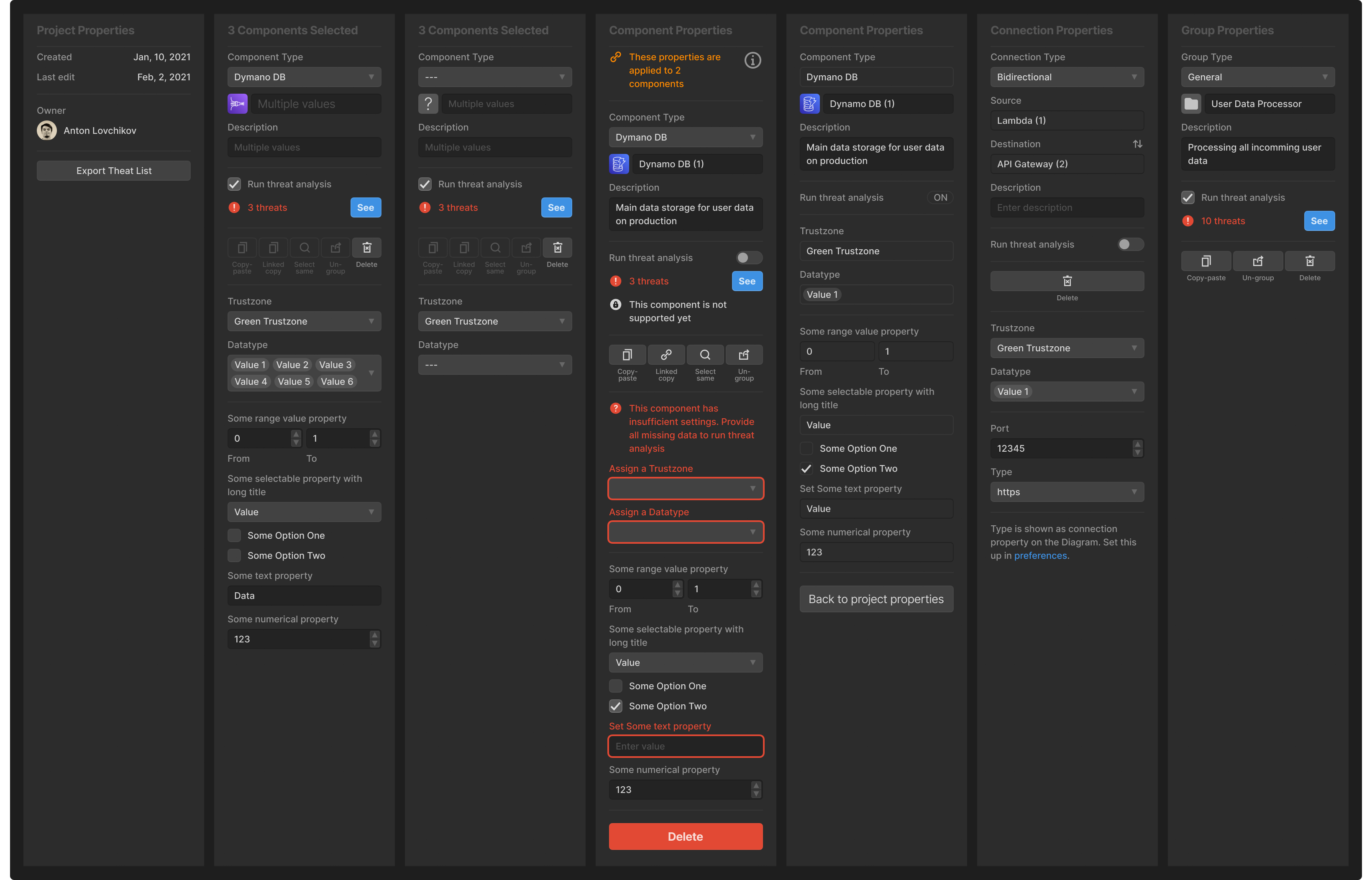
Variations of the Properties panel in the Akeero UI showcase how its content seamlessly adapts to a wide range of user’s tasks.
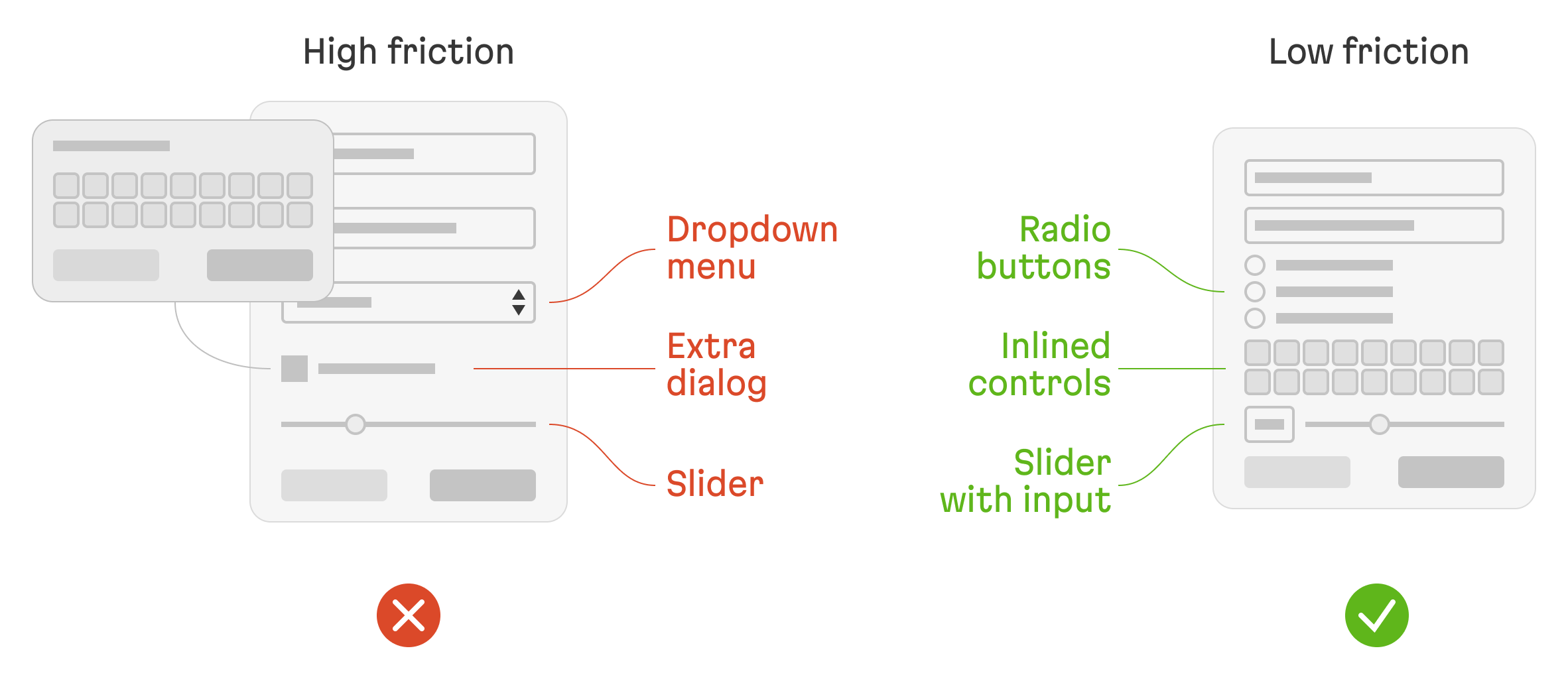
Also, try to reduce friction within the interface. What does this entail? For instance, whenever possible, use radio buttons instead of dropdown menus, support sliders and text inputs which share values that are bound to the sliders so that users can opt for more precise control as needed.
Further, avoid unnecessary dialogs and windows, and pay attention to element sizing, spacing—don’t waste space, this forces users to needlessly spend time scrolling:

As users will frequently interact with panel elements inside your interface, take extra care and try to make wise judgments when setting their size and spacing. If panel content is too long, users might spend too much time scrolling back and forth: this can lead to time wasted, and with that, a serious loss of productivity. Consider taking advantage of independent zoom for panels, like Blender does:
Play this video to check out independent zoom in action!
Use panel footers: they’re a great place for secondary actions, statuses, and warnings. Since they’re placed at the bottom of the action they don’t clutter your interface but still remain available as needed. Just make sure these actions don’t interfere with the OS dock icons.
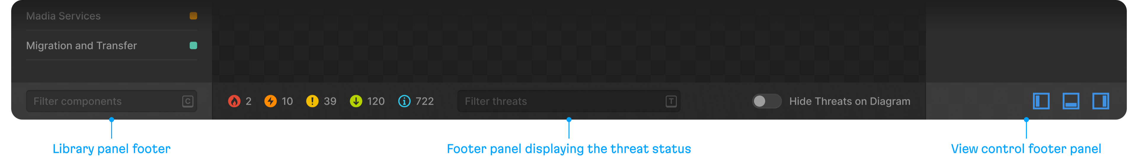
In Akeero UI, each footer panel enhances the functionality of the main section’s content.
Designing the best intermediate context experience
Give users the ability to work with a few small contexts simultaneously when needed. This might mean the ability to inspect several adjacent files inside an IDE or allowing for a bird’s eye view of all mockups in Figma (this was almost impossible in Photoshop, remember that pain?)
Ensure that any interface for adjusting properties doesn’t cover the viewer where these changes will actually be applied. Additionally, try to avoid pop ups; instead, place property-adjusting fields in a panel next to the viewer.

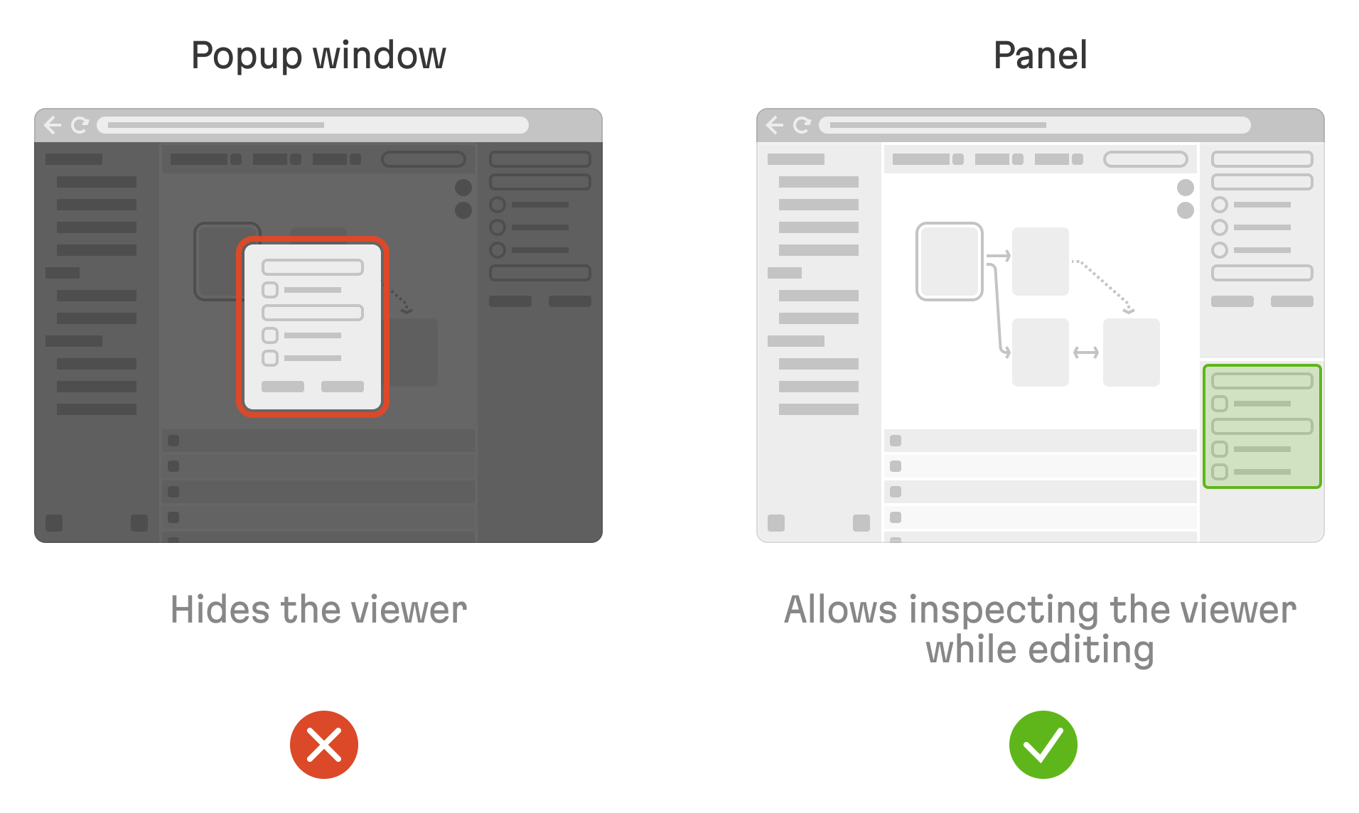
If you can’t avoid popups, persist the content’s scroll position and the last tab viewed so that users can easily get back to their context when ready. For instance, let’s say you want to adjust the text size: imagine you must scroll within the property list to the text size property. Next, imagine that the popup itself blocks the text you’re trying to adjust. You make the adjustment, close the popup and—well, the text size is still not right. Now you have to repeat the process. It would be better if the popup “remembered” exactly where the user was working, so they don’t have to deal with this kind of hassle.
Don’t be afraid to offer a wide array of settings. Even the tiniest inconvenience, when encountered hundreds of times a day, can result in a great amount of frustration. To curb any potential headaches, make panels resizable, re-orderable, and give users the ability to add panels to the layout and close useless ones. For a good example that illustrates proper implementation of this principle, we can once again turn to Blender:
Check the video to witness an example of layout flexibility in the wild.
Add a way to pin different files for a quick switch. It’s very important to give the user the ability to switch quickly between different aspects of their work. Imagine a browser that didn’t have a tab feature, and instead, users were forced to navigate one page at a time. By modern standards, this would certainly be considered the worst browser around.
That being said, there’s no need to rush off and try to build a browser-esque tab system on your own because this is actually extremely difficult to implement well. Vertical lists are much easier for developers to reckon with. As a last resort, you could also just leave it for the browser to deal with. Just give users some sort of hint that they are able to open a file in a new tab.
Designing the best broad context experience:
Think about the big picture—how do your users use your app in their daily job? Do they open it next to a browser? Do they open it at the bottom of an IDE, like a console? Or perhaps they pin it in the corner of the screen, like a calculator:

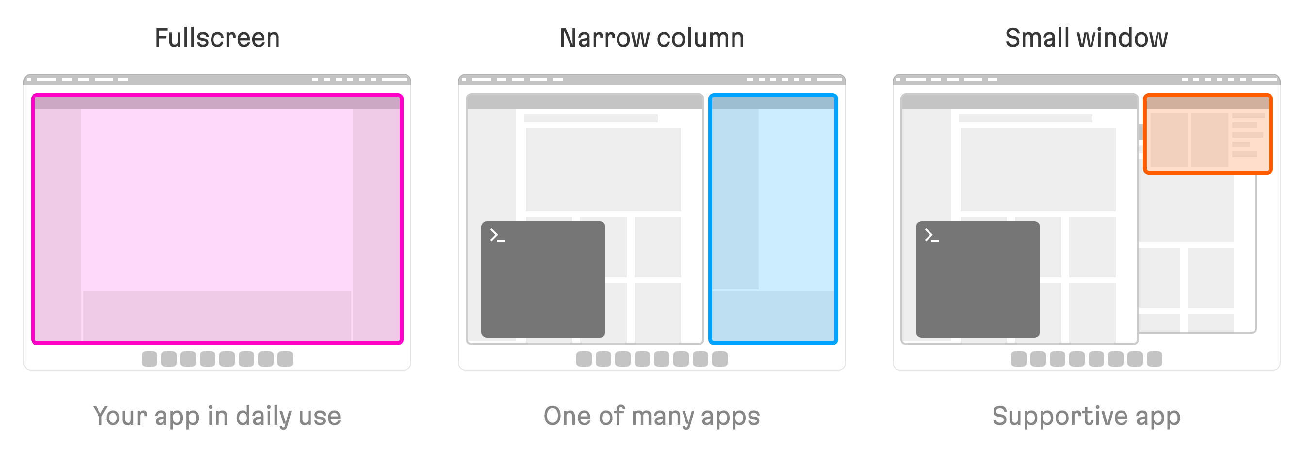
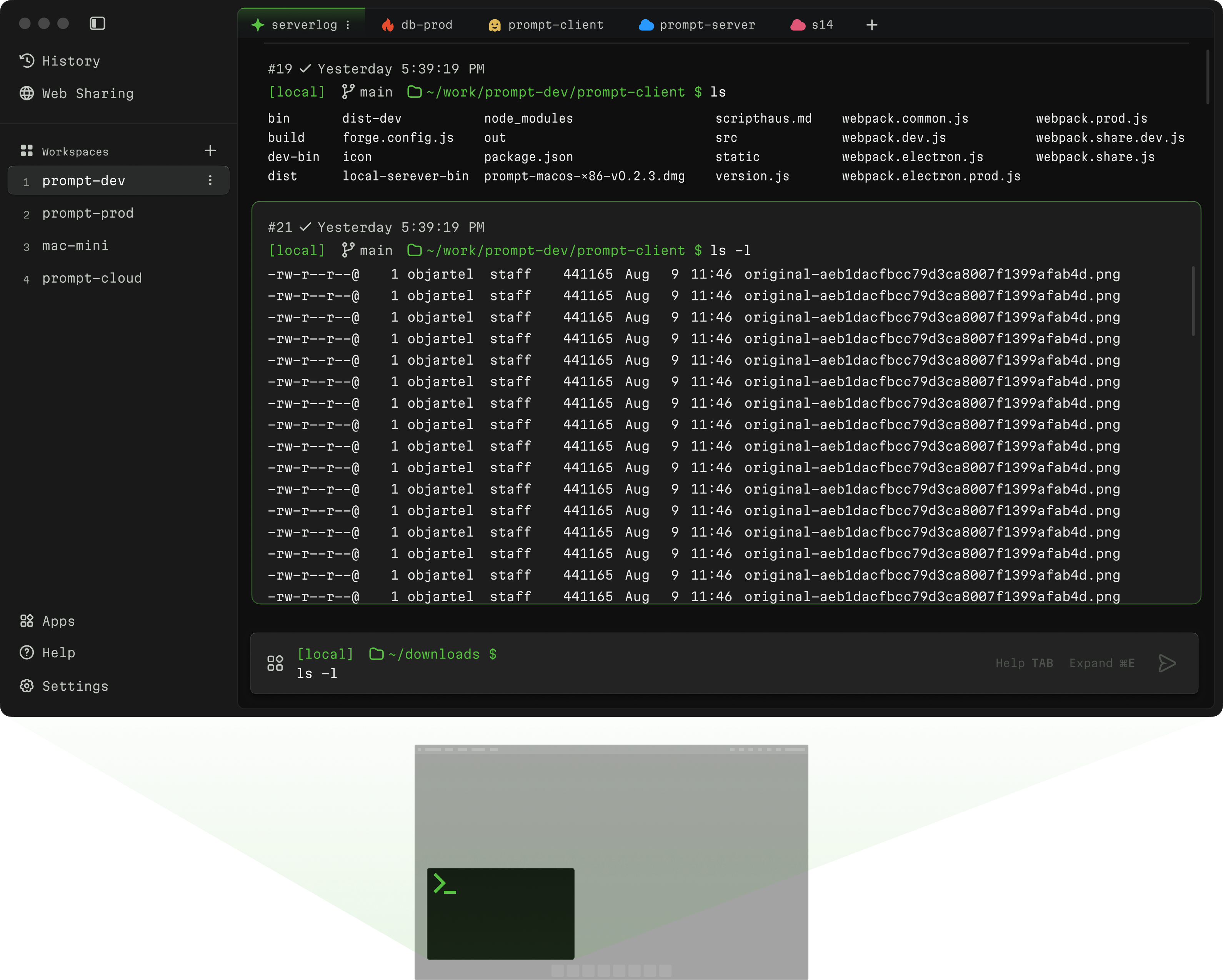
When designing Wave Terminal—an open-source terminal app enhanced with AI and graphical widgets—the Martian product designer carefully optimized the app’s layout, keeping in mind that it’s typically used in a windowed mode, though on some rare occasions it does run in fullscreen.

Consider using a responsive layout even if the product isn’t targeting a mobile audience. This choice will come in handy if the developer decides to keep the app open as a narrow window alongside some other apps. Test your interface and verify that it works well when sized with limited heights, and consider preparing a card-like layout so users can pin it to the top of the screen.
A few final miscellaneous points
It’s not really necessary to use precious interface real estate in order to display a logo within a tool that will be used for everyday tasks. If removing the logo isn’t feasible, try using a compact icon version of it and placing it in the top-left corner of the main menu. Here are a few examples of dev tool app headers crafted by Evil Martians.
Pay attention to scrollbar styles and behavior—there’ll be plenty of them, so it’s worth thinking about. Take a look at how many scrollbars there are in even the most simple dev tool. Imagine how unpleasant the interface might look if a browser’s default styles are applied instead of you own. Work out scrollbar appearance—the color, size and shapes. Also, think if they should be visible all the time or only appear when scrolling:

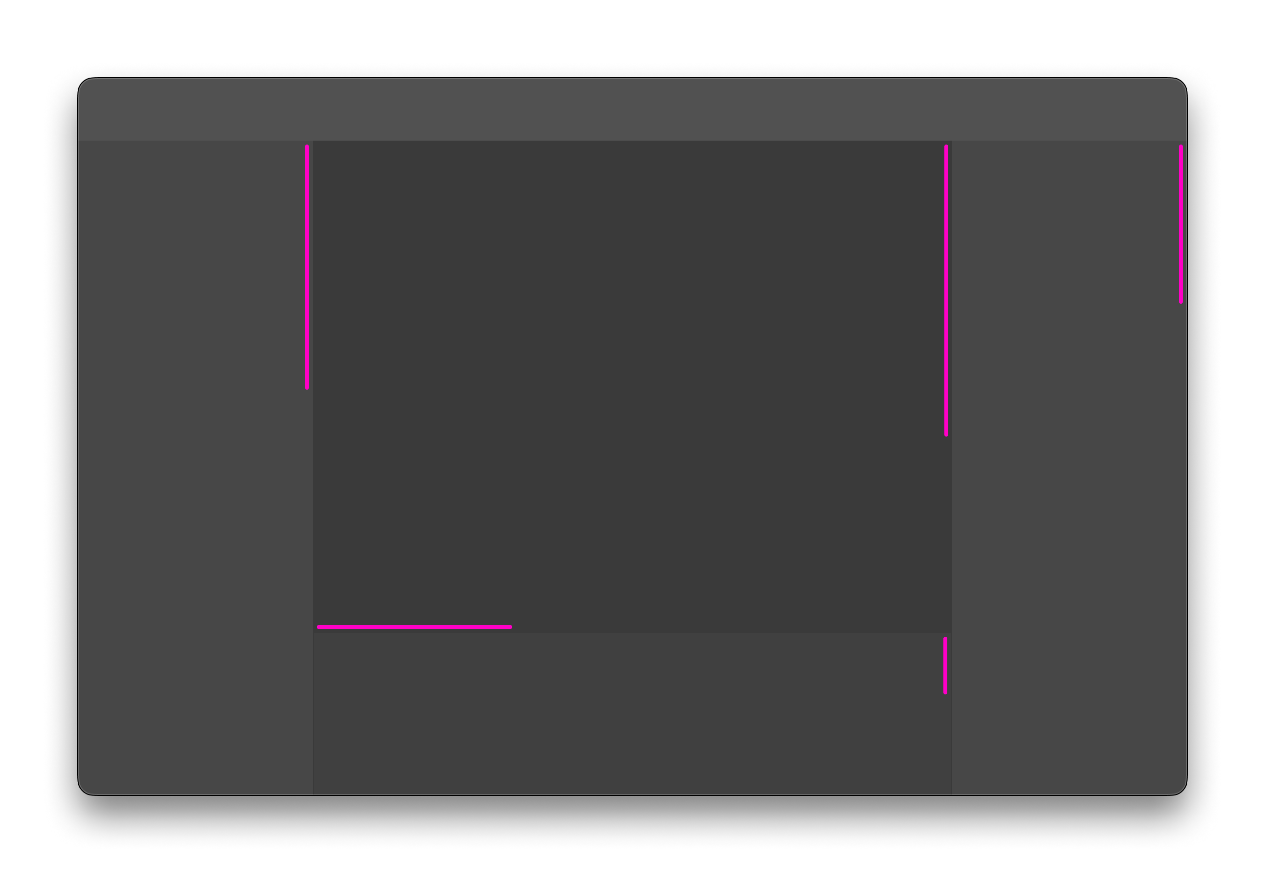
I’ve highlighted the scrollbars here to demonstrate their presence in even a simple interface—your choices have a big impact on the final vibe.
Finally, be ready to port your design to the desktop.

Developing a conclusion
Hopefully, this quick and dirty guide is enough of a kickstart so that you’ll start analyzing the differences that exist in terms of interface and user flow between commercial software intended for consumer audiences compared to more “creative”, professional tools like those used by software developers part of their work every single day. If you’re a creative professional yourself, then you likely already have a substantial amount of developer-tool experience to draw from, so put that experience to good use!
Be aware of the important features of your app, and based on that, take into account how space is being distributed in the interface. Keep in mind the context your user might be operating within. Focus on eliminating blocks, and unnecessary elements. Give some extra thought to implementing quality-of-life features like customization settings, pin features, and UI elements that actually make sense for how they are being used.