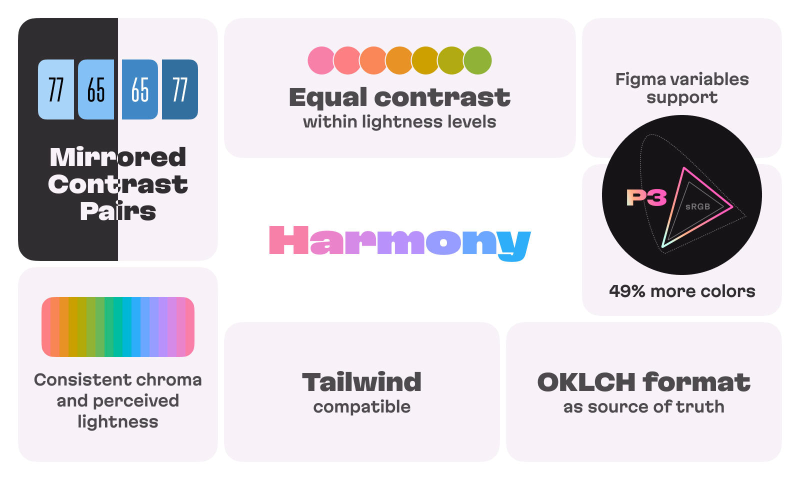
With the OKLCH color space and the innovative APCA contrast algorithm, Harmony offers highly consistent color shades, previously unavailable P3 gamut colors, and precise control over text and UI element contrast.
Product Hunt has seen thousands of color palette types of products but this one is serious with an idea and science behind it. The makers had me at “intensely focused on accessibility” and just kept going. — Twitter.


Product Hunt
The official account
Features
- Equal contrast within lightness groups
- Mirrored contrast pairs
- Contrast levels for readability
- Consistent chroma
- Tailwind compatibility
- Figma variables support
- P3 gamut for maximum color

Fantastic idea. Congratulations on your launch! I felt Harmony works best when building design system and products. Especially, dark mode adjustment is amazing. — Product Hunt.

Kimihito Tanaka
Frontend Developer
Read more about features and use cases in the Twitter thread:
The Harmony color palette is very impressive and pushes the baseline for what to expect from modern design systems. By taking advantage of modern color tech like the Display P3 color gamut and the OKLCH color space for a wider range of colors, it manages to be consistent, recognizable, colorful and accessible at the same time. — LinkedIn.

Jacob Rask
Staff Engineer, Web Platform at Volvo Cars