Blend to my will! Fonts on cylinder objects in Blender
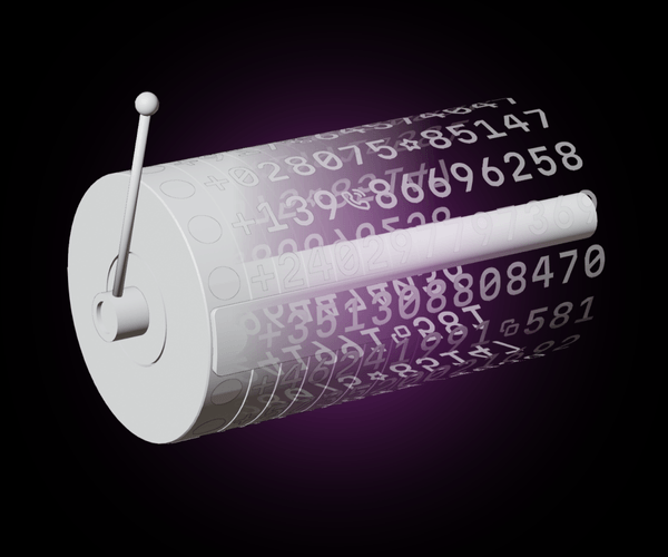
Each time we make an illustration, we face some unique challenge. This can be technical, creative, or perhaps even spiritual. In this article, we’ll get an over-the-shoulder look at this process and see how to model and render a metal object inspired by a classic picker UI design, and we’ll tackle working with fonts in Blender—specifically, making the text curve around this cylinder-shaped object (and we’ll animate it, too!)
If you want to dive straight to the main problem, click here. Otherwise, keep reading for the full story, starting with its genesis, proceeding to problem solving, and concluding with the sound of art.
The story behind the story
I recently completed an article on the essentials and the inner workings of phone input UIs. Finalizing the article, I, along with some help from my brilliant colleague Anton Lovchikov, started thinking about the illustration that would accompany the text.
This process involved, essentially, four steps:
- Conceptualizing the illustration
- Initial render and any major problem solving
- Adding details
- Animating (optional)
Conceptualizing the illustration
First, I began with some free-form brainstorming. This is a great way to collect rough ideas. Since my article was about phone inputs, initial concepts centered around this topic (although some esoteric ideas were also included).
Related ideas and metaphors: telephone numbers, design tips, processors, numbers in matrices.
I gathered these all together on a mood board. Mood boards are a great way to define an illustration concept at these embryonic stages.
Choosing a path
From there, I came up with the idea for the main component to be featured in the illustration: a processor representing a telephone input. Inspired by the design of a motherboard, from the central processor there would be modules representing input-defining values: flags, country codes, formats, searches, and so on.
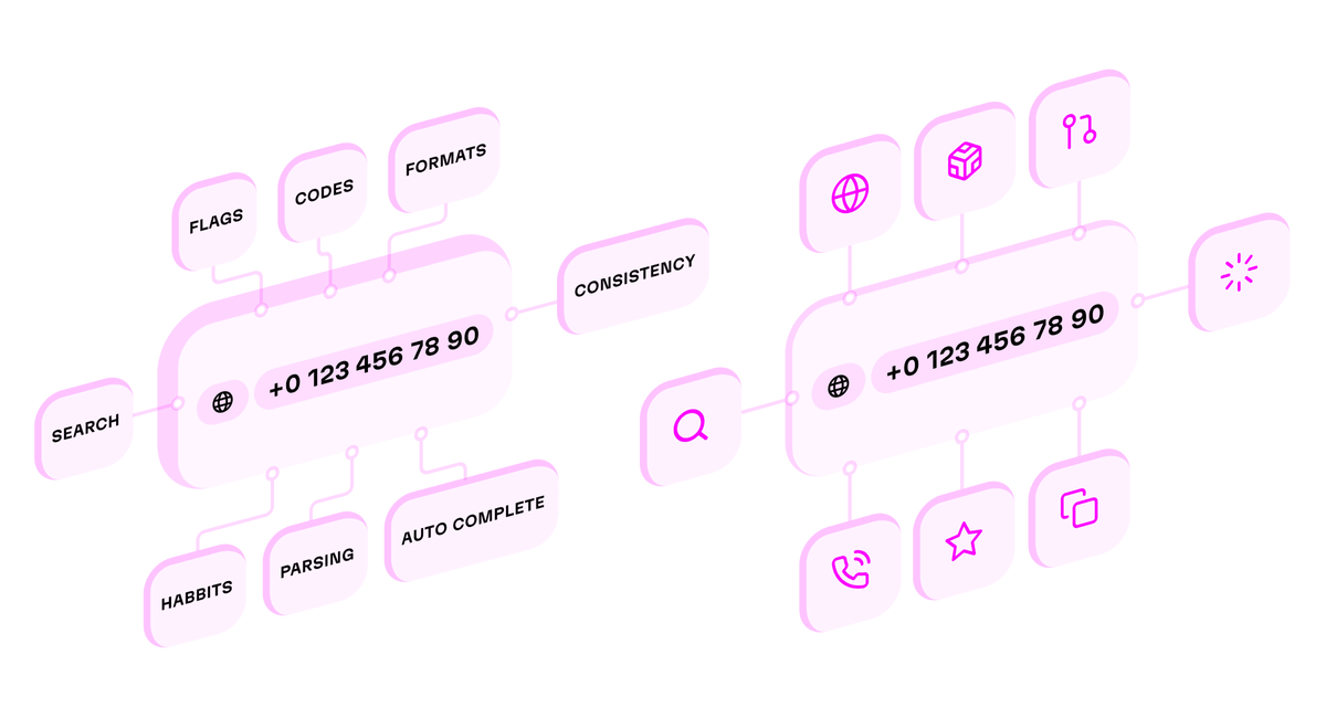
Or, at least I thought I did. This idea was OK, but Anton suggested another direction: an illustration inspired by the picker input, a UI artifact that might be familiar to you from back in the early days of iOS! (Ultimately, we went with this option—the value of a good teammate cannot be understated!)
First visualizations
I started visualization in Blender to check how the composition and the “vibes” felt in 3D. Frankly, things looked strange.
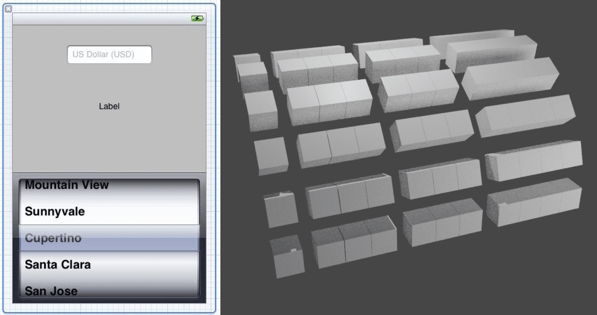
Anton suggested displaying them as one piece, and this worked. In spite of this initial win, I wasn’t done yet. I needed to deal with the material and lighting, but my attempt with gold and dark colors looked very bright and far too “fat”. We needed something more streamlined, with more focus. After some discussion, we chose bright colors, a metal material, and a thin layer of glass that would reflect selected numbers. Each number and icon had its own space to control.
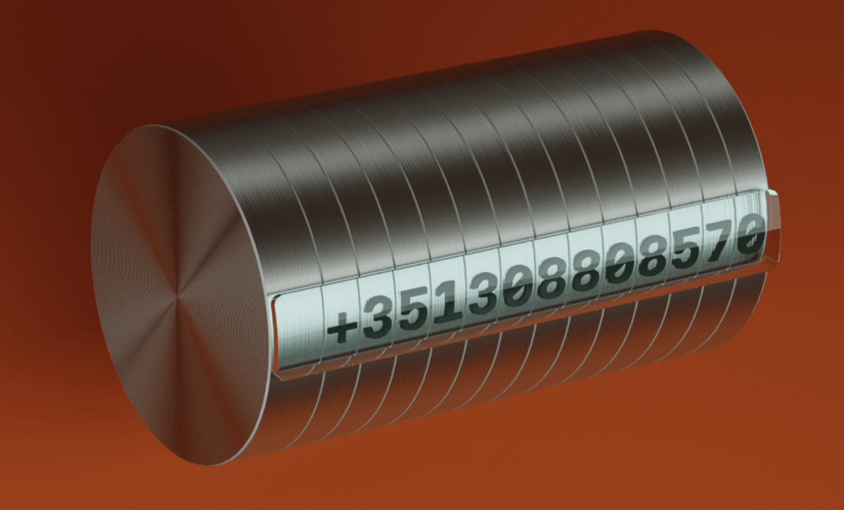
With just one row, this looked pretty good! But what would things look like once we packed it fully with numbers, icons, and flags? We needed all these details because, after all, this design was supposed to bring telephone numbers to life in a big way!
Solving font trouble with Blender
I intended to use the beautiful, open source Martian Mono variable font. By the way, we picked a monospaced font here because the cylinder’s disks all have the same width.
Here’s a little tip for anytime you need to deal with text in Blender: I could have dutifully prepared each number in the phone number above as an SVG file, but working with these files would turn out to be quite a bit of trouble. It would take a lot of time to prepare all the SVGs, place them onto the round surface, connect them, and so on.
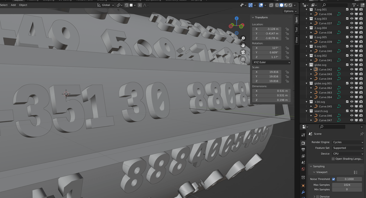
Imagine the madness if, after doing this with 20 or so files, I needed to go back and edit the design. Do not go this route!
Instead, the solution to dealing with fonts actually turns out to be quite simple. In Blender, we can simply upload font files—you don’t need to vectorize them—and they give us a ton of great options for working with them. We can work with types and make them 3D, transform them, position them, apply modifiers to connect them with surfaces, and much more.
And when you exchange a Blender file with a colleague, you can attach this file to help keep everyone on the same page—easy collaboration.
Putting the numbers on the cylinder object
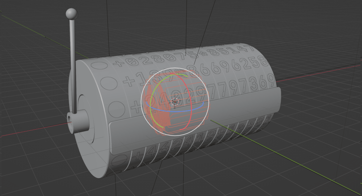
So now, in Blender, we have this 3D cylinder object. It models the primary component in the old picker.
While working with the coating and drawing the numbers on the cylinder, another hitch (albeit, an interesting hitch) came up here. As is often the case with complex design tools, there appeared to be two ways of completing the task: an obvious, yet complex way, and a tricky way (with a bit of magic needed).
The complex method would involve manually marking up and placing the numbers. The tricky method would be accomplished with the help of the Null object. Of course, you can probably guess which one I opted for.
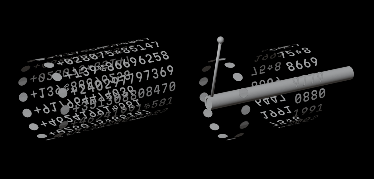
We can use the Null object as a base and rotate objects relative to it. In the center of the cylinder, we’ll have our object, and we can duplicate and rotate the number elements perfectly. In Blender, Null can be your best friend.
Adding further details
So, I covered the cylinder with numbers, but with the black color, these 3D elements looked quite heavy. Therefore, in the next iteration, I decided to switch it up; I gave them a white, “light” appearance. But still the illustration had that sense of heaviness. How could we add details to make this look more dynamic and alive?
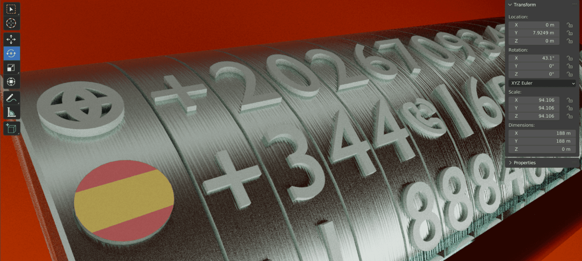
To really make an image pop, to make it come alive (if that’s what you’re after—and I was), there needs to be some sense of action in the scene.
As you can see in the image below, we’ve added a handle element onto the side of the cylinder to control the various phone number configurations. It’s a bit reminiscent of a slot machine, and automatically gives the image an impression of interaction. It’s a sense of dynamism that isn’t present otherwise; it’s almost as if you could literally reach out and pull it.
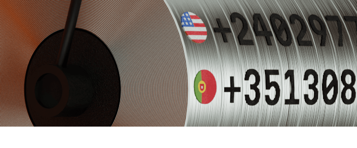
When rendered in color, and with the addition of country flag components, the illustration already appears much more alive, no? However, after adding details, we realized we need to decrease the volume of the numbers and give them dark colors to match the color scheme. The nice contrast of the flag colors against the background looks good, too.
The big show: adding animation
If the handle begs to be pulled, why not just pull it? Here’s a reliable sign that your image has a great sense of dynamism: it begs to be animated. That’s exactly the place we often find ourselves, and this illustration was no exception. All of the elements were practically crying out, “animate us, animate us, please!” Who could say no?
In this case, the final concept for the animation is probably easy to surmise—the handle will be pulled, magic happens, and we’ll see a selected number. Again, we can think in terms of slot machines here.
In terms of the technical details, luckily, handling animation in Blender is quite easy. We can control the animation type, interpolation, easing, simulate physics, and so on.
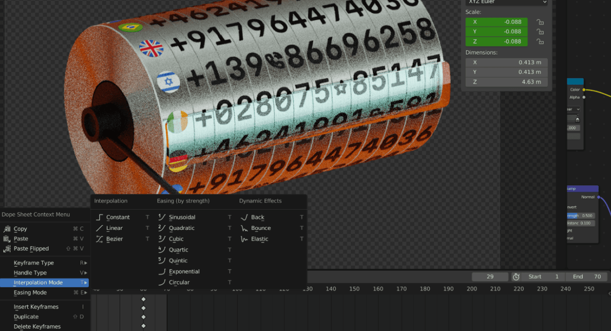
We first tried an animation where the numbers were rotating simultaneously. Of course, it would look even more dynamic and cool if each row of numbers individually rotated. This took a couple of iterations to achieve, but in the end, everything worked out:
One last win
Conclusion
During the night, as I tried to render the final animation, the computer produced such terrible noises. But each time it happened, I told myself this is the sound of art being created. There’s something kind of magical about needing to wait a few minutes before you can check your render preview, make adjustments as necessary, and try again. Actually, despite any pain, I don’t want to lose that feeling. And, the satisfaction of the final result makes it all the more sweeter.
Evil Martians can bring this same level of passion and care to your project. Have a web or mobile application that requires expert problem solving with product design? Need a frontend, backend, or software reliability solution? Looking to get your project off the ground? Reach out to us!

