Figma Auto Layout: Practical tips for dynamic designs

Go beyond pixel pushing and start speaking the same language as your engineering team by harnessing the power of Figma Auto Layout in your UI mockups. Learn how we use it to implement universal dynamic component systems—from design to code. See how Auto Layout allowed us to rethink the way we create interfaces for our clients and internal projects.
In the ideal world, everyone would just design websites from scratch directly in code. Modern browsers give us perfect tools to inspect, tweak, and test our components with instant visual feedback.
Designing with Chrome Inspector 🕵️♀️
But even if you imagine that all designers on Earth learned their HTML, CSS, and JavaScript, the ideal won’t be reached anyways. Code takes time. It is hard to explain to your clients that they would have to wait for the next product release only to check the results of yet another design iteration.
So, static mockups remain Step One in almost any digital product process (Step Zero being the discussion of project requirements).
The problem with static mockups is that they can be designed rather quickly by professionals using tools like Sketch and Figma (and Adobe Photoshop a while ago)—but iterating over them and adding new features is an elaborate manual process that requires a lot of “pixel pushing”: re-arranging dozens of mockup layers on screen with every minor change.
The pain every designer feels 😭
All of that changed after Figma introduced its Auto Layout feature. It bridges the gap between static designs and their dynamic incarnations in code.
As soon as Auto Layout was released, our design team was quick to rebuild their processes around the possibilities it brings.
We are going to share our learnings (with a lot of moving pictures), and at the end of this article you’ll discover a Figma artboard that you are free to use as a starting point for your dynamic designs!
For the sake of example, we will be using the same design system that powers Martian Chronicles—a notorious team blog that you are reading right now.
The hardest button to button
Buttons and their states 📍
Auto Layout makes it extremely easy to turn any text layer into a dynamic button, allowing you to set the same constraints that your frontend developers will impose in CSS. We’re talking horizontal and vertical paddings and margins, background properties, and corner radius. You can group buttons together and make them behave as a single grid that naturally converts to a flexbox-based CSS layout with a ready-to-use code.

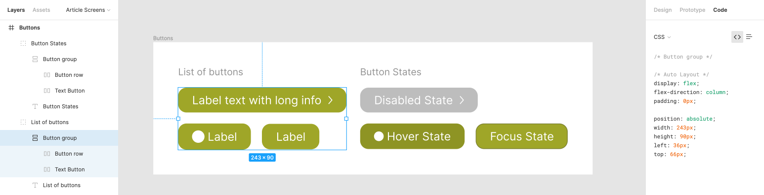
Generated CSS on the right does not look half-bad
En-list-ing the power of Auto Layout

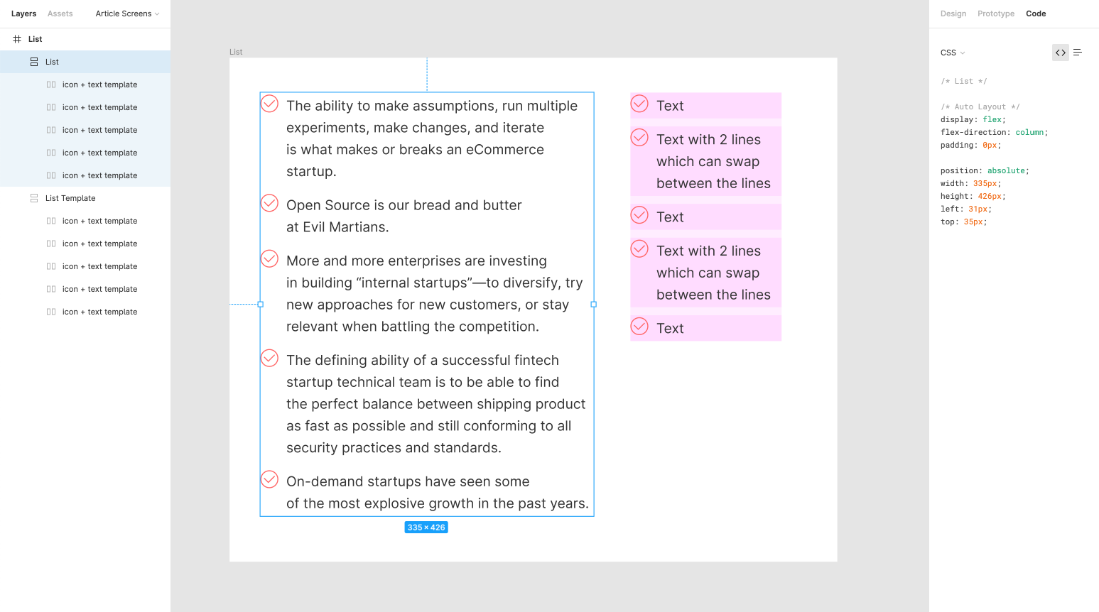
Auto Layout scaffold on the right, actual content on the left
We can design lists by bringing several Auto Layout components together. We use one for the horizontal alignment of a checkbox and a string of text, and another one for the vertical alignment of list items.
An important thing here is that we need to specify the width of the text block in the enclosing (vertical) component and set the Auto Height settings. Now you’ll be able to see the magic happening: text will find its lines dynamically, and the icons will automatically remain in place.
A magical self-aligning list 📜
Jaw-dropping drop-downs

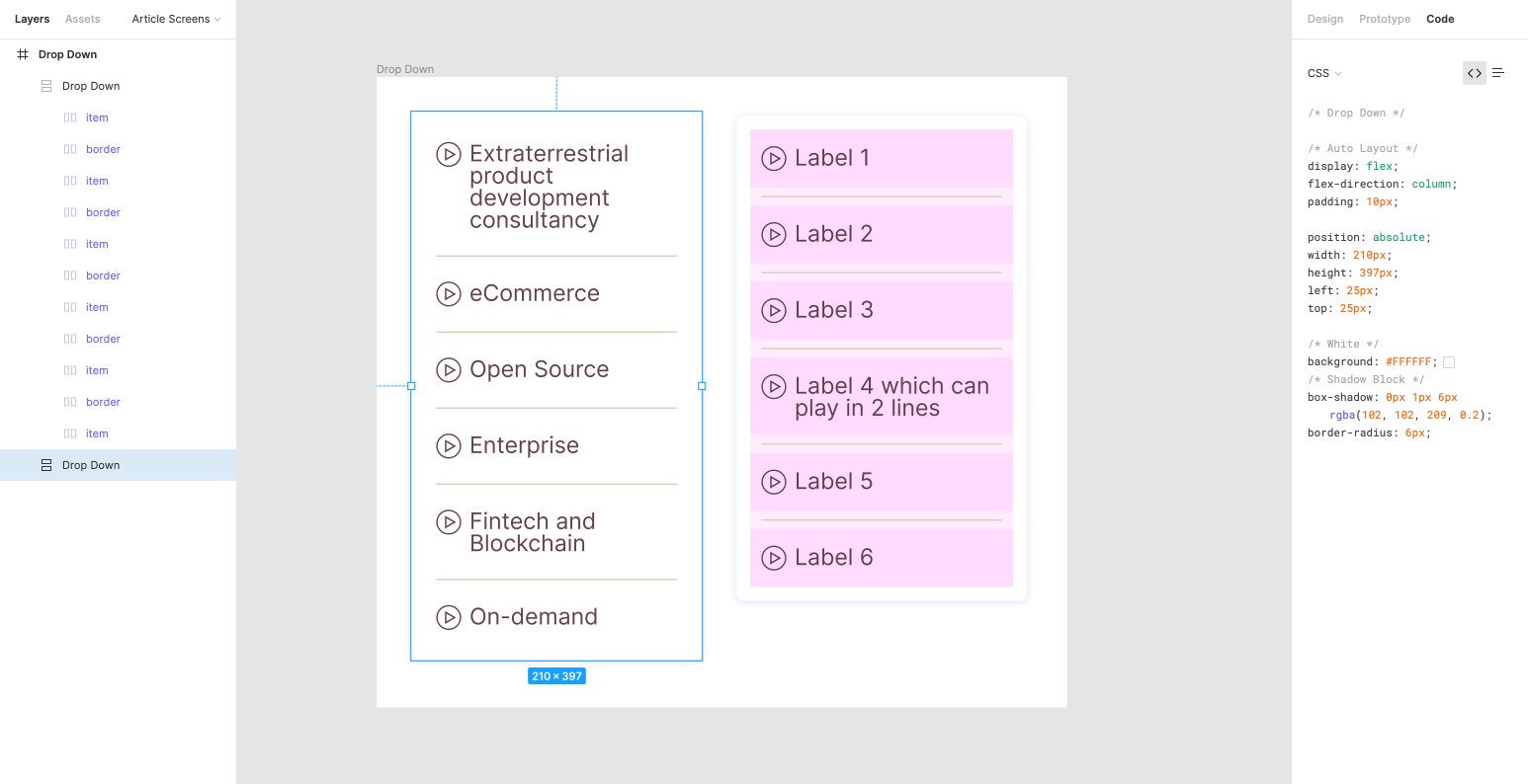
Highly customizable drop-down component that allows to control separators, wrapper, etc.
A similar approach can be used to build dynamic inputs like drop-downs. The main difference from the list component is the addition of a separating rectangle. By controlling its borders and opacity, we can change the look and feel of our drop-down list. The first and the last separators are special as they don’t require enclosing borders: you can apply different stroke setting to achieve desired results. You can also use those invisible rectangles to regulate spacing.
Dynamic drop-down in action ✨
Enable notifications

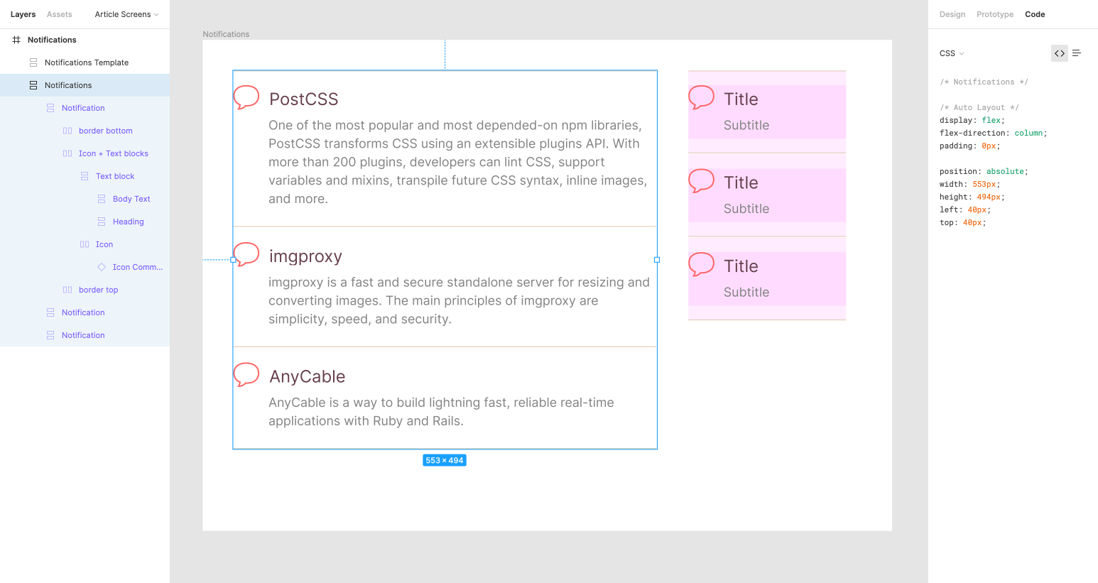
Intricate nesting for notification components
Now, Let’s build a more complicated component with a title, a subtitle, an icon, and a separator. Auto Layout allows to combine all the building blocks, and add a custom margin around the inner primitives. Throw in “border bottom” and “border top” layers to avoid excessive symmetry that makes reading the text harder.
Controlling the text now yields the automatic formatting of the whole group leading to total designer satisfaction.
I wish those notifications would never be snoozed 💤
What’s in the cards?

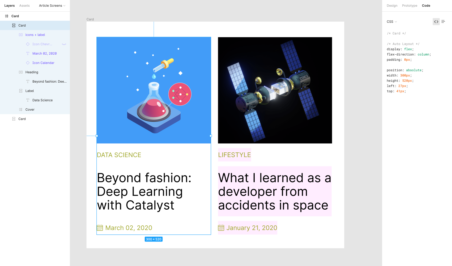
Reusable card components are the bread and butter of every designer
We build a card out of several primitives: image, tag, title, icon, and an icon “data string”. It is an example of a more complex component. To keep all the layers in check on resizing, we have constrained the width of the text element, exactly as in a previous example with notifications. That makes our cards reusable for different content types, as more text will just yield a taller card due to “auto height”. We can fix the text block size too, but not allowing, say, five lines of text: everything else will be nicely cut out. We recommend using the grid fill (we use magenta, out of respect for the printing past) to highlight the anatomy of the resulting element.
The house of cards 🃏
Auto Layout + Constraints = ❤️

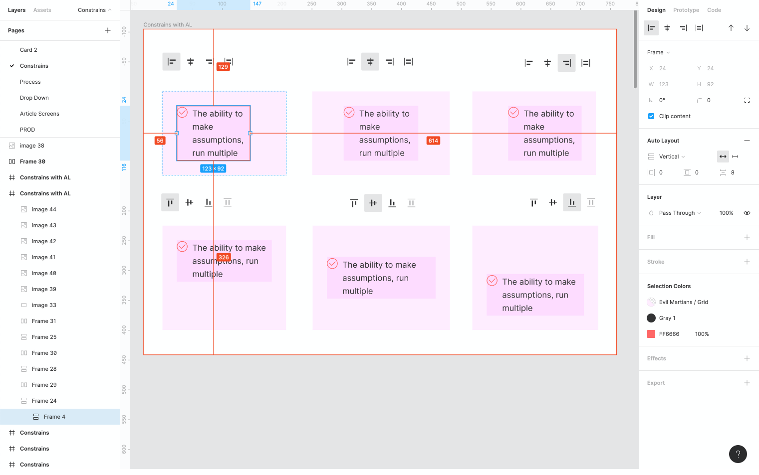
Figma constraint controls
Constraints help us focus on the actual design instead of mere pixel pushing. In Figma, we can make all our components behave predictably by tinkering with constraint settings. Combining it with Auto Layout lets us improve our design workflow even further.
Constraints without Auto Layout
To start working with constraints, you need to create a frame (a hot key) and place your Auto Layout component inside. Now we can control the frame constraints, and Auto Layout will conform to them.
Constraints with Auto Layout
When we combine frames with Auto Layout, we get fewer options for constraints (for instance, we cannot stretch in multiple directions at the same time, but we can still replicate the default behavior: through controlling the orientation of the Auto Layout component.
Congratulations, you’ve made it to the end of our Figma tour! Now, feel free to grab the source file with all the examples and tweak it to your liking.

Of course, there is no such thing as an ideal design flow (cause otherwise there won’t be an internal conflict that drives the creativity, will it?), but Auto Layout brings us pretty close to the world where we don’t have to push pixels anymore. We can design every product iteration just once, by building a comprehensive library of one-size-fits-all components.
It also enables designers to communicate with developers more efficiently: as developers (we are talking frontend here), already reason in components. There is still far to go to achieve a perfect code-design synergy, but we believe that once we will all get there.
Feel free to give us a shout if you want to enlist Martian designers to help you find a perfect direction for your product. Take note that we never do “design for the sake of design,” and we always work in close cooperation with our engineers to deliver production-ready user experiences to our clients.
And stay tuned for more posts on how we get some extra mileage out of Figma—we have something exciting in the works that we will share with you soon.