Product design that sells: the smart UX for Tines

Our project with Tines is an excellent example of how smart UX design helps attract valuable customers while frontend and backend improvements increase system performance by up to 100 times in target areas. All that encouraged the startup team to pass off the bootstrapping stage and become profitable quickly.
Martians nailed the task to make a complex interface with many visualized actions, focused on security professionals, easy and satisfying to use even for newcomers.
Tines and Martians to make security teams happier
Tines is a SaaS product for advanced security orchestration and automation. The co-founders Eoin Hinchy and Thomas Kinsella spent 15 years working for “the most attacked companies on the planet”—like eBay, Deloitte, PayPal, and DocuSign—doing the same security tasks over and over again. They looked for a platform to reduce these manual workloads and automate repetitive tasks, didn’t find anything good enough, and founded Tines.
Back then, Tines was solving a task to improve the user interface and make the entire arrangement of security activities apparent and easy-to-understand even for an inexperienced user: all the chain of actions and the results of each step should be visualized. And Evil Martians joined the team to solve this thrilling challenge. Since Tines is primarily a Ruby on Rails project, we were pleased to help our customers with our favorite framework for building web startups.
Tines, with its new interface and smart features, won the customers’ attention and secured some significant clients, including Box.com, Auth0, McKesson, Fortune 10’s, global banks, and SaaS companies.
Tines has partnered with investors who believed in their mission. The startup raised $4.1 million in Series A funding from Blossom Capital and then added a further $11 million from Accel and Index Ventures.
Here are some juicy technical details on how we had it done.
Product design: new User Experience
Security engineers have many technologies and tools—firewalls, intrusion detection systems, antivirus systems, and others—that can detect security anomalies and create an alert (actually, thousands of these alerts per day). Tines’ main advantage is in the combination of visualization and automation of these activities.
The core of their approach relies on software “agents”—multipurpose building blocks that replicate a particular workflow. Within one of these agents, there are many steps for dealing with the attack or any security problem—like cross-checking the email address with trusted contacts or a blacklist, scanning attachments for viruses or examining URLs. Tines calls these visual scripts of all the actions within agents the “stories.”
Initially, the interface forced a user to complete throngs of forms to create these agents and stories. The creation process was short of simplicity as instead of letting a user build a story brick by brick, it required deep expertise and a lot of additional actions, not always obvious to do.
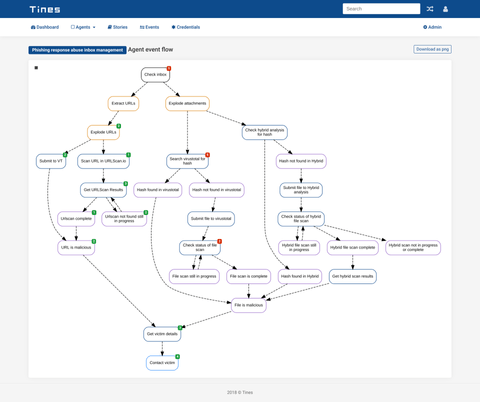
Previous interface
That’s why it was crucial to improve the process and give users the ability to quickly turn on and configure the story, showing the necessary objects to change their parameters and manage them directly via drag-and-drop and checkboxes with no additional pages to browse. Tines’ intuitive automation story concept now gives security teams the desired control of workflow as users can drag agents and connect them with a mouse or touchpad. In other terms, that was the UX evolution similar to command-line interface transformation into the graphic user one.
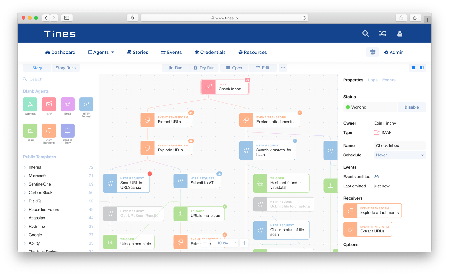
New story-centric interface
Drag-n-drop feature
Martians worked on a new layout and suggested Tines to be story-centric. Meaning every story has its beginning, stages, and conclusion, this approach creates the single and logical flow of agents management.
Now working with stories feels like working with files on your desktop—you can create an empty story and edit it. This communication model is more familiar for users as it’s close to the process of interaction with other software and tools.
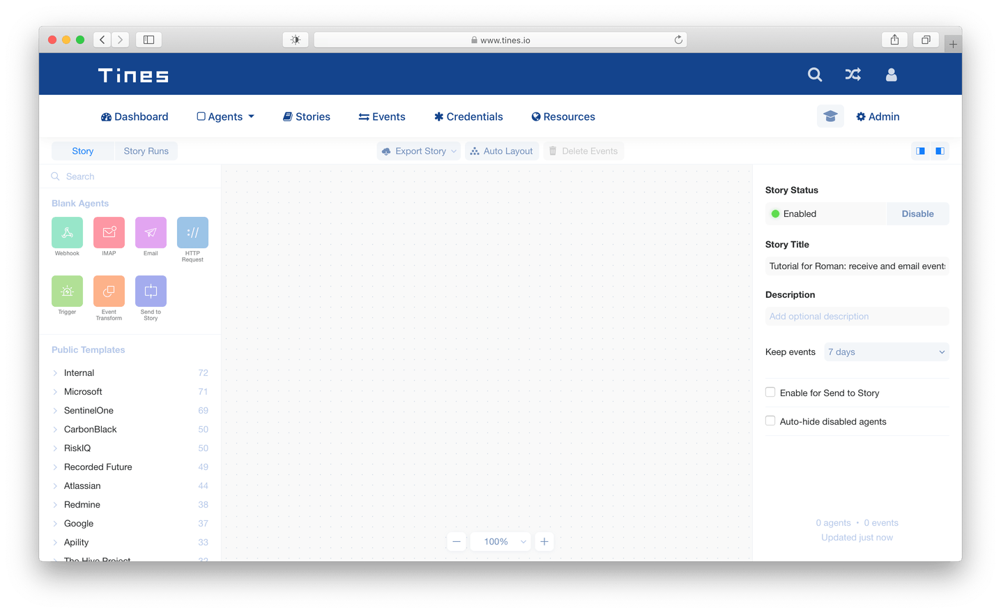
Blank story to start
Optimistic UI
Second, we implemented an optimistic UI for the most crucial and overloaded areas.
“Optimistic,” in this case, means saving and applying for different functions almost invisible for users with no need to reload a page or click “Save” or “Submit” buttons each time.
The application management now is a seamless process with no efforts.
Optimistic UI effect
The next area to apply this approach was the notifications system. Earlier, a user had to reload a page to get the information on something that happened. We’ve made a step forward to enhance the system dramatically as now any notifications come immediately, and all the errors are visible on-the-fly. Hence, it’s much easier to monitor everything.
Navigation
Also, we needed to simplify the activities and story navigation. To do that, we’ve reworked critical parts of Tines frontend to use the Single Page Application (SPA) architecture, where loading new data, statuses, or events now requires no additional action from users. On our way towards the SPA, we had to move to React.js (more on that later), since previous frontend infrastructure would not allow implementing new exciting features easy and fast.
Early on, the SPA approach was challenging for a story with hundreds of agents that often need to be deleted, added, or edited. The entire chain had to reload when you updated something important like an agent name, and the process was too conspicuous for a user. It could be distractive, so we made some steps to do it more intuitively. First, we simplified the agents’ setups allowing now to select an agent to see all its parameters on the same page in the sidebar. Then, if a user edits an agent’s name in this panel, it applies to the entire diagram with no reloading.
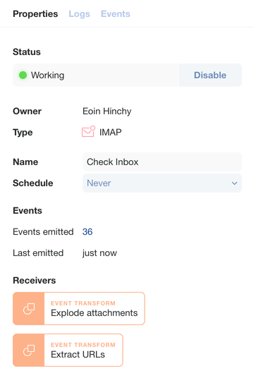
Sidebar with parameters
Besides, we designed any critical change to require at least two clicks: this reduces the chances to cause havoc by accident. In the previous version, a misclick could run a serious process like downloading or changing the action—which is dangerous, taking into account that every step results in the next step activation or the system’s response.
Debugging
Earlier, the interface had no debugging tools. Introducing them was a real challenge, as the desired story editor needed additional tools to discover a sequence of events. As a result, we built a special mode to find the exact moment when something went wrong and debug it.
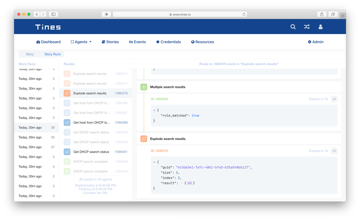
Debugging mode
The mode now gives some handy tools to focus on a specific chain of events to trace all the way an event traveled and all the changes it had on this path. A user can also share a direct link to a piece of code under debugging to get some recommendations. All this, again, in “optimistic UI” mode with no additional efforts and buttons.
Onboarding for new users
Finally, we worked on the onboarding process for new users. Tines is a complex product that requires a lot of security engineering knowledge: a user needs to understand the basics of the web and some things like webhooks, HTTP requests, and APIs. Typically, complex products make long text tutorials or videos that are expensive to produce. Together with the customer, we decided that the best onboarding would motivate the new users to create a simple story on their own. So we built an interactive guide to explain the process. This smart guide navigates a newcomer from stage to stage, showing the related videos and links to additional docs in the right places. It also checks if all the things are correctly done before letting a user head over to the next stage.
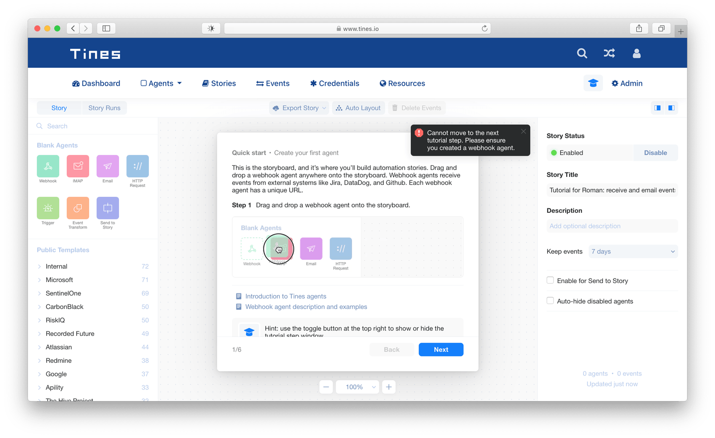
Onboarding guide
Martians completed the first design sprint in a week and the next one in a month. We enhanced the product design so radically that the team decided to continue with long-term cooperation for all the frontend development and some backend to support the new UX features.
Frontend enhancements
To begin with, we needed to extract the frontend code from the Rails application and rewrite the old jQuery code to React.js to simplify the logic dramatically. React is a perfect fit for the project because it has clear rules for interacting with modern frontend tools and helps to divide the codebase into separate components. Frontend component separation makes all testing and code review easier, allows reusing some of the components, and rewriting only the targeted ones. React also let us use cutting-edge frameworks and libraries—MobX for state management, GraphQL for communication with the server, and Monaco code editor—for building complex features like the infinite loading lists or interactive code editor.
We implemented drag-n-drop interactive diagrams with JointJS with our brand new colorful design and some original solutions (e.g., auto-width resizable Joint elements and custom gradient links between them).
Martians created a React component for JSONViewer that loads its nested values from the server on demand when the user clicks on the “Expand” button. It helped to reduce time-to-interactive (TTI), as we initially loaded only first-level JSON keys on the page, and solved the problem of loading large JSON that slowed everything down.
One more React component that we created was JSONEditor that enabled two editor code modes. The basic one is a Builder mode focused on users with little coding experience who can edit a code by adding and deleting functions. The Code mode is based on Monaco editor but with custom design and add-ins specific for Tines. This Pro-like mode helps to validate a code right after its entering and highlight code snippets with errors.

Two modes of JSONEditor
We integrated Tailwind CSS to correctly deal with sizes, spacing, and colors in the app, and integration was quite smooth as now the application relies on micromodule based design and a strict color system. Compared to our previous mix of CSS modules and global legacy styles, the code base is now easier to manage.
Backend tasks
First, we’ve implemented most of the APIs on the backend with GraphQL to make frontend and backend integration smoother and save time for ongoing API development. Second, we deployed a proper instrumentation and monitoring setup using Prometheus and Grafana.
The next task was to implement a better deployment solution and set up an appropriate environment for testing and development. Tines’ engineers chose the BitbucketCI for running continuous integration, so we used it to eventually arrive at a goal to get the coherent integration process of rolling out all the deployments. Now Tines has tests on every single commit that helped switch to the right track for more predictable updates and feature delivery.
Also, every framework and all major libraries were updated to their latest version. With the up-to-date CI process, we are now confident that no change will break the system; we are keeping an eye on refreshing project dependencies regularly.
Performance
Now, let’s talk about performance. Initially, one of the most crucial backend tasks was to double the system performance by increasing processing speed from 12K events to 25K events per day.
The previous event handling system was based on an event loop that didn’t let through more events to process. The loop caused a heavy database load since its tables were temporarily locked along the line. In addition, events could not be processed in parallel. Instead of improving this solution, we’ve implemented a new one from scratch to eliminate all the related problems, like high delays between creating and receiving data and excessive incoming traffic to the server.
Martians introduced a pipeline solution that enabled almost immediate and smooth calls for events agents. Besides, we redesigned the tables to empower parallel processing without any heavy database locks. Today the project processes more than 2.5M events per day, and that’s an impressive 106X increase in performance.
We also reduced Ruby’s memory bloat caused by the fact that there was too much data processed at once within the Ruby application. In addition, we made some changes in a database schema that allowed us to reduce the amount of data 10Х. The result was reached after refactoring the way the data are stored in PostgreSQL to avoid duplication.
Finally, Martians covered about 100% of the critical application areas with unit and integration tests. We also fixed all the broken tests to let us (and Tines team) deliver features with confidence.
Martian open source in action
This project required a lot of Martian open source like Yabeda, Action Policy, and Gon. Of course, we could not do without our highly popular open source frontend projects: PostCSS (one of the most depended-on npm libraries) and Autoprefixer.
Excited users and big deals
After the new design rolled out Tines team got many admiration comments from users and team members alike.
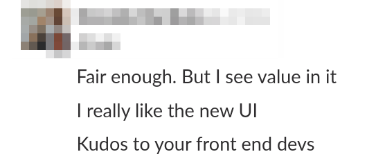

Today, Tines is a profitable company that continues to grow, builds strategic partnerships, and hires more talents to reinforce the product team. Martians are continuing to enhance the user experience and to support frontend and backend developments.
If you want to learn more about the UX and frontend modifications we performed for Tines—check out “Keep up with the Tines: Rails frontend revamp”, the most recent article we published on our collaboration.
We are proud to go along with the customer from bootstrapping to the profitability stage. The Martians were able not only to implement the customer’s ideas but to offer our concepts that fly and, which is essential, meet the deadline.
Get in touch to discuss how Martians can help to improve your product UX design and reach the same results for your business.

