Images done right: Web graphics, good to the last byte
Topics
Translations
In this post: start taking web graphics seriously and boost application performance by learning (both modern and old-school) image format essentials. Dig into SVGs and adopt the latest and greatest tools to optimize graphical content: both vector and raster. Study the theory behind digital images and human perception of them to improve UX.
Did you know that, in 2019, the average web page destined for a desktop takes 2MB of traffic? Further, did you know half of everything that a web server sends to the user’s browser is graphics? This includes JPEGs, PNGs, SVGs, GIFs, and some other acronyms familiar to anyone who has ever built a digital product. And while one might think everything displayed on a web page is a matter of frontend development, we assure you that understanding images is essential for every member of a product team: from backend to design, to management, and customer support.
TL;DR and ToC
Instead of trying to describe the entire content of this long and winding article in words, we’ve drawn a graphical map for your convenience. So, start from the top, with the source image of a cupcake, and decide what you want to do!
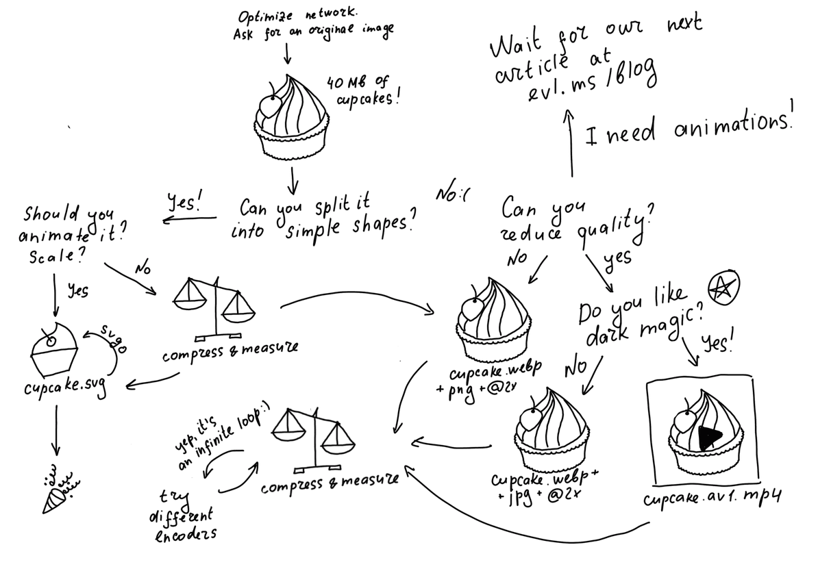
A visual TL;DR
Or, you can make a direct jump:
- All brands of pixels and DPR
- SVG magic
- Evil Martians’ Big Image Compression Cookbook
- Animations on the web
But if you have the time (and patience), just start reading from here! Good luck!
A curve and a tuple walk into a bar
While, technically speaking, hypertext, envisioned by Douglas Engelbart as a pillar of modern communication, does not need images to convey information, user attention still needs to be guided by graphical content that stands out: images, video clips, CSS-animations, canvas drawings, WebGL, even Flash—that obscure technology of ancient times—everything is fair game in the constant fight for user retention.
From the computer’s perspective, every image is just a sequence of specific instructions. But how they get translated into hardware pixels displayed on a screen is an exciting story in itself. First of all, most image formats out there, with the notable exception of BMP (Microsoft Paint, anyone?), do not explicitly store pixel values. Some math is involved in decoding data contained in a file into an array of color-coded values, with Red, Green, Blue being the most obvious way to convey color.
RGB is just one of many color models in existence. Our personal favorite is YCbCr which takes into account the way human eyes and brain work: we’re actually more perceptive to changes in luminance than to variations in color.
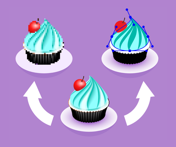
When dealing with vector formats, we think not in tuples, triples, and quadruples, as in raster formats, but in geometric primitives: lines, circles, and squares that are all, basically, just curves.
Moving on, PNG, GIF, JPEG, WebP, HEIC, AVIF are raster formats, SVG is a vector format. We’ll cover all of them below.
Seeing the big picture
The image below was meant to be 37.8MB in size to show a source file from a professional video camera. Out of respect for your ISP (and the environment in general), we’ve done our best to compress it to 3.5MB without losing much quality.

37.8MB compressed into 3.5MB
However, optimizing an image itself is not the first thing you should consider when dealing with visual content on the web. First, you should evaluate the whole stack behind delivering those sweet, sweet bytes (yes, most of our image examples will be food-related!) over the network to the end-user.
Thus, you should ask yourself the following questions:
- Are you loading all the pictures at once, or do you only focus on those that need to be rendered first? (check out lazy loading)
- Have you considered HTTP/2 that supports multiplexing at a protocol level?
- Are you effectively compressing your assets?
- Are you using a CDN?
Still, we’ll leave that checklist as an exercise for you and focus on the images themselves.
Nothing is perfect
It’s your responsibility to your users to deliver the highest-quality image while using the least amount of resources: processing power (both server and client), memory, and bandwidth.
In this article, we’re mostly concerned with technical image quality—so, this means we don’t take into account things like composition, perspective, or color harmony. In fact, we’ll assume that we’re already starting with some “ideal image”, and we need to put a version of it on the web in the most optimal way possible.
Here, by image quality, we mean the extent to which a resulting image differs from the “ideal image” we’ve already been given.
Essentially, when we say “quality,” we primarily have the following factors in mind:
Sharpness

Sharp vector image on the left versus blurry raster one on the right. Compare in Codepen
Color accuracy

True color on the left versus twenty colors on the right. Compare in Codepen
Lack of artifacts

Smooth rendering on the left versus pixelating on the right Compare in Codepen
Eyes, brain, and context
As a frontend developer implementing a mockup in HTML and CSS, or as a designer who is creating this mockup, you’re effectively solving the same problem: the need to illustrate some concept for your users through images. So it pays off to keep in mind the context before you even get to the tools. Take a look at the following examples:

Different image contexts
In the case of a card (1), the picture itself is the main content: we expect the user to spend some time looking at it, so we need the best quality possible.
In the case of a banner (2), the text is more important. The picture is there just to keep the company. You can take your optimizations to eleven without the fear of pushing your users away.
In the case of an interactive element (3), both text and image are equally important, as they call for user action. Such elements need to be scalable, reusable, and take up as little space as possible—that’s why it makes sense to ditch raster for vector images here.
Another critical factor is human perception. As we’ve mentioned already, luminance and contrast are more important than color, so we can save on colors without anyone noticing.
Let’s also keep in mind that the images are going to be rendered by browsers on some physical device, so, the screen (and different browsers) render images a bit differently. Although, sometimes you need to squint really hard to notice these (and if you don’t happen to have a Retina screen, you may be out of luck):

Same image in different browsers
You should account for those differences and provide different images based on screen type, viewport size, browser flavor.
Not all pixels are created equal
What is a pixel, after all? Nowadays, even a toddler who has spent some time watching “Peppa Pig” on their parent’s phone would probably have some idea. However, initial intuition is not always correct.
When we say “pixel,” we actually mean one of at least three very different things: a point in a hardware sense, a point in a CSS sense, or a point in an “image data” sense.
The trickiest one is the so-called CSS pixel, which is described as a unit of length, which roughly corresponds to the width or height of a single dot that can be comfortably seen by the human eye without strain.
When you’re reading text on your phone, you hold the screen at a certain distance from your eyeballs, but when you look at a computer screen, you tend to be further from it to read comfortably. The larger the distance between the retina and the Retina, the larger the size a “CSS pixel” will have.
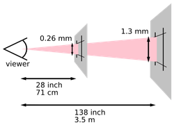
How CSS pixel is measured (from the CSS specification)
Without getting into too much detail, the “physical size” of a CSS pixel is a value in millimeters that’s different for every screen type and never changes. On Apple’s Retina screens (iPhones, iPads, Macs), this value varies from 0.11 mm to 0.23 mm.
And don’t ask us about the shape of a pixel (that’s a loaded question!), just remember that we use a single value, not a tuple.
A CSS pixel is also not the same as a hardware pixel, with the latter being just the minimal size of a dot according to a particular screen’s physical specifications.
Now, we can finally talk about device pixel ratio. Understanding DPR is extremely important if you want your images to look equally good on all devices.
You can open the DevTools in whatever browser you’re using right now and type devicePixelRatio to find out your current screen DPR. Note that if you drag the window to another screen (e.g., an external display), the number will update. We can calculate it like this:
devicePixelRatio = CSS pixel size / hardware pixel size
Let’s take an image with a width of 1000 pixels and a height of 1000 pixels. How does this map to our screen?
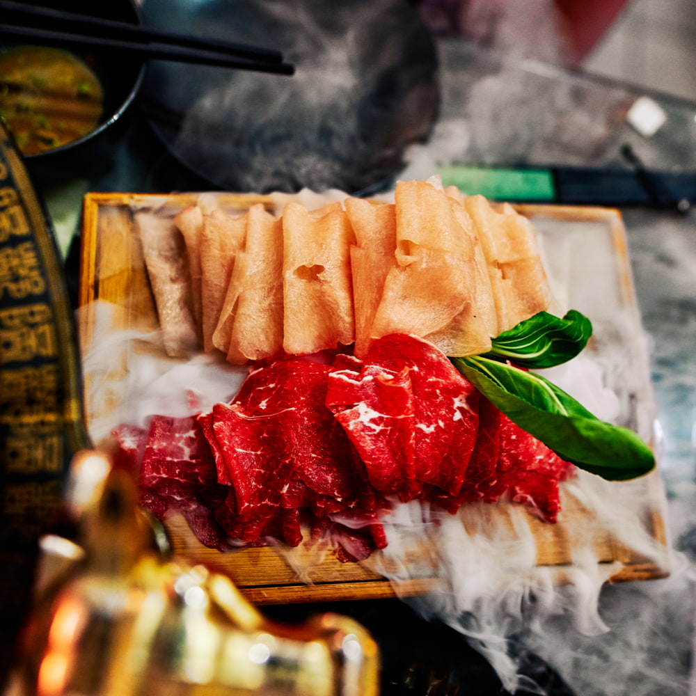
1000 × 1000 px image
Now, let’s put this image on a web page:
<img src="cake.jpg" style="width: 1000px;">By setting width to 1000px, you tell your browser to render 1000 * 1000 = 1 000 000 CSS pixels. If your device pixel ratio is one (non-Retina screen), than 1000 * 1 * 1000 * 1 = 1 000 000 hardware pixels are involved.
One hardware pixel is responsible for one “image” pixel, as intuitively should be the case.
But what if the DPR is two (Retina)? Now your image is rendered by 1000 * 2 * 1000 * 2 = 4 000 000 hardware pixels.
That means that one pixel of your image is rendered by four hardware pixels. Your image will be upscaled: every pixel of the image data is “stretched” to be painted on a screen.
A little pixel in a big world
As we’ve seen above, image dimensions no longer map to hardware dimensions one to one. And, as browsers have no way to tell the contents of a raster image, they use generic algorithms (Math! Math! Math!) to guess the best resizing strategy.
As you might guess, they don’t always guess right.
We can control this process with the image-rendering CSS property. That said, while it allows you to pick a strategy, but you still have no control over the particular algorithm chosen by the browser.
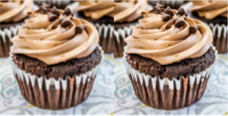
Different CSS image-rendering values displayed in Chrome
The image below explains how upscaling works:
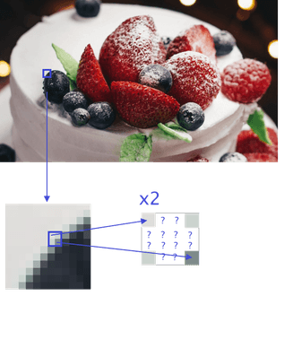
Scaling a 4px region to 16px
When scaling a 4px region to 16px, the browser has only four image pixels available, and the other 12 need to be guessed. So, blurry edges and other artifacts are a result of interpolation performed by a resizing algorithm.
Your goal is to avoid upscaling by any means necessary. Here’s how:
- Try to understand the context and settle on an acceptable quality.
- Resize the original picture via
max_size_of_your_container * DPR. - Have multiple image versions for the most common DPRs (one, two, even three).
- Account for this in your markup, like so:
<img srcset="cupcake.png 1x, cupcake@2x.png 2x, cupcake@3x.png 3x" src="cupcake.png">SVG: Scales Very Good
SVG stands for scalable vector graphics. So, by definition, SVG images are not afraid of scaling. Why is that?
Let’s take a closer look at the anatomy of an SVG file. The first thing we notice is that that the contents are written in plain text that is human-readable and which suspiciously resembles good ol’ XML.
Here, I did my best to draw a cookie using simple geometric shapes, and exported it as an .svg file:
<svg xmlns="http://www.w3.org/2000/svg" width="200" height="120" viewBox="0 0 200 120">
    <g fill="none">
        <ellipse cx="100" cy="60" fill="#FDC970" rx="100" ry="60"/>
        <path fill="#794545"
              d="M69.5433628,33.5480878 C65.8626549,33.5480878 61.7766372,31.1161129 58.1720354,32.2999373 C56.2746903,32.9232602 56.3815929,38.2702194 60.5900885,38.6347335 C65.4106195,39.0530408 69.8828319,39.0225705 69.3709735,33.1215047 C69.3550443,32.9383072 69.0442478,32.9992476 68.881062,32.9383072 M122.896283,19.855674 C118.705133,19.4005016 114.333451,17.1182445 110.322832,18.4897806 C108.631504,19.0679624 108.557522,23.9431975 110.322832,24.1549843 L110.835398,24.7019436 C113.283894,24.9953605 115.762124,25.3203762 118.217699,25.1021944 C121.980531,24.7681505 123.187611,20.541442 119.776283,18.861442 M153.981593,50.2878997 C152.356106,49.1322884 150.801062,47.8563009 149.105841,46.8206897 C143.614159,43.4659561 139.981239,46.0728527 142.624779,53.3021944 C142.882478,54.0071473 143.838938,54.2219436 144.547965,54.2862696 C146.88177,54.499185 149.286726,54.6590596 151.573097,54.1188715 C152.198584,53.9710345 152.378407,51.1380564 152.378407,48.2467712 M90.3642478,74.3676489 C90.1281416,74.2999373 82.6669027,71.6516614 80.7334513,72.3396865 C79.4789381,72.7862069 76.300177,74.2623197 77.5178761,74.8126646 L77.1681416,78.876489 C84.1083186,82.0122884 88.0523894,79.6845141 87.441062,74.061442 M41.1472566,60.9460815 C34.3621239,61.3455799 42.7111504,61.193605 35.5578761,60.1429467 C32.7461947,59.729906 25.1047788,62.6068966 30.1058407,66.3366771 C36.7384071,71.2830094 41.4778761,66.7895925 40.3543363,60.5902194 M141.784425,93.0744828 C135.735221,93.0744828 143.533451,93.3603762 131.213451,89.6674608 C127.678938,88.6081505 125.312566,93.9363009 127.677168,96.1651411 C130.754336,99.0647022 140.590442,98.4154232 140.590442,93.0221944 M113.093097,50.5941066 C110.309381,50.4473981 107.51823,49.9011912 104.740885,50.1547335 C103.281416,50.2878997 102.962832,56.4951724 105.088142,56.8611912 C108.850973,57.5097179 119.12708,58.2022571 112.47292,49.9373041"/>
    </g>
</svg>
You can’t see a cookie yet (wait for it), but what you can see is a set of tags:
<svg>is a container for our image<g>is a unit of composition (actually this tag is useless in the previous code example, it’s there for demonstration only)<ellipse>, <path>are geometric primitives.<path>is the most versatile shape. We can use it to represent all other shapes (circles, triangles, complex curves).
The appearance of a shape is determined by attributes.
In our example, rx, d, cx, and similar attributes are responsible for the size and position of the figures. The values of these attributes are just coordinates, but these coordinates have nothing to do with the screen’s coordinate system. Instead, they’re calculated relative to the viewBox of an SVG image. In our case:
viewBox="0 0 200 120"The above translates to: 0 pixels from the left and 0 pixels from the top of the document with a width of 200 pixels and a height of 120 pixels. This is the size and location of the viewport where our image is placed. Our SVG also has width and height attributes. These determine the real size of the image itself. In our case, that would be 200 × 120 CSS pixels (1).
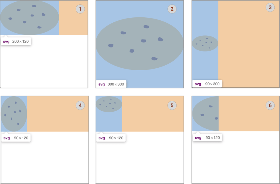
Playing with different SVG attributes: 1. Initial picture; 2. Removing width and height; 3. width:90px; 4. preserveAspectRatio: none; 5. preserveAspectRatio: meet; 6. preserveAspectRatio: slice
Let’s remove the width and height attributes. Now the size of our image is determined by the size of the browser window (2).
Another way to set the size of our image is to set width and/or height in CSS. For instance:
<svg xmlns="http://www.w3.org/2000/svg" viewBox="0 0 200 120" style="width: 90px" >The size of our image now is 20% of the height of the browser window (3).
But wait, why is our cookie vertically centered? The reason is, yet another attribute, preserveAspectRatio. The default value of this attribute is xMidYMid meet. This means (admittedly, not easily guessed): keep the original proportions of the image, keep the contents of the current viewBox visible, scale the image as much as possible, center the result both vertically and horizontally.
Let’s play with this attribute (refer to figures (4) to (6) above):
<svg xmlns="http://www.w3.org/2000/svg" viewBox="0 0 200 120" preserveAspectRatio="none" style="width:90px"><svg xmlns="http://www.w3.org/2000/svg" viewBox="0 0 200 120" preserveAspectRatio="xMinYMin meet" style="width:90px"><svg xmlns="http://www.w3.org/2000/svg" viewBox="0 0 200 120" preserveAspectRatio="xMinYMin slice" style="width: 90px">What if we want to see only a half of the cookie? Just cut the viewBox width:
<svg xmlns="http://www.w3.org/2000/svg" viewBox="0 0 100 120" preserveAspectRatio="xMinYMin meet" style="width: 90px">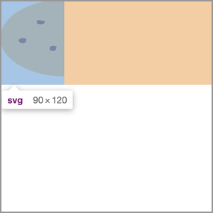
Changing SVG viewbox
viewBoxandpreserveAspectRatioare your best friends.
Using these attributes together, we can scale our images in millions of different ways.
The hidden powers of SVG
Besides tags, curves, and coordinates, SVG hides some surprises, too. First, you can put raster images inside them. So, always make sure to check if the SVG image you’re dealing with is really a vector image, because that might not be the case. This technique can be useful if we want to add some interactivity to an otherwise raster image, or to mark it up in some way.
Second, we can animate the paths inside an SVG image. This opens the door to the beautiful world of SVG animations.
Last, SVG files can also be dangerous. Nothing prevents someone from putting a <script> tag and some JavaScript inside the XML syntax. A browser will run this code, happily, and without question:
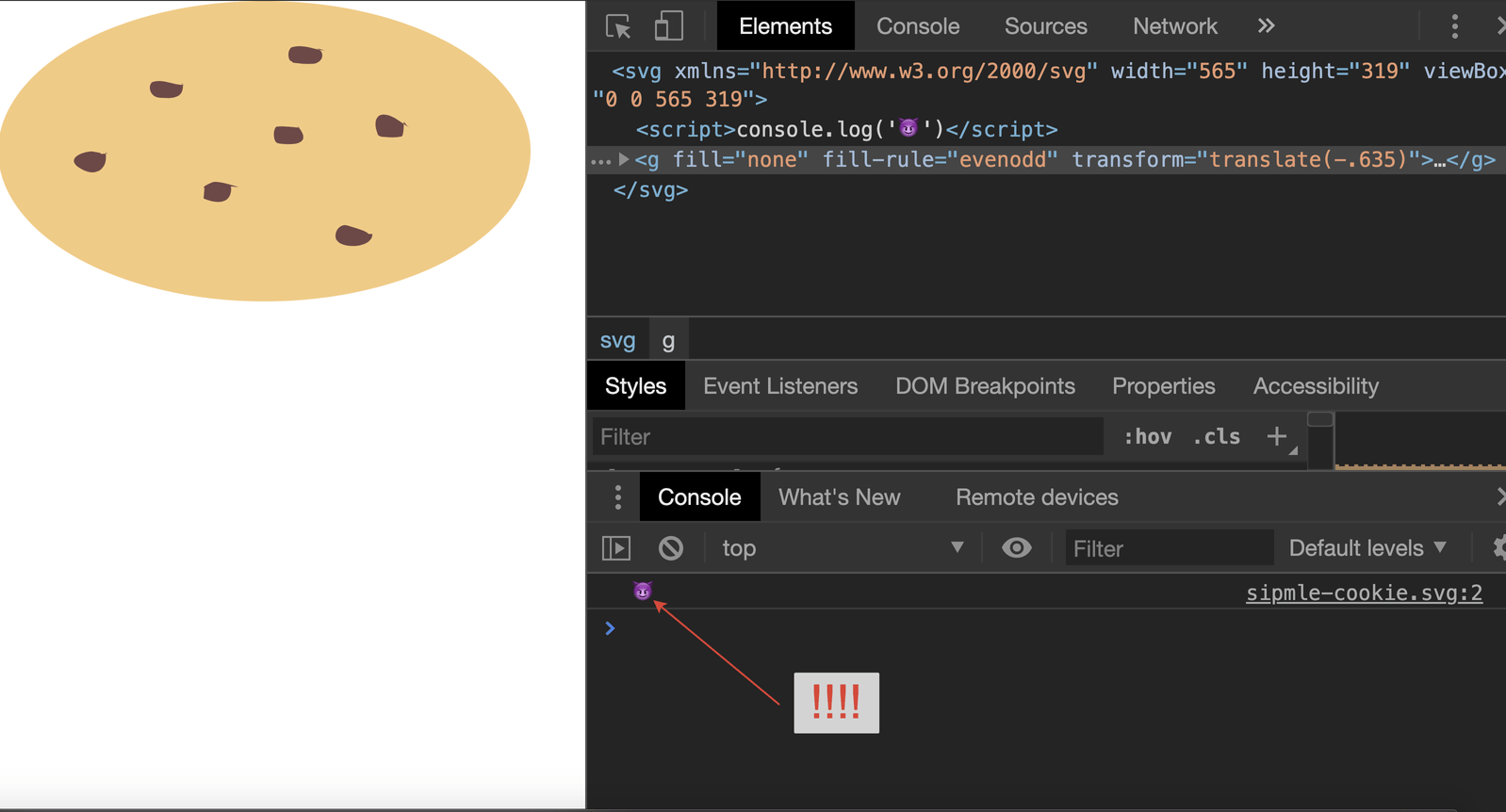
SVG files can be dangerous
Exercise caution whenever dealing with SVG images from untrusted sources! Generally, it’s always a good idea to take a peek inside before publishing an SVG on the web.
SVG vs. Raster formats
ОK, SVG images have superpowers. Should we always use them for simple graphics? Nope! Using an SVG gives us 26KB of cookies, while WebPs (read below!) store the same amount of cookies with just 16KB. And if there’s no distinction, visually, why pay more?
A lot of cookies
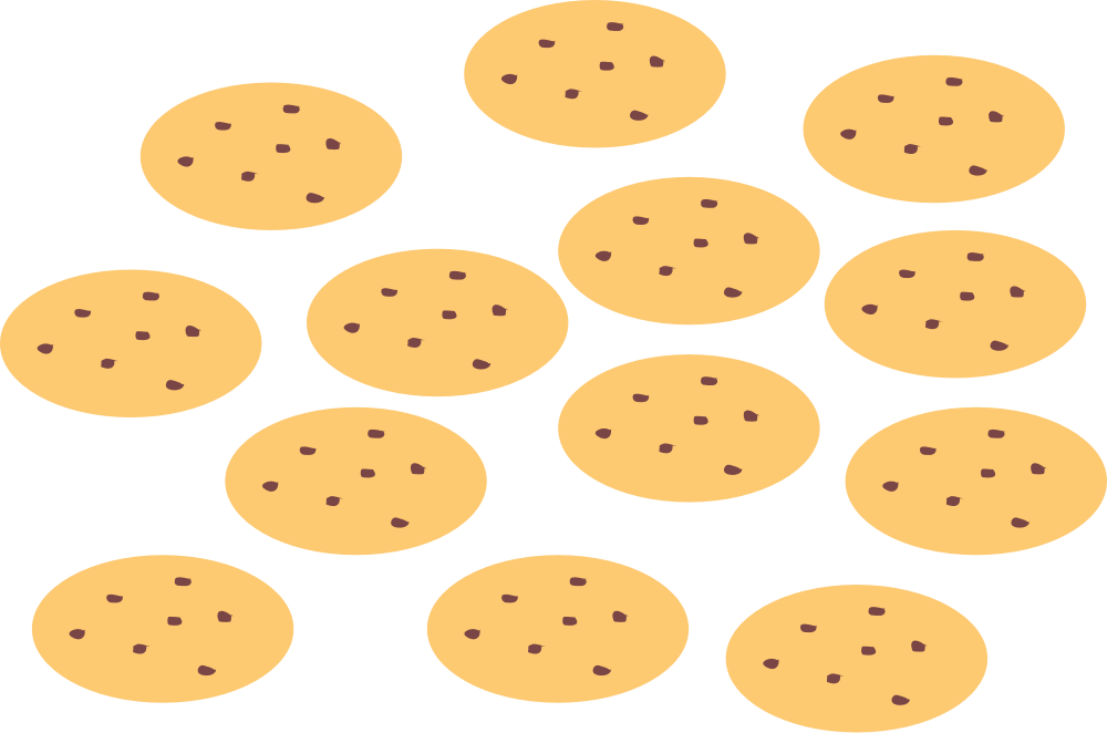
A lot of cookies
You can work with an SVG—creating and editing them—right in the browser console. But, to do it in a more comfortable and professional setting, you can pick any vector image editor. We can recommend Boxy SVG—it has a full set of options for working with vector graphics within its GUI, but it also has a built-in code editor if you want to get your hands dirty.
Now it’s time to optimize our SVG image with svgo. Finally, we have a 13KB SVG versus a 16KB WebP. Look, vector won again!
Now we want to make sure that we set up an asset compression correctly. Since SVG images are just text files, they compress very well.
We’ll repeat this many times: “There is no perfect format.”
But you can choose the right format for your task and apply as many optimizations as you want.
Now, let’s get back to raster graphics.
What is image compression anyway?
Let’s do some simple math. We have a 1000 × 1000 image. We can represent every pixel with four numbers. Three for color and one for opacity. Each number is represented by one byte. So 4 * 1000 * 1000 * 1 byte is a 4MB of raw image data—that’s quite a lot. We need to compress an image before sending it to the browser, and the browser needs to decode it back.
Compression algorithms are divided into lossless and lossy: the former guarantees that the pixels an image consists of will match the original exactly, while the latter will not hesitate to degrade your image to preserve space.
Compression is handled by encoders: programs that use a pipeline of algorithms that operate on the original image data at different stages of compression. At some stages, original data can be dropped, and that would result in a lossy compression (by the way, downscaling, as described above is lossy, too).
While working on a digital product, you don’t necessarily need to know the math behind compression algorithms, all you need to know is that the choice of an encoder, its settings, and the number of times you run it, will yield different visual quality, where the acceptable result depends entirely on your context.
There is no such thing as perfect compression, there’s only that which fits your use case.
See the different encoders in action:

Cupcake exported from Sketch

Cupcake encoded with OptiPNG, it’s 21% smaller than the previous one
Evil Martians’ Big Image Compression Cookbook
We’ve spent weeks compressing raster images for you, so you don’t have to double-guess. Note that all the comparison tables below are not proper benchmarks per se, as we did not perform measurements in a controlled setting, but rather used as tools as you would use in real life: play with the settings and compare the results.
We have scrutinized every common web image format through a set of tools, and we’ve shared our findings, so you can optimize your JPEGs, PNGs, WebPs, and GIFs in the most optimal way.
Here are the tools at your disposal:
- Any graphics editor (Adobe Photoshop, GIMP, Figma, Sketch) will have a spaceship’s dashboard worth of compression options. However, if you have a lot of images, treating each of them individually in an often costly software is not the optimal way.
- If you’re a Mac user, don’t look any further than ImageOptim (with a free, open source version), and also available online (paid). It has a dead simple drag-n-drop interface, and does not overwhelm you with knobs and sliders. It also comes with a Sketch plugin. However, if you want the fine-grained control over your settings, opt for CLI tools. Unfortunately, ImageOptim does not handle progressive JPEGs at all.
- In the vast land of CLI tools, ImageMagick stands out the most. It can not only optimize, but also crop, resize, rotate, adjust colors, apply various special effects to images of all possible formats, create progressive JPEGs, and much more.
Think Swiss Army Knife, for instance:
convert -strip -interlace Plane -gaussian-blur 0.05 -quality 85% image.jpg image_new.jpgThis creates a new file from an original image with reduced quality, blurred a little to reduce the size, with stripped metadata and plain interlace to create a progressive JPEG.
- Squoosh from Google has advanced compression options for lossy and lossless compression for images of different formats, allows you to resize them, or reduce palette with a side-by-side comparison. It’s also one of the best-engineered web apps out there. However, it works with only one file at a time.
- If you’re a frontend developer who works within the Node.js ecosystem and relies on asset bundlers like Webpack, check out these libraries: sharp (it uses the lightning-fast
libvipsimage processing library) and imagemin. - imgproxy is a fast and secure standalone server written in Go that can take care of your image sizes, quality, progressiveness, and interlacing, and even automatically detect when you can use WebP format for the current user! It transforms images on the fly as a separate service that you can easily host yourself, as it is free and open source. It’s a game-changer when it comes to handling user-generated image content, as it saves your disk space, processing power, and handles the main security concerns.
- Some CDNs provide automatic image optimization, detection of modern image formats, and conversion between supported browsers: Cloudinary, Cloudflare, Cloudimage, and others.
It’s time to take a look at which options work better with any given popular web image format. Stay tuned for benchmarks, comparison tables, and other juicy details that will help you pick the optimal compression strategy!
JPEG
We start with the decorated veteran of the web: JPEG has been around since 1992, and displaying 16 million colors was a big deal back then. It uses a lossy compression algorithm and is capable of storing metadata: dimensions, color profile, EXIF (camera settings information), and geolocation data.
Regardless of its age, JPEG still packs the powerful punch that is progressive loading. This ensures a smooth UX even in 2019 (GPRS is still a thing in half of the world)—just take a second to notice how Instagram or Twitter load your images on slow connections. To test if your JPEG image is progressive, you can use this super-simple web tool or ImageMagick CLI with the command:
identify -format "%[interlace]" your_file_name.jpgHowever, there are areas where JPEG has not aged well: it never learned to handle transparency. JPEG compression artifacts are so prominent that it practically spawned a new art form.
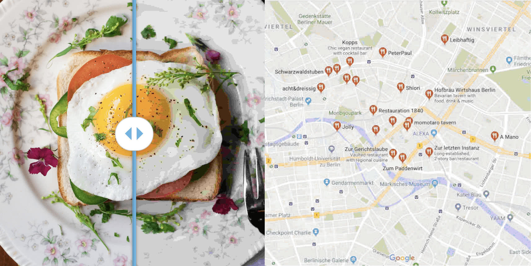
These quality loss artifacts look not fancy at all. They may appear even if you re-save your image many times or just use JPEG for maps or schemes
Let’s say we receive the following image as a design mockup:

JPEG in the foreground
One can quickly figure out the context: it’s a banner meant to attract user attention and the picture of lemonades is the primary visual content that should stay in the foreground. The photo was originally taken by a digital camera, so JPEG seems like a perfect fit: we don’t need transparency, and we don’t care too much about sharpness or details. However, we still need to compress it, at about 80% to avoid losing quality. We also need progressiveness to improve UX.
Let’s benchmark different options!

Compressing foreground JPEG with different tools at 80% quality
However, if a similar image needs to be used as a background, we can safely drop the quality to 25%, since user attention will be drawn to the foreground text, not the image.

JPEG image in the background

Compressing background JPEG with different tools at 25% quality
As far as we can see, Squoosh and ImageMin produce similar, great results (because they both use MozJPEG for compression and ImageMagick for quantization). ImageOptim is really useful if you don’t want to add progressiveness to your image, but we see no reason not to do it.
To summarize, JPEG is fine to be used in:
- Backgrounds
- Large camera photos: avatars, banners, etc.
- Images where super-precise quality is not our goal
PNG
PNG, short for Portable Network Graphics, is a lossless format designed in 1996 as a superior, patent-free replacement for GIF (as GIF usage was not free back in the day). The format itself is more flexible than JPEG or GIF and supports considerably more compression options, storing images effectively based on the number of colors they use. Its primary advantages over JPEG are support for transparency and much higher sharpness, which makes PNG an excellent choice for displaying computer-generated graphics like charts or schemas. It’s also way better than JPEG at handling rasterized text.
The tradeoff is that PNG files generally weigh more than JPEGs.
In real-world web development, PNGs are often used when we need to rely on transparency in our design. These vegetables will look good against a background of any color (except red and green, probably). PNG also helps keep those baby spinach leaves incredibly sharp. Before deploying to production, we’d want to compress the image at about 80% quality, let’s see how different tools would fare:
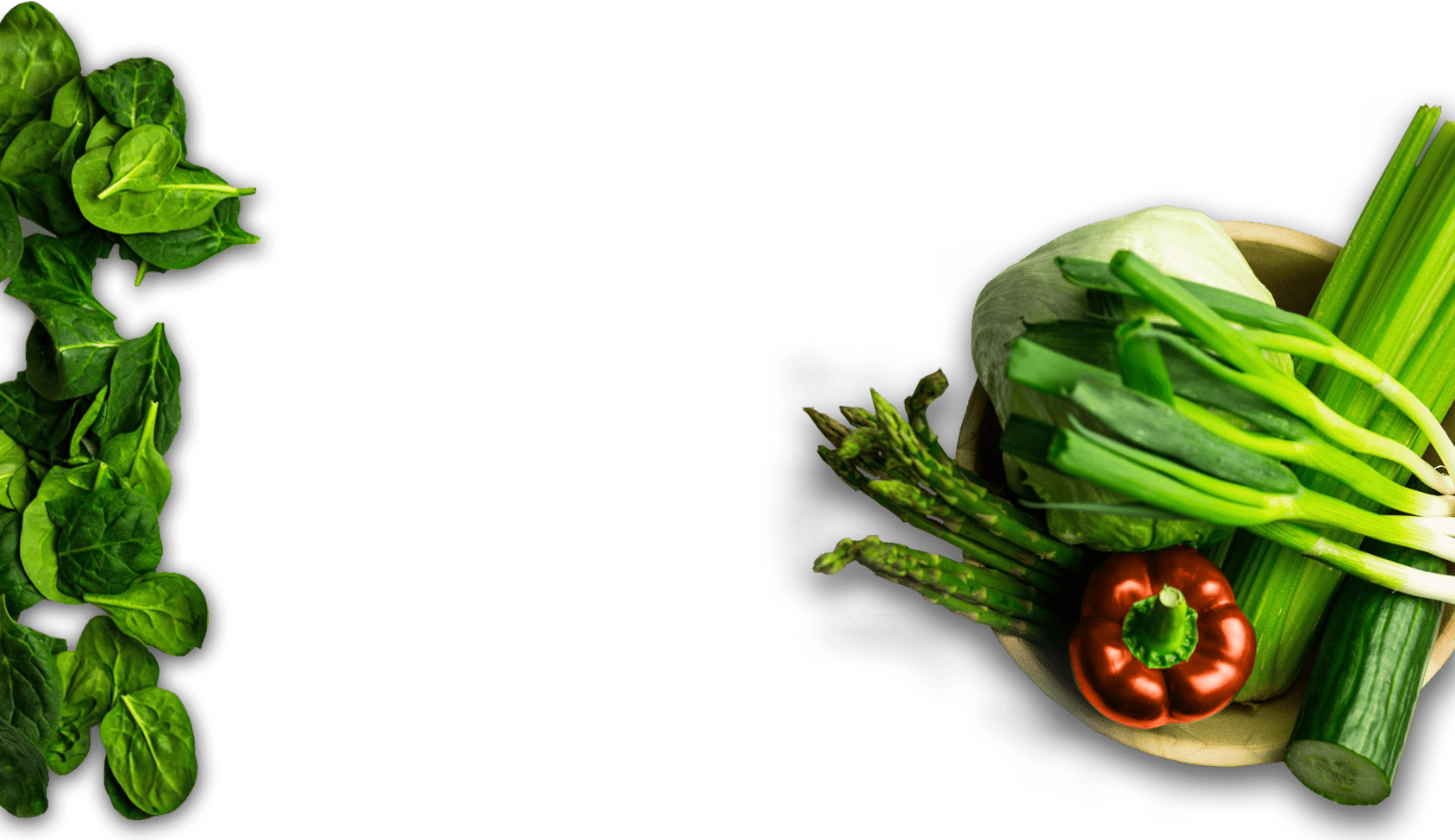
A PNG image to be compressed

Compressing PNG with different tools at 80% quality
We can safely say that interlacing does not improve our UX here, as the image becomes larger (and thus will take longer to load). The clear winner is ImageOptim.
To summarize, PNG is ideal for:
- Images that need to be transparent
- Charts, schemes, highly detailed maps; places where details matter
- Images that contain text
WebP
The youngest static format supported by most web browsers today is actually 9 years old: it was created in 2010 at Google, and perhaps the only reason not to switch to it right now is the fact that Safari does not support it, and you still have to provide PNG or JPEG fallbacks. It’s also hard to come by anywhere outside of the web.
But as you’ll soon see, the advantages outweigh compatibility problems. A lossless flavor of WebP outperforms PNG by keeping images sharp and transparent while the lossy version of the format wipes the floor with JPEG and still supports opacity.
If you want the best of both worlds, it can handle colors in a lossy way, while making sure that the alpha channel is still lossless. It also supports animations, but don’t get too excited over that, as we’ll show later.
Where WebP really shines is with compression at the lowest possible quality. WebP at 0% quality is still perceived much better by human eyes than JPEG at 10% quality.
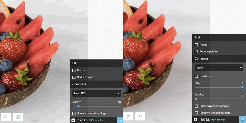
JPEG high compression on quality 10 have block artifacts and costs 128KB, while WebP compression on 0 quality looks smoother and the weight became 107KB
At 80% quality, the images are visually indistinguishable, but the WebP wins significantly in size: the same image from above weighs 412KB, versus 717KB with JPEG.
You can convert an image to WebP with all the tools we mentioned, except for ImageOptim. For the lossy benchmark we’ll convert that first lemonade JPEG image to WebP and look at the numbers:

Converting JPEG to WebP
For the lossless benchmark, the source image will be the PNG image with green vegetables from the examples above:

Converting PNG to WebP
The savings numbers from WebP conversion speak for themselves, reaching 90% of the original file size. However, even with all of WebP’s technical prowess, JPEG and PNG are not leaving the ring anywhere soon; WebP only works in browser environments: if you save a WebP image to a disk, you most likely won’t be able to open it with your sysyem’s default image viewing software.
The video hack
If all you care about is performance and browser support is not your primary concern, you can use the power of today’s most efficient video compression algorithms to compress a single frame, effectively rendering an image on a web page as a tiny looped video file, like this:
<video src="path_to_your_one_frame_video" autoplay="true" muted>Note the addition of the muted property; it’s necessary to have it since some browsers will refuse to show videos without an additional prompt from the user. If you want to try this extravagant approach, we recommend taking a look at the AV1 codec that we described at length in one of our previous articles. Be warned about adoption rates, though.
Animations on the web
GIF is perhaps the only commonly used web format today that actually precedes the World Wide Web itself: it was developed in 1987, long before cat memes became a thing. As it’s so ancient, it only supports 256 colors, and its lossless compression is far from state of the art. The reason for its world domination is that the world, frankly, did not have much choice: internet browsers supported GIFs from day one.
Using GIFs for animations on your webpage in 2019 is an incredibly bad idea.
GIF is really poor at inter frame compression, which powers all modern moving image formats. The alternative for GIF would be APNG (an animated flavor of PNG developed in 2008) or animated WebP from 2010. APNG shows better results both in compression and quality, while WebPs may still look blurry to humans.
APNG has decent browser support (except Microsoft Edge), so this image will probably display:
Salt Bae at his craft
APNG and WebP, while being more technically advanced, still have the same problem as GIF when it comes to inter frames. Even GIPHY, your go-to place for animated memes, usually offers an HTML5 video alternative.
You’re better off publishing your animated content as video files: either MP4 or WebM.
HTML5 .mp4 and .webm video files are actually just containers that store video data compressed by either of a multitude of different codecs like H.264/AVC, H.265/HEVC, or AV1. (We won’t go into the technical or legal details of these codecs as it deserves a separate article.)
Unlike animated “static” formats that store information about every particular frame, “true” video formats store a number of so-called keyframes and the information about changes between them (inter frames), and this allows for unparalleled compression.
But enough talk, time to crunch some numbers. We’ll start with a cheesy source GIF and convert it to WebP, APNG, AV1 as MP4, H.264 as MP4, and WebM, then determine a winner. We’ll use the CLI tools gif2webp and gif2apng, as well as ffmpeg. We’ll also use GIMP as an alternative way for converting GIF to WebP.
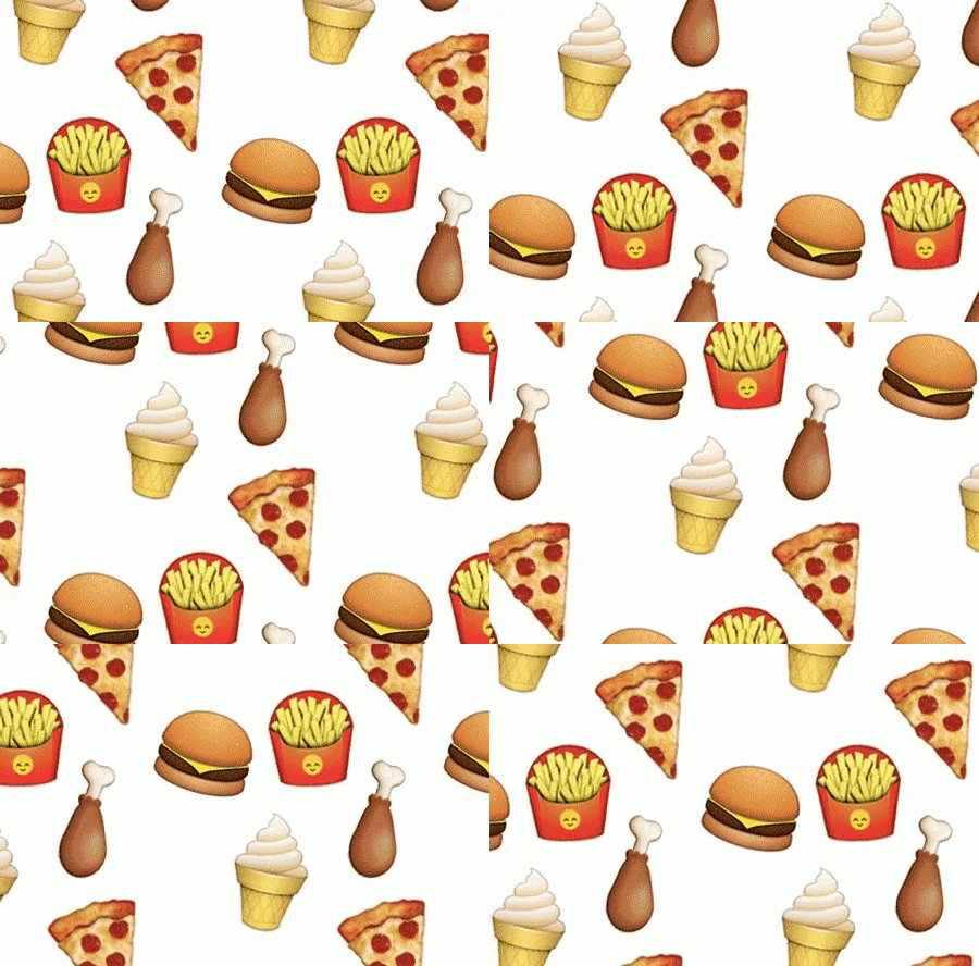
Animated GIF
And here are the results:
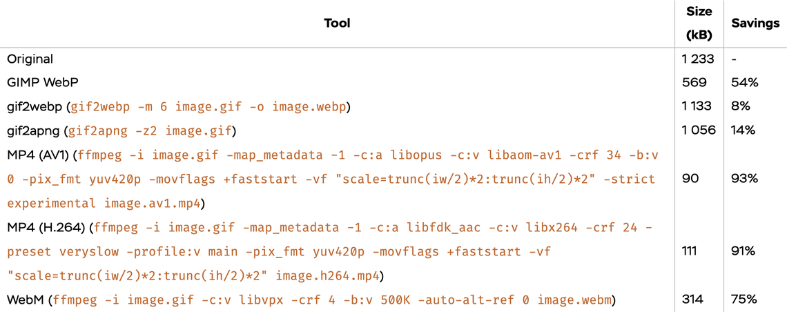
Transforming GIF to other formats
The size of the GIF is reduced by 90% when using video codecs and by 67% using compressed WebP via GIMP. So, if you want to make the web faster (and better), think about always using MP4 as an animated image instead of GIF. See, you don’t have to be a 10x engineer to reduce the size of assets by 10x!
How to use raster images in your markup?
Since Safari does not support WebP, we need to add some additional HTML code to provide a fallback to other formats.
Just use <picture> along with an srcset attribute
<picture>
    <source srcset="cupcake.webp 1x, cupcake@2x.webp 2x" type="image/webp">
    <img src="cupcake.jpg" srcset="cupcake.jpg 1x, cupcake@2x.jpg 2x" alt="a yummy cupcake">
</picture>
Add a media attribute into the mix to add dynamic conditions based on a browser’s window size:
<picture>
    <source
     media="(max-width: 799px)"
     srcset="cupcake.webp 1x, cupcake@2x.webp 2x"
     type="image/webp"
    >
    <source
     media="(min-width: 800px)"
     srcset="huge-cupcake.webp 1x, huge-cupcake@2x.webp 2x"
     type="image/webp"
    >
    ...
    <img src="cupcake.jpg" srcset="cupcake.jpg 1x, cupcake@2x.jpg 2x" alt="a yummy cupcake">
</picture>
If you want your image to behave like a background, just use the object-fit and object-position styles on an <img> tag inside the <picture> tag.
Thank you for reading! We tried to make this journey as fun and engaging as possible with abundant patisserie references, but if you noticed any mistakes or inconsistencies—please let us know!
Now you know that pixels are not created equal, what a CSS pixel is, and how it gets converted into hardware pixels through downscaling (or upscaling). You’ve learned about the wonders of SVG and whether or not you should prefer it to raster images (short answer: it depends!).
Before getting your hands dirty with knobs and sliders of numerous optimization tools, you know to think about your network stack and the visual context of the image in your design.
Finally, you have all the information necessary to pick between different image formats, and you can compare how all of them perform under pressure. You aren’t using WebP just out of FOMO, but you also don’t cling to image format dinosaurs (JPEG and GIF), because you are well aware of modern alternatives. And you never, never use GIFs for your animations.
You can now savor every bite of your sweet, freshly-baked web images 🧁!
Don’t forget to save our visual cheat-sheet for future reference; it can help you make optimal decisions when it comes to cooking your images for the web!


