Martian Grotesk is an open source font available under OFL license.

Irina Nazarova CEO at Evil Martians
It’s functional, has personality, plus, it’s readable. How’s that possible?
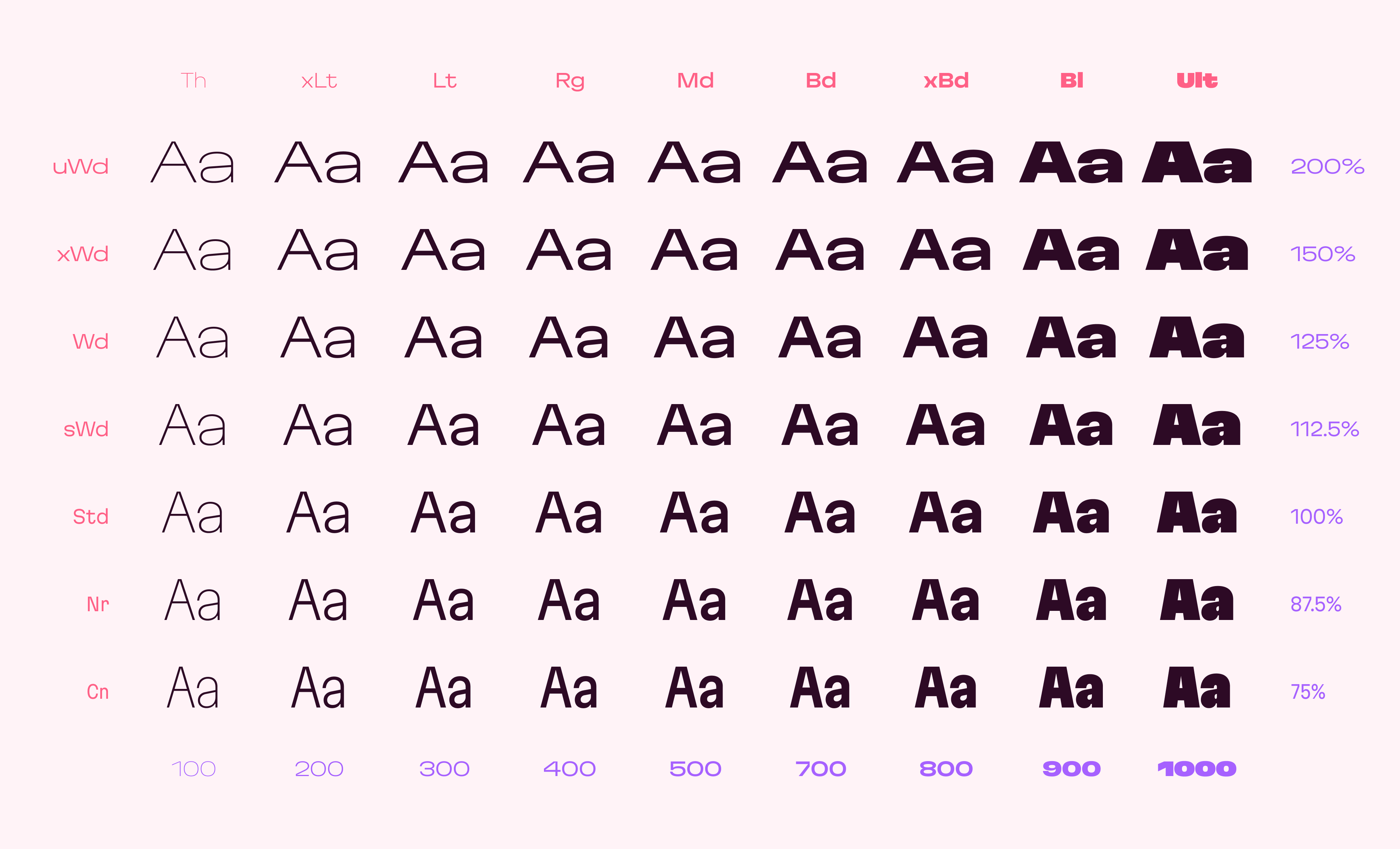
To address the problem of “uneven metrics” that plague nearly every single typeface on the market, we created Martian Grotesk. It’s a typeface with a strong personality that makes life easier for web and mobile developers, designers, and readers in the end.

Aesthetics
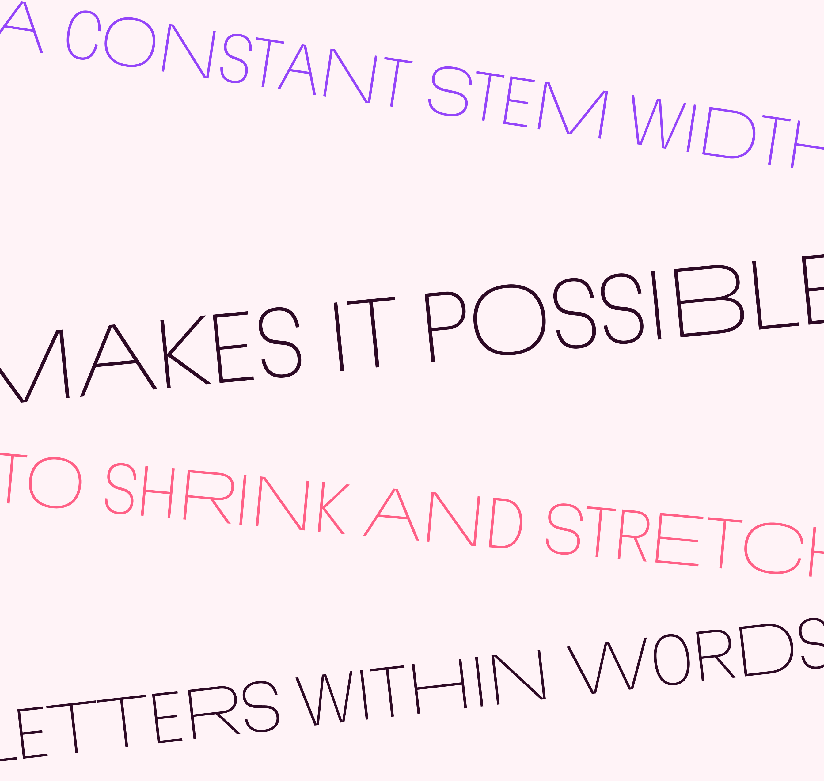
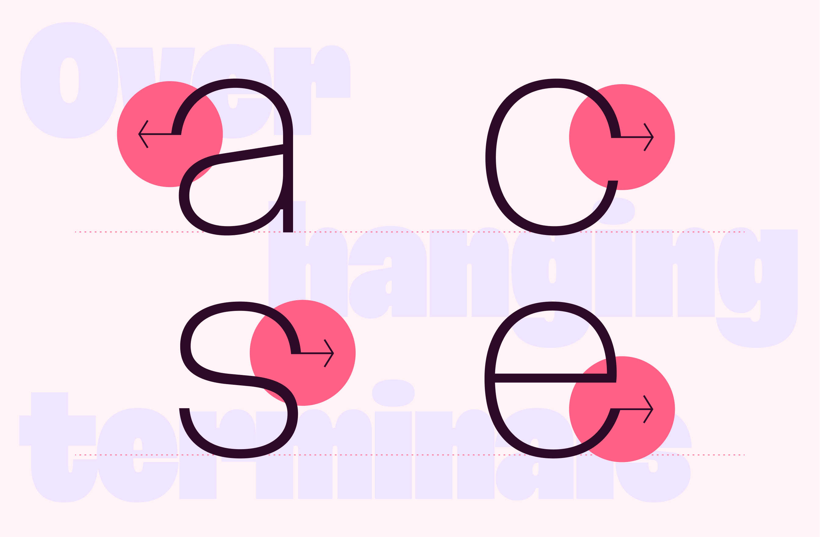
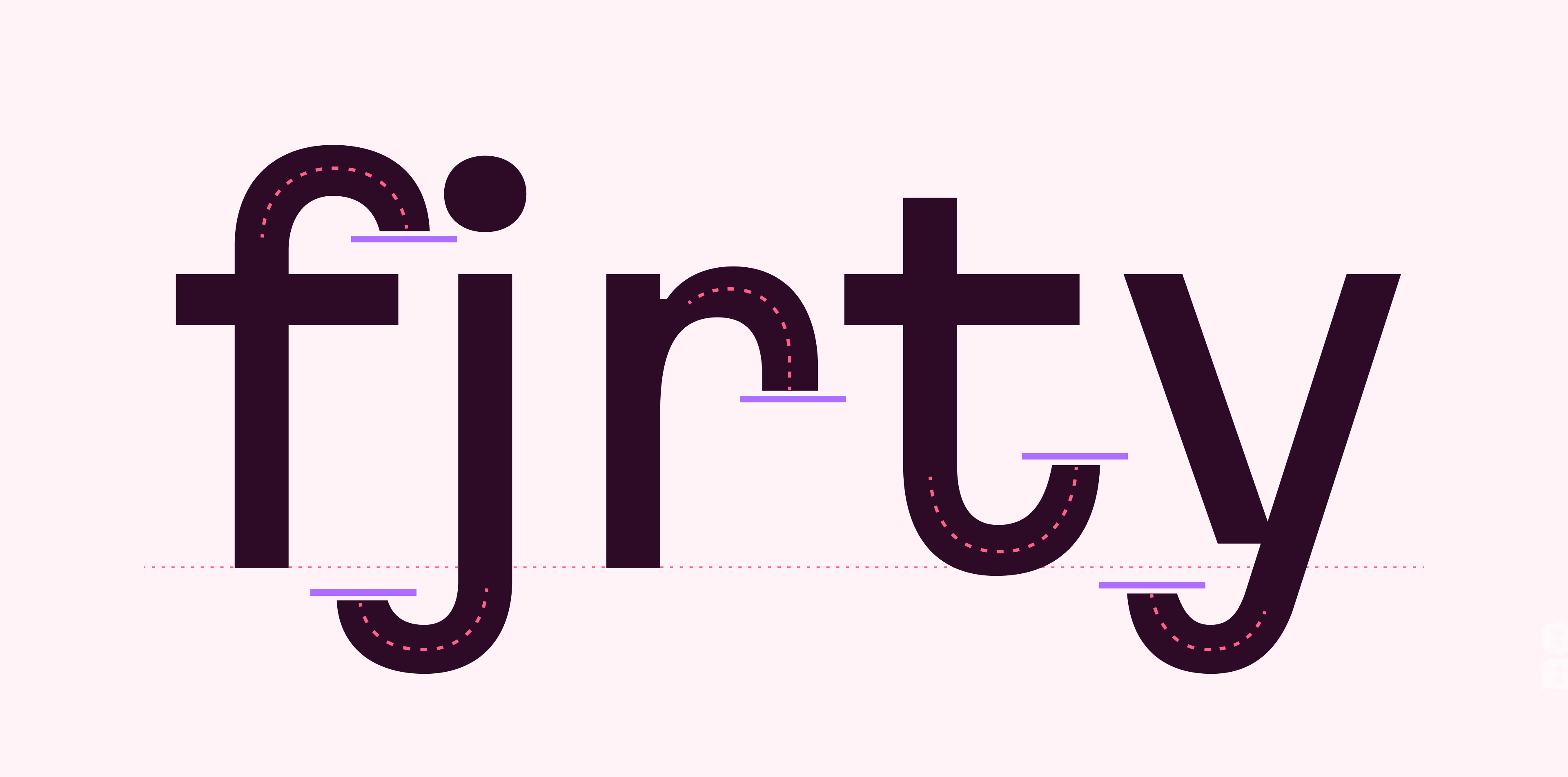
As you’ve already noticed (since you’re reading this text in Martian Grotesk), the font style is characterized by some brutality and assertiveness. Overhanging terminals, a closed aperture, and an almost complete lack of contrast lead to this effect. Further, some elements of the letters are especially enlarged.

This font gives any text the impression of being a “signature” style. We also did it to make the typeface catchy. Nevertheless, we keep the golden mean between its rebellious nature and readability.

Perfect for web development
We created Martian Grotesk for the web and digital project world. When laying out web pages, frontend developers are constantly faced with the fact that uneven metrics do not allow text to be placed evenly on some design element, for example, on a button. Instead, they have to compensate in some way, like making the top padding smaller in CSS, and the bottom larger.
This little deal really hurts. Also, if your project adheres to design system principles, you might be unable to stand a lack of systematic approach when working with fonts.
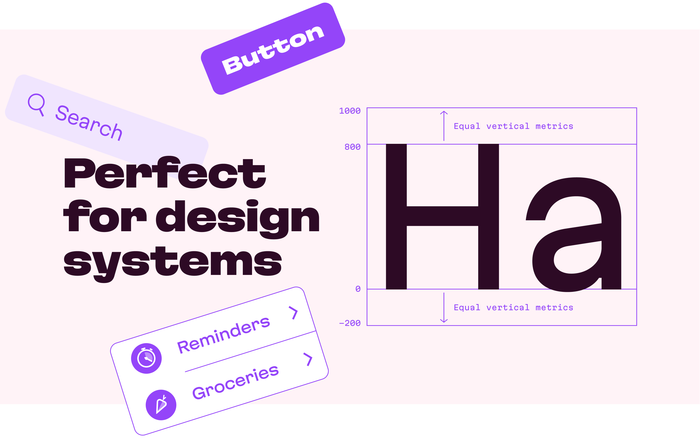
We researched and calculated vertical metrics and set them up in a way that guarantees equal space above the cap height and under the baseline. This enables the text labels to be evenly placed on buttons, inputs, lists, and forms.

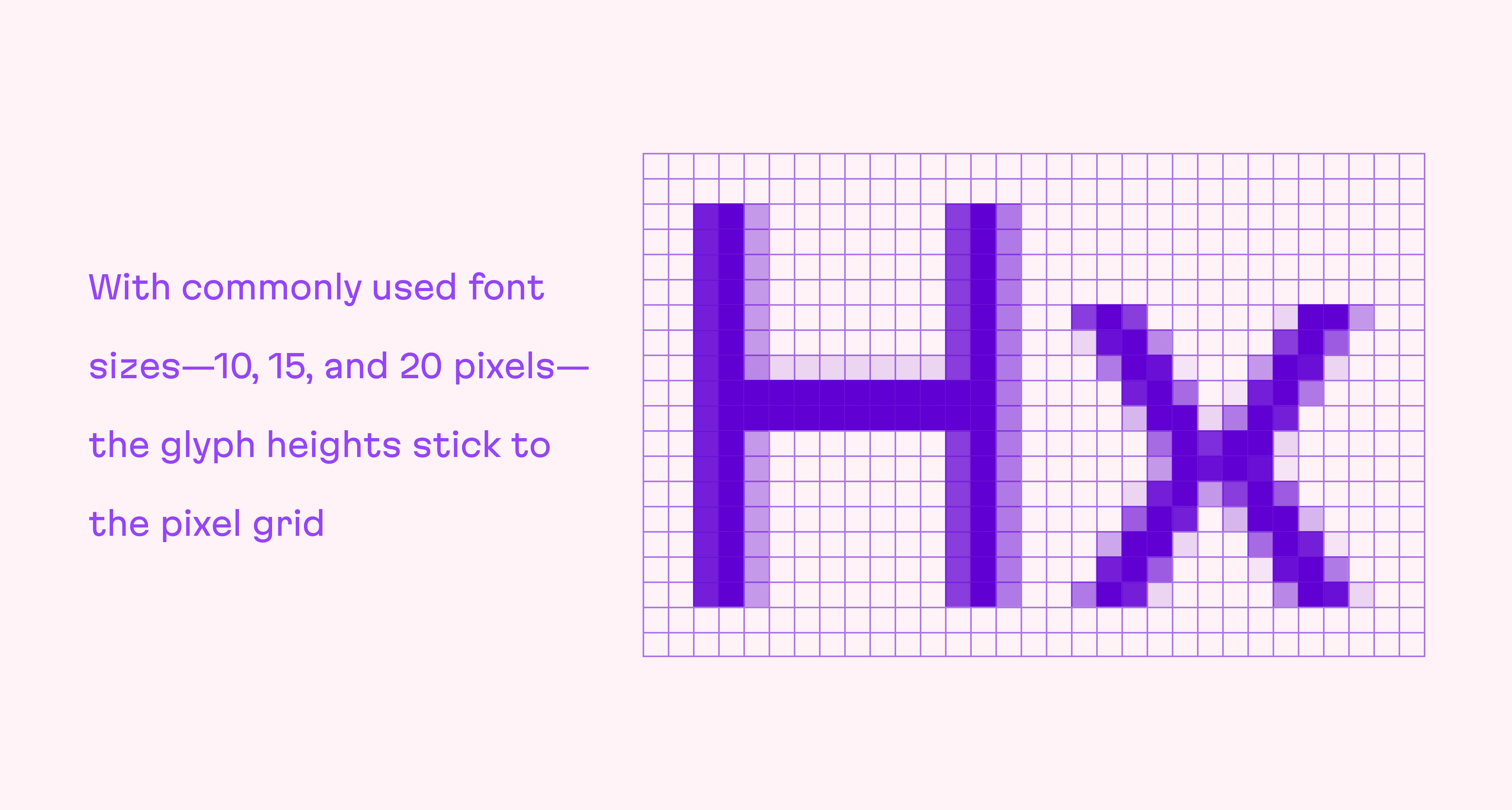
In addition, we found a proper ratio of the letter heights, so, on commonly used font sizes—10, 15, and 20 pixels—the glyph heights stick to the pixel grid. As a result, the letter shapes become sharper, which reduces the load on the reader’s eyes and simply looks much better. The typeface also comes equipped with OpenType and TrueType hinting, and Martian Grotesk appears legible on most platforms, even when being rendered in small sizes.

When coupled together, all the above features make Martian Grotesk a reasonable choice for any user interface design.