Variable fonts in real life: how to use and love them

Consumers, designers, and frontend engineers all have a lot of gain by switching to variable fonts: improved accessibility options, better file size management, and enhanced styling control. There are a ton of benefits, but everything boils down quite simply—the future is here, and we’re all winners! 💪 To find out exactly how and why, read on!
Other parts:
- Variable fonts in real life: how to use and love them
- The joy of Variable Fonts: getting started on the Frontend
So, just in case you’re not yet familiar with the concept, we’ll give a brief explanation of variable fonts. But even before that, in order to provide proper context to this discussion, let’s talk about a common font convention which is still ongoing: buying fonts by style. In other words, a system where each font is purchased per individual style.
Under this convention, in essence, you end up buying a separate OTF or WOFF2 file for each style: Regular, Italic, and so on. Naturally, under these conditions, budgetary concerns can begin to emerge.

We’d have to buy each of these.
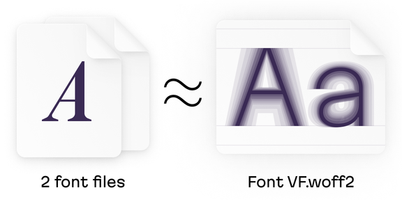
A variable font, on the other hand, consists of just one file which contains all the existing styles for that font. One font to rule them all. And this isn’t some half-baked concept digesting on a harddrive somewhere, we can take advantage of variable fonts right now.
Variable fonts and the axis of variation
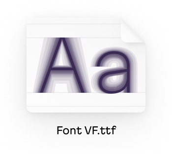
But how does this work? Well, instead of treating each font as a kind of isolated island, they’re now notched on a continuous scale called the axis of variation.
And, by definition, you can put a point on an axis… anywhere! This is where the magic begins! 🧙 Thanks to the flexibility afforded by the axis of variation, we can specify how a state is weighted at any point somewhere between Regular and Light, exactly as we please. This contrasts with the other way, where developers are forced into decisions based on font limitations.
The way the axis of variation works is simple. To make it perfectly clear, let’s start with our familiar Regular and Light styles. On the axis, Regular styles correspond to coordinate 400, while Light styles correspond with coordinate 300. With variable fonts, however, these labels aren’t so important: you can set the font weight as 301 or 399. Actually, we could set this value to be any number in the available range.
So, with variable fonts, it turns out that there are no longer styles in the old sense. Now we have, to paraphrase an old iPod commercial, a thousand styles in our pocket.
And actually, if anything, a thousand is not an exaggeration. Let’s do the math. We’ll assume a typeface has a weight axis ranging from 100 to 900 which is incremented by 1 and a slant axis running from 0 to 10 in increments of 0.1 (we’ll further unravel multiple axes a bit later). Since these axes are independent, we’ll multiply the 800 available weight values by the 100 possible slants. That’s 80,000 configurations!
In real life, of course, a style difference of 1 point on an axis will not be visible to the naked eye. But a 10 point difference is quite easy to see, and that’s still a lot to work with! 👀 With the figure above in mind, I’d suggest that a variable font can provide about 8,000 unique settings even with the minimal set of styles.
Now, where might variable fonts actually be useful in your work? Well, a lot of places! Let’s talk about some possible use cases.
Variable fonts in practice
Matching the design
For our first example, let’s say that you need to work with icons or illustrations, but you have no control over their design. Have no fear—you don’t need to complain to the people in charge of your company’s branding: with variable fonts, you can adjust a font’s weight to match the exact stroke thickness of the designs:
We can match the font on the right exactly to the width of the plus icon on the left
Working with small texts
Let’s consider another situation: we’ll just imagine we’re working with some very small texts. So, what can be done?
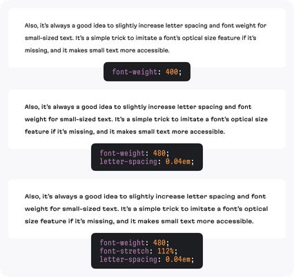
- The first (and most common) solution is adding some space between the letters. This is an easy fix because it’s not too demanding, and it works for both variable fonts and non-variable fonts.
- The second approach is to make the font’s style slightly bolder. Now, this is bit more tricky for two reasons: in order to implement this, the font in question should contain Medium or Semi Bold styles—this requires users to have purchased one of them.
- The third solution is to expand the font style a bit, making the letters bigger (but with the same height). And the bigger the letter, the easier it is to read. Similar to the second approach, the user will need to have purchased Expanded (Extended, Wide) styles. And this is quite a rare scenario in the world of fonts, indeed.
That’s well and fine if the stars align, but there can be problems here. For instance, let’s say you’ve purchased a Medium style: it could still look too bold or too light for the current size. Likewise, even if the font family has an Expanded style, it could look too expanded. You’ll just be left staring at this glaring imperfection, close but no cigar, clutching your armrest and wishing it was only possible to decrease this property just a little bit more.
As designers, we want to be able to implement all three solutions as necessary. Variable fonts can 100% handle the first and second points with ease, because of their ability to offer us more precise control mechanisms. And that’s awesome.
With the third point, sadly, variable fonts still aren’t quite there. Not every variable font offers a width axis with Expanded letter proportions—but it is becoming more and more common! Nevertheless, if a width axis exists, it can be fine tuned to get a more expanded or less expanded look as desired.
Dealing with contrasts
Finally, let’s imagine you’ve been tasked with helping to implement a night theme. But, another problem emerges! Even if we keep the same font size, if we change a dark font to a bright one, it will visually expand and appear bolder against the dark background we’ve swapped in for the night mode.
And, as a side effect of this quirk, the original intent behind the design is not entirely preserved. Check for yourself in the image below:
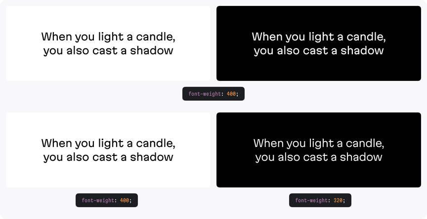
Why is this so? Well, it’s a matter of simple physics. We can think of a pixel as a bulb inside a lamp that can either be white or black. When a lamp is on, the bulb is shining and the pixel is white. When you switch the lamp off, the pixel turns black. When the light is on, the bulb looks bolder and it actually appears to be bigger than it really is. Likewise, everything white onscreen takes up more visual space.
So, white texts absorb black backgrounds, and white backgrounds absorb black text, which is even more apparent in this comparison:

The solution is to make the white text slightly lighter against the black background in order to compensate for this sense of physical expansion. Why do variable fonts more easily put this within our grasp? The reason has been covered: the ability to precisely increase/decrease the font’s weight makes it possible to finely specify the degree of this compensation.
The advantages of variable fonts: why has this taken so long?
In the past, we didn’t do all these things because, well, first and foremost, our screens literally weren’t ready for this brave new world. Prior to the widespread arrival of retina displays on the scene, the vast majority of commercial displays out there simply did not possess the level of fidelity necessary to show off such minor differences. Second, the highly precise control mechanisms that variable fonts give us were not available to us, and finally, (and here we begin to touch upon another big advantage of variable fonts) no one wanted to load the extra kilobytes.
Variable font file sizes and file counts
Let’s roll with that last point. A variable font’s file size is roughly as big as two separate non-variable fonts (the max I’ve seen a font as big as four non-variable fonts). Imagine a website is using a quartet of Regular, Italic, Bold, and Bold Italic fonts throughout its design. The size of each font face, we’ll say, is 40KB. We’ll also need to double this number of account for fonts in order to include the option to lighten up all of the text whenever a user switches on the night theme. So, in total 160KB. With just one variable font file, we could get all of this, plus thousands of more options, for the same or less memory cost! In fact, the more styles you use in the design, the bigger the savings!
Speaking of font counts, sometimes, (we’ll talk about it this in just a moment) a single font file could be a pain for font loading optimization because you can’t split it for delayed loading. On the other hand, it’s incredibly easy to manage a single file in your code. You never need to worry if you’ve forgotten to include some necessary styles. One file, one font-face CSS rule. And less code is always better.
Multiple axes illustrated via the width axis
What else could variability offer? Several different axes to play with (including simultaneously), that’s what!

Within the design space, (as seen in the image above) besides weight and slant, it’s also possible to control width. More than that, such fonts can have their proportions changed from Condensed to Wide (often referred to as Extended or Expanded).
Alright, so we have control options. But where can this control actually be useful in practice? They can be a useful tool when working on accessible design concerns. For example, as mentioned in the article Accessible design from the get-go, we could separate a secondary text from the main one by using a condensed style. This means we don’t need to compromise on size and color and we can keep side notes and picture captions large and with high enough contrast.

It’s pretty much the same deal with headlines. When adapting a desktop layout for mobile, designers often have to significantly reduce headline sizes. This is because, otherwise, any long words would not be able to properly fit the available screen width. But reducing size leads to the visual hierarchy suffering. For instance, in the normal context of a webpage, the difference between H2 and H3 headings would hardly be able to be distinguished. (That is, assuming they weren’t placed one after another, for some reason!)
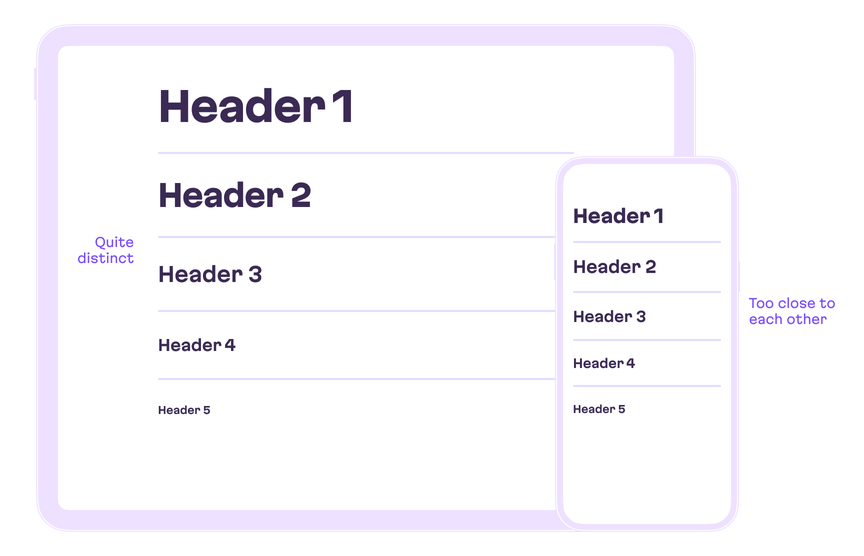
But suppose we had a typeface family that was condensed enough to work; in this case, it could even allow us to keep the same font size for both desktop and mobile screen sizes.

So, the presence of any condensed style is a font win! The key here is an effective utilization of available horizontal space. Not enough space → compress the text. Too much space → expand it!
Further expressive power
Inside the design space, we can manipulate these traits upon any possible axis of variability as desired—each parameter can be very precisely tuned, and there is no need to load dozens of files to do so. The future is already here!
And that’s serious. To emphasize this, right now, in your web applications you already can use all the power of variable fonts: they are supported by all modern browsers, that’s 92% of the global userbase!
And, of course, on the web, any kind of dynamic expression of any of these axes is possible. And you can simultaneously animate as many of them as you want. Anything can be an axis of variation, even if it’s a bit crazy! Check out v-fonts support page, which is full of fonts exploring variability.
The future of the future
Another problem we sometimes deal with when working with mobile screen sizes is overflowing buttons and list text. Back in the early days, the developers working on the first versions of iOS came up with many great ideas: auto-shrinking, letter-space tightening, and truncation by ellipsis. These are, of course, still pretty smart tricks, but on the other hand, small text can still be hard to read, and truncation can hide important information.
Although I’ve yet to see it, I think that perhaps something like dynamic font width compression, which would allow keeping font size, would be a good solution—especially for accessibility reasons.

A showcase of variable fonts
Let’s take a look at some creative uses of variable fonts, starting with Flicker. Here, the axis of variability is used to control the degree of the wavy effect.
Another interesting example is the Climate Crisis Font. The typeface is an art project, and it’s a great example of variability being used to promote environmental awareness.
Pangea is more practical and contains an impressive number of features. Among other things, you can actually close and open the aperture of letterforms or pull and shorten the ascenders and descenders.
The disadvantages of variable fonts
I’m obviously a big proponent of variable fonts. Nevertheless, let’s touch on the downsides. As for the disadvantages of variable fonts, at the moment, I see them as pricing, software support, and some aspects of the file size. Let’s tackle each of these.
First of all, there are some unresolved questions about the pricing model. How should customers be charged for variable fonts? Should a font be valued by the sum of all possible styles in the family? Or should they be priced at a discount as part of a package deal? Further still, considering all the aforementioned benefits, would a variable font be worth paying more for? I don’t have an answer to this. And, there might be a lack of flexibility here, as it’s not currently possible for a customer to control the contents of the final font before making a purchase. We can’t exclude needless axes or set up limited ranges and then be charged a corresponding price.
Secondly, support. Now, at the start of 2022, no word processor and (almost) no video editor offers support for variable fonts.
Finally, the size of a variable font file might sometimes exceed 200KB, especially one which contains a few axes and thousands of glyphs for multilingual support. So keep your eye on performance! Using glyphhanger or pyftsubset for subsetting a font’s character set may significantly help with this. Of course, with regard to file size, there is one more thing we should keep in mind. As I’ve already mentioned, the average variable font size is just about twice the size of a separate font style file. So any time a website would have otherwise used more than two styles in its design, the size cost of a variable font pays off. But in some cases, where loading optimization is crucial, it’s true that separate, small font files might work better.
What’s next?
That’s all for this time. Now it’s time to choose your own conclusion.
The long conclusion:
Variable fonts aren’t a perfect solution for every design problem we come across, and there are also technical considerations to keep in mind before using them. But, by pretty much any metrics, VFs are ready for the big time. It’s my hope that, having read this article, you’ll at least entertain the idea of using them in a project. Also, in the near future, we plan to upload a sequel post, where we’ll detail working with variable fonts on the front end in further detail.
Designers love the fact that, instead of having just set Regular and Medium styles, they’re get an almost infinite degree of control which makes the font adaptive for any context. We can lighten text when the night theme is on—without loading a separate file!. Or dynamically fit your text to the available space making it condensed to a needed degree.
Frontend developers love that all this power is packed into just a single file, instead of 49, and they get all these styles for the price of around two font files. Fewer requests, less traffic, less code. And further, browser support is sitting at 94% right now.
I could deploy any number of cliches about “the future”—that’s because they’re so appropriate!
The TLDR conclusion:
No time to explain. Get in the variable fonts car. 🚗
By the way, unless otherwise noted, all of the illustrations in this article were made with our own variable fonts, Martian Grotesk and Martian Mono, which are currently in the final stages of development. Want to get early access? Drop us a line at fonts@evilmartians.com. And follow Roman Shamin on Twitter, @romanshamin to get the latest updates about these releases!
And one more thing: if you’ve got a problem or project that needs help, whether it’s design-related, or not, Evil Martians are ready to help detect it, analyze it, and make it no more! Get in touch!
The joy of Variable Fonts: getting started on the Frontend
