Woah, opacity! A full guide to this badass hero of efficient UI design

Topics
Translations
- JapaneseUIデザインで役立つ「不透明度」使いこなしガイド
Transparent colors are a staple of modern operating systems, yet, for some reason, web apps still underutilize this marvel of modern interface design. And what happens when you properly integrate transparent colors into your design toolkit? You can minimize the number of design tokens, styles, and component variations—making your workflow more efficient and flexible. So, let’s talk about the ways opacity can be a game-changer in your design practice—and especially useful for startups and fast-moving teams!
1. A simpler solution for buttons
Designing secondary buttons can be more complicated than it seems, especially when you consider how they’ll appear across different backgrounds and surfaces. A button with a light color might seem fine on a white background—until you introduce more layers, like additional gray surfaces. Suddenly, your button isn’t visible and you’re forced to create multiple button styles, each with its own hover and pressed states.
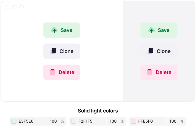
Placing light-colored buttons on a light gray background might cause them to blend in and become less visible
And here’s where opacity shines: by using transparent colors, we eliminate the need for these extra styles. One set of transparent colors adapts to various backgrounds, requiring only three states: idle, hover, and pressed.
This approach isn’t just effective for gray buttons—it works for any color, simplifying your design process across the board.
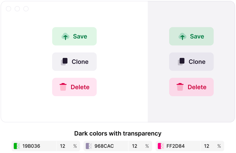
By using transparent colors you can easily fix this

Irina Nazarova CEO at Evil Martians
2. Streamlined and adaptable states
Like buttons, many interface elements require distinct states: hover and pressed. Designing these states with solid colors can lead to visibility issues, especially on different backgrounds.
Transparent colors solve this problem by adapting to any surface, ensuring consistency without multiplying your design work:
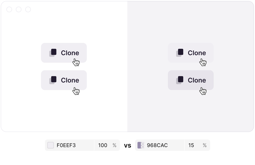
Increasing the transparency by 3% will result in a good hover color that works on any surface. The same solid color works on white, but not on gray.
3. Borders: the perfect case for transparency
When it comes to borders, transparent colors are almost always the best choice. This is because they maintain accessibility across various surfaces and work seamlessly in both light and dark modes. Unlike buttons and hover states, borders don’t require the same level of contrast maintenance, making transparency a clear winner here.
 demonstrates how transparent colors help avoid a lot of manual work](/static/b39f3be07916fd018e84aa5dbfdb5bcc/c2d5e/transparent-colors.webp)
This example from HTTPie demonstrates how transparent colors help avoid a lot of manual work
4. Effortless theme-ability
If your application offers customizable themes (like a white, greenish, or blue-ish background) transparent colors are invaluable. They blend naturally with different surfaces, eliminating the need for separate color sets for each theme.
Perfect examples of apps that can benefit from this are Slack or Zed, where user customization is a key feature. Transparent elements automatically adapt, providing a consistent experience with minimal effort.
If your product uses transparency, you can change the background color and the whole product will adapt
All that said, while properly utilizing opacity can offer significant benefits for your designs and workflows, there are a few considerations to keep in mind.
Contrast levels (WCAG/APCA compliance)
The contrast of transparent colors can vary depending on the background. For instance, #000000 at 8% opacity might meet contrast requirements on white and light grey backgrounds but not on darker backgrounds. If strict accessibility compliance is essential, solid colors may be necessary.
We’ve built a little demo to understand how contrast ratio correlates with opacity and background colors. The results are interesting to say the least, if you have a set of gray colors for surfaces (for example, Radix Colors Gray scale) and #000000 color with opacity range up to 20%, your CR will be pretty consistent.
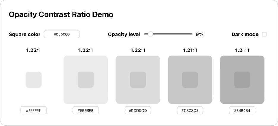
The change in contrast ratio for gray colors is insignificant when done correctly
Pretty much the same holds true for the grayscale of Radix colors in dark mode and a #FFFFFF square. The change in contrast ratio is insignificant if you keep the opacity around 13%.
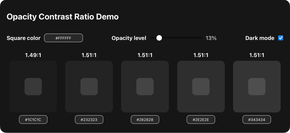
Change in contrast ratio for dark mode is insignificant too
You can still use opacity in your Figma designs, but by converting everything to solid colors and adjusting little mistakes; this is how the old Figma design system used to work.
Border overlapping
Semi-transparent borders can create an overlapping effect that’s visually distracting—be mindful of this when designing overlapping elements.

Pro tip: you can easily fix this by setting 1px paddings
Performance
While transparent elements generally perform well, older devices or those with weak GPUs—such as most budget smart TVs or 10-year-old smartphones—might experience performance issues, especially when displaying fullscreen opacity. Testing on a range of devices is crucial to ensure a consistent user experience. We’ve built a simple test stand for you to test if transparency will works on your device. We ran this test on a wide variety of machines, including an old laptop from 2011 with Intel Core i3, and got consistent 60 fps everywhere.
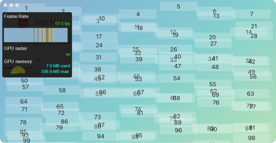
100 moving transparent rectangles on a gradient background at 58.8 fps on Intel Core i3
Opacity is a powerful tool that can simplify your design process, especially when time is limited; it’s an 80% solution with only 20% of the effort.
Sure, more sophisticated approaches like apcach or OKLCH can provide even better results, but they often require significantly more time and resources. For startups and fast-moving teams, embracing transparency in design can lead to cleaner, more effective results—without the need for endless variations and styles!


