UI design for HTTPie: macOS vibes for the API testing client


For Evil Martians’ designers, our project with HTTPie, an open source API testing client, was simultaneously one of our most challenging and creatively inspiring efforts.
The top dev tool project on GitHub
HTTPie is a popular open source terminal-based CLI tool that enables API testing directly from the console. Users can generate complex requests, automate testing flow, and use other features designed to make APIs simple and intuitive for builders. HTTPie’s authors have even developed a special language for attaching files and forming complex requests with parameters, headers, bodies, and so on—that’s why it has rapidly become one of the top projects on GitHub.
By the time our cooperation started, the project team had already secured funding and was going to enter a market of large corporate clients whose users needed the ability to work from several devices at once. Evil Martians helped create a cross-platform web and desktop app wrapped up in a sleek graphical interface to supplement their pre-existing CLI version.
Frontenders + Designers
The HTTPie team initially came to us with some frontend tasks to help them add features to their prototype. But we proposed a new, advanced approach that would make the feature development cycle much shorter: adding a product designer to the team. We proposed that it would be much faster to sketch a feature’s overall look and logic in a graphical editor so that frontend engineers could code it with the help of “visuals.” In addition to this feature work, we also sketched out a full interface draft for the web and desktop app.
We started, not with a classic design sprint, but with parallel work on prototype design and its finalization: the frontenders had their own pool of tasks related to adding new features, while the designers embarked upon UI redesign. We ran two designs in parallel for a while—we developed a feature with a new design and then adapted it to the current prototype.

The original prototype
HTTPie had set an ambitious goal for us: to build the best API testing tool possible, a golden standard for an entire class of similar tools (much like Figma has become the trademark app for UI design or Notion—one of the most popular documentation organization apps.)
Together with the client, we studied dozens of dev tool applications and analyzed their solutions for the particular problems we intended to solve. That analysis helped us understand each solution’s pros and cons and made it possible to clearly distinguish the issue at hand.
The new UI design proved flexible, scalable, and well-suited for adding, so the HTTPie team decided to focus solely on this new interface.
Writing the UI from scratch also allowed the frontend engineers to build precisely the new components they needed and modify them to their needs.
Dev tool UI specificities
The most crucial difference between dev tool UIs from other interface UIs is that, with the former, their users create; they do not consume. This creative process does not lend itself well to optimization. In other words, we cannot utilize any specific “happy path” and adapt the interface to this path since each user will work with the product differently, sometimes in quite unexpected ways.
The second thing that makes dev tool UIs unique is that users spend hours and hours working with them. In this way, they are similar to social networks, however, the aforementioned creative aspects of dev tools demand a higher level of focus from users, which ultimately consumes more mental energy. For this reason, it’s critical to reduce “interface friction.” So, if users are performing the same operation 100 times a day and you can simplify this action to be even one second less, over the course of a day, this single simplification can free up 1.5 minutes for more important things.
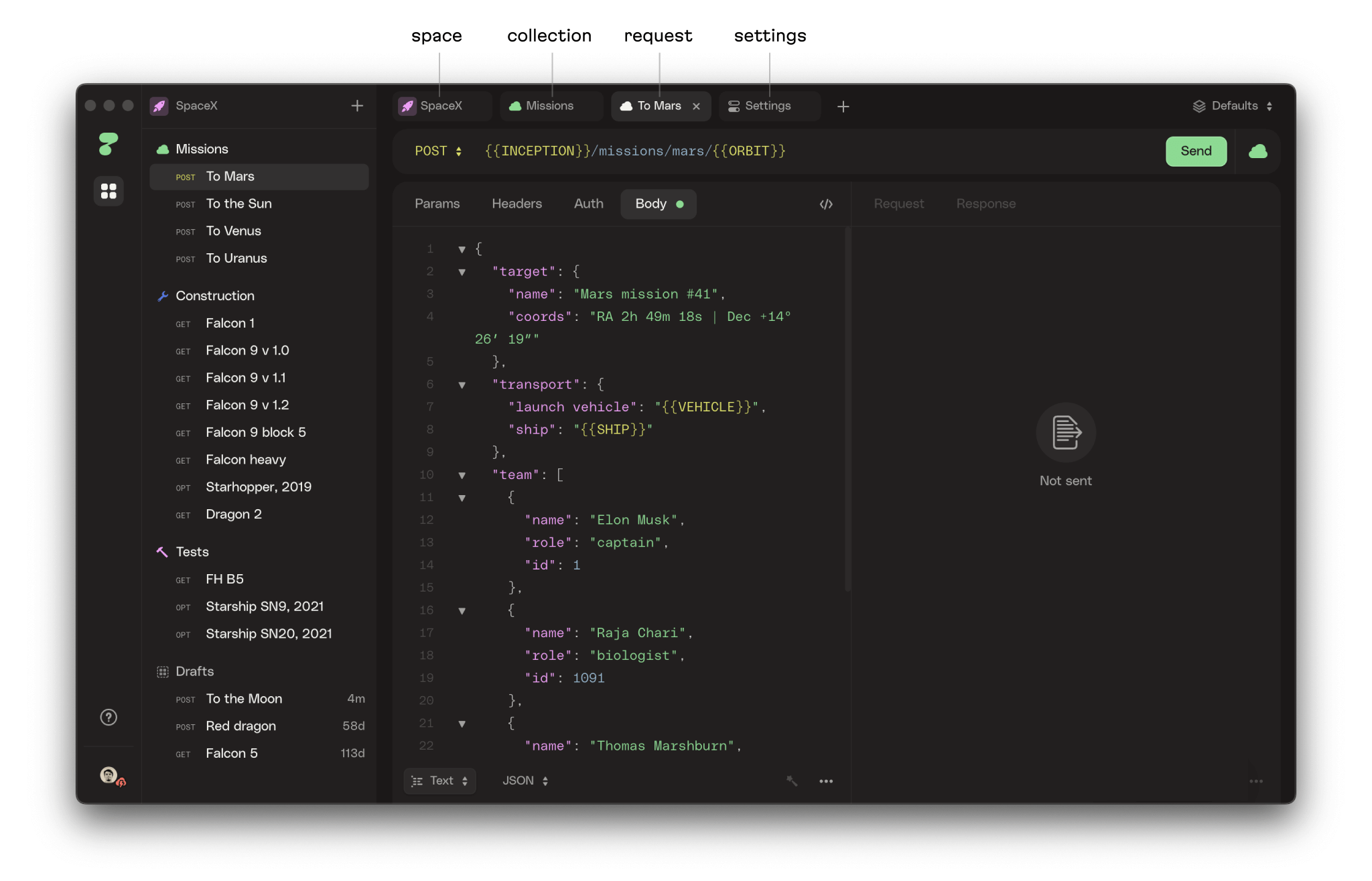
That said, the HTTPie interface differed from other dev tool UIs. Commonly, dev tools have one main area where users spend most of the time: the graphics editor canvas, code editor, or the “virtual paper.” There is no such area in the HTTPie app. Here, user attention constantly shifts from the request editor to the server response panel. This imposed specific requirements on UI organization.
Additionally, the project team decided to port the desktop version to Electron as a standalone application. This was a quick move technically, but the interface “felt” like a WebView page, so users saw a typical website instead of a true desktop app. We had a long discussion with the customer, did some research, and came up with an approach to make the UI more “macOS-native.”
Our efforts included things like mimicking the default cursor, having text non-selectable by default, no-hover effects, and many other stylistic imitations (and, accordingly, this list guided us while we were designing HTTPie’s UI.) We detailed this “macOS-ification” process in our article “How to make absolutely any app look like a macOS app.”
Choosing the layout
But, if we were really going to create “the best tool” ever, even a super-thought-out tool with automation and features for “senior” developers wouldn’t be enough. We aimed to make the app and the UI head and shoulders above the competitors. This would require a task not formerly assigned to us—adding some “magic.”
We set our goal for the interface as a combination of lightweight and concise UI design: an intuitive UX with unlimited functionality that would stand in opposition to bloated, cluttered interfaces that don’t care about user cognitive overload. We also decided to avoid using a vertical layout that looked like a layered cake.

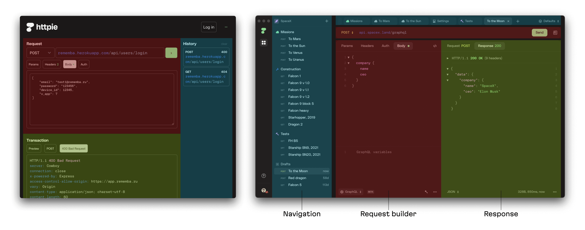
Vertical layout vs layered

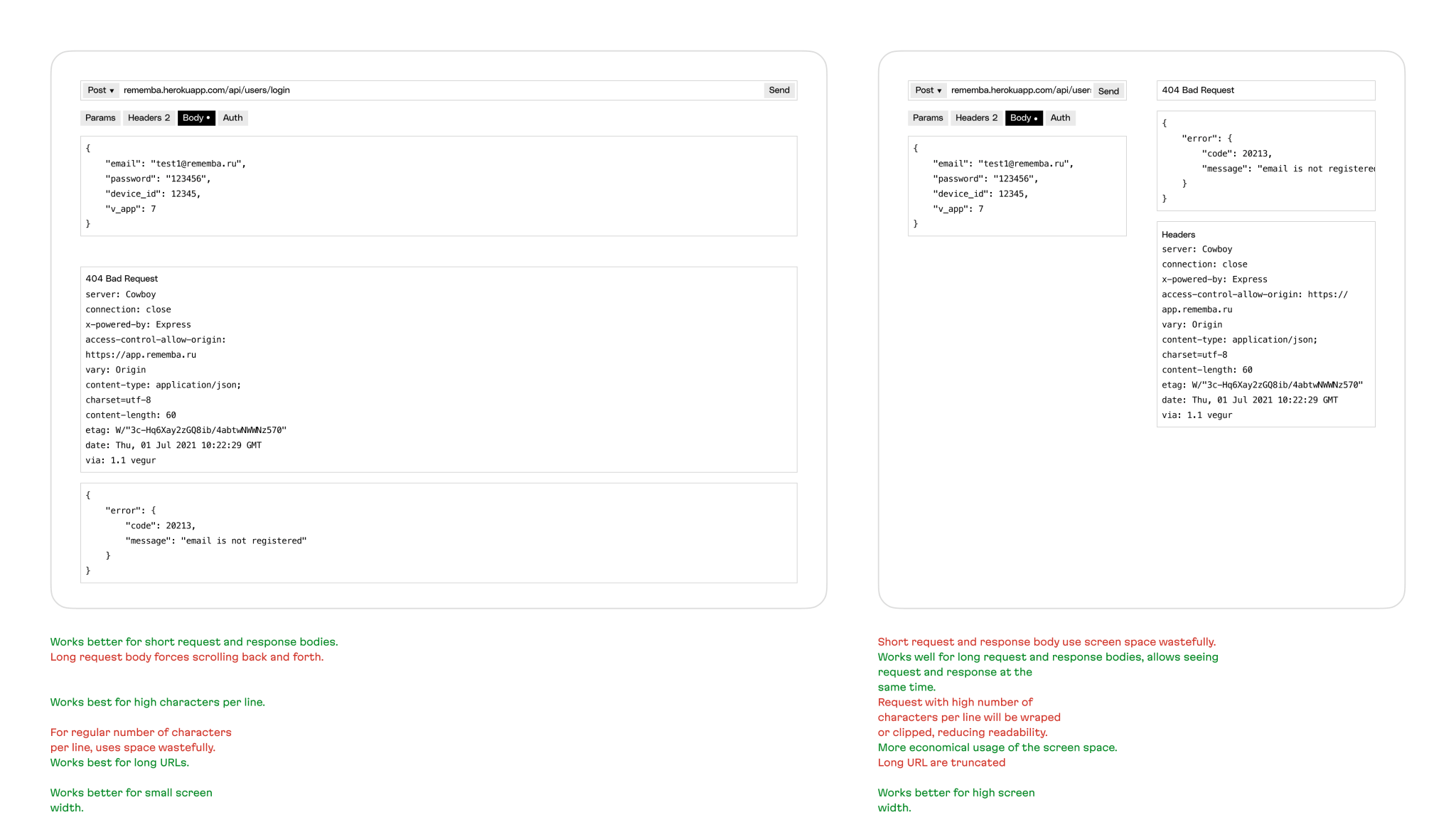
Space consuming
We prepared a different layout, something that was more classically in the realm of dev tools, and which offered a flexible “column” layout. A “layered cake” consumes a lot of precious vertical screen space (the panels are stretched horizontally, so there is usually more empty horizontal than vertical space). A “column” layout saves vertical space and fully consumes the horizontal space, and allows the app to more easily add functionality in the future.
”Magic” features
In addition to the main interface and flow, we helped the HTTPie team design some features (and implement them on the frontend.) Here are some of those:
Tabs
Although the client did not initially request this feature, while experimenting with different layouts, we understood that the tab system would organically fit into the new interface. After release, users liked this feature, and, we’re happy to say, it’s now emphasized in promotional materials.
Our thinking went like this: the request history is similar to the browser history: users only open it occasionally when they need to go back and check it. There was no need to reinvent the wheel here, because, after all, the user will need to work with several requests in parallel and switch between them sooner or later. So now, with tabs, users can pin the necessary requests and work without the risk that they will float away.

Workspaces
Since we could forecast future collaboration and real-time synchronization between different clients (web and desktop applications) as well as devices from which the user can work (including offline mode), we began to explore different approaches to collaboration.
There are many examples of real-time collaboration: pull requests on GitHub, Miro, Figma with real-time, visible moving cursors for different users, Google Documents with its constantly updating comments and ability to display where different users are currently looking. Each approach has pros and cons, and we’re currently evaluating them for future implementation.
In parallel with synchronization state fine-tuning, we worked on a challenging feature for organizing the user’s personal space—workspaces. We believe this feature has the potential to soon become multi-user and collaborative.

The task of adding workspaces seemed simple at first glance: we needed to add more space in addition to the main interface to display the new canvas. But we could do it in several ways: in terms of interface or architecture. The client asked us to spend time researching and choosing the most flexible solution before solving this problem. The HTTPie team wanted to ensure that the feature architecture would let them implement other multi-user features in the future.
We explored dozens of dev tools to see different ways of organizing workspaces. We sketched out 4 variants of data architecture with all the entities and their interactions. We analyzed the pros and cons of each variant and how each architecture might look in the UI.

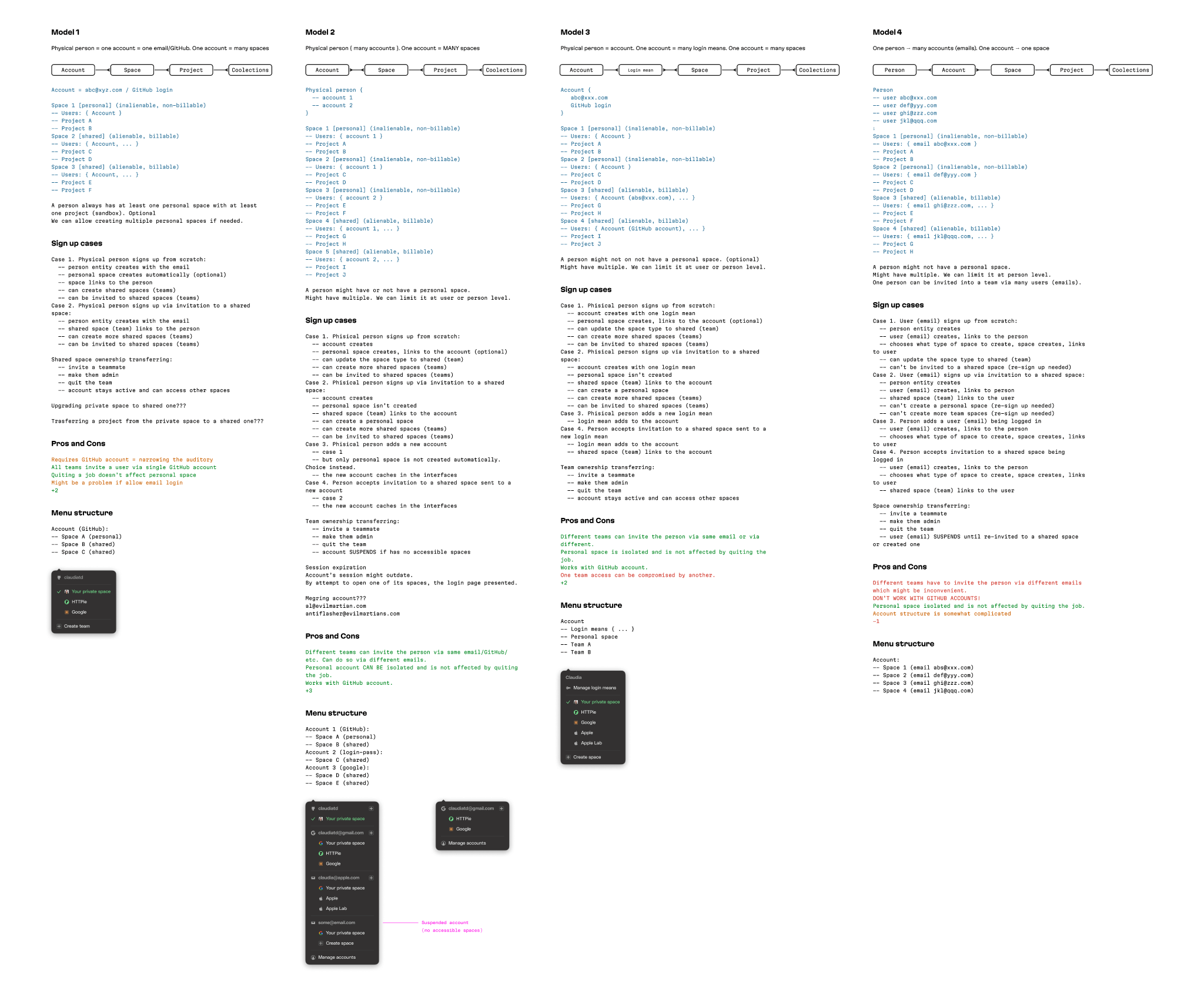
Variants for workspaces
The HTTPie team liked this visual approach to solving complex infrastructure problems. They still remember this case as an example of an effective solution. The option they ultimately went with worked out of the box and is presently still in service.
Onboarding
According to HTTPie user feedback, the app’s users quickly understand the interface and features. But the project team still wanted to improve and speed up this process. Therefore, together, we came up with a couple of features to smoothen out the user onboarding process.
First, we developed a system of banners that helps guide users through the app’s entire funnel.
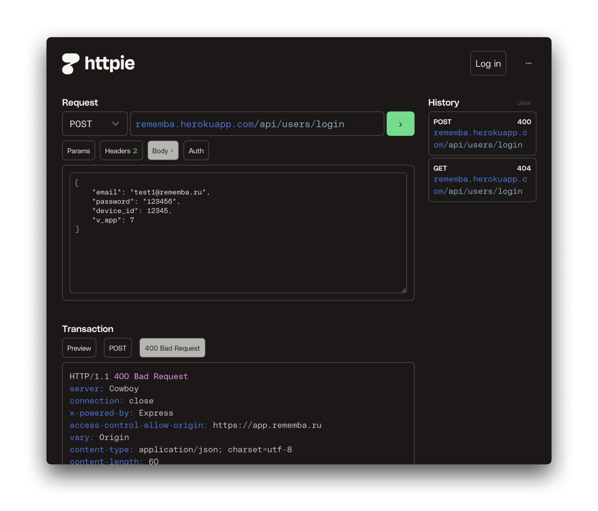
Second, most HTTPie competitors, unfortunately, do not care about barriers to entry in their application (we are talking, for example, the default URL in the address bar that new users see.) They either put a placeholder with a non-existent API address that returns an error, or they prompt to “Enter request URL” and return an error after sending a request. So the HTTPie team came up with the clever idea of onboarding users through the text coming from a server in response to the demo request. If the user doesn’t enter anything, we send a prepared response.

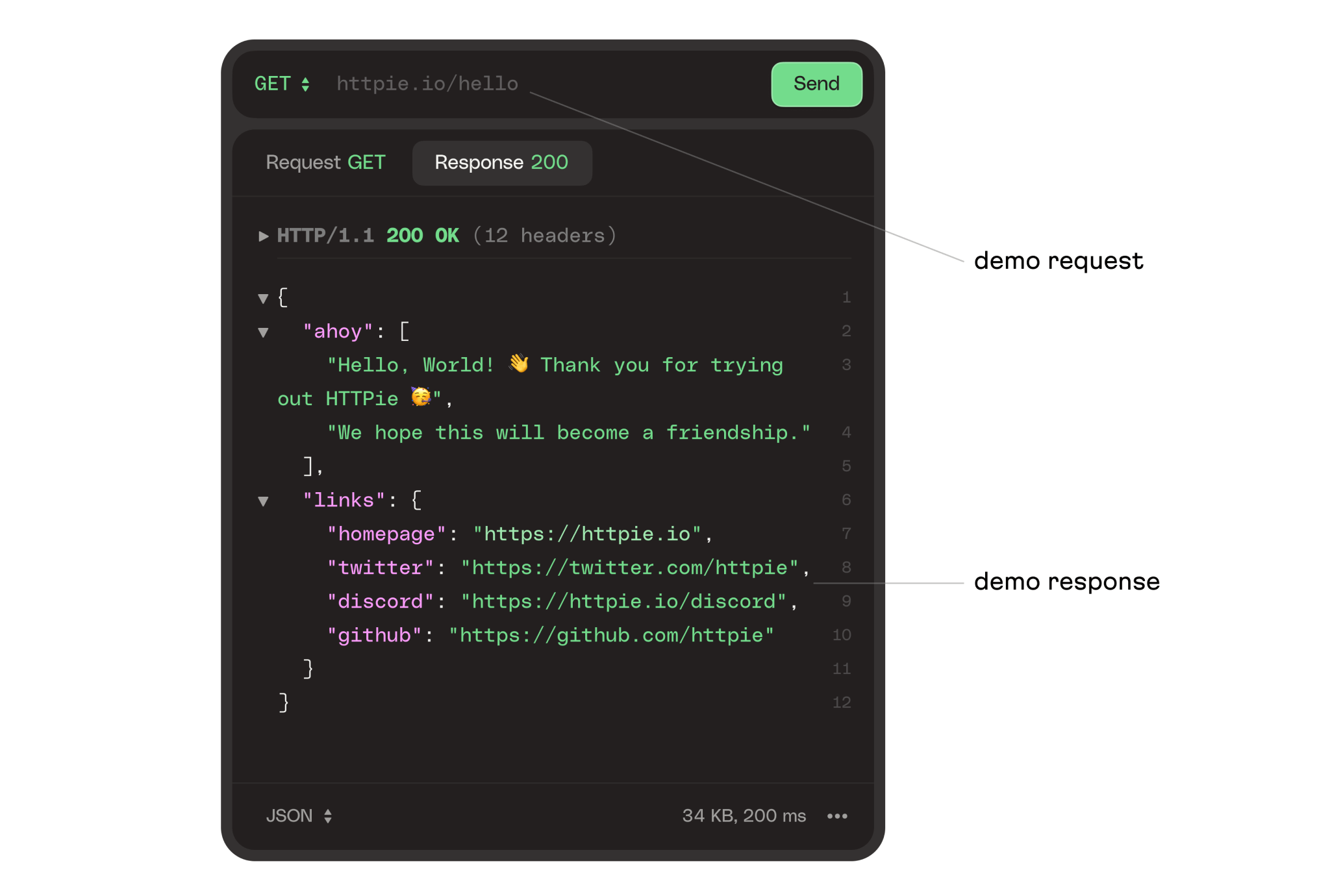
This answer contains a greeting and links to social networks.
Preview
This feature converts a request to one of the 35 programming languages our library supports (in fact, this feature includes a code preview before conversion.) This is quite convenient—users simply choose the language in which they need to make a request, and the preview translates it.

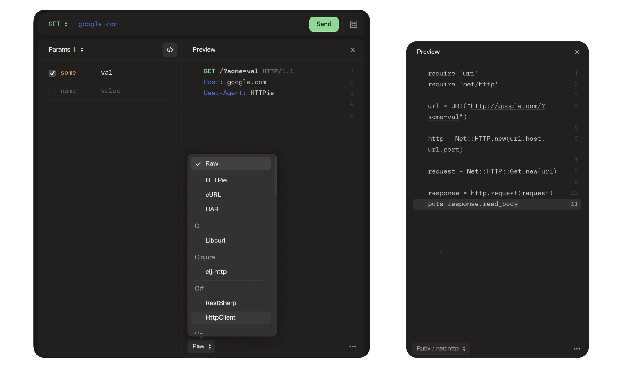
Preview
Unlike competitors, where this feature hangs about somewhere below as a narrow console (or is absent altogether), we have it as a fully-fledged interface element located next to the request form (but the user can close this column if desired.)
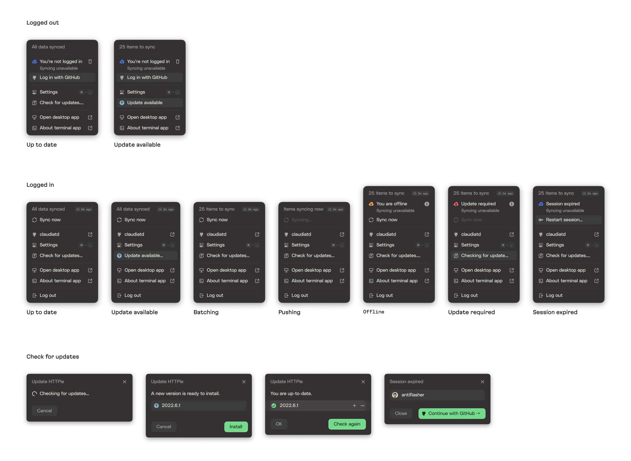
Cloud sync
To provide end-users with a smooth UX while letting them work from different devices, we implemented a cloud storage solution that synchronizes user data—settings, requests, input and output, history, and so on—across all machines using the same account.
Brand elements
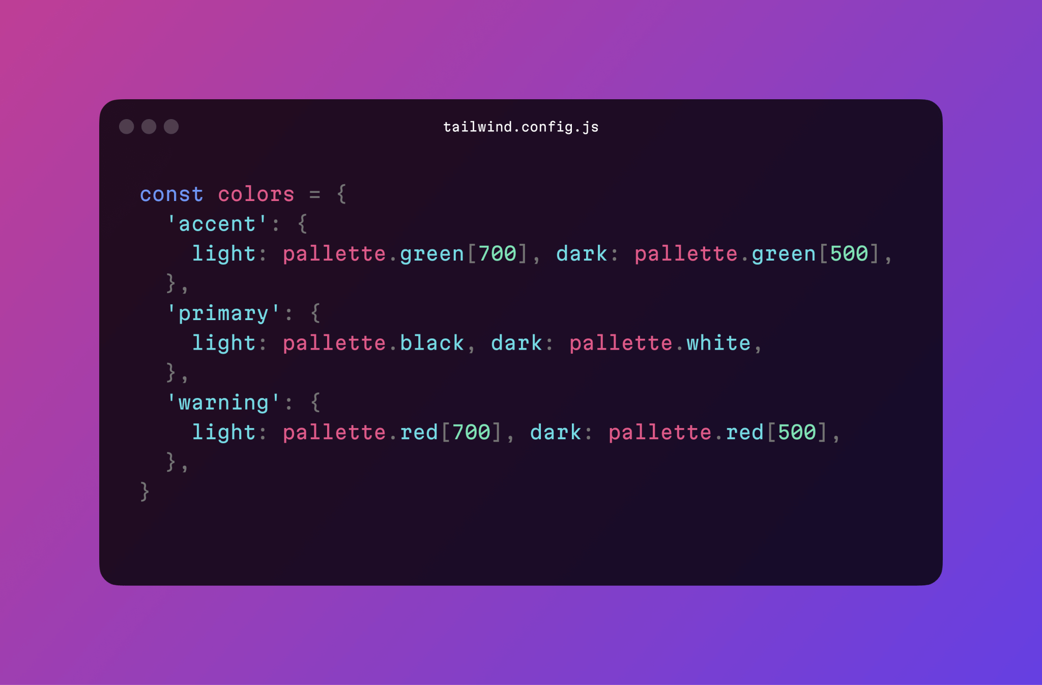
Colors
In this project, we used two color palettes: spectral colors, prepared by the client’s brand agency, and functional color styles mapping onto the spectral ones. Initially, the app strictly adhered to the brand book colors only. But we also managed to bring in additional colors and translucent ones.
We showed two interface versions: one with additional colors (for borders, hovers, and active states of the buttons) and one which featured only the brand colors. The first version looked more subtle and deliberately designed, and thus, the team agreed to expand their color palette.
Translucent colors allowed us to create one style for borders, hovered items, selected icons, and secondary text colors that worked well against almost any background.

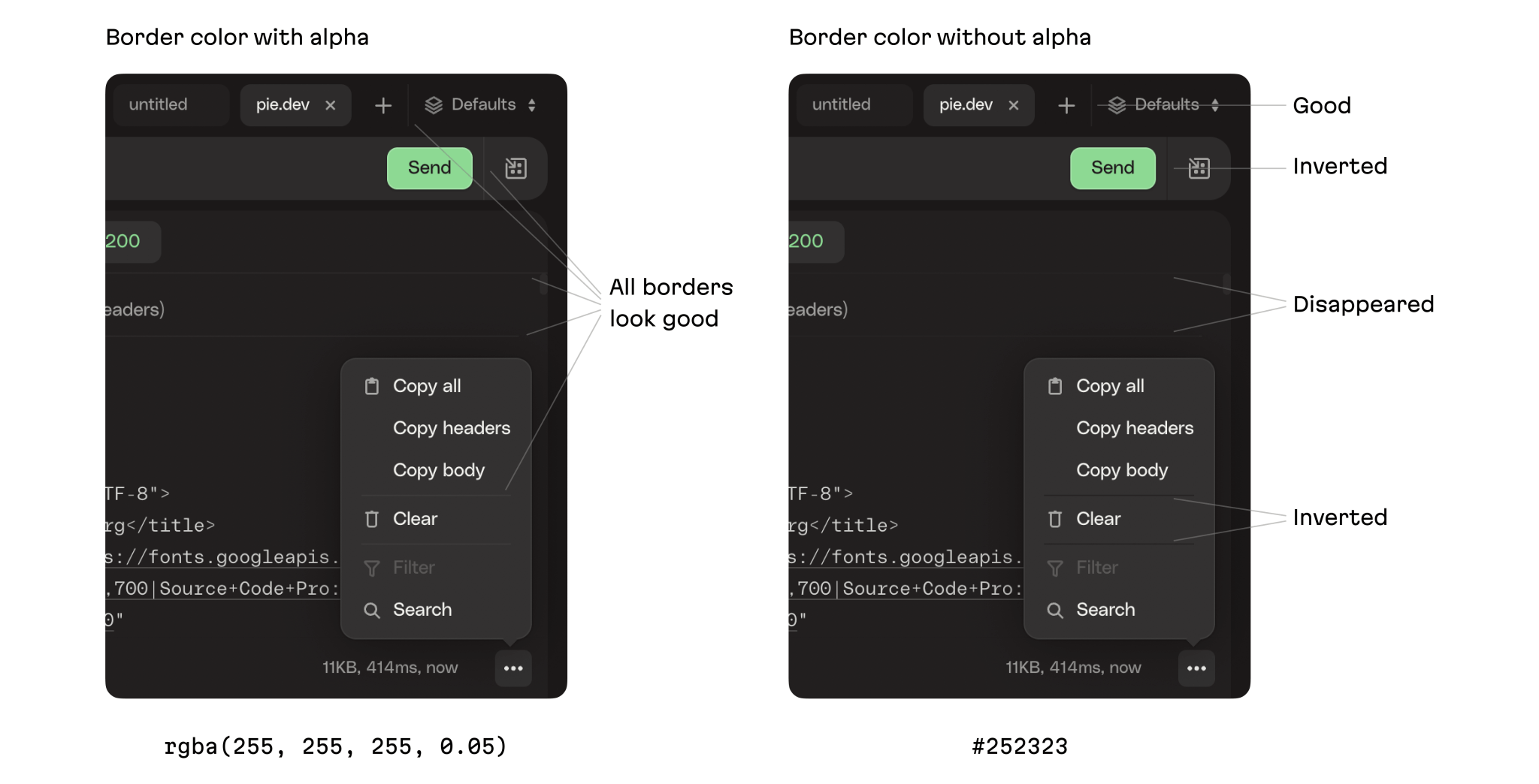
Translucent colors
For instance, a border in an opaque color would look different on different backgrounds. Here the border next to the “Send” button has almost disappeared, and in the drop-down menu, it inverted and became darker than the background.
Icons
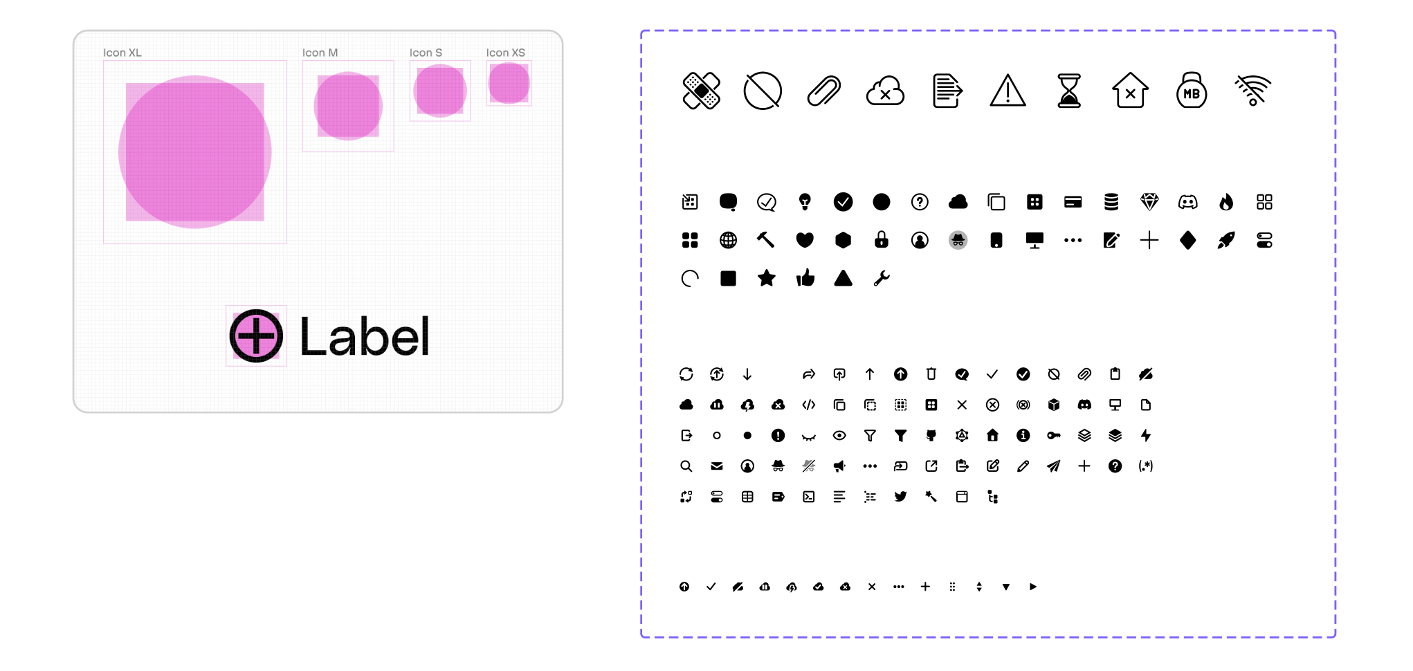
The balance and size of the app’s icons were critical.
First of all, it was necessary to have a limited amount of icon sizes so that they could be interchangeable without consequences for the layout, and so developers could immediately understand which icon size was used. Therefore, we reduced all the icons to 4 standard sizes:
- XL: 48×48 pixels
- M: 24×24 pixels
- S: 16×16 pixels
- XS: 12×12 pixels (we had just a few of these, they are used for very specific purposes.)
Second, two icons of the same size had to be balanced in terms of mass. To get a round icon to be visually the same size as a square one, we needed to make it a little larger. To comply with all project requirements, we used templates for this. We assigned a particular template for each standard size—and any icon’s vertical and horizontal strokes fit neatly into the pixel grid.
Third, the icons’ stroke thickness had to match font thickness. Through trial and error, we arrived at 1.5 px as the perfect balance.

Icons’ stroke thickness
Design processes
The HTTPie team consistently gathered user feedback at every single stage of development and after every release. This feedback often positively highlighted the UI’s simplicity and high quality—this was achieved thanks to incredibly thorough work dedicated to perfecting the look and feel of the UI.
Reach perfection
This customer had a perfectionist approach—this was simultaneously the most fantastic and most challenging part of the project. The HTTPie developers use tons of tools every day. They know the good and the bad when it comes to UI convenience, so they had their own motivations for putting forth such effort to achieve this goal.
Such meticulous attention to every detail makes designers pump up their own attention levels. Most of the things we implemented directly resulted from a client request for research in those areas.
We found that often, whenever we previewed a feature design for the client (a feature we were already quite pleased with). The client would come back with their own critique, and thankfully every single time, we found that the final variant was much better than our initial suggestion. We are sure that with our next project, we’ll take this approach again.
Evil Martians’ team of designers typically operates in two modes: if we’re working on building an MVP or feature launches on a tight deadline—things where speed matters—we usually prepare 1-2 versions, a client gives feedback, and then we’re ready for the next iteration. If a client is keen on meticulously crafting the perfect UX, this approach requires a dozen sketches for each feature or detail.
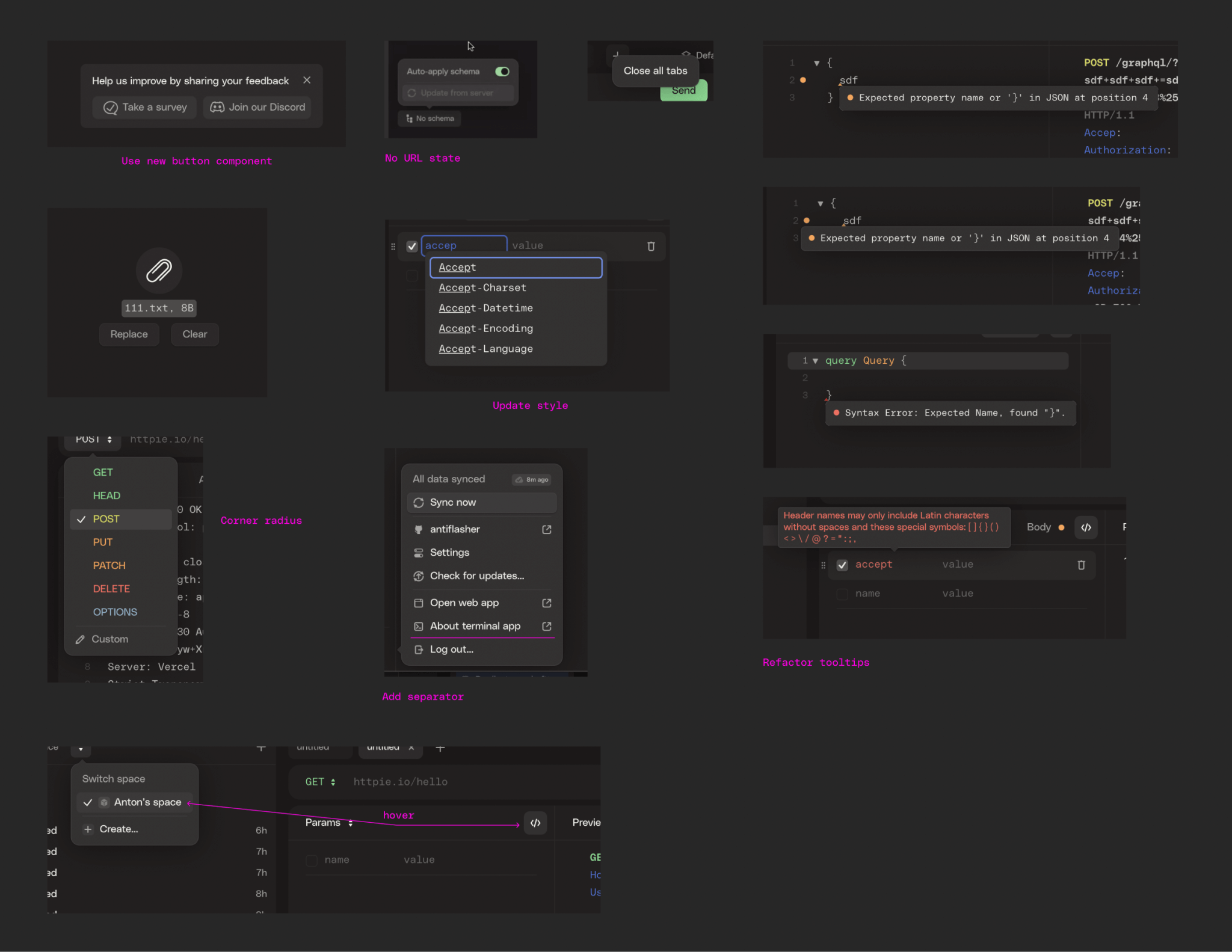
In this project, the client wanted to be sure we had considered all possible variants and then made the best choice. So we drilled deeply into every feature and sketched 10-20 versions for almost every one of them.
For instance, we created 7 options for selecting the “body” type and 18 to display the response. We created and explored 16 variants of table row layouts (because in the 360 pixels allotted to it, we had to place two text fields, a checkbox, a basket icon, and a taskbar icon to reorganize the row order, keeping in mind that the number of characters in each input was unlimited.) And for the input itself, we suggested 7 design options to find their best balance in terms of size and clarity.

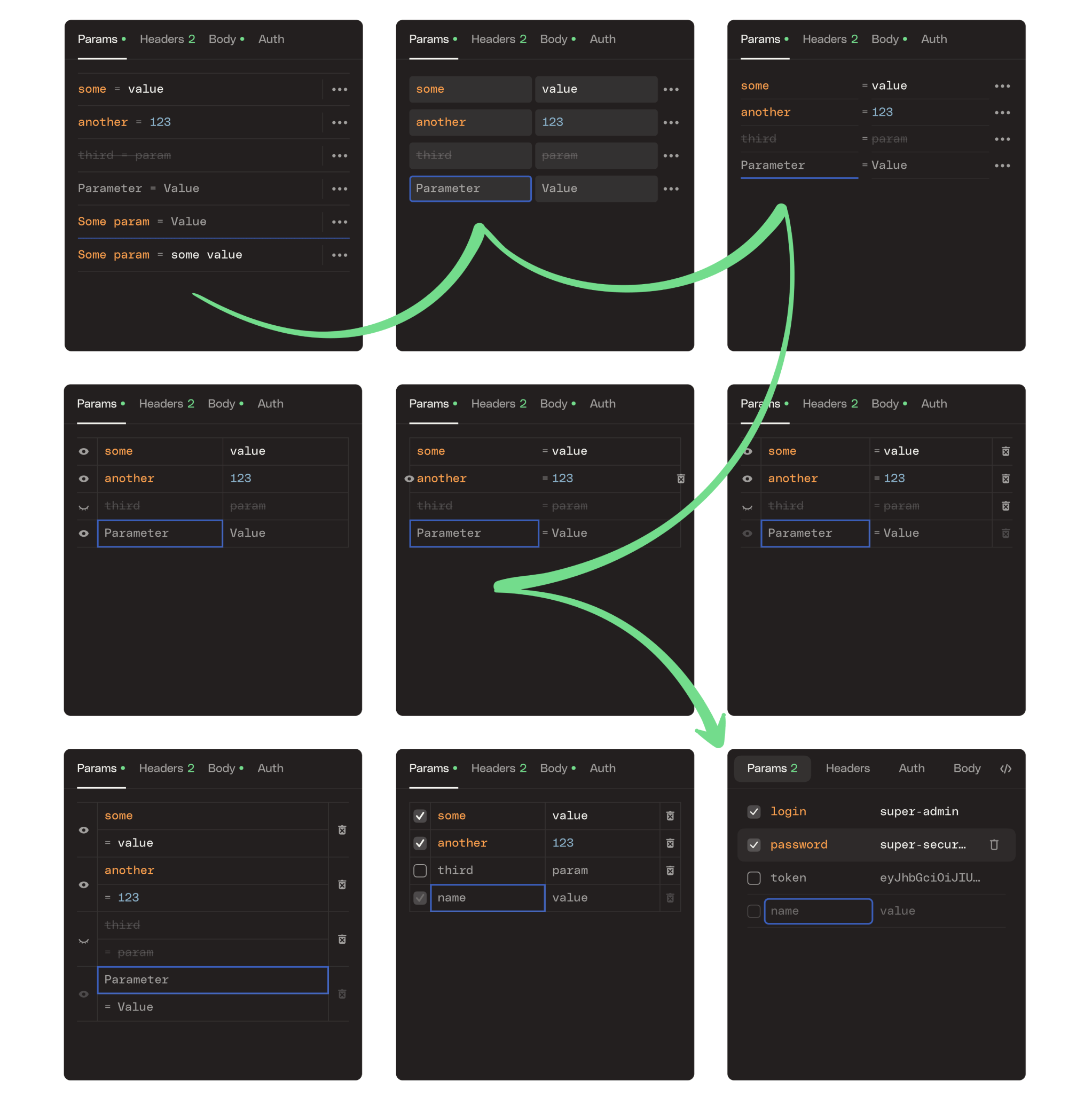
Variants, variants, variants
DesignDev
This was one of commercial projects where Evil Martian designers contributed to an app’s code base.
When a client asked to increase the interface contrast, we decided that it would be more correct to do it right in the code—we figured out the necessary configs and minor bugs and made a full-fledged pull request.
But further, we also went beyond waiting for the client to ask. For example, the screenshot below displays the 4th or 5th bundle of fixes (that means the previous bundles have already been fixed and pushed.) Our designer constantly has the app open, uses it heavily, and notices items to be polished. These are noted, then once per month, a “polish” PR is created consisting of a number of fixes.

We started tweaking the color codes, padding, and element sizes and introducing new styles. After a couple of months, we studied the project and the toolkit from top to bottom, and within a week of starting, we managed to deliver a complete project’s restyling.

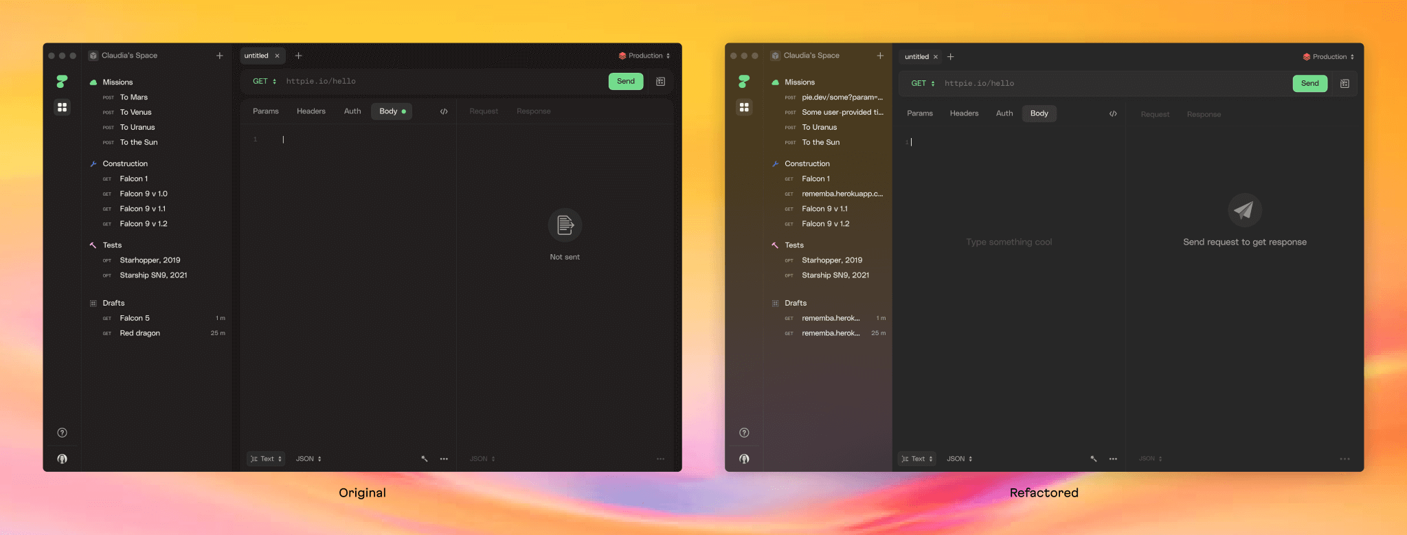
Design refactoring
Electron is a wrapper to package a web interface into a native Mac, Windows, or Linux application. We studied Electron and immersed ourselves more deeply into the project code (HTTPie uses Tailwind for styling and React components). In particular, we figured out how to customize the menu—many popular Electron applications still use its default menu options, despite the fact that it allows users to pretty easily tweak the app menu.

An example of a menu tweak (and, by the way, we used our own monospace Martian Mono font here.)
Our designers committed to the codebase regularly, putting the finishing touches before feature releases and polishing the interface. This took some of the load off the frontend engineers and helped develop design tricks that couldn’t be possible with a static layout.
To illustrate, we created a filter and a search to find the desired data within large server responses. Additionally, since this requires text, it’s notable that we used our regular font here instead of the monospaced variant used for code. But filtering requires entering a request written in a special JSONPath language, so the font in the filter field is monospaced. This was obvious at the design stage, and we immediately incorporated it into the layouts. But we later found that when the RegExp mode was enabled in the search, the font must also be changed to monospace. So we quickly adapted the styles and implemented them.
Filtering
Now, the HTTPie team is sure that coding skills would be a good skill for a designer to possess because a long cycle “design → approval → frontend → review” can now be shrunk to “designer builds frontend → pull request.” So, for simple design-frontend tasks like polishing the paddings or updating icons, we committed directly to the codebase of the “live” app and sent our code via GitHub pull request.
Coding also helps designers better understand how frontend works, what tokens are used, and how our system will be implemented.
The HTTPie team held helpful clarifications on HTTP protocol and the intricacies of API testing on almost every call. As a result, not only designers (and, of course, frontend engineers) committed to the code, but also the account manager, who helped catch bugs and set up statistics collection.
Martian Design System
In this project, we utilize the Martian Design System—a set of patterns that we use as fundamental principles to more quickly start each new project. The system is based on tokens—standard sizes of fonts, icons, and other elements. So, thanks to this system, a frontender looking at a mockup will never have to feel the pain of looking at a font size of 16.83px. We also use these patterns to name components, with composition, our color system, and so forth. Utilizing this methodology, components remain consistent wherever they’re used—developers can use and reuse components, thus boosting engineering speed.

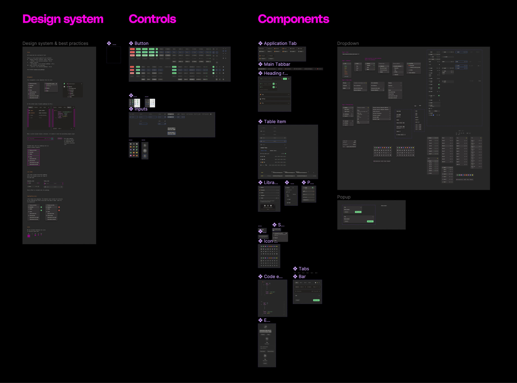
The system’s components for the HTTPie project
Other accomplishments
Beginning with the user interface and UI logic design we worked in parallel to help the HTTPie team add new features on the frontend and backend and configure analytical systems to track key technical and business metrics. We also assisted in product analytics, competitor analysis, feature prioritization, roadmap preparation, project management, and post-launch statistics analysis.
Further, we participated in a private beta release and soon after—in a public beta release as well. The HTTPie team expected thousands of users, so it was critical to be fully prepared. Therefore, we tested the application intensively within the HTTPie team and the entire Evil Martians team, checking the flow and all possible details on different platforms—Windows, Linux, and in mobile browsers.

Despite our expertise in dev tools, we went into this project striving to match the dedication of its core team, and we spent time getting an in-depth understanding of API testing. This allowed us to make complex things that looked simple to end users.
User feedback was the main driver of development. We constantly collected it from different channels and interviews and aggregated it into a single list where we could find inspiration for feature requests.
And we received a lot of fantastic feedback!

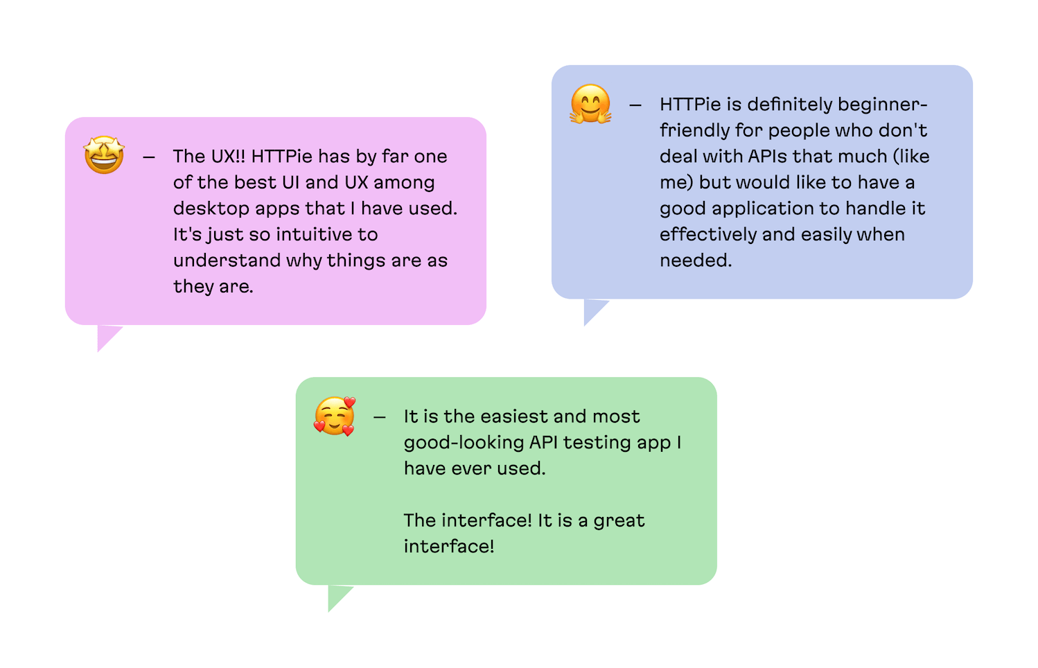
To date, the CLI client has an impressive 24K stars and 3.7K forks on GitHub. The project’s community is growing, and its participants say they prefer HTTPie to Postman because of its sleek interface.
Make your own judgment by downloading it for free: httpie.io/app.
If you want us to dive this deep into the UI design of your app, even if it’s not from the open source or dev tools industry—please drop us a line!