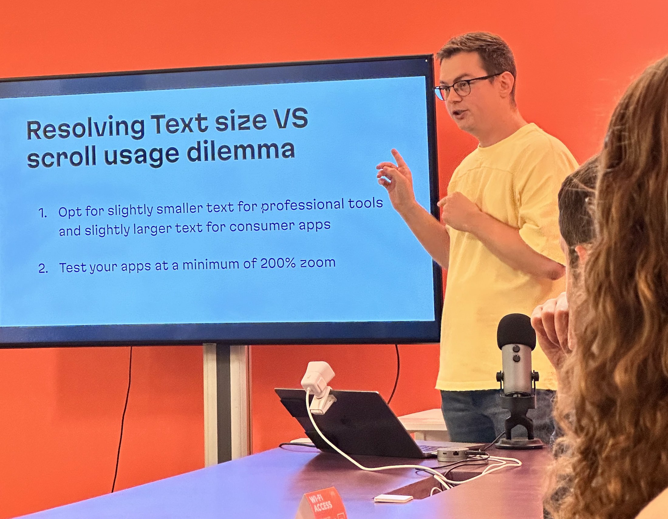


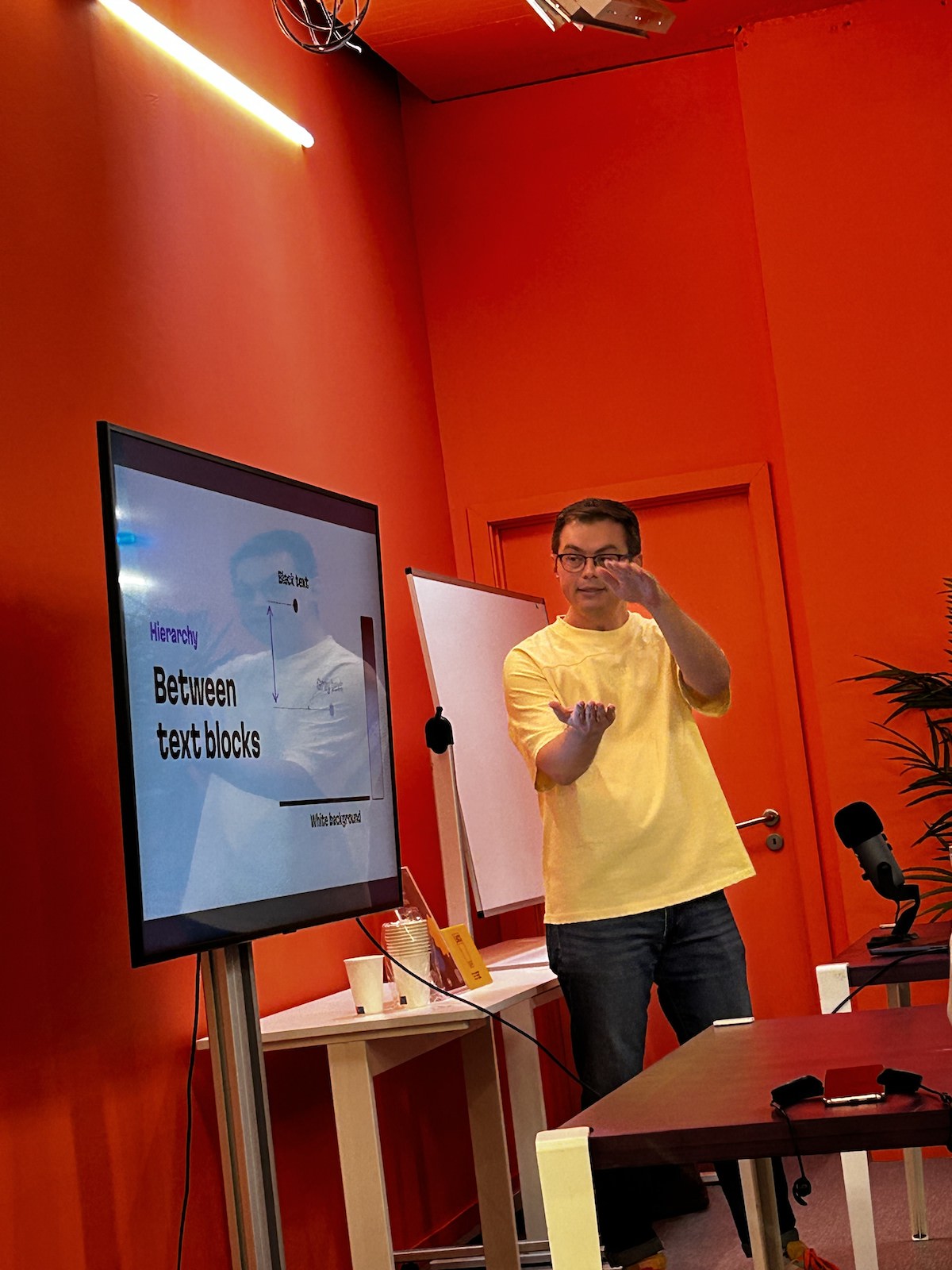
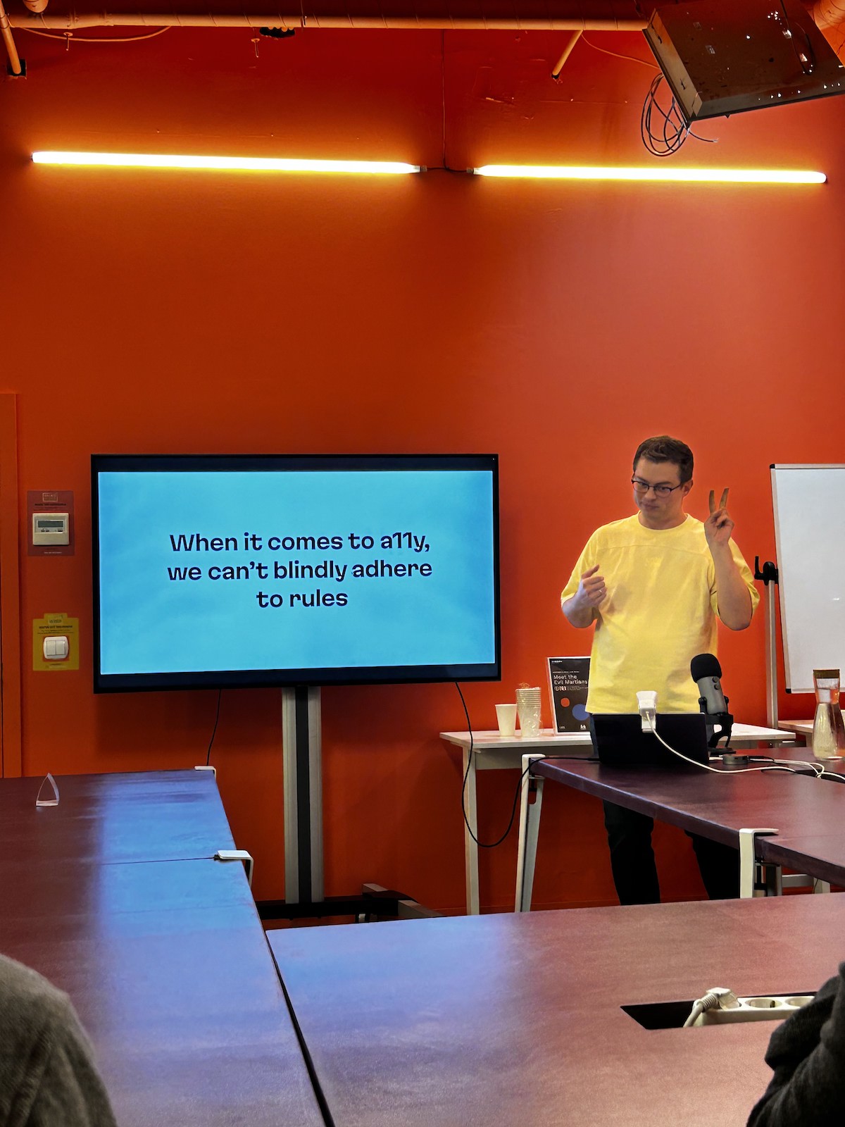

We all know the general rules for better accessibility: using larger text and higher color contrast. But is it always the case? In this talk, I explore cases where following these rules can actually create the opposite effect, making it harder for people to use your app. We examine these cases and work towards finding solutions for each dilemma.

Irina Nazarova CEO at Evil Martians
Evil Martians is a developer tools consultancy founded in 2006. Creators of PostCSS, imgproxy, and 100+ open source projects with 25 billion downloads.