I’ve been waiting for something like this for a very long time. Very handy tool. Great job! — Product Hunt.


Mark Frost
Reviewer on Product Hunt
Case 1: Adjusting text color to the background
Select any object with a solid fill on the canvas, open the Figma properties panel’s color picker, and adjust the color until it reaches your desired contrast level against the object’s background.
This simplicity is achievable thanks to two core features of Polychrom: the background search engine and the highly responsive UI. Firstly, the moment you select something, the plugin finds the actual background for the selected object and displays the contrast level between them. Secondly, whenever you alter colors in your selection, Polychrom immediately adjusts to the change.


Case 2: Adjusting the background color for text
Select two objects, the foreground and the background. Use Figma’s Selection colors to open the color picker, but this time for your background color. As before, adjust the color until it achieves the required contrast.
This could be beneficial when you have, for example, the brand color, and you’re seeking a background color that provides enough contrast.
As a designer and frontend-developer in one, I’ve been trying different tools for working with colors and palettes for years. OKLCH was a fresh breath of air when creating and working with color palettes in design systems.
Today, Polychrom has become an awesome addition to my every day toolkit. Thanks for OKLCH support, fast and beautiful interface. — Product Hunt.

Eduard Aksamitov
Designer. Developer. Suprematist.
Case 3: Working with multiple objects
Select 3 or more objects, and Polychrom will act exactly like in the first case—it immediately finds the background area—but this time for every selected object. Then it organizes them in a deck of cards.

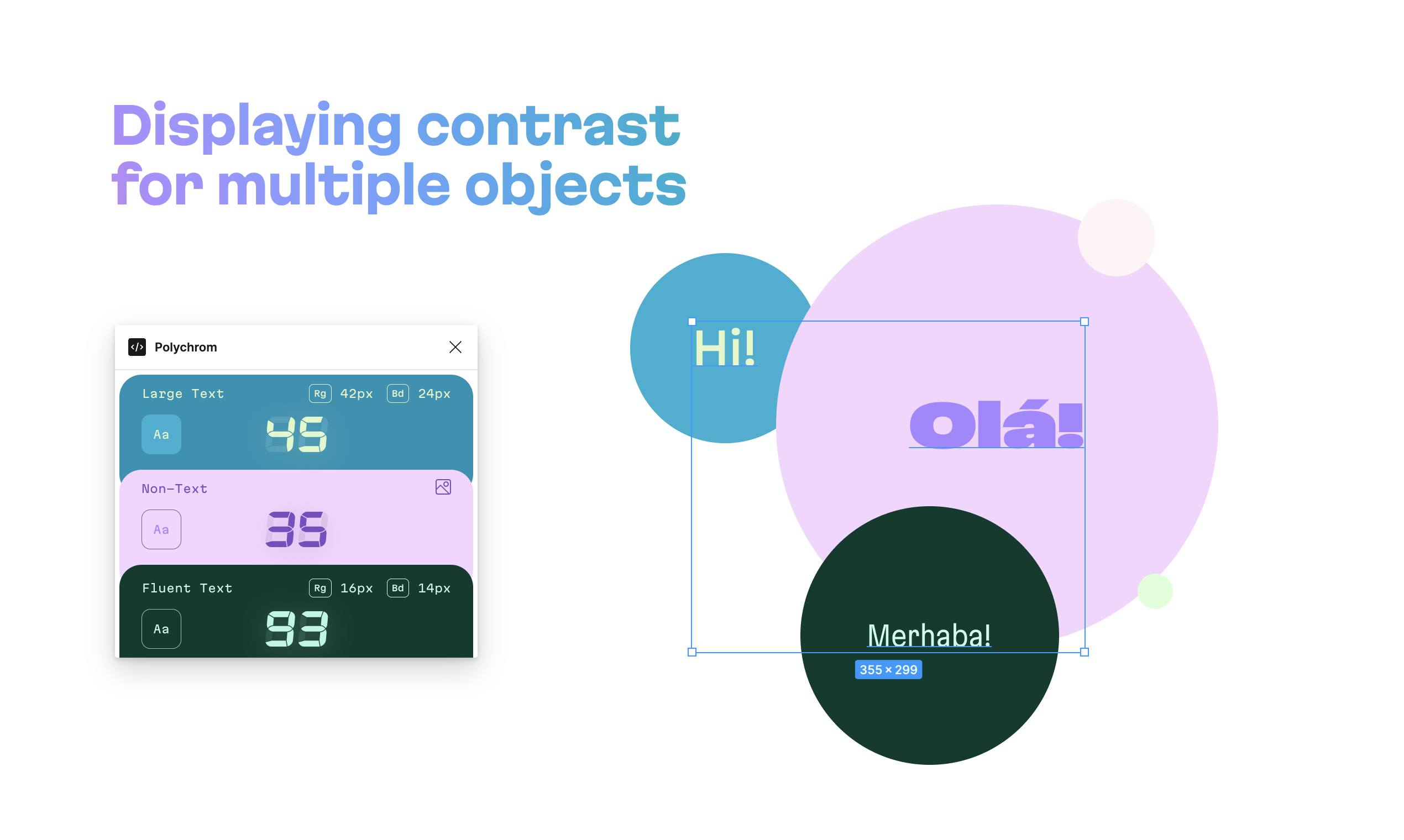
If you select three or more objects, Polychrom displays them as a deck of cards
Note that Polychrom is smart enough to adapt its behavior depending on your needs: for two objects, it shows the contrast between those two, while for 3+ objects, it shows the contrast for each one.
Case 4: Handling opacities and blend modes
In Figma, you can adjust the alpha for the entire layer and the solid fill simultaneously. Additionally, there might be multiple fills on one layer and several semi-transparent layers stacked on top of each other. Multiply this by 19 blend modes. Polychrom effortlessly manages almost all possible combinations, no matter how intricately you’ve mixed layers, opacities, and blend modes.

This way, Polychrom addresses every possible designer’s need. You can not only check if your colors provide enough contrast but also adjust any color on the fly, using Polychrom to create an accessible palette for your UI.
Dynamic UI theming
Polychrom adapts to the color scheme of your selection. For instance, if you choose red on yellow, Polychrom uses red text on a yellow background for its UI. Importantly, the UI always remains accessible, with a contrast of APCA 60 or higher between the background and the text. Unlike regular software limited to light and dark themes, Polychrom can display an infinite number of UI themes. This showcases the power of OKLCH and APCA working together.
Additional features
- Displays the contrast level according to the APCA method.
- Offers text size recommendations for regular (weight 400) and bold (weight 700) font styles, following the APCA contrast-to-font table (Beta 0.1.7).
- Converts original colors to the OKLCH color model, facilitating easy CSS code clipboard copying. (HSL, RGB, and HEX formats are also available.)
- Full P3 support. Polychrom automatically detects whether your Figma document uses the Display P3 color mode and treats colors accordingly. This guarantees that your text remains legible on all modern displays with confidence.
What is APCA?
The Accessible Perceptual Contrast Algorithm (APCA) is a novel method for calculating and predicting readability contrast. This model is specially optimized for ensuring accessible color visibility on self-illuminated RGB computer displays and devices. It also addresses the requirements of visually impaired users, focusing on improving visual readability.
APCA is a candidate contrast method for the forthcoming WCAG 3 and is concurrently evolving as the APCA Readability Criterion, an independent standard managed by Inclusive Reading Technologies.