Icon transcendence: customizing icons to complement fonts
Icons are an extremely valuable part of our interfaces, aren’t they? They can be used to help deliver easily-understandable messages, reflect some underlying state, or make a statement more powerful. But can we go even deeper than this? How can we leverage fonts’ styles and characteristics to create icons that provide more seamless product flows and designs? In this post, we’ll build a bridge between these two important interface elements.
We believe that developing a solid connection between icons and fonts is one way we can provide our products with a polished sense of beauty, a better user experience, and in some cases even, perhaps better functionality.
In short, taking your icons to the next level can help take your product to the next level.
But before we level up, let’s take a look at this example of a basic icon—we’re extremely limited with what we can do here; we can increase the weight of the lines, and that’s about it. While it might come in handy in some situations, overall, this isn’t a very robust solution, is it?
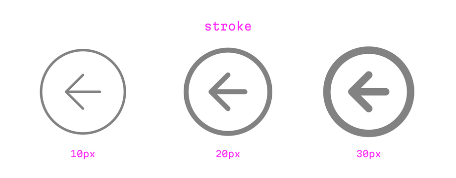
If we want to match this icon to a specific font, chances are, we won’t be able to go very far. That’s why the ability to modify and adapt icons is such a cool tool you can add to your product design arsenal.
Let’s first get a larger conceptual view of this idea of customizing icons: in the image below, we have two columns with six pairs of icons and fonts. Although these icons look quite differently visually, they were actually crafted by using the single source icon you saw above as a reference. For each of the fonts here, we’ve modified that source icon, thus producing a custom icon that better matches the style and mood of each font:
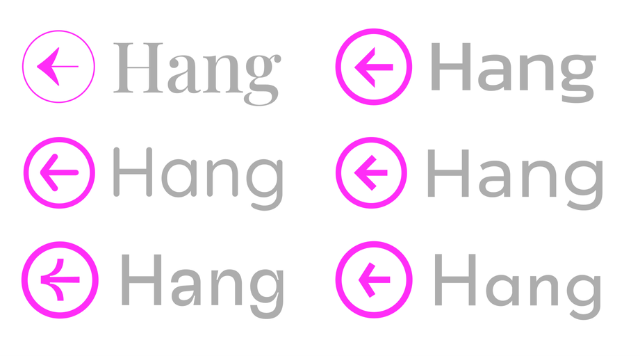
Various icons modified to better match their corresponding font family
But how do we actually know what modifications to make to our icons? This knowledge comes from a thoughtful analysis of whatever font we’re working with, and in just a short time, we’ll point out the exact font characteristics we need to pay attention to when crafting icons that will be more cohesive and natural.
A snapshot of the icon and font scene
By the way, in general, when speaking about icon and font styles, it’s worth mentioning how lucky we are in terms of selection these days: we have a wide variety of available sources to choose from.
With regards to icons, you probably know most already, but let’s highlight a few anyway: for webpage design, Font Awesome icons, iOS and macOS have SF Symbols, Android apps have Material Symbols, and there is also a nice selection of open source sets out there (including our spartan Evil Icons!)
As for fonts, we have almost the same level of overflowing goodness: with Google Fonts, designers can almost always find an ideal font for their project, ready to go, and free to use.
Preparing your icon-creation workflow
We talked about performing a thoughtful analysis of fonts in order to craft corresponding icons, but what aspects of a font should we pay attention to? We all know there are a variety of font styles out there: classic, contemporary, geometric and humanist styles. They may have a closed or open aperture. Finally, there are high-contrast, reverse-contrast, and monolinear faces.
As we adapt our icons to match the style of an font—small spoiler here—we can adjust all of the above properties to reach our desired outcome.
If you’re curious about the process in technical terms, it’s rather simple: I’ll take an icon from an open source set, then I’ll visit Google Fonts, sort by popularity, open it in Figma (although you can use your design tool of choice). In practice, you could type a pangram with the font to understand the essence of the typeface, but for this article, we’ll just use the word “Hang”, which will be enough for our purposes. Then, you can outline the characters as vectors, and create shapes, and from there, we can combine and modify elements to produce our custom icons, as you’ll see.
The motivation behind our reference icon
This time, for our icon reference, we’ve selected a common symbol: an arrow in a circle. This is a classic, common interface icon, and further, practically speaking, the simplicity of this familiar symbol and its design elements (the basic lines of the arrow, the circle) will help us easily highlight how we’re adapting an icon to fit a font.
Let’s get to the real work now. With each icon, we’ll have the plain icon and text on the left side, and I’ll highlight the adaptations on the right side. At times, I’ll also include a big image on the bottom of each illustration that will use pink highlights to draw your attention to the key areas of focus.
Icon modification 1: high-contrast typefaces
Here below, we can see a font with notable contrast: pay attention to the difference between the horizontal and vertical strokes of the letters.
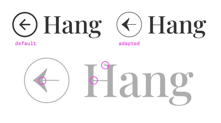
The original icon is on the top-left, the adapted, on the top-right. The bottom illustration highlights points of interest inside the circles.
Now, take a look at the adapted icon in the image above: we’ve applied a specific counter value to the circle, making it appear thinner, and, in terms of the weight of the line (the shaft of the arrow), we’ve also made the level of contrast better resemble the font. With this, the icon better reflects the characteristics of the font, and thus, would look more “native” within whatever context it’s being presented.
Some bonus exploration with high-contrast fonts
Of course, this isn’t the only direction we could take here: we’re working with a serif font with high contrast, and we have other places to draw inspiration from. Let’s play around a bit:

Here we’ve implemented a nice, thin circle with an arrow that has more clear contrast between the tips and the shaft. And let’s try another way:

Now, let’s go off course a bit, take a look at the letter “O” in the font and check how the counter value is set up. Let’s take that for our icon’s circle, and let’s make the horizontal line of the arrow thin. The result looks interesting, but it’s not really right, because, even in high-contrast fonts, well, circles should still actually be circles.
Bonus experiments: using character sets for further inspiration
By the way, when adapting icons to a font, for inspirational purposes, it’s always helpful to take a look at a font’s character set. For example, I did so using Adobe Illustrator:
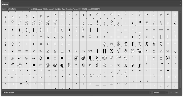
The character set for the Playfair Display font in Adobe Illustrator.
With this in mind, let’s explore this a little bit further and take some inspiration from this font’s character set, and play around a bit more with these possibilities.

First, here’s another icon: this time, we’ll take a glyph from the font library as a reference and for the head of the customized arrow, we’ll increase the curves of its angles to match the style of the glyph, and we’ll make the horizontal thin line within the arrow thin as well to correspond with the thin lines of the font.
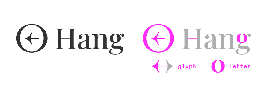
For our next adaptation, we’ve returned to the concept of the “O” and the counter values. What if, like above, we again set the counter on the “O” here, and make it a little thicker? But this time we’ll also combine that with the arrow we customized using the glyph from the font library. The result: we’re still breaking the rules a little bit too much—a circle should be a circle!
But, no worries, even if we broke some rules, the point was to push the boundaries, and emphasize the importance of exploration during icon customization (using both font elements and character sets).
On that note, we won’t go this deep for every icon we examine in this article, but we hope you’ll dig into these concepts when you dive in for yourself.
Icon modification 2: a font with square angles
Here we have a typeface with a wide-open aperture (more on this in a second), and its most characteristic detail is its terminals in “a”, “g”, “r”, and so on:
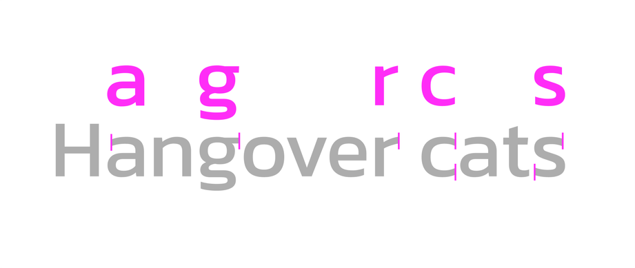
The phrase ‘Hangover cats’ is perfect for illustrating the vertical nature of this font’s terminals (or the title of a musical about the morning after a pretty wild feline party.)
In this font, the terminals (and the characters in general) have cuts at vertical angles. Let’s borrow this detail for the arrow in our icon and cut its terminals vertically, too:
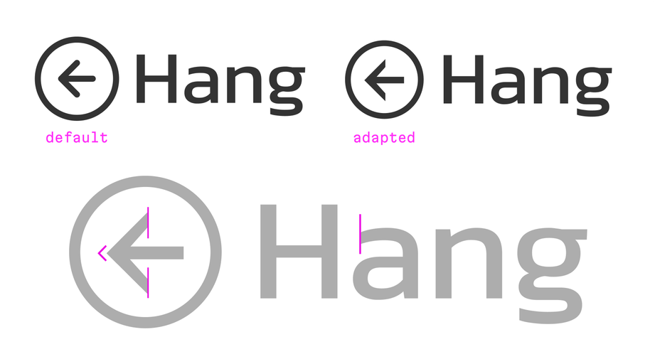
Bonus experiments: opening the arrow to match the font’s open aperture
Great! What else can we do here? It’s playtime. At the beginning of this section, we mentioned that this font has open apertures. This means that the terminals in “a”, “e”, “c”, and “s” don’t bend significantly inward.
Let’s pull apart the tips of the arrow head and let’s increase their openness as much as possible:

Not bad, right? We’ve found two stylistic features in the given typeface and incorporated them into the icon look aligned. We could expand or contract the arrow to achieve the “perfect” look as desired. Again, experimentation and flexing your creative muscles is the emphasis in these bonus sections.
Icon modification 3: a font with round corners
By default, this font has lines with round corners and generally soft characteristics. Here, we’ve modified our icon with round corners to match this feeling. Plus, this font has open and wide counters, so this means we can also expand the corners of the arrows, which we have done.
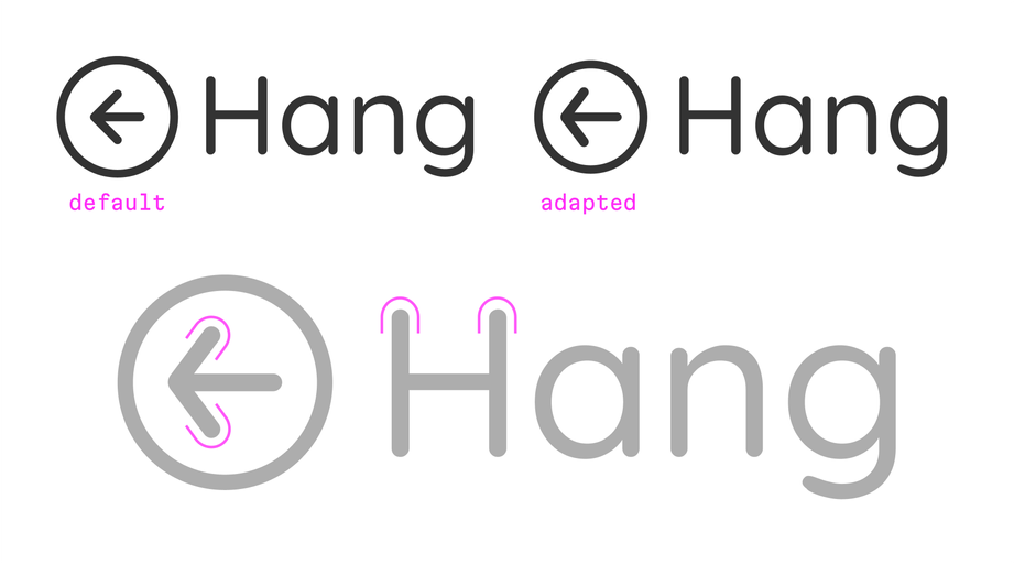
Frankly speaking, the result here looks very similar to the default icon.
In general, if you don’t need to change anything, the free default icon could actually work; the choice to modify an icon is all about the goals of the individual project.
We’ll cover this choice in more detail near the end of this article. But nonetheless, in this example, with our modifications, the arrow still looks more like a native element from the reference font.
Icon modification 4: fonts with 90 degree angles
Here, we see that the terminals of letters “a” and “g” have 90 degree angles and this characteristic defines the nature of this font. This feature also provides us with a solid basis to customize our icon.
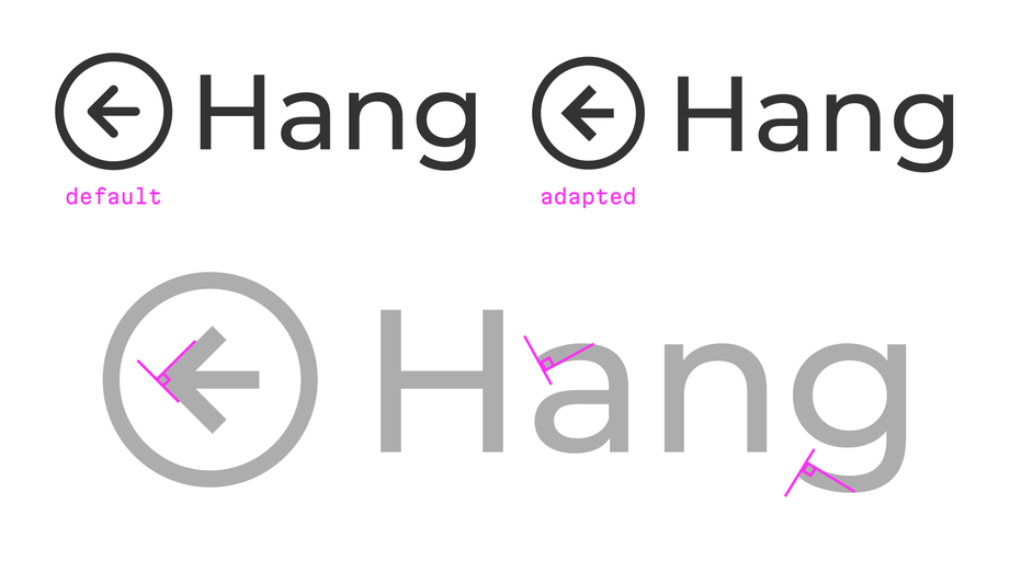
We’ve highlighted the 90 degree angles of our adapted icon. It’s a ‘hot’ look, for sure.
The default icon uses round lines here, so it does not match the font. We can take this 90 degree approach and apply it to our arrow, making sure to line it up with the vertical midpoint of the letter “H” to preserve the angular feel of the font. Additionally, we’ll give the arrow square corners as well to emphasize this point. And, here, we’ve ended up with another example of a more “native” icon that matches its corresponding font.
As with the other cases, we can also play with the arrow angle of this icon to highlight a font’s look and feel; the more open the letters in a font, the more open angles we can use with our icon’s arrows. These small changes actually have a big impact on the ultimate appearance and feel of an icon.
Icon modification 5: ink traps
This is a font with an intriguing character and beautiful line connections. Here, most likely, the most immediately visible trait we’ll reference to craft our adapted icons are related to those line connections, the ink traps.
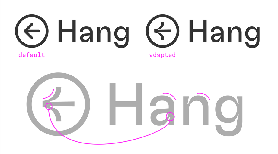
The results above reflect an important concept: the more specific details a particular font has, the more unique options we have to customize an icon set.
Incidentally, this font highlights one motivation behind the creation of this article quite well: the default icons wouldn’t really work with this font, instead, they would stick out like a sore thumb.
Bonus experiments with ink traps
Staying with ink traps, we could play with the connections and angles, too. Let’s have an experiment with straight arrow tips:

Next, let’s turn our attention to the tip of the arrow and play with its roundness (taking inspiration from a glyph from the character set):

All of the options above offer their own feel beyond the typical arrow, regardless of if that feel is “good” or “bad”, the results are definitely unique. Bottom line: the direction you’ll go with icon customization depends on your needs—but sometimes this can come from unexpected places, so dare to explore!
Icon modification 6: low x-height
Out of the fonts we’ve worked with so far, this one has the lowest lowercase letters of them all, which we’ve highlighted in the image below (but feel free to scroll back up and compare). Because of how low this x-height is, we’ll need to respect this characteristic of the font when we adapt our icon.
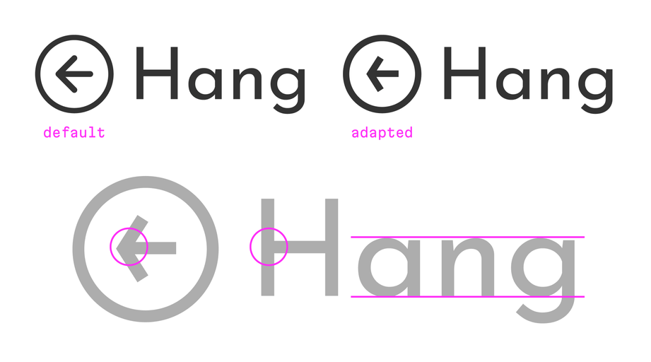
We’ve reflected those characteristics in our adapted icon:
- The length of the arrow tips have been decreased to correspond to the low x-height of the font (because with this low x-height, the length of the lowercase letters is also smaller.)
- We will make the height of the arrowhead lines a little thicker than the horizontal shaft line to match the letter “H” which has the same feature. (This difference may be hard to see with the naked eye, but it is so.)
- Because we have fairly big apertures in the lowercase letters (seen clearly inside “a” and “g”) this will again influence the openness of the arrow tips.
To adapt, or not to adapt, that is the question
Obviously, if you care about the overall result and the little details, tailoring icons to match your project’s font is preferable to the alternative. But is it really necessary to do this in all cases?
Truthfully, not every project needs to use this level of customization.
Let’s identify cases where incorporating modifications like we’ve done here would be welcome versus those where it’s probably better to avoid the extra work.
If your project is at an MVP level using a standard components (and a standard icon set), it’s probably not the best time to redefine anything, (especially if we’re talking about mobile apps). Instead, you’ll typically use standard fonts and glyphs at this point; we need understandable, predictable behavior, and an intuitive look and feel. Basic icon sets will serve you well here, and the iOS and Android guidelines provide excellent instructions and nice glyph collections suitable for any of your goals.
On the other hand, if you have a product that really needs its own voice and brand, the first step is usually to take advantage of an interesting, modern font, which naturally leads to interesting, modern vibes. And this choice offers designers the opportunity to increase their uniqueness even further by finding a unique voice for their icons, too.
Practical next steps
So, where can we go from here? It’s actually relatively easy to put what we’ve discussed here into actual practice.:
- When you have a project that features both fonts and icons—take the time to examine the characteristics and style of the fonts
- Take note of the parts of the font that reflect the idea of the interface and the brand itself
- Highlight the aspects of the font you can use to create customized icons
(By the way, of course, icons aren’t the only thing we can customize based on fonts, in fact, nearly every aspect of a brand can inherit these details—but that’s a topic for another day.)
To sum things up, even if it’s not strictly necessary in some cases, it’s still worth it to make customized a icon set for a product for other reasons. Namely, a love for details and for the typography of the product. Although these details might not even affect users immediately, they will nonetheless provide a more polished and unique look and feel for the product—and each page will act as proof of the care and attention to details that the product design team bled into the final result.
If your project craves the same attention to detail that we’ve given our icons in this post, reach out to us! The Evil Martians team are ready to reach out a cosmic hand of assistance, no matter if it’s product design, frontend, backend, devops or even beyond, we’re waiting in the launch bay, ready to answer the call.


