Keep it together: 5 essential design patterns for dev tool UIs


UI design is a critical factor that can often make or break a successful developer tool. Whether you’re creating a tool for designers, engineers, creatives, or any other tool tailored for developers, this post is for you. (Even if you’re not a designer!)
For some context, in a previous post, we outlined how, within the classic startup’s core team of “hustler” and “hacker”, it often falls on the hacker (the technical founder, CTO, or engineering lead) to design the initial user interface, especially for developer-facing tools.
While that arrangement may make sense given the close relationship between software development and interface design, it can be a challenging task for those without formal UI/UX design training. That post attempted to bridge the gap, making dev tool product design a bit more accessible.
Building upon that article, this time, we’ll actually look at practical developer tool design cases, with detailed examples, both at a general level, and pulled from real-life software:
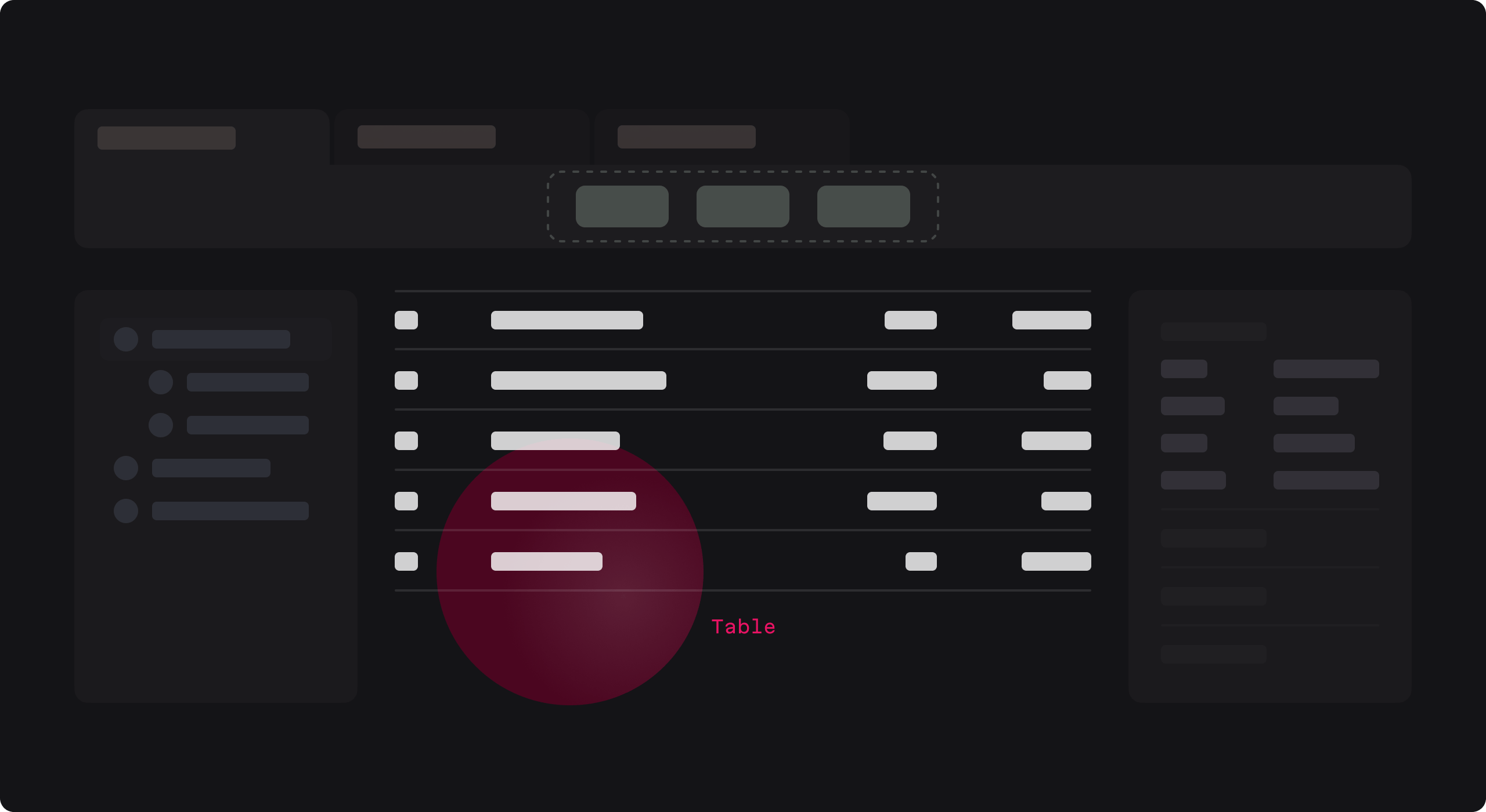
Below is a generic example of a developer-facing application that will serve as our roadmap.

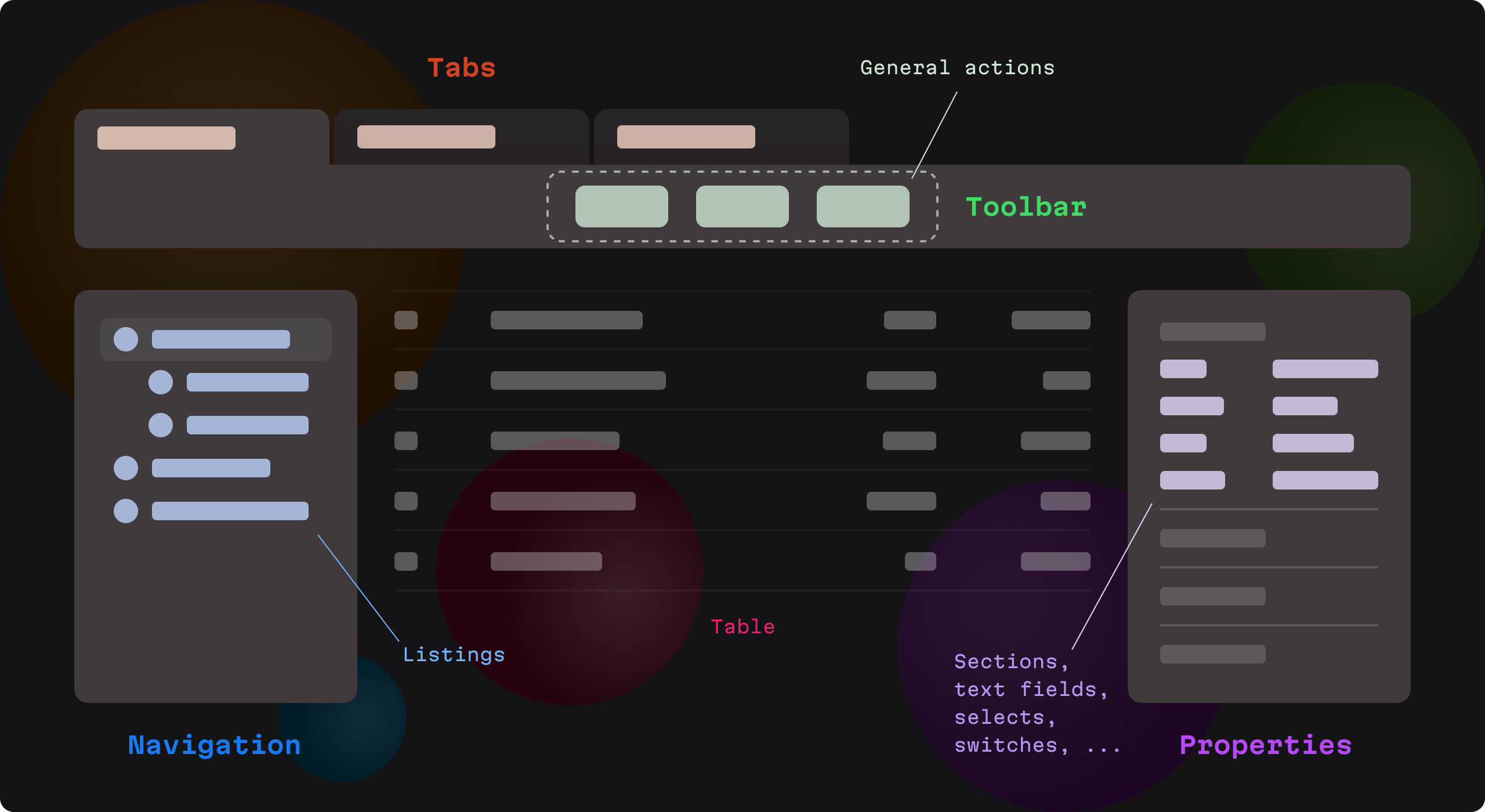
We see an interface divided into several distinct groups, each of which is important.
On our tour of lightning-speed developer tool design enlightenment, we’ll make a pitstop at each group and look at the specific UI design patterns that will enhance the user experience.
1: Tabs
Developers must often work on multiple files, datasets, or projects simultaneously. How can they possibly keep tab of all that? With tabs, of course!
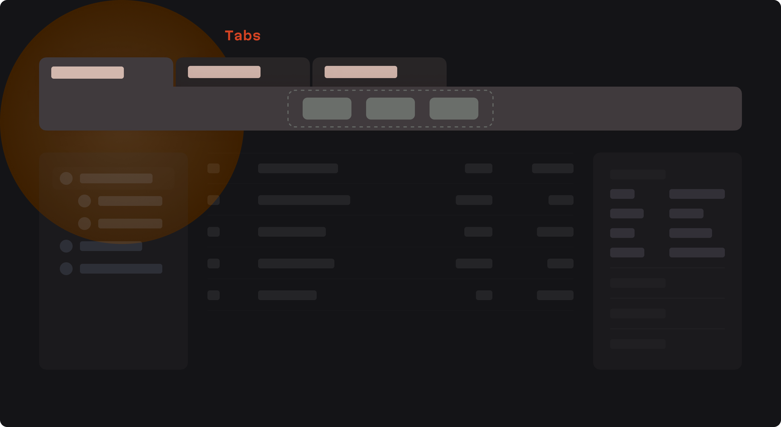
Tabs enable users to quickly switch contexts without losing their place. They are vital for multitasking and keeping track of open workspaces. Tabs reduce the cognitive load and organize work into manageable sections.
But, to do their job effectively, tabs must also be intuitive and flexible to use, allowing users to open, close, reorder, and preview content as needed. How to make sure this happens? Let’s look at some key principles.
First, clearly distinct tabs are important because they allow developers to easily differentiate the multiple open files or views they likely have open within an application.
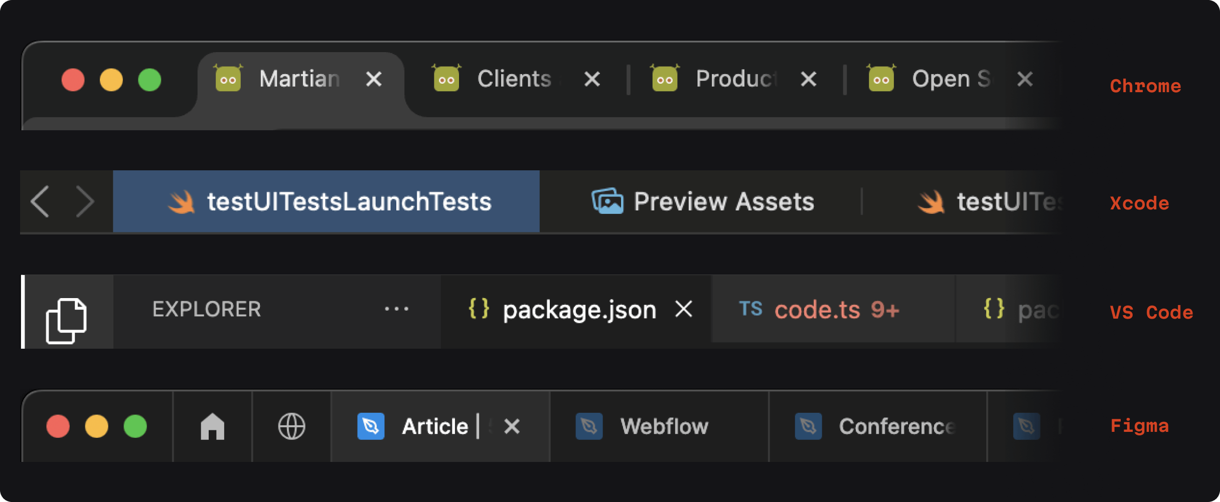
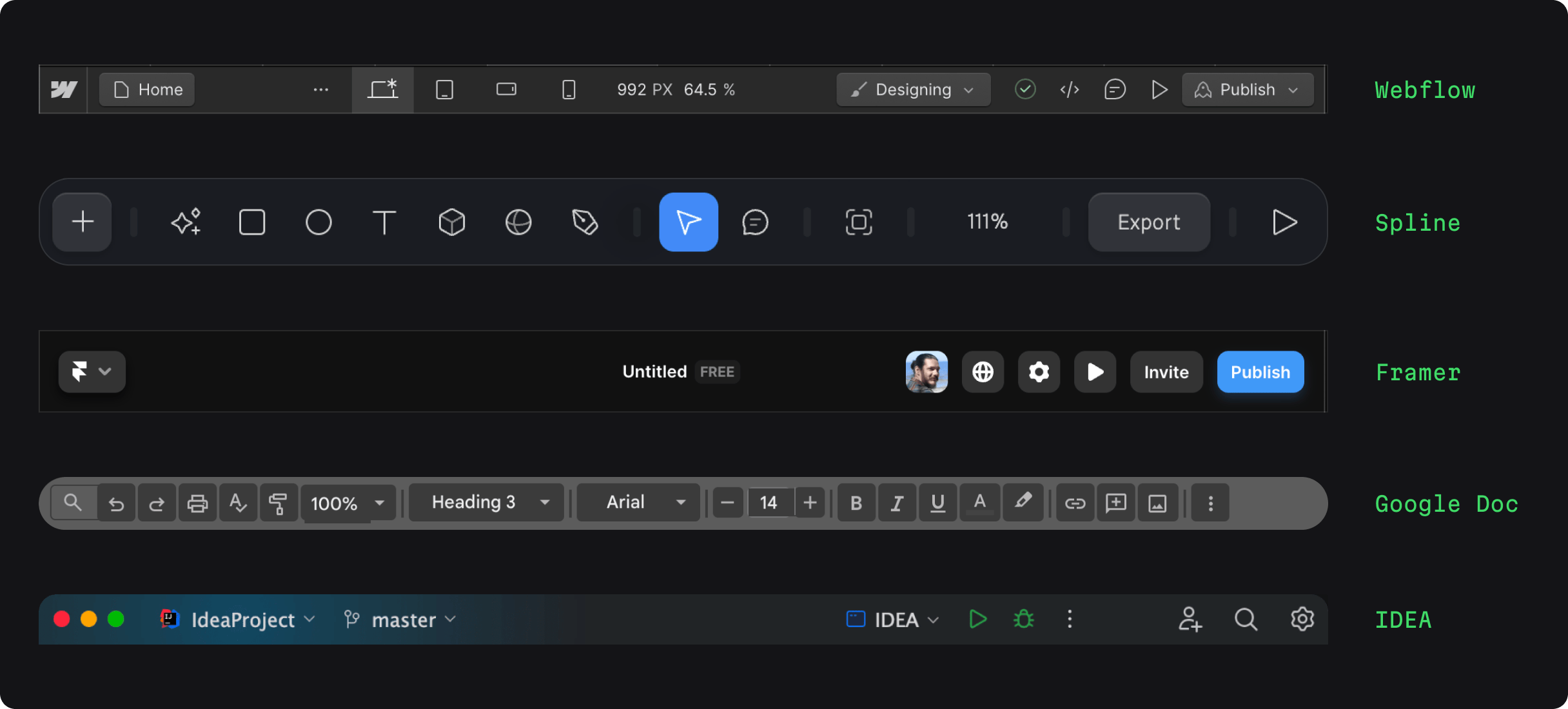
As we can see in the collection below, drawn from live developer tools, while there are several ways to implement this feature, across the board, some form of visual highlighting makes it clear where we’re working:

You can implement this on your own by following some simple guidelines:
- Clearly define the active state with distinct visual styling
- Provide visual cues like colors, underlines, or shadows to differentiate between active and inactive tabs
Let’s talk about where things can go wrong.
We need to ensure visual clarity. Specifically, the active tab must be distinct enough from inactive ones without relying solely on color, which might not be as obvious to all users, especially in a dimly lit development environment.

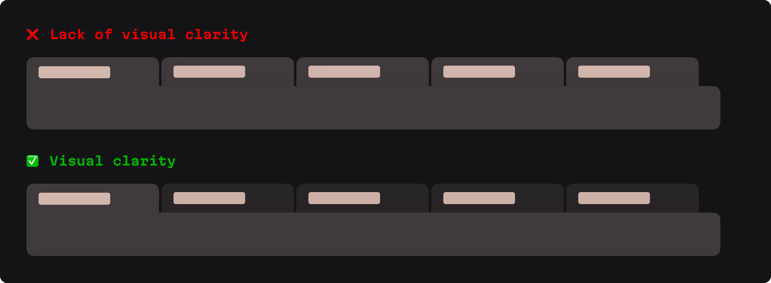
For instance, in the image with references above, we can see that when a tab is highlighed in Figma or VS Code, the highlighted tab also uniquely displays the “close tab” icon.
Second, take care when dealing with how tab titles appear when too many are open simultaneously:

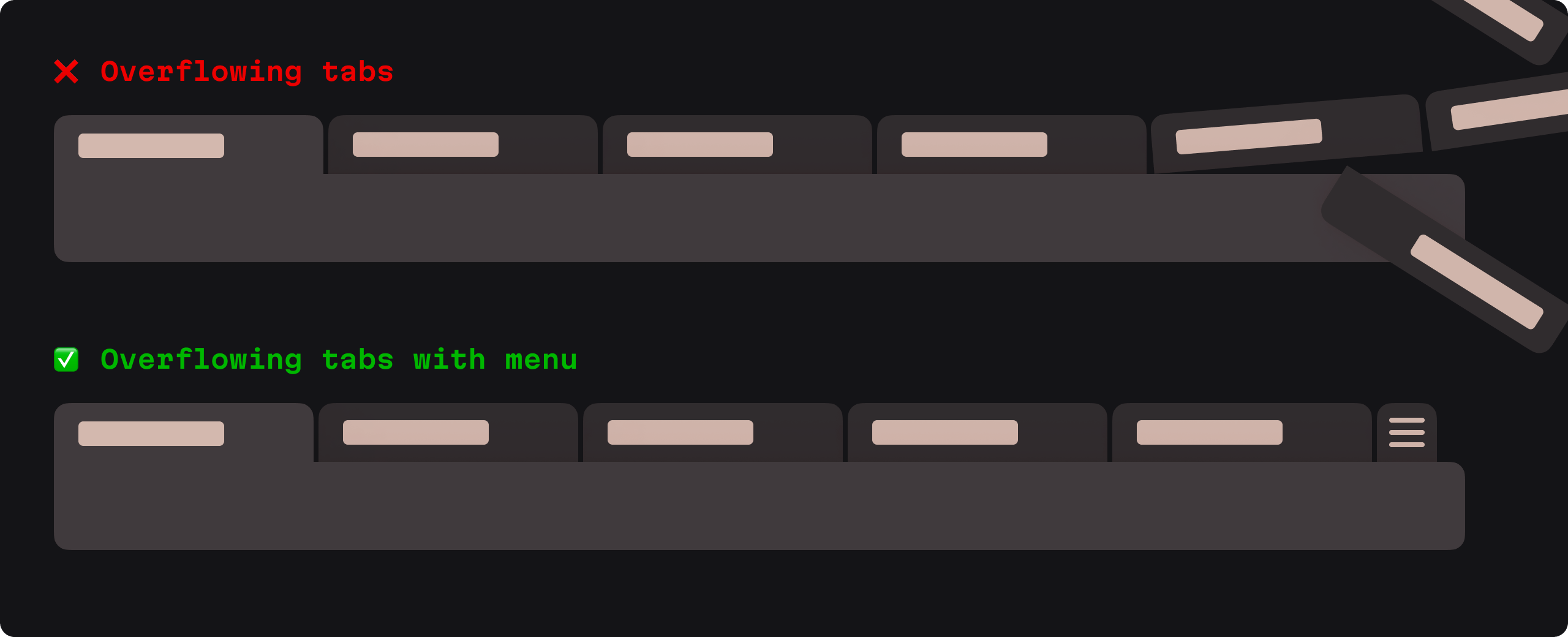
The “bad” example above demonstrates what might as well be happening during a tab overflow—complete chaos and mental overload. But the “good” example shows a way forward here: a menu. (Another possible option could be to allow for tab scrolling.)
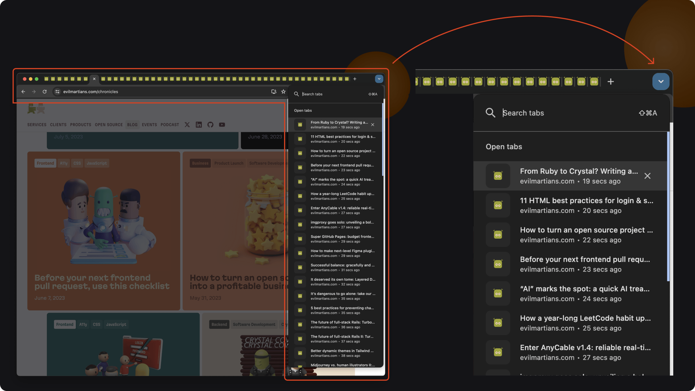
To illustrate, here’s how the Google Chrome menu allows for a convenient view and search functionality when a ton of tabs are open:

2: Toolbars
Really, developers are builders—and builders use tools. That’s where toolbars come in to play.
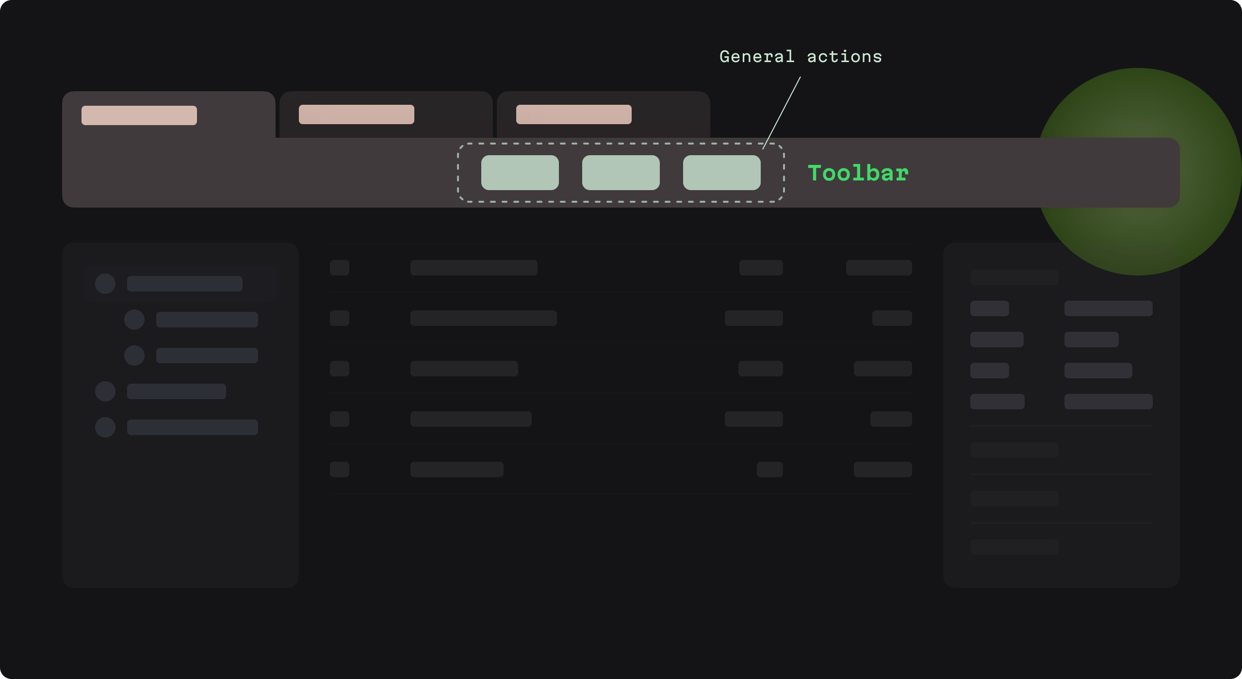
Here we can place common actions within easy reach. A well-designed toolbar reduces the need to navigate menus for every action, which can really have positive productivity impact on the overall development process.
Further, for developers who perform repetitive tasks (running tests, committing code, or debugging), a customizable toolbar means they can streamline their workflow, which boosts productivity.
In particular, action buttons provide quick access to frequently used commands (like save or run). Some examples:

So, how to start crafting your handy new toolbar?
First, it pays to determine the common actions in the user workflow, then design prominent buttons for those actions.
However, when dealing with toolbars, again, we have to take care here.
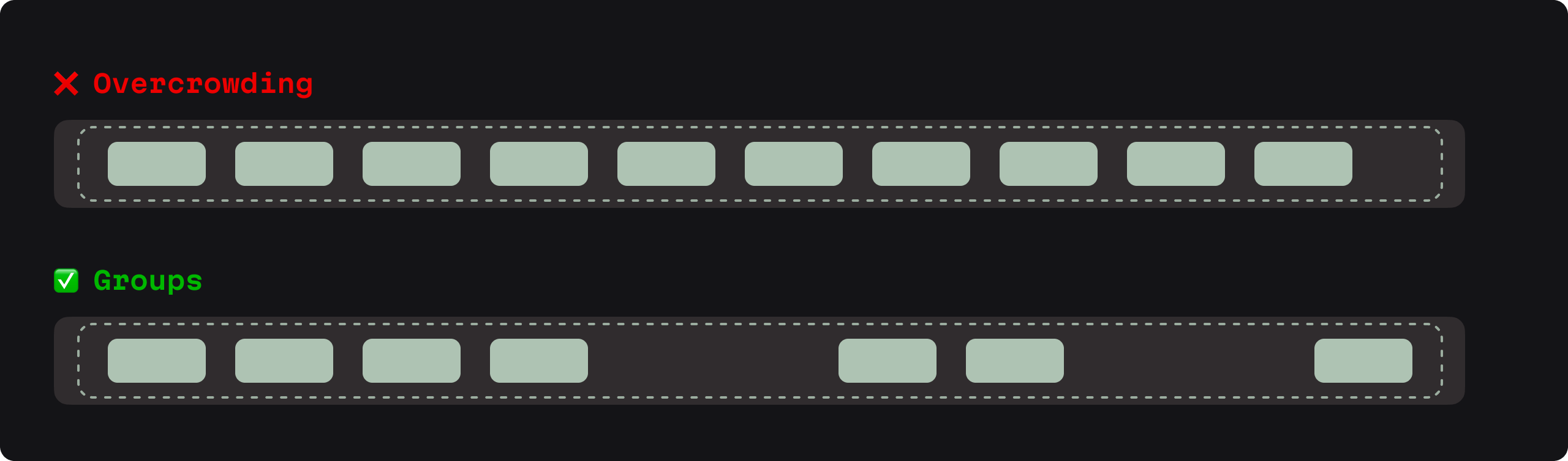
Overcrowding can be an issue. Including too many action buttons can lead to a cluttered interface, which can overwhelm users and making it difficult to locate specific commands quickly.
Instead, opt for group items to enable easy identification:

Additionally, avoid inconsistency. Action buttons that are not consistent in size, color, or design can cause confusion and mayhem.
And another point: action buttons that don’t adapt to the context of the user’s task can make the toolbar less efficient.
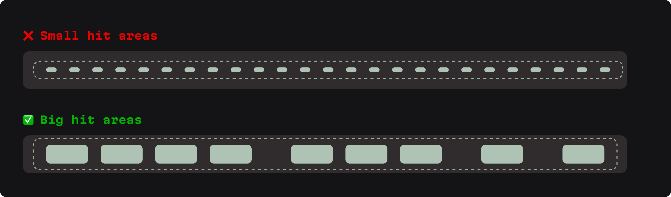
Finally, don’t neglect accessibility, and keep in mind that small hit areas for action buttons can be frustrating for users; it’s crucial to design buttons that are easy to click or tap.
3: Navigation sidebars
Navigating complex project structures can be cumbersome and time-consuming, but navigation sidebars act as a developer’s guide through an application. In short, they help users make their way through files, directories, and settings.
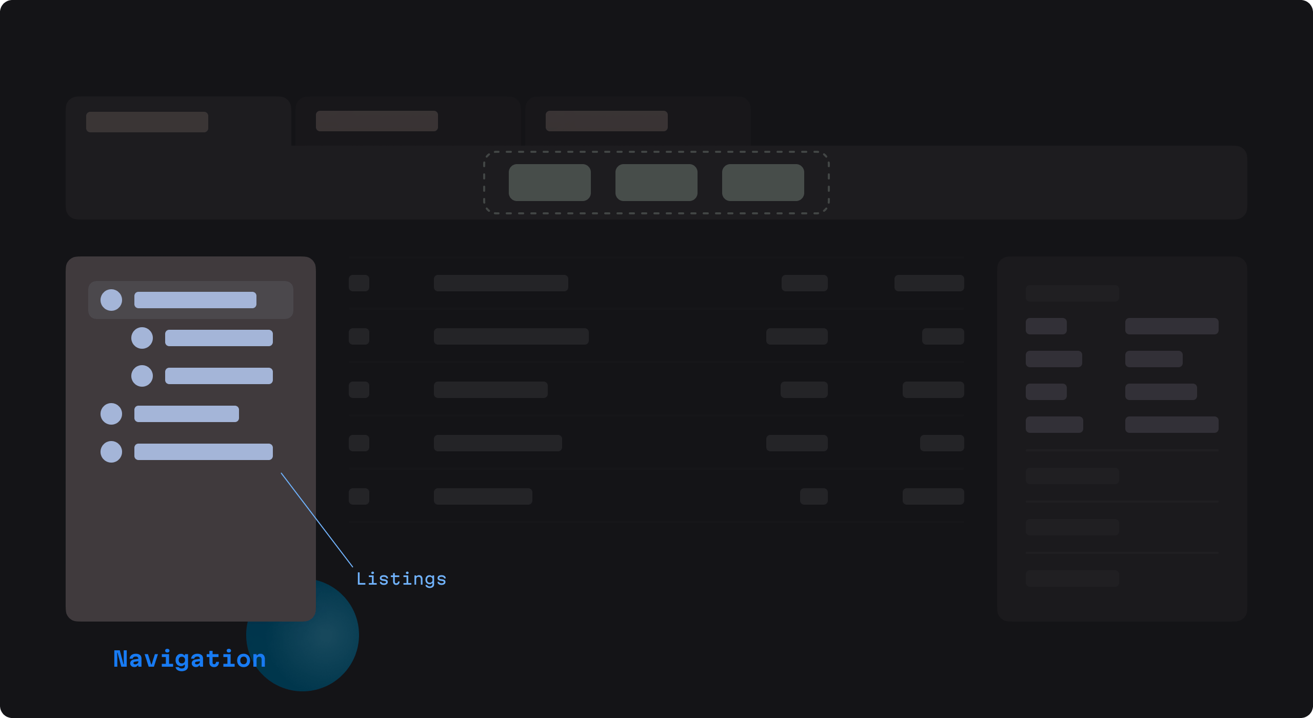
For complex development environments with deeply nested structures, a well-organized sidebar is essential. Features like collapsibility, search, and customization make for a more efficient and customized experience for individual users.
Use a hierarchical navigation system; this can allow users to rapidly grasp their projects’ organization and quickly navigate between different files and directories.
Again, let’s turn to some real developer tool examples to see how they do it:

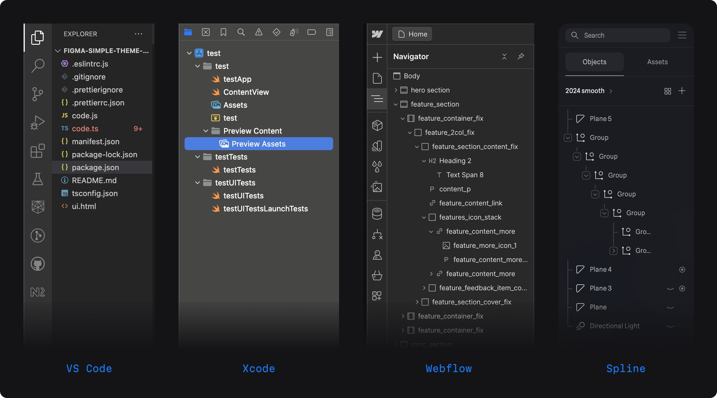
To implement this classic structure, simply follow these guidelines:
- Use indentation and tree-view structures to represent the hierarchy.
- Allow users to collapse and expand folders to manage visible information.
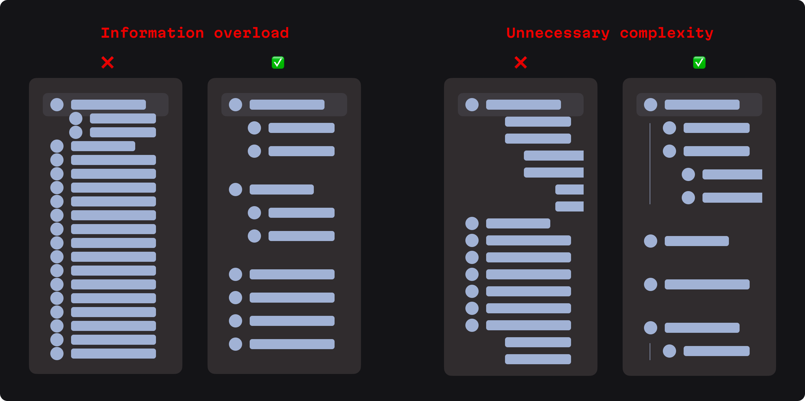
Be consistent with how folders collapse or expand. Otherwise, this can lead to usability frustration.
Despite the benefits of this kind of navigation, we must also take care to avoid information overload. When using a dense hierarchical structure, important actions (for instance, creating, moving, or deleting items) may become obscured or difficult to access. Further, presenting too much information at once can overwhelm users.

Finally, consider performance issues, since implementing tree views can result in bottlenecks if they aren’t optimized for large structures. That can mean slow loading times, and a bad UX.
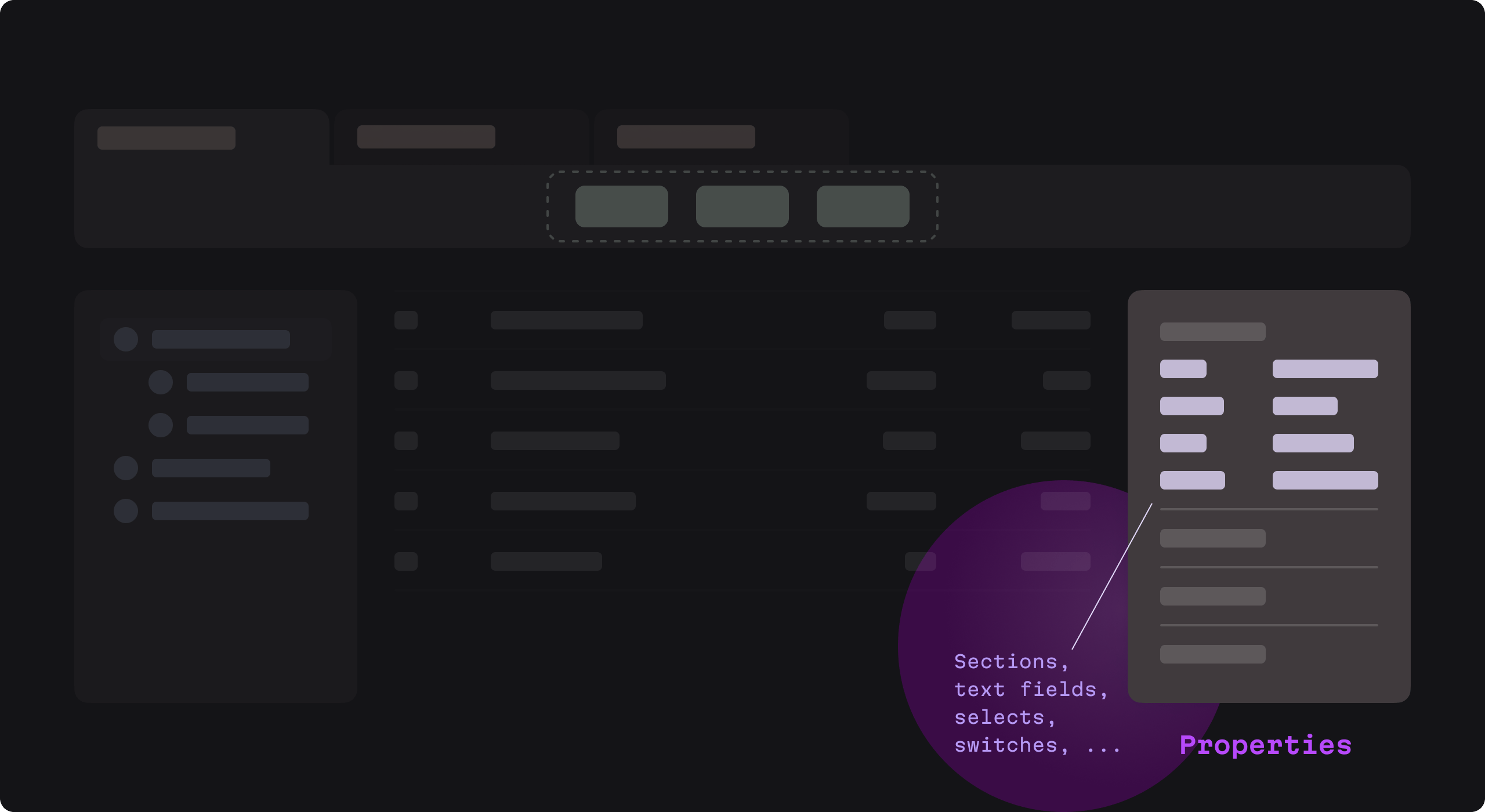
4: Properties panels
Moving on, properties panels represent a dedicated place for displaying and editing the attributes of a selected item. This could be a space where users adjust the configuration of a tool, modify metadata, or tweak the visual elements of a UI.
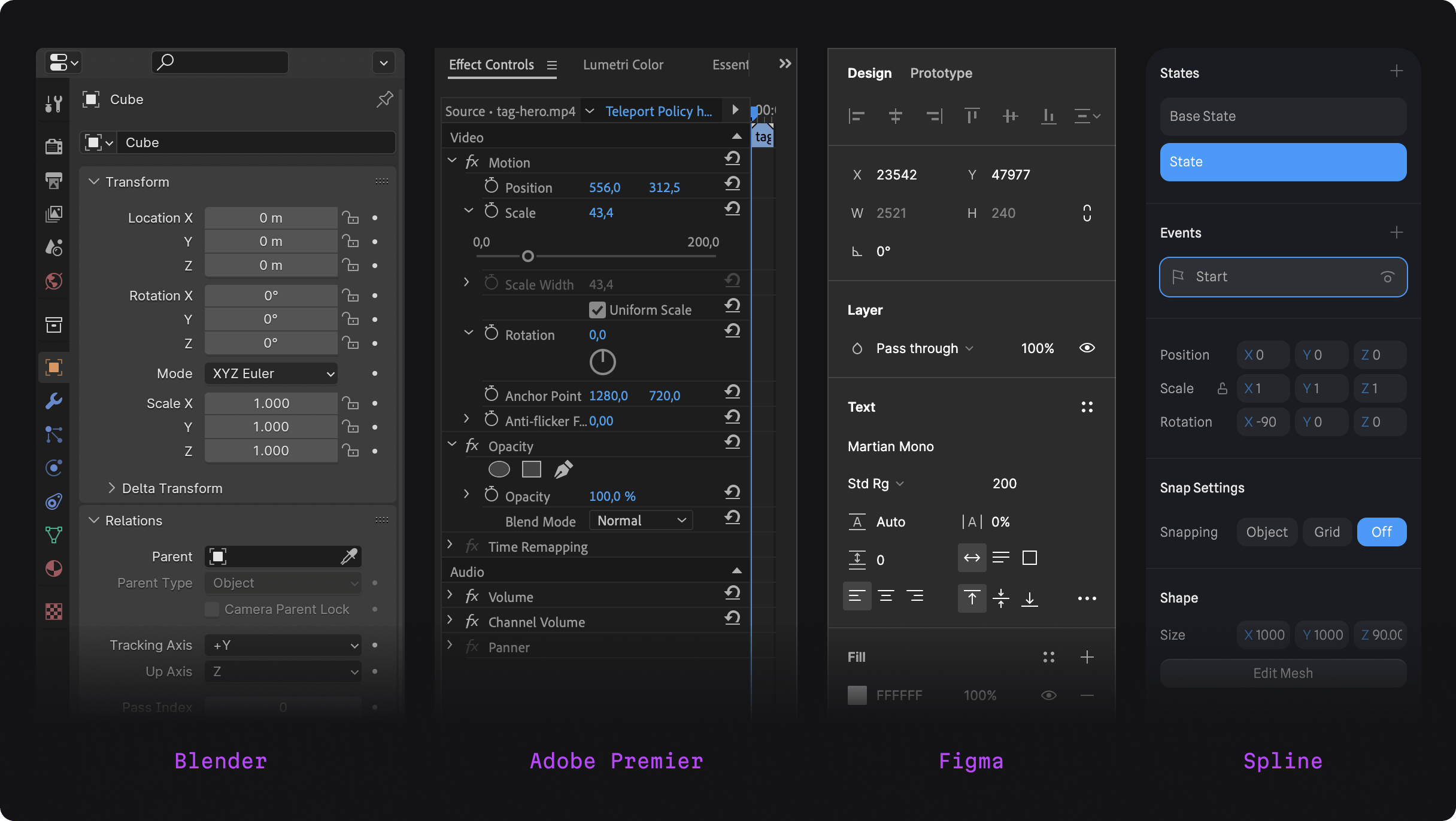
Again, let’s turn to some industry examples to show off what a property panel can look like in a developer tool:

So, as we can see, a lot of important action takes place within these panels. Therefore, giving immediate access to adjust these properties is incredibly important. And doing it without unneeded clutter is even more critical.
In this spirit, display properties in a label-value format for clarity.
We can see this clearly in the example above. For instance, Blender uses a hierarchical structure as we discussed earlier, but with label-value fields that quickly clue in developers for what adjustments the fields correspond to. For example, we see X, Y, and Z values paired with their corresponding number values.
When working within the framework of the label-value format, use inline editing with appropriate form controls like dropdowns, switches, and text fields. Of course, be consistent with how you use those controls across the properties. Don’t use a dropdown for one X value and an input field for others. This can lead to confusion, frustration, and, you know, bad emotions.
Keep in mind space constraint: property labels or values can wind up truncated, especially in complex applications with numerous settings. But don’t let this happen. It can add extra steps and complexity to a developer’s work.
Lastly, as with any UI, mind the cognitive load the layout will carry with it: property names and values can blend together if not clearly differentiated.
5: Tables
Finally, we come to our last stop: tables, as pictured smack dab in the middle of our roadmap below.
Tables offer us a fundamental way for displaying structured data, which is super common when dealing with development-related matters. Developers must be able to see, edit, sort, filter, and the ability to do all of that in an efficient way directly impacts their productivity and work experience.
At the same time, large tables can be difficult to read or navigate, especially when they contain many types of information. Let’s look at how some real life cases keep things clear.

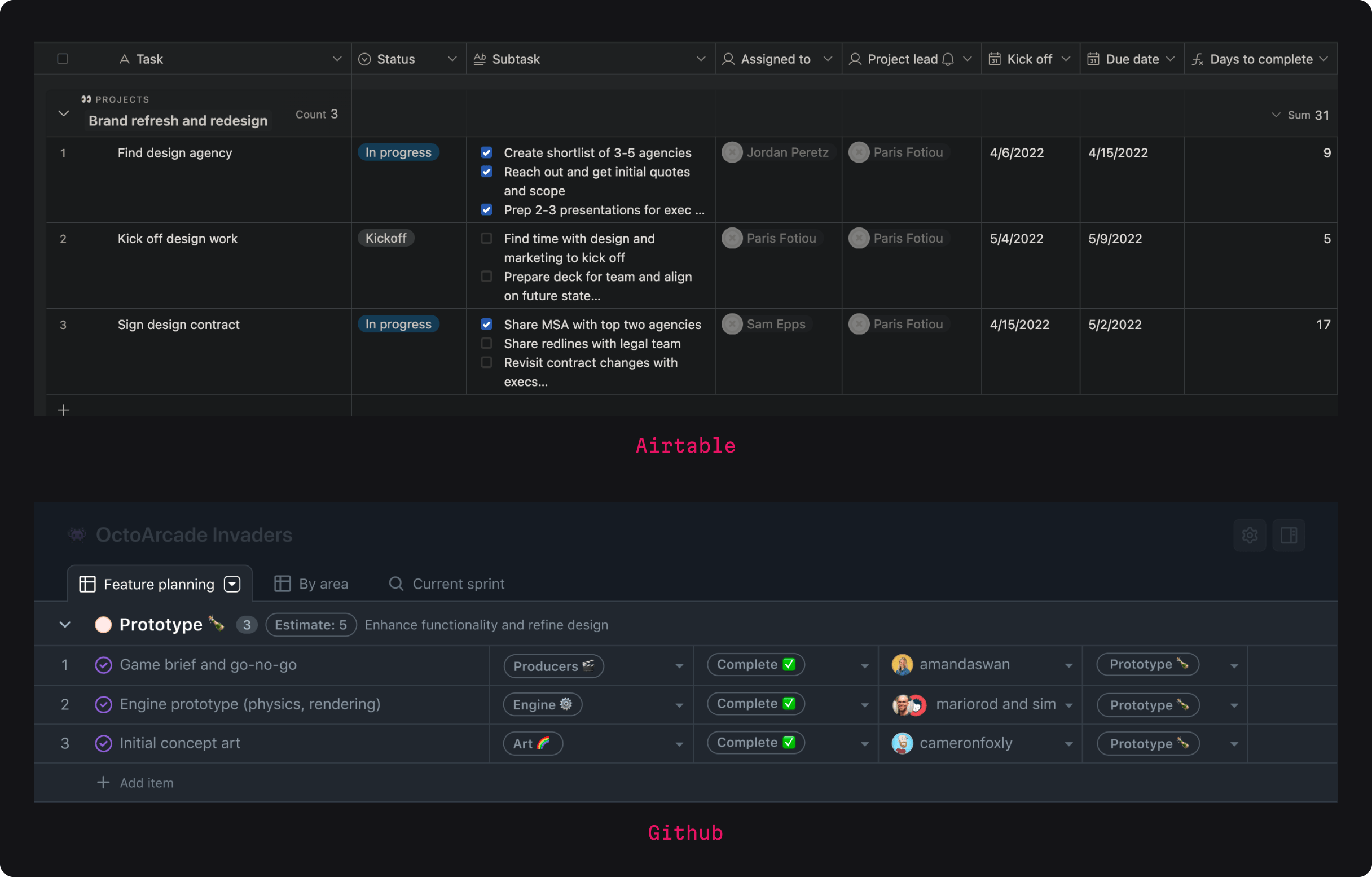
Employing bold and larger font sizes for table headers can establish visual dominance over data cells. Above, we see how Airtable’s colorful and customizable interface. The headers are distinct and bold, allowing users to effectively manage and visualize tasks.
We can utilize lighter font weights and smaller sizes for data to help support a visual hierarchy. Additionally, color coding, with subtler shades for data cells and stronger colors for headers can also aid visual separation. GitHub’s issue tracking and repository tables use both color and typography to differentiate between issue titles, labels, and metadata, making scanning and navigation more efficient.

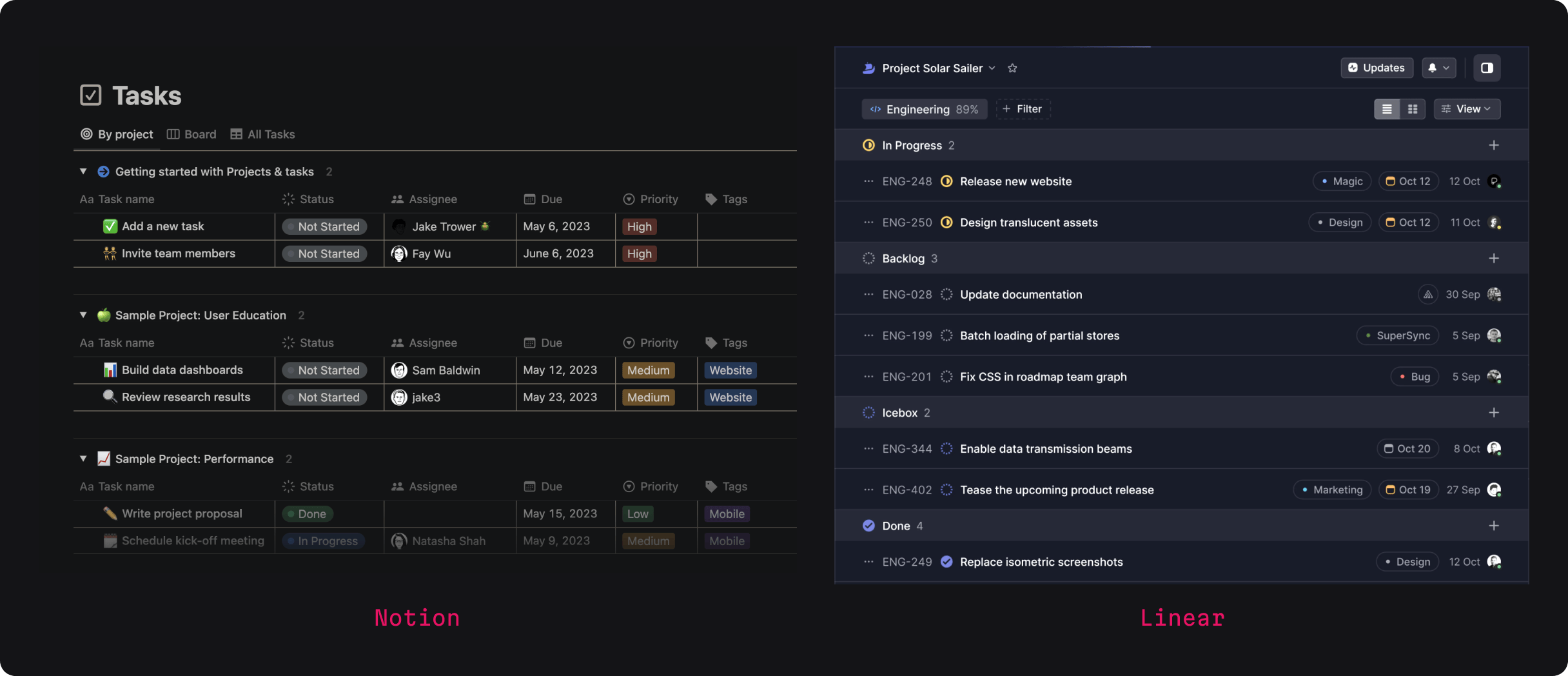
On the right, we also see how Linear employs a minimalist table design, leveraging typography to craft a clean hierarchy that clearly separates task names, statuses, and descriptions.
Many developer tools employ hover row states. This is a visual cue that appears when a user hovers over a data row. We can change the appearance of the row under the cursor, making it stand out from the rest of the data. This helps users focus on specific pieces of information without losing their place.
Moreover, another useful feature for keeping users grounded are sticky headers. This just means that the headings remain visible as users scroll down through a table. The key info visible in the headings remain on the screen regardless of the user’s position in the dataset.
Now, there are a few things to watch out for here as well:
-
First, keep performance impact in mind. (Sticky headers, in particular, can drag things down if left unchecked and dealing with a ton of data.)
-
Second, keep your headings from getting too cluttered. Too many columns can overwhelm the eyes in the blink of, well, an eye.
-
Third, keep accessibility at the forefront. Users who rely on keyboard navigation or screen readers might find these features less intuitive if not properly implemented. Be sure to test out your implementations to make sure all is working as it should.
-
Finally, particularly with sticky headers, there’s the risk of content overlap or headers that consuming too much vertical space.