When it comes to the design, UI components are the foundation stone. That is why it is totally surprising that today’s design tools are so poorly suitable for work with components. Of course, there has been a certain progress lately, and the symbol update in Sketch 3.7 is a fine example. However, as useful as it was, this update didn’t change the situation entirely. There is still a lot of room for improvement.
Working with components. What it usually is
Let’s launch Sketch and make a button. Create a text layer and a rectangle, then align them, and turn them into a Sketch symbol. Everything is perfectly fine until you need a button with a long label.

Assume the button width depends on the label width. Unfortunately, this is not a case when Sketch Symbols can help. One has to adjust the rectangle to fit the label there is no escaping it.
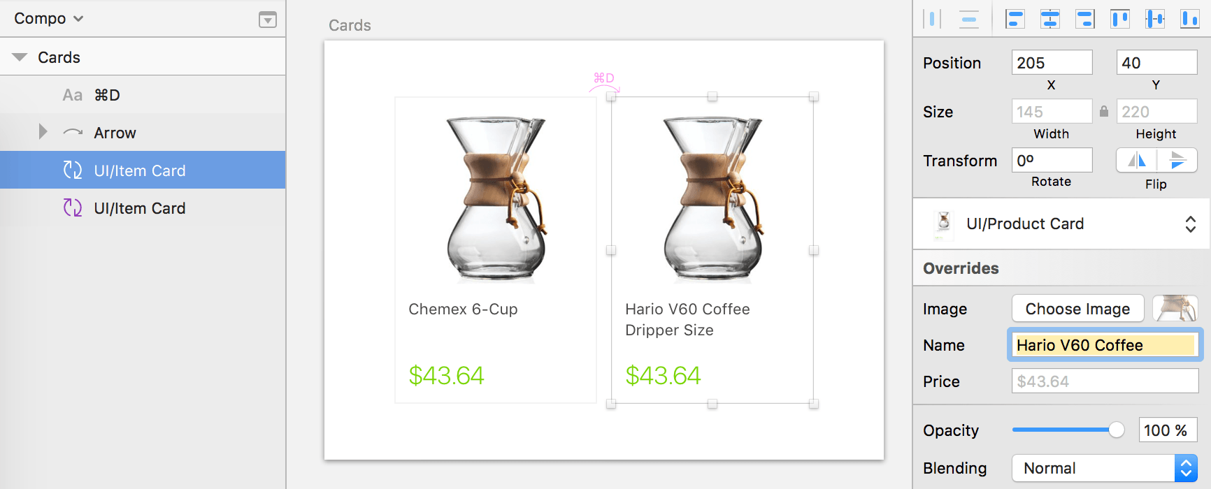
Another example. Let it be a more complex component like a product card with the photo, name, and the price. Turn this construction into a symbol, and the considerate Sketch will allow each item to have parameters of its own. Isn’t it great?

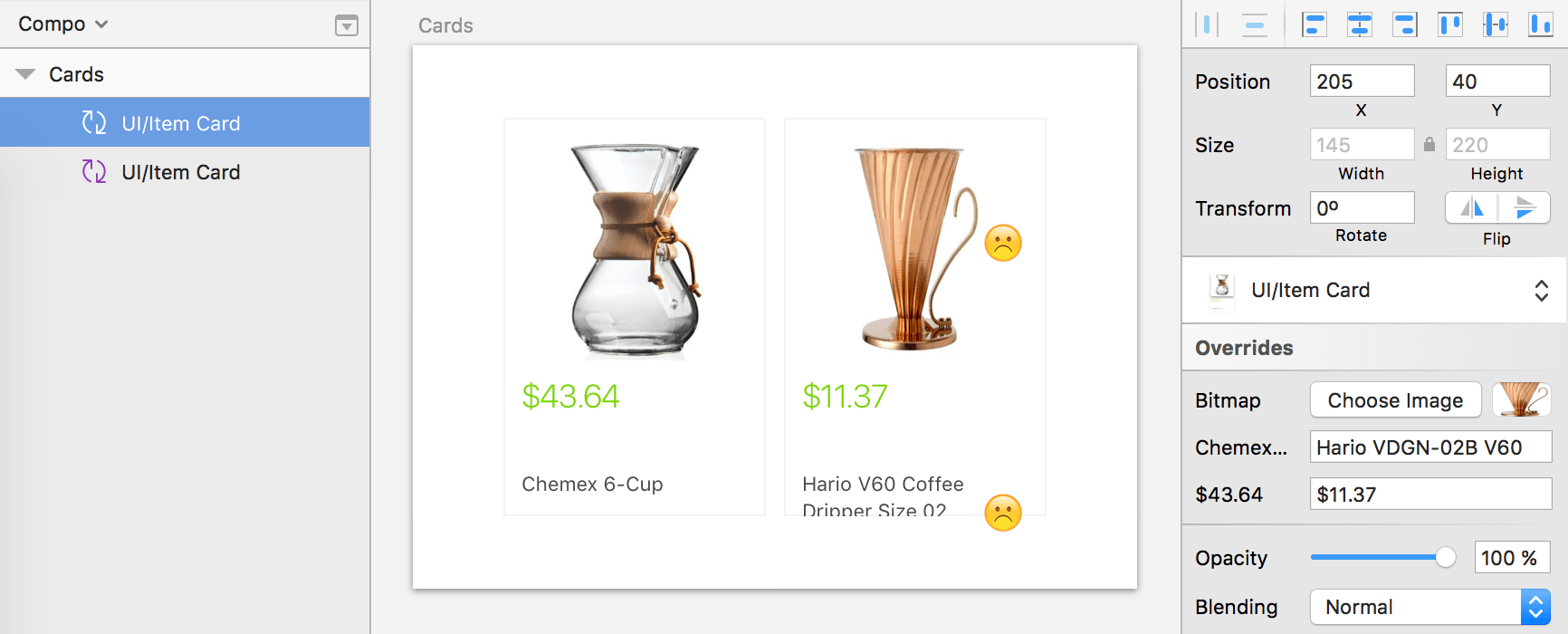
The problem is the tiniest change in our card will prevent Symbols from working. What if we have the price at the top and the name at the bottom with the name aligned by the bottom of the picture? If the name is shorter or longer than it is by default, the construction will become a mess. The Symbol won’t know I want to align the text to the bottom.


