Ease and epiphany: 4 ways to stop misguided dev tools user onboarding

Developer tool users don’t need the typical onboarding process, period. That is, we don’t need to walk through a collection of features, buttons, or other well-worn ideas. Instead, dev tools users need help getting up to speed with a tool as quickly, efficiently, and painlessly as possible. For developer tool designers, that means we’re looking to help our users reach an “a-ha moment” as soon as possible. In this post, we’re ready to share how we help both our developer tool clients and our own users reach that ultimate productivity revelation, the one where your tool almost turns your visions into reality faster than you can even imagine them.
Evil Martians work with and develop dev tool startups, and we’re well-familiar with the most substantial challenges of onboarding for professional tools. For this post, we analyzed 40 modern web-based devtools and synthesized that knowledge with our own experience. So the advice we’ll share here isn’t just pure opinion, we’ve put in the years to back it up.

Irina Nazarova CEO at Evil Martians
Let’s back up: for regular apps, interactive walkthoughts have really become synonyms with “onboarding”, which is actually a much more complicated process. In professional applications and developer tools, “onboarding” can require much more nuance and consideration. Basically, developers and consumers have fundamentally different needs.
Stay with us here: our goal should be for developer tool users to reach this epiphany as soon as possible. To describe it in more detail: after this moment has been reached, everything “clicks” and the user then understands quite well how to utilize the tool to solve problems, deploy products, and make their development work easier.
The main problem of onboarding for professional tools is simply getting users to understand tools that can be fairly more complicated and specialized to use than regular consumer apps. The other challenge is that efficiency is incredibly important for professional tools, so we need to help them understand the internal data model and strategies to ensure they have absolutely the best, most efficient use of the product. To that end, let’s look at 4 fundamental steps to respect the unique requirements of onboarding for developer tools (including methods we can use to induce those critical pro user “a-ha moments”).
Remove non-necessary steps from initial setup
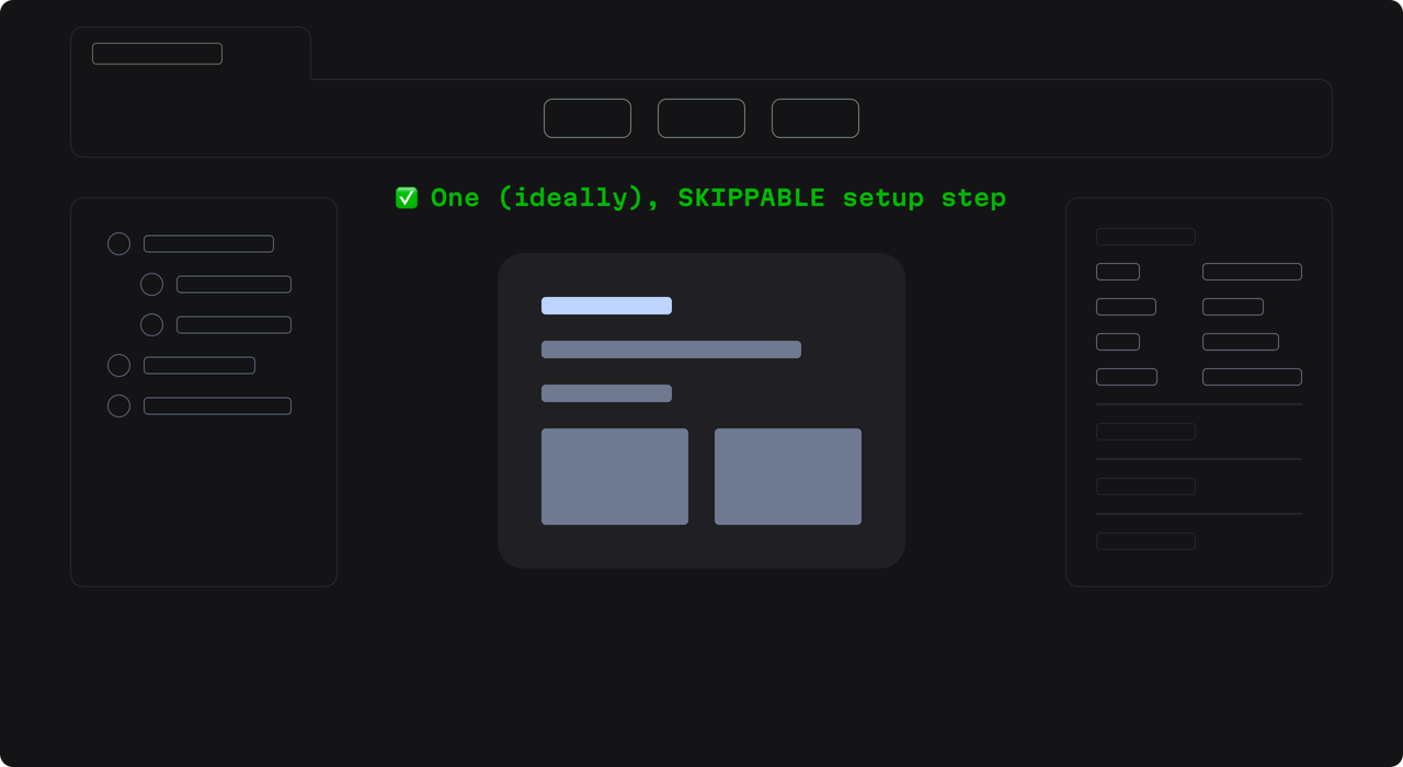
Don’t overcomplicate the initial setup. We need one screen that showcases what the user can do to start working with this developer application as soon as reasonably possible.
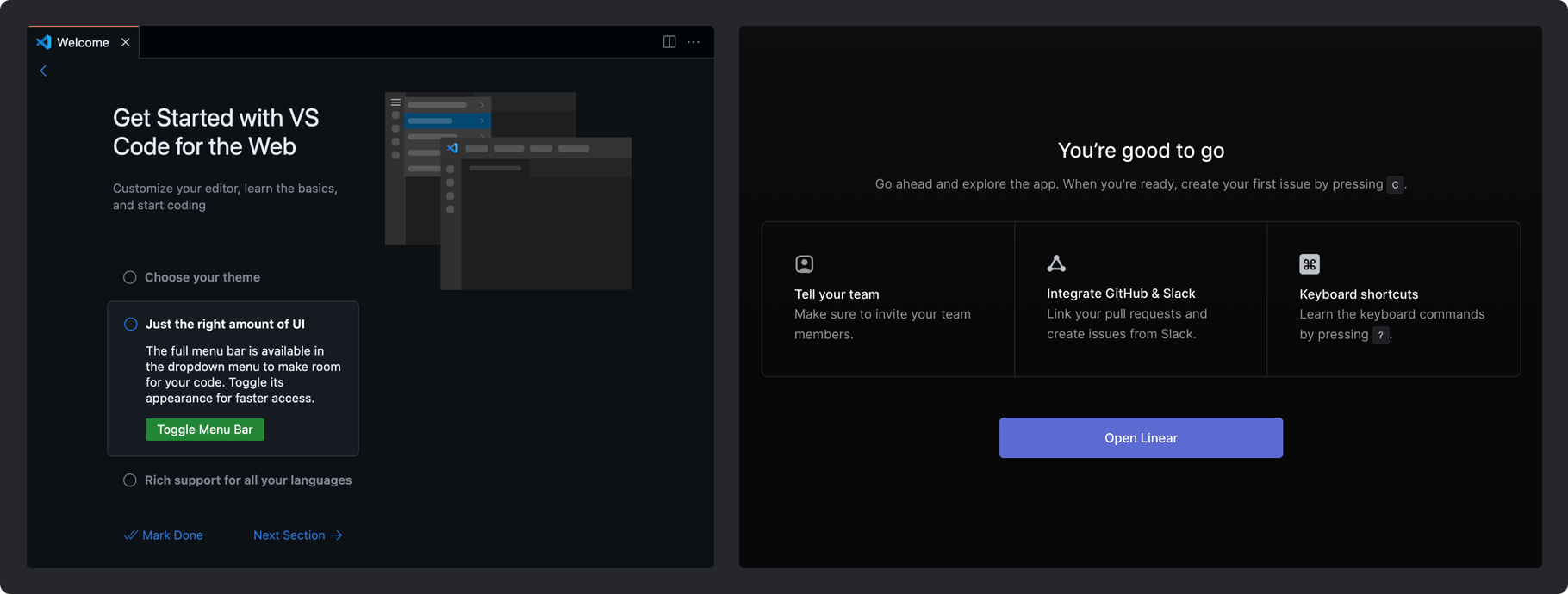
For example, on the left, VS Code has a multi-setup approach on one screen, Linear on the other side, demonstrates the steps you can take right now or later, there are collaborative features, and all of it is also unobtrusive and easily skippable for pro users.
Here’s the challenge: we must carefully consider each element of initial setup and what we show our users during this process. For example, if a GitHub connection feature is useful but not necessary for application functionality, it’s probably worth postponing it.
Another key (and complex) consideration are collaborative functions. On one hand, almost any app can be used alone, if your app’s value is better demonstrated via collaborative experience, then inviting the team is appropriate to do during initial setup.
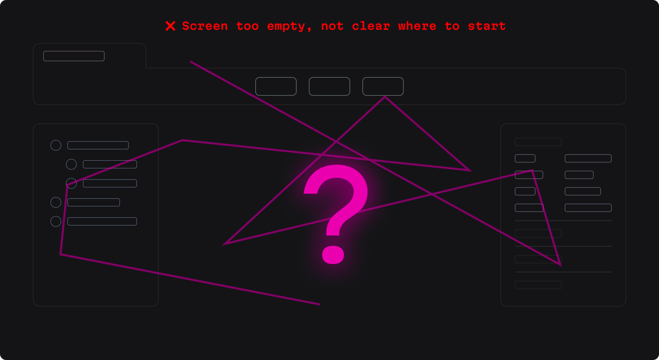
With all the powerful developer tools available to us, the temptation to do too much can occur here. However, this is an important temptation to resist. Here’s a generically bad example of what that might look like (without any resemblance any real company, of course):

Is every screen and option important to every user? No. Keep things simple:

“A-ha” moment accelerators:
- Ruthlessly eliminate anything not essential for core functionality
- Keep initial setup to a single, focused screen
- Delay collaborative features unless they’re core to your value proposition
- Make every setup step justify its existence (if it’s optional, it’s postponable)
Show them what to do
After initial setup, it’s naturally time for users to take their first steps with the application–and to begin the process of actually being able to do their jobs. At this point, we want to make it so that although the user might be in a slightly new world, they intuitively understand the “next step”, whether that involves documentation, creation, or whatever.
Here are some basic examples of what these “next steps” can look across a variety of scenarios: a button to create the first basic entity, a link to a “Getting Started” documentation page, a set of prepared templates/boilerplates, and so on.
Take for example Vercel, as shown in the image on the left below. On their “Let’s build something new” screen. It’s time to build–simple and clear. They suggest first steps starting a project from scratch, or to build one by using a pre-existing template.
Meanwhile, when Posthog shows the “next steps” it operates from the sentiment of “Where do you want to start? Clear paths are presented, and coupled with the easily accessible (but again, optional) guides, the whole thing makes for a comfortable developer experience.
Posthog is a very advanced tool with an incredible number of use cases and a large number of potential users. Their efforts to accommodate the diversity of their userbase are commendable, but hard won. That said, if you find yourself juggling a lot of potential “next steps”, you can end up with a setup that lends itself to analysis paralysis from your users.
Moving deeper into designing the tools the users will work with, if you decide to go extremely minimalistic, take care not to arrogantly assume anything about the ability of your users. If you give some generic workspace with more negative space than features–or a confusing layout–well, it’s possible you’ll alienate some users!

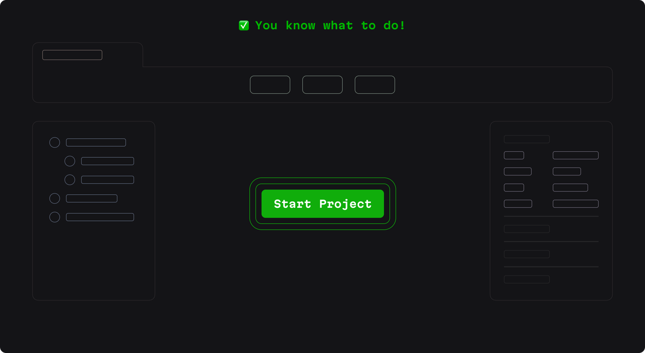
Instead, keep it simple. Start small with an important call to action, be consistent, and balance this against any impulse to overwhelm the user as you move through their workflow.

“A-ha” moment accelerators:
- Present clear, actionable “next steps”, and do so immediately after setup
- Give users an intuitive path for creating their first meaningful work
- Never leave users stranded in a blank workspace
- Even empty states should still guide the action in some way
Offer test data
If your application requires filling out forms or dealing with data, prepare test data and provide instructions on how to load that data as part of the getting started flow.
Firebase proposes starting a project on your own OR to try a sample app which shows you how you can work with the data on the platform: file structure, operations, all of the goodies. Meanwhile, Bolt.new balances different approaches. And for instance, on the far right, we see Medplum, which has specific sample data you can download and then upload in order to gain an understanding about the product and how it works with the relevant data.
“A-ha” moment accelerators:
- Provide immediately usable, domain-specific test data
- Show real-world examples of your tool handling actual workflows
- Sample data should educate and demonstrate best practices
- Let users experiment with realistic scenarios right from the start
Create a setup wizard or tutorial
For developer tools, everything should be skippable. But that doesn’t mean that everything should be skipped. If your developer tool is related to a field that is particularly complex, your guides will be better off to include some more immersive elements–so take users through the creative workflow of projects and entities, or show them an interactive guide that will show them how their changes will impact the result.
Create an interactive tutorial: SwiftUI provides an immersive tutorial in an interactive mode where you can see how the system works from a kickstart level. For example, it shows you everything about a project from scratch–all the way through to what it takes to get that classic “hello world” code running. As users go through this basic walkthrough, they not only gain the knowledge to work up their muscle memory with the tool, they also end up with a master template that they can use to start to immediately realize their visions.
Use a “Wizard” approach and help users as they set up a full app: Firebase goes further with their approach and sample app. Instead of just basic concepts, users end up with a fully functional prototype that showcases real-world implementation patterns.
Plus, this sample app acts both as documentation and playground. Developers can explore a complete working system, better understand how their own real projects might be structured, and by the end of it, developers have a practical reference implementation they can adapt.
You can see the file structure, the terminal running dependencies, and more. This leads into an important point: by the end, you get to see a project working for real. In fact, it is a real project–it’s your project, ready for you to adapt.
There are also advanced approaches, and these are sometimes necessary when it’s difficult or impossible to fill in the informational gaps. For instance, Supabase may present a quite complex setup from some users.
So, it takes users through the entire workflow, accompanying you (and lightly pushing you) as you embark on a project setup that will essentially end up with a result as in actual production deployment. In short, you not only get the “what” and “how”, but the entire development pipeline.
This experience aims to provide an understanding of the full scope of the tool’s capabilities and requirements (including in a real production context). This takes a lot more time than the other approaches, but is worth nothing as it can be appropriate in a few contexts.
“A-ha” moment accelerators:
- Make every tutorial step skippable–no exceptions!
- Focus on teaching the creative workflow possibilities over regular feature exploration
- Demonstrate the immediate impact of user actions
- Reserve any detailed walkthroughs solely for genuinely complex operations
A-HA!
Yes, this article was not the typical post about onboarding–and that’s because, like we’ve said, onboarding for developer tools is different. The tools are different. The people using them are different. The workflows are different. The business needs are different. Remember: developer tools users need help getting up to speed with a tool as quickly, efficiently, and painlessly as possible.
To that end, we also highlighted the importance of achieving the “a-ha moments” that transform regular developer tool users into those who have reached ultimate productivity enlightenment.
Oh yeah, also, you need good documentation, but you have that already, don’t you?


