We studied 100 dev tool landing pages—here’s what really works in 2025


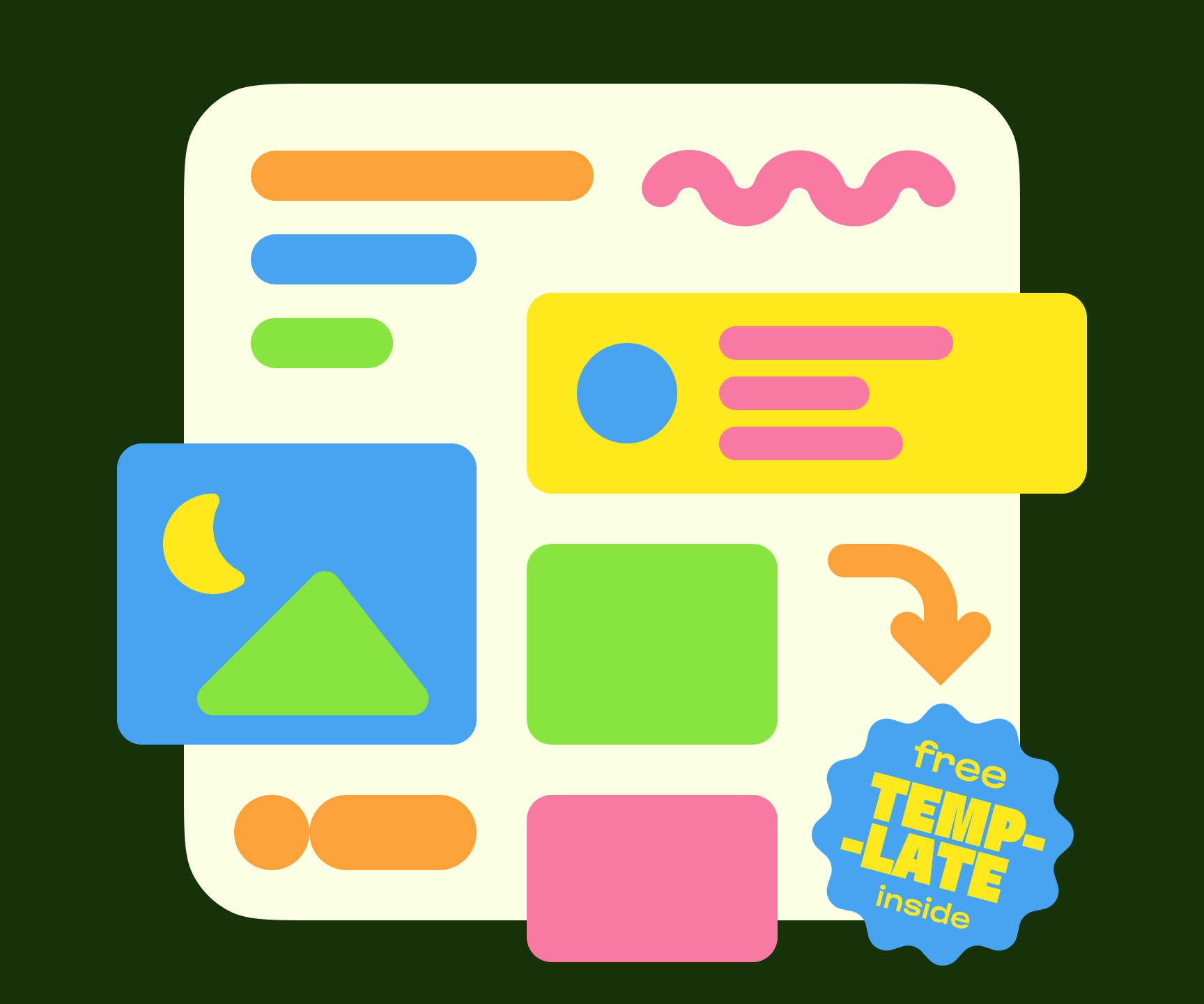
So, you’ve built an amazing open source project or developer tool. Now you need a landing page that doesn’t suck! You could spend weeks researching what works, A/B testing layouts, and second-guessing design decisions. Or… you could fight blank page pain by learning from what the best dev tools are doing in 2025. To save you the time, Anton Lovchikov, Head of Design at Evil Martians, analyzed 100+ dev tool landing pages, from Linear to Vercel to Supabase. Here’s exactly what works, backed by real data from real companies. (And yes, we’ve turned this research into an open source template you can use to ship within minutes.)
Here’s the structure that works for early-stage product landing pages based on our research:

Hire Evil Martians
Our free open source template is a great starting point. Now, let's talk go-to-market for your developer tool.
General layout notes
Before we dive into the specific sections, let’s note that two rules stood out across nearly every dev tool landing page we studied:
- No salesy BS.
- Clever and simple wins.
Most pages avoid flashy interactions. They focus on clean design: solid typography, clear layout, and enough breathing room. This makes sense since early-stage teams need to move fast, validate ideas, and get users. The flashy stuff comes later.
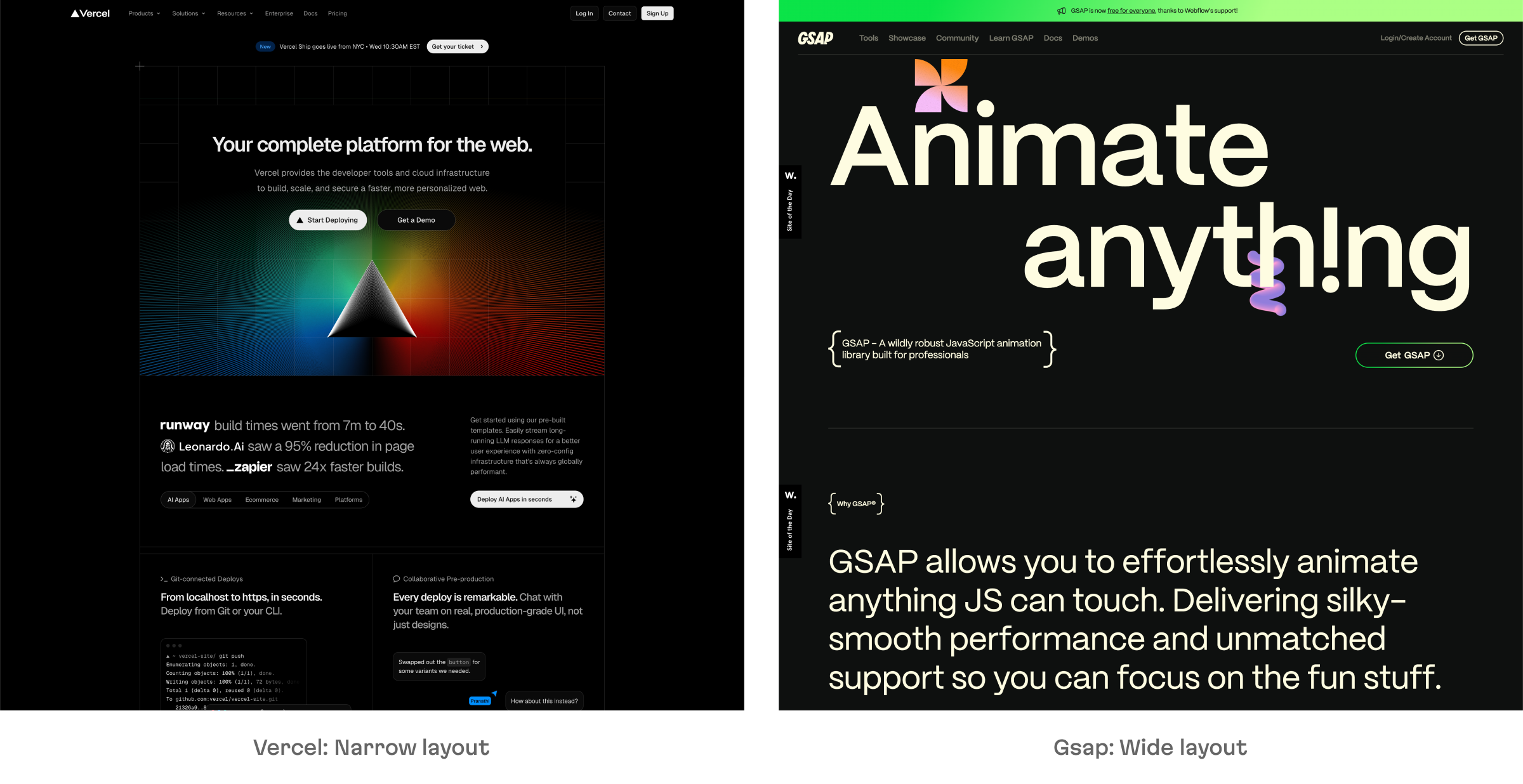
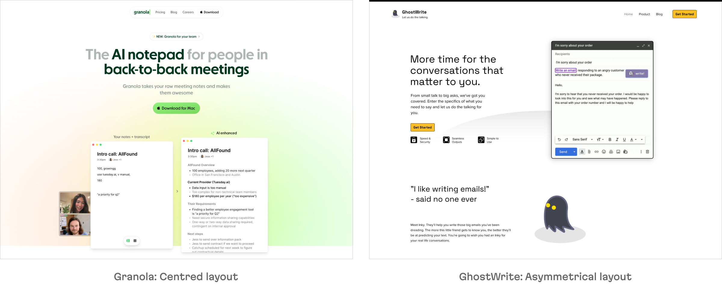
Almost all pages use a centered layout with a max-width container. It’s simple, readable, and quick to build. A few go wide, stretching edge to edge. While this is a bold move that can look premium, it’s also harder to execute. Still, if done right, it’s a good way to stand out.

Hero section
TL;DR: Use centered composition with a static or animated product shot and an engaging CTA.
Most developer tool landing pages in 2025 follow a surprisingly consistent pattern in the hero section.
Centered composition
In the vast majority of examples we studied, the hero section is centered: a big, bold headline in the middle of the screen, with a supporting graphical element placed right below. This looks stable, feels trustworthy, and it just works.
Only a handful of sites go for a side-by-side layout, with text on the left and visuals on the right. These feel more like classic SaaS pages, but while they can look great with the right design, they seem to be the exception, not the rule, especially in the dev tools space.

Main visual element
The graphic part of the hero section varies a lot depending on the product’s maturity and nature:
1. Animated product UI
This adds movement, shows off more product surface. Great for demos, but takes more effort to prepare.
Playbook: Animated product preview (we made screenshots of all landings as of today and put them into a single folder, so your design team can use it for inspiration)
2. Static product UI
Totally valid but also much faster to implement and still gives users a sense of what the tool looks like.

: Static product shot](/static/4ee71f7b98f6eac30fcfaf6f981dc2c5/hero-static-image.png)
Linear: Static product shot
3. Switchable multiple product UI
This works especially well if your product has multiple use cases or features, and you haven’t narrowed your core messaging yet.
Mintlify: Multiple switchable product shots
4. Live product embed
Some small utilitarian products skip screenshots entirely and embed a real, working UI element. It’s a power move if you can pull it off, but only realistic for narrow-scope tools (e.g. image upscaler, background remover, and so on).

: Live demo in the hero section](/static/bf78e9d8dda8ded2e5550996349ce909/hero-live-demo.png)
Pixelcut: Live demo in the hero section
5. Code snippet
Common for tools without much UI like libraries, SDKs, and infra products.

: Code snippet as main visual element](/static/d73b7f3b32c584633138fa3b1ab9940d/hero-code.png)
Tailwind: Code snippet as main visual element
6. Abstract illustration or no visual at all
Useful when the UI doesn’t yet exist, or when the product lives under the hood (e.g. observability, data infra). This is also used by stealth or pre-launch projects testing demand.
: Textual composition instead of UI preview](/static/6417e938849efe7d891aee97dd4664e4/hero-no-image.png)
Recraft: Textual composition instead of UI preview
Eyebrows and Banners
In order to create a sense of activity and momentum around the product (something especially important for early-stage startups looking to gain trust quickly) product teams pack extra information into the hero section using small elements, like these:
Eyebrows are small text above the title, usually used for highlighting a new release, funding round, or launch event. This is a useful element for setting the context.

: A promo link featuring an important milestone](/static/ed0c686643c07c145aaba6eaa26b12e5/hero-title-link.png)
Ion: A promo link featuring an important milestone
A full-width banner at the top of the page—used for similar purposes, but often with a longer message.

: banner with new feature announcement](/static/cdd276e9ce660e5dbd5c029742ab84fb/hero-banner.png)
PlayAI: banner with new feature announcement
Call to Action
Leveraging two CTAs in the hero allows you to both convert paid customers and provide immediate value to developers, either through open source or direct access to documentation.
- The primary CTA is styled boldly. Try to avoid generic “Get started” language and use something more specific for your product: “Start building”, “Download now”, and so on.
- If there’s a secondary CTA (e.g. “View docs,” “Join waitlist,” or “GitHub”), it’s always visually distinct—lighter, outlined, or styled differently to avoid competing.
: Two CTAs with different styles](/static/2436896030da5b15ecb7acc870627b2f/hero-cta.png)
Cursor: Two CTAs with different styles
Trust block
TL;DR: Display logos of a few important customers or show off a few numbers demonstrating user engagement.
The majority of developer tool startups include a clients section, and most of them place it right after the hero. This is one of the fastest ways to build credibility. If your product is already used by teams with recognizable names—show them off. Remember, open source users are users, too.
There are two main directions this section takes, depending on the type of product:
B2B-oriented products
If your users are companies or teams, this section usually features recognizable logos. About half of the pages we reviewed go with an auto-scrolling carousel to fit more logos without taking too much vertical space. Products that don’t have a lot of clients with loud names yet present a short testimonial and a photo of a client representative instead.

: Client logo belt reinforced with a client testimony](/static/f4762ec1fa90766469ebee880c07435b/trust-clients.png)
Helocone: Client logo belt reinforced with a client testimony
Individual-oriented services
For tools aimed at solo developers, designers, or other individual users, it’s more common to see big numbers instead: GitHub stars, usage stats, or even awards like “App Store Editor’s Choice.” These stats show traction without needing enterprise names behind them.
: Uses Apple Design Award as the source of trust](/static/fbc607bfb7b22aaad5c62bda3137a58c/trust-regalia.png)
Play: Uses Apple Design Award as the source of trust
In some cases user reviews can be used for trust purposes.

: User reviews are placed right below the hero section](/static/ba9d70fc674b2ad37b0a469c380af1c5/trust-reviews.png)
Bulma: User reviews are placed right below the hero section
Feature block
TL;DR: Highlight real user problems and the way the product solves them instead of talking about features.
Once trust has been established, it’s time to explain what the product actually does and why it matters. Across the 100+ dev tool sites we studied, two layers of structure emerged: how the story is told, and how it’s laid out on the page.
Storytelling
Startups choose very different approaches to structure the narrative behind their features. Here are the most common ones:
1. A list of functions
This is the most straightforward—and weakest—approach. It’s a simple list of what the product can do, with little context or reasoning. This “here’s what we have, figure it out” approach is easy to write, but doesn’t sell well. It fails to connect features to user needs or problems.
: Function-forward approach](/static/11e8037022a5e9988b12e82195f0a539/features-functionality.png)
Voiso: Function-forward approach
2. Action-oriented or task-oriented stories
This one is a very common format. Each block starts with an incentive: “Build faster”, “Run anywhere”, “Ship in seconds”. This is slightly better than just listing functions (since it hints at use cases) but it often stops short of explaining why these tasks matter or why this product is the best way to do them. Easy to write, but light on persuasion.
: Clear and direct incentives describing the product](/static/fb3baad1e94597cdbb460a1d59a96711/features-action.png)
Fastgen: Clear and direct incentives describing the product
3. Problem-oriented story
More engaging and user-focused. The site surfaces a pain point and shows how the product solves it. This approach tends to create better emotional resonance—users feel like the tool “gets” them. It’s harder to write, but generally much more effective for early-stage products.
: Product description begins with stating a problem](/static/2d844e52ac5d9713216eec3b3f7bcd1f/features-problem.png)
Devinsight: Product description begins with stating a problem
4. Bold statements and evocative phrases
Some products skip problem framing and go straight for a punchy, opinionated voice. They use confident, standalone phrases to define each block—like slogans for each capability. This style can work well for established products with some reputation. It’s less suitable for new tools or niche tech, where clarity still matters more than personality.

: Feature section starts with a teaser “You don’t need a budget…](/static/7e081e6e34bf091f7e717c3e0ee54337/features-bold-statement.png)
Animoto: Feature section starts with a teaser “You don’t need a budget…
5. Mission statement-style storytelling
Rare, but powerful in the right hands. Instead of selling features, the site presents a vision: a bigger problem in the world that this tool is trying to solve. This approach only works when the problem is both real and under-appreciated, and when the team clearly believes in their mission. That’s not easy to fake.

: Storytelling begins with a mission statement directly from the CEO](/static/7d0a063aa96e0d42153512ae87bc521c/features-mission.png)
Circle: Storytelling begins with a mission statement directly from the CEO
Format
Once the story has been shaped, the next step is choosing how to show it on the page. There are several proven layout patterns, each with its own strengths.
1. Full screenshots with short descriptions
A common format for UI-heavy tools. Let the product speak for itself visually, with just enough text to explain what’s going on.
: Each feature is a screenshot with short description](/static/d112d6837ebd40fa903e7deb639ed4c1/feature-ordinary-image.png)
Cline: Each feature is a screenshot with short description
2. Chess layout
Here we see alternating image/text blocks: left/right, right/left. It’s simple and readable. Adds some visual rhythm without a custom design system. Great when each feature needs a bit more text to

: Chess layout makes feature presentation a little more interesting](/static/e05877e18d4501e535b06d9ce4ef065e/feature-chess.png)
Dust: Chess layout makes feature presentation a little more interesting
3. Text with icons
Works well when the product doesn’t have much UI (e.g. SDKs, libraries) or when describing lots of smaller features. Icon + headline + short text; it’s fast to skim, easy to write.
: Feature cards with icons](/static/340f6623a8e8373196c059f3cb3fe3a1/feature-icons.png)
PlayAI: Feature cards with icons
4. Belts
Full-width, often scrollable strips of cards or screenshots. Useful for showcasing many small elements—integrations, capabilities, feature tags—without overwhelming the layout. Adds motion and breaks up the vertical rhythm.
Flair.ai: Belt-gallery with product examples
5. Bento block
A grid-like layout with mixed card sizes. Good for visual variety and condensing a lot of info into a single screen. Requires thoughtful composition to avoid looking cluttered.

: Bento cards break the page rhythm making the layout more interesting](/static/3e45e83d44165e8a621eda143f650c8d/feature-bento.png)
Decent: Bento cards break the page rhythm making the layout more interesting
6. Tabbed feature block
A UX pattern that groups related features under tabs. Useful when features fall into logical categories (e.g. “Build”, “Deploy”, “Monitor”) or when serving multiple user personas.
Toggl: Several related features are grouped together under one tab bar
7. Step-by-step layout
Ideal for showing onboarding flows, setup processes, or how the product works from start to finish. Often uses numbered steps, short labels, and small visuals.
: Essential commands form a set of steps](/static/b6c6b2a4897959abf5ea5afe972426b4/feature-steps.png)
Bun: Essential commands form a set of steps
8. Rich cards
A design-heavy approach where each feature is treated like its own mini-section. These layouts take more time and effort, but can look highly polished and unique.
: Each functionality is decorated as a unique block](/static/fe00f625798c818197f1a72b011ea9fc/feature-rich-card.png)
Recraft: Each functionality is decorated as a unique block
9. Video tutorials
A shortcut for teams without time to design polished visuals. Embedding a quick demo or explainer video gives users a sense of the product in action—without building complex UI representations.

: Video demo welcomes visitors right below the hero section](/static/196839a99898bf9b5811d1a31725f4da/feature-video.png)
Avenue: Video demo welcomes visitors right below the hero section
Add-ons that support the story
Some products include extra blocks to clarify what the tool is, who it’s for, and how it fits into the user’s world. These sections aren’t always present, but they’re common—and helpful.
“How it works” section
A conceptual explanation of the product’s core idea. Especially useful when there’s some “magic” involved (like AI, automation, background syncing) and the product isn’t self-explanatory from the UI alone.
: Explains the core concept of their product](/static/c8946347274dec108da947aabbbea7d7/feature-how-it-works.png)
Granola: Explains the core concept of their product
Usage examples
Popular with tools for individuals or small teams. These sections show off real outputs: presentations, images, dashboards—to spark ideas and show what’s possible. It’s a practical way to inspire use cases and trigger interest.
: Examples of modes created by the users](/static/8832216252a6f8d150c232b4d792a51f/feature-usage.png)
Vizcom: Examples of modes created by the users
Compatibility / integrations
A block filled with logos of services, platforms, or languages the product works with. It signals maturity and makes it easy for users to see if the tool fits their stack. Especially important for utilities that sit on top of other tools or workflows.

: Visualization of integrations with other services](/static/144d9f2ed04486284faebd7f2816ce25/feature-integrations.png)
Fastgen: Visualization of integrations with other services
Social proof block
TL;DR: Select the most relevant user reviews and present them nicely. It’s okay if yoy have only one review.
Social proof is one of the main principles in developer marketing. Out of the 100+ devtool landing pages we studied, nearly all use curated testimonials (and not auto-pulled tweets or reviews). Even when it looks like a tweet or GitHub comment, it’s usually just styled that way and manually chosen. No links, no embeds. Just a clean, controlled snippet of praise that aligns with the message of the page.
Why? Because this approach is safer. It guarantees only relevant and positive feedback is shown. And frankly, it reads better, too: no broken formatting, no off-topic noise.

 selects and decorates reviews from twitter users](/static/41ce3e3b3ba378250a8640947650f405/reviews-curated.png)
PlayAI selects and decorates reviews from twitter users
This section usually lives near the bottom, after the product story is told. Just a few concise quotes, often styled with the person’s avatar, name, and company logo if it’s B2B.

 focuses attention on personas and their position at companies](/static/06b2b0cd974e01f860b5001d4ad8acc9/reviews-b2b.png)
Sameday focuses attention on personas and their position at companies
Even early-stage startups can benefit from this section. Ask your first client, a teammate, or even a friend to write one sentence about the product. That’s enough to add human voice and credibility.
As your product grows, you can move to a system that pulls real comments (from Twitter, GitHub, Discord, or wherever). Just make sure you moderate them. Linking to the source can increase trust, but only if what’s being said is truly solid.

: Features a review from one client](/static/26e9fbe3f129a7ddc83a3838683536a2/reviews-one-feedback.png)
Swarmia: Features a review from one client
A smarter pattern: integrating quotes with features
A few teams went a step further and used user quotes throughout the page, not just as a block. For example, a feature might be explained in one section, and right beneath it is a short comment from a user saying how much they loved it. This makes the social proof feel contextual, not bolted on, and it helps reinforce specific product value.

 adds user reviews right next to a feature description](/static/c07173e7b0743556d982d902985bc240/reviews-context.png)
Swarmia adds user reviews right next to a feature description
Supporting blocks
TL;DR: Don’t over complicate things. You probably only need an FAQ.
These aren’t must-haves for early-stage products, but they show up often enough to be worth mentioning, especially for more mature teams or startups entering competitive spaces.
Comparison Table
This section compares your product with existing tools, usually in a table format. It’s rarely used, but when it is, the goal is clear: to show that your tool does the same job, but better.
This is a good way to differentiate from other solutions in a highly competitive market, when the product is not revolutionary, but focuses on execution, speed, DX, and so forth. The format is usually a side-by-side table with checkmarks or concise feature differences. It’s a straight-up pitch for switching tools.

: Performance comparison across popular frameworks](/static/2db82529653782063b5360ada0b77299/comparison-table.png)
Astro: Performance comparison across popular frameworks
Pricing
Only a handful of landing pages show pricing directly. Most teams defer it to a separate page.
But when it is included, the design tends to be clean: side-by-side plans, a short label (“Free”, “Pro”, “Team”), a list of features, and a CTA button. Some teams add monthly/yearly toggles.
 includes the plans at the bottom of the main page](/static/65d24a0481ae9a7005993e41ceb0b5ec/pricing.png)
Plane includes the plans at the bottom of the main page
FAQ
The accordion-style FAQ block is a pretty common pattern. It’s usually placed near the end of the page and includes a handful of practical questions: “What happens after the trial ends?”, “Do you store my data?”, “Can I use it without logging in?”, and so on.

: FAQ section](/static/140f748cdf6224db7bcc02ad77b8762f/faq.png)
Forefront: FAQ section
Blog or Changelog Preview
Only a small number of more mature teams include this. It’s usually a narrow horizontal block with recent blog posts or changelog entries. It’s not there to drive clicks, but rather, it’s a signal: “we’re alive, we’re shipping, and we care.”
During the early stages, it’s enough to keep your updates (including the changelog) for your socials until you hire someone for maintaining a blog.

: Latest articles from the changelog](/static/bdc6343190cb7de26a88050048249441/blog.png)
Koyeb: Latest articles from the changelog
Final CTA
TL;DR: Make it big and loud. Don’t lose your last chance to convert a visitor.
A strong, distinct CTA—a full-width block that visually stands apart from the rest of the layout—is the last chance to make the visitor act.
The best examples use a clearly separated background (colorful or dark-on-light), a short, motivating message, and one concise button with a single goal: start using, try the demo, or book a call

: Large edge-to-edge CTA block with animation](/static/dcc11a4fa3698ee706692966468c1672/cta.png)
Dynaboard: Large edge-to-edge CTA block with animation
This section isn’t just decoration. A clear CTA at the bottom works like a safety net—catching visitors who scrolled all the way down but didn’t click anything earlier.
One clever example embedded a calendar widget right into the CTA block, letting users instantly book a call with a person, like the CEO or CTO. It’s a simple but powerful move—especially for startups with few leads, where each qualified visitor matters. For early-stage teams, this kind of frictionless scheduling can be more effective than yet another “Sign up” button.
: Uses a calendar widget as main CTA](/static/ef8b962b78db3e561e76e3a986d99010/cta-calendar.png)
Graphlit: Uses a calendar widget as main CTA
Need to ship your developer tool landing page fast?
Finally, we come to this! We’ve turned all of this research into a no-fluff, ready-to-use template. And it’s built specifically for developer products based on what we saw across 100+ startups. Check it out, it comes in both Webflow and static HTML versions.
Get started for free below: