Why Harmonizer?
There are many great color palettes out there—from design systems to brand colors provided by agencies. But these palettes often aren’t made with UI design in mind:
- Inconsistent levels: Same “level” colors vary in lightness/chroma.
- Contrast guesswork: Text colors often need manual adjustments based on the background of UI elements.
- Themes don’t mirror: Light/dark modes require custom mappings.
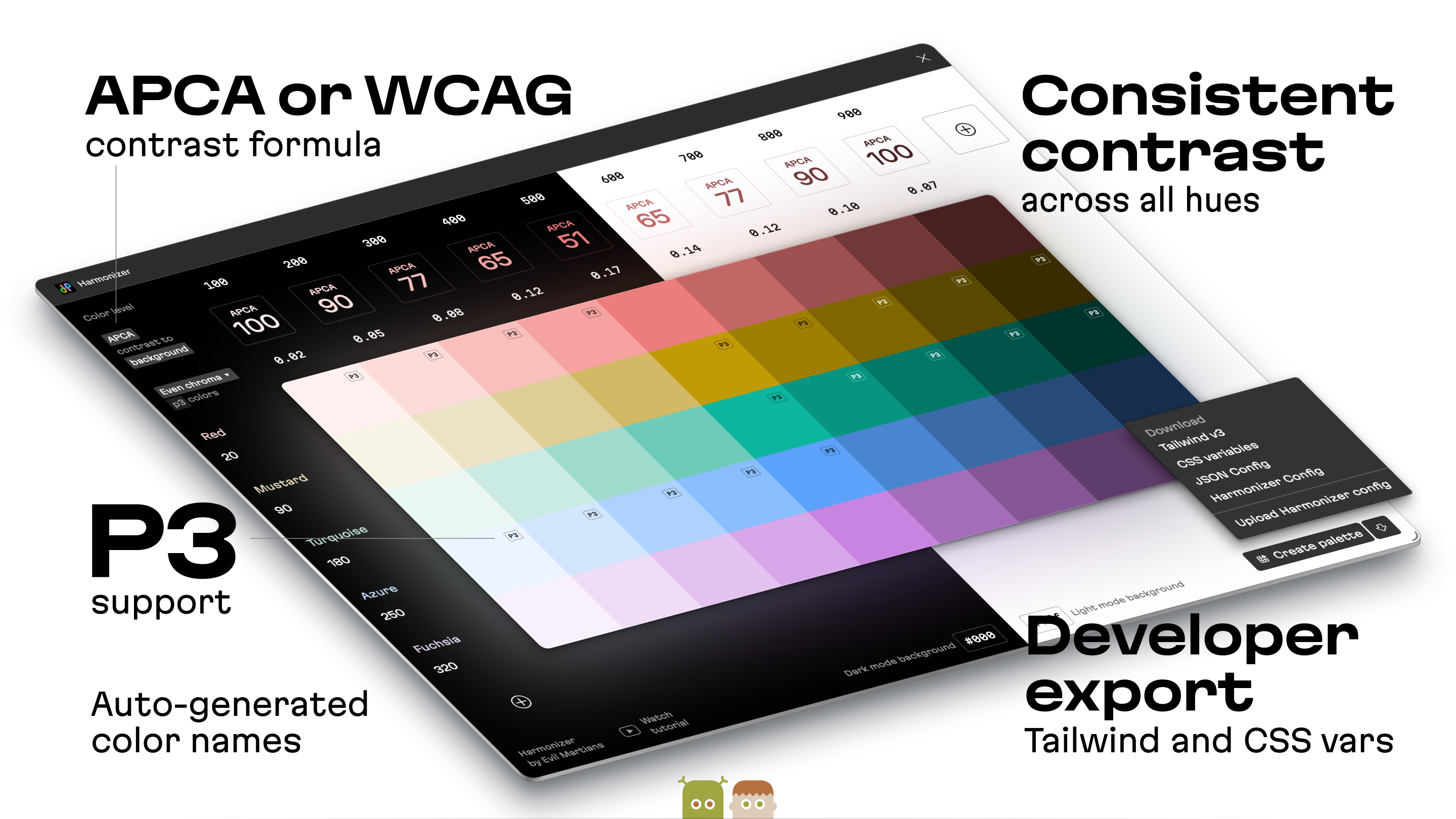
Harmonizer solves this by generating color with perceptually consistent lightness and contrast. It makes the levels reliable—you can change colors of the same level and be sure the text contrast remains exactly the same.
How it works
- Set color space (inherits from your Figma document: P3 or sRGB).
- Define levels (e.g., 100–900) as lightness steps.
- Adjust contrast per level (calculated against your background).
- Add hues and name them (e.g., “Brand Blue,” “Error Red”).
- Set background context (default: white/black; customizable).
- Create Palette > generates the color preview and variables in Figma file.