Brand guidelines
Here are our logo files, the two fonts we made, and a few rules for using them. They’re for anyone who needs to show Evil Martians in an article, on a slide, or in a list of partners.
Logos
Download allLogo
Logo filled
Logo stroked
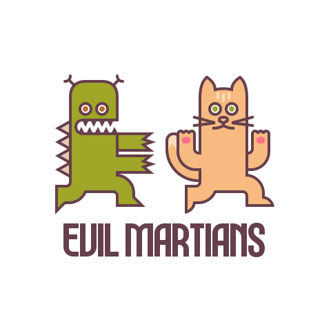
Logo lurkers
Logo lurkers filled
Logo lurkers stroked
Logo horizontal
Usage
- Don’t stretch, rotate, or add effects to the logo, and leave some empty space around it.
- The color logo works on both light and dark backgrounds. Don’t change its colors.
- The filled and stroked versions can be set in any single color. They’re meant for one-color printing and engraving.
- Use the square logo where you can. The horizontal one is for tight spaces, and the lurkers on their own are decoration and shouldn’t stand in for the logo.
- Our name is written as Evil Martians, two words, both capitalized.





Fonts
Both typefaces were designed by Roman Shamin and are free to use under the SIL Open Font License.
Standard Regular works well for body text, Wide Bold for headings, and Condensed Regular for footnotes and captions.
Martian Grotesk
A quiet Martian farmer grew fresh corn, juicy kiwis, and six plump zucchini by the vast dome.
Weight
Regular
Width
Standard
Size
32px
Martian Mono
Martian engineers quickly fixed the buzzing pump while Jupiter’s red storm swirled overhead.
Weight
Regular
Width
Standard
Size
32px
Logo remixes
Sometimes we redraw the logo for a client or a special occasion. They’re just for fun and shouldn’t be used as the real logo.