6 things developer tools must have in 2026 to earn trust and adoption


When it comes to developer tools, the same six principles come up time after time. This post is our field-tested playbook for implementing them in the tools you’ll ship in 2026.

Irina Nazarova CEO at Evil Martians
Table of contents:
- Speed
- Discoverability and progressive disclosure
- UI consistency and predictability
- Design with multitasking in mind
- Resilience and stability
- AI governance
Devtool adoption vs. devtool dumping
Recent surveys tell a consistent story about devtool adoption.
Stack Overflow’s 2025 Developer Survey finds that 54% of respondents say they use 6 or more tools to get work done.

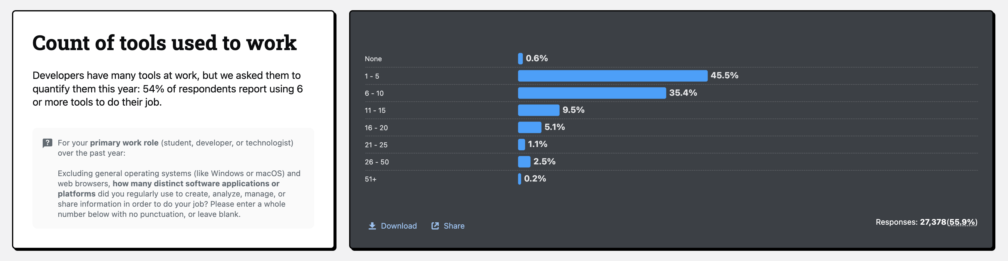
GitLab’s DevSecOps survey shows similar tool counts, and most teams say they want to consolidate to get away from a patchwork of home-grown tools that are hard to keep aligned and secure.

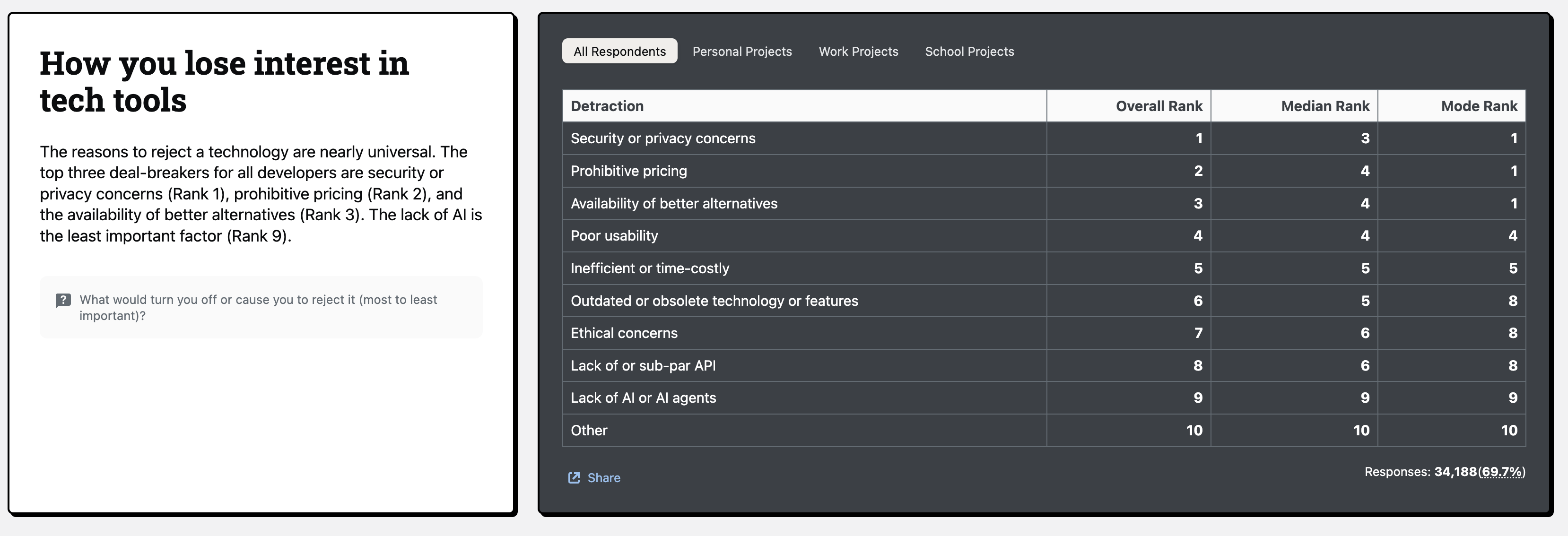
Meanwhile, some reasons developers drop tools:
- Poor usability
- Time-costly/inefficient experiences
- Security/privacy concerns
- Pricing that’s hard to justify.
(And by the way, “no AI” is almost never the deal-breaker.)
So, how to make sure that your developer tool becomes an invaluable asset in user toolkits? Let’s look at 6 markers of high devtool quality.
1. Speed
(Obviously) devtool speed directly affects work speed. Actually, latency is much more important than initial speed because devtool user sessions are much longer than those on usual websites. Thus, this latency compounds.
Slowness can also be a big problem because maintaining flow is critical. Developers can spend as much time (or more) waiting for builds, tests, and deployments they actually write new code. Accordingly, slow tools annoy users, then they quietly drop it.
So, we need to understand the different types of latency, because this will dictate how to fix the issue.
Microfreezes happen when you click or type, and the UI hesitates or locks up for a moment. Here, latency consists of input → next paint: how long it takes from a click/keystroke to visible UI reaction.
Slow jobs are when the system itself takes a long time to respond. Latency is job duration meaning how long the builds, tests, queries, deployments, or LLM calls actually take.
Microfreezes
Microfreezes destroy trust in the interface. Users start double-clicking, re-submitting forms, or assuming “it didn’t work”. The fixes are mostly UI-focused. You won’t make every job fast, but you can keep user trust by making the interface feel alive.
With devtools, interactions are dense and long-lived, so input → reaction time becomes the primary performance indicator. Even if a job runs for seconds, the UI must acknowledge the action almost immediately.
The RAIL performance model recommends handling input in <50 ms so users see a reaction within ~100 ms:

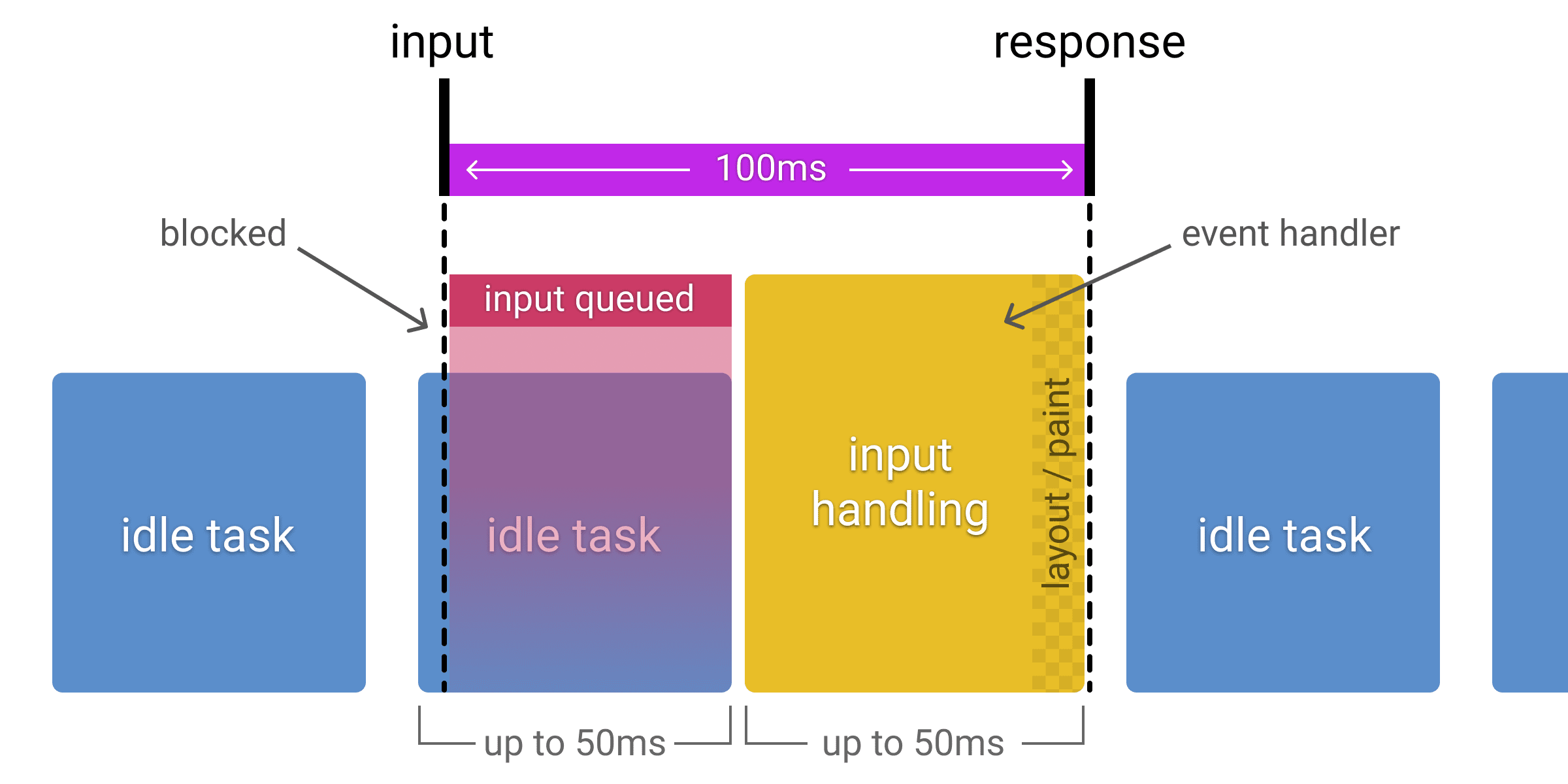
Core Web Vitals classifies an INP (Interaction to Next Paint) ≤ 200 ms (p75) as “good,” measured at the 75th percentile per device class:

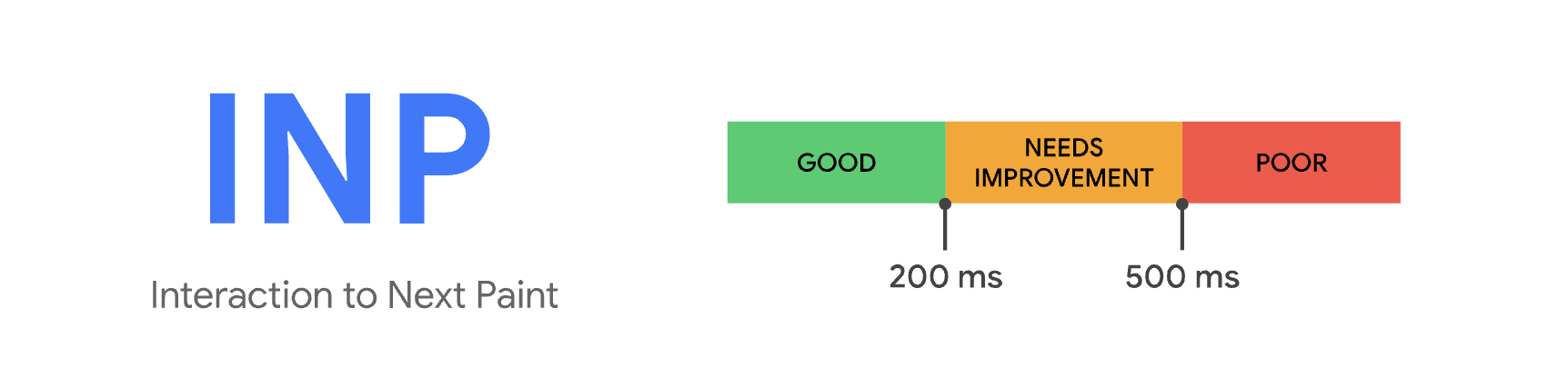
Aim for visible feedback on most interactions around ~100 ms and treat 200 ms as an upper comfort bound. Below that, actions feel seamless. If any more, people start to wonder what happened.
Slow jobs
Slow jobs are different. Here, the UI can be perfectly snappy, but the underlying work (tests, builds, migrations, LLM calls, log queries) takes too long.
Per-action latency is dominated by job duration. For instance: a suite of tests that takes 45 seconds and runs dozens of times per day, or a deployment can block you for several minutes. These may be “fine” from an infra perspective, but from “maintaining user flow” perspective, they’re catastrophic!
For heavy operations where sub-200 ms just isn’t realistic (complex queries, large remote workspaces, long-running tests), it’s better to admit they’re slow and design for it:
- Stream partial results as soon as possible
- Display progress and “time remaining” honestly
- Keep the rest of the UI responsive so people can do something useful while they wait
- Make pausing/canceling cheap so people aren’t afraid to abort and retry
- Cache aggressively when safe, so repeated runs are much cheaper than first runs
2. Discoverability and progressive disclosure
Devtools can be sprawling: commands, settings, profiles, panels, logs, extension UIs, and so forth. This begs the question: how easy is it for developers to find and use the things your tool can do?
Discoverability is the core navigation system for everything from editors to CI dashboards and observability consoles. This directly affects how fast developers can turn intent into action and how much of the tool’s power they actually use.
Discoverability
Poor discoverability quickly snowballs into UX debt, with people avoiding features, saving deep links, or repeatedly asking teammates “where did they hide that toggle?”.
Every find action exists in the “findability” loop:
recall → compose → retrieve → decide → act → learn
Good tools shrink each of these stages and make learning a side effect.
A simple way to think about this concept is in relation to task completion time, or the gap between realizing you need to do something and being done or understanding the blocker. (Our loop “recall + typing + scanning + deciding + acting” minus the time you save next time because the interface taught you something useful.)
Think that “search box” that shows up everywhere: editor command palettes, internal developer portals, CI job filters, log query builders. It’s worth treating this as one navigation system and designing them to feel equally quick and predictable, instead of tuning each entry point in isolation.
A last note: Accessibility = discoverability. Low-contrast or tiny controls are effectively invisible, especially on bad screens. Treat contrast tooling (e.g. Harmonizer) and built-in browser contrast inspectors as part of your discoverability pipeline, so accessible color and size decisions are the default.
Progressive disclosure
We’ve talked about discoverability as the navigation layer. Progressive disclosure is how you put power on top of that without flooding the default view.
Global command surfaces are your main lever of power here.
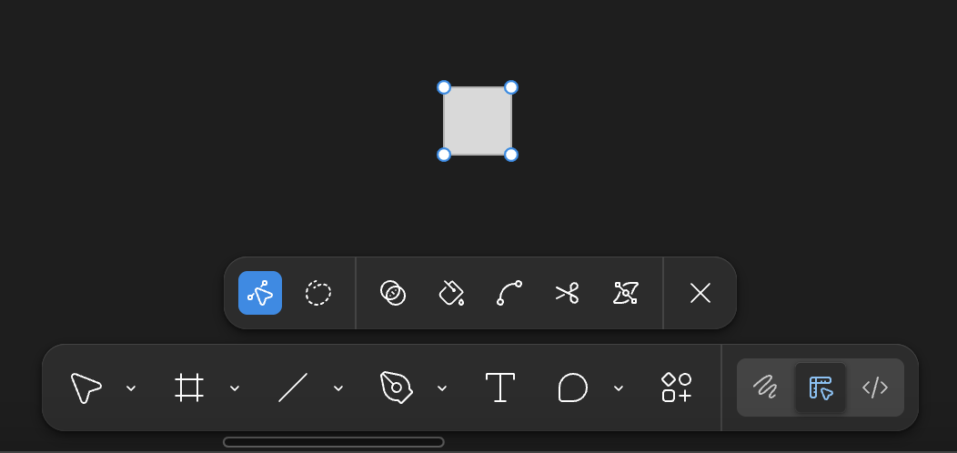
VS Code’s ⇧⌘P is the canonical example: one shortcut opens a searchable list of actions, and the relevant commands change with context.
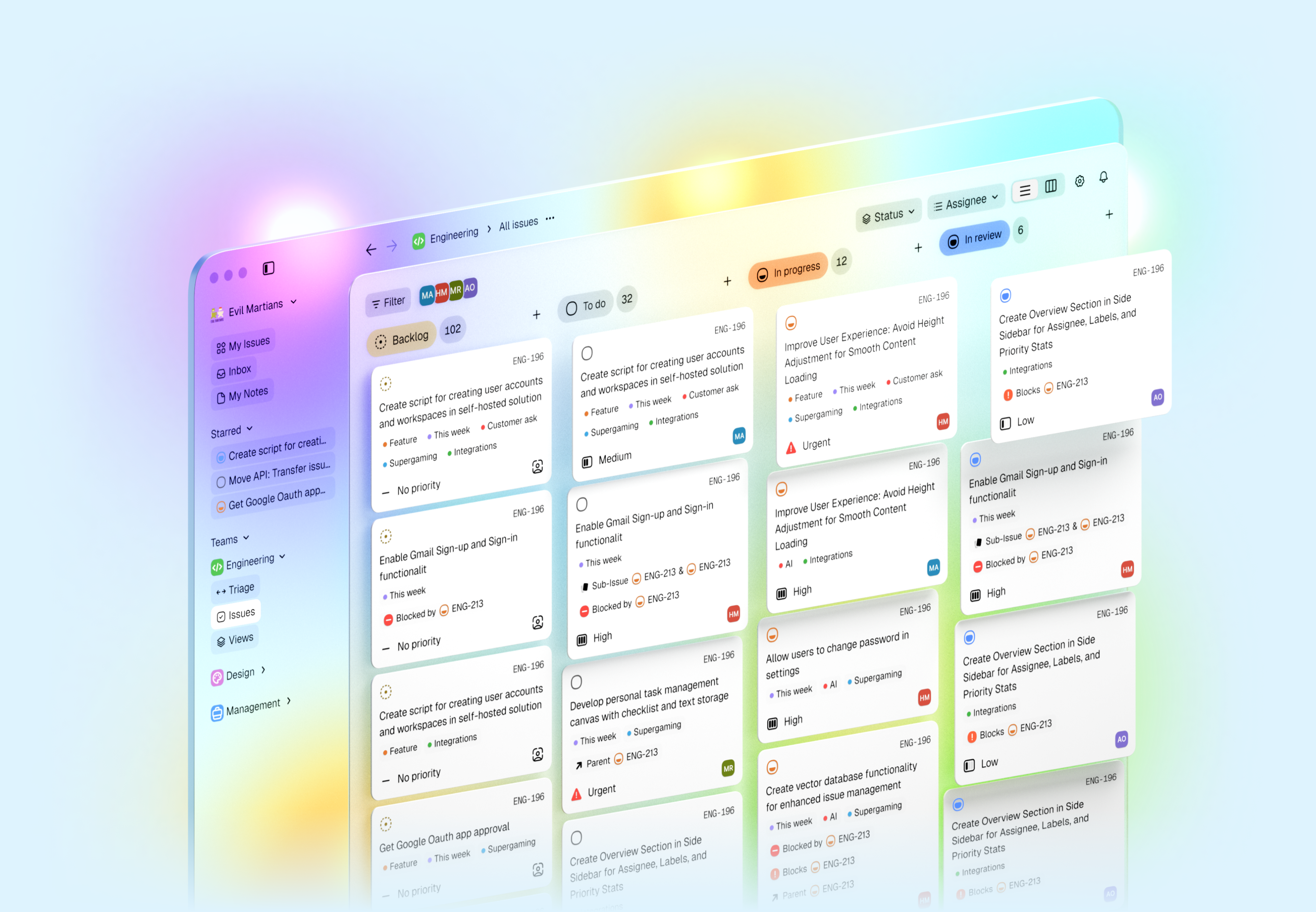
Modern tools generalize this idea. Linear’s Command Menu lets you jump between issues, change states, tweak views, or switch teams from a single surface, filtered by whatever you’re currently looking at. It feels like a thin, keyboard-first layer over the entire app.

Similar command menus show up in browser devtools, internal developer portals, and observability tools: one box that jumps to pipelines, docs, dashboards, or incidents. You don’t need to explain this pattern three times across your product; if you have a strong, predictable command surface, this is your progressive disclosure for power users.

Of course, sometimes you need a more local form of power, a stable place on the screen (but only when you’re doing a certain kind of work). These are adjustable toolbars and task-specific workspaces.
Tools like Blender lean into task-based workspaces: Modeling, UV Editing, Scripting, and so on. Each workspace reconfigures panels and toolbars for that job; users can customize and save their own layouts.
Photoshop’s workspaces have the same idea: you can hide panels you don’t need, dock the ones that matter, and save named layouts for different tasks (retouching, typography, 3D, and so on.)

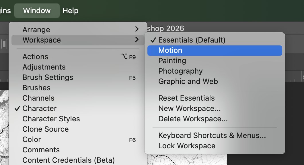
Different panels prioritized, but always reachable in one move and easy to reset to a known-good default.
Context-aware panels are the inline cousin of command palettes.
For devtools, this means:
- Sidebars and inspectors that adapt to the current selection and mode.
- Contextual menus (including keyboard-invoked ones) that surface the most likely next actions.
- Panels that can be shown/hidden quickly, with state remembered per workspace.
In Xcode, the inspector changes depending on what you’ve selected in code or Interface Builder. You can hide and show side panels to keep the main editor clean, but when they’re visible, they show properties that match your current focus.
In Figma, the right-hand properties panel and contextual toolbar change based on what’s selected: frames vs. vectors vs. text expose different controls, and when you start editing shape nodes, node-level tools (paths, boolean operations, handles) take over. Context menus and toolbars become little progressive-disclosure engines.

All of this still has to respect the accessibility rules above: targets large enough, focus visible and unobstructed, and enough contrast that “advanced” controls aren’t just grey noise.
Finally, there’s the “UI on top, CLI underneath” pattern.
On macOS, Finder’s preferences only expose a curated subset of options. To show hidden files everywhere, you jump to Terminal and run:
defaults write com.apple.finder AppleShowAllFiles -bool true
killall finder
Apple and the community treat these defaults write incantations as a deep-power layer: advanced and potentially risky options live behind commands, not in UI checkboxes.
Devtools can also mirror this format as appropriate:
- A clean settings UI with popular, safe options.
- A config file or admin CLI for rare, experimental, or high-risk switches.
- Documentation that clearly links UI settings to their deeper config/CLI equivalents.
Keep rare, dangerous, or extremely specialized functionality out of the everyday mental model, while still making it reachable for people who need it.
3. UI consistency and predictability
About 69% of developers say they lose eight or more hours per week to inefficiencies, including: unclear navigation, fragmented tools, and repeated context rebuilding.
In dense devtools, developers actually end up heavily relying on muscle memory. UI consistency is really about predictability. This means leveraging the same visual patterns, labels, and interaction rules, so developers don’t have to re-learn the interface every time they switch context.
Teams are now encoding consistency as a system so visuals and shortcuts mean the same thing everywhere. In 2025, the Design Tokens Community Group shipped the first stable spec to standardize cross-tool color/spacing/typography.
In editors, semantic tokens play a similar role: language servers mark up symbols with shared types/modifiers so themes behave predictably across languages and workspaces. You can see this in mainstream tools:
- JetBrains’ Islands theme is framed as a visual refresh with functionality unchanged, deliberately refining the look-and-feel without breaking habits (JetBrains: Islands theme).
- Visual Studio consolidated options into Unified Settings so pages respect themes and reuse consistent controls instead of mixing styles.
- VS Code publishes UX Guidelines and Contribution Points so extensions plug in with the same menus, keybindings, and settings patterns.
- Docker Desktop requires extensions to follow design guidelines so third-party panels feel native.
- GitLab’s Pajamas and GitHub’s Primer both exist to kill bespoke components and ship consistent, accessible ones instead.
Keyboard-first workflows and focus predictability
Keyboard UX is related, but it’s a separate layer that deserves its own rules.
When most actions are driven by tab/arrow/shortcut, the focus target has to be visible and stable. WCAG 2.2’s Focus Not Obscured (2.4.12) requires that focused components aren’t hidden, which is less about ticking a box and more about letting experts operate at speed without second-guessing the UI.
Mainstream tooling bakes those keyboard concerns into their UX standards:
- Visual Studio’s UX guidance treats consistent navigation patterns and shortcut behavior as part of extension quality itself.
- VS Code’s UX docs for views and settings expect extensions to participate in the same navigation model (command palette, view containers, context menus) instead of inventing parallel keyboard schemes.
And when we needed a more systematic way to reason about keyboard behavior across complex UIs, we built and open-sourced KeyUX, a library specifically focused on keyboard UI patterns for web apps.
KeyUX helps teams implement and test consistent arrow-key navigation, roving tabindex, and shortcut handling so that complex widgets (menus, tablists, grids) behave like users expect, even under heavy customization.
An Evil Martians case study
When redesigning Tegon, before touching visuals, we mapped how states, colors, and interactions behaved across lists, detail views, and AI-assisted flows, then collapsed them into a single token and pattern system. That work made it possible to introduce new AI features without creating “special” one-off behaviors that would erode muscle memory.
4. Design with multitasking in mind
Developers constantly switch context while working on tasks because real work is multi-threaded. We bounce between tickets, branches, terminals, clusters, and datasets. Developers move from coding, reviewing, debugging incidents, and triaging CI failures.
But context switching is measurably expensive, and this can obviously degrade overall productivity if not handled gracefully.
In classic usability terms, context switching directly attacks:
- Efficiency – it takes longer to complete tasks.
- Memorability – it’s harder to re-establish proficiency after a break.
- Satisfaction – frequent context loss feels stressful and frustrating.
Addy Osmani notes that studies often estimate around 20–23 minutes to fully regain focus after a distraction.
Customization as a way to support usability under multitasking
Customization is one of the concrete ways devtools can improve usability in a multitasking reality:
- Layouts let people pin the right views together (code + logs + metrics), so they don’t waste time juggling windows.
- Contexts / workspaces / profiles let them save a whole working state (open resources, environment, filters) and restore it in a single action.
- Keybindings and command palettes let them jump between tasks and views without hunting through menus.
Well-designed customization with multitasking in mind boosts efficiency, improves memorability, and reduces errors.
But use customization where it’s actually needed
A practical rule: the more time developers spend in a devtool (and the more contexts they juggle there) the more that tool should invest in multitasking customization.
Broader scenarios: If a tool is used every day, for hours by a stable group of developers, or as a hub for multiple tasks (tickets, services, environments) then its usability is dominated by efficiency, memorability, and long-term satisfaction.
In this context, features like workspaces, profiles, layouts, and shortcuts are not “nice to have”, they’re a must.
More specific scenarios: If a tool is: used rarely, in narrower flows, by many different users then its usability depends more on learnability (being easy to pick up) and error prevention than on deep personalization.
Heavy customization here may add cognitive overhead without real benefit.
Over-customization harms usability
From a usability standpoint, uncontrolled customization fragments the experience and erodes shared mental models. You don’t want a tool that everyone must redesign before they can use it.
“More settings” ≠ “better usability”.
Too much customization can:
- Hurt learnability because it’s harder for new users to understand the tool.
- Hurt memorability because people can’t rely on stable layouts and interaction patterns.
- Increase errors due to misconfigured views or hidden panels.
- Reduce team satisfaction because team pairing and support suffer when everyone’s UI looks different.
Strong defaults first, customization as a layer
A usability-friendly strategy means starting with strong, opinionated defaults:
- A default layout that already matches the primary workflows.
- Clear, documented navigation patterns and key actions.
- Defaults that let most users be productive without touching settings.
And giving users carefully chosen customization hooks:
- Workspaces or profiles for people who juggle many contexts.
- A small, well-chosen set of keybindings that can be remapped.
- A few layout variations (for roles or screens), not infinite free-form rearranging.
This is exactly how popular tools approach customization:
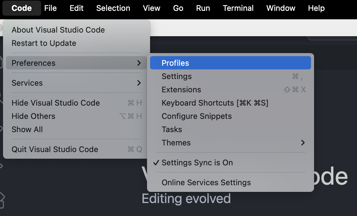
- When Microsoft shipped VS Code Profiles, they called it “one of the all-time most requested” capabilities—developers wanted to switch entire setups by task.
- In heavier IDEs, IntelliJ Tasks & Contexts let you save/load open files, bookmarks, and breakpoints per ticket, while Settings Backup & Sync keeps themes, keymaps, and code style consistent across machines.
- Jupyter treats the workspace as the unit of state—named URLs can reopen the exact layout and documents you were using.

Layout matters just as much as configuration. Visual Studio supports saving up to 10 window layouts: “dual-monitor debug”, “single-screen review”, and so on.
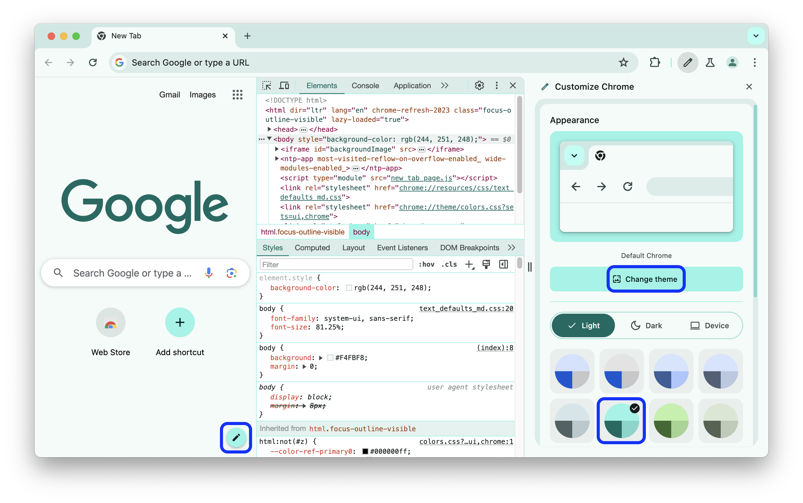
Browser devtools preserve similar preferences: Chrome DevTools allows panel reordering and dock/undock to a separate window, with settings remembered across sessions.
On the cloud side, dev containers/Codespaces encode entire environments in devcontainer.json, so switching tasks is as simple as picking the right profile

5. Resilience and stability
Devtools are “long-lived”, stateful environments where developers spend a lot of time. When tools lose state or make recovery difficult, developers stop trusting them and work around critical flows. This decreases user performance.
Here’s what a good devtool needs:
- User work should not disappear
- Pipelines and dashboards behave as expected
- Recovery from failure is predictable and cheap
For devtools, resilience shows up at three levels: local, system, and security.
Local resilience: lossless environments
Local resilience means that editors, terminals, and browsers survive crashes and restarts without losing important state. Developers now expect things to be “lossless by default”.
- Visual Studio Code has Auto Save and Hot Exit: the editor can close or crash, and unsaved files are restored on next launch without nag dialogs.
- JetBrains IDEs ship Local History, an automatic “shadow VCS” that tracks file and project changes even without commits, so you can roll back after crashes or bad edits.
- Cloud-backed sessions like VS Code’s Edit Sessions / Cloud Changes sync dirty files and session context so you can resume on another machine without passing patches around by hand.
- In notebook workflows, Jupyter Notebook combines autosave with explicit checkpoints, so you can revert to a named state instead of hoping the current autosave is “good enough”.
The pattern behind all of these is this: Capture state continuously → expose a timeline → recover in one move.
By the way, “state” is more than file contents:
- Open files and terminals
- Breakpoints, watches, and run configurations
- Filters, log levels, and expanded rows
- The layout you rely on to navigate quickly
A resilient tool preserves this web of context and makes it clear how to restore it when something goes wrong.
Debugging and incident work can often be long-running investigation: filters, expanded traces, focused subsets of logs. Reloads and reconnects shouldn’t reset everything.
Chrome DevTools exposes options like Preserve log in the Console and Network panels so logs and requests survive page reloads instead of being wiped on every refresh.
For devtools, having “resilient investigations” means that:
- Log levels, filters, and views persist across restarts by default (or can be pinned)
- Long-lived investigations can be saved and shared (not reconstructed from screenshots and Slack threads)
System resilience: pipelines you can trust
At the system level, resilience is about how often changes hurt you and how quickly you recover. CI/CD, environments, and deployment tooling fail in predictable ways and are easy to recover.
Resilient tools make rollback safety obvious in one or two steps; you don’t have to dig through dashboards and wikis to find it. If it takes ten minutes of hunting to understand whether it’s safe to roll back, you don’t have resilient devtools …you have expensive guesswork.
Security as part of resilience
Your devtool’s system should keep its integrity under pressure: no secret leaks, no opaque artifacts, no surprise data flows.

If your toolchain:
- Leaks secrets into logs or AI prompts
- Produces artifacts with no provenance
- Or hides what’s actually inside a deployed image
…then the system isn’t stable in any meaningful sense, and actually it’s just reliably fragile.
Meanwhile, mainstream platforms are folding this into everyday devtools:
- GitHub can generate and expose SBOMs so you can see what’s inside your software directly in the repo.
- GitLab integrates SBOM generation and dependency scanning into CI, so supply-chain checks run alongside builds and tests.
So, from a developer’s perspective, “secure-by-default” looks like this:
- Builds that show which bill of materials and provenance they produced
- Releases that show which policies they passed
- Security exceptions that are visible, auditable states—not hidden toggles in a separate console.
AI security
Assume untrusted text will reach your model. Devtools should assume injection attempts and design for containment by default. OWASP now tracks LLM-specific top risks in the OWASP Top 10 for LLM Applications, and the UK NCSC warns prompt injection may never be fully “solved”.
Here are some “secure-by-default” AI patterns:
- Never execute model output directly. Treat responses like user input: validate, escape, and constrain before touching shells/SQL/config/Markdown/HTML. Prefer structured tool calls with strict schemas and allowlists.
- Constrain agency by default. Read-only tools first; require explicit confirmation for irreversible actions (merge, deploy, permission changes, deletes). Keep a clear action log.
- Secure retrieval (RAG) like production data access. Enforce real ACLs, minimize context, and redact secrets before prompting and logging.
- Sanitize rendered output. Strip/neutralize risky Markdown/HTML and remote content (OWASP explicitly calls out HTML/Markdown injection and indirect/remote injection).
- Budget + circuit-breakers. Hard limits on tokens/tool calls/time to prevent abuse and cost blowups (“unbounded consumption”).
Get more advice here.
6. AI governance
That makes for a great point to segue to our next section.
Devtools live around deeply ingrained habits. Change key shortcuts, panel behavior, or core flows in the wrong way and you’re breaking years of practice.
2025 survey data shows AI adoption is high but trust is low.
Developers want explanations, controls, and reversibility more than yet another checkbox.
That’s why iteration (especially iteration that involves AI) has to be opt-in, reversible, and explainable.

AI assistance already delivers real gains (especially for boilerplate, tests, docs, and exploring unfamiliar code). But they can also slow experts down, increase risk, or explode costs when bolted onto shaky processes or weak review/testing.
AI only “wins” when it fits existing delivery and reliability practices.
At the same time, more than half say they can only “fully delegate” 0–20% of their work and worry about skill atrophy, reduced mentorship (Claude as the first stop for questions), and long-term role uncertainty.
That’s exactly the shape of AI devtools today: huge upside, but only if you treat delegation, oversight, and human collaboration as a first-class design problem.
When we brought LLM assistance into TestProf, our Rails test-profiling toolkit, we treated it as exactly that: an assist layer on top of a battle-tested workflow. AI proposes refactorings and configuration tweaks, but everything is wired through GitHub Actions, diffs, and regular reviews. That meant existing users could adopt AI gradually, with clear levers for cost and risk.
Browsers and editors already ship changes where consent is explicit:
- Chrome hides risky additions behind DevTools > Settings > Experiments, and surfaces them first in preview channels so you opt in before they touch core flows.
- VS Code gates features via controlled experiments and lets users or extensions turn off experiments and data collection in clear, well-documented settings.
The same model applies to AI features: start in preview channels, hide behind feature flags or experiments, and make opt-out simple and visible.
Vendors are already adjusting to this, too:
- JetBrains AI Enterprise; product page lets teams connect their own providers (Vertex, Bedrock, OpenAI, on-prem LLMs) and manage configuration centrally.
- Sourcegraph Cody offers self-hosted and LLM choice for governance and data locality.
- GitLab Duo Self-Hosted lets orgs run features with their own LLMs on their own infra, controlling which features are enabled and where requests go.
- GitHub Copilot exposes enterprise policies to allow/deny features and models, and audit logs to track usage—plus detailed docs on how Copilot handles data.
Make AI edits diff-first and reversible
Keep AI inside the existing safety nets: diffs, reviews, history, and undo.
The strongest AI UX pattern is: propose → preview diff → apply/revert.
GitHub’s Copilot Edits ships multi-file changes through a review UI (including in Visual Studio), keeping edits auditable before they land. Sourcegraph’s Cody added inline diffs and explicit Apply / Show Diff flows for code edits.
AI Assistant from JetBrains integrates with VCS so you can self-review a commit and Apply/Revert changes at the hunk level.
Another Evil Martians case study
When we used LLMs as a design-engineering copilot on a data-heavy, interactive chart project, rather than anything AI-related, the biggest win was seeing an experienced designer-engineer explore many more options, wire up realistic prototypes in Bolt.new, and hand off production-ready code in days instead of weeks—while still owning every decision, end to end.